Commons:Featured picture candidates/Log/December 2008
This is an archive for Commons:Featured picture candidates page debates and voting.
The debates are closed and should not be edited.
Image:Jovan Kaneo.jpg, not featured[edit]
Voting period ends on 29 Nov 2008 at 13:30:53
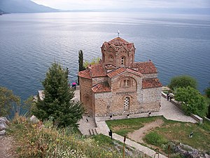
 Info created by Vanjagenije - uploaded by Ori~ - nominated by Tseno Maximov
 Support – Tseno Maximov (talk) 13:30, 20 November 2008 (UTC)
 Support Georgez (talk) 14:26, 20 November 2008 (UTC)
 Oppose Rather flat, and the pink umbrella distracts. --MichaelMaggs (talk) 23:05, 20 November 2008 (UTC)
 Neutral is it me, or it is even so slightly out of focus ? --JY Rehby (talk) 02:38, 21 November 2008 (UTC)
 Oppose: not geocoded, {{Information}} is not used, {{Self}} does not mention the author (who is different form the uploader). --Kjetil_r 00:40, 24 November 2008 (UTC)
 Neutral Yeah, some parts of the picture are blurry, it's not only you ;-) But I must admire the composition. --Aktron (talk) 15:15, 24 November 2008 (UTC)
 Support Now, it is geocoded, I've added {{Information}} and name in {{Self}} Vanjagenije (talk) 01:53, 29 November 2008 (UTC)
.svg/15px-Pictogram_voting_comment_(orange).svg.png) Comment The geocoding can't be correct: Compare the position in Google Maps with the background in the photo, where is the lake/sea in the map? --Kjetil_r 13:59, 29 November 2008 (UTC)
Comment The geocoding can't be correct: Compare the position in Google Maps with the background in the photo, where is the lake/sea in the map? --Kjetil_r 13:59, 29 November 2008 (UTC)
result: 3 support, 2 oppose, 2 neutral => not featured. Pom² (talk) 12:14, 1 December 2008 (UTC)
Image:Parthenocissus quinquefolia on wall, November 1, 2008.jpg, not featured[edit]
Voting period ends on 30 Nov 2008 at 00:56:04
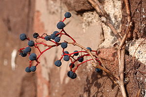
 Info Created and uploaded by Ragesoss - nominated by Ram-Man 00:56, 21 November 2008 (UTC)
 Support I think this is simple, beautiful, and a little different. As a bonus, it nicely illustrates its Wikipedia article. -- Ram-Man 00:56, 21 November 2008 (UTC)
 Support per previous voter. Lighting and color palette are very expressive. --JY Rehby (talk) 02:32, 21 November 2008 (UTC)
 Support – Tseno Maximov (talk) 09:39, 21 November 2008 (UTC)
 Oppose - I don't like the composition. Was the image rotated? -- Alvesgaspar (talk) 23:28, 21 November 2008 (UTC)
 Oppose I don't think this is FP material. --Massimo Catarinella (talk) 01:24, 22 November 2008 (UTC)
 Neutral Somehow i like it --Richard Bartz (talk) 12:24, 22 November 2008 (UTC)
 Support I like the composition, colors are nice. --Aktron (talk) 15:14, 24 November 2008 (UTC)
 Support - pretty okay I guess. diego_pmc (talk) 18:52, 24 November 2008 (UTC)
 Oppose Composition. --Karelj (talk) 22:04, 24 November 2008 (UTC)
 Support --Lošmi (talk) 20:46, 25 November 2008 (UTC)
 Oppose Quality is rather ok but it misses the magic to become FP. Lycaon (talk) 17:03, 26 November 2008 (UTC)
 Oppose Composition and backround. --Herrick (talk) 18:49, 27 November 2008 (UTC)
result: 6 support, 5 oppose, 1 neutral => not featured. Pom² (talk) 12:15, 1 December 2008 (UTC)
Image:Bödele Bregenzerwald Panorama.jpg, featured[edit]
Voting period ends on 30 Nov 2008 at 12:58:09

 Info created, uploaded and nominated by -- Böhringer (talk) 12:58, 21 November 2008 (UTC)
 Support -- Böhringer (talk) 12:58, 21 November 2008 (UTC)
 Oppose, lens flare (even *two*) equals obvious non-FP, in my eyes. --Aqwis (talk) 13:15, 21 November 2008 (UTC)
 Support Great panorama. --Kosiarz-PL 14:02, 21 November 2008 (UTC)
 Support That is one great panorama. --Mr. Mario (talk) 15:26, 21 November 2008 (UTC)
 Support. I like it. – Tseno Maximov (talk) 16:04, 21 November 2008 (UTC)
 Support Georgez (talk) 16:25, 21 November 2008 (UTC)
 Oppose The lens flares ruin it for me. Es tut mir leid. --Massimo Catarinella (talk) 17:05, 21 November 2008 (UTC)
 Support Nice panorama. --Jagro (talk) 20:59, 21 November 2008 (UTC)
 Support no question. nice work --Simonizer (talk) 21:04, 21 November 2008 (UTC)
 Oppose - I don't like the symmetry of the composition -- Alvesgaspar (talk) 23:31, 21 November 2008 (UTC)
 Support --Richard Bartz (talk) 12:58, 22 November 2008 (UTC)
 Support weakly, great panorama, sharpness, colors, rendition of atmosphere are great. Lens flare a little too present, unfortunately. --JY Rehby (talk) 17:51, 22 November 2008 (UTC)
 Support My first reaction to this image was "wow". Calandrella (talk) 21:26, 22 November 2008 (UTC)
 Support --Lestat (talk) 22:02, 22 November 2008 (UTC)
 Support --Karelj (talk) 22:03, 23 November 2008 (UTC)
 Support --Kjetil_r 00:36, 24 November 2008 (UTC)
 SupportJukoFF (talk) 05:12, 24 November 2008 (UTC)
 Support--Wisnia6522 (talk) 10:46, 24 November 2008 (UTC)
 Support -- Martin Kozák (talk) 16:21, 24 November 2008 (UTC) — Good composition, good moment, good colors, good work.
 Neutral It's super ! but I think there's too much sky. Benh (talk) 20:56, 24 November 2008 (UTC)
 Support --Pom² (talk) 11:52, 25 November 2008 (UTC)
 Support ■ MMXXtalk 05:16, 26 November 2008 (UTC)
 Support /Daniel78 (talk) 21:15, 26 November 2008 (UTC)
 Support Awesome! - Man On Mission (talk) 08:16, 28 November 2008 (UTC)
 Support Great panorama, really interesting. --MonaLuna (talk) 23:51, 29 November 2008 (UTC)
result: 21 support, 3 oppose, 1 neutral => featured. Pom² (talk) 12:16, 1 December 2008 (UTC)
Image:Struthio camelus (Kunene).jpg, not featured[edit]
Voting period ends on 30 Nov 2008 at 13:33:08
.jpg/300px-Struthio_camelus_(Kunene).jpg)
 Info created, uploaded and nominated by Lycaon (talk) 13:33, 21 November 2008 (UTC)
 Support Mind the dip! Picture taken while driving (don't tell). -- Lycaon (talk) 13:33, 21 November 2008 (UTC)
 Oppose Funny but nothing for higher encyclopedic use. --Herrick (talk) 15:56, 21 November 2008 (UTC)
.svg/15px-Pictogram_voting_comment_(orange).svg.png) Comment A featured picture doesn't need to be encyclopedic. It just needs to fall within the scope. Diti (talk to the penguin) 17:58, 21 November 2008 (UTC)
Comment A featured picture doesn't need to be encyclopedic. It just needs to fall within the scope. Diti (talk to the penguin) 17:58, 21 November 2008 (UTC).svg/15px-Pictogram_voting_comment_(orange).svg.png) Comment Beats any zoo picture though ;-) Lycaon (talk) 23:17, 21 November 2008 (UTC)
Comment Beats any zoo picture though ;-) Lycaon (talk) 23:17, 21 November 2008 (UTC)
 Oppose Back side of the ostrich and road in bad composition. --Jagro (talk) 17:23, 21 November 2008 (UTC)
 Support I think this picture's good! --Mr. Mario (talk) 23:59, 21 November 2008 (UTC)
 Support One of my favorite images -- the first time I saw this not only did I laugh but I also said "Wow". (I so support this that I have to sit on my hands to not log in from some of the other ips I have access to and vote....) -- carol (talk) 06:33, 22 November 2008 (UTC)
 Oppose Upsampled. Flying Freddy (talk) 06:53, 22 November 2008 (UTC)
- If you look at the upload log, you will find that Lycaon just uploaded the original version, not an upsampled version. --Digon3 talk 15:09, 22 November 2008 (UTC)
- I think he was making a joke :) Noodle snacks (talk) 22:21, 22 November 2008 (UTC)
 Support 4 given cirumstances and under strictly abidance 4 traffic regulations it's a great shot. --Richard Bartz (talk) 12:31, 22 November 2008 (UTC)
 Support Might be reframed later if necessary ; composition is interesting, the neck falls exactly between 2 road signs. Maybe a little bit too much road on the right hand side, but then the ostrich would be too centered... oh well, i think it's very good for a picture taken while drivin of a running ostrich. --JY Rehby (talk) 17:48, 22 November 2008 (UTC)
 Oppose -- Too bad composition for my taste. Manuel R. (talk) 20:53, 22 November 2008 (UTC)
 Support Maybe not the best quality, but the feeling is good. Calandrella (talk) 21:24, 22 November 2008 (UTC)
 Support --Simonizer (talk) 22:36, 22 November 2008 (UTC)
 Oppose It is unusual and perhaps comical, but I don't think it meets the compositional or quality requirements. Noodle snacks (talk) 22:41, 22 November 2008 (UTC)
 Oppose Bad composition, and sorta dull, IMO. diego_pmc (talk) 12:14, 23 November 2008 (UTC)
 Oppose As other opponents. --Karelj (talk) 22:06, 23 November 2008 (UTC)
 Oppose Too grey, no sky... >>> composition should be better. --Aktron (talk) 15:13, 24 November 2008 (UTC)
 Oppose overcropped.--Juan de Vojníkov (talk) 15:50, 24 November 2008 (UTC)
- Nonsense. Only about 250px cropped from the bottom to remove part of he car's bonnet. Lycaon (talk) 16:48, 24 November 2008 (UTC)
- Well and thats a problem. It si done from unforable place, so it cant be better.--Juan de Vojníkov (talk) 12:11, 25 November 2008 (UTC)
- Nonsense. Only about 250px cropped from the bottom to remove part of he car's bonnet. Lycaon (talk) 16:48, 24 November 2008 (UTC)
 Oppose wrong side --Mbdortmund (talk) 22:17, 28 November 2008 (UTC)
result: 7 support, 9 oppose, 0 neutral => not featured. Pom² (talk) 12:18, 1 December 2008 (UTC)
Image:Blue Angels NAS Jacksonville Air Show 2452.JPG, featured[edit]
Voting period ends on 30 Nov 2008 at 16:02:23
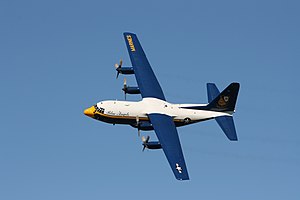
 Info created, uploaded, and nominated by Digon3 --Digon3 talk 16:02, 21 November 2008 (UTC)
 Support --Digon3 talk 16:02, 21 November 2008 (UTC)
 Support – Tseno Maximov (talk) 16:18, 21 November 2008 (UTC)
 Support A perfect shot. Diti (talk to the penguin) 14:33, 22 November 2008 (UTC)
 Support detailed in every respect, down to the bubble crewman, and the damage on the port wingtip. Ultra7 (talk) 17:34, 23 November 2008 (UTC)
 Support -- Albertus teolog (talk) 18:00, 23 November 2008 (UTC)
 Support --Karelj (talk) 22:07, 23 November 2008 (UTC)
 Support not bad.--Juan de Vojníkov (talk) 15:46, 24 November 2008 (UTC)
 Support Great shot --Pom² (talk) 11:51, 25 November 2008 (UTC)
 Support A bit vignetting visible though. /Daniel78 (talk) 21:18, 26 November 2008 (UTC)
 Support nice one - Man On Mission (talk) 07:49, 28 November 2008 (UTC)
result: 10 support, 0 oppose, 0 neutral => featured. Pom² (talk) 12:19, 1 December 2008 (UTC)
Image:Tu-95MS and F-15C.jpg, not featured[edit]
Voting period ends on 30 Nov 2008 at 18:54:23
%2c_28_September_2006_(060928-)
 Info created by USAF - uploaded by Nova13 - nominated by Tseno Maximov
 Support – Tseno Maximov (talk) 18:54, 21 November 2008 (UTC)
 Oppose Compression artifacts and posterized sky. /Daniel78 (talk) 23:34, 21 November 2008 (UTC)
 Support --Avala (talk) 00:01, 22 November 2008 (UTC)
 Oppose The quality is very bad, heavily compressed. --Massimo Catarinella (talk) 01:23, 22 November 2008 (UTC)
 Oppose Nothing special. Diti (talk to the penguin) 09:37, 22 November 2008 (UTC)
 Support --Karelj (talk) 21:05, 23 November 2008 (UTC)
.svg/15px-Pictogram_voting_comment_(orange).svg.png) Comment The original NORAD photo is here, in case somebody wants to upload a version without artifacts. --Kjetil_r 00:13, 24 November 2008 (UTC)
Comment The original NORAD photo is here, in case somebody wants to upload a version without artifacts. --Kjetil_r 00:13, 24 November 2008 (UTC) Oppose Ouch, bad quality. Should've been FPX'ed Lycaon (talk) 17:14, 24 November 2008 (UTC)
 SupportI like it! --Jhz94 (talk) 00:01, 24 November 2008 (UTC)
 Oppose Too much grain, too much compression. I am sorry. --Aktron (talk) 14:16, 28 November 2008 (UTC)
 Oppose bad quality --Mbdortmund (talk) 22:16, 28 November 2008 (UTC)
 Oppose Agree with Kjetil_r, original is much better quality. --Specious (talk) 23:06, 28 November 2008 (UTC)
result: 4 support, 7 oppose, 0 neutral => not featured. Pom² (talk) 12:21, 1 December 2008 (UTC)
Image:Air conditioning unit-en.svg, featured[edit]
Voting period ends on 1 Dec 2008 at 02:08:01
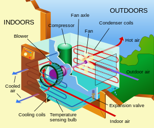
 Info created by Pbroks13 - uploaded by Pbroks13 - nominated by Pbroks13 -- Pbroks13 (talk) 02:08, 22 November 2008 (UTC)
 Support -- Pbroks13 (talk) 02:08, 22 November 2008 (UTC)
 Support Very well done. Diti (talk to the penguin) 09:13, 22 November 2008 (UTC)
 Oppose
 QuestionI'm sorry, but where should it be pointing then? Is that not the expansion valve? Pbroks13 (talk) 02:08, 23 November 2008 (UTC)
 Info JY Rehby (talk) adjusts his spectacles on his nose and checks. As of now, it's pointing to a purple, horizontal rod linking the blower's motor to the fan on the "hot" side. This would be called the "fan axle". The "expansion valve", per se, is currently not shown. It ought to be in the bottom right corner of the unit, approx. where the inner wall of the appliance is set, and it should be installed on the tubing between the "hot" and "cold" sides. After a quick search, I found this diagram [1] that should help you locate the device. The "red" and "blue" sides have the same meaning in both your and their diagram. Hoping this helps!--JY Rehby (talk) 16:51, 23 November 2008 (UTC)
 Support Good compromise between smplicity and level of detail. --JY Rehby (talk) 03:03, 28 November 2008 (UTC)
 Support Well done! --norro 17:12, 29 November 2008 (UTC)
November 2008 (UTC)
result: 5 support, 0 oppose, 0 neutral => featured. Pom² (talk) 12:22, 1 December 2008 (UTC)
Image:Acer platanoides in autumn colors.JPG, not featured[edit]
Voting period ends on 1 Dec 2008 at 08:09:44
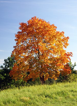
 Info created by Kosiarz-PL - uploaded by Kosiarz-PL - nominated by Kosiarz-PL -- Kosiarz-PL 08:09, 22 November 2008 (UTC)
 Support -- Kosiarz-PL 08:09, 22 November 2008 (UTC)
 Oppose It is overexposed I am afraid. Both the red and blue channels are badly clipped. Also, it is not that sharp, given the rather small image size. I would suggest using a tripod for a 1/60 second exposure. --MichaelMaggs (talk) 08:22, 22 November 2008 (UTC)
 Oppose Overall impression is neat but it's 2 blurry --Richard Bartz (talk) 12:02, 22 November 2008 (UTC)
 Oppose per previous voter. A nice picture of an automn tree, not sharp enough though for FP, i think. --JY Rehby (talk) 17:39, 22 November 2008 (UTC)
 Support It is not overexposed and trees are very oftern blurry like this one. I have no reason to oppose. --Aktron (talk) 15:12, 24 November 2008 (UTC)
 Oppose not sharp, bad compostition.--Juan de Vojníkov (talk) 15:44, 24 November 2008 (UTC)
result: 2 support, 4 oppose, 0 neutral => not featured. Pom² (talk) 12:23, 1 December 2008 (UTC)
Image:StAugustinesächsischeWand.jpg, not featured[edit]
Voting period ends on 1 Dec 2008 at 11:27:01
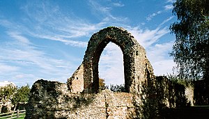
 Info created by Agnete - uploaded by Agnete - nominated by Tseno Maximov
 Support – Tseno Maximov (talk) 11:27, 22 November 2008 (UTC)
 Oppose Insufficient quality such as grain/noise & contrast. --Richard Bartz (talk) 12:06, 22 November 2008 (UTC)
 Oppose per previous voter --JY Rehby (talk) 17:34, 22 November 2008 (UTC)
 Oppose Grain, and the wall is lacking detail - problem should be the lighting. --Aktron (talk) 15:24, 24 November 2008 (UTC)
 Oppose yeah, grain.--Juan de Vojníkov (talk) 15:42, 24 November 2008 (UTC)
 Oppose grain and lacking detail --SuperJew (talk) 14:13, 1 December 2008 (UTC)
result: 1 support, 5 opposes, 0 neutral => not featured (rule of the 5th day). Benh (talk) 18:42, 1 December 2008 (UTC)
Image:Bonde Sta Tereza01.jpg, not featured[edit]
Voting period ends on 2 Dec 2008 at 11:40:05

 Info photos by Wolfhardt; stitch created by Klaus with K - uploaded by Klaus with K - nominated by Wolfhardt -- Wolfhardt (talk) 11:40, 23 November 2008 (UTC)
![]() Support – Nice panorama --Jagro (talk) 22:16, 23 November 2008 (UTC)
Support – Nice panorama --Jagro (talk) 22:16, 23 November 2008 (UTC)
.svg/15px-Pictogram_voting_comment_(orange).svg.png) Comment Can you geocode it? --Kjetil_r 00:03, 24 November 2008 (UTC)
Comment Can you geocode it? --Kjetil_r 00:03, 24 November 2008 (UTC)
- I put the coordinate on the page, but I don`t know if that`s exactly what you meant. Feel free to change the syntax of the coordinate. I am very unexperienced with that. -- 84.187.58.99 13:28, 24 November 2008 (UTC)
.svg/15px-Pictogram_voting_comment_(orange).svg.png) Comment Quite ok for a start. I changed it to the camera position (and I use a different geocoding template) -- Klaus with K (talk) 14:00, 24 November 2008 (UTC)
Comment Quite ok for a start. I changed it to the camera position (and I use a different geocoding template) -- Klaus with K (talk) 14:00, 24 November 2008 (UTC)
 Oppose unfortunate quality. Lycaon (talk) 08:12, 24 November 2008 (UTC)
 Oppose I am not sure about the colors and the clouds are not looking good also (however, these are quite hard to shoot). --Aktron (talk) 15:27, 24 November 2008 (UTC)
 Oppose--Georgez (talk) 15:14, 25 November 2008 (UTC)
result: 1 support, 3 opposes, 0 neutral => not featured (rule of the 5th day). Benh (talk) 18:43, 1 December 2008 (UTC)
Image:Berlín, Mitte, socha na mostě Schloßbrücke.jpg, not featured[edit]
Voting period ends on 3 Dec 2008 at 17:00:15
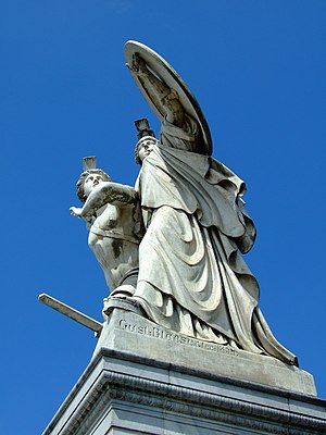
 Info created by Aktron - uploaded by Aktron - nominated by Aktron -- Aktron (talk) 17:00, 24 November 2008 (UTC)
 Support -- Aktron (talk) 17:00, 24 November 2008 (UTC)
 Oppose Composition. Very unfortunate POV. Lycaon (talk) 17:10, 24 November 2008 (UTC)
 Oppose Composition and viewpoint --Richard Bartz (talk) 17:26, 24 November 2008 (UTC)
 Oppose Too usual point of view (ya rly). →Diti the penguin — 00:01, 25 November 2008 (UTC)
 Oppose--Georgez (talk) 15:14, 25 November 2008 (UTC)
 Oppose very bad point of view. --JY Rehby (talk) 23:48, 25 November 2008 (UTC)
- I like the composition, it's strong.
Sorry, you should try Commons:Quality images candidates first! --Beyond silence 01:26, 1 December 2008 (UTC)
 Support
result: 1 support, 5 opposes, 0 neutral => not featured (rule of the 5th day). Benh (talk) 18:44, 1 December 2008 (UTC)
Image:Rembrandt self portrait.jpg, not featured[edit]
Voting period ends on 9 Dec 2008 at 01:00 (UTC)
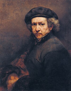
 Info created by Rembrandt - uploaded and nominated by Paris 16 (talk) 00:29, 26 November 2008 (UTC)
 Support --Paris 16 (talk) 00:29, 26 November 2008 (UTC)
 Oppose Looks like a scan from a book, dithering pattern is visible. /Daniel78 (talk) 21:09, 26 November 2008 (UTC)
 Oppose As Daniel78 --Lošmi (talk) 00:29, 27 November 2008 (UTC)
 Oppose Not a good quality Vanjagenije (talk) 11:12, 29 November 2008 (UTC)
result: 1 support, 3 opposes, 0 neutral => not featured (rule of the 5th day). Benh (talk) 18:44, 1 December 2008 (UTC)
Image:Peggys Cove - NS - Leuchturm.jpg, not featured[edit]
Voting period ends on 5 Dec 2008 at 06:08:44
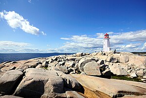
 Info created by Taxiarchos228 - uploaded by Tohma - nominated by Mmxx -- ■ MMXXtalk 06:08, 26 November 2008 (UTC)
 Support -- ■ MMXXtalk 06:08, 26 November 2008 (UTC)
 Oppose Composition --Herrick (talk) 08:28, 28 November 2008 (UTC)
 Oppose Get closer, man. The lighthouse is a bit far for me. If the picture is used as a thumb like here, people would see some white place, not a lighthouse. --Aktron (talk) 14:14, 28 November 2008 (UTC)
 Oppose Bad composition (skyline at the middle —think about the rule of thirds!) and unwanted vignetting. →Diti the penguin — 20:54, 28 November 2008 (UTC)
 Neutral This image is really not bad at all! I like it a lot. The lighthouse is rather distant indeed, but the landscape is very nice. And the centered skyline doesn't bother me: the rule of the thirds is not always the best solution. The balance between the sky and the rocks is very good here. The reason why I'm not supporting for FP, is that the lighthouse itself is partially overexposed... -- MJJR (talk) 21:54, 29 November 2008 (UTC)
result: 1 support, 3 opposes, 1 neutral => not featured (rule of the 5th day). Benh (talk) 18:45, 1 December 2008 (UTC)
Image:MS Sonnenkönigin 01.JPG, withdrawn[edit]
Voting period ends on 10 Dec 2008 at 21:00:02
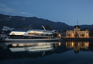
 Info created, uploaded and nominated by -- Böhringer (talk) 21:00, 1 December 2008 (UTC)
 Support -- Böhringer (talk) 21:00, 1 December 2008 (UTC)
 Oppose too noisy. ISO 800 is way to high for an image that doesn't "run away" please use a tripod and longer exposure time next time. -- Gorgo (talk) 00:52, 2 December 2008 (UTC)
 Oppose ISO 800? The composition is awesome and it is looking really good... but this thing ruins it. I am sorry. --Aktron (talk) 11:02, 2 December 2008 (UTC)
 Oppose Iso 800 --Massimo Catarinella (talk) 15:59, 2 December 2008 (UTC)
 I withdraw my nomination ye have fairly but 800 is too high --Böhringer (talk) 21:57, 2 December 2008 (UTC)
result: withdrawn => not featured Lycaon (talk) 07:12, 3 December 2008 (UTC)
Image:Fisherman's mascot.jpg, withdrawn[edit]
Voting period ends on 11 Dec 2008 at 07:31:30
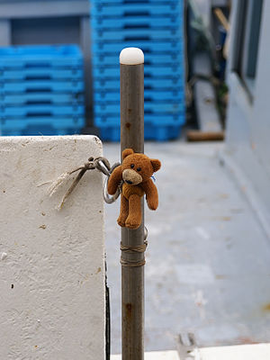
 Info created, uploaded and nominated by Lycaon (talk) 07:31, 2 December 2008 (UTC)
 Support -- Lycaon (talk) 07:31, 2 December 2008 (UTC)
 Oppose I think closer view with maybe a bit different angle would be much better. If this picture is displayed as a thumb the teddy bear would be very tiny. --Aktron (talk) 11:00, 2 December 2008 (UTC)
 Oppose Nothing WOW, Bad composition --libertad0 ॐ (talk) 14:24, 2 December 2008 (UTC)
 Support Great illustration for wild brown bear --Pom² (talk) 14:59, 2 December 2008 (UTC)
 Oppose Dislike the centric composition --Massimo Catarinella (talk) 16:00, 2 December 2008 (UTC)
 Oppose No wow, closer view would be preferable. Anonymous101 talk 17:11, 2 December 2008 (UTC)
 I withdraw my nomination Yep you're right: cute ≠ FP. :-). Lycaon (talk) 18:08, 2 December 2008 (UTC)
result: withdrawn => not featured Lycaon (talk) 07:13, 3 December 2008 (UTC)
Image:Calocera viscosa LC0123.jpg, Not Featured[edit]
Voting period ends on 1 Dec 2008 at 12:13:20
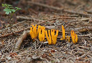
 Info Yellow slagshorn fungus; created, uploaded & nominated by -- LC-de (talk) 12:13, 22 November 2008 (UTC)
 Support -- LC-de (talk) 12:13, 22 November 2008 (UTC)
 Neutral Nice. The mushrooms look a little bit flat and could have more grip (texture) and plasticity (lighting) 4 my taste --Richard Bartz (talk) 12:43, 22 November 2008 (UTC)
- Thanks for your opinion. Actually the mushrooms have a smooth surface without any visible texture. Maybe I could show more plasticity by more direct lighting, but I like this dimmed light on the forest soil. Btw. Unlike the pic in the Makro-Forum it was a dry day. Normally they aren't as slimy as seen on the pic there. --LC-de (talk) 13:10, 22 November 2008 (UTC)
 Support I think the depth of field is not optimal, the top of the mushrooms is a bit blurred. I like the leaf at the left, so we can compare the mushrooms' size, but you should have chosen an aperture a little bit bigger. Diti (talk to the penguin) 14:32, 22 November 2008 (UTC)
 Support Looks ok to me --JY Rehby (talk) 17:37, 22 November 2008 (UTC)
 Support Focus is good, detail is good, composition is fine. --Aktron (talk) 15:25, 24 November 2008 (UTC)
 Support --Lošmi (talk) 20:45, 25 November 2008 (UTC)
 Support Looks really cool to me. --Albertgenii12 (User talk: Albertgenii12)
 Oppose - Unfocused foreground ruins it, in my opinion -- Alvesgaspar (talk) 18:05, 26 November 2008 (UTC)
 Support --Böhringer (talk) 22:02, 27 November 2008 (UTC)
 Oppose per Alvesgaspar. Lycaon (talk) 11:22, 28 November 2008 (UTC)
 Neutral Lycaon (talk) 19:58, 1 December 2008 (UTC)
 Oppose per Alvesgaspar. --Mbdortmund (talk) 22:15, 28 November 2008 (UTC)
 Oppose per Alvesgaspar. --Massimo Catarinella (talk) 23:36, 28 November 2008 (UTC)
 Support nice --MonaLuna (talk) 23:33, 29 November 2008 (UTC)
.svg/15px-Pictogram_voting_comment_(orange).svg.png) Comment Suspect voting Lycaon (talk) 09:36, 1 December 2008 (UTC) Vote was suspect but not invalid. Lycaon (talk) 09:59, 2 December 2008 (UTC)
Comment Suspect voting Lycaon (talk) 09:36, 1 December 2008 (UTC) Vote was suspect but not invalid. Lycaon (talk) 09:59, 2 December 2008 (UTC)
result: 7 support, 4 oppose, 1 neutral => not featured. Pom² (talk) 08:55, 2 December 2008 (UTC)
Image:Calocera viscosa LC0123 edit.jpg, Not Featured[edit]
Voting period ends on 6 Dec 2008 at 023:24:46
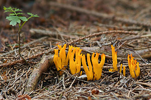
 Info created by LC-de - uploaded by Waugsberg - nominated by Waugsberg -- Lycaon (talk) 23:28, 27 November 2008 (UTC)
 Support --Lošmi (talk) 01:41, 29 November 2008 (UTC)
result: 1 support, 0 oppose, 0 neutral => not featured --Massimo Catarinella (talk) 20:10, 7 December 2008 (UTC)
Image:Kraków - Wawel Cathedral 01.jpg, Not Featured[edit]
Voting period ends on 1 Dec 2008 at 22:04:47
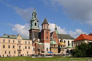
 Info created, uploaded and nominated by Lestat -- Lestat (talk) 22:04, 22 November 2008 (UTC)
 Support -- Lestat (talk) 22:04, 22 November 2008 (UTC)
 Support -- Albertus teolog (talk) 17:59, 23 November 2008 (UTC)
 Support --Umnik (talk) 11:18, 24 November 2008 (UTC)
 Support I am not sure about the colors, but that's quite marginal and may not be a problem if we consider there people have different computer screens. --Aktron (talk) 15:11, 24 November 2008 (UTC)
 Oppose bad compostition--Juan de Vojníkov (talk) 15:39, 24 November 2008 (UTC)
 Oppose --Herrick (talk) 09:53, 25 November 2008 (UTC)
 Oppose composition --MichaelMaggs (talk) 17:40, 25 November 2008 (UTC)
 Oppose This cathedral being, by itself, the result of additions over the years, it's not visually easy to read. It challenges the notions of symmetry, unity, homogeneity, that we might come to expect in architectural works. Thus, this picture (namely, its composition and point of view) is not optimal to get a good idea of the church. The building on the left appears stuck on the cathedral, although it actually isn't. The towers appear to be leaning slightly on the left, too. --JY Rehby (talk) 19:16, 26 November 2008 (UTC)
 Oppose ... and the crop is not optimal on the left side building, part of the edge outside the image. /Daniel78 (talk) 21:20, 26 November 2008 (UTC)
 Oppose don't like the composition to much --SuperJew (talk) 14:18, 1 December 2008 (UTC)
result: 4 support, 6 oppose, 0 neutral => not featured --Massimo Catarinella (talk) 20:10, 7 December 2008 (UTC)
Image:Fragonard, The Swing.jpg, Not Featured[edit]
Voting period ends on 5 Dec 2008 at 23:20:43
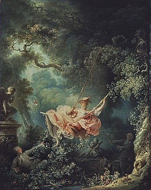
 Info created by Jean-Honoré Fragonard - uploaded, nominated by -- Paris 16 (talk) 23:20, 26 November 2008 (UTC)
 Support -- Paris 16 (talk) 23:20, 26 November 2008 (UTC)
 Support --Pom² (talk) 21:44, 2 December 2008 (UTC)
 Support --Michael Gäbler (talk) 23:12, 3 December 2008 (UTC)
 Support Nice painting. How do you turn this on (talk) 01:01, 4 December 2008 (UTC)
 Oppose Unfaithful reproduction. Lycaon (talk) 07:09, 5 December 2008 (UTC)
 Question Again, could you be more specific? --Eusebius (talk) 16:28, 5 December 2008 (UTC)
- To many colour versions on the web. Needs a photograph together with a colour chart to identify correct colour temperature/balance. Lycaon (talk) 20:10, 5 December 2008 (UTC)
- OK. But you're assuming unfaithful reproduction, then? For any representation of a painting? --Eusebius (talk) 22:16, 5 December 2008 (UTC)
- Not any but many. I've seen colour calibration charts with photographs on commons (can't recall exactly where at the moment though). Chances may also be better for wikipedian self photographed works of art, but not the ones grabbed from the net (look e.g. at the upload history of this particular one). Mostly the grab-jobs don't even include an EXIF. Lycaon (talk) 22:52, 5 December 2008 (UTC)
- OK. But you're assuming unfaithful reproduction, then? For any representation of a painting? --Eusebius (talk) 22:16, 5 December 2008 (UTC)
- To many colour versions on the web. Needs a photograph together with a colour chart to identify correct colour temperature/balance. Lycaon (talk) 20:10, 5 December 2008 (UTC)
-
original
-
color adjusted
- I don't know for certain if the color renovation was accurate. I do know that a lot of information came with this LOC download and that the renovator of this image did the very best she could given the information that is there and had aged with the photograph. I also can tell you for certain that after my experience with the scans of old color prints that are being hosted here that I will in the future and given a chance always scan with a color card as similar to the color bars that exist on this old photograph.
 Oppose until a known accurate representation can be uploaded. -- carol (talk) 04:08, 6 December 2008 (UTC)
result: 4 support, 1 oppose, 0 neutral => not featured --Massimo Catarinella (talk) 20:16, 7 December 2008 (UTC)
- This vote unfortunately does not count. -- carol (talk) 21:18, 7 December 2008 (UTC)
 Oppose until a known accurate representation can be uploaded. -- carol (talk) 04:08, 6 December 2008 (UTC)
result: 4 support, 1 oppose, 0 neutral => not featured -- carol 21:18, 7 December 2008 (UTC)
Image:Pelargonium Peltatum.JPG, Not Featured[edit]
Voting period ends on 6 Dec 2008 at 16:07:59
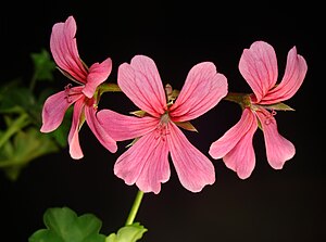
 Info created, uploaded and nominated by Silfiriel -- Silfiriel (talk) 16:07, 27 November 2008 (UTC)
 Support -- Silfiriel (talk) 16:07, 27 November 2008 (UTC)
 Oppose Strong CA on the edges, DOF suboptimal, not categorized and, oh yes, unnecessarily downsampled. Lycaon (talk) 16:13, 27 November 2008 (UTC)
 Oppose 4 a fragile object like this the lighting & quality is 2 rough --Richard Bartz (talk) 18:01, 27 November 2008 (UTC)
result: 1 support, 2 oppose, 0 neutral => not featured --Massimo Catarinella (talk) 20:18, 7 December 2008 (UTC)
Another version[edit]
 Info created, uploaded and nominated by Silfiriel -- Silfiriel (talk) 14:08, 29 November 2008 (UTC)
 Support -- Silfiriel (talk)
Image:Bone cross-section.svg, Not Featured[edit]
Voting period ends on 6 Dec 2008 at 02:26:13
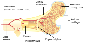
 Info created by Pbroks13 - uploaded by Pbroks13 - nominated by Pbroks13 -- Pbroks13 (talk) 02:26, 27 November 2008 (UTC)
 Support -- Pbroks13 (talk) 02:26, 27 November 2008 (UTC)
 Support --Böhringer (talk) 21:59, 27 November 2008 (UTC)
 Support but i prefer a version number.--Econt (talk) 17:42, 29 November 2008 (UTC)
.svg/15px-Pictogram_voting_comment_(orange).svg.png) Comment - i'm not going to !vote, but isn't FP on commons about the beauty of the picture, and the FPs on wikipedia is the place for educational images like this? —Ceran (speak) 20:37, 29 November 2008 (UTC)
Comment - i'm not going to !vote, but isn't FP on commons about the beauty of the picture, and the FPs on wikipedia is the place for educational images like this? —Ceran (speak) 20:37, 29 November 2008 (UTC) Oppose Too simple for FP. --Karelj (talk) 19:52, 30 November 2008 (UTC)
 Support --Beyond silence 01:34, 1 December 2008 (UTC)
 Oppose Very simple, nothing special, nothing WOW --libertad0 ॐ (talk) 17:31, 4 December 2008 (UTC)
result: 4 support, 2 oppose, 0 neutral => not featured --Massimo Catarinella (talk) 20:18, 7 December 2008 (UTC)
Image:Admiral Vanessa atalanta rb.jpg, Not Featured[edit]
Voting period ends on 7 Dec 2008 at 10:42:41
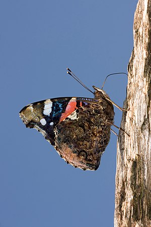
 Info created, uploaded & nominated by --Richard Bartz (talk) 10:42, 28 November 2008 (UTC)
 Info Red Admiral (Vanessa atalanta)
 Support -- Richard Bartz (talk) 10:42, 28 November 2008 (UTC)
- endlich wieder einen R.B.
 Support --Böhringer (talk) 12:17, 28 November 2008 (UTC) (bitte 4 Sensorflecken entfernen - alle im der oberen Bildhälfte - blauer Bereich)
  Erledigt --Richard Bartz (talk) 13:30, 28 November 2008 (UTC)
 Oppose - Not your best work. I don't like the composition, the lighting and the blurred eye. -- Alvesgaspar (talk) 13:48, 28 November 2008 (UTC)
 Support --Lošmi (talk) 01:37, 29 November 2008 (UTC)
 Oppose This picture could and should be better to become a FP. --Massimo Catarinella (talk) 10:39, 29 November 2008 (UTC)
 Oppose -- it could do with a crop, and the composition isn't the best either. diego_pmc (talk) 07:35, 2 December 2008 (UTC)
result: 3 support, 3 oppose, 0 neutral => not featured --Massimo Catarinella (talk) 18:13, 8 December 2008 (UTC)
image:Mountet18.jpg, not featured[edit]
 Info created by Debugman - uploaded by Debugman - nominated by Debugman --Debugman (talk) 19:28, 30 November 2008 (UTC)
 Support --Debugman (talk) 19:28, 30 November 2008 (UTC)
 Oppose Dimensions of image, it is too cut from the top side. --Karelj (talk) 20:05, 30 November 2008 (UTC)
 Neutral Unfortunatelly I've not the photoshop skill to recreate the sky. I'll have to wait next summer to take such an impressive picture with more sky. --Debugman (talk) 19:28, 30 November 2008 (UTC)
 Oppose Too much compression artifact and CA --Massimo Catarinella (talk) 10:21, 1 December 2008 (UTC)
 Neutral Quality is good and the detail also. Yet Karelj is true. There should be more sky in the picture. --Aktron (talk) 11:08, 2 December 2008 (UTC)
 Support Georgez (talk) 19:53, 2 December 2008 (UTC)
 Support I'm happy here. How do you turn this on (talk) 00:54, 4 December 2008 (UTC)
 Oppose Top crop and CA. Lycaon (talk) 09:02, 6 December 2008 (UTC)
result: 3 support, 3 oppose, 2 neutral => not featured. Pom² (talk) 10:42, 10 December 2008 (UTC)
Image:Weiße Seerose IMG 5489.jpg, not featured[edit]
Voting period ends on 9 Dec 2008 at 17:54:29
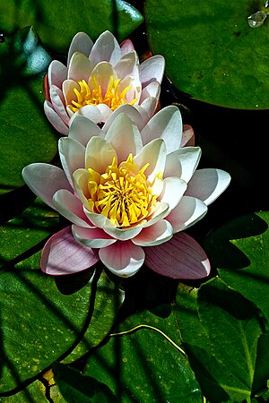
 Info created and uploaded by Hedwig Storch - nominated by D-Kuru -- D-Kuru (talk) 17:54, 30 November 2008 (UTC)
 Support -- D-Kuru (talk) 17:54, 30 November 2008 (UTC)
.svg/15px-Pictogram_voting_comment_(orange).svg.png) Comment Image may should be renamed --D-Kuru (talk) 17:54, 30 November 2008 (UTC)
Comment Image may should be renamed --D-Kuru (talk) 17:54, 30 November 2008 (UTC) Support -- ■ MMXXtalk 20:56, 30 November 2008 (UTC)
 Support --Aktron (talk) 11:08, 2 December 2008 (UTC)
 Oppose white borders around petals --Pom² (talk) 21:50, 2 December 2008 (UTC)
 Oppose Lighting is odd. How do you turn this on (talk) 00:55, 4 December 2008 (UTC)
 Oppose as per previous oppose and for oversaturated colors (Varcos (talk) 09:22, 9 December 2008 (UTC))
result: 3 support, 3 oppose, 0 neutral => not featured. Pom² (talk) 10:41, 10 December 2008 (UTC)
File:McDonnell-Douglas F15 (modificata).jpg[edit]
Voting period ends on 27 Dec 2008 at 11:07:37
 Info created by Suetonius - uploaded by Suetonius - nominated by Suetonius --Suetonius (talk) 11:07, 18 December 2008 (UTC)
 Support -- Suetonius (talk) 11:07, 18 December 2008 (UTC)
 Oppose. Image page says "Screenshot di Microsoft Flight Simulator 2004". Doesn't that mean "delete as a copyvio"? Lupo 11:38, 18 December 2008 (UTC)
| Thank you for nominating this image. Unfortunately, it does not fall within the Guidelines and is unlikely to succeed for the following reason: image is too small | Anyone other than the nominator who disagrees may override this template by changing {{FPX}} to {{FPX contested}} and adding a vote in support. Voting will then continue in the usual way. If not contested within 24 hours, this nomination may be closed. |
Lycaon (talk) 11:43, 18 December 2008 (UTC)
File:Uzungol panoramic2.jpg[edit]
Voting period ends on 26 Dec 2008 at 12:19:19

 Info created by Maderibeyza - uploaded by Maderibeyza - nominated by Maderibeyza -- Maderibeyza (talk) 12:19, 17 December 2008 (UTC)
 Support -- Maderibeyza (talk) 12:19, 17 December 2008 (UTC)
| Thank you for nominating this image. Unfortunately, it does not fall within the Guidelines and is unlikely to succeed for the following reason: image is much too small | Anyone other than the nominator who disagrees may override this template by changing {{FPX}} to {{FPX contested}} and adding a vote in support. Voting will then continue in the usual way. If not contested within 24 hours, this nomination may be closed. |
Lycaon (talk) 15:50, 17 December 2008 (UTC)
Image:Affresco Villa Livia.jpg[edit]
Voting period ends on 24 Dec 2008 at 16:51:20
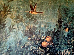
 Info created by FilWriter - uploaded by FilWriter - nominated by FilWriter -- FilWriter (talk) 16:51, 15 December 2008 (UTC)
 Support -- FilWriter (talk) 16:51, 15 December 2008 (UTC)
| Thank you for nominating this image. Unfortunately, it does not fall within the Guidelines and is unlikely to succeed for the following reason: it is too small | Anyone other than the nominator who disagrees may override this template by changing {{FPX}} to {{FPX contested}} and adding a vote in support. Voting will then continue in the usual way. If not contested within 24 hours, this nomination may be closed. |
-- Alvesgaspar (talk) 18:08, 16 December 2008 (UTC)
Image:Eastern Gray Squirrel in Farmington, Connecticut 1, November 29, 2008.jpg, not featured[edit]
Voting period ends on 9 Dec 2008 at 17:00:45
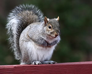
 Info created and uploaded by Ragesoss - nominated by D-Kuru -- D-Kuru (talk) 17:00, 30 November 2008 (UTC)
 Support -- D-Kuru (talk) 17:00, 30 November 2008 (UTC)
 Support --Karelj (talk) 19:58, 30 November 2008 (UTC)
 Support --Lošmi (talk) 23:47, 30 November 2008 (UTC)
 Oppose Very low DOF, only part of the head is in focus. Lycaon (talk) 08:35, 1 December 2008 (UTC)
 Oppose Per Lycaon --Massimo Catarinella (talk) 10:20, 1 December 2008 (UTC)
 Support--83.59.14.94 20:20, 1 December 2008 (UTC)
 Oppose I have to agree with Lycaon. --Aktron (talk) 11:09, 2 December 2008 (UTC)
 Oppose Georgez (talk) 19:51, 2 December 2008 (UTC)
 Support It's a very funny image! User: 84.222.229.170 19:58, 30 November 2008 (UTC)
result: 3 support, 4 oppose, 0 neutral => not featured. Pom² (talk) 10:41, 10 December 2008 (UTC)
Image:SantaAnaCave.JPG, not featured[edit]
Voting period ends on 9 Dec 2008 at 12:27:42
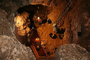
 Info created by mario modesto - uploaded by mario modesto - nominated by mario modesto -- mario modesto (talk) 12:27, 30 November 2008 (UTC)
 Support -- mario modesto (talk) 12:27, 30 November 2008 (UTC)
 Support --Lošmi (talk) 23:48, 30 November 2008 (UTC)
 Support diego_pmc (talk) 07:33, 2 December 2008 (UTC)
 Support --Wisnia6522 (talk) 08:23, 2 December 2008 (UTC)
 Oppose - While obviously quite a hard shot to have taken, I feel that it doesn't really show anything, it is just a shot of three people standing in a hole - not enough of interest to make it an FP. R-T-C Tim (talk) 14:57, 2 December 2008 (UTC)
.svg/15px-Pictogram_voting_comment_(orange).svg.png) Comment there are 6 people in the photo, 3 well seen, obviously, and three relatively hidden. It shows the process of prospecting a cave, and the difficulties that it entails. Each person is in a different level, and that shows progressively the depth and the danger of falling down any stone. As well, each one has a different function in the chain extracting sediments. That who is next to the ladder controls the up&down big buckets with the crane (not seen in the photo), the other who is in the saft is extracting the sediments; the rest only help extracting them with small buckets. The cave is circle and the main 3 people form a triangle inside it. Well, that's my explanation. mario modesto
Comment there are 6 people in the photo, 3 well seen, obviously, and three relatively hidden. It shows the process of prospecting a cave, and the difficulties that it entails. Each person is in a different level, and that shows progressively the depth and the danger of falling down any stone. As well, each one has a different function in the chain extracting sediments. That who is next to the ladder controls the up&down big buckets with the crane (not seen in the photo), the other who is in the saft is extracting the sediments; the rest only help extracting them with small buckets. The cave is circle and the main 3 people form a triangle inside it. Well, that's my explanation. mario modesto
result: 4 support, 1 oppose, 0 neutral => not featured. Pom² (talk) 10:40, 10 December 2008 (UTC)
Image:De fem søstre i Århus.jpg, not featured[edit]
Voting period ends on 9 Dec 2008 at 10:36:22
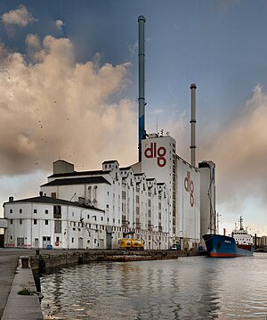
 Info created by Villy Fink Isaksen - uploaded by Villy Fink Isaksen - nominated by Villy Fink Isaksen -- Villy Fink Isaksen (talk) 10:36, 30 November 2008 (UTC)
 Support -- Villy Fink Isaksen (talk) 10:36, 30 November 2008 (UTC)
 Neutral
- Dust spots? It is birds or tell me were the spots are. --Villy Fink Isaksen (talk) 11:59, 30 November 2008 (UTC)
- Perspective corrected. --Villy Fink Isaksen (talk) 13:22, 30 November 2008 (UTC)
- I count six dust spots in the old version and three in the new one. They are all located in the upper right corner. The new version is also in need of some level tweaking. --Massimo Catarinella (talk) 14:27, 30 November 2008 (UTC)
- Thanks - finally I saw the dust. --Villy Fink Isaksen (talk) 19:31, 30 November 2008 (UTC)
- I count six dust spots in the old version and three in the new one. They are all located in the upper right corner. The new version is also in need of some level tweaking. --Massimo Catarinella (talk) 14:27, 30 November 2008 (UTC)
- Perspective corrected. --Villy Fink Isaksen (talk) 13:22, 30 November 2008 (UTC)
 Support I organized the nomination --Massimo Catarinella (talk) 21:47, 30 November 2008 (UTC)
 Info Re-organized the nomination again Previous versions --Richard Bartz (talk)
 Support --Lošmi (talk) 23:53, 30 November 2008 (UTC)
 Question why didn't you correct this one in final version? It's in bigger resolution.
 Oppose Something does not look correct to me with the sky. Why is it brighter just around the chimneys ? And there is something weird with the clouds on the left side. /Daniel78 (talk) 00:30, 1 December 2008 (UTC)
- Looks like a HDR to me Noodle snacks (talk) 00:33, 1 December 2008 (UTC)
 Oppose With every edit this file is getting more downsampled. Two more comments and nothing is left ;-). I might have supported a level/perspective/dust corrected version of the original 16Mpx+ file. Lycaon (talk) 09:30, 1 December 2008 (UTC)
.svg/15px-Pictogram_voting_comment_(orange).svg.png) Comment unless you started from the original RAW-file ;-)
Comment unless you started from the original RAW-file ;-)
result: 3 support, 3 oppose, 0 neutral => not featured. Pom² (talk) 10:40, 10 December 2008 (UTC)
Image:Hovawart.blackandtan-play.jpg, not featured[edit]
Voting period ends on 9 Dec 2008 at 10:21:31
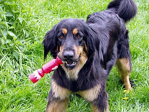
 Info created, uploaded and nominated by Faigl.ladislav -- Faigl.ladislav (talk) 10:21, 30 November 2008 (UTC)
 Support -- Faigl.ladislav (talk) 10:21, 30 November 2008 (UTC)
| Thank you for nominating this image. Unfortunately, it does not fall within the Guidelines and is unlikely to succeed for the following reason: image is poorly cropped. | Anyone other than the nominator who disagrees may override this template by changing {{FPX}} to {{FPX contested}} and adding a vote in support. Voting will then continue in the usual way. If not contested within 24 hours, this nomination may be closed. |
Lycaon (talk) 13:50, 30 November 2008 (UTC)
result: 1 support, 1 oppose, 0 neutral => not featured. Pom² (talk) 10:39, 10 December 2008 (UTC)
Image:Queen-Paul Rodgers-Madrid-6.jpg, not featured[edit]
Voting period ends on 8 Dec 2008 at 19:24:43
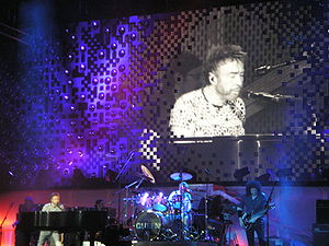
 Info created, uploaded and nominated by Kadellar -- Kadellar (talk) 19:24, 29 November 2008 (UTC)
 Support -- Kadellar (talk) 19:24, 29 November 2008 (UTC)
 Oppose - Nothing really special, not that great quality. —Ceran (speak) 20:35, 29 November 2008 (UTC)
 Oppose Bad quality, dislike it. --MonaLuna (talk) 00:06, 30 November 2008 (UTC)
.svg/15px-Pictogram_voting_comment_(orange).svg.png) Comment Suspect voting Lycaon (talk) 09:38, 1 December 2008 (UTC)
Comment Suspect voting Lycaon (talk) 09:38, 1 December 2008 (UTC)
 Oppose Georgez (talk) 00:08, 30 November 2008 (UTC)
 Oppose Too much noise. ISO 400 is way too much on these occasions. Try with ISO 100 next time. →Diti the penguin — 10:23, 30 November 2008 (UTC)
 Oppose Not sharp Vanjagenije (talk) 12:17, 3 December 2008 (UTC)
 Oppose – No wow, I find it hard to look at. – Jerryteps 10:12, 4 December 2008 (UTC)
 Oppose Nothing special and too noise, I don't like it.--84.223.165.15 19:17, 5 December 2008 (UTC)
 Oppose There is too noise. I don't like this picture.--Suetonius (talk) 22:22, 7 December 2008 (UTC)
result: 1 support, 7 oppose, 0 neutral => not featured. Pom² (talk) 10:38, 10 December 2008 (UTC)
Image:Licheń bazylika 2.JPG, not featured[edit]
Voting period ends on 8 Dec 2008 at 00:10:51
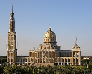
 Info created, uploaded and nominated by Albertus teolog -- Albertus teolog (talk) 00:10, 29 November 2008 (UTC)
 Support -- Albertus teolog (talk) 00:10, 29 November 2008 (UTC)
 Oppose - Sorry Albertus but the quality of the image is just not enough for FP status. The exposure choice is all wrong, with a high shutter speed and a large apperture, which is the cause of the too small DOF -- Alvesgaspar (talk) 01:32, 29 November 2008 (UTC)
- Joaquim, history has known worse candidate :-) Yours.Albertus teolog (talk) 02:57, 29 November 2008 (UTC)
 Oppose If never seen pictures of Joaquim which are out of focus and contain perspective distortion. --Massimo Catarinella (talk) 10:40, 29 November 2008 (UTC)
 Oppose It's not horizontal Vanjagenije (talk) 11:21, 29 November 2008 (UTC)
 Oppose Indeed the picture need a bit of rotation and some perspective corrections. The detail is not so big deal, however, better weather would make it much nicer. And of course good perspective. --Aktron (talk) 15:15, 29 November 2008 (UTC)
 Support I like it. Georgez (talk) 00:10, 30 November 2008 (UTC)
 Support --Karelj (talk) 19:55, 30 November 2008 (UTC)
 Oppose as other opposers. Lycaon (talk) 20:12, 2 December 2008 (UTC)
 Oppose tilted, lack of sharpness, overall "dull and greyish" effect. --JY Rehby (talk) 18:38, 7 December 2008 (UTC)
result: 3 support, 6 oppose, 0 neutral => not featured. Pom² (talk) 10:37, 10 December 2008 (UTC)
Image:Mantis Hymenopus coronatus 6 Luc Viatour.jpg, not featured[edit]
Voting period ends on 10 Dec 2008 at 06:46:03
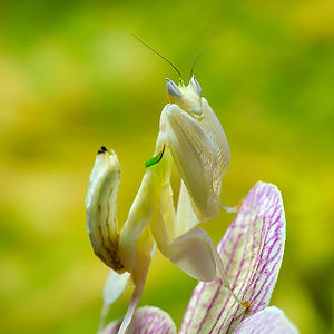
 Info created by Luc Viatour (talk) - uploaded by Luc Viatour (talk) - nominated by -- Luc Viatour (talk) 06:46, 1 December 2008 (UTC)
 Support -- Luc Viatour (talk) 06:46, 1 December 2008 (UTC)
 Support --Böhringer (talk) 14:38, 1 December 2008 (UTC)
 Oppose -- Too much of the insect out of focus Manuel R. (talk) 19:56, 1 December 2008 (UTC)
 Neutral Well the colors and sharpness are nice, Manuel R. is right. Too much of the insect is out of focus. --Aktron (talk) 11:04, 2 December 2008 (UTC)
 Oppose Sorry, can't tell what's the flower and what's the insect. How do you turn this on (talk) 00:51, 4 December 2008 (UTC)
 Support Out of focus areas are inherent in macro photography. By reading the metadata, a 150 mm macro lens, and a f8 aperture tells me that from the technique point of view the picture is adequate, no more reasonable DOF could be expected. Camouflage, or blending of the insect with the environment is OK, that is what it is all about. --Tomascastelazo (talk) 13:30, 7 December 2008 (UTC)
 Oppose I agree with the previous "oppose". Poorly croped also.(Varcos (talk) 21:10, 8 December 2008 (UTC))
 Support I think this is a beautiful picture. (Neighbours564eva (talk) 00:10 9 December 2008 (UTC))
 Support Sure, this could have been shot with a stop smaller aperture (f/11), but the focus is quite accurate, thus good enough. -- Ram-Man 12:13, 9 December 2008 (UTC)
 Oppose Quality - focus + too light. --Karelj (talk) 22:40, 9 December 2008 (UTC)
 Support JalalV (talk) 04:46, 10 December 2008 (UTC)
result: 6 support, 4 oppose, 1 neutral => not featured. Pom² (talk) 10:46, 10 December 2008 (UTC)
Image:Chachani summit edited.jpg, not featured[edit]
Voting period ends on 10 Dec 2008 at 02:07:40
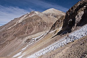
 Info created by Nattfodd - uploaded by Nattfodd - nominated by Ceranthor -- Also an FP on English Wikipedia. —Ceranthor 02:07, 1 December 2008 (UTC)
 Support -- —Ceranthor 02:07, 1 December 2008 (UTC)
 Oppose Poor composition, nothing special for FP nomination. --Karelj (talk) 15:39, 1 December 2008 (UTC)
 Oppose The composition is special but I am not sure about the colors :-( --Aktron (talk) 11:05, 2 December 2008 (UTC)
 Oppose Per lack of quality --Massimo Catarinella (talk) 16:01, 2 December 2008 (UTC)
 Oppose Not particularly awesome. How do you turn this on (talk) 00:53, 4 December 2008 (UTC)
 Oppose No wow, just a plain bland mountain. – Jerryteps 09:33, 4 December 2008 (UTC)
result: 1 support, 5 oppose, 0 neutral => not featured. Pom² (talk) 10:45, 10 December 2008 (UTC)
Image:LMFBR schematics2.svg, Featured[edit]
Voting period ends on 2 Dec 2008 at 11:28:25
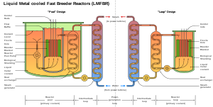
 Info created by Graevemoore - uploaded by diego_pmc - nominated by diego_pmc -- diego_pmc (talk) 11:28, 23 November 2008 (UTC)
 Support -- diego_pmc (talk) 11:28, 23 November 2008 (UTC)
 Support I don't have faintest idea of what this describes, but it looks good. I trust people on enwiki who promoted it to FP there for accuracy :) Benh (talk) 22:51, 26 November 2008 (UTC)
 Oppose Me parece que los elementos son muy simples, sencillamente copiar y pegar. Además que falta una versión en otros idiomas o numeradas. --libertad0 ॐ (talk) 21:41, 27 November 2008 (UTC)
- Online translator: "It seems me that the elements are very simple, simply to copy and to hit (paste). Besides that lacks a version in other languages or numbered."
- The elements should be simple—it's a schematic (as the description states). The purpose it to educate, not to please. Besides that I definitely can't say it's an ugly drawing; in fact it looks quite good. Indeed perhaps a version with numbers would be good, but I doubt that is any reason to oppose this image. The text can easily be translated with Inkscape. diego_pmc (talk) 05:45, 28 November 2008 (UTC)
 Support --Beyond silence 01:27, 1 December 2008 (UTC)
 Support per Benh --SuperJew (talk) 14:19, 1 December 2008 (UTC)
 Oppose Simple yet confusing. Why not split 'em into two and present them side by side? Then they can both be recycled for single use too. Lycaon (talk) 15:10, 1 December 2008 (UTC)
 Support --Karelj (talk) 15:31, 1 December 2008 (UTC)
 Support
 --83.59.14.94 20:17, 1 December 2008 (UTC)--Tintero (talk) 20:22, 1 December 2008 (UTC)
result: 6 support, 2 oppose, 0 neutral => featured --Massimo Catarinella (talk) 20:11, 7 December 2008 (UTC)
Image:EmossonLac082007.jpg, Not Featured[edit]
Voting period ends on 4 Dec 2008 at 06:21:32

 Info created by Debugman - uploaded by Debugman - nominated by Debugman -- 85.5.180.53 06:21, 25 November 2008 (UTC)
 Support -- 85.5.180.53 06:21, 25 November 2008 (UTC)
 Oppose Tilted. ---donald- (talk) 11:06, 25 November 2008 (UTC)
 Support --Georgez (talk) 15:15, 25 November 2008 (UTC)
 Support --Lošmi (talk) 20:43, 25 November 2008 (UTC)
 Support very good panorama --JY Rehby (talk) 23:47, 25 November 2008 (UTC)
 Support -- I can reupload a new version with the correct tilt if you want, but I've to say that I don't know how (sorry I'm new)Debugman (talk) 10:20, 26 November 2008 (UTC)
 Oppose, excessively tilted. --Aqwis (talk) 10:30, 26 November 2008 (UTC)
 Oppose As above, plus you should try to recover shadows / highlights on the right. Else really nice picture --Pom² (talk) 11:56, 26 November 2008 (UTC)
 Oppose Yes, tilt. @ the upper right corner there is a white crop fragment --Richard Bartz (talk) 18:16, 27 November 2008 (UTC)
- Weakly
 Oppose per above. How do you turn this on (talk) 01:03, 4 December 2008 (UTC)
result: 4 support, 5 oppose, 0 neutral => not featured --Massimo Catarinella (talk) 20:13, 7 December 2008 (UTC)
Image:EmossonLac082007_edit.jpg, Featured[edit]
Voting period ends on 6 Dec 2008 at 18:22

 Info Version with tilt correction --Richard Bartz (talk) 18:22, 27 November 2008 (UTC)
 Support --Aqwis (talk) 21:20, 27 November 2008 (UTC)
 Support Now, it is good --Böhringer (talk) 21:57, 27 November 2008 (UTC)
 Support--Wisnia6522 (talk) 09:23, 28 November 2008 (UTC)
 Support--Pom² (talk) 17:45, 28 November 2008 (UTC)
 Support --Lošmi (talk) 01:39, 29 November 2008 (UTC)
 Oppose Nothing special Vanjagenije (talk) 11:13, 29 November 2008 (UTC)
 Support This one is not rotated, resolution is fine --Aktron (talk) 15:55, 29 November 2008 (UTC)
 Support This version is better. It's a really nice pic (for me it's something special). --MonaLuna (talk) 23:43, 29 November 2008 (UTC)
 Support --Xxxx00 (talk) 15:15, 30 November 2008 (UTC)
 Support --Michael Gäbler (talk) 23:02, 3 December 2008 (UTC)
 Neutral Looks like there's a line running through it, but not enough for me to oppose. How do you turn this on (talk) 01:06, 4 December 2008 (UTC)
result: 9 support, 1 oppose, 1 neutral => featured --Massimo Catarinella (talk) 20:13, 7 December 2008 (UTC)
Image:Papilio Machaon caterpillar.JPG, Featured[edit]
Voting period ends on 5 Dec 2008 at 21:22:14
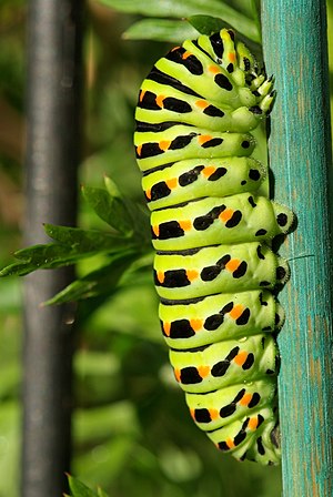
 Info created by Entomolo - uploaded by Entomolo - nominated by Mmxx -- ■ MMXXtalk 21:22, 26 November 2008 (UTC)
 Support -- ■ MMXXtalk 21:22, 26 November 2008 (UTC)
 Support Very good indeed ! Some technically minded ones might argue that the DOF is too shallow and the tail is blurred - which doesn't matter to me, given the overall quality, sharpness, and contrast, of the picture. --JY Rehby (talk) 02:27, 27 November 2008 (UTC)
 Support - a depiction that crosses the anatomical and the scientific with the splendid. Well done. - Anonymous DissidentTalk 13:19, 27 November 2008 (UTC)
 Support Georgez (talk) 16:13, 27 November 2008 (UTC)
- Barely
 Oppose 60/40 decision. Good. It's absolutely worth watching. The painted turquoise rod unfortunately clashes with the remaining green tones & background is 2 distracting --Richard Bartz (talk) 17:27, 27 November 2008 (UTC)
  Support --Aqwis (talk) 21:20, 27 November 2008 (UTC)
 Support --Böhringer (talk) 21:58, 27 November 2008 (UTC)
 Oppose I like the main subject, but I also find the background quite distracting, sorry --AlexanderKlink (talk) 22:29, 27 November 2008 (UTC)
 Oppose Agree with AlexanderKlink.- Man On Mission (talk) 7:09, 28 November 2008 (UTC)
 Oppose crop is too tight for me. Lycaon (talk) 08:17, 28 November 2008 (UTC)
 Support Nice! --Karelj (talk) 15:57, 29 November 2008 (UTC)
 Support--Beyond silence 01:33, 1 December 2008 (UTC)
 Support Kadellar (talk) 16:17, 1 December 2008 (UTC)
 Support
 --83.59.14.94 20:20, 1 December 2008 (UTC)--Tintero (talk) 20:21, 1 December 2008 (UTC) Support -- MJJR (talk) 20:05, 2 December 2008 (UTC)
 Oppose As AlexanderKlink --Pom² (talk) 21:42, 2 December 2008 (UTC)
 Support --Michael Gäbler (talk) 22:58, 3 December 2008 (UTC)
 Support Great shot. How do you turn this on (talk) 01:03, 4 December 2008 (UTC)
 Support JukoFF (talk) 16:05, 7 December 2008 (UTC)
result: 13 support, 5 oppose, 0 neutral => featured --Massimo Catarinella (talk) 20:14, 7 December 2008 (UTC)
Image:Édouard Manet - Le Déjeuner sur l'herbe.jpg, Featured[edit]
Voting period ends on 5 Dec 2008 at 23:44:41
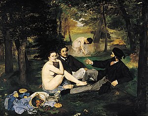
 Info created by Édouard Manet - uploaded and nominated by Paris 16 (talk) 23:44, 26 November 2008 (UTC)
 Support -- Paris 16 (talk) 23:44, 26 November 2008 (UTC)
 Support Compared with large images that can be find on Google images ([2], [3], [4]), quality of this one is far better. --Lošmi (talk) 00:27, 27 November 2008 (UTC)
 Support sharp --Beyond silence 01:34, 1 December 2008 (UTC)
 Support --Pom² (talk) 21:44, 2 December 2008 (UTC)
 Support Nice painting. How do you turn this on (talk) 01:01, 4 December 2008 (UTC)
 Oppose Unfaithful reproduction. Lycaon (talk) 07:08, 5 December 2008 (UTC)
 Oppose per Lycaon. -- carol (talk) 04:06, 6 December 2008 (UTC)
result: 5 support, 1 oppose, 0 neutral => featured --Massimo Catarinella (talk) 20:17, 7 December 2008 (UTC)
- This vote unfortunately does not count. -- carol (talk) 21:20, 7 December 2008 (UTC)
 Oppose per Lycaon. -- carol (talk) 04:06, 6 December 2008 (UTC)
result: 5 support, 1 oppose, 0 neutral => featured -- carol 21:20, 7 December 2008 (UTC)
Image:Water mill Rosenmühle in Lower Saxony, Germany.jpg, Featured[edit]
Voting period ends on 6 Dec 2008 at 23:19:32
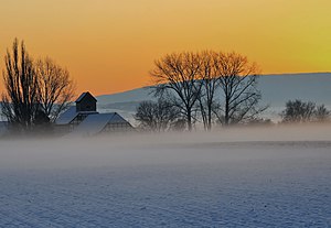
 Info created by Michael Gäbler - uploaded by Michael Gäbler - nominated by --Michael Gäbler (talk) 23:19, 27 November 2008 (UTC)
 Support -- Michael Gäbler (talk) 23:19, 27 November 2008 (UTC)
 Support Lycaon (talk) 00:10, 28 November 2008 (UTC)
 Oppose excessive noise - Man On Mission (talk) 6:57, 28 November 2008 (UTC)
 Info it's mist and fog in the evening on the river "Haller". --Michael Gäbler (talk) 13:07, 28 November 2008 (UTC)
.svg/15px-Pictogram_voting_comment_(orange).svg.png) Comment, is it not tilted? --Aqwis (talk) 12:46, 28 November 2008 (UTC)
Comment, is it not tilted? --Aqwis (talk) 12:46, 28 November 2008 (UTC) Info the mill is vertical. --Michael Gäbler (talk) 13:19, 28 November 2008 (UTC)
 Neutral Well the noise is no probem for me, but the colors seems a bit unusual (yet it may be nautral scene of course). And compression, mostly in the sky... --Aktron (talk) 14:12, 28 November 2008 (UTC)
 Support Beautiful --B.navez (talk) 14:54, 28 November 2008 (UTC)
 Support --Mbdortmund (talk) 22:13, 28 November 2008 (UTC)
 Support--Base64 (talk) 09:51, 29 November 2008 (UTC)
 Support -- I think it's slightly tilted, but that's something that happens to me all te time, and is more than compensated by the wow-factor. MartinD (talk) 15:04, 29 November 2008 (UTC)
 Support --MonaLuna (talk) 23:57, 29 November 2008 (UTC)
.svg/15px-Pictogram_voting_comment_(orange).svg.png) Comment Suspect voting Lycaon (talk) 09:39, 1 December 2008 (UTC)
Comment Suspect voting Lycaon (talk) 09:39, 1 December 2008 (UTC)
 Neutral The noise and small tilt keep me from supporting this otherwise beautiful picture. --Massimo Catarinella (talk) 01:58, 30 November 2008 (UTC)
 Support Nice mood, good composition, allthough I think it would profit from a little croping at the bottom --Simonizer (talk) 09:35, 30 November 2008 (UTC)
 Neutral Nice colour nice composition but a bit blurry. -- Laitche (talk) 10:02, 30 November 2008 (UTC)
 Oppose Too noisy. --Karelj (talk) 19:53, 30 November 2008 (UTC)
 Support --Aqwis (talk) 14:45, 1 December 2008 (UTC)
 Oppose -- Poor quality, noise, blured, unrecognizable objects.Silfiriel (talk) 16:10, 3 December 2008
result: 9 support, 3 oppose, 3 neutral => featured --Massimo Catarinella (talk) 20:19, 7 December 2008 (UTC)
Image:Alaskan Malamute R Bartz.jpg, Featured[edit]
Voting period ends on 7 Dec 2008 at 13:51:01
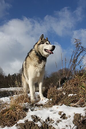
 Info created, uploaded & nominated Richard Bartz (talk) 13:51, 28 November 2008 (UTC)
 Info This is the real TRUCK under the sled dogs. Alaskan Malamute with a weight of 100 pounds.
 Support WOOF ! -- Richard Bartz (talk) 13:51, 28 November 2008 (UTC)
 Support Man, my nominations are lame compared to this one. --Aktron (talk) 14:07, 28 November 2008 (UTC)
 Support Impressive. --AlexanderKlink (talk) 18:20, 28 November 2008 (UTC)
 Support --Lošmi (talk) 01:36, 29 November 2008 (UTC)
 Support Beautiful photo Vanjagenije (talk) 02:01, 29 November 2008 (UTC)
 Support --Euphoriceyes (talk) 12:21, 29 November 2008 (UTC)
 Support Lycaon (talk) 13:27, 29 November 2008 (UTC)
 Support - I can almost hear it howling... —Ceran (speak) 14:30, 29 November 2008 (UTC)
 Support Amazing technical quality. What focal length did you use? Freedom to share (talk) 16:56, 29 November 2008 (UTC)
 Support Very nice. /Daniel78 (talk) 19:50, 29 November 2008 (UTC)
 Support sehr schön --Böhringer (talk) 21:31, 29 November 2008 (UTC)
 Support --MonaLuna (talk) 00:12, 30 November 2008 (UTC)
.svg/15px-Pictogram_voting_comment_(orange).svg.png) Comment Suspect voting Lycaon (talk) 09:38, 1 December 2008 (UTC)
Comment Suspect voting Lycaon (talk) 09:38, 1 December 2008 (UTC)
 Support --Massimo Catarinella (talk) 01:57, 30 November 2008 (UTC)
 Support wonderful --Faigl.ladislav (talk) 10:34, 30 November 2008 (UTC)
 Support --D-Kuru (talk) 12:16, 30 November 2008 (UTC)
 Support ■ MMXXtalk 21:02, 30 November 2008 (UTC)
 Support - LOVE IT so cute and amazing quality --SuperJew (talk) 14:22, 1 December 2008 (UTC)
 Support
 --83.59.14.94 20:20, 1 December 2008 (UTC)--Tintero (talk) 20:21, 1 December 2008 (UTC) Support Great picture, looks like it's going to pass unanimously. Jerry teps (talk) 06:11, 2 December 2008 (UTC)
 Support Beautiful picture! --Caspian blue 08:22, 2 December 2008 (UTC)
 Support -- MJJR (talk) 20:01, 2 December 2008 (UTC)
 Support I like it. --Michael Gäbler (talk) 22:51, 3 December 2008 (UTC)
- Pile-on
 Support ;-) How do you turn this on (talk) 01:00, 4 December 2008 (UTC)
  Support Very nicely done. Digitaldreamer (talk) 17:00, 4 December 2008 (UTC)
 Support This edit, since I opposed the one below. :) --J.smith (talk) 02:44, 7 December 2008 (UTC)
 Support --Mr. Mario (talk) 15:23, 8 December 2008 (UTC)
 Support grat picture, i like it! --Abbax (talk) 17:34, 8 Dicember 2008 (UTC)
result: 26 support, 0 oppose, 0 neutral => featured --Massimo Catarinella (talk) 18:16, 8 December 2008 (UTC)
.svg/15px-Pictogram_voting_comment_(orange).svg.png) Comment - this edit has been added by Fir0002 at the en.wp discussion, and I thought it should also be mentioned here. diego_pmc (talk) 08:01, 2 December 2008 (UTC)
Comment - this edit has been added by Fir0002 at the en.wp discussion, and I thought it should also be mentioned here. diego_pmc (talk) 08:01, 2 December 2008 (UTC).svg/15px-Pictogram_voting_comment_(orange).svg.png) Comment Cropped like this the chill-factor is a bit lost. --Richard Bartz (talk) 17:31, 2 December 2008 (UTC)
Comment Cropped like this the chill-factor is a bit lost. --Richard Bartz (talk) 17:31, 2 December 2008 (UTC).svg/15px-Pictogram_voting_comment_(orange).svg.png) Comment This edit crops away the frame the subject corresponds with, and even worse, moves the subject into the dead center. It does make for a way worse composition. Digitaldreamer (talk) 17:00, 4 December 2008 (UTC)
Comment This edit crops away the frame the subject corresponds with, and even worse, moves the subject into the dead center. It does make for a way worse composition. Digitaldreamer (talk) 17:00, 4 December 2008 (UTC) Oppose this edit. --J.smith (talk) 02:44, 7 December 2008 (UTC)
result: 0 support, 1 oppose, 0 neutral => not featured --Massimo Catarinella (talk) 18:16, 8 December 2008 (UTC)
Image:Hedychium gardnerianum.JPG, featured[edit]
Voting period ends on 9 Dec 2008 at 22:54:23
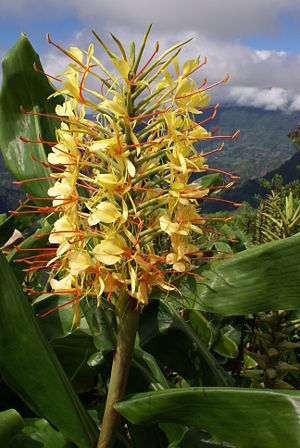
 Info created and uploaded by B.navez - nominated by -- LC-de (talk) 22:54, 30 November 2008 (UTC)
 Support -- LC-de (talk) 22:54, 30 November 2008 (UTC)
 Support wow! --Lošmi (talk) 23:46, 30 November 2008 (UTC)
 Support --Böhringer (talk) 14:36, 1 December 2008 (UTC)
 Oppose Disturbing background. --Karelj (talk) 15:35, 1 December 2008 (UTC)
 Oppose Agree with Karelj --AlexanderKlink (talk) 22:11, 1 December 2008 (UTC)
 Support Background is not disturbing at all for me, it gives an impression of the natural biotope were the flower is growing. --Donarreiskoffer (talk) 07:32, 2 December 2008 (UTC)
 Support --Wisnia6522 (talk) 08:19, 2 December 2008 (UTC)
 Support Well I think that Donarreiskoffer told what I exactly wanted to say. This picture has more to say than just ordinary flower macro. And such a feature is very important for an encyclopedia. --Aktron (talk) 11:06, 2 December 2008 (UTC)
 Support Natural environment is a plus, quality is good too. Lycaon (talk) 12:35, 2 December 2008 (UTC)
 Oppose it's good example that natural enviroment can be negative effort on the composition. --Herrick (talk) 14:32, 2 December 2008 (UTC)
 Support A very good picture and I think the background is superb, really adding to the picture. Could it be geocoded though. R-T-C Tim (talk) 14:53, 2 December 2008 (UTC)
 Support It's a great picture! --Mr. Mario (talk) 15:14, 2 December 2008 (UTC)
 Oppose per Karelj --Pom² (talk) 21:40, 2 December 2008 (UTC)
 Support I agree with Donarreiskoffer. --Michael Gäbler (talk) 22:47, 3 December 2008 (UTC)
 Support Amazing. How do you turn this on (talk) 00:54, 4 December 2008 (UTC)
 Support Geocoded. --B.navez (talk) 03:17, 4 December 2008 (UTC)
 Support I really like the background here. /Daniel78 (talk) 22:13, 4 December 2008 (UTC)
 Support I also like the background. It looks like almost like a fantasy setting. A302b (talk) 10:12, 10 December 2008 (UTC)
result: 13 support, 4 oppose, 0 neutral => featured. Pom² (talk) 10:44, 10 December 2008 (UTC)
Image:Lightning over Oradea Romania 3.jpg, not featured[edit]
Voting period ends on 10 Dec 2008 at 17:43:01
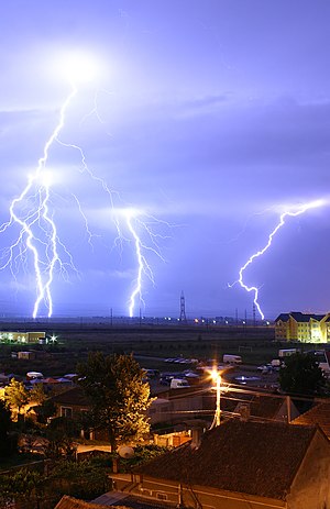
 Info created by Nelumadau - uploaded by Diego pmc - nominated by Diego pmc -- diego_pmc (talk) 17:43, 1 December 2008 (UTC)
 Support -- diego_pmc (talk) 17:43, 1 December 2008 (UTC)
 Support -- Manuel R. (talk) 19:51, 1 December 2008 (UTC)
 Support Good illustrative value, WOW effect present, quite nice. --Aktron (talk) 11:03, 2 December 2008 (UTC)
 Support Amazing picture! R-T-C Tim (talk) 14:52, 2 December 2008 (UTC)
 Support OK, guality could be better, but wow is here. --Karelj (talk) 19:35, 2 December 2008 (UTC)
 Support Georgez (talk) 19:54, 2 December 2008 (UTC)
 Support -- MJJR (talk) 19:55, 2 December 2008 (UTC)
 Oppose Poor image quality. Lycaon (talk) 20:10, 2 December 2008 (UTC)
 Support – Great picture, plenty of wow, is encyclopedic too. Jerry teps (talk) 21:20, 2 December 2008 (UTC)
 Oppose Per Lycaon + bad foreground --Pom² (talk) 21:41, 2 December 2008 (UTC)
 Support Fine for me. How do you turn this on (talk) 00:49, 4 December 2008 (UTC)
 Oppose - Per previous opposers -- Alvesgaspar (talk) 13:09, 4 December 2008 (UTC)
 Oppose building in front -- Gorgo (talk) 20:19, 4 December 2008 (UTC)
 Info See Commons:Featured picture candidates/Image:Lightning over Oradea Romania 2.jpg for nomination of an earlier version of the same image]]. --MichaelMaggs (talk) 23:02, 4 December 2008 (UTC)
 Oppose poor foreground. --MichaelMaggs (talk) 23:02, 4 December 2008 (UTC)
.svg/15px-Pictogram_voting_comment_(orange).svg.png) Comment -- in my opinion the foreground helps the image by adding contrast to it. This crop shows what I'm referring to — IMO the image is just too dull like that. The full also looks somewhat more striking (probably from seeing the houses so close to the lightning). diego_pmc (talk) 06:11, 5 December 2008 (UTC)
Comment -- in my opinion the foreground helps the image by adding contrast to it. This crop shows what I'm referring to — IMO the image is just too dull like that. The full also looks somewhat more striking (probably from seeing the houses so close to the lightning). diego_pmc (talk) 06:11, 5 December 2008 (UTC) Oppose Per other opposers --Massimo Catarinella (talk) 22:25, 5 December 2008 (UTC)
 Support capturing 4 lighting bolts makes this a fascinating image. This is the kind of image that has some personality... a story if you will. --J.smith (talk) 16:49, 6 December 2008 (UTC)
 Support I like the multiple strikes. --Dori - Talk 18:29, 6 December 2008 (UTC)
 Support with reserves. This picture almost has a "Magritte-esque" feeling to it, in the contrast between the sky, almost as lit as during the day, and the houses and streets, dark and sparely lit by street lamps. The foreground thus has to remain, imho. The small piece of a pointy roof, in the foreground, could be left out, on the other hand. As for the overall image quality, it seems fine, yet not optimal. The wow factor of the picture makes up for it, though. --JY Rehby (talk) 00:12, 7 December 2008 (UTC)
 Support --Joku Janne (talk) 10:04, 7 December 2008 (UTC)
 Oppose unfortunate setting --Simonizer (talk) 11:58, 8 December 2008 (UTC)
 Support Quote from the guidelines: "A bad picture of a very difficult subject is a better picture than a good picture of an ordinary subject" (Varcos (talk) 09:40, 9 December 2008 (UTC))
 Neutral Stunning subject matter, but the composition could use a little adjustment to be really evocative. Otherwise sound. JalalV (talk) 04:47, 10 December 2008 (UTC)
 Oppose The foreground ruins it for me. --Estrilda (talk) 16:40, 10 December 2008 (UTC)
 Support
result: 14 support, 8 oppose, 1 neutral => not featured. --Pom² (talk) 19:01, 10 December 2008 (UTC)(UTC)
Image:Marcellus4.jpg[edit]
Voting period ends on 11 Dec 2008 at 19:41:09
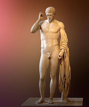
 Info created by Kleomeles - uploaded by Kleomeles - nominated by USERNAME -- 84.222.229.170 19:41, 2 December 2008 (UTC)
 Support -- 84.222.229.170 19:41, 2 December 2008 (UTC)
| Thank you for nominating this image. Unfortunately, it does not fall within the Guidelines and is unlikely to succeed for the following reason: image is tiny. | Anyone other than the nominator who disagrees may override this template by changing {{FPX}} to {{FPX contested}} and adding a vote in support. Voting will then continue in the usual way. If not contested within 24 hours, this nomination may be closed. |
Lycaon (talk) 19:59, 2 December 2008 (UTC)
Image:Giant Bison Vertebra with Atlatl Point.jpg[edit]
Voting period ends on 13 Dec 2008 at 19:28:55
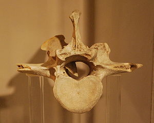
 Info created by J.smith - uploaded by J.smith - nominated by J.smith (how redundant) -- J.smith (talk) 19:28, 4 December 2008 (UTC)
 Support, of course. -- J.smith (talk) 19:28, 4 December 2008 (UTC)
 Oppose, sorry ;-). Poor lighting, noisy and insufficient DOF. Lycaon (talk) 20:51, 4 December 2008 (UTC)
 Oppose And the white balance seem incorrect. /Daniel78 (talk) 22:10, 4 December 2008 (UTC)
| Thank you for nominating this image. Unfortunately, it does not fall within the Guidelines and is unlikely to succeed for the following reason: noise, missing DOF, white balance | Anyone other than the nominator who disagrees may override this template by changing {{FPX}} to {{FPX contested}} and adding a vote in support. Voting will then continue in the usual way. If not contested within 24 hours, this nomination may be closed. |
--AlexanderKlink (talk) 08:20, 5 December 2008 (UTC)
- Feel free to close the nomination early (consider it withdrawn, if you like), but that template is obnoxious. J.smith (talk) 08:45, 5 December 2008 (UTC)
- Sorry if you feel offended by it, but I believe I'm not the only one who thinks this is not FP-worthy. Don't take it personally, please --AlexanderKlink (talk) 09:17, 5 December 2008 (UTC)
- No, I'm not offended that you dislike the image (I see that this nomination wont pass) I just think the template is insulting. --J.smith (talk) 19:53, 5 December 2008 (UTC)
- Alexander, if you don't think this is FP-worthy, it's exactly the point where you oppose to the nomination,not FPXing it. --norro 10:45, 7 December 2008 (UTC)
- Agreed, I should have phrased that differently. I thought it was not FP-worthy because it did not meet the guidelines, thus my FPX.
- Sorry if you feel offended by it, but I believe I'm not the only one who thinks this is not FP-worthy. Don't take it personally, please --AlexanderKlink (talk) 09:17, 5 December 2008 (UTC)
- Feel free to close the nomination early (consider it withdrawn, if you like), but that template is obnoxious. J.smith (talk) 08:45, 5 December 2008 (UTC)
Image:NGC2207+IC2163.jpg, featured[edit]
Voting period ends on 11 Dec 2008 at 06:24:31
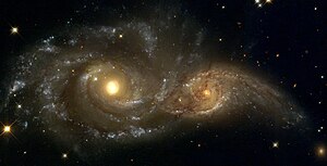
 Info created by HST/NASA/ESA - uploaded by Mfield - nominated by Jerry teps -- Jerry teps (talk) 06:24, 2 December 2008 (UTC)
 Support -- Jerry teps (talk) 06:24, 2 December 2008 (UTC)
 Support Space is fascinating. How do you turn this on (talk) 00:48, 4 December 2008 (UTC)
 Support Wow! This looks like No Fear eyes. --Lošmi (talk) 12:08, 4 December 2008 (UTC)
 Support Georgez (talk) 12:22, 6 December 2008 (UTC)
 Support JukoFF (talk) 16:05, 7 December 2008 (UTC)
 Support JalalV (talk) 04:39, 10 December 2008 (UTC)
 Support Hedwig --Hedwig Storch (talk) 08:38, 11 December 2008 (UTC)
result: 7 support, 0 oppose, 0 neutral => featured. – Jerryteps 10:27, 11 December 2008 (UTC)
Image:Antidorcas marsupialis 1.jpg, not featured[edit]
Voting period ends on 11 Dec 2008 at 07:28:30
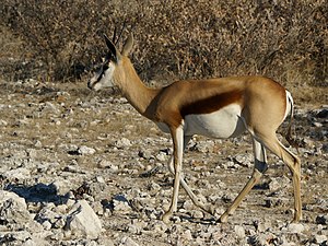
 Info Springbok (Antidorcas marsupialis) in its natural environment in Etosha, Namibia, created, uploaded and nominated by Lycaon (talk) 07:28, 2 December 2008 (UTC)
 Oppose Distracting background. --Aktron (talk) 11:00, 2 December 2008 (UTC)
 Oppose As Aktron - backgroung. --Karelj (talk) 19:53, 2 December 2008 (UTC)
 Oppose Sorry, background too distracting. How do you turn this on (talk) 00:24, 4 December 2008 (UTC)
 Oppose Background distracting. Marlith (talk) 01:29, 4 December 2008 (UTC)
 Support Background shows nice camouflage. Muhammad 05:05, 4 December 2008 (UTC)
 Support Obviously not a zoo pic. Natural background adds value to an unresampled (slightly cropped for composition) hires image. Lycaon (talk) 00:58, 6 December 2008 (UTC)
- Of course not a ZOO pic, and I strongly agree with your kind of late support vote for your own image. I believe the image should get promoted, and I also believe that you should at least try to apply the same standarts that you apply to your own images to other people images too. At first maybe you could try at least not to oppose the images that are unique, rare, underwater, taken in the wild, and highly educational, no matter what quality they are, and then later maybe you could try to support one.Thanks.--Mbz1 (talk) 21:37, 9 December 2008 (UTC)
 Oppose JalalV (talk) 04:39, 10 December 2008 (UTC)
 Oppose Impossible to tell whether this is a zoo shot or not, but that makes no difference, it looks like one. The background interferes with the head of the subject, so there is no clear contour of the animal, a basic graphic element. The lighting from behind does not favor subject. Good photographic technique would have called for use of a longer lens, wider aperture, lower camera position in order to exalt the subject. And BTW, nice to see you again. --Tomascastelazo (talk) 22:35, 10 December 2008 (UTC)
- Tomas, look at the geolocation: This is wild Africa where animals don't do as they are told;-), no zoo 450 km in the neighbourhood! Welcome back! Lycaon (talk) 22:45, 10 December 2008 (UTC)
- You can give moon locations for that matter, but that does not mean the picture was taken there, I guess it is just like my live scorpion, that you hint is dead. As I said, zoo shot or not, looks like one. Now, this IS a good shot #REDIRECT [5] And nice to see you too!--Tomascastelazo (talk) 22:54, 10 December 2008 (UTC)
- It doesn't matter if it is a zoo shot or not, but the biggest clue is the focal length of 135mm. It'd be very, very difficult to get so close to a wild animal. Most of the zoo pictures on the English Wikipedia are at similar focal lengths. I'd say that Tomascastelazo was probably picking up the perspective of the 135mm lens, which is quite different to a 500mm one. Noodle snacks (talk) 00:21, 11 December 2008 (UTC)
- You can give moon locations for that matter, but that does not mean the picture was taken there, I guess it is just like my live scorpion, that you hint is dead. As I said, zoo shot or not, looks like one. Now, this IS a good shot #REDIRECT [5] And nice to see you too!--Tomascastelazo (talk) 22:54, 10 December 2008 (UTC)
result: 2 support, 6 oppose, 0 neutral => not featured. – Jerryteps 10:44, 11 December 2008 (UTC)
Image:Larus argentatus juv.jpg, not featured[edit]
Voting period ends on 11 Dec 2008 at 07:37:53
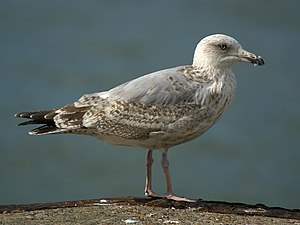
 Info created, uploaded and nominated by Lycaon (talk) 07:37, 2 December 2008 (UTC)
 Support -- Lycaon (talk) 07:37, 2 December 2008 (UTC)
 Support Unlike another similar nomination some time before this one looks better. The colors do have something to say - it's not only grey. --Aktron (talk) 10:59, 2 December 2008 (UTC)
 Oppose artefacts in the background. --Herrick (talk) 14:31, 2 December 2008 (UTC)
 Support Great quality --Massimo Catarinella (talk) 15:59, 2 December 2008 (UTC)
 Support - Great picture, great quality. Anonymous101 talk 17:10, 2 December 2008 (UTC)
 Oppose No wow, just another bird. --Karelj (talk) 19:43, 2 December 2008 (UTC)
 Support --Böhringer (talk) 21:58, 2 December 2008 (UTC)
 Support - Great picture -- Alvesgaspar (talk) 23:44, 2 December 2008 (UTC)
 Support Good choice of aperture and excellent shot. →Diti the penguin — 13:15, 3 December 2008 (UTC)
 Support --Michael Gäbler (talk) 23:16, 3 December 2008 (UTC)
 Support Fine for me, good job! How do you turn this on (talk) 00:23, 4 December 2008 (UTC)
 Support --Richard Bartz (talk) 01:40, 7 December 2008 (UTC)
 Support --Simonizer (talk) 11:57, 8 December 2008 (UTC)
 Support No wow for an easy shot ("the most abundant and best known of all gulls along the shores of Asia, western Europe, and North America"). But meets the rest of the criteria otherwise. Noodle snacks (talk) 19:26, 8 December 2008 (UTC)
 Oppose Not spectacular. JalalV (talk) 04:37, 10 December 2008 (UTC)
 Oppose Very good photo, but nothing special to qualify it for FP. In my opinion, fits perfectly in <http://commons.wikimedia.org/wiki/Commons:Quality_images> (Varcos (talk) 09:55, 10 December 2008 (UTC))
 Oppose It says nothing to me. A302b (talk) 10:10, 10 December 2008 (UTC)
 Oppose It's a very good shot, but also very easy, so nothing very extraordinary... sorry. Benh (talk) 22:29, 10 December 2008 (UTC)
 Oppose Of all the birds, seagulls are probably the easiest to photograph, and one can get to 2-3 feet away from them. A little bait and they walk right into the camera. --Tomascastelazo (talk) 23:11, 10 December 2008 (UTC)
 Support
result: 13 support, 7 oppose, 0 neutral => featured. – Jerryteps 10:48, 11 December 2008 (UTC)
- 3. Ratio of supporting/opposing votes at least 2/1 (a two-thirds majority)
result: 12 support, 7 oppose, 0 neutral => not featured. – --Pom² (talk) 12:49, 11 December 2008 (UTC)
Image:Fishermen - Tamandaré - Brasil pan.jpg, not delisted[edit]
Voting period ends on 10 Dec 2008 at 19:45:38
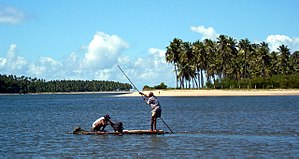
 Info Much below 2 Megapixels and unsharp (Original nomination)
 Delist -- Manuel R. (talk) 19:45, 1 December 2008 (UTC)
 Delist diego_pmc (talk) 07:38, 2 December 2008 (UTC)
 Keep Had 10 votes and 100% support, and I do not like removing old fp's. /Daniel78 (talk) 22:42, 3 December 2008 (UTC)
 Keep - still good.--Avala (talk) 13:55, 5 December 2008 (UTC)
 Keep It's a great picture. --Mr. Mario (talk) 15:14, 5 December 2008 (UTC)
 Delist Resolution and so on. --Aktron (talk) 13:23, 6 December 2008 (UTC)
 Keep Not egregious. --Dori - Talk 03:32, 7 December 2008 (UTC)
 Delist --Karelj (talk) 19:37, 7 December 2008 (UTC)
 Delist JalalV (talk) 04:31, 10 December 2008 (UTC)
 Keep --AngMoKio (talk) 08:51, 12 December 2008 (UTC)
result: 5 Delist, 4 Keep -->not delisted. --Mr. Mario (talk) 02:21, 13 December 2008 (UTC)
Image:Farmer plowing.jpg, kept[edit]
Voting period ends on 7 Dec 2008 at 09:24:28
 Info The image look really nice, but its quality is not as good as the image has quite a lot of noise. It was probably caused by sharpening (it's most visible around the edges). Besides, it is just below the 2MP limit. (Original nomination)
 Delist -- diego_pmc (talk) 09:24, 28 November 2008 (UTC)
 Keep The picture is from 2004. --Lošmi (talk) 01:35, 29 November 2008 (UTC)
 Delist it is under 2 megapixels Vanjagenije (talk) 02:03, 29 November 2008 (UTC)
 Keep Small size alone isn't a reason to delist an old FP, since 2 MPX was a huge format then. --Massimo Catarinella (talk) 10:37, 29 November 2008 (UTC)
 Keep Nice horses, illustrative picture, good quality. Maybe not for now, but still good for me. --Aktron (talk) 15:56, 29 November 2008 (UTC)
 Keep --Böhringer (talk) 21:36, 29 November 2008 (UTC)
 Keep --Mbdortmund (talk) 18:10, 30 November 2008 (UTC)
 Keep --Karelj (talk) 19:41, 30 November 2008 (UTC)
 Keep --Richard Bartz (talk) 12:04, 1 December 2008 (UTC)
 Keep --Wisnia6522 (talk) 13:20, 1 December 2008 (UTC)
- Withdraw diego_pmc (talk) 21:29, 1 December 2008 (UTC)
- Next time use the {{Withdraw}} template. --Mr. Mario (talk) 15:10, 5 December 2008 (UTC)
 Keep /Daniel78 (talk) 22:39, 3 December 2008 (UTC)
 Keep 100% -- ■ MMXXtalk 08:50, 5 December 2008 (UTC)
result: Withdrawn --> kept --Mr. Mario (talk) 15:10, 5 December 2008 (UTC)
Image:Coccinella septempunctata couple (aka).jpg~, kept[edit]
Voting period ends on 21 Nov 2008 at 00:24:20
.jpg/310px-Coccinella_septempunctata_couple_(aka).jpg)
 InfoToo small, uninteresting (no wow)(Original nomination)
 Delist -- Mr. Mario (talk) 00:24, 12 November 2008 (UTC)
 Keep Disagree --Massimo Catarinella (talk) 19:39, 12 November 2008 (UTC)
 Keep --Karelj (talk) 20:46, 12 November 2008 (UTC)
 Keep --Mbdortmund (talk) 16:54, 14 November 2008 (UTC)
Votes rather late ;-), don't count. Sorry. ~~
 Keep --Luc Viatour (talk) 14:15, 22 November 2008 (UTC)
 Keep --Lestat (talk) 22:03, 22 November 2008 (UTC)
 Delist Below 2 megapixels. Diti (talk to the penguin) 12:19, 23 November 2008 (UTC)
 Delist -- Manuel R. (talk) 20:03, 24 November 2008 (UTC)
result: 1 Delist, 3 Keep, 0 neutral => not delisted. --Lycaon (talk) 08:50, 28 November 2008 (UTC)
Image:RustChain.JPG, not featured[edit]
Voting period ends on 13 Dec 2008 at 01:28:30
 Info created by Marlith - uploaded by Marlith - nominated by Marlith -- Marlith (talk) 01:28, 4 December 2008 (UTC)
 Support -- Marlith (talk) 01:28, 4 December 2008 (UTC)
 Oppose: the tilted white "sky" irritates me ... --AlexanderKlink (talk) 08:17, 4 December 2008 (UTC)
 Oppose The quality isn't particularly good and the composition isn't either. --Massimo Catarinella (talk) 22:26, 5 December 2008 (UTC)
 Oppose Georgez (talk) 12:24, 6 December 2008 (UTC)
result: 1 support, 3 oppose, 0 neutral => not featured. AlexanderKlink (talk) 09:57, 13 December 2008 (UTC)
Image:Jean Auguste Dominique Ingres, La Grande Odalisque, 1814.jpg, not featured[edit]
Voting period ends on 12 Dec 2008 at 13:59:46
 Info created by Jean Auguste Dominique Ingres - uploaded and nominated by Paris 16.
 Support -- Paris 16 (talk) 13:59, 3 December 2008 (UTC)
 Oppose Not too keen on this - why is the end of her big toe cut off? How do you turn this on (talk) 00:21, 4 December 2008 (UTC)
result: 1 support, 1 oppose, 0 neutral => not featured. AlexanderKlink (talk) 20:59, 12 December 2008 (UTC)
Image:Louis Armstrong restored.jpg, not featured[edit]
Voting period ends on 12 Dec 2008 at 13:44:21
 Info created by World-Telegram staff photographer - uploaded by Mangostar - nominated by Paris 16.
 Support -- Paris 16 (talk) 13:44, 3 December 2008 (UTC)
 Oppose Nothing special, just an old photo, like many of these. --Aktron (talk) 18:44, 3 December 2008 (UTC)
 Oppose Agree. /Daniel78 (talk) 22:48, 3 December 2008 (UTC)
 Oppose Agree with above, good quality photo, but not awesome. How do you turn this on (talk) 00:22, 4 December 2008 (UTC)
 Oppose Georgez (talk) 12:22, 6 December 2008 (UTC)
 Support This is a great picture! --Mr. Mario (talk) 00:13, 7 December 2008 (UTC)
 Support Yes, it is. --Lošmi (talk) 02:09, 7 December 2008 (UTC)
 Support Great photo, and i like a lot Louis! --Abbax 19:39, 8 December 2008 (UTC)
 Support --Böhringer (talk) 22:13, 9 December 2008 (UTC)
 Oppose As Aktron. --Karelj (talk) 15:24, 10 December 2008 (UTC)
 Support Famous picture with a great quality --Pom² (talk) 10:15, 11 December 2008 (UTC)
 Support --Mbdortmund (talk) 01:20, 12 December 2008 (UTC)
result: 7 support, 5 oppose, 0 neutral => not featured. AlexanderKlink (talk) 20:57, 12 December 2008 (UTC)
Image:Sea otter nursing02.jpg, featured[edit]
Voting period ends on 13 Dec 2008 at 03:21:22
 Info created by Mike Baird - uploaded by Fir0002 - nominated by X! -- X! (talk) 03:21, 4 December 2008 (UTC)
 Support -- X! (talk) 03:21, 4 December 2008 (UTC)
 Support special! --Herrick (talk) 08:48, 4 December 2008 (UTC)
 Support – I supported this when it was nominated at the english wikipedia, and i'll support it again, great, encyclopedic picture. – Jerryteps 09:29, 4 December 2008 (UTC)
 Support --Böhringer (talk) 14:01, 4 December 2008 (UTC)
 Support Good information w/ composition. Marlith (talk) 01:23, 5 December 2008 (UTC)
 Support Vmenkov (talk) 22:45, 7 December 2008 (UTC)
 Support --Luc Viatour (talk) 18:55, 9 December 2008 (UTC)
 Support Cute! --Estrilda (talk) 16:41, 10 December 2008 (UTC)
 Support --Mbdortmund (talk) 01:20, 12 December 2008 (UTC)
result: 9 support, 0 oppose, 0 neutral => featured. AlexanderKlink (talk) 09:58, 13 December 2008 (UTC)
Image:Hobart Docks.jpg, not featured[edit]
Voting period ends on 14 Dec 2008 at 07:59:48
![]()
 Info created by Flying Freddy - uploaded by Flying Freddy - nominated by Flying Freddy -- Flying Freddy (talk) 07:59, 5 December 2008 (UTC)
 Support -- Flying Freddy (talk) 07:59, 5 December 2008 (UTC)
 Oppose (formerly FPX) Image does not fall within the guidelines, The image is badly lit and has a wrong projection. Lycaon (talk) 08:16, 5 December 2008 (UTC)
- There is no clear guideline violation. Both can be intended by the author. --norro 15:52, 5 December 2008 (UTC)
 Support I like it for its mood. --norro 15:52, 5 December 2008 (UTC)
 Oppose Distortion, exposure. –Dilaudid 22:04, 5 December 2008 (UTC)
 Oppose Distortion and noise --Massimo Catarinella (talk) 22:27, 5 December 2008 (UTC)
 Oppose Lighting. Well better than FPX problems like "what picture is nomination-capable" we should vote so these will not be nominated. --Aktron (talk) 13:21, 6 December 2008 (UTC)
 Oppose --JalalV (talk) 14:35, 10 December 2008 (UTC)
result: 2 supports, 5 opposes, 0 neutral => not featured. Benh (talk) 21:02, 15 December 2008 (UTC)
Image:Centaurea jacea Ruissalo.jpg, not featured[edit]
Voting period ends on 14 Dec 2008 at 22:18:52
 Info created by Dilaudid • uploaded by Dilaudid • nominated by Dilaudid on 22:18, 5 December 2008 (UTC)
 Support –Dilaudid 22:18, 5 December 2008 (UTC)
 Oppose (formerly FPX) Image does not fall within the guidelines, most of the subject is out of focus, probably due to a poor exposure solution Alvesgaspar (talk) 00:29, 6 December 2008 (UTC)
.svg/15px-Pictogram_voting_comment_(orange).svg.png) Comment The blur is intentional and imho doesn't deduce from getting an impression of the plant; personally I wouldn't do much to change the DOF. –Dilaudid 08:33, 6 December 2008 (UTC)
Comment The blur is intentional and imho doesn't deduce from getting an impression of the plant; personally I wouldn't do much to change the DOF. –Dilaudid 08:33, 6 December 2008 (UTC)
 Support I'll be the hond in het kegelspel this time. I think it might have a chance and FPX is a tad too harsh (I may wrong be of course). Lycaon (talk) 00:54, 6 December 2008 (UTC)
 Oppose I do not like the composition. The left side of the picture is distracting from the subject. I do not like the proportion either (as defined in the guidelines)(Varcos (talk) 20:49, 8 December 2008 (UTC))
 Oppose Didn't like composition. JalalV (talk) 04:37, 10 December 2008 (UTC)
result: 2 supports, 3 opposes, 0 neutral => not featured. Benh (talk) 21:03, 15 December 2008 (UTC)
Image:LR91-AJ-11 rocket engine - Thrust chamber.jpg, featured[edit]
Voting period ends on 14 Dec 2008 at 22:49:27
 Info created by J.smith - uploaded by J.smith - nominated by J.smith
 Info This photo is looking up the "tailpipe" of the LR91-AJ-11 rocket engine. This is one of the rockets that powered the Titan IV. -- J.smith (talk) 22:49, 5 December 2008 (UTC)
 Support myself, of course. -- J.smith (talk) 22:49, 5 December 2008 (UTC)
 Support I like the symmetry of it --AlexanderKlink (talk) 23:38, 5 December 2008 (UTC)
.svg/15px-Pictogram_voting_comment_(orange).svg.png) Comment - Well, symmetry is one of the basic ingredients of beauty, maybe the most important of all. In this case, and since we have a radial symmetry, the framing should be a perfect square. Alvesgaspar (talk) 00:26, 6 December 2008 (UTC)
Comment - Well, symmetry is one of the basic ingredients of beauty, maybe the most important of all. In this case, and since we have a radial symmetry, the framing should be a perfect square. Alvesgaspar (talk) 00:26, 6 December 2008 (UTC)
.svg/15px-Pictogram_voting_comment_(orange).svg.png) Comment I can crop it if you think that's the best way to go. --J.smith (talk) 01:26, 6 December 2008 (UTC)
Comment I can crop it if you think that's the best way to go. --J.smith (talk) 01:26, 6 December 2008 (UTC).svg/15px-Pictogram_voting_comment_(orange).svg.png) Comment I think I'm confusing myself a tad with your comment. By "perfect square" do you mean perfectly square with the center of the image or the image should be cropped to even X/Y dimensions? --J.smith (talk) 01:38, 6 December 2008 (UTC)
Comment I think I'm confusing myself a tad with your comment. By "perfect square" do you mean perfectly square with the center of the image or the image should be cropped to even X/Y dimensions? --J.smith (talk) 01:38, 6 December 2008 (UTC)
- Please don't crop this. The irregularities that are out of where the square would be are interesting and beautiful. -- carol (talk) 03:48, 6 December 2008 (UTC)
 Support --Aqwis (talk) 09:57, 6 December 2008 (UTC)
 Support /Daniel78 (talk) 11:46, 6 December 2008 (UTC)
 Support Nice picture --Aktron (talk) 13:20, 6 December 2008 (UTC)
 Support --Kanonkas(talk) 00:49, 7 December 2008 (UTC)
 Support --Karelj (talk) 19:48, 7 December 2008 (UTC)
 Support Love this, like an abstract metal eye --Pom² (talk) 16:21, 8 December 2008 (UTC)
 Support --Böhringer (talk) 20:43, 8 December 2008 (UTC)
 Support --TheWB (talk) 02:10, 9 December 2008 (UTC)
 Support --Luc Viatour (talk) 18:51, 9 December 2008 (UTC)
 Support Please don't crop. --Estrilda (talk) 16:42, 10 December 2008 (UTC)
 Support --Mbdortmund (talk) 01:19, 12 December 2008 (UTC)
 Support Nice abstract shot. --Tomascastelazo (talk) 22:58, 14 December 2008 (UTC)
result: 14 supports, 0 oppose, 0 neutral => featured. Benh (talk) 21:04, 15 December 2008 (UTC)
Image:RainAmsterdamTheNetherlands.jpg, not featured[edit]
Voting period ends on 15 Dec 2008 at 16:26:55
 Info created, uploaded and nominated by Massimo Catarinella -- Massimo Catarinella (talk) 16:26, 6 December 2008 (UTC)
 Support -- Massimo Catarinella (talk) 16:26, 6 December 2008 (UTC)
 Support /me likes! →Diti the penguin — 16:45, 6 December 2008 (UTC)
 Oppose -- Too simple, nothing outstanding Manuel R. (talk) 12:48, 7 December 2008 (UTC)
 Neutral It is simple... Calandrella (talk) 14:10, 7 December 2008 (UTC)
 Oppose As Manuel R. --Karelj (talk) 19:50, 7 December 2008 (UTC)
 Oppose Quote from the guidelines: "Pictures should be in some way special..." I found nothing special. Besides, I do not see the encyclopedical value.(Varcos (talk) 21:03, 8 December 2008 (UTC))
 Support --FilWriter 10:01, 13 December 2008 (UTC)
 Oppose no wow here, sorry --AlexanderKlink (talk) 10:09, 13 December 2008 (UTC)
result: 3 supports, 4 opposes, 1 neutral => not featured. Benh (talk) 21:04, 15 December 2008 (UTC)
Image:Parides anchises.JPG, not featured[edit]
Voting period ends on 15 Dec 2008 at 16:37:11
 Info created by Korall - uploaded by Korall - nominated by Korall -- Korall (talk) 16:37, 6 December 2008 (UTC)
 Support -- Korall (talk) 16:37, 6 December 2008 (UTC)
 Support It is a little blurred, but I like it although. Calandrella (talk) 14:09, 7 December 2008 (UTC)
 Oppose JalalV (talk) 12:19, 10 December 2008 (UTC)
 Support – Fantastic picture, I can't see why the above user opposed it, mind explaining? – Jerryteps 10:15, 11 December 2008 (UTC)
![]() Im not sure it has the proper name and categorisation--Korall (talk) 12:42, 12 December 2008 (UTC)
Im not sure it has the proper name and categorisation--Korall (talk) 12:42, 12 December 2008 (UTC)
result: withdrawn, not featured. Benh (talk) 21:05, 15 December 2008 (UTC)
Image:Rinya waterfall.jpg, not featured[edit]
 Info created by Mdonci - uploaded by Mdonci -- Mdonci (talk) 14:29, 7 December 2008 (UTC)
 Support -- Mdonci (talk) 14:29, 7 December 2008 (UTC)
 Question why did you upload an exact duplicate of Image:Rinya patak vízesése.jpg? --J.smith (talk) 16:45, 7 December 2008 (UTC)
 Oppose The subject is not put in the right context, therefore leading to confusion. This is a 10 cm tiny waterfall? If so, what is the encyclopedical value? (Varcos (talk) 21:29, 8 December 2008 (UTC))
 Oppose What are those little black dots all around the photo? I think it was dust on the lens. →Diti the penguin — 21:40, 8 December 2008 (UTC)
 Oppose Too much clutter; my eye couldn't concentrate on anything in particular. JalalV (talk) 04:21, 10 December 2008 (UTC)
result: 1 support, 3 opposes, 0 neutral => not featured (rule of the 5th day). Benh (talk) 21:06, 15 December 2008 (UTC)
Image:Levi 293.JPG, not featured[edit]
Voting period ends on 17 Dec 2008 at 17:17:05
 Info created by kallerna - uploaded by kallerna - nominated by kallerna —kallerna™ 17:21, 8 December 2008 (UTC)
 Support —kallerna™ 17:21, 8 December 2008 (UTC)
 Oppose Quote from the guidelines: "Pictures should be in some way special..." I found nothing special. Which is the subject of the picture? (Varcos (talk) 20:55, 8 December 2008 (UTC))
.svg/15px-Pictogram_voting_comment_(orange).svg.png) Comment It's good shot from funbox and shows how it's meant to use. I find it quite special. —kallerna™ 15:10, 9 December 2008 (UTC)
Comment It's good shot from funbox and shows how it's meant to use. I find it quite special. —kallerna™ 15:10, 9 December 2008 (UTC).svg/15px-Pictogram_voting_comment_(orange).svg.png) Comment Quote from <http://commons.wikimedia.org/wiki/Commons:Valued_images> : "Featured pictures are the cream of the crop at Commons and is reserved for images of both extraordinary value and technical quality." I don't think the proposal matches these criteria. Do you? I think the picture could be proposed as Quality image, which has lower standards <http://commons.wikimedia.org/wiki/Commons:Quality_images>(Varcos (talk) 17:07, 9 December 2008 (UTC))
Comment Quote from <http://commons.wikimedia.org/wiki/Commons:Valued_images> : "Featured pictures are the cream of the crop at Commons and is reserved for images of both extraordinary value and technical quality." I don't think the proposal matches these criteria. Do you? I think the picture could be proposed as Quality image, which has lower standards <http://commons.wikimedia.org/wiki/Commons:Quality_images>(Varcos (talk) 17:07, 9 December 2008 (UTC))
 Oppose, main subject is blurry and/or out of focus. --Aqwis (talk) 22:32, 9 December 2008 (UTC)
 Oppose Power lines detracted too much for me. JalalV (talk) 04:20, 10 December 2008 (UTC)
 Oppose The skier is not very sharp and missing part of his stick. --Estrilda (talk) 16:43, 10 December 2008 (UTC)
 Oppose Georgez (talk) 20:40, 11 December 2008 (UTC)
result: 1 support, 5 opposes, 0 neutral => not featured. Benh (talk) 21:07, 15 December 2008 (UTC)
Image:Voltaire nu 2.jpg, not featured[edit]
 Info created by Jean-Baptiste Pigalle (sculptor) + Coyau (photograph) - uploaded by Coyau - nominated by Coyau --Coyau (talk) 21:00, 8 December 2008 (UTC)
 Support --Coyau (talk) 21:00, 8 December 2008 (UTC)
 Oppose - looks plain to me - ChrisDHDR 17:10, 9 December 2008 (UTC)
 Oppose as per previous opposer. Also for the distracting background. (Varcos (talk) 17:43, 9 December 2008 (UTC))
 Oppose JalalV (talk) 04:50, 10 December 2008 (UTC)
result: 1 support, 3 opposes, 0 neutral => not featured (rule of the 5th day). Benh (talk) 21:14, 15 December 2008 (UTC)
Image:Shinjuku by Night.jpg[edit]
 Info created by Fboas - uploaded by Fboas - nominated by Fboas --82.244.128.126 12:41, 10 December 2008 (UTC)
 Support --82.244.128.126 12:41, 10 December 2008 (UTC)
 Oppose --Latzel (talk) 14:43, 10 December 2008 (UTC)
 Oppose Too dark. —kallerna™ 14:43, 10 December 2008 (UTC)
 Oppose Too, too, too dark. --Karelj (talk) 15:34, 10 December 2008 (UTC)
 Oppose Georgez (talk) 20:49, 11 December 2008 (UTC)
 Oppose - Could've at least turned the flash on. X! (talk) 00:34, 12 December 2008 (UTC)
| Thank you for nominating this image. Unfortunately, it does not fall within the Guidelines and is unlikely to succeed for the following reason: it is too dark. --Mr. Mario (talk) 02:12, 13 December 2008 (UTC) | Anyone other than the nominator who disagrees may override this template by changing {{FPX}} to {{FPX contested}} and adding a vote in support. Voting will then continue in the usual way. If not contested within 24 hours, this nomination may be closed. |
Image:Centruroides suffusus 1.jpg, not featured[edit]
Voting period ends on 15 Dec 2008 at 21:33:07
 Info created, uploaded and nominated by Tomascastelazo (talk) 21:33, 6 December 2008 (UTC)
 Support -- Tomascastelazo (talk) 21:33, 6 December 2008 (UTC)
 Question This guy is dead, isn't it ? --Richard Bartz (talk) 01:38, 7 December 2008 (UTC)
- It´s still alive, waiting for tomorrow´s photo shoot. --Tomascastelazo (talk) 01:56, 7 December 2008 (UTC)
 Neutral -- I like the white background and the position of the scorpion, but in full resolution, the quality is not as good as it could be. Parts of the scorpion are out of focus and theres some noise Manuel R. (talk) 12:57, 7 December 2008 (UTC)
 Support --Luc Viatour (talk) 18:53, 9 December 2008 (UTC)
 Support I like the white backgrounds. --Digon3 talk 20:37, 10 December 2008 (UTC)
 Oppose Good picture of a common (dead) scorpion with average DOF. As it is still around, you might take another picture, but please remove the dust and lint first. On a different note, the id might be wrong as C. suffusus (the Durango scorpion) has pale sides and only occurs in Durango province. The colour hints at C. vitattus but even then, although it is a wider spread animal, the place where you found it stays a bit problematic. All in all, a clean shoot of a properly identified (even dead) animal has surely FP potential. BTW, lighting is very good. Lycaon (talk) 22:04, 10 December 2008 (UTC)
- Dear Lycaon, I am not too keen on photographing dead fish in a perilous air-conditioned lab nor taking zoo pictures with bogus geolocations. If I say here that the bug is alive, it is. Here is another picture of the model and a little brother (who did die) #REDIRECT Image:Centruroides suffusus 2.jpg. As far as the ID, a Bug-o-logist friend tentatively identifies it between a suffussus or a infamatus infamatus or infamatus ornatus. The problem is that they are very small. The dust? Well, I sure ain´t going to try to brush it off. :o) --Tomascastelazo (talk) 23:05, 10 December 2008 (UTC)
 Oppose - I'm with Lycaon. For a studio shot it could and should have a much better quality and DOF (focus bracketing?). I don't like white backgrounds, but that is a minor remark. -- Alvesgaspar (talk) 00:24, 11 December 2008 (UTC)
- Of course you are with Lycaon! Birds of a feather flock together! I am much more amused than surprised. What makes you assume that it is a studio shot? Just so you know, the critter was photographed with daylight in the shade, in a plastic ice cream container... pretty much in its natural habitat, my back patio. Perhaps for a photo critic you could and should have much better quality in your critiques, substantiated by insightful arguments, not blanket statements that say nothing. Nice to see you again too! --Tomascastelazo (talk) 00:46, 11 December 2008 (UTC)
- Welcome back, Tomas! I see that you are well and sound. And with the usual difficulty in accepting criticism... Nothing new, really. I wish we have fun together and find new talents here! -- Alvesgaspar (talk) 01:17, 11 December 2008 (UTC)
- Thank you for the warm welcome Alvesgaspar!!! Funny thing about criticism. I love criticism! I truly do! Problem around here is that there is no criticism. I am a dictionary freak, and criticism is rave; appraisal, assessment, evaluation; analysis, examination, study. There is very, very little of that. What there is a lot of, however, is a lot of self delusion about knowing about photography. But it is ok though, this effort is still worth it, there is redeeming value in here. It is a fact of life that everything has good and bad, so we just have to accommodate for that. Zen says that in order for there to be short, there must be long, for there to be heavy there must be light, so I guess here in order to have wonderful, fun people like me there must exist the opposite. What's there to do but accept reality?? ;o) --Tomascastelazo (talk) 01:49, 11 December 2008 (UTC)
- Wow, I wish I could cope with your gongoristic style and deep, genuine modesty... But no, the only thing I have to offer in exchange is a little photographic experience, hardly conquered througout all these long years.-- Alvesgaspar (talk) 17:46, 11 December 2008 (UTC)
- Yes Alvesgaspar, I can see that you hardly have conquered little photographic experience. But it is ok, time is a great and patient teacher, just stick with it and some day it will come to you. ;o) --Tomascastelazo (talk) 16:59, 12 December 2008 (UTC)
- Yes, thanks, maybe I'm luckier than you ;-) -- Alvesgaspar (talk) 00:54, 14 December 2008 (UTC)
- Probably... they say ignorance is bliss. ;o) --Tomascastelazo (talk) 01:27, 15 December 2008 (UTC)
- Yes, thanks, maybe I'm luckier than you ;-) -- Alvesgaspar (talk) 00:54, 14 December 2008 (UTC)
- Yes Alvesgaspar, I can see that you hardly have conquered little photographic experience. But it is ok, time is a great and patient teacher, just stick with it and some day it will come to you. ;o) --Tomascastelazo (talk) 16:59, 12 December 2008 (UTC)
- Wow, I wish I could cope with your gongoristic style and deep, genuine modesty... But no, the only thing I have to offer in exchange is a little photographic experience, hardly conquered througout all these long years.-- Alvesgaspar (talk) 17:46, 11 December 2008 (UTC)
- Thank you for the warm welcome Alvesgaspar!!! Funny thing about criticism. I love criticism! I truly do! Problem around here is that there is no criticism. I am a dictionary freak, and criticism is rave; appraisal, assessment, evaluation; analysis, examination, study. There is very, very little of that. What there is a lot of, however, is a lot of self delusion about knowing about photography. But it is ok though, this effort is still worth it, there is redeeming value in here. It is a fact of life that everything has good and bad, so we just have to accommodate for that. Zen says that in order for there to be short, there must be long, for there to be heavy there must be light, so I guess here in order to have wonderful, fun people like me there must exist the opposite. What's there to do but accept reality?? ;o) --Tomascastelazo (talk) 01:49, 11 December 2008 (UTC)
- Welcome back, Tomas! I see that you are well and sound. And with the usual difficulty in accepting criticism... Nothing new, really. I wish we have fun together and find new talents here! -- Alvesgaspar (talk) 01:17, 11 December 2008 (UTC)
- Of course you are with Lycaon! Birds of a feather flock together! I am much more amused than surprised. What makes you assume that it is a studio shot? Just so you know, the critter was photographed with daylight in the shade, in a plastic ice cream container... pretty much in its natural habitat, my back patio. Perhaps for a photo critic you could and should have much better quality in your critiques, substantiated by insightful arguments, not blanket statements that say nothing. Nice to see you again too! --Tomascastelazo (talk) 00:46, 11 December 2008 (UTC)
 Oppose Uuhm, no --Richard Bartz (talk) 23:52, 11 December 2008 (UTC)
- In all seriousness, this is a critique I would like to hear. I am not a bug photographer so I don't really have all the fine distinctions of the art. I appreciate the quality of your work, and have followed it since your makro freak days. A few opinions as to why not would be a great lesson for all, or at least to me. I take it by your reply that you evaluated the picture, so I really want to know your thoughts. Besides, you wont need a lot of words, your elocuence is evident!!! Cheers! --Tomascastelazo (talk) 02:40, 12 December 2008 (UTC)
- It looks sad/jailed. Better - a positive picture in his nat. env.
(with a majestical angle from beneath, maybe)--Richard Bartz (talk) 08:25, 12 December 2008 (UTC)
- It looks sad/jailed. Better - a positive picture in his nat. env.
- In all seriousness, this is a critique I would like to hear. I am not a bug photographer so I don't really have all the fine distinctions of the art. I appreciate the quality of your work, and have followed it since your makro freak days. A few opinions as to why not would be a great lesson for all, or at least to me. I take it by your reply that you evaluated the picture, so I really want to know your thoughts. Besides, you wont need a lot of words, your elocuence is evident!!! Cheers! --Tomascastelazo (talk) 02:40, 12 December 2008 (UTC)
result: 3 support, 3 oppose, 1 neutral => not featured. Pom² (talk) 14:29, 19 December 2008 (UTC)
Image:Lauhanvuori Kivijata 3.jpg, not featured[edit]
Voting period ends on 16 Dec 2008 at 09:53:38
 Info created by Roquai - uploaded by Roquai - nominated by Joku Janne --Joku Janne (talk) 09:53, 7 December 2008 (UTC)
 Support --Joku Janne (talk) 09:53, 7 December 2008 (UTC)
 Support This really looks normal, but... Well, it is something in the picture that I really like. — Preceding unsigned comment added by Calandrella (talk • contribs) 14:07, 7 December 2008 (UTC)
 Support Nice picture to nice article. —kallerna™ 17:23, 8 December 2008 (UTC)
 Oppose The composition is "ruined" by the grass in the up right corner. I suggest a crop. (Varcos (talk) 21:19, 8 December 2008 (UTC))
 Oppose No wow at all. --Karelj (talk) 22:43, 9 December 2008 (UTC)
 Oppose JalalV (talk) 04:23, 10 December 2008 (UTC)
 Oppose composition? --Latzel (talk) 07:15, 11 December 2008 (UTC)
result: 3 support, 4 oppose, 0 neutral => not featured. Pom² (talk) 14:30, 19 December 2008 (UTC)
Image:Roman Infantry 1.jpg, not featured[edit]
Voting period ends on 17 Dec 2008 at 20:51:03
 Info created by David Friel - uploaded by Dorieo21 - nominated by Suetonius -- Suetonius (talk) 20:51, 8 December 2008 (UTC)
 Support -- Suetonius (talk) 20:51, 8 December 2008 (UTC)
 Oppose Sadly too much noise on the full-resolution photo. →Diti the penguin — 21:52, 8 December 2008 (UTC)
 Oppose noise and border should be removed --Simonizer (talk) 22:13, 8 December 2008 (UTC)
result: 1 support, 2 opposes, 0 neutral => not featured (rule of the 5th day). Benh (talk) 21:08, 15 December 2008 (UTC)
Image:Roman Infantry Edit.jpg, not featured[edit]
 Info created by David Friel - edited and uploaded by --Lošmi (talk) 01:56, 9 December 2008 (UTC)
.svg/15px-Pictogram_voting_comment_(orange).svg.png) Comment - I removed a lot of noise, used some color balance, and removed the border. --Lošmi (talk) 01:56, 9 December 2008 (UTC)
Comment - I removed a lot of noise, used some color balance, and removed the border. --Lošmi (talk) 01:56, 9 December 2008 (UTC) Support --Simonizer (talk) 08:34, 9 December 2008 (UTC)
 Support (Varcos (talk) 09:45, 9 December 2008 (UTC))
 Cool! --Mr. Mario (talk) 15:14, 9 December 2008 (UTC)
 Support - ChrisDHDR 17:16, 9 December 2008 (UTC)
 Support good work --Böhringer (talk) 22:05, 9 December 2008 (UTC)
 Support, decent enough. --Aqwis (talk) 22:06, 9 December 2008 (UTC)
 Oppose Sorry ,but the artefacts especially on the face are really too strong. In general a good shot though. --AngMoKio (talk) 08:21, 10 December 2008 (UTC)
 Oppose Over 9000 saturation, Oversharpened, Border and Noise. Noodle snacks (talk) 12:38, 10 December 2008 (UTC)
 Support --Karelj (talk) 15:29, 10 December 2008 (UTC)
 Support --Suetonius (talk) 17:09, 10 December 2008 (UTC)
 Oppose -- Interesting perspective, but technically low quality: it looks as if the whole photograph had crinkles Manuel R. (talk) 17:43, 10 December 2008 (UTC)
 Oppose Per previous, thumbnail is really great, full size is scary --Pom² (talk) 23:04, 10 December 2008 (UTC)
 Oppose - Terrible quality, not mitigated by the fine composition -- Alvesgaspar (talk) 00:15, 11 December 2008 (UTC)
 Oppose - Quality. Look at the artefacts in the neck area, to take just one example. --MichaelMaggs (talk) 07:29, 11 December 2008 (UTC)
 Oppose Quality. Look at the artefacts at the left side. It's a shame if you look at the thumbnail. --Herrick (talk) 19:36, 11 December 2008 (UTC)
 Oppose
 Neutral I'm sorry, but the noise reduction method you use is... distracting. The composition is wonderful however. --J.smith (talk) 23:41, 11 December 2008 (UTC)
.svg/15px-Pictogram_voting_comment_(orange).svg.png) Comment I believe on a regular photo print it will look great and artefacts aren't visible --Richard Bartz (talk) 00:00, 12 December 2008 (UTC)
Comment I believe on a regular photo print it will look great and artefacts aren't visible --Richard Bartz (talk) 00:00, 12 December 2008 (UTC)
- Yes, it would look great a postcard-sized print. J.smith (talk) 03:37, 12 December 2008 (UTC)
- I agree with you, but isn't this true for nearly all noise problems? --AngMoKio (talk) 08:53, 12 December 2008 (UTC)
- Thats why noise shouldn't be a problem @ 6 Mpx. --Richard Bartz (talk) 11:43, 12 December 2008 (UTC)
result: 8 support, 7 oppose, 1 neutral => not featured. Pom² (talk) 14:32, 19 December 2008 (UTC)
Image:Atlantis launch plume edit.jpg, not featured[edit]
Voting period ends on 18 Dec 2008 at 00:06:07
 Info created by
 Fir0002w:NASA - uploaded by Fir0002 - nominated by neighbours564eva -- Neighbours564eva (talk) 00:06, 9 December 2008 (UTC) Support -- Neighbours564eva (talk) 00:06, 9 December 2008 (UTC)
 Support --Lošmi (talk) 02:14, 9 December 2008 (UTC)
 OMG! --Mr. Mario (talk) 03:44, 9 December 2008 (UTC)
 Support ! →Diti the penguin — 07:58, 9 December 2008 (UTC)
 Oppose Poor quality. --Kosiarz-PL 13:25, 9 December 2008 (UTC)
 Oppose Idem as Kosiarz. Quote from the guidelines: "Pictures being nominated should be of high technical quality." This is not.
 Oppose, no double standards, please. --Aqwis (talk) 14:33, 9 December 2008 (UTC)
 Oppose Idem as Kosiarz. Quote from the guidelines: "Pictures being nominated should be of high technical quality." This is not. (Varcos (talk) 16:58, 9 December 2008 (UTC))
 Info Discussion moved to here --Richard Bartz (talk) 19:03, 10 December 2008 (UTC)
 Support can't see a quality problem - ChrisDHDR 17:07, 9 December 2008 (UTC)
 Support --Karelj (talk) 22:47, 9 December 2008 (UTC)
 Oppose JalalV (talk) 04:17, 10 December 2008 (UTC)
 Oppose - As previous opposers. Maybe it has a chance as a Valued image. As for Mila comments, it would be nice to see you back, as a creator and a reviewer. Criticizing the evaluations of the other reviewers is not nice role for you. -- Alvesgaspar (talk) 11:14, 10 December 2008 (UTC)
- Thank you, Alvesgaspar. I did not criticize anybody. I just stated my opinion, that's all.What is really not nice it is you using the words "not nice" with no reason whatsoever--Mbz1 (talk) 15:04, 10 December 2008 (UTC)
 Support --Latzel (talk) 14:47, 10 December 2008 (UTC)
 Support I think this image has enough wow factor to overcome the technical issues. --J.smith (talk) 23:37, 11 December 2008 (UTC)
 Oppose It looks spectacular but the quality is not good enough. --Estrilda (talk) 07:52, 13 December 2008 (UTC)
result: 8 support, 6 oppose, 0 neutral => not featured. Pom² (talk) 14:33, 19 December 2008 (UTC)
Image:Aleurites moluccana-cropped.png, not featured[edit]
Voting period ends on 19 Dec 2008 at 09:59:08
 Info original created by User:Shahibbul - cropped by A302b - uploaded by A302b - nominated by A302b -- A302b (talk) 09:59, 10 December 2008 (UTC)
 Support -- A302b (talk) 09:59, 10 December 2008 (UTC)
 Oppose --Latzel (talk) 14:44, 10 December 2008 (UTC)
 Oppose Too pale and nothing special. --Aktron (talk) 15:18, 10 December 2008 (UTC)
 Oppose Georgez (talk) 20:49, 11 December 2008 (UTC)
- This image is quite useful (might be the most valued image in it's category) but there isn't anything about it that pops out to me as featured. At review size the background looks like noise. --J.smith (talk) 23:32, 11 December 2008 (UTC)
 Support with reserves : would it be possible to edit out the black lines on the rightmost edge ? Otherwise, I think i perfectly fits its category. --JY Rehby (talk) 07:31, 12 December 2008 (UTC)
.svg/15px-Pictogram_voting_comment_(orange).svg.png) Comment I have to agree with JY Rehby. I love the soft-colored textures, and would give it my support. But the black lines really need to go. Can someone put an alternate version up for vote (without the lines)? --JalalV (talk) 00:48, 15 December 2008 (UTC)
Comment I have to agree with JY Rehby. I love the soft-colored textures, and would give it my support. But the black lines really need to go. Can someone put an alternate version up for vote (without the lines)? --JalalV (talk) 00:48, 15 December 2008 (UTC)
result: 2 support, 3 oppose, 0 neutral => not featured. Pom² (talk) 14:35, 19 December 2008 (UTC)
Image:Tea-grower-hangzhou.jpg, not featured[edit]
Voting period ends on 19 Dec 2008 at 09:57:37
 Info original created by User:JalalV - uploaded by JalalV - nominated by A302b -- A302b (talk) 09:57, 10 December 2008 (UTC)
 Support -- A302b (talk) 09:57, 10 December 2008 (UTC)
 Oppose --Latzel (talk) 14:44, 10 December 2008 (UTC)
 Oppose The topic is not clear and the background is a bit cluttered. Sorry, not special enough for FP. --Estrilda (talk) 16:46, 10 December 2008 (UTC)
 Support I like how it captures the subject in a natural context. Although to be perfectly honest, I prefer this version: File:Tea-grower-hangzhou-edit.png --JalalV (talk) 01:05, 15 December 2008 (UTC)
result: 2 support, 2 oppose, 0 neutral => not featured. Pom² (talk) 14:34, 19 December 2008 (UTC)
Image:Ferry loading.jpg, not featured[edit]
Voting period ends on 19 Dec 2008 at 09:00:45
 Info created, uploaded and nominated by Muhammad Mahdi Karim -- Muhammad 09:00, 10 December 2008 (UTC)
 Support -- Muhammad 09:00, 10 December 2008 (UTC)
 Oppose --Latzel (talk) 14:45, 10 December 2008 (UTC)
- You're supposed to give a reason for your vote. Muhammad 19:50, 10 December 2008 (UTC)
- Do I? Allright: Resolution - Photographs of lower resolution than 2 million pixels are typically rejected unless there are 'strong mitigating reasons'. Note that a 1600 x 1200 image has 1.92 Mpx, just less than the 2 million level. --Latzel (talk) 07:02, 11 December 2008 (UTC)
- The picture above is more than 3mpx. Seriously, we need to teach people the difference between megabytes and megapixels. Muhammad 08:04, 11 December 2008 (UTC)
- "Size matters?" Look at the compression artefacts and the perspective distortion. Focal length in 35 mm film under 28 mm? Seriously, we need to teach Muhammad about nice and good pictures, sorry, but you are persistent. --Latzel (talk) 10:25, 11 December 2008 (UTC)
- Where are the compression artefacts and the distortion? FWIW, nice and good have very little difference if any at all. Again, I ask you take back your comments about the size since the image is well above the requirements. Perspective distortion, artefacts are not related to mega pixels. Muhammad 14:00, 11 December 2008 (UTC)
- "Size matters?" Look at the compression artefacts and the perspective distortion. Focal length in 35 mm film under 28 mm? Seriously, we need to teach Muhammad about nice and good pictures, sorry, but you are persistent. --Latzel (talk) 10:25, 11 December 2008 (UTC)
- The picture above is more than 3mpx. Seriously, we need to teach people the difference between megabytes and megapixels. Muhammad 08:04, 11 December 2008 (UTC)
- Do I? Allright: Resolution - Photographs of lower resolution than 2 million pixels are typically rejected unless there are 'strong mitigating reasons'. Note that a 1600 x 1200 image has 1.92 Mpx, just less than the 2 million level. --Latzel (talk) 07:02, 11 December 2008 (UTC)
- You're supposed to give a reason for your vote. Muhammad 19:50, 10 December 2008 (UTC)
 Oppose Size of image, nothing special, wow missing. --Karelj (talk) 15:32, 10 December 2008 (UTC)
- You got to be kidding me. Size of image? Muhammad 17:46, 10 December 2008 (UTC)
- I am not so courageous to kid man as you. I mean - the resolution for FP should be minimum 2 Mpixels. Yours is 0,75 Mp. But this is not substantional. For me the missing wow is the main reason in this case. And do not be angry and try again. As me. --Karelj (talk) 22:04, 10 December 2008 (UTC)
- 2717*1200 is more than 3 Mpixels in my book - !? --AlexanderKlink (talk) 22:36, 10 December 2008 (UTC)
 Info There is here a confusion between the number of pixels (3,26 Mpixels) and the size of the file (0.75 Mbytes). Only the first number is relevant for the guidelines. -- Alvesgaspar (talk) 00:13, 11 December 2008 (UTC)
- OK let´s forget size (even I think that 0,75 MBytes is important and is too low) but quality of this image is not good enough for FP anyway. --Karelj (talk) 21:35, 11 December 2008 (UTC)
- I am not so courageous to kid man as you. I mean - the resolution for FP should be minimum 2 Mpixels. Yours is 0,75 Mp. But this is not substantional. For me the missing wow is the main reason in this case. And do not be angry and try again. As me. --Karelj (talk) 22:04, 10 December 2008 (UTC)
- You got to be kidding me. Size of image? Muhammad 17:46, 10 December 2008 (UTC)
 Support (admittedly more as a protest vote against the previous opposes). --Aqwis (talk) 20:36, 12 December 2008 (UTC)
result: 2 support, 2 oppose, 0 neutral => not featured. Pom² (talk) 14:34, 19 December 2008 (UTC)
Image:GunnarSønsteby.jpg, featured[edit]
Voting period ends on 16 Dec 2008 at 17:24:11
 Info created by User:Arnephoto - uploaded by User:Arnephoto - nominated by Profero -- Profero (talk) 17:24, 7 December 2008 (UTC)
 Support -- Profero (talk) 17:24, 7 December 2008 (UTC)
 Support --AlexanderKlink (talk) 18:18, 7 December 2008 (UTC)
 Support --Aqwis (talk) 18:33, 7 December 2008 (UTC)
 Support --Richard Bartz (talk) 19:21, 7 December 2008 (UTC)
 Support --MichaelMaggs (talk) 22:55, 7 December 2008 (UTC)
 Support /Daniel78 (talk) 22:56, 7 December 2008 (UTC)
 Support --Böhringer (talk) 07:31, 8 December 2008 (UTC)
 Support --Simonizer (talk) 11:53, 8 December 2008 (UTC)
 Support --AngMoKio (talk) 12:43, 8 December 2008 (UTC)
 Support --Massimo Catarinella (talk) 18:12, 8 December 2008 (UTC)
 Support --TheWB (talk) 02:05, 9 December 2008 (UTC)
 Support --Luc Viatour (talk) 18:54, 9 December 2008 (UTC)
 Support --Yvonnefm (talk) 09:55, 10 December 2008 (CET)
 Support very decent portrait. Lycaon (talk) 19:38, 10 December 2008 (UTC)
 Support - Excellent portrait and excellent quality. We need more of these. -- Alvesgaspar (talk) 00:19, 11 December 2008 (UTC)
 Support --B.navez (talk) 09:34, 11 December 2008 (UTC)
 Support – Good picture, but there's no "wow" at all. – Jerryteps 10:13, 11 December 2008 (UTC)
- Norwegians will get a “wow,” as this person is the most highly decorated person in the history of Norway (he is a World War II hero). --Kjetil_r 17:32, 13 December 2008 (UTC)
 Support --Mr. Mario (talk) 15:14, 11 December 2008 (UTC)
 Support --Mbdortmund (talk) 01:18, 12 December 2008 (UTC)
 Support Great. --Kosiarz-PL 06:45, 13 December 2008 (UTC)
 Support --Kjetil_r 17:19, 13 December 2008 (UTC)
 Support — Aitias // discussion 23:43, 18 December 2008 (UTC)
result: 21 support, 0 oppose, 0 neutral => featured. Pom² (talk) 14:31, 19 December 2008 (UTC)
Image:Alpstein Pano.jpg, featured[edit]
Voting period ends on 17 Dec 2008 at 20:40:14

 Info created, uploaded and nominated by -- Böhringer (talk) 20:40, 8 December 2008 (UTC)
 Support -- Böhringer (talk) 20:40, 8 December 2008 (UTC)
 Support nice --Simonizer (talk) 22:12, 8 December 2008 (UTC)
 Support Good job! --Karelj (talk) 22:22, 8 December 2008 (UTC)
 Support Nice colors. --Kosiarz-PL 13:28, 9 December 2008 (UTC)
 Support I like the composition and the colors. (Varcos (talk) 13:58, 9 December 2008 (UTC))
 Support Very fine !--JY Rehby (talk) 16:42, 9 December 2008 (UTC)
 Support Very nice, good quality. ---donald- (talk) 20:32, 9 December 2008 (UTC)
 Oppose, left part of the picture is overexposed and uninteresting, and the bright sun is very disturbing. Personally, I would have cropped it just to the right of the tree. --Aqwis (talk) 22:05, 9 December 2008 (UTC)
 Support --D-Kuru (talk) 22:34, 9 December 2008 (UTC)
 Support This is nice! --Mr. Mario (talk) 00:34, 10 December 2008 (UTC)
 Support Nice colors! JalalV (talk) 04:22, 10 December 2008 (UTC)
 Support Really nice! Georgez (talk) 20:44, 11 December 2008 (UTC)
 Support --Avala (talk) 18:08, 12 December 2008 (UTC)
 Support The sun is a little bit bothering me, but the overall impression gives the thumbs-up. --Estrilda (talk) 07:54, 13 December 2008 (UTC)
 Support Very cool colours, and very well done technically - Benh (talk) 21:21, 15 December 2008 (UTC)
result: 14 support, 1 oppose, 0 neutral => featured. Pom² (talk) 14:32, 19 December 2008 (UTC)
Image:Deathvalleysky nps big.jpg, featured[edit]
Voting period ends on 19 Dec 2008 at 08:51:49

 Info A deep sky photo in the Dead Valley national Park created by Dan Duriscoe - uploaded by MagpieShooter - nominated by Sotcr -- Sotcr (talk) 08:51, 10 December 2008 (UTC)
 Support -- Sotcr (talk) 08:51, 10 December 2008 (UTC)
 Support --Karelj (talk) 22:07, 10 December 2008 (UTC)
 Neutral I like the picture but IMHO top sky should be cropped a bit, there is too much distortion. And a minor detail: a dark grey border on bottom --Pom² (talk) 10:24, 11 December 2008 (UTC)
 Support - I disagree with Pom. The The Milky Way arc is an important part of what makes this image interesting. J.smith (talk) 23:29, 11 December 2008 (UTC)
 Support --Lošmi (talk) 03:58, 12 December 2008 (UTC)
 Support --Massimo Catarinella (talk) 20:40, 14 December 2008 (UTC)
 Support Impressive and very interesting. -- MJJR (talk) 21:33, 14 December 2008 (UTC)
 Support A superb and very amazing panorama... I wonder how author kept the "stars still" during the (multiples!) long exposures... (Does someone know ?) - Benh (talk) 21:52, 15 December 2008 (UTC)
 Support Technically excellent. Do not crop. --MichaelMaggs (talk) 09:41, 16 December 2008 (UTC)
result: 8 support, 0 oppose, 1 neutral => featured. Pom² (talk) 14:36, 19 December 2008 (UTC)
Image:Neuer Leuchtturm Borkum.jpg, not featured[edit]
Voting period ends on 19 Dec 2008 at 17:10:50
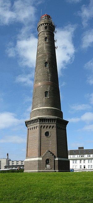
 Info created by Tola69 - uploaded by Tola69 - nominated by Tola69 -- Tola69 (talk) 17:10, 10 December 2008 (UTC)
 Support -- Tola69 (talk) 17:10, 10 December 2008 (UTC)
 Support --Karelj (talk) 22:09, 10 December 2008 (UTC)
 Oppose tilted to the left --AlexanderKlink (talk) 22:40, 10 December 2008 (UTC)
 Oppose - Poor angle and technical quality -- Alvesgaspar (talk) 00:05, 11 December 2008 (UTC)
 Question Alvesgaspar - Considering the subject, what angle would you have used? Ground level camera position? Crane? Helicopter? And what about the technical aspect? Is it exposure? Dynamic range? Lighting? Noise? ISO? Statements like "poor angle" and "technical quality" are so vague as esoteric. Those statements, in keeping with honorable critique practice, should be followed by an explanation that points to specific and relevant elements so as to be useful to the author and the reader, so people can learn from the experience. The lack of specificity is useless, it leaves nothing, it is sterile. --Tomascastelazo (talk) 00:24, 11 December 2008 (UTC)
 Info - Considering the angle, the shot should have been made much further away from the building, IMO. As for the technical e quality, the image could and should be sharper -- Alvesgaspar (talk) 09:23, 12 December 2008 (UTC)
- Camera to subject distance is a valid point, which affects angle and it is valid from the personal preference point of view. If, however, we increase the camera to subject distance, sharpness decreases. Sacrifice sharpness for point of view or sacrifice point of view for sharpness? Image, in my opinion, is sharp enough, and ca be sharpened with photoshop to suit certain reproduction needs. --Tomascastelazo (talk) 18:09, 12 December 2008 (UTC)
 Support in cause of the angle ;-) --Latzel (talk) 07:13, 11 December 2008 (UTC)
 Support An interesting example of a lighthouse. Good lighting, exposure, DOF. Tilted a tiny bit to the left, author should correct this minor aspect. --Tomascastelazo (talk) 14:42, 11 December 2008 (UTC)
 Support Georgez (talk) 20:50, 11 December 2008 (UTC)
 Oppose Awkward perspective and not really sharp for a static object. Lycaon (talk) 22:44, 11 December 2008 (UTC)
 Oppose - angle --Avala (talk) 18:07, 12 December 2008 (UTC)
 Oppose Per Lycaon --Massimo Catarinella (talk) 20:41, 14 December 2008 (UTC)
 Oppose Per Lycaon as well. --MichaelMaggs (talk) 09:38, 16 December 2008 (UTC)
result: 5 support, 6 oppose, 0 neutral => not featured. Simonizer (talk) 20:48, 19 December 2008 (UTC)
Image:S7 Il-86.jpg, not featured[edit]
Voting period ends on 19 Dec 2008 at 20:05:28
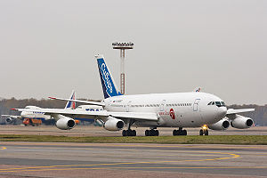
 Info created by Dmitry A. Mottl| - uploaded by Dmitry A. Mottl - nominated by Dmitry A. Mottl| -- Dmitry A. Mottl (talk) 20:05, 10 December 2008 (UTC)
 Support -- Dmitry A. Mottl (talk) 20:05, 10 December 2008 (UTC)
 Oppose Size of image, nothing special - just a picture of aircraft on airport, no wow. --Karelj (talk) 22:13, 10 December 2008 (UTC)
- The picture is 3.84 mp, almost 2 times the 2mp requirement.
 Support Muhammad 04:33, 11 December 2008 (UTC)
 Oppose Exposure, composition, colours. Useful for illustrating but nothing special --Latzel (talk) 07:11, 11 December 2008 (UTC)
 Oppose Sorry - messy background. --MichaelMaggs (talk) 07:25, 11 December 2008 (UTC)
 Oppose Per Latzel0. →Diti the penguin — 08:37, 11 December 2008 (UTC)
 Oppose Georgez (talk) 20:50, 11 December 2008 (UTC)
 Oppose Meh. X! (talk) 00:32, 12 December 2008 (UTC)
 Oppose --Avala (talk) 18:06, 12 December 2008 (UTC)
result: 2 support, 7 oppose, 0 neutral => not featured. Simonizer (talk) 20:49, 19 December 2008 (UTC)
Image:A Wilde time 3.jpg, featured[edit]
Voting period ends on 20 Dec 2008 at 06:07:48
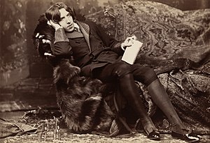
 Info Oscar Wilde, created by Napoleon Sarony (1821-1896) - uploaded by Durova - restored from Image:A Wilde time.jpg by Durova - nominated by Durova -- Durova (talk) 06:07, 11 December 2008 (UTC)
 Support -- Durova (talk) 06:07, 11 December 2008 (UTC)
 Support --MichaelMaggs (talk) 07:24, 11 December 2008 (UTC)
 Support --Tomascastelazo (talk) 14:40, 11 December 2008 (UTC)
 Support --Karelj (talk) 16:00, 11 December 2008 (UTC)
 Support --X! (talk) 00:31, 12 December 2008 (UTC)
 Support good --Mbdortmund (talk) 01:16, 12 December 2008 (UTC)
 Support --Avala (talk) 18:06, 12 December 2008 (UTC)
 Support --Lošmi (talk) 15:58, 13 December 2008 (UTC)
result: 8 support, 0 oppose, 0 neutral => featured. Simonizer (talk) 20:49, 20 December 2008 (UTC)
File:Isla todos santos.jpg, not featured[edit]
Voting period ends on 21 Dec 2008 at 00:05:24
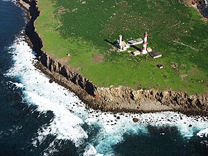
 Info Created, uploaded and nominated by -- Tomascastelazo (talk) 00:05, 12 December 2008 (UTC)
 Support Taken at Todos Santos Island, Ensenada, Baja California, Mexico, using a very big ladder. -- Tomascastelazo (talk) 00:05, 12 December 2008 (UTC)
 Oppose
 Neutral The main subject in the picture isn't the lighthouse, but overall it's still nice. --Mr. Mario (talk) 15:13, 12 December 2008 (UTC)
.svg/15px-Pictogram_voting_comment_(orange).svg.png) Comment That is correct, the main subject in the picture isn't the lighthouse. It is the lighthouse, the greenery, the cliffs, the ocean. The group of elements within a context, with their respective scale and proportion. --Tomascastelazo (talk) 02:49, 12 December 2008 (UTC)
Comment That is correct, the main subject in the picture isn't the lighthouse. It is the lighthouse, the greenery, the cliffs, the ocean. The group of elements within a context, with their respective scale and proportion. --Tomascastelazo (talk) 02:49, 12 December 2008 (UTC)
 Support --Lošmi (talk) 03:55, 12 December 2008 (UTC)
 Oppose - Interesting composition but poor image quality (overall unsharpness and lack of detail). I don't like the harsh shadows of the buildings either. -- Alvesgaspar (talk) 09:19, 12 December 2008 (UTC)
 Support --Karelj (talk) 15:37, 12 December 2008 (UTC)
 Support --Avala (talk) 18:06, 12 December 2008 (UTC)
 Oppose It is a bit too unsharp for me for the size of the photograph. --Estrilda (talk) 07:56, 13 December 2008 (UTC)
 Oppose Per other opposers --Massimo Catarinella (talk) 20:42, 14 December 2008 (UTC)
 Neutral It's a bit nice indeed... Georgez (talk) 22:12, 14 December 2008 (UTC)
 Support Something different... I like it. For an aerial shot, I also thought it was sharp enough. --00:44, 15 December 2008 (UTC)
 Support Aerial views are really beautiful. --ComputerHotline (talk) 10:49, 16 December 2008 (UTC)
 Oppose great composition but quality is too bad in my opinion --Simonizer (talk) 19:14, 16 December 2008 (UTC)
 Support Quality mitigated by difficulty of shot. Freedom to share (talk) 12:27, 20 December 2008 (UTC)
 Oppose The composition doesn't pull me in. There isn't a clear primary subject, and the eye skips between the cliff, the lighthouse, and back again. --MichaelMaggs (talk) 21:44, 20 December 2008 (UTC)
result: 7 support, 5 opposes, 2 neutral => not featured. Lycaon (talk) 00:06, 22 December 2008 (UTC)
There might be perhaps a slight chance that photography does not require one clear subject, don´t you think? If your eye goes back and forward, that suggests that there is movement in the picture. Imagine if one were just to look at a photograph and zoom in in one clear subject. How boring. This photograph illustrates the interaction of several elements, the lighthouse and the cliffs, it speaks of the utilitarian aspect of one of the subjects, hence the eye skiping. Usually they build lighthouses in order to avoid ships crashing into the cliffs, but I guess some of them might be built as pretty props to be featured in Commons. An aerial photograph of such elements provides a visual dimension of these elements that are seldom seen from this perspective and scale. Now, if you no likey, you no likey. --Tomascastelazo (talk) 02:33, 21 December 2008 (UTC)
Image:Gustave Doré - The Holy Bible - Plate I, The Deluge.jpg, featured[edit]
Voting period ends on 21 Dec 2008 at 00:24:46
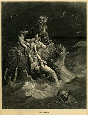
 Info created by Gustave Doré - scanned, uploaded and nominated by Adam Cuerden -- Adam Cuerden (talk) 00:24, 12 December 2008 (UTC)
 Info Special thanks to Mike.lifeguard, who removed some pencil marks just below the image, but above the caption.
 Info From Gustave Doré's illustrations to the Holy Bible. I saw his in a bookshop today - it was fairly expensive, but with a 10% student discount, I could just about afford it, and my long-standing desire to finally get some high-quality Doré featured won out =). I believe the resolution, nearly 30 megapixels, should be sufficient for quite some time.
 Support -- Adam Cuerden (talk) 00:24, 12 December 2008 (UTC)
 SupportThis a true treat, thanks for sharing it.... got any more??? --Tomascastelazo (talk) 02:44, 12 December 2008 (UTC)
- There's about 200 in the volume I just bought. I'm going to try and scan them all, but obviously we probably shouldn't feature them all - I'll try to pick the highlights. =) Adam Cuerden (talk) 04:21, 12 December 2008 (UTC)
 Support --Lošmi (talk) 03:56, 12 December 2008 (UTC)
 Oppose Technically well done, but not my cup of tea. Lycaon (talk) 06:59, 12 December 2008 (UTC)
- Dear Lycaon, It is OK not to like certain type of art, each is entitled to their own taste, or lack of it. Not to like Dore, in this instance, on the personal level, you have that right. There is, however, another side that is much larger than the personal taste: the fact that Dore is one of the Great Masters of engraving, and as such, his work is an inheritance to humanity, and as such, the importance of his work transcends the personal taste of a particular individual. FP is a vehicle that promotes quality images of encyclopaedic value, consistent with the goals of Wikipedia, and I am sure, Dore´s images fall within that category, much more above personal preferences. At the very minumum, you may oppose this particular image based on the technical merits of the digital capture, but according to you, that seems to be OK, but to oppose the image and deprive it of its opportunity for diffussion in this wiki effort seems to me, a little unfair.--Tomascastelazo (talk) 17:20, 12 December 2008 (UTC)
 Oppose per Lycaon --Latzel (talk) 16:16, 12 December 2008 (UTC)
.svg/15px-Pictogram_voting_comment_(orange).svg.png) Comment Adam, Engravings were done at 100% of their mechanical reproduction, this is important considering that the reproduction size also determines in a way the viewing distance. In the case of the bible, the viewing distance would be the reading distance too. If this were always true, a scan of 300 dpi at 100% of original reproduction size would be sufficient. In this case the dpi is at 600 dip at reproduction size, which means that one can get a very fine 16x20 print at 300 dpi, and a decent 32x40 print at 150 dpi, that when viewed at a distance would be fine enough. Point is, keep scanning at this resolution. The only tip I would suggest is to scan in grayscale in order to save space and compress in photoshop at the highest quality. A high quality compression in gray scale will result in a smaller file than a medium to high quality color scan. Unless the color of the paper is important, I would stick to grayscale. In this case the original file is 27.5 megas vs 20.9 megas in grayscale. This is a good opportunity to really have this Great Master in high quality. Another that I would love to see here is some Albretch Durer, which I am sure, you must also love. Keep them coming!!!--Tomascastelazo (talk) 16:49, 12 December 2008 (UTC)
Comment Adam, Engravings were done at 100% of their mechanical reproduction, this is important considering that the reproduction size also determines in a way the viewing distance. In the case of the bible, the viewing distance would be the reading distance too. If this were always true, a scan of 300 dpi at 100% of original reproduction size would be sufficient. In this case the dpi is at 600 dip at reproduction size, which means that one can get a very fine 16x20 print at 300 dpi, and a decent 32x40 print at 150 dpi, that when viewed at a distance would be fine enough. Point is, keep scanning at this resolution. The only tip I would suggest is to scan in grayscale in order to save space and compress in photoshop at the highest quality. A high quality compression in gray scale will result in a smaller file than a medium to high quality color scan. Unless the color of the paper is important, I would stick to grayscale. In this case the original file is 27.5 megas vs 20.9 megas in grayscale. This is a good opportunity to really have this Great Master in high quality. Another that I would love to see here is some Albretch Durer, which I am sure, you must also love. Keep them coming!!!--Tomascastelazo (talk) 16:49, 12 December 2008 (UTC)
- I figured that it's easy to create a greyscale from the colour, but not the other way around, and, as I don't want to scan the book repeatedly - it's 200+ images, after all - that I'd upload a high-res colour version, and people could use photoshop to create an appropriate black-and-white version without the paper texture. Adam Cuerden (talk) 17:35, 12 December 2008 (UTC)
- OK, I was just thinking about space and upload time, but you are right, better in color first and then convert. Man, I´ve been looking over this one and it is just exquisite. I am going to try a 16x20 print with this one. I will look over some of the other engravings and will suggest a few, if you don´t mind. --Tomascastelazo (talk) 17:44, 12 December 2008 (UTC)
- Oh, certainly! Could always use some extra eyes. I cannot guarantee how quick I'll get through them all, but I'll try to get the Pentaeuch done before Christmas, possibly Matthew as well (for obvious reasons). Adam Cuerden (talk) 19:00, 12 December 2008 (UTC)
- I figured that it's easy to create a greyscale from the colour, but not the other way around, and, as I don't want to scan the book repeatedly - it's 200+ images, after all - that I'd upload a high-res colour version, and people could use photoshop to create an appropriate black-and-white version without the paper texture. Adam Cuerden (talk) 17:35, 12 December 2008 (UTC)
![]() Comment Simply because this is non photographic media is no reason to oppose such a technically and asthetically pleasing piece of work. Bravo to the creator! 203.35.135.136 07:45, 20 December 2008 (UTC)
Comment Simply because this is non photographic media is no reason to oppose such a technically and asthetically pleasing piece of work. Bravo to the creator! 203.35.135.136 07:45, 20 December 2008 (UTC)
 Support Very wowwish! Muhammad 17:11, 12 December 2008 (UTC)
 Support --Aqwis (talk) 20:34, 12 December 2008 (UTC)
 Support Agree with both Lycaon and Tomascastelazo - not exactly my cup of tea, but I have to admire the quality of the image and its encyclopedic value. --AlexanderKlink (talk) 11:30, 13 December 2008 (UTC)
 Support a stunningly dramatic image. God having declared these people wicked and unfit for life are still trying against all hope to save their children. The scan is flawless and I can't find anything to complain about.... and I sure look when it's not something commons has produced. --J.smith (talk) 15:16, 14 December 2008 (UTC)
 Oppose Georgez (talk) 22:13, 14 December 2008 (UTC)
 Support --Massimo Catarinella (talk) 00:33, 15 December 2008 (UTC)
 Support Both artistically and technically extremely good. --MichaelMaggs (talk) 22:31, 15 December 2008 (UTC)
result: 9 support, 3 opposes, 0 neutral => featured. Lycaon (talk) 00:08, 22 December 2008 (UTC)
Image:Dmitry Medvedev official large photo -1.jpg, not featured[edit]
Voting period ends on 21 Dec 2008 at 18:21:44

 Info created by Presidential Press and Information Office - uploaded by Russavia - nominated by Avala -- Avala (talk) 18:21, 12 December 2008 (UTC)
 Support -- Avala (talk) 18:21, 12 December 2008 (UTC)
 Oppose -- I don't like the cutting around the hair. --Villy Fink Isaksen (talk) 19:18, 12 December 2008 (UTC)
 Oppose, the cutting is terrible. Why didn't they use a white background instead? --Aqwis (talk) 20:34, 12 December 2008 (UTC)
 Oppose (formerly FPX) Image does not fall within the guidelines, the image is poorly masked Lycaon (talk) 20:41, 12 December 2008 (UTC)
 Support Good James Bond-type portrait of one of today's world leaders. Yes the soft edges are terrible, but it seems to be the best picture of this guy. --Tomascastelazo (talk) 02:20, 13 December 2008 (UTC)
- A leader?! You mean a marionette, right? (scnr) --AngMoKio (talk) 12:05, 14 December 2008 (UTC)
- If it is the best picture on Commons of this guy, it could do well at COM:VI. But being the "best on Commons" is not a criterion for acceptance as a FP. --MichaelMaggs (talk) 09:32, 16 December 2008 (UTC)
 Oppose The edges kill the picture. --Lošmi (talk) 03:08, 13 December 2008 (UTC)
 Oppose The soft edges are indeed unfortunate. --Estrilda (talk) 07:50, 13 December 2008 (UTC)
 Oppose As per the edging on the photo. IMO, this is a much better photo. --russavia (talk) 09:26, 13 December 2008 (UTC)
 Oppose Agree with russavia. --AlexanderKlink (talk) 10:12, 13 December 2008 (UTC)
- Well Putin is blurry in that other photo.--Avala (talk) 20:52, 13 December 2008 (UTC)
- You'll find that is probably supposed to be like that. This is a photo which was done for Medved's presidential campaign. If you followed the election you'll know that the campaign was built around them being a 'team', but you will notice how Medved is placed out in the front of the photo, whilst Putin is in the background; perhaps this matches the reality somewhat. --russavia (talk) 16:51, 14 December 2008 (UTC)
- Well Putin is blurry in that other photo.--Avala (talk) 20:52, 13 December 2008 (UTC)
 Oppose agree with Lycaon. --AngMoKio (talk) 12:10, 14 December 2008 (UTC)
 Oppose Georgez (talk) 22:14, 14 December 2008 (UTC)
result: 2 support, 9 opposes, 0 neutral => not featured. Lycaon (talk) 00:09, 22 December 2008 (UTC)
File:Lauhanvuori Kivijata 3 without grass.jpg, not featured[edit]
Voting period ends on 21 Dec 2008 at 20:35:14
 Info created by Roquai - uploaded by Roquai - nominated by Joku Janne --Joku Janne (talk) 20:35, 12 December 2008 (UTC)
 Info Same as File:Lauhanvuori Kivijata 3.jpg but without grass in the right top corner. Some users said that the grass in the corner ruins the composition.
 Support --Joku Janne (talk) 20:35, 12 December 2008 (UTC)
 Oppose Same as before, with or without grass. --Karelj (talk) 22:21, 12 December 2008 (UTC)
 Oppose It has no "WOW" factor. --Mr. Mario (talk) 02:10, 13 December 2008 (UTC)
 Info - Last edit was undone by me. No anonymous votes are considered and the only way to remove a FPX template is with a support vote -- Alvesgaspar (talk) 10:11, 14 December 2008 (UTC)
 Support If it is the only way to oppose FPX, I will do support. "No wow factor" is so subjective that it can't be an acceptable argument to make an FPX reject. Sorry but they are problems of logging by now and that's why my signature has not been recognized B.navez 11:14, 14 December 2008 (UTC)~
 Oppose Though I agree with Mr. Mario about the lack of wow, this is indeed not an FPX criterion. Lycaon (talk) 13:02, 14 December 2008 (UTC)
 Oppose No wow factor. X! (talk) 18:17, 14 December 2008 (UTC)
 Oppose Georgez (talk) 22:14, 14 December 2008 (UTC)
result: 2 support, 5 opposes, 0 neutral => not featured. Lycaon (talk) 00:12, 22 December 2008 (UTC)
File:Monterey a rock with bird+their crap.jpg, not featured[edit]
Voting period ends on 22 Dec 2008 at 01:27:00
 Info created by Mr. Mario (talk) - uploaded by Mr. Mario (talk) - nominated by Mr. Mario (talk) -- Mr. Mario (talk) 01:27, 13 December 2008 (UTC)
 Support -- Mr. Mario (talk) 01:27, 13 December 2008 (UTC)
 Oppose well, it's a rock with birds and their crap, nothing spectacular. Plus I don't like the crop --AlexanderKlink (talk) 10:12, 13 December 2008 (UTC)
 Oppose, too tight crop, uninteresting subject and dull lighting. --Aqwis (talk) 23:47, 13 December 2008 (UTC)
 Oppose the composition of this image is quite lacking and the subject lacks interest. Also, I think the educational value is a bit limited in this case. But, on that note, I could be wrong. Maybe I just don't get it? -J.smith (talk) 15:21, 14 December 2008 (UTC)
 Oppose Georgez (talk) 22:15, 14 December 2008 (UTC)
result: 1 support, 4 opposes, 0 neutral => not featured (rule of the 5th day). Lycaon (talk) 17:15, 21 December 2008 (UTC)
File:Tobiko on grilled Albacore.jpg, not featured[edit]
Voting period ends on 22 Dec 2008 at 23:14:46
 Info created by, uploaded by and nominated by J.smith. -- J.smith (talk) 23:14, 13 December 2008 (UTC)
 Info Tobiko (flying fish roe) is a delicacy in Japan. It was on my Sashimi and it has a great smoky/salty flavor. The eggs are approximately .5 - .8 mm in diameter. To get an idea of the scale, the white circles (green onion?) are approximately the size of a pencil eraser. J.smith (talk) 23:14, 13 December 2008 (UTC)
 Support, of course. -- J.smith (talk) 23:14, 13 December 2008 (UTC)
 Support --Kanonkas(talk) 19:38, 14 December 2008 (UTC)
 Support ■ MMXXtalk 20:53, 14 December 2008 (UTC)
 Oppose Felt like a clash of too many colors to me. --JalalV (talk) 00:32, 15 December 2008 (UTC)
- I'm not sure how to respond to that. Would you prefer a B&W version? --J.smith (talk) 01:01, 15 December 2008 (UTC)
- Alright, I'll try be more specific as it is a good quality macro shot. I had an emotional reaction to the picture that it "clashed", hence my comment above. After looking it over in more detail, I believe it it the mayonnaise on the left side that puts me off. I much prefer the following crop: Image:Tobiko_on_grilled_Albacore-edit.png --JalalV (talk) 03:07, 15 December 2008 (UTC)
- I'm not sure how to respond to that. Would you prefer a B&W version? --J.smith (talk) 01:01, 15 December 2008 (UTC)
 Oppose Suboptimal lighting (too dark left bottom quarter) and not crisp enough. Seems yummy though. Lycaon (talk) 13:26, 15 December 2008 (UTC)
 Oppose Lower left not sharp enough. --Mbdortmund (talk) 23:32, 15 December 2008 (UTC)
 Oppose My first reaction was also that it was too dark at the bottom left. /Daniel78 (talk) 09:14, 18 December 2008 (UTC)
result: 3 support, 4 oppose, 0 neutral => not featured. Simonizer (talk) 10:54, 23 December 2008 (UTC)
Image:Jacksonville Skyline Panorama 3.jpg, not featured[edit]
Voting period ends on 22 Dec 2008 at 23:46:21

 Info created by Digon3 - uploaded by Digon3 - nominated by Avala -- Avala (talk) 23:46, 13 December 2008 (UTC)
 Support it is already listed as quality and I think it deserves the FP status. -- Avala (talk) 23:46, 13 December 2008 (UTC)
 Support - a flawless stitch, interesting sky and very well composed. --J.smith (talk) 15:09, 14 December 2008 (UTC)
 Support - Very well made image, interesting. X! (talk) 18:16, 14 December 2008 (UTC)
 Oppose. Bland and unappealing lighting, crooked verticals, substandard resolution for a pano, soft focus, washed out. This one by the same user is better. --Dschwen (talk) 19:45, 14 December 2008 (UTC)
 Oppose Per Dschwen --Massimo Catarinella (talk) 20:43, 14 December 2008 (UTC)
- If this photo really suffered such flaws, it would have never been listed as quality image.--Avala (talk) 21:35, 14 December 2008 (UTC)
- Mistakes happen. QI is a fixed quality standard, which despite requesting a higher resolution than the minimum resolution of FPC, is not that strict. FPs should be the best pictures in their area. If there is a very similar better shot by the same photographer, this image should not get promoted with the enumerated shortcomings. --Dschwen (talk) 13:44, 15 December 2008 (UTC)
- If this photo really suffered such flaws, it would have never been listed as quality image.--Avala (talk) 21:35, 14 December 2008 (UTC)
 Support Georgez (talk) 22:16, 14 December 2008 (UTC)
 Oppose I do not like images with this dimensions ratio. Poor composition - everything is on horizont. --Karelj (talk) 23:29, 14 December 2008 (UTC)
 Oppose As opposers above. --JalalV (talk) 03:24, 15 December 2008 (UTC)
.svg/15px-Pictogram_voting_comment_(orange).svg.png) Comment I don't think this picture should be featured. It was taken with my older 4 megapixel camera and doesn't have that good of quality as mentioned by Dschwen (plus there is one stitching error). I don't know why I have not made a panorama of the skyline with my new camera, I will probably do that soon. --Digon3 talk 06:52, 19 December 2008 (UTC)
Comment I don't think this picture should be featured. It was taken with my older 4 megapixel camera and doesn't have that good of quality as mentioned by Dschwen (plus there is one stitching error). I don't know why I have not made a panorama of the skyline with my new camera, I will probably do that soon. --Digon3 talk 06:52, 19 December 2008 (UTC)
result: 4 support, 4 oppose, 0 neutral => not featured. Simonizer (talk) 10:55, 23 December 2008 (UTC)
File:Old wooden door detail.jpg, not featured[edit]
Voting period ends on 23 Dec 2008 at 23:53:29
 Info created, uploaded and nominated by -- Tomascastelazo (talk) 23:53, 14 December 2008 (UTC)
 Support -- Tomascastelazo (talk) 23:53, 14 December 2008 (UTC)
 Oppose I'm sorry, but nothing pulls me in to the photo. --JalalV (talk) 00:23, 15 December 2008 (UTC)
 Oppose - Unacceptable softness for a motionless subject (camera shake?) -- Alvesgaspar (talk) 10:16, 15 December 2008 (UTC)
 Oppose Blurry indeed. Please categorize. Lycaon (talk) 13:24, 15 December 2008 (UTC)
.svg/15px-Pictogram_voting_comment_(orange).svg.png) Comment Lycaon, Either check your monitor for it may be fuzzy or old. Print it at 300 dpi if you have a good or decent printer. I´ve notice that you often mention blurriness. I can resolve small lines that must be 1/50th of a millimiter on a print. You know how equipment is, it gets old too fast. --Tomascastelazo (talk) 16:15, 15 December 2008 (UTC)
Comment Lycaon, Either check your monitor for it may be fuzzy or old. Print it at 300 dpi if you have a good or decent printer. I´ve notice that you often mention blurriness. I can resolve small lines that must be 1/50th of a millimiter on a print. You know how equipment is, it gets old too fast. --Tomascastelazo (talk) 16:15, 15 December 2008 (UTC)
 Oppose It is not particularly sharp. --Massimo Catarinella (talk) 16:25, 15 December 2008 (UTC)
 Oppose Nothing special, for me there is no reason for nomination for FP. --Karelj (talk) 19:17, 15 December 2008 (UTC)
 Oppose Georgez (talk) 20:33, 15 December 2008 (UTC)
result: 1 support, 6 opposes, 0 neutral => not featured (rule of the 5th day). -- Lycaon (talk) 17:16, 21 December 2008 (UTC)
File:Old truck window.jpg, not featured[edit]
Voting period ends on 24 Dec 2008 at 00:31:22
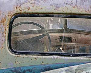
 Info created, uploaded and nominated by -- Tomascastelazo (talk) 00:31, 15 December 2008 (UTC)
 Support -- Tomascastelazo (talk) 00:31, 15 December 2008 (UTC)
 Oppose Didn't like composition. --JalalV (talk) 03:19, 15 December 2008 (UTC)
 Oppose Georgez (talk) 20:34, 15 December 2008 (UTC)
 Oppose Composition. --MichaelMaggs (talk) 22:26, 15 December 2008 (UTC)
 Oppose Normal picture. Sh1019 (talk) 04:56, 17 December 2008 (UTC)
result: 1 support, 4 opposes, 0 neutral => not featured (rule of the 5th day). -- Lycaon (talk) 17:17, 21 December 2008 (UTC)
Image:Edificios-Calle50Panamá.jpg, not featured[edit]
Voting period ends on 25 Dec 2008 at 20:47:53
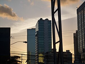
 Info created by 123Hollic - uploaded by 123Hollic - nominated by 123Hollic -- 123Hollic (talk) 03:09, 16 December 2008 (UTC)123Hollic (talk) 02:45, 16 December 2008 (UTC)
 Support -- 123Hollic (talk) 03:09, 16 December 2008 (UTC) 123Hollic (talk) 02:45, 16 December 2008 (UTC)
 Oppose Composition - sorry. The vertical gantry divides the image into two unconnected parts. --MichaelMaggs (talk) 08:44, 16 December 2008 (UTC)
 Oppose per Michael --Herrick (talk) 10:04, 16 December 2008 (UTC)
 Oppose agree with Michael. --Maderibeyza (talk) 12:42, 17 December 2008 (UTC)
 Oppose nondescript, unfocused. --JY REHBY (discuter) 18:05, 17 December 2008 (UTC)
 Oppose Georgez (talk) 18:57, 17 December 2008 (UTC)
 Neutral Its more like artistic imagine, than somethink for Wikimedia. Well not bad, quite difficult composition.--Juan de Vojníkov (talk) 13:45, 18 December 2008 (UTC)
 Oppose per Michael —kallerna™ 15:48, 21 December 2008 (UTC)
result: 1 support, 6 oppose, 1 neutral => not featured. Simonizer (talk) 10:57, 23 December 2008 (UTC) (Rule of the 5th day)
File:Thomas Bresson - Silene (by).jpg, not featured[edit]
Voting period ends on 25 Dec 2008 at 14:30:40
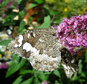
 Info created by Thomas Bresson - uploaded by Thomas Bresson - nominated by Thomas Bresson -- ComputerHotline (talk) 14:30, 16 December 2008 (UTC)
 Support -- ComputerHotline (talk) 14:30, 16 December 2008 (UTC)
 Neutral Georgez (talk) 19:01, 17 December 2008 (UTC)
 Question Could you provide more description, please? Including English and scientific name of the species. The support flower would be nice to know too. Thanks!--Juan de Vojníkov (talk) 13:31, 18 December 2008 (UTC)
 Oppose bad background to the main object. There is to much white on the butterfly.--Juan de Vojníkov (talk) 13:31, 18 December 2008 (UTC)
 Oppose Oppose as previous opposer. --JalalV (talk) 14:01, 18 December 2008 (UTC)
result: 1 support, 2 oppose, 1 neutral => not featured. Simonizer (talk) 10:58, 23 December 2008 (UTC) (Rule of the 5th day)
File:Prokudin-Gorskii-09-edit2.jpg, not featured[edit]
Voting period ends on 26 Dec 2008 at 03:06:01
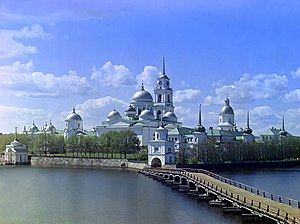
 Info created by en:Sergey Prokudin-Gorsky - uploaded by Gorgo - nominated by Russavia -- russavia (talk) 03:06, 17 December 2008 (UTC)
 Support -- russavia (talk) 03:06, 17 December 2008 (UTC)
 Oppose -- The file not good quality and picture not clear. Sh1019 (talk) 04:48, 17 December 2008 (UTC)
 Oppose -- nice composition but tilted and noise, sorry --ianaré (talk) 04:53, 17 December 2008 (UTC)
- Comment You guys do realise who the photos are by and the history behind these colour photos? If Prokudin-Gorsky can't become featured on Commons, there is something seriously wrong here. --russavia (talk) 15:56, 17 December 2008 (UTC)
- So you noticed? Leonardo, Michaelangelo, Ansel Adams, Durer, etc., etc., don't have a chance here at all... Their work is too old, too small or may be even cracking... ;o) --Tomascastelazo (talk) 02:28, 18 December 2008 (UTC)
 Oppose Poor image quality. Georgez (talk) 19:05, 17 December 2008 (UTC)
- Alternative An alternative would be File:Nilo-Stolobensky monastery.png. This is the image as it was originally developed using the 3 negatives. This IMO is a better image to demonstrate the work, in that the composition of the monastery is there, but the lakefront also shows the ghosting which was inevitably resulting in this revolutionary method of colour photography in the early 1900s. Remember such images were made in the 1900s using new methods for colour photography; long before the advent of digital photograhy. --russavia (talk) 19:21, 17 December 2008 (UTC)
- this helps as far as understanding the process better but I still think the scan was not the best. That the original image is a little fuzzy due to a then-new process is entirely forgivable (and in fact adds to the image in a way), however the noise in the image is digital noise resulting from improper scanning equipment or settings, and as such is not so easily forgivable. I did look at the 'originals' from the source site, and they are also very noisy, especially considering it's a 28mb tiff. Maybe the guy doing the scanning was having a bad day or something. Anyway, I think what would be needed here is a little loving care and restoration, performed by someone much more talented than I, unfortunately. ianaré (talk) 21:52, 17 December 2008 (UTC)
 Oppose not sharp.--Juan de Vojníkov (talk) 13:25, 18 December 2008 (UTC)
 Oppose, per Georgez. —kallerna™ 15:45, 21 December 2008 (UTC)
result: 1 support, 5 oppose, 0 neutral => not featured. Simonizer (talk) 10:59, 23 December 2008 (UTC) (Rule of the 5th day)
File:Aleurites moluccana edit.png, not featured[edit]
Voting period ends on 27 Dec 2008 at 15:35:18
 Info created by Shahibbul - uploaded by A302b - nominated by JalalV -- JalalV (talk) 15:35, 18 December 2008 (UTC)
.svg/15px-Pictogram_voting_comment_(orange).svg.png) Comment There were three images currently nearing the end of voting that I felt would have been good candidates with just a little cropping or editing. So I am adding edited versions here. Am adding now, as plan to be away for a few days. JalalV (talk) 15:35, 18 December 2008 (UTC)
Comment There were three images currently nearing the end of voting that I felt would have been good candidates with just a little cropping or editing. So I am adding edited versions here. Am adding now, as plan to be away for a few days. JalalV (talk) 15:35, 18 December 2008 (UTC) Support -- JalalV (talk) 15:35, 18 December 2008 (UTC)
 Oppose Badly lit, poor background, small size. Lycaon (talk) 19:36, 18 December 2008 (UTC)
 Oppose to Lycaon, do not cropp it,
 when having lower resolution next time.--Juan de Vojníkov (talk) 22:06, 18 December 2008 (UTC) Oppose Too small. Georgez (talk) 15:20, 20 December 2008 (UTC)
result: 1 support, 3 oppose, 0 neutral => not featured. Simonizer (talk) 11:00, 23 December 2008 (UTC) (Rule of the 5th day)
File:Domestic cat felis catus.jpg, not featured[edit]
Voting period ends on 27 Dec 2008 at 18:14:59
 Info created, uploaded and nominated by Muhammad Mahdi Karim -- Muhammad 18:14, 18 December 2008 (UTC)
 Support -- Muhammad 18:14, 18 December 2008 (UTC)
 Oppose licensing says For any other concerns, such as need for a higher resolution version of the image, or a commercial license, contact me through my talk page or e-mail me(my emphasis) puts this outside of Commons licensing requirements, while it has a GNU/GFDL license box this tag is included within that, potential FP should have unambiguous licenses. Gnangarra 02:22, 19 December 2008 (UTC)
- I do not believe that is the case. A release under GFDL is non-revocable and no other message on the page can "take it back". Besides, I'm sure the message on the image page refers to acquiring permission to use the image in an unrestricted manner for situations where GFDL is impractical. J.smith (talk) 06:38, 19 December 2008 (UTC)
 Oppose - The head is nice but the body of the animal spoils the composition. -- Alvesgaspar (talk) 21:34, 19 December 2008 (UTC)
 Oppose Composition. Georgez (talk) 15:26, 20 December 2008 (UTC)
 Oppose —kallerna™ 15:44, 21 December 2008 (UTC)
result: 1 support, 4 oppose, 0 neutral => not featured. Simonizer (talk) 11:00, 23 December 2008 (UTC) (Rule of the 5th day)
File:Tarnów, centrum města, Rynek, vchod do radnice.JPG, not featured[edit]
Voting period ends on 27 Dec 2008 at 22:29:35
 Info created by Aktron - uploaded by Aktron - nominated by Aktron -- Aktron (talk) 22:29, 18 December 2008 (UTC)
 Support -- Aktron (talk) 22:29, 18 December 2008 (UTC)
 Question isn't it slightly tilted to the right ? Otherwise, a fine picture, contrast is vivid and colors are well defined, yet on the muffled side, sharpness is ok. --JY REHBY (discuter) 23:57, 18 December 2008 (UTC)
 Oppose tilt and composition the portions of stairs are a distraction notably the 10% of step at bottom. Gnangarra 02:09, 19 December 2008 (UTC)
.svg/15px-Pictogram_voting_comment_(orange).svg.png) Comment good picture, but tilt should be corrected --Mbdortmund (talk) 11:20, 19 December 2008 (UTC)
Comment good picture, but tilt should be corrected --Mbdortmund (talk) 11:20, 19 December 2008 (UTC) Oppose, per Gnangarra. Also, I find the image, overall, somewhat less than stunning. Sorry. - Anonymous DissidentTalk 11:35, 19 December 2008 (UTC)
 Neutral - Well, I like this image. Yes, it might benefict from a little crop at the bottom and the colours seem a bit sad. But my main concern is focus (especially the stairs). Why use this exposure choice? -- Alvesgaspar (talk) 21:26, 19 December 2008 (UTC)
result: 1 support, 2 oppose, 1 neutral => not featured. Simonizer (talk) 11:01, 23 December 2008 (UTC) (Rule of the 5th day)
Image:NGC 1672 HST.jpg, Replaced[edit]
Voting period ends on 16 Dec 2008 at 11:47:14
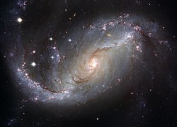

 Info The proposed replacement is the exact same picture, only about 5 times larger (and in this case definitely five times better). I also thought that maybe since it's the same picture it'd be appropriate to just move all the assessments of the current FP to the higher res version. (Original nomination)
 Delist or upload over the old one -- diego_pmc (talk) 11:47, 7 December 2008 (UTC)
 Delist and replace -- Manuel R. (talk) 12:44, 7 December 2008 (UTC)
 Upload over the old one Or maybe we can upload and store lowres versions for every conceivable use ;-(. Lycaon (talk) 14:54, 7 December 2008 (UTC)--
 Delist and replace – Also the higher res picture seems to be sharper. – Jerryteps 23:52, 8 December 2008 (UTC)
.svg/15px-Pictogram_voting_comment_(orange).svg.png) Comment Shouldn't you separate nominations? (Example: This would turn into this) --Mr. Mario (talk) 04:03, 9 December 2008 (UTC)
Comment Shouldn't you separate nominations? (Example: This would turn into this) --Mr. Mario (talk) 04:03, 9 December 2008 (UTC)
- I honestly think this would just complicate things a lot for everybody. diego_pmc (talk) 06:44, 9 December 2008 (UTC)
 Delist and replace. I'm not too worried about the mechanics of the procedure as long as there are enough votes. --MichaelMaggs (talk) 07:23, 11 December 2008 (UTC)
 Delist and replace In that case... --Mr. Mario (talk) 00:26, 12 December 2008 (UTC)
 Delist and replace --Mbdortmund (talk) 01:21, 12 December 2008 (UTC)
 Question Please also mention if you agree to move all the assessments to the higher resolution version. diego_pmc (talk) 06:08, 12 December 2008 (UTC)
.svg/15px-Pictogram_voting_comment_(orange).svg.png) Comment Frankly if it is the same image, from the same source, but higher resolution, I would just upload it over the original and mark the existing hi-res one as a duplicate. Delisting this one and copying across the assessments is not an appropriate way to do things. If there is a suggestion that the smaller version has been processed in ways other than simple scaling then the hi-res version should be nominated for FP, and this one would only be delisted if that nomination succeeds. --Tony Wills (talk) 00:50, 13 December 2008 (UTC)
Comment Frankly if it is the same image, from the same source, but higher resolution, I would just upload it over the original and mark the existing hi-res one as a duplicate. Delisting this one and copying across the assessments is not an appropriate way to do things. If there is a suggestion that the smaller version has been processed in ways other than simple scaling then the hi-res version should be nominated for FP, and this one would only be delisted if that nomination succeeds. --Tony Wills (talk) 00:50, 13 December 2008 (UTC)
-
- That's not quite the same, that is talking about 'improved' versions of images, which always need evalution. But Commons always treats scaled down versions of images as duplicates of the original. Delist and replace as is being suggested here is a new arbitary process that is not appropriate. So I reiterate, if they are just scaled versions of the same image then the solution is simple. If there are processing differences then it is just a normal situation - nominate the new version and delist the old one if the new 'improved' one succeeds. --Tony Wills (talk) 19:00, 14 December 2008 (UTC)
 Delist and replace --AlexanderKlink (talk) 10:06, 13 December 2008 (UTC)
Replaced -- Lycaon (talk) 18:03, 21 December 2008 (UTC)
Image:Cartesian Theater.svg[edit]
Voting period ends on 19 Dec 2008 at 08:21:18
Original nom[edit]
 Info This image is an SVG redraw of Image:Cartesian Theater.jpg by Reverie, which is a FP (see nom). Although I am only proposing this one to be a FP, maybe a possible delist and replace? Created by Pbroks13 - uploaded by Pbroks13 - nominated by Pbroks13 -- Pbroks13 (talk) 08:21, 10 December 2008 (UTC)
 Support -- Pbroks13 (talk) 08:21, 10 December 2008 (UTC)
 Oppose A302b (talk) 09:12, 10 December 2008 (UTC)
 Support --Latzel (talk) 14:46, 10 December 2008 (UTC)
.svg/15px-Pictogram_voting_comment_(orange).svg.png) Comment Would you mind moving it to Delist and replace? I think it is more consistent than the current FP and could replace it. Lycaon (talk) 22:49, 10 December 2008 (UTC)
Comment Would you mind moving it to Delist and replace? I think it is more consistent than the current FP and could replace it. Lycaon (talk) 22:49, 10 December 2008 (UTC)
Delist and replace nom, not replaced[edit]
 Delist and replace -- Pbroks13 (talk) 03:51, 11 December 2008 (UTC)
 Delist and replace -- Lycaon (talk) 07:10, 11 December 2008 (UTC)
 Delist and replace --MichaelMaggs (talk) 07:22, 11 December 2008 (UTC)
 Delist and replace --Mr. Mario (talk) 15:22, 11 December 2008 (UTC)
 Delist and replace --AlexanderKlink (talk) 10:07, 13 December 2008 (UTC)
 Delist and replace --Latzel (talk) 13:39, 13 December 2008 (UTC)
 Keep Original: While the SVG is largely good, the lack of detail in the thing the person is seeing is very damaging - the frying egg in the theatre projection, for instance, lacks a good view of the pan handle; the pan on the stove is squashed flat, having no sides, and the new, black stove lacks contrast with the pan. The photographic images are far, far superior to the SVG versions, while they're replaceable, we should expect better than this. Adam Cuerden (talk) 05:32, 17 December 2008 (UTC)
 Keep I agree. I prefer the look of the old one. --Lošmi (talk) 19:06, 17 December 2008 (UTC)
 Keep Adam has a valid point - did not notice that before --AlexanderKlink (talk) 22:52, 17 December 2008 (UTC)
 I withdraw my nomination Very valid point. If I get a chance, I'll be sure to try to fix the problems noted above and renominate it. Thanks! Pbroks13 (talk) 08:21, 19 December 2008 (UTC)
Haha, and besides it ends right now. My clock is apparently -5 hours from this. Oh well, thanks again. Pbroks13 (talk) 08:23, 19 December 2008 (UTC)
result: witdrawn => not replaced. --Simonizer (talk) 11:33, 23 December 2008 (UTC)
File:Don Quixote 1.jpg, delisted[edit]
Voting period ends on 21 Dec 2008 at 00:05:57
 Info I think we can all agree that, while the original work has merit, this resolution (959 × 1,210) has long ago ceased to be acceptable, particularly in an engraving. (Original nomination)
 Delist -- Adam Cuerden (talk) 00:05, 12 December 2008 (UTC)
 Delist --Lošmi (talk) 18:47, 12 December 2008 (UTC)
 Delist --Mr. Mario (talk) 02:15, 13 December 2008 (UTC)
 Delist --AlexanderKlink (talk) 10:08, 13 December 2008 (UTC)
 Delist --Karelj (talk) 19:30, 15 December 2008 (UTC)
 Delist Sh1019 (talk) 04:43, 17 December 2008 (UTC)
result: 6 Delist, 0 Keep, 0 neutral => delisted. --Simonizer (talk) 11:34, 23 December 2008 (UTC)
Delist and replace nom, not replaced[edit]
 Delist and replace
- That's not really a fantastic scan, though. Obviously, I agree the underlying image deserves featuring, but the quality of the reproduction does need considered. Adam Cuerden (talk) 04:23, 12 December 2008 (UTC)
- I guess your right. Comparing to other scans of similar type, this one isn't so good. It would be great to have it in good quality, though. --Lošmi (talk) 18:46, 12 December 2008 (UTC)
- Definitely. If I can find it, I'll be sur eto get it, but I believe it was only used in a french-language edition, so... Adam Cuerden (talk) 19:47, 12 December 2008 (UTC)
- I guess your right. Comparing to other scans of similar type, this one isn't so good. It would be great to have it in good quality, though. --Lošmi (talk) 18:46, 12 December 2008 (UTC)
- That's not really a fantastic scan, though. Obviously, I agree the underlying image deserves featuring, but the quality of the reproduction does need considered. Adam Cuerden (talk) 04:23, 12 December 2008 (UTC)
result: 0 Delist, 0 Keep, 0 neutral => not replaced. --Simonizer (talk) 11:35, 23 December 2008 (UTC)
Image:FL Alligator 1.jpg, not featured[edit]
Voting period ends on 23 Dec 2008 at 19:19:32
 Info created by Daniel Schwen - uploaded by Daniel Schwen - nominated by User:AlexanderKlink -- AlexanderKlink (talk) 19:19, 14 December 2008 (UTC)
 Support. Saw this over at COM:QIC, gave me quite a chill -- AlexanderKlink (talk) 19:19, 14 December 2008 (UTC)
 Support Love crocs! --Tomascastelazo (talk) 21:51, 14 December 2008 (UTC)
 Support Fantastic textures. Parrot of Doom (talk) 21:57, 14 December 2008 (UTC)
 Oppose Georgez (talk) 22:17, 14 December 2008 (UTC)
 Support --JalalV (talk) 00:27, 15 December 2008 (UTC)
 Support wow! --Lošmi (talk) 04:31, 15 December 2008 (UTC)
 Oppose DOF is not sufficient here. That the back of the animal is not in focus is acceptable, but the tip of the snout at least should have been sharp. Borderline case for me as the colours and composition are fine. Lycaon (talk) 07:59, 15 December 2008 (UTC)
- Photographig crocs poses a challenge for many reasons. First, they tend to move. Second, one has to use medium to long telephoto, which have an inherent shallow dept of field. Photographers know that from the photographic point of view, when you focus on a particular point, whatever depth of field that is available according to the focal length and the aperture, one third of the critical focus area obtained with that particular aperture will move towards the front, and two thirds will fall back towards the rear. If the critical focus would have been done on the snout, the snout would have looked good, but critical focus would have started to fall off toward the back, the eyes woulf have had a soft focus and the tail would have been really out of focus, the critical focus on the snout would have given us worthless sharp water in front. As it is here, the critical focus was done intelligently around the eyes, thus allowing the focus to fall off gradually into the snout and the back, rendering a very acceptable general sharpness. Composition is great, a very dynamic diagonal, nice texture and simple environment. --Tomascastelazo (talk) 16:24, 15 December 2008 (UTC)
 Support --Böhringer (talk) 11:31, 15 December 2008 (UTC)
 Oppose What is the liquid, in which this poor animal is swimming? Looks like some crude oil distillation product. Aircraft kerosene? Diesel oil? --Karelj (talk) 12:18, 15 December 2008 (UTC)
- What are you talking about?? --Dschwen (talk) 13:11, 15 December 2008 (UTC)
- That's the normal color of the mud soup we have for water in the 'glades. ianaré (talk) 00:23, 17 December 2008 (UTC)
- So it was just a drive-by oppose with a useless made-up reason. Not very courteous :-(. --Dschwen (talk) 17:26, 19 December 2008 (UTC)
- OK, sorry for hoke (we have some samples of aircraft petrol in our laboratory now and it looks very similar) but anyway I think, that this image quality is enough for FP. --Karelj (talk) 23:07, 21 December 2008 (UTC)
 Support --Mbdortmund (talk) 23:31, 15 December 2008 (UTC)
 Support The focus is on the eye, which is where it should be. Great composition. --MichaelMaggs (talk) 09:27, 16 December 2008 (UTC)
 Oppose technical excellence as always, but I find the composition a bit too boring for FP. --ianaré (talk) 00:23, 17 December 2008 (UTC)
 Oppose As Ianare. /Daniel78 (talk) 09:12, 18 December 2008 (UTC)
 Support Good quality and nice wow! Also spooky Muhammad 16:50, 19 December 2008 (UTC)
 Oppose Imo, DOF is not sufficient, sure there was a practical limit on this, but aperture could go to atleast f/11 without running into diffraction issues if not more. The focus is on the right point and this is a valuable image but the DOF kills it for me sorry. Flying Freddy (talk) 00:27, 20 December 2008 (UTC)
result: 9 support, 6 oppose, 0 neutral => not featured. Simonizer (talk) 19:32, 25 December 2008 (UTC)
File:NYSEWallStreet.jpg, not featured[edit]
Voting period ends on 23 Dec 2008 at 20:38:23
 Info created, uploaded and nominated by Massimo Catarinella -- Massimo Catarinella (talk) 20:38, 14 December 2008 (UTC)
 Support -- Massimo Catarinella (talk) 20:38, 14 December 2008 (UTC)
 Oppose Georgez (talk) 22:16, 14 December 2008 (UTC)
 Oppose Considering the times...--Tomascastelazo (talk) 01:19, 15 December 2008 (UTC)
 Support very symbolic of current times ianaré (talk) 04:51, 17 December 2008 (UTC)
 Oppose composition -- Gorgo (talk) 19:36, 22 December 2008 (UTC)
result: 2 support, 3 oppose, 0 neutral => not featured. Simonizer (talk) 19:34, 25 December 2008 (UTC)
Image:Owl on old treetrunk.jpg, not featured[edit]
Voting period ends on 23 Dec 2008 at 21:23:05
 Info created by Vbandke - uploaded by Vbandke - nominated by Vbandke -- Vbandke (talk) 21:23, 14 December 2008 (UTC)
 Support -- Vbandke (talk) 21:23, 14 December 2008 (UTC)
 Oppose Georgez (talk) 22:18, 14 December 2008 (UTC)
.svg/15px-Pictogram_voting_comment_(orange).svg.png) Comment You oppose the picture because it is too small. But the size is 2.132 × 2.843 Pixel, Dateigröße: 3,61 MB, MIME-Typ: image/jpeg. What is the problem here? -- Vbandke (talk) 14:10, 15 December 2008 (UTC)
Comment You oppose the picture because it is too small. But the size is 2.132 × 2.843 Pixel, Dateigröße: 3,61 MB, MIME-Typ: image/jpeg. What is the problem here? -- Vbandke (talk) 14:10, 15 December 2008 (UTC).svg/15px-Pictogram_voting_comment_(orange).svg.png) Comment I would definitely give my support if the species name of the owl could be found. It is a nice picture! JalalV (talk) 00:27, 15 December 2008 (UTC)
Comment I would definitely give my support if the species name of the owl could be found. It is a nice picture! JalalV (talk) 00:27, 15 December 2008 (UTC)
 Support --JalalV (talk) 13:36, 18 December 2008 (UTC)
 Support Wow! Very nice. --Lošmi (talk) 10:14, 15 December 2008 (UTC)
.svg/15px-Pictogram_voting_comment_(orange).svg.png) Comment Oh no, it has nothing to do with the size of the picture! It's just because that was no "wow factor" for me. Regards, Georgez (talk) 20:38, 15 December 2008 (UTC)
Comment Oh no, it has nothing to do with the size of the picture! It's just because that was no "wow factor" for me. Regards, Georgez (talk) 20:38, 15 December 2008 (UTC).svg/15px-Pictogram_voting_comment_(orange).svg.png) Comment Sorry, my mistake, somehow. I clicked on the "Discussion" hyperlink in your "oppose" post, and there was the text saying the picture were too small. This text is, IOW, unrelated to my picure. Sorry about the misinterpretation. -- Vbandke (talk) 22:22, 18 December 2008 (UTC)
Comment Sorry, my mistake, somehow. I clicked on the "Discussion" hyperlink in your "oppose" post, and there was the text saying the picture were too small. This text is, IOW, unrelated to my picure. Sorry about the misinterpretation. -- Vbandke (talk) 22:22, 18 December 2008 (UTC) Ya rly →Diti the penguin — 08:41, 16 December 2008 (UTC)
 Support For the wonderful feather detail. Adam Cuerden (talk) 01:49, 21 December 2008 (UTC)
 Oppose For the tight crop at the top. Lycaon (talk) 01:57, 21 December 2008 (UTC)
.svg/15px-Pictogram_voting_comment_(orange).svg.png) Comment You wouldn't believe it, but I did that on purpose: a) to move the main subject more way from the optical center, and b) to reduce the amount of (nearly all) black area on the picture. But, of course, each to his own taste :) If I would re-crop it, should the image than be renominated? Or, what is the correct procedure to follow in such (or similar) cases) -- with kind regards Vbandke (talk) 11:08, 21 December 2008 (UTC)
Comment You wouldn't believe it, but I did that on purpose: a) to move the main subject more way from the optical center, and b) to reduce the amount of (nearly all) black area on the picture. But, of course, each to his own taste :) If I would re-crop it, should the image than be renominated? Or, what is the correct procedure to follow in such (or similar) cases) -- with kind regards Vbandke (talk) 11:08, 21 December 2008 (UTC)
 Oppose Per lycaon, else would support it --Pom² (talk) 14:06, 23 December 2008 (UTC)
.svg/15px-Pictogram_voting_comment_(orange).svg.png) Comment I re-cropped the image, and didn't like it. IOW, I leave the image as is, and will not upload an edited version. Thanks for your opinion nevertheless -- with kind regards Vbandke (talk) 21:58, 23 December 2008 (UTC)
Comment I re-cropped the image, and didn't like it. IOW, I leave the image as is, and will not upload an edited version. Thanks for your opinion nevertheless -- with kind regards Vbandke (talk) 21:58, 23 December 2008 (UTC)
result: 5 support, 3 oppose, 0 neutral => not featured. Simonizer (talk) 19:36, 25 December 2008 (UTC)
Image:St thomas church radcliffe greater manchester2.jpg, not featured[edit]
Voting period ends on 23 Dec 2008 at 21:56:04
 Info created by Parrot of Doom - uploaded by Parrot of Doom - nominated by Parrot of Doom -- Parrot of Doom (talk) 21:56, 14 December 2008 (UTC)
 Support -- Parrot of Doom (talk) 21:56, 14 December 2008 (UTC)
 Oppose (formerly FPX) Image does not fall within the guidelines, the image has a lot of artefacts Lycaon (talk) 22:00, 14 December 2008 (UTC)
 Support Georgez (talk) 22:18, 14 December 2008 (UTC)
 Oppose - Per Lycaon -- Alvesgaspar (talk) 23:55, 14 December 2008 (UTC)
 Support Nice... I would straighten perspective. It would look better. --Tomascastelazo (talk) 00:44, 15 December 2008 (UTC)
 Oppose Perspective - tower of building looks to fall to the right side. --Karelj (talk) 14:15, 15 December 2008 (UTC)
 Oppose Perspective needs correction, not sharp, tilted, CA and heavily artifacted. --Massimo Catarinella (talk) 16:24, 15 December 2008 (UTC)
 Oppose way too noisy --ianaré (talk) 21:36, 17 December 2008 (UTC)
 Oppose overall lack of sharpness, graininess, artefacts, plus a disturbingly exagerated perspective distortion... sorry to sound so negative !--JY REHBY (discuter) 00:08, 19 December 2008 (UTC)
result: 3 support, 6 oppose, 0 neutral => not featured. Simonizer (talk) 19:40, 25 December 2008 (UTC)
[edit]
Voting period ends on 24 Dec 2008 at 00:00:17
 Info created by Ricardo J. Reyes (US Navy) - uploaded by Neutrality - nominated by →Diti the penguin — 00:00, 15 December 2008 (UTC)
 Info Former candidature in October 2006: CPM:FPC/Image:Navy_binoculars.jpg --norro 07:35, 15 December 2008 (UTC)
 Support →Diti the penguin — 00:00, 15 December 2008 (UTC)
 Support--Tomascastelazo (talk) 00:08, 15 December 2008 (UTC)
 Support I like the reflection in the binoculars. --JalalV (talk) 00:22, 15 December 2008 (UTC)
 Support Maybe tiny DoF, but composition is really good --Pom² (talk) 13:09, 15 December 2008 (UTC)
 Support I've nominated the first time, I'll support it now... Jacopo (talk) 13:52, 15 December 2008 (UTC)
 Support --Karelj (talk) 19:00, 15 December 2008 (UTC)
 Support Great somposition; definietly one of the best compositions I've seen on Commons. Calandrella (talk) 20:53, 15 December 2008 (UTC)
 Support Yup ! Benh (talk) 21:46, 15 December 2008 (UTC)
 Support --MichaelMaggs (talk) 22:27, 15 December 2008 (UTC)
 Oppose Good idea, not so good execution. Lycaon (talk) 19:17, 16 December 2008 (UTC)
 Support --Luc Viatour (talk) 14:08, 17 December 2008 (UTC)
 Support- Oh yea, great photo. (Giligone (talk) 16:03, 17 December 2008 (UTC))
 Support great ! --ianaré (talk) 18:23, 17 December 2008 (UTC)
 Oppose ugly crop --Niabot (talk) 22:25, 17 December 2008 (UTC)
 Support ■ MMXXtalk 07:13, 18 December 2008 (UTC)
 Support --FilWriter 7:55, 19 Dicember (UTC)
result: 14 support, 2 oppose, 0 neutral => featured. Simonizer (talk) 19:41, 25 December 2008 (UTC)
File:Texture color and shape.jpg, not featured[edit]
Voting period ends on 24 Dec 2008 at 02:26:53
 Info created, uploaded and nominated by -- Tomascastelazo (talk) 02:26, 15 December 2008 (UTC)
 Support Color, texture and shape, elements of design in photography -- Tomascastelazo (talk) 02:26, 15 December 2008 (UTC)
 Support I have to say, I normally don't like textures but the colors on this one pulled me in. It could use a more descriptive name though. What is it a picture of? --JalalV (talk) 03:22, 15 December 2008 (UTC)
.svg/15px-Pictogram_voting_comment_(orange).svg.png) Comment Just a good old door at El Cubo, a mining town in the state of Guanajuato, Mexico. The metal ring is about 3-4 inches long. --Tomascastelazo (talk) 18:03, 15 December 2008 (UTC)
Comment Just a good old door at El Cubo, a mining town in the state of Guanajuato, Mexico. The metal ring is about 3-4 inches long. --Tomascastelazo (talk) 18:03, 15 December 2008 (UTC)
 Oppose The photograph is not sharp enough. The ring is blurred. If it it was on purpose, I find it not fitting here. Estrilda (talk) 07:01, 15 December 2008 (UTC)
 Oppose - Subject out of focus -- Alvesgaspar (talk) 10:14, 15 December 2008 (UTC)
.svg/15px-Pictogram_voting_comment_(orange).svg.png) Comment Alvesgaspar: Either check your monitor for it may be fuzzy or old. Print it at 300 dpi if you have a good printer. --Tomascastelazo (talk) 16:10, 15 December 2008 (UTC)
Comment Alvesgaspar: Either check your monitor for it may be fuzzy or old. Print it at 300 dpi if you have a good printer. --Tomascastelazo (talk) 16:10, 15 December 2008 (UTC)
.svg/15px-Pictogram_voting_comment_(orange).svg.png) Comment - My monitor is new, excellent and well calibrated -- Alvesgaspar (talk) 16:15, 15 December 2008 (UTC)
Comment - My monitor is new, excellent and well calibrated -- Alvesgaspar (talk) 16:15, 15 December 2008 (UTC)
- There appears to be two areas that are out of focus - or less then sharp. The left hand side of the door's surface is in less focus then the right hand side. That isn't really a problem for me. The other part is that the ring is out of the very narrow depth of field. That does appear to be soft compared to the background - even when the image is scaled down to the size of my screen. J.smith (talk) 20:46, 15 December 2008 (UTC)
 Oppose Per Alvesgaspar --Massimo Catarinella (talk) 16:27, 15 December 2008 (UTC)
 Oppose As above. --Karelj (talk) 18:58, 15 December 2008 (UTC)
 Oppose Front of ring is out of focus, and the flat appearance doesn't make a feature of the background, in my view. --MichaelMaggs (talk) 22:26, 15 December 2008 (UTC)
 Oppose Georgez (talk) 18:50, 17 December 2008 (UTC)
 Support wow! adamantios (talk) 10:42, 20 December 2008 (UTC)
result: 3 support, 6 oppose, 0 neutral => not featured. Simonizer (talk) 19:43, 25 December 2008 (UTC)
File:Pyracantha angustifolia 08DEC03.jpg, not featured[edit]
Voting period ends on 24 Dec 2008 at 04:34:52
 Info created by 池田正樹 - uploaded by 池田正樹 - nominated by 池田正樹 -- 池田正樹 (talk) 04:34, 15 December 2008 (UTC)
 Support -- 池田正樹 (talk) 04:34, 15 December 2008 (UTC)
 Support This one has wow for me. --Lošmi (talk) 15:26, 15 December 2008 (UTC)
 Support Great shot. Great use of color as an element and great use of depth of field to separe elements of a kind. These images really set the bar higher. This IS good photography. --Tomascastelazo (talk) 16:06, 15 December 2008 (UTC)
 Oppose Not bad image, but for me not enough for FP. Only some 10% of image is sharp, I believe, I could look better. --Karelj (talk) 18:51, 15 December 2008 (UTC)
 Neutral It is a nice idea, but the sharp berries (?) most far away are unsharp, which make the change between sharp and unsharp bad. Calandrella (talk) 20:51, 15 December 2008 (UTC)
 Oppose No WOW for me. Maybe the cause is the bright unnatural looking flashiness and/or the composition. --Simonizer (talk) 21:37, 15 December 2008 (UTC)
 Oppose Almost works, but not quite. For me, the issue is that the background is not only the same colour as the foreground, it is also about the same brightness leading to insufficient separation. --MichaelMaggs (talk) 09:21, 16 December 2008 (UTC)
 Oppose Nothing special on background. Sh1019 (talk) 04:54, 17 December 2008 (UTC)
 Oppose Georgez (talk) 18:51, 17 December 2008 (UTC)
result: 3 support, 5 oppose, 1 neutral => not featured. Simonizer (talk) 19:45, 25 December 2008 (UTC)
File:RCA ’808’ Power Vacuum Tube.jpg, featured[edit]
Voting period ends on 24 Dec 2008 at 04:37:18
 Info created by 池田正樹 - uploaded by 池田正樹 - nominated by 池田正樹 -- 池田正樹 (talk) 04:37, 15 December 2008 (UTC)
 Support -- 池田正樹 (talk) 04:37, 15 December 2008 (UTC)
 Support --Aqwis (talk) 08:36, 15 December 2008 (UTC)
 Oppose - Unacceptable softness for a studio shot, mainly due to poor DOF. Might have success at VIC though -- Alvesgaspar (talk) 10:11, 15 December 2008 (UTC)
 Support A bit soft but nice --Pom² (talk) 12:51, 15 December 2008 (UTC)
 Support --Karelj (talk) 14:25, 15 December 2008 (UTC)
 Support Definitely sharp enough and a very high quality image. Enough detail is there for it to be useful to whoever likes these things! --Tomascastelazo (talk) 16:03, 15 December 2008 (UTC)
 Support --Böhringer (talk) 18:18, 15 December 2008 (UTC)
 Support It's very nice (but I agree a little on the DOF issue). Benh (talk) 21:33, 15 December 2008 (UTC)
 Neutral I really like the lighting, but the wide-open f-stop of 3.3 means the DoF is too narrow. --MichaelMaggs (talk) 09:23, 16 December 2008 (UTC)
 Support --Luc Viatour (talk) 14:08, 17 December 2008 (UTC)
 Oppose Georgez (talk) 18:52, 17 December 2008 (UTC)
 Support ■ MMXXtalk 07:11, 18 December 2008 (UTC)
 Support --JalalV (talk) 14:15, 18 December 2008 (UTC)
 Oppose As Alvesgaspar. Lycaon (talk) 17:10, 21 December 2008 (UTC)
 Support Sh1019 (talk) 03:10, 24 December 2008 (UTC)
result: 11 support, 3 oppose, 1 neutral => featured. Simonizer (talk) 19:46, 25 December 2008 (UTC)
File:Abutilon striatum08Nov06.jpg, not featured[edit]
Voting period ends on 24 Dec 2008 at 04:39:49
 Info created by 池田正樹 - uploaded by 池田正樹 - nominated by 池田正樹 -- 池田正樹 (talk) 04:39, 15 December 2008 (UTC)
 Support -- 池田正樹 (talk) 04:39, 15 December 2008 (UTC)
 Support Definitely probably above all previuos flower collections. I am so jeleaous! Nice use of elements. --Tomascastelazo (talk) 15:59, 15 December 2008 (UTC)
 Support I like the colors. Calandrella (talk) 20:47, 15 December 2008 (UTC)
 Oppose Blown reds and heavy downsampling exclude it from the best of the best. It is a greenhouse picture, so controlled. Then the sky is the limit, but there is now liftoff here. Lycaon (talk) 21:20, 15 December 2008 (UTC)
 Oppose I find the bright parts of the background distracting --Simonizer (talk) 21:25, 15 December 2008 (UTC)
 Oppose Georgez (talk) 18:52, 17 December 2008 (UTC)
result: 3 support, 3 oppose, 0 neutral => not featured. Simonizer (talk) 19:47, 25 December 2008 (UTC)
File:Cyclamen persicum Mill 08DEC06.jpg, featured[edit]
Voting period ends on 24 Dec 2008 at 04:41:57
 Info created by 池田正樹 - uploaded by 池田正樹 - nominated by 池田正樹 -- 池田正樹 (talk) 04:41, 15 December 2008 (UTC)
 Support -- 池田正樹 (talk) 04:41, 15 December 2008 (UTC)
 Support --Aqwis (talk) 08:36, 15 December 2008 (UTC)
 Oppose - The background is pixelated probably due to overprocessing -- Alvesgaspar (talk) 10:07, 15 December 2008 (UTC)
 Support perhaps a better trimming of the image otherwise very nice --Böhringer (talk) 11:27, 15 December 2008 (UTC)
 SupportBeautiful use of color and contour. Delicate, exquisite. Great photographic eye and taste. --Tomascastelazo (talk) 15:56, 15 December 2008 (UTC)
 Support - grain in the background of an image is not necessarily a bad thing and, as our featured guidelines state, since it's not detracting I don't think in this case it is a disqualifyer. On the plus side of things, this picture is beautiful and very well composed. J.smith (talk) 20:04, 15 December 2008 (UTC)
 Support Very nice. Calandrella (talk) 20:46, 15 December 2008 (UTC)
 Support --Simonizer (talk) 21:21, 15 December 2008 (UTC)
 Support --MichaelMaggs (talk) 22:23, 15 December 2008 (UTC)
 Support beautiful --ianaré (talk) 04:37, 17 December 2008 (UTC)
 Support --Maderibeyza (talk) 12:42, 17 December 2008 (UTC)
 Support Georgez (talk) 18:54, 17 December 2008 (UTC)
 Support ■ MMXXtalk 07:11, 18 December 2008 (UTC)
result: 12 support, 1 oppose, 0 neutral => featured. Simonizer (talk) 19:48, 25 December 2008 (UTC)
File:Anthurium andreanum 08Nov29.jpg, not featured[edit]
Voting period ends on 24 Dec 2008 at 04:44:03

 Info created by 池田正樹 - uploaded by 池田正樹 - nominated by 池田正樹 -- 池田正樹 (talk) 04:44, 15 December 2008 (UTC)
 Support -- 池田正樹 (talk) 04:44, 15 December 2008 (UTC)
 Support Great use of color, very nice abstract. --Tomascastelazo (talk) 15:54, 15 December 2008 (UTC)
 Oppose Georgez (talk) 18:54, 17 December 2008 (UTC)
 Oppose Didn't like how part of the flower was cut off. --JalalV (talk) 14:14, 18 December 2008 (UTC)
 Oppose Poorly cropped. Lycaon (talk) 17:09, 21 December 2008 (UTC)
result: 2 support, 3 oppose, 0 neutral => not featured. Simonizer (talk) 19:50, 25 December 2008 (UTC)
File:Episcia cupreata 08Nov29.jpg, not featured[edit]
Voting period ends on 24 Dec 2008 at 04:45:58
 Info created by 池田正樹 - uploaded by 池田正樹 - nominated by 池田正樹 -- 池田正樹 (talk) 04:45, 15 December 2008 (UTC)
 Support -- 池田正樹 (talk) 04:45, 15 December 2008 (UTC)
 Oppose (formerly FPX) Image does not fall within the guidelines, it is out of focus Alvesgaspar (talk) 10:04, 15 December 2008 (UTC)
 Support Close up photography almost always will have something that is out of focus, that is an elementary fact. It is just like the eye, when focused at something at a close distance, the background or foreground will be out of focus. What happenes with the human eye, is that the brain adjusts automatically and one may think that we see wit everything in focus, when reality is that the human field of sharp vision is only about 1%. In this case, it is natural to have something out of focues. As of the other elements, color, texture, contour, shape, dept and composition make it a very nice photograh indeed. --Tomascastelazo (talk) 13:47, 15 December 2008 (UTC)
 Oppose Main topic is out of focus. Lycaon (talk) 14:13, 15 December 2008 (UTC)
.svg/15px-Pictogram_voting_comment_(orange).svg.png) Comment Elaborate discussion about focus moved to talk page. Lycaon (talk) 21:12, 15 December 2008 (UTC)
Comment Elaborate discussion about focus moved to talk page. Lycaon (talk) 21:12, 15 December 2008 (UTC)
.svg/15px-Pictogram_voting_comment_(orange).svg.png) Comment -- Sorry Lycaon, but i think you shouldn't have removed the elaborate discussion. Here is my comment:
Comment -- Sorry Lycaon, but i think you shouldn't have removed the elaborate discussion. Here is my comment:- Let me first cite some recent “pearls” so everybody understands what I was complaining about:
- Critique of any discipline necessitates that the critiquer commands the principles or distinctions of the art.
- Criticism without knowledge is fine, but limits its value or validity to the aesthetic preferences of the viewer
- As for me accepting criticism, as that defined as unfavorable criticism, that which springs from envy, anger, ignorance or other base human emotions, yes, I have a problem with that
- […] and this particular forum, not Wikipedia, is problably the most hostile and yet less qualified photography forum on the net. What a contradiction.'
- Perhaps for a photo critic you could and should have much better quality in your critiques, substantiated by insightful arguments, not blanket statements that say nothing.
- Many times I have said that most of what I know today about digital photography I have learned it here, through the criticism of others. Not pretentious dissertations, as the one above, but direct critics like “out of focus, use a smaller aperture” or “flat light, horrible flash” or even “boring composition”. Those critics came both from experienced photographers and beginners, as all have the right to participate in the forum and have something to teach to others. Sure, I’m ignorant, in photography as well as in many other things. What I can’t easily accept is that someone whose knowledge or talent, or recognized work, has yet to be proved calls me one. Maybe that peacock type of rhetoric is only theatrical. Or maybe not. In both cases, it is terrible manners. Like showing our a** in public. -- Alvesgaspar (talk) 21:56, 15 December 2008 (UTC)
 Oppose composition is unbalanced in my opinion. It is too near to the bottom border. --Simonizer (talk) 21:18, 15 December 2008 (UTC)
 Oppose Insufficient depth of field to cover the front edges of the flower. --MichaelMaggs (talk) 22:21, 15 December 2008 (UTC)
 Oppose Georgez (talk) 18:54, 17 December 2008 (UTC)
result: 2 support, 5 oppose, 0 neutral => not featured. Simonizer (talk) 19:52, 25 December 2008 (UTC)
File:Cirrhopetalum Elizabeth Ann ‘Buckleberry’ 08Nov29a.jpg, featured[edit]
Voting period ends on 24 Dec 2008 at 04:47:53
 Info created by 池田正樹 - uploaded by 池田正樹 - nominated by 池田正樹 -- 池田正樹 (talk) 04:47, 15 December 2008 (UTC)
 Support -- 池田正樹 (talk) 04:47, 15 December 2008 (UTC)
 Support Nice use of cotour and color --Tomascastelazo (talk) 15:53, 15 December 2008 (UTC)
 Support --Luc Viatour (talk) 14:07, 17 December 2008 (UTC)
 Support Georgez (talk) 18:57, 17 December 2008 (UTC)
 Support --Böhringer (talk) 09:07, 18 December 2008 (UTC)
 Support ianaré (talk) 08:40, 21 December 2008 (UTC)
 Support -- Ainali (talk) 17:56, 23 December 2008 (UTC)
result: 7 support, 0 oppose, 0 neutral => featured. Simonizer (talk) 19:53, 25 December 2008 (UTC)
File:Red deer stag.jpg[edit]
Original, not featured[edit]
Voting period ends on 24 Dec 2008 at 13:55:25
 Info created by Mehmet Karatay - uploaded by Mehmet Karatay - nominated by Ayack -- Ayack (talk) 13:55, 15 December 2008 (UTC)
 Support -- Ayack (talk) 13:55, 15 December 2008 (UTC)
 Support --Karelj (talk) 14:24, 15 December 2008 (UTC)
 Support Absolute beautiful!!!! Even though the back deer is out of focus!!! (Just kidding, I just wrote about Depth of field below in another picture.) This is a great example of what I was trying to say about dept of field and composition. The use of planes, the cropping, the balance, and so many things make this an absolute jewel of a photograph. One of the very best. Congratulations. --Tomascastelazo (talk) 15:52, 15 December 2008 (UTC)
 Support
 Oppose Light. Lycaon (talk) 21:24, 15 December 2008 (UTC)
 Support Perfect colors and focus. --ComputerHotline (talk) 10:46, 16 December 2008 (UTC)
 Oppose Light. The edit is much better. --Mbdortmund (talk) 13:16, 22 December 2008 (UTC)
 Support--Avala (talk) 00:26, 24 December 2008 (UTC)
result: 5 support, 2 oppose, 0 neutral => not featured. Simonizer (talk) 19:55, 25 December 2008 (UTC) (Edit has more support votes)
Edit, featured[edit]
Voting period ends on 24 Dec 2008 at 16:41
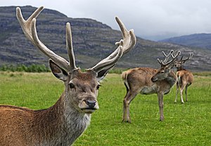
.svg/15px-Pictogram_voting_comment_(orange).svg.png) Comment I've made an edit. --Massimo Catarinella (talk) 16:41, 15 December 2008 (UTC)
Comment I've made an edit. --Massimo Catarinella (talk) 16:41, 15 December 2008 (UTC).svg/15px-Pictogram_voting_comment_(orange).svg.png) Comment Nice edit. --Tomascastelazo (talk) 17:06, 15 December 2008 (UTC)
Comment Nice edit. --Tomascastelazo (talk) 17:06, 15 December 2008 (UTC) Support the edited version - very cool! Calandrella (talk) 20:45, 15 December 2008 (UTC)
 Support for the edit --Simonizer (talk) 21:10, 15 December 2008 (UTC)
 Support edit only. --Aqwis (talk) 21:17, 15 December 2008 (UTC)
 Support edit only. Lycaon (talk) 21:24, 15 December 2008 (UTC)
 Support edit only. --MichaelMaggs (talk) 22:22, 15 December 2008 (UTC)
 Support -- Alvesgaspar (talk) 22:59, 15 December 2008 (UTC)
 Support --Mbdortmund (talk) 23:28, 15 December 2008 (UTC)
 Support --Böhringer (talk) 08:03, 16 December 2008 (UTC)
 Support --Mr. Mario (talk) 03:48, 17 December 2008 (UTC)
 Support -- Snowwayout (talk) 04:37, 17 December 2008 (UTC)
 Support Georgez (talk) 18:56, 17 December 2008 (UTC)
 Support - Peripitus (talk) 07:21, 20 December 2008 (UTC)
 Support --DsMurattalk 15:39, 20 December 2008 (UTC)
 Support -- Ainali (talk) 17:55, 23 December 2008 (UTC)
result: 14 support, 0 oppose, 0 neutral => featured. Simonizer (talk) 19:56, 25 December 2008 (UTC)
Image:Maroc Marrakech Saadiens Luc Viatour 5.jpg, featured[edit]
Voting period ends on 24 Dec 2008 at 18:54:36
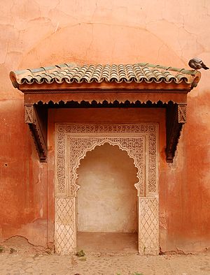
 Info created by Lviatour - uploaded by Lviatour - nominated by FilWriter -- FilWriter (talk) 18:54, 15 December 2008 (UTC)
 Support -- FilWriter (talk) 18:54, 15 December 2008 (UTC)
 Support Colour, composition and subject all say wow. Lycaon (talk) 19:14, 16 December 2008 (UTC)
 Support dito Lycaon --Böhringer (talk) 21:24, 16 December 2008 (UTC)
 Support the lighting is beautiful --ianaré (talk) 04:57, 17 December 2008 (UTC)
 Support Georgez (talk) 18:56, 17 December 2008 (UTC)
 Support subtle lighting, great picture. --JY REHBY (discuter) 00:03, 19 December 2008 (UTC)
result: 6 support, 0 oppose, 0 neutral => featured. Simonizer (talk) 19:57, 25 December 2008 (UTC)
File:Do-Bittermark 2719.JPG, not featured[edit]
Voting period ends on 25 Dec 2008 at 08:37:59
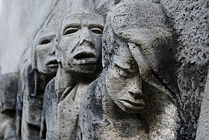
 Info created by mbdortmund - uploaded by mbdortmund - nominated by Simonizer (talk) 08:37, 16 December 2008 (UTC)
 Support Good composition, nice use of DOF -- Simonizer (talk) 08:37, 16 December 2008 (UTC)
 Support Excellent Composition, proper use of DOF --Herrick (talk) 10:02, 16 December 2008 (UTC)
 Oppose No more lights and colors. --ComputerHotline (talk) 10:43, 16 December 2008 (UTC)
 Support --Pudelek (talk) 11:17, 16 December 2008 (UTC)
 Support a powerful image --ianaré (talk) 18:10, 17 December 2008 (UTC)
 Oppose Georgez (talk) 18:57, 17 December 2008 (UTC)
 Support great expression --Niabot (talk) 22:23, 17 December 2008 (UTC)
 Oppose I would vote pro, if the licence were more userfriendly. GFDL license is not a good license for imagines in the policy of the free content.--Juan de Vojníkov (talk) 13:42, 18 December 2008 (UTC)
 Oppose No wow for me at all. --JalalV (talk) 14:05, 18 December 2008 (UTC)
 Support There are several interesting issues here. First of all the fact that this work is a Memorial and as a public work of art, it worked its way through and this is it, that in itself speaks of the merit of the work. Some may argue that this is not necessarily a good argument that legitimizes quality, but considering the historical aspects, as well as the art tradition of the region, I think we are on the safe side. It would be hard to conceive that Germany would build bad cars, for example. The second issue is the photographic representation of a work of art. In that sense, even though the entire work is not being represented, the synthesis is a powerful one. The use of depth of field and the sensation that it creates, makes the image come towards the observer, and the faces evoke powerful emotions. Other elements such as texture and composition are also very well managed. --Tomascastelazo (talk) 13:18, 19 December 2008 (UTC)
 SupportTiago Vasconcelos (talk) 20:37, 19 December 2008 (UTC)
 Oppose --Karelj (talk) 23:15, 21 December 2008 (UTC)
 Oppose--Avala (talk) 00:26, 24 December 2008 (UTC)
result: 7 support, 6 oppose, 0 neutral => not featured. D-Kuru (talk) 12:23, 27 December 2008 (UTC)
File:Rooster portrait2.jpg, featured[edit]
Voting period ends on 25 Dec 2008 at 09:30:44
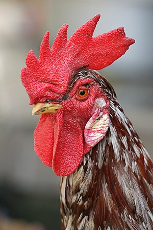
 Info created, uploaded and nominated by Muhammad Mahdi Karim -- Muhammad 09:30, 16 December 2008 (UTC)
 Support -- Muhammad 09:30, 16 December 2008 (UTC)
 Support if you concern that the focus is on the rooster's face - not the feathers... --Herrick (talk) 09:56, 16 December 2008 (UTC)
 Support good portrait --Mbdortmund (talk) 15:09, 16 December 2008 (UTC)
 Support --Simonizer (talk) 17:21, 16 December 2008 (UTC)
 Support --Böhringer (talk) 21:21, 16 December 2008 (UTC)
 Support Nice guy. --Karelj (talk) 23:09, 16 December 2008 (UTC)
 Support yum yum --ianaré (talk) 00:18, 17 December 2008 (UTC)
 Support Nice portrait. ;) --Jagro (talk) 11:08, 17 December 2008 (UTC)
 Support Georgez (talk) 18:58, 17 December 2008 (UTC)
 Oppose the picture is perfect, but Commons FP is not just about it. Use some free Creative Commons license and I will change my vote. Using GFDL for media is a nonsence, GFDL was not created for media - this picture is than not free.--Juan de Vojníkov (talk) 13:38, 18 December 2008 (UTC)
- Thank you for your complements about the perfectness of my picture. GFDL is an available license in the upload form when uploading pictures and many current FPs are licensed as such. Muhammad 16:30, 18 December 2008 (UTC)
- Well, it is a relict there. It is there from the times, when CC licences were not existing. Now they are in here and they are better for images. Imagine a situation, someone would like to make a pexeso for children from featured pictures. If they were licensed just GFDL, each pexeso should have 5 pages of licence. With GFDL it is much easier. You as author can offer it under every licensed you want. So why not to change it to the dual license GFDLxCC-BY-SA 3.0. Well, the same q can come to other authors of GFDL FP:-)--Juan de Vojníkov (talk) 21:59, 18 December 2008 (UTC)
- Dont say this. I dont think so, this will happen. This must be agreed by authors. You cant change a licence.--Juan de Vojníkov (talk) 21:59, 18 December 2008 (UTC)
- "Permission is granted to copy, distribute and/or modify this document under the terms of the GNU Free Documentation License, Version 1.2 or any later version " The bold part is what I'm talking about. Version 1.3 is out and it has clauses that permit conversion to CC-BY-SA in some circumstances. --J.smith (talk) 07:50, 19 December 2008 (UTC)
- Pssst, do not speak so laud. If you were right, I will invite you for a beer and vice versa.--Juan de Vojníkov (talk) 14:19, 19 December 2008 (UTC)
- "Permission is granted to copy, distribute and/or modify this document under the terms of the GNU Free Documentation License, Version 1.2 or any later version " The bold part is what I'm talking about. Version 1.3 is out and it has clauses that permit conversion to CC-BY-SA in some circumstances. --J.smith (talk) 07:50, 19 December 2008 (UTC)
 Support well done. — Aitias // discussion 23:40, 18 December 2008 (UTC)
 Support Nice. --Tomascastelazo (talk) 14:21, 19 December 2008 (UTC)
 Support -- Ainali (talk) 17:53, 23 December 2008 (UTC)
 Support--Avala (talk) 00:25, 24 December 2008 (UTC)
result: 13 support, 1 oppose, 0 neutral => featured. D-Kuru (talk) 12:25, 27 December 2008 (UTC)
File:Thomas Bresson - Machaon-1 (by).jpg, featured[edit]
 Info created by ComputerHotline - uploaded by ComputerHotline - nominated by ComputerHotline --ComputerHotline (talk) 10:30, 16 December 2008 (UTC)
 Support --ComputerHotline (talk) 10:30, 16 December 2008 (UTC)
 Support very nice --Böhringer (talk) 21:16, 16 December 2008 (UTC)
 Support Best of the four. Lycaon (talk) 09:47, 17 December 2008 (UTC)
 Support --Luc Viatour (talk) 14:05, 17 December 2008 (UTC)
 Support Georgez (talk) 18:59, 17 December 2008 (UTC)
 Support ■ MMXXtalk 07:17, 18 December 2008 (UTC)
 Support /Daniel78 (talk) 09:01, 18 December 2008 (UTC)
 Question coudl you provide description in English including English and scientific name of the butterfly, plant and ecosystem?--Juan de Vojníkov (talk) 13:36, 18 December 2008 (UTC)
.svg/15px-Pictogram_voting_comment_(orange).svg.png) Comment It's a Papilio machaon. --ComputerHotline (talk) 09:07, 19 December 2008 (UTC)
Comment It's a Papilio machaon. --ComputerHotline (talk) 09:07, 19 December 2008 (UTC)
.svg/15px-Pictogram_voting_comment_(orange).svg.png) Comment Nice! Would definitely support if I could find the scientific name. --JalalV (talk) 14:04, 18 December 2008 (UTC)
Comment Nice! Would definitely support if I could find the scientific name. --JalalV (talk) 14:04, 18 December 2008 (UTC)
 Support This one is the best of the series of butterfly pictures --Simonizer (talk) 20:35, 19 December 2008 (UTC)
 Support --MichaelMaggs (talk) 09:13, 20 December 2008 (UTC)
result: 9 support, 0 oppose, 0 neutral => featured. Simonizer (talk) 00:35, 28 December 2008 (UTC)
File:Thomas Bresson - Souci-3 (by).jpg, not featured[edit]
Voting period ends on 25 Dec 2008 at 10:40:13
.jpg/300px-Thomas_Bresson_-_Souci-3_(by).jpg)
 Info created by ComputerHotline - uploaded by ComputerHotline - nominated by ComputerHotline -- ComputerHotline (talk) 10:40, 16 December 2008 (UTC)
 Support -- ComputerHotline (talk) 10:40, 16 December 2008 (UTC)
 Support --Böhringer (talk) 21:19, 16 December 2008 (UTC)
 Oppose Composition - disturbing background. --Karelj (talk) 22:24, 16 December 2008 (UTC)
 Support Georgez (talk) 18:59, 17 December 2008 (UTC)
 Oppose As Karelj /Daniel78 (talk) 09:01, 18 December 2008 (UTC)
.svg/15px-Pictogram_voting_comment_(orange).svg.png) Comment more description needed.--Juan de Vojníkov (talk) 13:34, 18 December 2008 (UTC)
Comment more description needed.--Juan de Vojníkov (talk) 13:34, 18 December 2008 (UTC) Oppose As Karelj. Lycaon (talk) 17:07, 21 December 2008 (UTC)
 Oppose As Karelj Lucash (talk)
result: 3 support, 4 oppose, 0 neutral => not featured. Simonizer (talk) 00:37, 28 December 2008 (UTC)
File:ComputerHotline - Vulcain (by).jpg, not featured[edit]
 Info created by ComputerHotline - uploaded by ComputerHotline - nominated by ComputerHotline --ComputerHotline (talk) 14:27, 16 December 2008 (UTC)
 Support --ComputerHotline (talk) 14:27, 16 December 2008 (UTC)
 Support shows diet of butterfly, great quality --ianaré (talk) 04:55, 17 December 2008 (UTC)
 Neutral Georgez (talk) 19:02, 17 December 2008 (UTC)
 Support Good quality, nice colors. --Lošmi (talk) 10:14, 18 December 2008 (UTC)
 Question do you know the exact taxis name?--Juan de Vojníkov (talk) 13:33, 18 December 2008 (UTC)
.svg/15px-Pictogram_voting_comment_(orange).svg.png) Comment It's a Vanessa atalanta. --ComputerHotline (talk) 09:05, 19 December 2008 (UTC)
Comment It's a Vanessa atalanta. --ComputerHotline (talk) 09:05, 19 December 2008 (UTC)
 Oppose Distracting background. --JalalV (talk) 14:03, 18 December 2008 (UTC)
 Oppose As above. --Karelj (talk) 23:13, 21 December 2008 (UTC)
result: 3 support, 2 oppose, 0 neutral => not featured. Simonizer (talk) 00:38, 28 December 2008 (UTC)
File:Kazan church.jpg, not featured[edit]
Voting period ends on 26 Dec 2008 at 01:33:56
 Info created by Maarten - uploaded by Russavia - nominated by Russavia -- russavia (talk) 01:33, 17 December 2008 (UTC)
 Support At first glance this is just a normal church, but look closer and one can see that it is combo between a church and a mosque, with both religions represented in the overall design of the building. -- russavia (talk) 01:33, 17 December 2008 (UTC)
 Support Correct exposure, DoF and focus. It's very beautiful. --ComputerHotline (talk) 10:37, 17 December 2008 (UTC)
 Oppose Distortion. Please use a shift. --Herrick (talk) 12:01, 17 December 2008 (UTC)
 Oppose Torn and twisted, bent and stretched. Nice colours but the impossible projection and distortions sadly can't be undone. Lycaon (talk) 15:42, 19 December 2008 (UTC)
*
![]() Support Cool photo. —kallerna™ 15:46, 21 December 2008 (UTC)
Support Cool photo. —kallerna™ 15:46, 21 December 2008 (UTC)
result: 2 support, 2 oppose, 0 neutral => not featured. Simonizer (talk) 00:44, 28 December 2008 (UTC)
File:Kazan church edit.jpg, not featured[edit]
Voting period ends on 26 Dec 2008 at 01:33:56
 Info created by Maarten - uploaded by Russavia - nominated by --Böhringer (talk) 21:58, 17 December 2008 (UTC)
 Support --Böhringer (talk) 21:58, 17 December 2008 (UTC)
 Support nice colors, good edit --AlexanderKlink (talk) 22:48, 17 December 2008 (UTC)
.svg/15px-Pictogram_voting_comment_(orange).svg.png) Comment You should mention what modifications that have been made. /Daniel78 (talk) 08:58, 18 December 2008 (UTC)
Comment You should mention what modifications that have been made. /Daniel78 (talk) 08:58, 18 December 2008 (UTC) Done --Böhringer (talk) 09:08, 18 December 2008 (UTC)
 Support Nice picture with the edit. Good colors. --JalalV (talk) 13:45, 18 December 2008 (UTC)
 Oppose sorry, but also with the stitching program you'll see the distortions on the right and left helmet. --Herrick (talk) 07:40, 19 December 2008 (UTC)
.svg/15px-Pictogram_voting_comment_(orange).svg.png) Comment there was no stitching program but it is in this instance does not matter --Böhringer (talk) 11:53, 19 December 2008 (UTC)
Comment there was no stitching program but it is in this instance does not matter --Böhringer (talk) 11:53, 19 December 2008 (UTC) Support Original and good Image --FilWriter 14:03 19 Dicember 2008 (UTC)
 Oppose Torn and twisted, bent and stretched. Nice colours but the impossible projection and distortions of the original image sadly can't be undone. Lycaon (talk) 15:41, 19 December 2008 (UTC)
 Support Cool photo. —kallerna™ 15:46, 21 December 2008 (UTC)
 Oppose It's impossible to correct the perspective. --Massimo Catarinella (talk) 18:48, 22 December 2008 (UTC)
result: 5 support, 3 oppose, 0 neutral => not featured. Simonizer (talk) 00:43, 28 December 2008 (UTC)
File:Kazan church edit1.jpg, not featured[edit]
Voting period ends on 26 Dec 2008 at 01:33:56
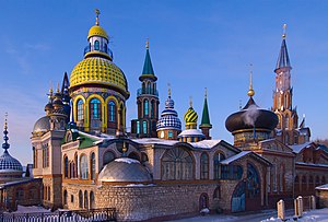
 Info created by Maarten - uploaded by Russavia - nominated by --Mfield (talk) 04:14, 18 December 2008 (UTC)
 Info Without realizing the above edit existed, I had created another edit for en:WP that I think corrects the distortions more completely. Mfield (talk) 04:08, 18 December 2008 (UTC)
 Support Mfield (talk) 04:08, 18 December 2008 (UTC)
 Support I like the corrections. I like both edits, so am supporting both, in case others have stronger opinions. --JalalV (talk) 16:10, 18 December 2008 (UTC)
 Oppose sorry, but also with the stitching program you'll see the distortions on the right and left helmet. --Herrick (talk) 07:40, 19 December 2008 (UTC)
 Oppose Torn and twisted, bent and stretched. Nice colours but the impossible projection and distortions of the original image sadly can't be undone. Lycaon (talk) 15:42, 19 December 2008 (UTC)
 Support Cool photo. —kallerna™ 15:46, 21 December 2008 (UTC)
 Oppose It's impossible to correct the perspective. --Massimo Catarinella (talk) 18:48, 22 December 2008 (UTC)
.svg/15px-Pictogram_voting_comment_(orange).svg.png) Comment Such a gorgeous, rich and deep image. But alas, so twisted...
Comment Such a gorgeous, rich and deep image. But alas, so twisted...
result: 3 support, 3 oppose, 0 neutral => not featured. Simonizer (talk) 00:42, 28 December 2008 (UTC)
File:Thomas Bresson - Punaise mangeant une chenille sur des orties (by).jpg, not featured[edit]
 Info created by Thomas Bresson - uploaded by Thomas Bresson - nominated by Thomas Bresson --ComputerHotline (talk) 10:33, 17 December 2008 (UTC)
 Support --ComputerHotline (talk) 10:33, 17 December 2008 (UTC)
 Oppose (formerly FPX) Image does not fall within the guidelines, image is much too small Lycaon (talk) 15:50, 17 December 2008 (UTC)
 Support -- Strong mitigating circumstances. Flying Freddy (talk) 10:42, 18 December 2008 (UTC)
 Oppose to Lycaon.--Juan de Vojníkov (talk) 13:24, 18 December 2008 (UTC)
 Oppose Great image, but too small. --JalalV (talk) 16:01, 18 December 2008 (UTC)
 Support I like it even though it's a bit small. /Daniel78 (talk) 18:28, 18 December 2008 (UTC)
.svg/15px-Pictogram_voting_comment_(orange).svg.png) Comment Please be serious here. Nothing has changed since last time, so why the renomination? Lycaon (talk) 19:34, 18 December 2008 (UTC)
Comment Please be serious here. Nothing has changed since last time, so why the renomination? Lycaon (talk) 19:34, 18 December 2008 (UTC)
 Support The picture is really a good picture, it has technical merit on one hand and without being a bug-o-logist, I can appreciate how this image can illustrate an article or be useful in an educational project, which is I suppose, the objective of Wikipedia. Pixel wise it may be small, but if you enlarge it at the pixel level in photoshop, it retains a lot of fine detail and it is definitely much larger than a lot of images used to illustrate electronic articles. Even for print work it is useful. I see a lot of much smaller pictures that do not necessarily lose value due to their size. On the aesthetic side it really is a fine photograph. Good color, texture, etc., and best of all, a key moment in the insects´ life. I much rather have this picture than none at all. Does this image, despite the shortcomings of size, according to some, contribute to the goals of this effort and to the advancement of knowledge? I think it does. Very strong mitigating circumstances. --Tomascastelazo (talk) 00:32, 19 December 2008 (UTC)
 Oppose the image was decline in August 2008, the image hasnt changed since then nor have the FP standards been altered to give reason for this image to be renominated. Gnangarra 02:48, 19 December 2008 (UTC)
.svg/15px-Pictogram_voting_comment_(orange).svg.png) Comment So what if the image was nominated before and declined? Does that mean anything? Van Gough was not famous until after his death, and then people discovered his genius! What if the reviewers were not qualified back in august? I mean, if collective hysteria is possible, collective bad judgement is definitely within the possibilities. --Tomascastelazo (talk) 03:50, 19 December 2008 (UTC)
Comment So what if the image was nominated before and declined? Does that mean anything? Van Gough was not famous until after his death, and then people discovered his genius! What if the reviewers were not qualified back in august? I mean, if collective hysteria is possible, collective bad judgement is definitely within the possibilities. --Tomascastelazo (talk) 03:50, 19 December 2008 (UTC)
.svg/15px-Pictogram_voting_comment_(orange).svg.png) Comment I see no real problem in renominating it, but I think it should be by a new person and after a longer period as to not encourage people to just renominate things that are borderline FP enough times such that it just passes. To me it has nothing to do with the image, just the nomination process. /Daniel78 (talk) 10:39, 19 December 2008 (UTC)
Comment I see no real problem in renominating it, but I think it should be by a new person and after a longer period as to not encourage people to just renominate things that are borderline FP enough times such that it just passes. To me it has nothing to do with the image, just the nomination process. /Daniel78 (talk) 10:39, 19 December 2008 (UTC)
.svg/15px-Pictogram_voting_comment_(orange).svg.png) Comment @Gnangarra : I haven't got full size image. --ComputerHotline (talk) 08:59, 19 December 2008 (UTC)
Comment @Gnangarra : I haven't got full size image. --ComputerHotline (talk) 08:59, 19 December 2008 (UTC)
- Are you just shooting at low res then? J.smith (talk) 18:38, 19 December 2008 (UTC)
.svg/15px-Pictogram_voting_comment_(orange).svg.png) Comment I havent asked for a larger image, I;m saying I see no reason for a new nomination, the image hasnt been altered and the criteria havent changed. I'd be happy to reconsider the image if ComputerHotline can explain what makes it different from the last nomination. Gnangarra 15:49, 20 December 2008 (UTC)
Comment I havent asked for a larger image, I;m saying I see no reason for a new nomination, the image hasnt been altered and the criteria havent changed. I'd be happy to reconsider the image if ComputerHotline can explain what makes it different from the last nomination. Gnangarra 15:49, 20 December 2008 (UTC)
 Oppose This undoutably a valuable addition to our project, however, it fails out most basic technical requirements. I understand if ComputerHotline doesn't want to release the full-res (or higher res) version of this file, but if he does, I would support it at a new FP nomination. -J.smith (talk) 06:48, 19 December 2008 (UTC)
 Oppose low res + renom -- Gorgo (talk) 17:28, 19 December 2008 (UTC)
 Oppose Much too small. --MichaelMaggs (talk) 09:11, 20 December 2008 (UTC)
 Oppose Too small. Georgez (talk) 15:17, 20 December 2008 (UTC)
 Oppose too small, sorry (again) --ianaré (talk) 08:37, 21 December 2008 (UTC)
result: 3 support, 9 oppose, 0 neutral => not featured. Simonizer (talk) 00:47, 28 December 2008 (UTC)
File:Kestaneler.JPG, not featured[edit]
Voting period ends on 26 Dec 2008 at 12:23:10
 Info created by Maderibeyza - uploaded by Maderibeyza - nominated by Maderibeyza -- Maderibeyza (talk) 12:23, 17 December 2008 (UTC)
 Support -- Maderibeyza (talk) 12:23, 17 December 2008 (UTC)
 Oppose High saturation, lack of DOF, boring color scheme... --JY REHBY (discuter) 17:49, 17 December 2008 (UTC)
 Oppose no wow --ianaré (talk) 18:24, 17 December 2008 (UTC)
 Oppose bad composition, not tasty--Juan de Vojníkov (talk) 13:22, 18 December 2008 (UTC)
 Oppose Didn't like colors. --JalalV (talk) 14:07, 18 December 2008 (UTC)
 Oppose (formerly FPX) Image does not fall within the guidelines, of bad composition and poor lighting Alvesgaspar (talk) 00:18, 19 December 2008 (UTC)
 Support I like it. --DsMurattalk 15:28, 20 December 2008 (UTC)
 Oppose Poor composition and lighting. Lycaon (talk) 01:18, 21 December 2008 (UTC)
result: 2 support, 6 oppose, 0 neutral => not featured. Simonizer (talk) 00:49, 28 December 2008 (UTC)
File:Tea-grower-hangzhou-edit.png not featured[edit]
Voting period ends on 27 Dec 2008 at 15:42:05
 Info created by JalalV - uploaded by JalalV - nominated by JalalV -- JalalV (talk) 15:42, 18 December 2008 (UTC)
.svg/15px-Pictogram_voting_comment_(orange).svg.png) Comment There were three images currently nearing the end of voting that I felt would have been good candidates with just a little cropping or editing. So I am adding edited versions here. Am adding now, as plan to be away for a few days. JalalV (talk) 15:42, 18 December 2008 (UTC)
Comment There were three images currently nearing the end of voting that I felt would have been good candidates with just a little cropping or editing. So I am adding edited versions here. Am adding now, as plan to be away for a few days. JalalV (talk) 15:42, 18 December 2008 (UTC) Support -- JalalV (talk) 15:42, 18 December 2008 (UTC)
 Oppose Snapshot without any real topic. If the face of the person had been visible it might have been different... Lycaon (talk) 19:38, 18 December 2008 (UTC)
 Oppose too chaotic.--Juan de Vojníkov (talk) 22:05, 18 December 2008 (UTC)
 Support Quite nice. Georgez (talk) 15:25, 20 December 2008 (UTC)
 Oppose Chromatic aberration. --Kosiarz-PL 09:37, 22 December 2008 (UTC)
result: 2 support, 3 oppose, 0 neutral => not featured. Simonizer (talk) 00:52, 28 December 2008 (UTC)
File:Tobiko on grilled Albacore-edit.png, not featured[edit]
Voting period ends on 27 Dec 2008 at 15:46:54
 Info created by J.smith - uploaded by J.smith - nominated by JalalV -- JalalV (talk) 15:46, 18 December 2008 (UTC)
.svg/15px-Pictogram_voting_comment_(orange).svg.png) Comment There were three images currently nearing the end of voting that I felt would have been good candidates with just a little cropping or editing. So I am adding edited versions here. Am adding now, as plan to be away for a few days. JalalV (talk) 15:46, 18 December 2008 (UTC)
Comment There were three images currently nearing the end of voting that I felt would have been good candidates with just a little cropping or editing. So I am adding edited versions here. Am adding now, as plan to be away for a few days. JalalV (talk) 15:46, 18 December 2008 (UTC) Support -- JalalV (talk) 15:46, 18 December 2008 (UTC)
 Support I much prefer the other version, but I am not an unbias party :). --J.smith (talk) 19:19, 18 December 2008 (UTC)
 Oppose its cute, but there is no composition.--Juan de Vojníkov (talk) 22:04, 18 December 2008 (UTC)
 Question what is the taste like?--Juan de Vojníkov (talk) 22:04, 18 December 2008 (UTC)
- Salty, smoky and a bit of fishiness, but in a good way. If that makes sense. :) Very good as a garnish, but it tends to get lost in everything on a roll. This dish, lightly grilled albacore is really well served by the added flavor. --J.smith (talk) 06:18, 19 December 2008 (UTC)
- I see, Thanks.--Juan de Vojníkov (talk) 14:15, 19 December 2008 (UTC)
- Salty, smoky and a bit of fishiness, but in a good way. If that makes sense. :) Very good as a garnish, but it tends to get lost in everything on a roll. This dish, lightly grilled albacore is really well served by the added flavor. --J.smith (talk) 06:18, 19 December 2008 (UTC)
 Support definitely better than the other version. May I suggest that you even crop it a little further on the leftmost side, let's say to remove 1/12th or 1/10th of its present width ? It would leave out those eggs that are sunken in the mayonnaise-like sauce, and most of those who have sharp "white-spot" reflection, which attract the eye to a section of the picture where the composition is less interesting ? Then, i believe it would be georgeous. Hmmm, i'm craving sushi, now ! --JY REHBY (discuter) 00:21, 19 December 2008 (UTC)
- Oh man, if feels like cutting my own arm, but I have done it, for you! ;-) J.smith (talk) 06:23, 19 December 2008 (UTC)
- ;) I definitely like the composition and framing of this version. As for the "out of focus" thing, i happen to think it's part of the composition of the picture. --JY REHBY (discuter) 19:09, 19 December 2008 (UTC)
- Oh man, if feels like cutting my own arm, but I have done it, for you! ;-) J.smith (talk) 06:23, 19 December 2008 (UTC)
 Oppose -- Too much out of focus Manuel R. (talk) 15:01, 19 December 2008 (UTC)
 Support but I think the other version (File:Tobiko_on_grilled_Albacore.jpg) was much better and looks more delicious! it was more in focus and shiny and had more detail of food and the sauce adds life to the picture. ■ MMXXtalk 08:31, 20 December 2008 (UTC)
 Oppose Focus and lighting - sorry. --MichaelMaggs (talk) 09:10, 20 December 2008 (UTC)
 Oppose Composition. Georgez (talk) 15:26, 20 December 2008 (UTC)
 Oppose The cropping has not improved the focus and the lighting. Lycaon (talk) 23:55, 21 December 2008 (UTC)
 Support --FilWriter 19:51, 23 December 2008 (UTC)
 Oppose out of focus --Avala (talk) 00:24, 24 December 2008 (UTC)
result: 5 support, 6 oppose, 0 neutral => not featured. Simonizer (talk) 00:54, 28 December 2008 (UTC)
File:Domestic cat felis catus stare.jpg, not featured[edit]
Voting period ends on 27 Dec 2008 at 18:18:41
 Info created, uploaded and nominated by Muhammad Mahdi Karim -- Muhammad 18:18, 18 December 2008 (UTC)
 Support -- Muhammad 18:18, 18 December 2008 (UTC)
 Oppose the cat is in the bad angle. Even the background is simmilar to the cats color.--Juan de Vojníkov (talk) 22:02, 18 December 2008 (UTC)
 Support/Daniel78 (talk) 01:20, 19 December 2008 (UTC)
 Oppose composition too much unused space for a FP, eyes not engaged Gnangarra 02:15, 19 December 2008 (UTC)
 Support Beautiful portrait of a cat. --Lošmi (talk) 03:34, 19 December 2008 (UTC)
.svg/15px-Pictogram_voting_comment_(orange).svg.png) Comment not bad, but some white parts of the fur are overexposured, can perhaps be repaired. --Mbdortmund (talk) 11:26, 19 December 2008 (UTC)
Comment not bad, but some white parts of the fur are overexposured, can perhaps be repaired. --Mbdortmund (talk) 11:26, 19 December 2008 (UTC) Oppose Nothing special in this foto. --Umnik (talk) 15:24, 19 December 2008 (UTC)
 Neutral - I love cats and this is a nice picture. A pity that the foreground and background don't contrast. Also, it would be better to use a smaller aperture to get a larger dof -- Alvesgaspar (talk) 21:32, 19 December 2008 (UTC)
 Oppose No wow for me. Georgez (talk) 15:26, 20 December 2008 (UTC)
 Oppose, per Georgez. —kallerna™ 15:43, 21 December 2008 (UTC)
 Support--Avala (talk) 00:24, 24 December 2008 (UTC)
result: 4 support, 5 oppose, 1 neutral => not featured. Simonizer (talk) 00:59, 28 December 2008 (UTC)
File:Alfeniques.jpg, not featured[edit]
Voting period ends on 27 Dec 2008 at 18:29:11
 Info created, uploaded and nominated by -- Tomascastelazo (talk) 18:29, 18 December 2008 (UTC)
 Support Alfeñiques are traditional sugar-made figures of the Day of the Dead celebration in Mexico. -- Tomascastelazo (talk) 18:29, 18 December 2008 (UTC)
 Support I like think about death with pleasure, e.g. due to sugar. :) This is a valuable image for Wiktionary, see e.g. a word черепок in Russian Wiktionary. -- AKA MBG (talk) 20:02, 18 December 2008 (UTC)
 Oppose nothing special.--Juan de Vojníkov (talk) 22:00, 18 December 2008 (UTC)
 Oppose composition, the fragments of the table on the edges. Gnangarra 02:13, 19 December 2008 (UTC)
 Oppose Composition. Georgez (talk) 15:27, 20 December 2008 (UTC)
 Oppose Composition and colors. --ComputerHotline (talk) 16:50, 20 December 2008 (UTC)
 Question So in my best sweet, sarcastic tradition I ask: Considering that public opinion opposes this picture on the grounds of composition, and considering the suject matter, What would a better composition for these subjects be? Obviously there are plenty of items in this image so that one of you may enlight the rest of us with an example of better composition. Please do so. Download the picture, crop, compose and reload image so that the critique contributes to better photography. --Tomascastelazo (talk) 03:34, 21 December 2008 (UTC)
result: 2 support, 4 oppose, 0 neutral => not featured. Simonizer (talk) 01:01, 28 December 2008 (UTC)
File:Crocodylus acutus mexico 08.jpg, not featured[edit]
Voting period ends on 27 Dec 2008 at 19:19:59
 Info created, uploaded andnominated by -- Tomascastelazo (talk) 19:19, 18 December 2008 (UTC)
 Support Taken in swamp at La Manzanilla, Jalisco, Mexico -- Tomascastelazo (talk) 19:19, 18 December 2008 (UTC)
 Support This picture rocks. So live and dynamic. Like an action-movie sequence. --Lošmi (talk) 03:33, 19 December 2008 (UTC)
 Support interesting angle --Herrick (talk) 07:43, 19 December 2008 (UTC)
.svg/15px-Pictogram_voting_comment_(orange).svg.png) Comment As an IP I can't vote, but I have to say that the crop is horrible. Great work otherwise.202.12.233.23 08:07, 19 December 2008 (UTC)
Comment As an IP I can't vote, but I have to say that the crop is horrible. Great work otherwise.202.12.233.23 08:07, 19 December 2008 (UTC)
 Support --Mbdortmund (talk) 11:22, 19 December 2008 (UTC)
 Oppose Great subject, however not a great composition and a bit too much noise for me. - Relic38 (talk) 19:49, 19 December 2008 (UTC)
 Oppose Great composition, setting and light, but i wish the eyes of the crocodyle would be sharp too and not only the nose --Simonizer (talk) 20:32, 19 December 2008 (UTC)
 Oppose composition + only front part of the head is in focus -- Gorgo (talk) 09:52, 20 December 2008 (UTC)
 Oppose Wow is there (both in thumb as in full size) but technically per your own comments. Lycaon (talk) 15:08, 20 December 2008 (UTC)
.svg/15px-Pictogram_voting_comment_(orange).svg.png) Comment Dear Lycaon, I stand by those comments... however, we are talking about two different situations, that a knowledgeable and discerning observer can easily identify. The comments that you allude to are for a particular picture and the comments are valid within the context of that image. Just to illustrate you, if that could be possible, would be to mention first of all that the angle of view is different in both pictures. In this particular image, the angle of view is much lower, which means that the elements of the image are positioned much further away in relation to each other, thus making the DOF issue more difficult. Another point would be that obviously the main point of interest in this particular case are the crocodyle's teeth, and not the eyes, they are positioned in a much better place than the eyes, and they cover an area much larger than the eyes, I would say that the ratio is about 50 to 1 maybe? So to sacrifice critical focus to an object of that ratio would be stupid, for lack of a better word. So therefore the natural choice is to assure good detail in the main area of interest. I've never heard that people are impressed by crocodyle's eyes, have you? What impresses people are their jaws and teeth, which just happens to be the point of discussion and one of the central parts of this image. In the other image that you allude to, no teeth or jaws are present, therefore the criteria is different. Photography is much like music, where sounds fade in and out, with different volume, rythm, melody, etc., etc. In photography, like in music, focus fades in and out and it is the overall interaction of in focus and out of focus elements that make the visual music of a photograph. If in music all the sounds were to have the same intensity, tone and volume it would just be a lot of noise. Everything in focus in a photograph could lead to a lot of visual noise. So you say that you oppose based on a criteria that I myself set forth for another image... is that really the real reason? What happened to your own criteria? We both know (and many others) what the real reason is. Cheers!--Tomascastelazo (talk) 20:21, 20 December 2008 (UTC)
Comment Dear Lycaon, I stand by those comments... however, we are talking about two different situations, that a knowledgeable and discerning observer can easily identify. The comments that you allude to are for a particular picture and the comments are valid within the context of that image. Just to illustrate you, if that could be possible, would be to mention first of all that the angle of view is different in both pictures. In this particular image, the angle of view is much lower, which means that the elements of the image are positioned much further away in relation to each other, thus making the DOF issue more difficult. Another point would be that obviously the main point of interest in this particular case are the crocodyle's teeth, and not the eyes, they are positioned in a much better place than the eyes, and they cover an area much larger than the eyes, I would say that the ratio is about 50 to 1 maybe? So to sacrifice critical focus to an object of that ratio would be stupid, for lack of a better word. So therefore the natural choice is to assure good detail in the main area of interest. I've never heard that people are impressed by crocodyle's eyes, have you? What impresses people are their jaws and teeth, which just happens to be the point of discussion and one of the central parts of this image. In the other image that you allude to, no teeth or jaws are present, therefore the criteria is different. Photography is much like music, where sounds fade in and out, with different volume, rythm, melody, etc., etc. In photography, like in music, focus fades in and out and it is the overall interaction of in focus and out of focus elements that make the visual music of a photograph. If in music all the sounds were to have the same intensity, tone and volume it would just be a lot of noise. Everything in focus in a photograph could lead to a lot of visual noise. So you say that you oppose based on a criteria that I myself set forth for another image... is that really the real reason? What happened to your own criteria? We both know (and many others) what the real reason is. Cheers!--Tomascastelazo (talk) 20:21, 20 December 2008 (UTC)
result: 4 support, 4 oppose, 0 neutral => not featured. Simonizer (talk) 00:55, 28 December 2008 (UTC)
File:Gaschurn Panorama.jpg, not featured[edit]
Voting period ends on 25 Dec 2008 at 18:04:33

 Info created by Böhringer - uploaded by Böhringer - nominated by Simonizer (talk) 18:04, 16 December 2008 (UTC)
 Support Again, a very nice panorama -- Simonizer (talk) 18:04, 16 December 2008 (UTC)
 Oppose, per right part of the picture. --Aqwis (talk) 20:04, 16 December 2008 (UTC)
 Support Thank you for the nomination --Böhringer (talk) 21:12, 16 December 2008 (UTC)
 Oppose As Aqwis. --Karelj (talk) 22:27, 16 December 2008 (UTC)
 Support Nice view&picture. Sh1019 (talk) 04:42, 17 December 2008 (UTC)
 Support Very bautiful picture. --ComputerHotline (talk) 10:38, 17 December 2008 (UTC)
 Support - I love how it captures the snow line, 1 house 2 feet above the other has snow while the other has green grass. (Giligone (talk) 16:01, 17 December 2008 (UTC))
 Support, gorgeous panorama, the right part adds to the picture rather thant ruining it, imho. It give depth and adds a sense of reality and presence to the scenery. Something akin to : "there are real people living in there, it's not just a nice picture on chocolate wrappers". --JY REHBY (discuter) 17:59, 17 December 2008 (UTC)
 Support Georgez (talk) 19:03, 17 December 2008 (UTC)
 Support perfect picture of a very beautiful landscape. Plani (talk) 07:24, 18 December 2008 (UTC)
 Support --Lošmi (talk) 10:16, 18 December 2008 (UTC)
 Oppose Per previous and obvious stiching problem in the sky --Pom² (talk) 13:44, 18 December 2008 (UTC)
 Oppose Sorry, but this panorama didn't draw me in. --JalalV (talk) 14:00, 18 December 2008 (UTC)
 Oppose its a nice composition but there is an issue with stitching across the valley there is significant shift in light levels. Gnangarra 02:55, 19 December 2008 (UTC)
 Oppose Supporting edit. --MichaelMaggs (talk) 09:24, 21 December 2008 (UTC)
 Support--Avala (talk) 00:25, 24 December 2008 (UTC)
result: 7 support, 5 oppose, 0 neutral => not featured. Simonizer (talk) 00:41, 28 December 2008 (UTC)
File:Kopie von Gaschurn edit.jpg, Featured[edit]
Voting period ends on 29 Dec 2008 at 15:57

 Info edit by --Böhringer (talk) 15:57, 20 December 2008 (UTC)
 Support --Böhringer (talk) 16:02, 20 December 2008 (UTC)
 Support --Simonizer (talk) 17:00, 20 December 2008 (UTC)
 Support Lycaon (talk) 01:20, 21 December 2008 (UTC)
 Support --MichaelMaggs (talk) 09:25, 21 December 2008 (UTC)
 Support I formerly voted for the original-version but this one seems to be even better. Plani (talk) 23:26, 21 December 2008 (UTC)
 Support I could not find the artist any more - but do also vote for this one! Giacomo1970 (talk) 18:02, 22 December 2008 (UTC)
 Support I still could not find the artist any more - but do also vote for this one! Hope it's okay now!? Giacomo1970 13:28, 23 December 2008 (UTC)
 Info Giacomo1970 says the artist in the shadow of the original image, the way I've retouched. --Böhringer (talk) 13:14, 23 December 2008 (UTC)
 .svg/15px-Pictogram_voting_comment_(orange).svg.png) Comment How is he anonymous? He's got a userpage, has he not? Is there something I'm missing? The only anonymous one here is me. 202.12.233.23 13:58, 23 December 2008 (UTC)
Comment How is he anonymous? He's got a userpage, has he not? Is there something I'm missing? The only anonymous one here is me. 202.12.233.23 13:58, 23 December 2008 (UTC)
- Whoops, took a look at the Diff. Sorry, still learning. 203.35.135.133 17:55, 28 December 2008 (UTC)
result: 6 support, 0 oppose, 0 neutral => featured. -- Lycaon (talk) 20:52, 1 January 2009 (UTC)
File:Alfeniques crop 2.jpg, not featured[edit]
Voting period ends on 30 Dec 2008 at 15:05:10
 Question Like this? --Tomascastelazo (talk) 15:14, 21 December 2008 (UTC)
 Support. Yes, it is better. -- AKA MBG (talk) 09:19, 25 December 2008 (UTC)
 Support --ianaré (talk) 17:28, 26 December 2008 (UTC)
 Support --Tomascastelazo (talk) 18:41, 26 December 2008 (UTC)
result: 3 support, 0 oppose, 0 neutral => not featured. -- Lycaon (talk) 20:52, 1 January 2009 (UTC)
Image:Schweriner Schloss by Harald Hoyer.jpg, not featured[edit]
Voting period ends on 28 Dec 2008 at 15:12:47
 Info created by Backslash - uploaded by Backslash - nominated by Backslash -- Backslash (talk) 15:12, 19 December 2008 (UTC)
 Support -- Backslash (talk) 15:12, 19 December 2008 (UTC)
 Support Romantic. --Umnik (talk) 15:26, 19 December 2008 (UTC)
 Oppose Looks good as a thumb, but quality in full is not good: pale areas around the branches and quite noisy. But for me, the most disturbing part, is the plastic wrapping and the scaffolding from the ongoing restoration. Lycaon (talk) 16:04, 19 December 2008 (UTC)
 Oppose Unfortunately, heavy noise in tree and primary subject. - Relic38 (talk) 19:45, 19 December 2008 (UTC)
 Info Ok, replaced the photo with a version with less noise and less sharpening -- Backslash (talk) 21:36, 19 December 2008 (UTC)
 Oppose Because of the plastic wrapping. —kallerna™ 15:41, 21 December 2008 (UTC)
 Support--Avala (talk) 00:22, 24 December 2008 (UTC)
 Support --Georgez (talk) 01:28, 27 December 2008 (UTC)
result: 4 support, 3 oppose, 0 neutral => not featured. -- Lycaon (talk) 20:54, 1 January 2009 (UTC)
Image:Mill Network at Kinderdijk-Elshout.jpg, not featured[edit]
Voting period ends on 29 Dec 2008 at 02:39:38
 Info created by Staka - uploaded by Staka - nominated by Staka -- staka 02:39, 20 December 2008 (UTC)
 Support -- staka 02:39, 20 December 2008 (UTC)
 Oppose (formerly FPX) Image does not fall within the guidelines, the image is tilted and the main subject underexposed - Peripitus (talk) 06:57, 20 December 2008 (UTC)
 Support mostly in protest to the inappropriate use of the FPX tag. --J.smith (talk) 00:58, 21 December 2008 (UTC)
 Oppose Correct fpx. The image is tilted, the main subject underexposed and the sharpness is insufficient. Lycaon (talk) 01:14, 21 December 2008 (UTC)
 Oppose —kallerna™ 15:39, 21 December 2008 (UTC)
 Oppose I'm afraid that the category Kinderdijk contains better pictures. I hasten to add that it is not easy to take good pictures of these windmills. The background contains many distracting buildings, and the light can be remarkably difficult. -- MartinD (talk) 10:30, 23 December 2008 (UTC)
result: 2 support, 5 oppose, 0 neutral => not featured. -- Lycaon (talk) 20:55, 1 January 2009 (UTC)
Image:Venice - San Giorgio.jpg, not featured[edit]
Voting period ends on 29 Dec 2008 at 12:18:43
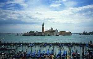
 Info created by imehling - uploaded by imehling - nominated by imehling -- Imehling (talk) 12:18, 20 December 2008 (UTC)
 Support -- Imehling (talk) 12:18, 20 December 2008 (UTC)
 Support-- nice picture& nice view. Sh1019 (talk) 14:58, 20 December 2008 (UTC)
 Oppose Very nice subject and composition, but sharpness and noise are below the standards. -- MJJR (talk) 21:02, 20 December 2008 (UTC)
 Oppose per MJJR. Lycaon (talk) 01:12, 21 December 2008 (UTC)
 Oppose per MJJR. —kallerna™ 15:38, 21 December 2008 (UTC)
 Support --Georgez (talk) 01:30, 27 December 2008 (UTC)
 Oppose Noisy. --Karelj (talk) 09:03, 28 December 2008 (UTC)
result: 3 support, 4 oppose, 0 neutral => not featured. -- Lycaon (talk) 20:57, 1 January 2009 (UTC)
Image:Hupao.jpg, featured[edit]
Voting period ends on 29 Dec 2008 at 13:09:34
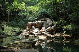
 Info created by sh1019 - uploaded by sh1019 - nominated by sh1019 -- Sh1019 (talk) 13:09, 20 December 2008 (UTC)
 Support -- Please give some advice.thanks.Sh1019 (talk) 13:09, 20 December 2008 (UTC)
 Support the lighting is what really pulled me in --ianaré (talk) 19:04, 20 December 2008 (UTC)
 Support Would make a beautiful poster. Good lighting, adequate sharpness, very good balance of shades and highlights, serene and peaceful composition. --JY REHBY (discuter) 23:54, 20 December 2008 (UTC)
 Support ■ MMXXtalk 07:42, 21 December 2008 (UTC)
.svg/15px-Pictogram_voting_comment_(orange).svg.png) Comment This photo needs a proper category. —kallerna™ 15:37, 21 December 2008 (UTC)
Comment This photo needs a proper category. —kallerna™ 15:37, 21 December 2008 (UTC)
.svg/15px-Pictogram_voting_comment_(orange).svg.png) Comment Blown highlights on statue, heavy vignetting... Noodle snacks (talk) 09:57, 22 December 2008 (UTC)
Comment Blown highlights on statue, heavy vignetting... Noodle snacks (talk) 09:57, 22 December 2008 (UTC) Support --Karelj (talk) 22:05, 23 December 2008 (UTC)
 Support --Georgez (talk) 01:31, 27 December 2008 (UTC)
result: 6 support, 0 oppose, 0 neutral => featured. -- Lycaon (talk) 21:01, 1 January 2009 (UTC)
Image:Common Pigeon Portrait.jpg, not featured[edit]
Voting period ends on 29 Dec 2008 at 20:41:43
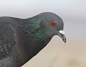
 Info created by Tomfriedel - uploaded by Tomfriedel - nominated by Tomfriedel -- Tomfriedel (talk) 20:41, 20 December 2008 (UTC)
 Support -- Tomfriedel (talk) 20:41, 20 December 2008 (UTC)
.svg/15px-Pictogram_voting_comment_(orange).svg.png) Comment This photo is superior (in my opinion) to the current Commons 'Common Pigeon Portrait' Featured Picture. Tomfriedel (talk) 20:45, 20 December 2008 (UTC)
Comment This photo is superior (in my opinion) to the current Commons 'Common Pigeon Portrait' Featured Picture. Tomfriedel (talk) 20:45, 20 December 2008 (UTC) Oppose But it is heavily downsampled, not identified and not categorized. Lycaon
.svg/15px-Pictogram_voting_comment_(orange).svg.png) Comment It is actually not downsampled, it is cropped. I didn't want too much of the bird's body to detract from the more interesting head and iridescence. 'Common Pigeon' is the official International Ornithological Congress name for this bird. I will look into the categories.
Comment It is actually not downsampled, it is cropped. I didn't want too much of the bird's body to detract from the more interesting head and iridescence. 'Common Pigeon' is the official International Ornithological Congress name for this bird. I will look into the categories.
- Identification means a scientific name which is unique for the species. 'Common pigeons' are also called rock pigeons, city doves, feral pigeons and other names that may add to the confusion. I'm not even talking of the French, the Turkish or the Urdu name then. Lycaon (talk) 11:34, 21 December 2008 (UTC)
 Support--Avala (talk) 11:53, 26 December 2008 (UTC)
 Oppose Nothing special. --Georgez (talk) 01:32, 27 December 2008 (UTC)
result: 2 support, 1 oppose, 0 neutral => not featured. -- Lycaon (talk) 21:02, 1 January 2009 (UTC)
Image:Filamento bombilla.JPG[edit]
Voting period ends on 30 Dec 2008 at 01:02:02
 Info created by Schumi4ever - uploaded by Schumi4ever - nominated by Schumi4ever -- JJ - Schumi4ever (talk) 01:02, 21 December 2008 (UTC)
 Support I know it is a bit small but it is quite difficult totake a photo of the inner wire of a light bulb whaen it is working. I had to take it through a welding mask glass, in order not to get a completely white picture; that is why you see it green. -- JJ - Schumi4ever (talk) 01:02, 21 December 2008 (UTC)
| Thank you for nominating this image. Unfortunately, it does not fall within the Guidelines and is unlikely to succeed for the following reason: image size is far below minimum requirements and most of it is even empty black space! | Anyone other than the nominator who disagrees may override this template by changing {{FPX}} to {{FPX contested}} and adding a vote in support. Voting will then continue in the usual way. If not contested within 24 hours, this nomination may be closed. |
Lycaon (talk) 01:08, 21 December 2008 (UTC)
.svg/15px-Pictogram_voting_comment_(orange).svg.png) Comment I know, but realise that the subject is only a few milimetres long, and just a milimetre wide, you cannot take a big photo (Though the original was 10Mpx). Also, the black part is necessary, I needed a welding mask glass, completely black, to take the photo. --JJ - Schumi4ever (talk) 01:20, 21 December 2008 (UTC)
Comment I know, but realise that the subject is only a few milimetres long, and just a milimetre wide, you cannot take a big photo (Though the original was 10Mpx). Also, the black part is necessary, I needed a welding mask glass, completely black, to take the photo. --JJ - Schumi4ever (talk) 01:20, 21 December 2008 (UTC)
 Oppose —kallerna™ 15:36, 21 December 2008 (UTC)
 Oppose Per comments above. --Georgez (talk) 01:35, 27 December 2008 (UTC)
File:Face of an African penguin.jpg, not featured[edit]
Voting period ends on 29 Dec 2008 at 23:32:53
 Info created by Baccharus - uploaded and nominated by Diti
 Support Unique (free photograph) and close view of this species. →Diti the penguin — 23:32, 20 December 2008 (UTC)
 Oppose blown highlights, noise, eyes out of focus --ianaré (talk) 08:27, 21 December 2008 (UTC)
 Oppose as Ianaré. BTW, all photos on Commons are free and most are unique ;-). Lycaon (talk) 11:38, 21 December 2008 (UTC)
- I meant that that kind of photos are rarely free, thus their “uniqueness” at Commons. :p If the image don't succeed, I think it's worth a nomination as a valued image. →Diti the penguin — 18:30, 21 December 2008 (UTC)
 Oppose Per the points mentioned above. Additionally, I don't like the composition. — Aitias // discussion 21:01, 21 December 2008 (UTC)
 Oppose Per ianaré. --Georgez (talk) 01:35, 27 December 2008 (UTC)
result: 1 support, 4 oppose, 0 neutral => not featured. -- Lycaon (talk) 21:04, 1 January 2009 (UTC)
File:Calidris alba portrait.JPG, Featured[edit]
Voting period ends on 30 Dec 2008 at 08:46:29
 Info Calidris alba - created, uploaded, and nominated by Ianaré Sévi
 Support -- ianaré (talk) 08:46, 21 December 2008 (UTC)
 Support Lycaon (talk) 11:36, 21 December 2008 (UTC)
 Support Nice picture. — Aitias // discussion 20:59, 21 December 2008 (UTC)
 Oppose Backgroung. --Karelj (talk) 23:30, 21 December 2008 (UTC)
 Oppose Bird blends in too much with background, with a difficult to see outline (shape) of body. Plants growing out of beak. --Tomascastelazo (talk) 00:39, 22 December 2008 (UTC)
 Oppose Mdf has a nice Sanderling photo that shows it mid-stride in it's typical beach running behaviour. This photo is side-lit and ideal lighting is thought to be from behind the photographer. Tomfriedel (talk) 02:21, 22 December 2008 (UTC)
- I'd disagree with that, lighting on axis with the photographer looks flat for birds. You really need of axis light then on axis fill. Noodle snacks (talk) 09:56, 22 December 2008 (UTC)
- I am not sure I follow what you write about axis, but I would look at photos by some of the top bird photographers like Alan Murphy and see if you can find any images lit this way. Another well known photographer/instructor is Arthur Morris, and you could quickly google to find his #1 tip about shooting in the direction of your shadow. Tomfriedel (talk) 23:13, 27 December 2008 (UTC)
- AFAIK Art Morris advocates shooting in this way in natural light (no flash), but he uses a better beamer and fill flash, which would be completely redundant if he was lucky enough to be on axis all the time. Here are some examples of his work and such lighting: [6],[7], [8], indeed the cover of his book is either side lit or back lit. IMHO the images that are shot with the on axis light you describe typically look very flat and boring (those are art morris shots as well). Noodle snacks (talk) 00:08, 28 December 2008 (UTC)
- Of course side-lit and back-lit photos sometimes look great, but in my opinion it does not help this photo. I will use the 100's of photos on Alan Murphy's site, many of which are staged, to contest your point that front-lit photos are 'typically' boring and flat. Tomfriedel (talk) 02:12, 29 December 2008 (UTC)
- AFAIK Art Morris advocates shooting in this way in natural light (no flash), but he uses a better beamer and fill flash, which would be completely redundant if he was lucky enough to be on axis all the time. Here are some examples of his work and such lighting: [6],[7], [8], indeed the cover of his book is either side lit or back lit. IMHO the images that are shot with the on axis light you describe typically look very flat and boring (those are art morris shots as well). Noodle snacks (talk) 00:08, 28 December 2008 (UTC)
- I am not sure I follow what you write about axis, but I would look at photos by some of the top bird photographers like Alan Murphy and see if you can find any images lit this way. Another well known photographer/instructor is Arthur Morris, and you could quickly google to find his #1 tip about shooting in the direction of your shadow. Tomfriedel (talk) 23:13, 27 December 2008 (UTC)
- I'd disagree with that, lighting on axis with the photographer looks flat for birds. You really need of axis light then on axis fill. Noodle snacks (talk) 09:56, 22 December 2008 (UTC)
 Support I like how the colors of a bird concur with colors of the background. --Lošmi (talk) 15:09, 22 December 2008 (UTC)
 Support --Massimo Catarinella (talk) 18:46, 22 December 2008 (UTC)
 Support --Böhringer (talk) 22:14, 22 December 2008 (UTC)
 Support --Georgez (talk) 01:37, 27 December 2008 (UTC)
 Support Nice --Richard Bartz (talk) 15:48, 28 December 2008 (UTC)
 Support -- MJJR (talk) 20:39, 28 December 2008 (UTC)
result: 9 support, 3 oppose, 0 neutral => featured. -- Lycaon (talk) 21:05, 1 January 2009 (UTC)
File:Larus novaehollandiae gnangarra 01.jpg, not featured[edit]
Voting period ends on 30 Dec 2008 at 14:20:25
 Info Silver Gull(Larus novaehollandiae) created by Gnangarra - uploaded by Gnangarra - nominated by -- Gnangarra 14:20, 21 December 2008 (UTC)
 Support -- Gnangarra 14:20, 21 December 2008 (UTC)
 Support Blurred at full resolution, however still a good picture overall. — Aitias // discussion 20:57, 21 December 2008 (UTC)
 Oppose Technically more or less ok, but it is another bird. Too static. Feet are hidden behind rock, looks awkward. --Tomascastelazo (talk) 00:37, 22 December 2008 (UTC)
 Oppose A nicely composed shot with nice colors, but technically not really ok, compare to for example http://commons.wikimedia.org/wiki/File:Larus-delawarensis-021.jpg at the pixel level. Silver Gull is listed as 'Least Concern' so I presume it is common somewhere. Tomfriedel (talk) 02:45, 22 December 2008 (UTC)
- Probably about the most common and easiest to photograph bird in coastal Australia. Noodle snacks (talk) 01:42, 27 December 2008 (UTC)
 Neutral Good... But it is to blurry to me to support. Calandrella (talk) 18:45, 22 December 2008 (UTC)
 Support --FilWriter 19:55, 23 December 2008 (UTC)
 Support--Avala (talk) 11:52, 26 December 2008 (UTC)
 Oppose too blurry at full resolution --ianaré (talk) 17:23, 26 December 2008 (UTC)
 Support--Georgez (talk) 01:40, 27 December 2008 (UTC)
 Oppose As Tomascastelazo. --Karelj (talk) 09:06, 28 December 2008 (UTC)
result: 5 support, 4 oppose, 0 neutral => not featured. -- Lycaon (talk) 21:08, 1 January 2009 (UTC)
File:Prague castle 3.jpg, not featured[edit]
Voting period ends on 30 Dec 2008 at 23:39:59
 Info created by Karelj - uploaded by Karelj - nominated by Karelj -- Karelj (talk) 23:39, 21 December 2008 (UTC)
 Support -- Karelj (talk) 23:39, 21 December 2008 (UTC)
 Oppose Smallish pano with no wow at all for me. Lycaon (talk) 23:52, 21 December 2008 (UTC)
 Oppose Tilted to the left, too much sky. I would have zoomed in about 15% crop out buildings to the left and take advantage of the reflexions on water. --Tomascastelazo (talk) 00:34, 22 December 2008 (UTC)
 Oppose terrible quality, boring composition --Simonizer (talk) 07:41, 22 December 2008 (UTC)
 Neutral I actually think that the image has wow, but, I am sorry to say, the qualitry is too bad to support. Calandrella (talk) 17:52, 22 December 2008 (UTC)
 Oppose Tilted, white balance is off, unsharp and noisy --Massimo Catarinella (talk) 18:46, 22 December 2008 (UTC)
 Oppose Je to fajn, ale aby to bylo FP tak by to asi chtělo vyšší ostrost a i rozlišení. A kromě toho mám pocit, že to mírně není rovně. Ale kompozice je skvělá, klasická a má hodně co říct. Dal bych nominaci na Valued Picture. --Aktron (talk) 19:41, 25 December 2008 (UTC)
 Neutral Pěkně nasvícené, ale z tohoto místa pochází většina fotek Hradu a tento oproti jiným zas až tak nevyniká. Souhlasím, že je to mírně našikmo a je tam až moc oblohy. --Dezidor (talk) 19:58, 25 December 2008 (UTC)
 OpposePer Massimo. --Georgez (talk) 01:39, 27 December 2008 (UTC)
 Neutral The composition is not so bad to me, but the sky is a bit too noisy, the reflect of the buildings is not complete and overall the stain in the sky is not very discret. --Metalheart (Have a talk ?) 23:45, 28 December 2008 (UTC)
result: 1 support, 6 oppose, 3 neutral => not featured. -- Lycaon (talk) 21:10, 1 January 2009 (UTC)
File:W5.jpg, withdrawn[edit]
Voting period ends on 31 Dec 2008 at 10:27:59
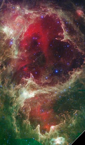
 Info created by NASA/JPL - uploaded by Anrie - nominated by Anrie -- Anrie (talk) 10:27, 22 December 2008 (UTC)
 Info A heart-shaped nebula, W5, about 6,500 light-years away in the constellation Cassiopeia. What's special about this picture (besides being heart-shaped and stunning), is that it also contains some of the best evidence yet for the triggered star-formation theory.
 Support -- Anrie (talk) 10:27, 22 December 2008 (UTC)
 Oppose amazing picture, but I can't support it with the huge black frame/watermark. I guess that picture on the bottom of the page [9] would be better when cropped (and higher resolution) -- Gorgo (talk) 19:17, 22 December 2008 (UTC)
 Oppose as per Gorgo --ianaré (talk) 01:22, 23 December 2008 (UTC)
.svg/15px-Pictogram_voting_comment_(orange).svg.png) Comment - I replaced the file with a cropped version. Hopefully this will address your concerns. Anrie (talk) 08:08, 23 December 2008 (UTC)
Comment - I replaced the file with a cropped version. Hopefully this will address your concerns. Anrie (talk) 08:08, 23 December 2008 (UTC).svg/15px-Pictogram_voting_comment_(orange).svg.png) Comment replacing an image while voting is still running is not the preferred way, better is to create a spearate version. I cropped a new image with the original data (see below), so it's now 21mp instead of only 4 ;). -- Gorgo (talk) 15:48, 23 December 2008 (UTC)
Comment replacing an image while voting is still running is not the preferred way, better is to create a spearate version. I cropped a new image with the original data (see below), so it's now 21mp instead of only 4 ;). -- Gorgo (talk) 15:48, 23 December 2008 (UTC)
.svg/15px-Pictogram_voting_comment_(orange).svg.png) Comment. Well, seeing as how there were only two opposing votes and no supporting ones (excluding my own), I used my discretion this time. Also, I hate having more than one edit of an image in a nomination, so I will rather support your version, meaning that
Comment. Well, seeing as how there were only two opposing votes and no supporting ones (excluding my own), I used my discretion this time. Also, I hate having more than one edit of an image in a nomination, so I will rather support your version, meaning that  Anrie (talk) 09:14, 24 December 2008 (UTC)
.svg/15px-Pictogram_voting_comment_(orange).svg.png) Comment As this is just one of millions of images, it is (in my opinion) in need of a more descriptive filename. Even for being just one of 1000's of deep space astronomy images, it is still in need of a more descriptive filename. -- carol (talk) 03:07, 24 December 2008 (UTC)
Comment As this is just one of millions of images, it is (in my opinion) in need of a more descriptive filename. Even for being just one of 1000's of deep space astronomy images, it is still in need of a more descriptive filename. -- carol (talk) 03:07, 24 December 2008 (UTC)
result: withdrawn -- Lycaon (talk) 21:12, 1 January 2009 (UTC)
File:W5 cropped.jpg, featured[edit]
Voting period ends on 1 Jan 2009 at 15:48:55
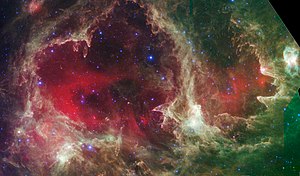
 Info created by NASA/JPL high-res and cropped version of above image. --Gorgo (talk) 15:48, 23 December 2008 (UTC)
.svg/15px-Pictogram_voting_comment_(orange).svg.png) Comment I think it's quite a stunning image. Unfortunately it has quality problems at the bottom, but cropping them would also mean losing the small nebula in the middle. -- Gorgo (talk) 15:48, 23 December 2008 (UTC)
Comment I think it's quite a stunning image. Unfortunately it has quality problems at the bottom, but cropping them would also mean losing the small nebula in the middle. -- Gorgo (talk) 15:48, 23 December 2008 (UTC) Support --ianaré (talk) 20:57, 23 December 2008 (UTC)
 Support --Man On Mission (talk) 08:25, 24 December 2008 (UTC)
 Support - As per my original nomination. This one is, however, of higher resolution. Anrie (talk) 09:14, 24 December 2008 (UTC)
 Support --Tomascastelazo (talk) 01:33, 25 December 2008 (UTC)
.svg/15px-Pictogram_voting_comment_(orange).svg.png) Comment As this is just one of millions of images, it is (in my opinion) in need of a more descriptive filename. Even for being just one of 1000's of deep space astronomy images, it is still in need of a more descriptive filename. -- carol (talk) 02:30, 25 December 2008 (UTC)
Comment As this is just one of millions of images, it is (in my opinion) in need of a more descriptive filename. Even for being just one of 1000's of deep space astronomy images, it is still in need of a more descriptive filename. -- carol (talk) 02:30, 25 December 2008 (UTC) Support--Georgez (talk) 01:41, 27 December 2008 (UTC)
 Support --FilWriter 15:32, 28 December 2008 (UTC)
 Support--imehling (talk) 17:59, 01 January 2009 (UTC)
result: 7 support, 0 oppose, 0 neutral => featured. -- Lycaon (talk) 21:11, 1 January 2009 (UTC)
File:PIA10245-Martian landslide.jpg, featured[edit]
Voting period ends on 31 Dec 2008 at 12:04:01
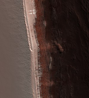
 Info created by NASA - uploaded by Anrie - nominated by Anrie -- Anrie (talk) 12:04, 22 December 2008 (UTC)
 Info The image shows a Martian avalanche, or debris fall, in action. It is extremely rare to catch such a dramatic event in action and observing currently active processes is often a useful tool in unlocking puzzles of the past for scientists studying the Earth.
 Support -- Anrie (talk) 12:04, 22 December 2008 (UTC)
 Support Indeed an interesting image. This is one of the great achievements of photography, that we seem to have lost sight of, the fact that photograhy transports us to far away places. I have one question (and many more probably!) I suppose that the high ground is the one of the left, the dark one, however, What is the scale? --Tomascastelazo (talk) 14:22, 22 December 2008 (UTC)
- Not sure about the scale. From the source page: The cloud is about 180 meters (590 feet) across and extends about 190 meters (625 feet) from the base of the steep cliff.. Indeed, the high ground is on the left. Again from the source page: The largest cloud [pictured] traces the path of the debris as it fell down the slope, hit the lower slope, and continues downhill, forming a billowing cloud front. Anrie (talk) 14:27, 22 December 2008 (UTC)
 Oppose It is surerly a cool event, but if I didn't know that, then the image just seem strange. Calandrella (talk) 17:40, 22 December 2008 (UTC)
- We have many Featured Pictures of which the awesomeness only becomes clear once one reads the summary. See, for example, a low-quality image of a man parachuting, low-quality image of three Russian woman simply standing still, this grainy picture of who knows what and strange, black gooey stuff. These are all images which depend to a certain degree on an explanation of what they contain. I hope this convinces you to reconsider. Anrie (talk) 17:54, 22 December 2008 (UTC)
 Oppose It's quite a rare picture that's true, but I can't see how that alone makes it to one of commons "finest" picture -- Gorgo (talk) 18:56, 22 December 2008 (UTC)
- IMO The image is one of commons "finest" pictures because it is highly educational and higly encyclopedic.--Mbz1 (talk) 20:21, 22 December 2008 (UTC)
- It's not clear to me why that picture is highly educational. I also don't really see where on wp it could possibly be extremely usefull, there is no article "landslides on mars" (only an extremely short part in "landslides") and I think we have quite a lot of pictures about mars already. So a little bit of criticism must be allowed here. -- Gorgo (talk) 20:50, 22 December 2008 (UTC)
.svg/15px-Pictogram_voting_comment_(orange).svg.png) Comment One of the greatest achievements of photography is that it brings different events, places and times to the present with a quality never seen before in the history of mankind. The fact that most people never reflect on this and take photography for granted is no reason to assume that these significant characteristics have come to pass. In fact, they are alive and well. The very fact that millions upon millions of dollars are spent on space travel and exploration, and the end result is a very sophisticated vehicle that basically what it does, among other things, is to gather visual information by putting a camera in front!!! Think of it as a rocket-propelled camera!
Comment One of the greatest achievements of photography is that it brings different events, places and times to the present with a quality never seen before in the history of mankind. The fact that most people never reflect on this and take photography for granted is no reason to assume that these significant characteristics have come to pass. In fact, they are alive and well. The very fact that millions upon millions of dollars are spent on space travel and exploration, and the end result is a very sophisticated vehicle that basically what it does, among other things, is to gather visual information by putting a camera in front!!! Think of it as a rocket-propelled camera!
- IMO The image is one of commons "finest" pictures because it is highly educational and higly encyclopedic.--Mbz1 (talk) 20:21, 22 December 2008 (UTC)
- The fact that one may ignore the content or the context of an image does not make it less important or impressive, but rather, it points out to the “lack of sensitivity” of the observer.
- The Mona Lisa is to many a work of art, appreciated by many, but the fact that one person may not consider it a work of art due to his/her own shortcomings, does not make a non work of art nor a subject of non appreciation. The same thing can be said for music.
- Now, as far as technical perfection, photography on earth has evolved drastically, and in today´s photography perhaps we can be picky (and pricky) about megapixels, HDR and all the new tec godies, but that does not diminish the value that photography of the past continues to bring us to this day. It is like time travel. And to judge great historical and valuable photographs based on today´s technical standards is plain foolish.
- To observe a high quality photograph of mars in today´s high quality standards, is in itself a wonder, both for photography and human achievement. The photograph is a testimony to both.
- Now, the sensitive part. A drive by oppose really does a disservice to the pursuit of knowledge, to the people who have worked to bring this to us, to the nominator and to the Wikipedia effort. Personal preference should be second to the public good. --Tomascastelazo (talk) 20:29, 22 December 2008 (UTC)
.svg/15px-Pictogram_voting_comment_(orange).svg.png) Comment Gorgo, I wasn´t talking about you, but generically. I took out the comparison, lest it offends other too. --Tomascastelazo (talk) 21:05, 22 December 2008 (UTC)
Comment Gorgo, I wasn´t talking about you, but generically. I took out the comparison, lest it offends other too. --Tomascastelazo (talk) 21:05, 22 December 2008 (UTC) Support unique and valuable image, also very good quality --ianaré (talk) 01:19, 23 December 2008 (UTC)
 Support Great scientific value, good quality --imehling (talk) 22:41, 23 December 2008 (UTC)
 Support Replaced in its context, a great image. Plus, when you don't know anything about the subject (and no "wow"), kind of picture which make you wonder why well-informed people think its valuable and search informations about it. --Pom² (talk) 14:43, 24 December 2008 (UTC)
- "when you don't know anything about the subject (and no "wow"), kind of picture which make you wonder why well-informed people think its valuable and search informations about it." Great point! Pom².--Mbz1 (talk) 15:39, 24 December 2008 (UTC)
 Support - Tappancs (talk) 19:30, 27 December 2008 (UTC)
 Support As per imehling -- MJJR (talk) 20:33, 28 December 2008 (UTC)
result: 7 support, 2 oppose, 0 neutral => featured. -- Lycaon (talk) 21:15, 1 January 2009 (UTC)
Voting period ends on 31 Dec 2008 at 12:04:01
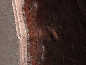
 Info This edit is a little more dramatic and understandable, IMHO. It's cropped but since the source image is so large, it still falls within guidelines.
 Support -- ianaré (talk) 03:02, 23 December 2008 (UTC)
 Oppose Per Gorgo. --Georgez (talk) 01:42, 27 December 2008 (UTC)
result: 1 support, 1 oppose, 0 neutral => not featured. -- Lycaon (talk) 21:15, 1 January 2009 (UTC)
File:Aepyceros melampus petersi 2.jpg, featured[edit]
Voting period ends on 31 Dec 2008 at 13:00:08
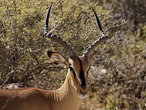
 Info Portrait of a Black-faced impala (Aepyceros melampus petersi) in Etosha, Namibia, created, uploaded and nominated by Lycaon (talk) 13:00, 22 December 2008 (UTC)
 Oppose Cute but looks like a zoo shot. Better use of DOF techniques would have separated the impala from the background. One of the principles of design in photography is to take advantage of the contour of the subjects. In this case it blends too much with background. A longer lens or a wider aperture would have taken care of this. --Tomascastelazo (talk) 13:24, 22 December 2008 (UTC)
 Support The DOF is sufficient for this picture. All other technical aspect are as well in order. The subject is remarkably sharp. --Massimo Catarinella (talk) 18:42, 22 December 2008 (UTC)
 Support --Böhringer (talk) 22:13, 22 December 2008 (UTC)
 Support subject is sharp, background blurry enough at full resolution. --ianaré (talk) 01:21, 23 December 2008 (UTC)
 Support --Mbdortmund (talk) 09:48, 23 December 2008 (UTC)
 Oppose quality is really good but the composition doesn't convince me. It is too straight forward for me. DOF is ok but I also think it good be a tad smaller. --AngMoKio (talk) 12:53, 23 December 2008 (UTC)
 Oppose Composition (background) is not good enough for FP. --Karelj (talk) 00:09, 24 December 2008 (UTC)
 Support - nice picture! --Man On Mission (talk) 07:05, 24 December 2008 (UTC)
 Support--Georgez (talk) 01:43, 27 December 2008 (UTC)
 Support Very nice image. --Tintero (talk) 22:35, 28 December 2008 (UTC)
 Oppose Background too busy. JalalV (talk) 05:05, 29 December 2008 (UTC)
 Support Oops forgot to support my own. Lycaon (talk) 09:48, 31 December 2008 (UTC)
result: 8 support, 4 oppose, 0 neutral => featured. -- Lycaon (talk) 21:15, 1 January 2009 (UTC)
File:Caesarea maritima BW 3.JPG, not featured[edit]
Voting period ends on 31 Dec 2008 at 16:26:11
 Info created - uploaded - nominated by -- Berthold Werner (talk) 16:26, 22 December 2008 (UTC)
 Support -- Berthold Werner (talk) 16:26, 22 December 2008 (UTC)
 Oppose lighting + composition -- Gorgo (talk) 19:10, 22 December 2008 (UTC)
.svg/15px-Pictogram_voting_comment_(orange).svg.png) Comment The aqueduct is a work of art, and the photographic representation could be improved a bit. If you have the opportunity to photograph it again I would suggest to step up to it, sharpen the angle of view, take it at 30º-40º or less, get one or two arches to cover about 50% of the image area and let the rest fall off into the space, creating a dynamic perspective. What this will do is to give good detail of the material, texture and construction and at the same time fill the frame nicely with a lot of detail. --Tomascastelazo (talk) 20:54, 22 December 2008 (UTC)
Comment The aqueduct is a work of art, and the photographic representation could be improved a bit. If you have the opportunity to photograph it again I would suggest to step up to it, sharpen the angle of view, take it at 30º-40º or less, get one or two arches to cover about 50% of the image area and let the rest fall off into the space, creating a dynamic perspective. What this will do is to give good detail of the material, texture and construction and at the same time fill the frame nicely with a lot of detail. --Tomascastelazo (talk) 20:54, 22 December 2008 (UTC) Oppose per Gorgo. —kallerna™ 13:15, 23 December 2008 (UTC)
 OpposePer Gorgo. --Georgez (talk) 01:46, 27 December 2008 (UTC)
result: 1 support, 3 oppose, 0 neutral => not featured. -- Lycaon (talk) 21:17, 1 January 2009 (UTC)
Image:Light in the darkness.jpg, not featured[edit]
Voting period ends on 01 jan 2009 at 20:47:53
 Info created by 123Hollic - uploaded by 123Hollic - nominated by 123Hollic -- 123Hollic (talk) 03:08, 23 December 2008 (UTC)
 Support -- 123Hollic (talk) 03:08, 23 December 2008 (UTC)
 Oppose blinded by the light? --Herrick (talk) 09:27, 23 December 2008 (UTC)
 OpposeWhat´s the point? --Georgez (talk) 01:48, 27 December 2008 (UTC)
 Oppose I see nothing special. --Aktron (talk) 20:58, 28 December 2008 (UTC)
 Oppose --Chrumps (talk) 19:53, 1 January 2009 (UTC)
result: 1 support, 4 oppose, 0 neutral => not featured. -- Lycaon (talk) 21:17, 1 January 2009 (UTC)
File:Convento Cristo December 2008-5a.jpg, not featured[edit]
Voting period ends on 2 Jan 2009 at 00:23:37
 Info Window of the Chapterhouse, from inside. Convent of Christ, Tomar, Portugal. Created & nominated by Alvesgaspar (talk) 00:23, 24 December 2008 (UTC)
 Support -- Alvesgaspar (talk) 00:23, 24 December 2008 (UTC)
 Neutral Oversaturated. Usually it wouldn't mind me, but what a pity you didn't use the Flash, insofar as the interesting thing on this photo was the room, which is not brightened enough. →Diti the penguin — 10:52, 24 December 2008 (UTC)
.svg/15px-Pictogram_voting_comment_(orange).svg.png) Comment - Sorry but, again, I don't agree. The flash would have ruined this natural colour. No saturation manipulation was done, only brightness correction. -- Alvesgaspar (talk) 12:08, 24 December 2008 (UTC)
Comment - Sorry but, again, I don't agree. The flash would have ruined this natural colour. No saturation manipulation was done, only brightness correction. -- Alvesgaspar (talk) 12:08, 24 December 2008 (UTC)
 Oppose There is no visual appeal. No wow factor. Even if a historical building, no relevant characteristics that set it apart from like buildings. --Tomascastelazo (talk) 00:52, 25 December 2008 (UTC)
 Oppose per Tomascastelazo. —kallerna™ 12:48, 27 December 2008 (UTC)
 Oppose Per Tomas. --Georgez (talk) 17:52, 27 December 2008 (UTC)
result: 1 support, 3 oppose, 1 neutral => rule of the 5th day: not featured. -- Lycaon (talk) 21:19, 1 January 2009 (UTC)
Image:Madonna Regina, cripta di Santa Prassede.jpg[edit]
Voting period ends on 28 Dec 2008 at 17:40:32
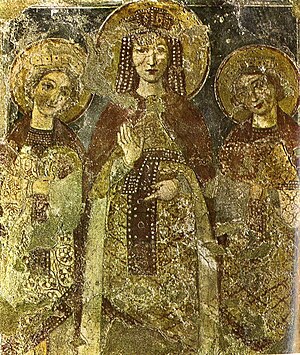
 Info created by FilWriter - uploaded by FilWriter - nominated by FilWriter -- FilWriter (talk) 17:40, 19 December 2008 (UTC)
 Support -- FilWriter (talk) 17:40, 19 December 2008 (UTC)
| Thank you for nominating this image. Unfortunately, it does not fall within the Guidelines and is unlikely to succeed for the following reason: image is much too small. | Anyone other than the nominator who disagrees may override this template by changing {{FPX}} to {{FPX contested}} and adding a vote in support. Voting will then continue in the usual way. If not contested within 24 hours, this nomination may be closed. |
Dura lex sed lex; sorry. Lycaon (talk) 18:23, 25 December 2008 (UTC)
- Errare humanum est --Richard Bartz (talk) 15:55, 28 December 2008 (UTC)
File:Thomas Bresson - Azure-10 (by).jpg[edit]
 Info created by ComputerHotline - uploaded by ComputerHotline - nominated by ComputerHotline --ComputerHotline (talk) 12:20, 25 December 2008 (UTC)
 Support --ComputerHotline (talk) 12:20, 25 December 2008 (UTC)
| Thank you for nominating this image. Unfortunately, it does not fall within the Guidelines and is unlikely to succeed for the following reason: it is too small | Anyone other than the nominator who disagrees may override this template by changing {{FPX}} to {{FPX contested}} and adding a vote in support. Voting will then continue in the usual way. If not contested within 24 hours, this nomination may be closed. |
--Simonizer (talk) 19:21, 25 December 2008 (UTC)
File:Thomas Bresson - Pieride1-1 (by).jpg, not featured[edit]
 Info created by Username - uploaded by Username - nominated by Username --ComputerHotline (talk) 13:43, 25 December 2008 (UTC)
 Support --ComputerHotline (talk) 13:43, 25 December 2008 (UTC)
 Oppose Nice Composition, but Quality ist not good enough for FP in my opinion --Simonizer (talk) 19:24, 25 December 2008 (UTC)
 Oppose per Simonizer. —kallerna™ 12:45, 27 December 2008 (UTC)
 Oppose Per Simonizer. --Georgez (talk) 17:56, 27 December 2008 (UTC)
result: 1 support, 3 oppose, 0 neutral => rule of the 5th day: not featured. -- Lycaon (talk) 21:20, 1 January 2009 (UTC)
File:Boxing080905 photoshop.jpg, FPX: not features[edit]
Voting period ends on 8 Jan 2009 at 20:50:39
 Info created by Wayne Short - uploaded by Shawnc - nominated by diego_pmc -- diego_pmc (talk) 20:50, 30 December 2008 (UTC)
 Info For some reason, even though this image is listed as a FP in the Sports section, I can't find its nomination. I guess someone just 'skipped' that step and added it to the list. Anyway, I thought it was a pretty darn good image and preferred to nominate it properly, rather than just remove it from the list. diego_pmc (talk) 20:50, 30 December 2008 (UTC)
 Support -- diego_pmc (talk) 20:50, 30 December 2008 (UTC)
 Oppose No wow for me. --Georgez (talk) 21:04, 30 December 2008 (UTC)
.svg/15px-Pictogram_voting_comment_(orange).svg.png) Comment "No wow"? Please provide a real reason for opposing this image. Redmarkviolinist (talk) 17:13, 31 December 2008 (UTC)
Comment "No wow"? Please provide a real reason for opposing this image. Redmarkviolinist (talk) 17:13, 31 December 2008 (UTC)
| Thank you for nominating this image. Unfortunately, it does not fall within the Guidelines and is unlikely to succeed for the following reason: the image is below the size requirements. | Anyone other than the nominator who disagrees may override this template by changing {{FPX}} to {{FPX contested}} and adding a vote in support. Voting will then continue in the usual way. If not contested within 24 hours, this nomination may be closed. |
Lycaon (talk) 21:10, 30 December 2008 (UTC)
Votes after FPX 24hrs limit



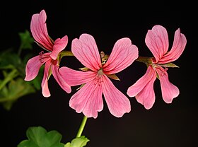


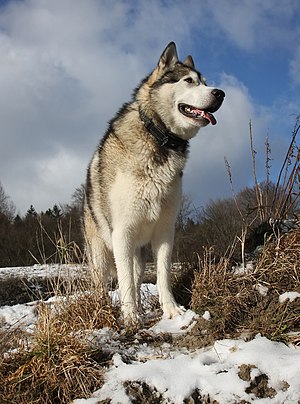
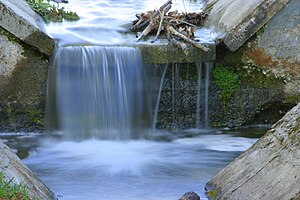
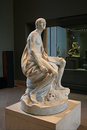
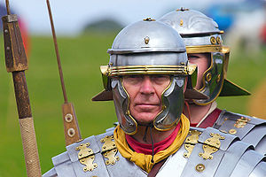
.jpg/300px-Thomas_Bresson_-_Machaon-1_(by).jpg)
.jpg/300px-ComputerHotline_-_Vulcain_(by).jpg)
.jpg/300px-Thomas_Bresson_-_Punaise_mangeant_une_chenille_sur_des_orties_(by).jpg)
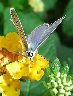
.jpg/300px-Thomas_Bresson_-_Pieride1-1_(by).jpg)