
Commons:Featured picture candidates/Log/May 2015
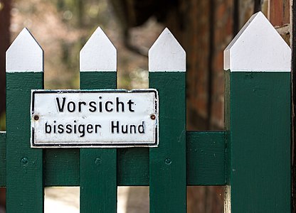
File:Dülmen, Buldern, Eingang zu einem Wohnhaus -- 2015 -- 5388.jpg, not featured[edit]
Voting period is over. Please don't add any new votes.Voting period ends on 30 Apr 2015 at 19:02:54 (UTC)
Visit the nomination page to add or modify image notes.
- Category: Commons:Featured pictures/Objects
 Info created by XRay - uploaded by XRay - nominated by XRay -- XRay talk 19:02, 21 April 2015 (UTC)
 Support -- XRay talk 19:02, 21 April 2015 (UTC)
.svg/15px-Pictogram_voting_comment_(orange).svg.png) Comment Could you please add a category above? Thanks, Yann (talk) 19:11, 21 April 2015 (UTC)
Comment Could you please add a category above? Thanks, Yann (talk) 19:11, 21 April 2015 (UTC)
- Comment What does that say in English? (What does the warning sign mean?) --Laitche (talk) 19:21, 21 April 2015 (UTC)
 Neutral I think the composition and technical quality is good and so is the idea of simply framing the subject like this. The background is too busy with too uneven contrast for my taste though. -- Slaunger (talk) 19:44, 21 April 2015 (UTC)
 Oppose A QI but not an FP—no wow. Daniel Case (talk) 22:43, 21 April 2015 (UTC)
- Oppose per Daniel Case --Martin Falbisoner (talk) 06:24, 22 April 2015 (UTC)
- Oppose I don't find this sufficiently striking for FP, and as Slaunger says the background is too busy, as well. --MichaelMaggs (talk) 08:34, 22 April 2015 (UTC)
- Neutral --Tremonist (talk) 14:07, 22 April 2015 (UTC)
- Support --LuisArmandoRasteletti (talk) 11:06, 25 April 2015 (UTC)
- Oppose per others. -- Colin (talk) 11:34, 27 April 2015 (UTC)
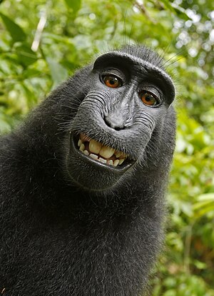
File:Macaca nigra self-portrait large.jpg, not featured[edit]
Voting period is over. Please don't add any new votes.Voting period ends on 30 Apr 2015 at 15:51:38 (UTC)
Visit the nomination page to add or modify image notes.
- Category: Commons:Featured pictures/Animals/Mammals
- Info created by a female Celebes crested macaque, uploaded by Crisco 1492, nominated by Qian.neewan -- Qian.neewan (talk) 15:51, 21 April 2015 (UTC)
- Support -- Qian.neewan (talk) 15:51, 21 April 2015 (UTC)
- Comment Could you please add a category above? Yann (talk) 15:59, 21 April 2015 (UTC)
- Support copyright issue of this picture makes it a featured picture to me, but it is great anyway. --Villy Fink Isaksen (talk) 18:08, 21 April 2015 (UTC)
- Neutral Nice, but IMO not FP. It's special because it was made by a monkey, but it is only a snapshot. --XRay talk 19:11, 21 April 2015 (UTC)
- It's a stolen image IMO. No matter what the stupid law says. --Donninigeorgia (talk) 19:15, 21 April 2015 (UTC)
- Comment This image was discussed extensively by a large number of reviewers at the earlier nomination: Commons:Featured picture candidates/File:Macaca nigra self-portrait (rotated and cropped).jpg. However, the actual JPG offered here is much larger (11.74MP vs 1.63MP) so I guess a revisit is justified. -- Colin (talk) 19:50, 21 April 2015 (UTC)
- Support Quality is not so bad seeing the condition how it was taken (good camera or artist monkey? ;oD) And now it is famous. Yann (talk) 22:31, 21 April 2015 (UTC)
- Support --King of ♥ ♦ ♣ ♠ 01:39, 22 April 2015 (UTC)
- Support - Great selfportrait... Kleuske (talk) 10:05, 22 April 2015 (UTC)
- Support Jacopo Werther iγ∂ψ=mψ 11:29, 22 April 2015 (UTC)
- Oppose There is enough doubt about the copyright status of this image to make featuring it unwise. Voting to promote it to FP status just as the (human) photographer has said in yesterday's edition of Amateur Photographer that he is ‘working to pursue infringers in the UK’ feels too much like an unethical exercise in photographer-baiting. --MichaelMaggs (talk) 13:49, 22 April 2015 (UTC)
- Michael, this is the wrong place to discuss the copyright status of this picture, which already have been discussed ad nauseam and settled. David Slater is not the photographer (that's the point), and he sent a DMCA notice to the WMF and it was rejected. BTW his arguments are complete bullshit. Regards, Yann (talk) 21:34, 22 April 2015 (UTC)
- See m:Wikimedia_Foundation_Transparency_Report/Requests_for_Content_Alteration_&_Takedown#Monkey_Selfie. -- KTC (talk) 22:41, 22 April 2015 (UTC)
- Yann, while I agree the copyright issue has been discussed ad nauseam and settled in the US, the image still strongly divides opinion on the ethics (enshrined in law or otherwise) of treating this image as free. A featured picture is supposed to be one "of the finest on Commons" and if some feel it is not ethical to host/promote such works then their opinion is a valid aspect that judgement of "our finest", even if some disagree. While threats of legal action continue in the UK, it would probably be unwise for any UK-based person to re-use this image [other than "fair use" for commentary, which seems to be 99% of its usage anyway], which surely affects its status as being among our best free works. -- Colin (talk) 07:54, 23 April 2015 (UTC)
- Colin, the copyright status has been reviewed by several legal experts, including from WMF and the US government. I don't think there is any doubt that it is in the public domain in the USA and most countries. Regards, Yann (talk) 08:01, 23 April 2015 (UTC)
- I know and I agree it seems pretty settled wrt copyright law. Doesn't mean that the ethics are settled (they clearly aren't, especially outside of Commons) or that the continued threat of legal action in the UK can be completely ignored. These two issues exist, regardless of whether one agrees with them or not. -- Colin (talk) 09:54, 23 April 2015 (UTC)
- Yann, I understand that you don't see any ethical problem here. I do. The copyright situation in the UK is by no means as clear as it is in the US, and if it were to be adjudicated by a UK court the decision could go either way. That, and the perception that Commons is featuring the image out of spite is very relevant, in my view. The comment by Daniel Case, below, exemplifies the type of hostile and unpleasant view that I find most regrettable. --MichaelMaggs (talk) 10:29, 23 April 2015 (UTC)
- Sorry to say, but talking about ethics here is a big hypocrisy. I am pretty sure than the camera owner, now being known as "the man who helped creating the monkey selfie", is a much better commercial position than being a photographer of an ordinary picture of an ordinary monkey. Beside, we promoted pictures of much worse ethics than this without anyone raising an eyebrow about it. And we will certainly do it again in the future. That's not an issue in itself, Commons being not a project for promoting ethics. I would be happy to discuss this in a RFC about "ethics and Commons", this nomination is not the right place to do it. Regards, Yann (talk) 19:35, 23 April 2015 (UTC)
- Colin, the copyright status has been reviewed by several legal experts, including from WMF and the US government. I don't think there is any doubt that it is in the public domain in the USA and most countries. Regards, Yann (talk) 08:01, 23 April 2015 (UTC)
- Michael, this is the wrong place to discuss the copyright status of this picture, which already have been discussed ad nauseam and settled. David Slater is not the photographer (that's the point), and he sent a DMCA notice to the WMF and it was rejected. BTW his arguments are complete bullshit. Regards, Yann (talk) 21:34, 22 April 2015 (UTC)
- Support --Tremonist (talk) 14:04, 22 April 2015 (UTC)
- Oppose Just another selfie. Saffron Blaze 22:45, 22 April 2015 (UTC)
- Oppose I don't want to be too formal but per XRay plus it was taken accidentally. --Laitche (talk) 22:49, 22 April 2015 (UTC)
- Strong support because it's now a picture with historic value in and of itself, it was pretty good to begin with, and David Slater can go stick his long lens where the sun don't shine. Daniel Case (talk) 23:43, 22 April 2015 (UTC)
- ... and another case in point as to why I don't contribute images to Wikimedia Commons anymore. Saffron Blaze (talk) 23:23, 23 April 2015 (UTC)
- Oppose bastial, animal, but not FP. A "snapsot" taken from an animal can't be featured. It is simply a random image, a snapshot. --Alchemist-hp (talk) 22:10, 24 April 2015 (UTC)
- Who or what created the image is not a criterion for FP. Daniel Case (talk) 16:01, 25 April 2015 (UTC)
- @Daniel Case: sorry, but what will be featured on this absolute and real/true random snapshot??? Can you please explain it me? That was neither wanted nor intended. It is comparable to a game of roulette or lotterie ... a simply chance from an interesting animal! --Alchemist-hp (talk) 20:38, 25 April 2015 (UTC)
- Who or what created the image is not a criterion for FP. Daniel Case (talk) 16:01, 25 April 2015 (UTC)
- Support --LuisArmandoRasteletti (talk) 11:06, 25 April 2015 (UTC)
- Oppose Nonsense. Jee 11:06, 27 April 2015 (UTC)
- Oppose as others -- Christian Ferrer 11:49, 27 April 2015 (UTC)
- Oppose Per others --LivioAndronico talk 15:09, 27 April 2015 (UTC)
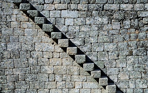
File:Stairway Monsanto Castle April 2015-1.jpg, featured[edit]
Voting period is over. Please don't add any new votes.Voting period ends on 2 May 2015 at 08:51:34 (UTC)
Visit the nomination page to add or modify image notes.
- Category: Commons:Featured pictures/Places/Architecture/Castles and fortifications
- Info Granite stairway in the Castle of Monsanto, Portugal. All by Alvesgaspar (talk) 08:51, 23 April 2015 (UTC)
- Support -- Alvesgaspar (talk) 08:51, 23 April 2015 (UTC)
- Comment At first view it appears as a zig-zag line rather than stairs, but it's really well-made. Is it possible to increase the stones' sharpness a bit? --Tremonist (talk) 12:07, 23 April 2015 (UTC)
- This is a very high resolution photo, with more than 22Mp. In my opinion the stones of granite are as sharp as they can be. Any further sharpening would cause undesired artifacts. Alvesgaspar (talk) 15:50, 23 April 2015 (UTC)
- Support Love the optical illusion created by those dark and harsh shadows. Well spotted and executed – Chapeau! Sharpness is perfectly fine for me. If you can find the stairs on a map, geocoding would be nice. --El Grafo (talk) 08:01, 24 April 2015 (UTC)
 Done Thank you @El Grafo: , it's good to know that some of our peers (one, at least!) perceive things the same way we do! Aussi, c'est bon d'être félicité en français! Alvesgaspar (talk) 18:21, 24 April 2015 (UTC)
- Support Excellent jeu d'ombres! At low resolution I have the impression that the stones are arranged in the wall and not that they are a stairs outside of this one. -- Christian Ferrer 08:04, 25 April 2015 (UTC)
- Support --LuisArmandoRasteletti (talk) 11:02, 25 April 2015 (UTC)
- Support I suggested a very small crop. Could we have a better file name? --Kadellar (talk) 12:20, 25 April 2015 (UTC)
- Support Nice subject! Very good! 😄 ArionEstar 😜 (talk) 16:08, 25 April 2015 (UTC)
- @Kadellar: & @Slaunger: -- I tried to crop a bit on the top and doesn't work out imo. The bright part in the bottom stair was darkened because it was a bit distracting. Alvesgaspar (talk) 20:47, 26 April 2015 (UTC)
- Support Did I say how much I love you when you submit this kind of pictures ?
 --Jebulon (talk) 14:43, 27 April 2015 (UTC)
- Indeed you did! Thank you Jebulon, I will try to nominate as many minimalist pictures as I can. Even knowing that most editors don't appreciate them much... Alvesgaspar (talk) 15:09, 27 April 2015 (UTC)
- Support very clear composition. --Hubertl (talk) 09:13, 28 April 2015 (UTC)
- Support Archaic. --Johann Jaritz (talk) Johann Jaritz 06:02, 29 April 2015 (UTC)
- Support nice idea. --Charles (talk) 09:19, 29 April 2015 (UTC)
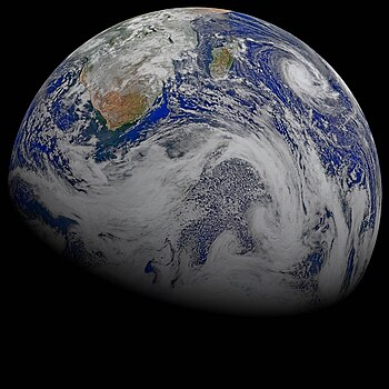
File:A Sky View of Earth From Suomi NPP.jpg, not featured[edit]
Voting period is over. Please don't add any new votes.Voting period ends on 1 May 2015 at 18:33:03 (UTC)
Visit the nomination page to add or modify image notes.
- Category: Commons:Featured pictures/Places/Satellite images
- Info created by NASA - uploaded & nominated by Originalwana (talk) 18:33, 22 April 2015 (UTC)
- Support As nominator Originalwana (talk) 18:33, 22 April 2015 (UTC)
- Comment I don't agree with the category... --Laitche (talk) 22:10, 22 April 2015 (UTC)
- Commons:Featured pictures/Astronomy? Yann (talk) 09:40, 23 April 2015 (UTC)
- Or Commons:Featured pictures/Places/Satellite images. -- KTC (talk) 10:11, 23 April 2015 (UTC)
- Commons:Featured pictures/Astronomy? Yann (talk) 09:40, 23 April 2015 (UTC)
- Neutral --Tremonist (talk) 12:18, 23 April 2015 (UTC)
- Oppose I think something wrong with the colours. --Laitche (talk) 22:17, 23 April 2015 (UTC)
- Support --LuisArmandoRasteletti (talk) 11:04, 25 April 2015 (UTC)
- Support Being a satellite photo, the colors are acceptable. 😄 ArionEstar 😜 (talk) 01:47, 26 April 2015 (UTC)
- Oppose I appreciate the colours are probably artificially generated, but they aren't realistic and since the JPG lacks any colourspace tag or profile, what you and I see is arbitrary rather than well-defined. -- Colin (talk) 11:40, 27 April 2015 (UTC)
File:Rissne Metro station September 2014.jpg, featured[edit]
Voting period is over. Please don't add any new votes.Voting period ends on 1 May 2015 at 19:59:46 (UTC)
Visit the nomination page to add or modify image notes.
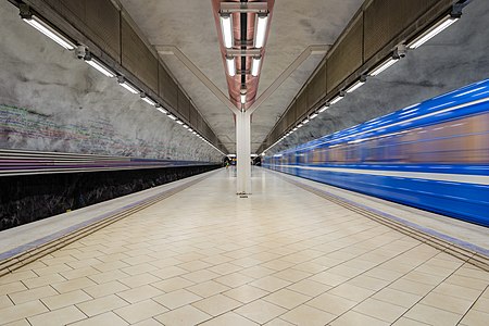
- Category: Commons:Featured pictures/Places/Interiors
- Info Rissne metro station, Stockholm. Created, uploaded and nominated by -- Arild Vågen (talk) 19:59, 22 April 2015 (UTC)
- Support -- ArildV (talk) 19:59, 22 April 2015 (UTC)
- Support --Code (talk) 04:49, 23 April 2015 (UTC)
- Support The train is blurred "on purpose", it's greatly done! And on the left wall even the writing is readable. Good work! --Tremonist (talk) 12:14, 23 April 2015 (UTC)
- Support very good, but note my suggested crop --Martin Falbisoner (talk) 12:17, 23 April 2015 (UTC)
- Support --Jacek Halicki (talk) 13:04, 23 April 2015 (UTC)
- Support but note my suggested crop, too, it is a bit different --Villy Fink Isaksen (talk) 14:01, 23 April 2015 (UTC)
- Support Daniel Case (talk) 01:02, 24 April 2015 (UTC)
- Weak Support. Nicely taken, although it's not the most interesting view. Very minimalist, not a lot of visual interest. Diliff (talk) 09:52, 24 April 2015 (UTC)
- Support --LuisArmandoRasteletti (talk) 11:03, 25 April 2015 (UTC)
- Support I like the composition and the overall "crispness" of how you captured this specific moment. --Frank Schulenburg (talk) 01:37, 27 April 2015 (UTC)
- Oppose We have now a lot of this kind of pictures in our gallery. The bar is getting higher and higher and is one is not the best of the best (Matter of taste), sorry.--Jebulon (talk) 14:51, 27 April 2015 (UTC)
- Oppose That train is really poorly captured with it being completely blown. I think it would look better without being blurred. Sorry. -- Pofka (talk) 14:14, 29 April 2015 (UTC)
- The train is blurred "on purpose".--ArildV (talk) 14:18, 29 April 2015 (UTC)
- Support Nice effect to the train. 😄 ArionEstar 😜 (talk) 22:47, 29 April 2015 (UTC)
File:Monaco Panorama 2015.jpg, featured[edit]
Voting period is over. Please don't add any new votes.Voting period ends on 2 May 2015 at 06:45:16 (UTC)
Visit the nomination page to add or modify image notes.
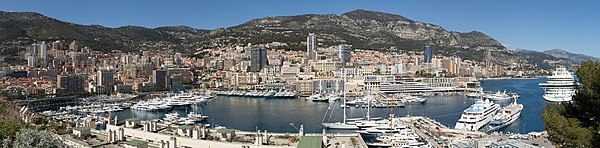
- Category: Commons:Featured pictures/Places/Panoramas
- Info all by Villy Fink Isaksen -- Villy Fink Isaksen (talk) 06:45, 23 April 2015 (UTC)
- Support -- Villy Fink Isaksen (talk) 06:45, 23 April 2015 (UTC)
- Support Great panorama with many, many details. --Tremonist (talk) 12:09, 23 April 2015 (UTC)
- Support --Jacek Halicki (talk) 13:02, 23 April 2015 (UTC)
- Support Yann (talk) 13:19, 23 April 2015 (UTC)
- Support --King of ♥ ♦ ♣ ♠ 00:25, 24 April 2015 (UTC)
- Support --Böhringer (talk) 06:31, 24 April 2015 (UTC)
- Comment Nice panorama though the colors look faded. --Laitche (talk) 07:28, 24 April 2015 (UTC)
- Oppose for now, although I could be persuaded to support if reprocessed to fix the issues with the sky. The whole scene looks slightly too dark too. I appreciate that it might have been to preserve highlight detail, but a bit of bumping up shadow and mids might be useful. Diliff (talk) 10:01, 24 April 2015 (UTC)
- Comment I am working on it but it is a hard job, please wait a few days. --Villy Fink Isaksen (talk) 21:47, 24 April 2015 (UTC)
- Support --LuisArmandoRasteletti (talk) 11:02, 25 April 2015 (UTC)
- Done Uploaded a better version with more light in the dark areas. And the sky is also better now. --Villy Fink Isaksen (talk) 19:24, 26 April 2015 (UTC)
- Support. Improved. I still think the right side of the sky is a bit dull and not very blue and the transitions between the frames is not great (you can clearly see a difference in brightness), but the left side is improved. Overall, it's just good enough for a support, but if you still have some energy to improve the sky on the right, it would be another step in the right direction. Did you make sure that each frame had the same exposure and the same white balance? It seems like something isn't quite right. Diliff (talk) 21:37, 26 April 2015 (UTC)
- Comment It's a tiny thing but a stitching error, added an image note. If you'd like to remove that, please do so. --Laitche (talk) 10:38, 27 April 2015 (UTC)
- Done I have uploaded a panorama with less stitching error, but this has moved to another place in the picture but harder to see. Thanks for all the reviews. The panorama is from 7 picture taken on vacation in southern France, and I was not prepared to take panoramas, so the seven picture are taken with f/11 but with different shutter time from 1/320 to 1/160 that leads to problems. And the boats have moved a bit between the shots and that leads to stitching errors. THX all. --Villy Fink Isaksen (talk) 13:38, 27 April 2015 (UTC)
- Comment Sorry, but I have uploaded the wrong version twice - but now it looks like the right one. - SORRY. --Villy Fink Isaksen (talk) 17:04, 28 April 2015 (UTC)
- Neutral Much better but still the colors are a bit faded and gradually changing a part by a part. --Laitche (talk) 22:00, 28 April 2015 (UTC)
- Support -- Pofka (talk) 14:12, 29 April 2015 (UTC)
File:Red Fuji southern wind clear morning.jpg, featured[edit]
Voting period is over. Please don't add any new votes.Voting period ends on 2 May 2015 at 09:35:45 (UTC)
Visit the nomination page to add or modify image notes.
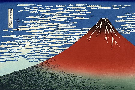
- Category: Commons:Featured pictures/Non-photographic media
- Info created by Katsushika Hokusai, uploaded by Petrusbarbygere, nominated by -- Yann (talk) 09:35, 23 April 2015 (UTC)
- Support Famous painting by Katsushika Hokusai, mostly known as the author of The Great Wave off Kanagawa. Renomination. -- Yann (talk) 09:35, 23 April 2015 (UTC)
- Support --Mile (talk) 10:02, 23 April 2015 (UTC)
- Support Quality reproduction. --Tremonist (talk) 12:02, 23 April 2015 (UTC)
{{s}}Razorsharp, notable artist, great work. Kleuske (talk) 12:59, 23 April 2015 (UTC)- Comment I nominated the alternative. This version was published circa 1930 and also the woodblock was made circa 1930. At least Hokusai had never seen this version then I'd like to support the alternative. When the last time I nominated this, I didn't realize that. --Laitche (talk) 13:05, 23 April 2015 (UTC)
- Support --LuisArmandoRasteletti (talk) 17:19, 25 April 2015 (UTC)
Alternative[edit]
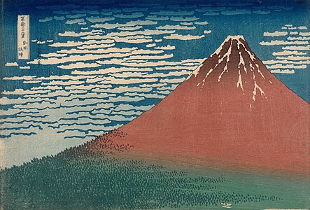
- Info This version was published circa 1830 - 1831. --Laitche (talk) 13:05, 23 April 2015 (UTC)
- Support --Laitche (talk) 13:05, 23 April 2015 (UTC)
- Support Obviously. Yann (talk) 14:48, 23 April 2015 (UTC)
- Support --Martin Falbisoner (talk) 05:37, 24 April 2015 (UTC)
- Support Also good. --Tremonist (talk) 12:20, 24 April 2015 (UTC)
- Support Better colors. Comparing the two versions, i find the above a bit overdone. Kleuske (talk) 12:59, 23 April 2015 (UTC)
- Oppose Too dull. -- Fotoriety (talk) 01:08, 25 April 2015 (UTC)
- Support --LuisArmandoRasteletti (talk) 11:00, 25 April 2015 (UTC)
- Support Beeing a painting published circa 1830 - 1831, it's very FP. 😄 ArionEstar 😜 (talk) 17:16, 30 April 2015 (UTC)
- Oppose -- It's impossible not to evaluate the work of art, though the idea in FPC is to evaluate the photography instead. And I don't like this one particularly. Alvesgaspar (talk) 09:41, 1 May 2015 (UTC)
File:2014 Szczytna, fontanna.JPG, featured[edit]
Voting period is over. Please don't add any new votes.Voting period ends on 2 May 2015 at 12:43:27 (UTC)
Visit the nomination page to add or modify image notes.
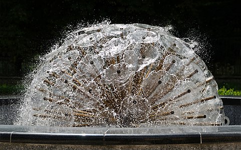
- Category: Commons:Featured pictures/Places/Architecture
- Info All by me -- Jacek Halicki (talk) 12:43, 23 April 2015 (UTC)
- Support -- Jacek Halicki (talk) 12:43, 23 April 2015 (UTC)
- Support Yann (talk) 17:57, 23 April 2015 (UTC)
- Support 😄 ArionEstar 😜 (talk) 19:36, 23 April 2015 (UTC)
- Support --King of ♥ ♦ ♣ ♠ 00:24, 24 April 2015 (UTC)
- Support --Tremonist (talk) 12:23, 24 April 2015 (UTC)
- Support Yarl ✉ 18:15, 24 April 2015 (UTC)
- Support Daniel Case (talk) 19:56, 24 April 2015 (UTC)
- Oppose Definitely a QI but not an FP for me(Good quality but
taken a fountain just as it is,the crop is too tight and background is too bark), sorry. --Laitche (talk) 09:39, 25 April 2015 (UTC)--Laitche (talk) 11:27, 25 April 2015 (UTC) - Support D kuba (talk) 10:06, 25 April 2015 (UTC)
- Support --LuisArmandoRasteletti (talk) 11:00, 25 April 2015 (UTC)
- Support--Lmbuga (talk) 11:00, 25 April 2015 (UTC)
- Support --Hubertl (talk) 09:12, 28 April 2015 (UTC)
- Support --Johann Jaritz (talk) 16:03, 28 April 2015 (UTC)
- Support--LivioAndronico talk 21:01, 28 April 2015 (UTC)
- Support -- Pofka (talk) 14:11, 29 April 2015 (UTC)
 Question This shape of the fountain is only this moment which was shotten? Or always this shape? If only this moment, I'd like to change my vote to support. --Laitche (talk) 15:29, 29 April 2015 (UTC)
- @Laitche: I'm not sure if I understood you well. Location of the nozzle does not change, but the power of the water stream changes with time and it is difficult to capture the maximum. --Jacek Halicki (talk) 16:14, 29 April 2015 (UTC)
- If I can see the video of this fountain, I want to see that. That's kind of what I meant. --Laitche (talk) 22:46, 29 April 2015 (UTC)
- I take only pictures, I don't have any videos. --Jacek Halicki (talk) 10:33, 1 May 2015 (UTC)
- If I can see the video of this fountain, I want to see that. That's kind of what I meant. --Laitche (talk) 22:46, 29 April 2015 (UTC)
- @Laitche: I'm not sure if I understood you well. Location of the nozzle does not change, but the power of the water stream changes with time and it is difficult to capture the maximum. --Jacek Halicki (talk) 16:14, 29 April 2015 (UTC)
- Support --Llez (talk) 20:05, 30 April 2015 (UTC)
- Support Simple and effective. Alvesgaspar (talk) 09:39, 1 May 2015 (UTC)
- Support I'd have cropped a bit more at the bottom but overall FP to me for originality and quality Poco2 08:45, 2 May 2015 (UTC)
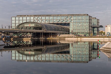
File:Berlin Hauptbahnhof Ostseite HDR.jpg, featured[edit]
Voting period is over. Please don't add any new votes.Voting period ends on 6 May 2015 at 05:56:28 (UTC)
Visit the nomination page to add or modify image notes.
- Category: Commons:Featured pictures/Places/Architecture
- Info created by Code - uploaded by Code - nominated by Code -- Code (talk) 05:56, 27 April 2015 (UTC)
- Info East facade of Berlin Central Station as seen at early dawn from Alexanderufer. The building is reflecting in the water of Humboldt harbour. The building was designed by Meinhard von Gerkan. HDR made of three exposures (f/11, ISO 100, exposure times 1/30, 1/60, 1/125).
- Support -- Code (talk) 05:56, 27 April 2015 (UTC)
- Support --A.Savin 11:53, 27 April 2015 (UTC)
- Support Impressiv light, composition, quality and high EV.--ArildV (talk) 14:14, 27 April 2015 (UTC)
- Support 😄 ArionEstar 😜 (talk) 16:30, 27 April 2015 (UTC)
- Support I'm surprised we don't yet have any FPs of this building ... just walking around inside you can find so many striking views. I'd love if we had it against a bluer sky, but as it is this is well-done. Daniel Case (talk) 16:55, 27 April 2015 (UTC)
- We do have one: File:S-Bahn at Hauptbahnhof Berlin.JPG, and de:wp has another two: File:141227 Berlin Hauptbahnhof Ostseite.jpg and File:Hauptbahnhof Berlin.jpg. Still agree with your statement though. — Julian H.✈ 18:02, 27 April 2015 (UTC)
- Thanks, I'd forgotten that one. I should have clarified that we need an FP of the exterior. Daniel Case (talk) 14:56, 28 April 2015 (UTC)
- Support -- Christian Ferrer 17:22, 27 April 2015 (UTC)
- Support --Laitche (talk) 17:40, 27 April 2015 (UTC)
- Support --Martin Falbisoner (talk) 19:32, 27 April 2015 (UTC)
- Comment. The white balance seems overly warm. I know it was taken at 'early dawn' but I think you could partially correct this and have a slightly more neutral looking image. Diliff (talk) 22:08, 27 April 2015 (UTC)
- Support, though HDR definitely would not have been necessary I feel... --King of ♥ ♦ ♣ ♠ 05:47, 28 April 2015 (UTC)
- Support --Hubertl (talk) 09:06, 28 April 2015 (UTC)
- Support --LivioAndronico talk 13:22, 28 April 2015 (UTC)
- Support --Tremonist (talk) 16:13, 28 April 2015 (UTC)
- Support --Johann Jaritz (talk) Johann Jaritz 05:59, 29 April 2015 (UTC)
- Support -- Colin (talk) 12:22, 29 April 2015 (UTC)
- Support--Lmbuga (talk) 13:29, 29 April 2015 (UTC)
- Support -- Pofka (talk) 13:55, 29 April 2015 (UTC)
- Support --Llez (talk) 20:12, 30 April 2015 (UTC)
- Support --Famberhorst (talk) 04:57, 1 May 2015 (UTC)
- Support Unusual view and nice Poco2 08:47, 2 May 2015 (UTC)
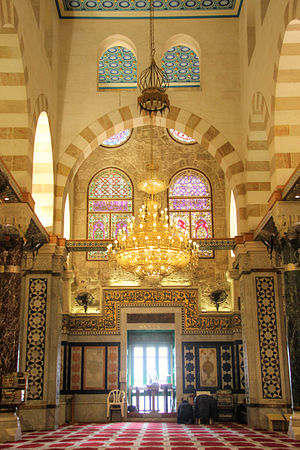
File:Islamic - Al-Aqsa Mosque.jpg, not featured[edit]
Voting period is over. Please don't add any new votes.Voting period ends on 7 May 2015 at 06:56:33 (UTC)
Visit the nomination page to add or modify image notes.
- Category: Commons:Featured pictures/Places/Interiors
- Info created by Moataz Egbaria - uploaded by Moataz Egbaria - nominated by Moataz Egbaria -- معتز أغبارية (talk) 06:56, 28 April 2015 (UTC)
- Support -- معتز أغبارية (talk) 06:56, 28 April 2015 (UTC)
- Oppose Nice idea, but perspective distortion and heavy CA around the ground window. --Cayambe (talk) 09:29, 28 April 2015 (UTC)
- Neutral Good, but has technical problems. --Tremonist (talk) 16:29, 28 April 2015 (UTC)
- Oppose QI perhaps but not FP, nothing striking about composition. Daniel Case (talk) 16:16, 29 April 2015 (UTC)
- Oppose per Cayambe and maybe camera shaking. --Laitche (talk) 16:14, 30 April 2015 (UTC)
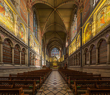
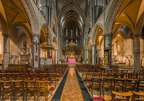
File:Keble College Chapel Interior 1, Oxford, UK - Diliff.jpg, featured[edit]
Voting period is over. Please don't add any new votes.Voting period ends on 6 May 2015 at 15:18:21 (UTC)
Visit the nomination page to add or modify image notes.
- Category: Commons:Featured pictures/Places/Interiors
- Info created by Diliff - uploaded by Diliff - nominated by Diliff -- Diliff (talk) 15:18, 27 April 2015 (UTC)
- Support -- Diliff (talk) 15:18, 27 April 2015 (UTC)
- Support --LivioAndronico talk 15:38, 27 April 2015 (UTC)
- Support 😄 ArionEstar 😜 (talk) 16:30, 27 April 2015 (UTC)
- Support --Martin Falbisoner (talk) 19:32, 27 April 2015 (UTC)
- Support --Code (talk) 19:34, 27 April 2015 (UTC)
- Support Idem above. ;) Yann (talk) 21:08, 27 April 2015 (UTC)
- Support I like this depth. --Laitche (talk) 14:29, 28 April 2015 (UTC)
- Support --Tremonist (talk) 16:15, 28 April 2015 (UTC)
- Support --Cayambe (talk) 09:32, 29 April 2015 (UTC)
- Support--Lmbuga (talk) 13:33, 29 April 2015 (UTC)
- Support -- Pofka (talk) 13:54, 29 April 2015 (UTC)
- Support --Llez (talk) 20:11, 30 April 2015 (UTC)
- Support Albertus teolog (talk) 00:01, 2 May 2015 (UTC)
- Support I think that this one is one of your best. The perspective here is really good and I feel like the image attracts me to get inside it :) Poco2 08:50, 2 May 2015 (UTC)
- Support --Σπάρτακος (talk) 18:42, 2 May 2015 (UTC)
File:Reflexions of a mangrove.jpg, not featured[edit]
Voting period is over. Please don't add any new votes.Voting period ends on 3 May 2015 at 00:14:20 (UTC)
Visit the nomination page to add or modify image notes.
- Category: Commons:Featured pictures/Places/Natural
- Info created, uploaded, nominated by -- Tomascastelazo (talk) 00:14, 24 April 2015 (UTC)
- Support -- Tomascastelazo (talk) 00:14, 24 April 2015 (UTC)
- Oppose Sorry, but I don't see an overall idea in the composition. --King of ♥ ♦ ♣ ♠ 00:24, 24 April 2015 (UTC)
- Oppose Per KoH. Daniel Case (talk) 00:56, 24 April 2015 (UTC)
However, on the left side of the picture there's a lot of magenta CA at the tree. I would support the nomination if this issue was fixed.--Code (talk) 09:57, 24 April 2015 (UTC)
- Neutral This is indeed very interesting with "reality" and reflection seamlessly blending without leaving any discernible water line. Makes my brain go nuts, which is meant in a positive way. I'd compare it to listening to one of the more obscure Zappa songs: complex music and strange lyrics (for a non-native speaker), so I have to listen to them actively and carefully multiple times for them to make sense, but after some time I usually start to like them. Most of those songs are not really danceable or radio-friendly, though, and I fear that this image may lack the FPC equivalents of these words (whatever they are) as well. --El Grafo (talk) 11:51, 24 April 2015 (UTC) I sincerely hope this comment makes sense to anyone but me. If not, it's obviously a side effect of looking at the image for too long ;-)
-
- I like this review, the analogy. If you look up mangrove photographs, 99% will be photographs from the outside looking at the edges of mangroves. Pictures from inside a mangrove are rare, and difficult because of the visual confusion, branches, reflections, light seeping in... The idea of this photograph is precisely that, to show the confusion, the visual confusion. The ripples of the water, the reflections make it hard even there to distinguish objects, until one just sits long enough and let the mangrove in. --Tomascastelazo (talk) 20:50, 25 April 2015 (UTC)
- Neutral Good composition, but lacks sharpness and too much darkness. --Tremonist (talk) 12:25, 24 April 2015 (UTC)
- Support --LuisArmandoRasteletti (talk) 10:59, 25 April 2015 (UTC)
- Oppose I like it very much and it deserve a better exposition which is too bright here IMO. -- Christian Ferrer 17:34, 27 April 2015 (UTC)
File:StJohnsAshfield StainedGlass GoodShepherd-frame crop.jpg, not featured[edit]
Voting period is over. Please don't add any new votes.Voting period ends on 3 May 2015 at 10:53:26 (UTC)
Visit the nomination page to add or modify image notes.

- Category: Commons:Featured pictures/Places/Interiors
- Info created by unknown - uploaded by unknown - nominated by Qian.Nivan -- Qian.neewan (talk) 10:53, 24 April 2015 (UTC)
- Support -- Qian.neewan (talk) 10:53, 24 April 2015 (UTC)
- Comment Would it be possible to increase the sharpness a little bit? Otherwise it's a nice image. --Tremonist (talk) 12:45, 24 April 2015 (UTC)
- Support --LuisArmandoRasteletti (talk) 10:58, 25 April 2015 (UTC)
- Oppose insufficient sharpness, imho. --El Grafo (talk) 11:20, 27 April 2015 (UTC)
- Oppose per above--ArildV (talk) 14:05, 27 April 2015 (UTC)
- Oppose per above -- Colin (talk) 11:58, 29 April 2015 (UTC)
File:St James's Church Interior 2, Spanish Place, London, UK - Diliff.jpg, featured[edit]
Voting period is over. Please don't add any new votes.Voting period ends on 6 May 2015 at 15:25:25 (UTC)
Visit the nomination page to add or modify image notes.
- Category: Commons:Featured pictures/Places/Interiors
- Info created by Diliff - uploaded by Diliff - nominated by Diliff. Quite a beautiful Roman Catholic local parish church in London, with lots of visual interest in the frame. -- Diliff (talk) 15:25, 27 April 2015 (UTC)
- Support -- Diliff (talk) 15:25, 27 April 2015 (UTC)
- Support Incredible acutance and wonderfull sharpness. -- Christian Ferrer 17:45, 27 April 2015 (UTC)
- Support. Though with the thumbnail sharpening, it's too much local and too little global contrast imo. I get dizzy looking at that. (Not your/the images' fault) — Julian H.✈ 18:10, 27 April 2015 (UTC)
- I know what you mean, I thought the same thing looking at the thumbnail. I can try adjusting it but it looks okay at full size IMO. Diliff (talk) 18:22, 27 April 2015 (UTC)
- Support --Martin Falbisoner (talk) 19:32, 27 April 2015 (UTC)
- Support Yes, first looking at the thumbnail, I thought "HDR is overdone". A case where the full size looks better than thumbnail... ;) Yann (talk) 21:07, 27 April 2015 (UTC)
- Support Beautiful piece. Fma12 (talk) 22:46, 27 April 2015 (UTC)
- Support Perfect, as usual. --Code (talk) 06:08, 28 April 2015 (UTC)
- Comment Distortions are not problem, of course. But left lower floor looks left-downward slope and right lower floor looks right-downward slope. Other church interior photos of similar composition are not like that... --Laitche (talk) 14:18, 28 April 2015 (UTC)
- I noticed this too but to be honest, I don't think it's a problem with the image or the processing. I double-checked the stitching and it's completely rectilinear, with no stitching or control point errors, the lens itself has very minimal distortion, the centre point is the middle of the church and all verticals are vertical. This should mean that horizontals are straight, and if there is a lean, it's because the chairs are not aligned properly with the church. Because this is a very wide angle view, any issues with angles are magnified, particularly with objects close to the camera. There's very little on the floor that you can use as a guide except the chairs, and because these are moveable, it's not possible to assume that they are aligned correctly (from my experience, a lot of church seating is badly aligned!). My only guess is that this is the cause of perception that the floor is leaning. Diliff (talk) 17:26, 28 April 2015 (UTC)
- @Diliff: Just to make sure. If exactly the same photo but with no chairs, I don't feel the floor a slope. That's what you mean? --Laitche (talk) 08:27, 30 April 2015 (UTC)
- Yes, that's what I mean. I think its only the chairs not being aligned correctly that make it look like it is leaning. I don't think there is a problem with the stitching. My method is very consistent in most of my interiors and none of the others have a problem. The only reason I could think for a problem like a leaning floor is if there is a stitching error but there aren't any in this. Diliff (talk) 13:24, 30 April 2015 (UTC)
- @Diliff: Just to make sure. If exactly the same photo but with no chairs, I don't feel the floor a slope. That's what you mean? --Laitche (talk) 08:27, 30 April 2015 (UTC)
- Support --Tremonist (talk) 16:15, 28 April 2015 (UTC)
- Support I can see a small dictortion in the left side, btw, could be nice and It would have been more interesting not to cut the chairs are in front, taking a photograph from back. --The Photographer (talk) 13:02, 29 April 2015 (UTC)
- I did take a photo from the back also, but I actually think the view is not as good. There's less visual interest and the books in the foreground unbalance the composition. Diliff (talk) 14:28, 29 April 2015 (UTC)
- Alternatively yourself orders chairs, so that appear ordered and not cut. --The Photographer (talk) 16:33, 29 April 2015 (UTC)
- I did take a photo from the back also, but I actually think the view is not as good. There's less visual interest and the books in the foreground unbalance the composition. Diliff (talk) 14:28, 29 April 2015 (UTC)
- Support --Lmbuga (talk) 13:32, 29 April 2015 (UTC)
- Support -- Pofka (talk) 13:54, 29 April 2015 (UTC)
- Support Nice colours, nice church, but Diliff what's that on the altar? I add a note. -- RTA 19:13, 29 April 2015 (UTC)
- Support --Llez (talk) 20:10, 30 April 2015 (UTC)
- Support Albertus teolog (talk) 00:00, 2 May 2015 (UTC)
- Support Poco2 08:48, 2 May 2015 (UTC)
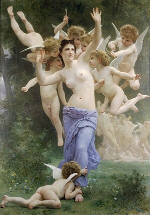
File:William-Adolphe Bouguereau, 1892 - Le Guêpier.jpg, not featured[edit]
Voting period is over. Please don't add any new votes.Voting period ends on 6 May 2015 at 12:22:48 (UTC)
Visit the nomination page to add or modify image notes.
- Category: Commons:Featured_pictures/Non-photographic media
- Info created by William-Adolphe Bouguereau, uploaded by Juanpdp, nominated by Qian.Nivan -- Qian.neewan (talk) 12:22, 27 April 2015 (UTC)
- Support -- Qian.neewan (talk) 12:22, 27 April 2015 (UTC)
- Comment It really makes me appreciate the Salon des Refusés and the Impressionists (even more). If this is what they were railing against, i'd rail with them. Kleuske (talk) 12:47, 27 April 2015 (UTC)
- Oppose Unsharp. And I'd be happy with a better source. Even if WAB is my fellow citizen, I tend to agree (for part) with Kleuske...
 (my taste, nothing to do with my vote). And the french wp article is excellent.--Jebulon (talk) 14:22, 27 April 2015 (UTC)
- Oppose Yes, it's unsharp. --Tremonist (talk) 16:14, 28 April 2015 (UTC)
- Oppose While I completely agree with Kleuske when it comes to taste, I actually find this painting really fascinating in a WTF?!? kind of way. I'm sure it tells a lot about the people of that time. Would support right away if it weren't for the sharpness issues of the digital reproduction. --El Grafo (talk) 12:32, 30 April 2015 (UTC)
File:Juan Griego sunset from Fortín La Galera.jpg, not featured[edit]
Voting period is over. Please don't add any new votes.Voting period ends on 4 May 2015 at 01:45:26 (UTC)
Visit the nomination page to add or modify image notes.
- Category: Commons:Featured pictures/Natural_phenomena
- Info All by -- The Photographer (talk) 01:45, 25 April 2015 (UTC)
- Support --LuisArmandoRasteletti (talk) 10:57, 25 April 2015 (UTC)
- Oppose QI definitely, but just another well-done sunset over the sea in a tropical location. Daniel Case (talk) 16:03, 25 April 2015 (UTC)
- This is not another sunset over the sea, this is a zoombie sunset before apocalipse :) --The Photographer (talk) 16:44, 26 April 2015 (UTC)
- Support --Tremonist (talk) 16:06, 28 April 2015 (UTC)
- Oppose QI "sunset view from a window" is nothing special. -- Colin (talk) 12:00, 29 April 2015 (UTC)
- Well its from La Galera fort, a historical place, however, its irrelevant, I think so, because is the same view from whatever :) --The Photographer (talk) 12:07, 29 April 2015 (UTC)
- Oppose As per others. It is just a usual sunset photo with palms in it and not a phenomena. Definitely QP, but doesn't have something really appealing in it to be FP. -- Pofka (talk) 14:11, 29 April 2015 (UTC)
File:Muscovy duck portrait.jpg, featured[edit]
Voting period is over. Please don't add any new votes.Voting period ends on 7 May 2015 at 21:30:45 (UTC)
Visit the nomination page to add or modify image notes.
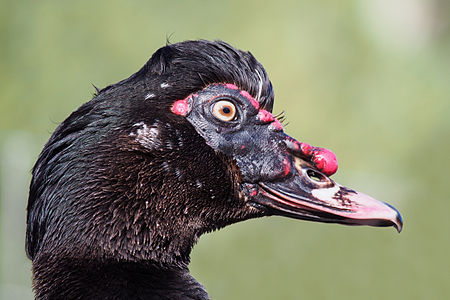
- Category: Commons:Featured pictures/Animals/Birds
- Info Muscovy duck, Cairina moschata, at Martin Mere, UK. All by me, --Baresi F (talk) 21:30, 28 April 2015 (UTC)
- Support -- Baresi F (talk) 21:30, 28 April 2015 (UTC)
- Support 😄 ArionEstar 😜 (talk) 23:02, 28 April 2015 (UTC)
- Support --LivioAndronico talk 11:55, 29 April 2015 (UTC)
- Support --Tremonist (talk) 12:20, 29 April 2015 (UTC)
- Support The portrait is really delicately captured, but I think the whole duck photo would be more valuable if taken with the same quality. -- Pofka (talk) 13:41, 29 April 2015 (UTC)
- Comment I like it and would support if you can adjust over-exposure on beak. --Charles (talk) 16:09, 29 April 2015 (UTC)
- Support -- George Chernilevsky talk 05:07, 30 April 2015 (UTC)
 Weak support the subject is impressive, but the composition (if there is any) not really wow. --Hubertl (talk) 18:55, 30 April 2015 (UTC)
- Support --Llez (talk) 20:08, 30 April 2015 (UTC)
- Support Poco2 13:10, 2 May 2015 (UTC)
- Support However a bit less of contrast would maybe improve it. -- Christian Ferrer 16:26, 3 May 2015 (UTC)
- Support --LuisArmandoRasteletti (talk) 23:05, 3 May 2015 (UTC)
File:Columba livia - 01.jpg, not featured[edit]
Voting period is over. Please don't add any new votes.Voting period ends on 4 May 2015 at 12:15:22 (UTC)
Visit the nomination page to add or modify image notes.
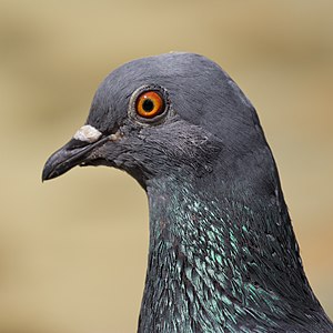
- Category: Commons:Featured pictures/Animals/Birds
- Info Rock dove (Columba livia) at Retiro Park, Madrid, Spain. Created, uploaded and nominated by -- Kadellar (talk) 12:15, 25 April 2015 (UTC)
- Support -- Kadellar (talk) 12:15, 25 April 2015 (UTC)
- Support 😄 ArionEstar 😜 (talk) 16:06, 25 April 2015 (UTC)
- Support --XRay talk 16:37, 25 April 2015 (UTC)
- Support --LuisArmandoRasteletti (talk) 17:16, 25 April 2015 (UTC)
- Support Daniel Case (talk) 15:12, 26 April 2015 (UTC)
- Support D kuba (talk) 16:43, 26 April 2015 (UTC)
- Comment I have next to zero experience with wildlife photography and never used a lens that long, so maybe this is a stupid question, but: It seems that at 1/2500 s there would have been some wiggle room to stop down a bit more in order to get a bit more DOF? I mean, you perfectly nailed the focus on the eye, which is amazingly sharp, but the beak is pretty soft even at screen size (1024×1024 px). Not sure how to vote here yet … --El Grafo (talk) 12:02, 27 April 2015 (UTC)
- It is not a question of lack of light. In wildlife photography, when you take a portrait (close up or full body), you want the background to be as blurred as possible, that will usually improve the image. 1/2500 is not strictly needed here, but you'd better use a quick shutter speed with birds, they make really fast small movements that can ruin the image. --Kadellar (talk) 13:13, 27 April 2015 (UTC)
- OK, so it's basically the usual trade-off between foreground depth of field and background blur/bokeh you'll have in an (non-stacked/outdoor-) macro as well (with slightly different secondary factors). If this was a butterfly image I'd probably oppose, but considering the movements you mention that might not be a fair comparison. I guess I'll stay Neutral on this one. Thanks for the explanation, though! --El Grafo (talk) 14:09, 27 April 2015 (UTC) PS: The eye section is still fascinating me – may I suggest to drop a crop of the eye into Category:Bird eyes and maybe nominate it at VIC with a scope like Columba livia (eye)?
- OK, so it's basically the usual trade-off between foreground depth of field and background blur/bokeh you'll have in an (non-stacked/outdoor-) macro as well (with slightly different secondary factors). If this was a butterfly image I'd probably oppose, but considering the movements you mention that might not be a fair comparison. I guess I'll stay
- Oppose Impressive eye and useful image, but the small DoF is too small for to make the image outstanding. -- Christian Ferrer 17:42, 27 April 2015 (UTC)
- Oppose beak is too out of focus for me. --Charles (talk) 11:47, 28 April 2015 (UTC)
- Oppose Sorry,per others --LivioAndronico talk 12:47, 28 April 2015 (UTC)
- Oppose Per Charles, sorry. --Tremonist (talk) 16:09, 28 April 2015 (UTC)
- Oppose DoF may well have been reasonable choice but then unfortunate that the beak is not more in line with the eye. -- Colin (talk) 12:08, 29 April 2015 (UTC)
- Comment Thank you for your support and comments. --Kadellar (talk) 13:41, 4 May 2015 (UTC)
File:Dülmen, Viktorkirmes auf dem Overbergplatz -- 2014 -- 3738 (2).jpg, featured[edit]
Voting period is over. Please don't add any new votes.Voting period ends on 4 May 2015 at 09:10:09 (UTC)
Visit the nomination page to add or modify image notes.
.jpg/450px-D%c3%bclmen%2c_Viktorkirmes_auf_dem_Overbergplatz_--_2014_--_3738_(2).jpg)
- Category: Commons:Featured pictures/Objects
- Info created by XRay - uploaded by XRay - nominated by Tuxyso -- Tuxyso (talk) 09:10, 25 April 2015 (UTC)
- Support I really like the nice light pattern coming from the ferris wheel. Also the composition is imho quite pleasing. -- Tuxyso (talk) 09:10, 25 April 2015 (UTC)
- Support per nom. Nikhil (talk) 09:18, 25 April 2015 (UTC)
- Oppose light ok, but too tight crop and weak sharpness, D kuba (talk) 10:11, 25 April 2015 (UTC)
- Support --LuisArmandoRasteletti (talk) 10:56, 25 April 2015 (UTC)
- Weak Support I don't mind the top crop but a little mind the bottom crop but agree with Tuxyso. --Laitche (talk) 20:04, 25 April 2015 (UTC)
- Support --Code (talk) 06:56, 26 April 2015 (UTC)
- Support Thanks to Tuxyso for nominating the picture. (BTW: I just improved the resolution.) --XRay talk 09:33, 26 April 2015 (UTC)
- Support - Sharpness could be better, but given the circumstances it is ok. I like the tight crop which gives the picture intensity and a feeling of actually being there. Nice work. --Pugilist (talk) 15:55, 26 April 2015 (UTC)
- Support as others --Hubertl (talk) 09:09, 28 April 2015 (UTC)
- Support --Tremonist (talk) 16:06, 28 April 2015 (UTC)
- Support -- Colin (talk) 12:02, 29 April 2015 (UTC)
- Weak Support Really eye-catching colors, though it's a pity that you chopped the top of the wheel in your picture. -- Pofka (talk) 14:07, 29 April 2015 (UTC)
- Support 😄 ArionEstar 😜 (talk) 22:33, 29 April 2015 (UTC)
- Support --King of ♥ ♦ ♣ ♠ 01:07, 1 May 2015 (UTC)
- Weak Support Per Pofka Poco2 08:46, 2 May 2015 (UTC)
- Support -- Wolf im Wald 09:14, 4 May 2015 (UTC)
File:Kowloon Panorama by Ryan Cheng 2010.jpg, not featured[edit]
Voting period is over. Please don't add any new votes.Voting period ends on 4 May 2015 at 12:51:37 (UTC)
Visit the nomination page to add or modify image notes.
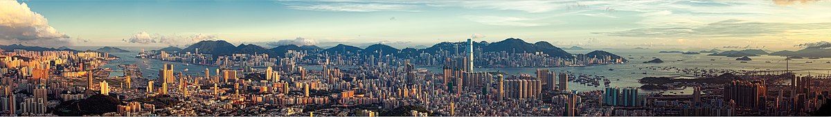
- Category: Commons:Featured pictures/Places/Panoramas
- Info created by Ryan Cheng - uploaded by Lkiller123 - nominated by Julien1978 -- Julien1978 (talk) 12:51, 25 April 2015 (UTC)
- Support -- Julien1978 (talk) 12:51, 25 April 2015 (UTC)
- Support --LuisArmandoRasteletti (talk) 17:15, 25 April 2015 (UTC)
- Support Per this, one of the best banners at Wikivoyage. Daniel Case (talk) 18:19, 25 April 2015 (UTC)
- Oppose Too small to see the detail for a panorama.(I presume downscaled to much.) --Laitche (talk) 19:27, 25 April 2015 (UTC) Plus gray bar on the top. --Laitche (talk) 08:36, 26 April 2015 (UTC)
- Comment there are stitching errors on the right side --93.144.76.191 23:26, 25 April 2015 (UTC)
- Oppose Gray bar, stitching, low vertical resolution, editing pretty exaggerated. — Julian H.✈ 09:22, 26 April 2015 (UTC)
- Oppose Per Julian, also horizon not level, buildings not straight vertically. This isn't "featured Wikivoyage banners". We have some standards. -- Colin (talk) 10:27, 26 April 2015 (UTC)
* Double vote. Yann (talk) 18:00, 26 April 2015 (UTC)
![]() Support --LuisArmandoRasteletti (talk) 12:51, 26 April 2015 (UTC)
Support --LuisArmandoRasteletti (talk) 12:51, 26 April 2015 (UTC)
- Oppose per other opposes. --Alchemist-hp (talk) 17:05, 26 April 2015 (UTC)
- Oppose Very nice lighting but too small. --King of ♥ ♦ ♣ ♠ 01:27, 27 April 2015 (UTC)
- Neutral Good, but too small. --Tremonist (talk) 16:10, 28 April 2015 (UTC)
- Oppose Nice colors, panorama, but the resolution is way too small. There are panorama pictures of ~50 MB size. This one obviously doesn't fit among them. -- Pofka (talk) 14:04, 29 April 2015 (UTC)
File:Meeting d'Athlétisme Paralympique de Paris 04.jpg, featured[edit]
Voting period is over. Please don't add any new votes.Voting period ends on 8 May 2015 at 11:23:51 (UTC)
Visit the nomination page to add or modify image notes.
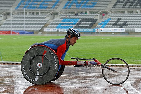
- Category: Commons:Featured pictures/Sports
- Info created by Pyb - uploaded by Pyb - nominated by Christian Ferrer -- Christian Ferrer 11:23, 29 April 2015 (UTC)
- Support -- Christian Ferrer 11:23, 29 April 2015 (UTC)
- Support Interesting. --Tremonist (talk) 12:31, 29 April 2015 (UTC)
- Support -- Pofka (talk) 13:38, 29 April 2015 (UTC)
- Support 😄 ArionEstar 😜 (talk) 16:53, 29 April 2015 (UTC)
- Neutral - For me a photo like that should show us the movement, the action. A panning pic could be better, still like that, just a QI, nothing more. -- RTA 19:19, 29 April 2015 (UTC)
- Support --XRay talk 03:56, 30 April 2015 (UTC)
- Support --LivioAndronico talk 11:30, 30 April 2015 (UTC)
- Support --Jacek Halicki (talk) 18:31, 30 April 2015 (UTC)
- Support I was decdided to oppose before opening the image in full size (for lack of wow). Then I noticed the rain and the expression of the athlete. Alvesgaspar (talk) 09:32, 1 May 2015 (UTC)
- Support I have to say Alvesgaspar has something. The thumbnail gives a very poor impression whereas seeing the image fullscreen is way better. Kudos Pyb for staying in the rain all day long. --PierreSelim (talk) 11:00, 1 May 2015 (UTC)
- Support --Cayambe (talk) 18:01, 1 May 2015 (UTC)
- Support Per Alvesgaspar Poco2 08:17, 2 May 2015 (UTC)
- Support Some more space at the right side would be much better but FP for me. --Laitche (talk) 13:52, 2 May 2015 (UTC)
- Comment Probably this image is tilted clockwise, frames of wheelchair for racing is not level so I get strange feeling from this photo, please see this photo or this page. --Laitche (talk) 12:42, 3 May 2015 (UTC)
- Support --LuisArmandoRasteletti (talk) 23:04, 3 May 2015 (UTC)
File:NASA Unveils Celestial Fireworks as Official Hubble 25th Anniversary Image.jpg, featured[edit]
Voting period is over. Please don't add any new votes.Voting period ends on 4 May 2015 at 09:46:17 (UTC)
Visit the nomination page to add or modify image notes.
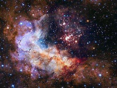
- Category: Commons:Featured pictures/Astronomy
- Info created by NASA, ESA and Hubble Heritage Team - uploaded by LuisArmandoRasteletti - nominated by LuisArmandoRasteletti -- LuisArmandoRasteletti (talk) 09:46, 25 April 2015 (UTC)
- Support -- LuisArmandoRasteletti (talk) 09:46, 25 April 2015 (UTC)
- Support--Lmbuga (talk) 10:48, 25 April 2015 (UTC)
- Support Nice space! 😄 ArionEstar 😜 (talk) 16:18, 25 April 2015 (UTC)
- Support truly beautiful. --Abd (talk) 00:58, 27 April 2015 (UTC)
- Oppose Truly beautiful, but not different (to me) from tons of comparable pictures we have already. Like sunsets, all space images are beautiful.--Jebulon (talk) 14:40, 27 April 2015 (UTC)
- Support --Tremonist (talk) 16:07, 28 April 2015 (UTC)
- Support I think the composition on this one is pretty good. -- Colin (talk) 12:05, 29 April 2015 (UTC)
- Support There never is too much of space pictures. -- Pofka (talk) 14:06, 29 April 2015 (UTC)
- Support --King of ♥ ♦ ♣ ♠ 01:07, 1 May 2015 (UTC)
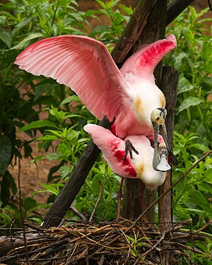
File:Roseate spoonbills at Smith Oaks Sanctuary, High Island, mating.jpg, featured[edit]
Voting period is over. Please don't add any new votes.Voting period ends on 8 May 2015 at 19:17:43 (UTC)
Visit the nomination page to add or modify image notes.
- Category: Commons:Featured pictures/Animals/Birds
- Info created by Frank Schulenburg – uploaded by Frank Schulenburg – nominated by Frank Schulenburg --Frank Schulenburg (talk) 19:17, 29 April 2015 (UTC)
- Support --Frank Schulenburg (talk) 19:17, 29 April 2015 (UTC)
- Support 😄 ArionEstar 😜 (talk) 22:51, 29 April 2015 (UTC)
- Support --XRay talk 03:54, 30 April 2015 (UTC)
- Support -- George Chernilevsky talk 05:09, 30 April 2015 (UTC)
- Support D kuba (talk) 07:03, 30 April 2015 (UTC)
- Support --Uoaei1 (talk) 09:11, 30 April 2015 (UTC)
- Support --Tremonist (talk) 13:05, 30 April 2015 (UTC)
- Support -- Pofka (talk) 15:00, 30 April 2015 (UTC)
- Support --Famberhorst (talk) 15:50, 30 April 2015 (UTC)
- Support --Jacek Halicki (talk) 18:29, 30 April 2015 (UTC)
- Support --Hubertl (talk) 18:53, 30 April 2015 (UTC)
- Support --Baresi F (talk) 23:26, 30 April 2015 (UTC)
- Support--ArildV (talk) 10:08, 1 May 2015 (UTC)
- Support Poco2 08:15, 2 May 2015 (UTC)
- Support --Schnobby (talk) 16:15, 3 May 2015 (UTC)
- Support -- Christian Ferrer 16:28, 3 May 2015 (UTC)
- Support --LuisArmandoRasteletti (talk) 23:03, 3 May 2015 (UTC)
File:Zaaddozen van Plumbago auriculata Locatie. Tuinreservaat Jonker vallei 01.jpg, featured[edit]
Voting period is over. Please don't add any new votes.Voting period ends on 8 May 2015 at 05:05:35 (UTC)
Visit the nomination page to add or modify image notes.
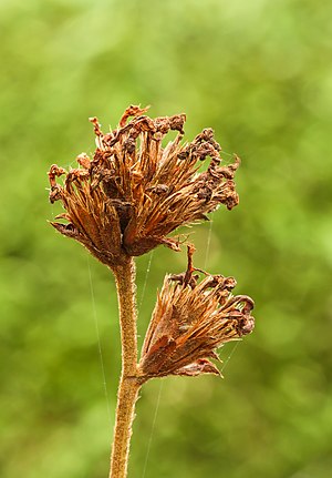
- Category: Commons:Featured pictures/Plants#Family: Plumbaginaceae
- Info Seed pods of Plumbago auriculata Location Garden Sanctuary Jonker Valley. created by Famberhorst - uploaded by Famberhorst - nominated by Famberhorst -- Famberhorst (talk) 05:05, 29 April 2015 (UTC)
- Support -- Famberhorst (talk) 05:05, 29 April 2015 (UTC)
- Support --LivioAndronico talk 11:55, 29 April 2015 (UTC)
- Support --Tremonist (talk) 12:21, 29 April 2015 (UTC)
- Support -- Pofka (talk) 13:40, 29 April 2015 (UTC)
- Support 😄 ArionEstar 😜 (talk) 16:53, 29 April 2015 (UTC)
- Support --Code (talk) 19:43, 29 April 2015 (UTC)
- Support --Hubertl (talk) 18:54, 30 April 2015 (UTC)
- Question It looks enough light, why still was it needed 1 sec exposure time with ISO200, f/11 and auto exposure? --Laitche (talk) 18:07, 1 May 2015 (UTC)
- Answer: I have this recording also made with F 7.1, but not all details sharp.--Famberhorst (talk) 04:55, 2 May 2015 (UTC)
- Answer: Perhaps I misunderstood your question. I master the English language and no translation with Google translate.--Famberhorst (talk) 16:33, 2 May 2015 (UTC)
- Neutral Very nice bokeh and good sharpness, but the DoF is a bit shallow to me and the subject itself is not so "wowing" Poco2 08:53, 2 May 2015 (UTC)
- Support -- Christian Ferrer 16:24, 3 May 2015 (UTC)
- Support --LuisArmandoRasteletti (talk) 23:05, 3 May 2015 (UTC)
- Support Yann (talk) 13:38, 4 May 2015 (UTC)
File:Kršlenica 01.jpg, not featured[edit]
Voting period is over. Please don't add any new votes.Voting period ends on 5 May 2015 at 07:45:12 (UTC)
Visit the nomination page to add or modify image notes.
- Category: Commons:Featured pictures/Places/Natural
- Info created by Doronenko - uploaded by Doronenko - nominated by Doronenko -- Doronenko (talk) 07:45, 26 April 2015 (UTC)
- Support -- Doronenko (talk) 07:45, 26 April 2015 (UTC)
- Oppose Disturbing shadow. Yann (talk) 08:13, 26 April 2015 (UTC)
- Oppose I agree with Yann and Cccefalon who added the three image notes. --Laitche (talk) 11:54, 26 April 2015 (UTC)
- Support --LuisArmandoRasteletti (talk) 12:50, 26 April 2015 (UTC)
- Oppose per Yann. --Alchemist-hp (talk) 17:03, 26 April 2015 (UTC)
- Oppose Per Yann. --Tremonist (talk) 16:10, 28 April 2015 (UTC)
- Oppose Shadow... -- Pofka (talk) 14:03, 29 April 2015 (UTC)
File:Kršlenica 02.jpg, not featured[edit]
Voting period is over. Please don't add any new votes.Voting period ends on 5 May 2015 at 07:43:57 (UTC)
Visit the nomination page to add or modify image notes.
- Category: Commons:Featured pictures/Places/Natural
- Info created by Doronenko - uploaded by Doronenko - nominated by Doronenko -- Doronenko (talk) 07:43, 26 April 2015 (UTC)
- Support -- Doronenko (talk) 07:43, 26 April 2015 (UTC)
- Oppose Disturbing shadow. Yann (talk) 08:13, 26 April 2015 (UTC)
- Oppose per Yann. --Cayambe (talk) 12:23, 26 April 2015 (UTC)
- Support --LuisArmandoRasteletti (talk) 12:49, 26 April 2015 (UTC)
- Oppose per Yann. --Alchemist-hp (talk) 17:02, 26 April 2015 (UTC)
- Oppose per Yann and not detailed overall. --Laitche (talk) 18:48, 26 April 2015 (UTC)
- Oppose Per Yann. --Tremonist (talk) 16:11, 28 April 2015 (UTC)
- Oppose It clearly could have been FP if not that shadow. -- Pofka (talk) 14:02, 29 April 2015 (UTC)
File:Barranco Valle de la Fuente - Fuerteventura.jpg, featured[edit]
Voting period is over. Please don't add any new votes.Voting period ends on 9 May 2015 at 19:57:08 (UTC)
Visit the nomination page to add or modify image notes.
- Category: Commons:Featured pictures/Places/Natural
- Info created by Llez - uploaded by Llez - nominated by Llez -- Llez (talk) 19:57, 30 April 2015 (UTC)
- Support -- Llez (talk) 19:57, 30 April 2015 (UTC)
- Support I like the colours. Nice composition. Could be sharper at 100%. --Code (talk) 15:16, 1 May 2015 (UTC)
- Support --LivioAndronico talk 18:43, 1 May 2015 (UTC)
- Support 😄 ArionEstar 😜 (talk) 19:55, 1 May 2015 (UTC)
- Comment Looks oversaturated to me Poco2 08:55, 2 May 2015 (UTC)
- Support -- Pofka (talk) 08:57, 3 May 2015 (UTC)
- Support --LuisArmandoRasteletti (talk) 23:00, 3 May 2015 (UTC)
- Support -- Wolf im Wald 09:09, 4 May 2015 (UTC)
- Support --Yann (talk) 12:26, 4 May 2015 (UTC)
- Support --Tremonist (talk) 12:57, 5 May 2015 (UTC)
File:Münster, Liudgerhaus und Diözesanbibliothek -- 2014 -- 0303.jpg, featured[edit]
Voting period is over. Please don't add any new votes.Voting period ends on 10 May 2015 at 04:30:19 (UTC)
Visit the nomination page to add or modify image notes.
- Category: Commons:Featured pictures/Places/Architecture/Religious buildings (gallery); Category: Featured pictures of architecture
- Info created by XRay - uploaded by XRay - nominated by XRay -- XRay talk 04:30, 1 May 2015 (UTC)
- Support -- XRay talk 04:30, 1 May 2015 (UTC)
- Support I like this picture more every time I watch it. It a different images and composition, but interesting. Some easy to remove traces of green CA (right part).--ArildV (talk) 09:59, 1 May 2015 (UTC)
- Comment Very good composition and theme: long live minmalism! Unfortunatley image quality leaves much to be desired: chromatic aberration all over and general softeness. Alvesgaspar (talk) 15:17, 1 May 2015 (UTC)
- Support Transparency! --Hubertl (talk) 18:21, 1 May 2015 (UTC)
- Support --LivioAndronico talk 18:43, 1 May 2015 (UTC)
- Support D kuba (talk) 18:49, 1 May 2015 (UTC)
- Neutral Comment Good composition, nice idea and it's nearly the wow idea to me. --Laitche (talk) 21:11, 1 May 2015 (UTC)
- Support Stunning composition and use of light. --King of ♥ ♦ ♣ ♠ 02:02, 2 May 2015 (UTC)
- Fixed Thanks for your advice. CAs are now removed.--XRay talk 05:23, 2 May 2015 (UTC)
- Support --Kikos (talk) 06:14, 2 May 2015 (UTC)
- Support I'd have probably chosen a different angle to the the first and second lamp a bit closer, but overall FP to me Poco2 08:57, 2 May 2015 (UTC)
- Weak Support Still CAs but acceptable. --Laitche (talk) 13:33, 2 May 2015 (UTC)
- Support --Frank Schulenburg (talk) 14:17, 2 May 2015 (UTC)
- Support --Ximonic (talk) 17:48, 2 May 2015 (UTC)
- Support nice and different. --Kadellar (talk) 01:37, 3 May 2015 (UTC)
- Support -- Pofka (talk) 08:57, 3 May 2015 (UTC)
- Support --Baresi F (talk) 12:31, 3 May 2015 (UTC)
- Support -- Christian Ferrer 16:23, 3 May 2015 (UTC)
- Support D kuba (talk) 19:20, 3 May 2015 (UTC)
- Support --LuisArmandoRasteletti (talk) 22:59, 3 May 2015 (UTC)
- Support Interesting, different and well-done for those. Daniel Case (talk) 02:52, 4 May 2015 (UTC)
- Support -- Wolf im Wald 09:08, 4 May 2015 (UTC)
- Support --Jacek Halicki (talk) 13:47, 4 May 2015 (UTC)
- Support --El Grafo (talk) 16:26, 4 May 2015 (UTC)
- Support --Tremonist (talk) 13:00, 5 May 2015 (UTC)
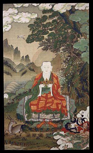
File:Rahula - Google Art Project.jpg, featured[edit]
Voting period is over. Please don't add any new votes.Voting period ends on 6 May 2015 at 17:20:15 (UTC)
Visit the nomination page to add or modify image notes.
- Category: Commons:Featured pictures/Non-photographic media
- Info created by unknown artist, uploaded by DcoetzeeBot, nominated by -- Yann (talk) 17:20, 27 April 2015 (UTC)
- Info Rāhula is the son of Buddha. Tibetan art, 16th century. High resolution, high quality reproduction.
- Support -- Yann (talk) 17:20, 27 April 2015 (UTC)
- Support --LivioAndronico talk 12:58, 28 April 2015 (UTC)
- Support --Tremonist (talk) 16:17, 28 April 2015 (UTC)
- Support -- Pofka (talk) 13:52, 29 April 2015 (UTC)
- Support -- Christian Ferrer 17:19, 29 April 2015 (UTC)
- Support 😄 ArionEstar 😜 (talk) 22:31, 29 April 2015 (UTC)
- Support -- George Chernilevsky talk 05:06, 30 April 2015 (UTC)
- Oppose Comment Tilted ccw and, in my opinion, the works by unknown artist(painter) should not be featured. I think if the quality is outstanding, that is valuable even it was created by unknown painter but that's not suitable for commons FP. --Laitche (talk) 17:20, 1 May 2015 (UTC)
- @Laitche: The author of Tibetan art work is very rarely known. More generally, before the 20th century, signing an art work is quite a Western tradition. Requiring the artist to be known would prevent almost any work from many places (Tibet, India, etc.) to be FP. Is that what you mean? Regards, Yann (talk) 19:38, 3 May 2015 (UTC)
- @Yann: I investigated about this image before I voted, and I think probably this image is Thangka,
but that is not the pointand I guess Thangka was a kind of mass-produced popular publications made by craftsmen so that is distinctly different from like this one. As I mentioned above If the quality is outstanding, that is valuable even it was created by unknown painter., that is my opinion but I think that kind of works(products) are not suitable for Commons FP, however if the category is changed to Commons:Featured pictures/Historical, maybe I can support this image as a history of Tibetan art, Regards. --Laitche (talk) 21:53, 3 May 2015 (UTC)
- @Yann: I investigated about this image before I voted, and I think probably this image is Thangka,
- @Laitche: The author of Tibetan art work is very rarely known. More generally, before the 20th century, signing an art work is quite a Western tradition. Requiring the artist to be known would prevent almost any work from many places (Tibet, India, etc.) to be FP. Is that what you mean? Regards, Yann (talk) 19:38, 3 May 2015 (UTC)
- Is it an answer to your question? --Laitche (talk) 22:00, 3 May 2015 (UTC)
- @Laitche: I think you are trying to compare apples and oranges. I don't think thangkas were more mass-produced that paintings in Europe at the same period. It is the most common form of Tibetan art which survived and is known to us. So as such, I don't don't see why thangkas are not suitable for FP. I think it is either discrimination or misunderstanding of Tibetan art. We put European paintings of that period in category "Non-photographic media", and I don't see why Tibetan art should be different. Regards, Yann (talk) 07:31, 4 May 2015 (UTC)
- @Yann: Oh, no! It's not discrimination of Tibetan art. In my opinion, thangkas are not works, those are products and the artists are not unknown, but the artists do not exist and that's the point thangas are different from European paintings. In this case it's like a kimono, if the quality is outstanding and artistic but that is not suitable for "Non-photographic media" and kimonos are not works, but products and artists don't exist. And about Ukiyo-e which made by woodblocks(some are not) is also mass-produced popular publications but definitely artists exist so that's different. Yes, that's right, apples and oranges that's the same as thangas and European paintings. And that's why thangas are not suitable for "Non-photographic media". But I can be mistaken of course, what do you think about? --Laitche (talk) 09:55, 4 May 2015 (UTC)
- @Laitche: Thangas are not mass-produced, so your comparaison is wrong. Kimonos are dresses, thangas are not. Regards, Yann (talk) 10:03, 4 May 2015 (UTC)
- @Yann: That's not what I meant. The artist, thangas artists are not unknown, but do not exist, that's the point and it's like a kimonos. Yes, mass-produced is too far maybe but the same thangas are made by different craftsmen, right? --Laitche (talk) 10:24, 4 May 2015 (UTC)
- @Laitche: Thangas are not mass-produced, so your comparaison is wrong. Kimonos are dresses, thangas are not. Regards, Yann (talk) 10:03, 4 May 2015 (UTC)
- @Yann: Oh, no! It's not discrimination of Tibetan art. In my opinion, thangkas are not works, those are products and the artists are not unknown, but the artists do not exist and that's the point thangas are different from European paintings. In this case it's like a kimono, if the quality is outstanding and artistic but that is not suitable for "Non-photographic media" and kimonos are not works, but products and artists don't exist. And about Ukiyo-e which made by woodblocks(some are not) is also mass-produced popular publications but definitely artists exist so that's different. Yes, that's right, apples and oranges that's the same as thangas and European paintings. And that's why thangas are not suitable for "Non-photographic media". But I can be mistaken of course, what do you think about? --Laitche (talk) 09:55, 4 May 2015 (UTC)
- @Laitche: I think you are trying to compare apples and oranges. I don't think thangkas were more mass-produced that paintings in Europe at the same period. It is the most common form of Tibetan art which survived and is known to us. So as such, I don't don't see why thangkas are not suitable for FP. I think it is either discrimination or misunderstanding of Tibetan art. We put European paintings of that period in category "Non-photographic media", and I don't see why Tibetan art should be different. Regards, Yann (talk) 07:31, 4 May 2015 (UTC)
- Is it an answer to your question? --Laitche (talk) 22:00, 3 May 2015 (UTC)
- @Yann: I think there are two types of thangkas especially in the early stages, that's more like artifact by divided work but there are lots of thangkas like painting as well, that was insufficient investigation and misunderstanding about thangkas so Category: Commons:Featured pictures/Non-photographic media is appropriate, I think, Regards. --Laitche (talk) 11:36, 4 May 2015 (UTC)
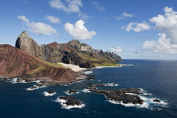
File:Simone Marinho - Trindade - 2010 05 08.jpg, featured[edit]
Voting period is over. Please don't add any new votes.Voting period ends on 6 May 2015 at 16:24:55 (UTC)
Visit the nomination page to add or modify image notes.
- Category: Commons:Featured pictures/Places/Natural
- Info Trindade and Martim Vaz archipelago, Espírito Santo, Brazil. Created and uploaded by Simone Marinho (edited by Webysther) - nominated by Arion -- 😄 ArionEstar 😜 (talk) 16:24, 27 April 2015 (UTC)
- Support -- 😄 ArionEstar 😜 (talk) 16:24, 27 April 2015 (UTC)
- Oppose Badly blown clouds, especially to right. Daniel Case (talk) 17:03, 27 April 2015 (UTC)
- Comment Very nice subject, colours and composition, but I think at the moment it is too noisy for FP and I found at least two dust spots in the sky. I would support the nomination if you could fix these two issues. If you have the RAW file, I could try to repair it for you. --Code (talk) 06:05, 28 April 2015 (UTC)
- Maybe you can repair from the first version. --Laitche (talk) 07:27, 28 April 2015 (UTC)
-
- Yeah, that's the best but seems difficult to contact
himher, maybe... --Laitche (talk) 08:26, 28 April 2015 (UTC)
- @Code and Laitche: But is only possible to improve the photo if the creator has the RAW file? 😄 ArionEstar 😜 (talk) 16:40, 28 April 2015 (UTC)
- I think that depends on the processing skill, anyway are you trying to contact the creator now? --Laitche (talk) 18:41, 28 April 2015 (UTC)
- @ArionEstar: We should give it a try. --Code (talk) 19:08, 28 April 2015 (UTC)
- @Webysther: Please Webysther, SOS. 😄 ArionEstar 😜 (talk) 19:34, 28 April 2015 (UTC)
- @ArionEstar: I uploaded the edited version made from the first version, I think that edit is not the best but rather better. If you'd like to nominate that as an alternative, please do so. But if you get the RAW file, I guess Code's work would be better than mine. --Laitche (talk) 19:59, 28 April 2015 (UTC)
- @Laitche: Done a new alternative nominated. And thanks! 😄 ArionEstar 😜 (talk) 20:37, 28 April 2015 (UTC)
- @Laitche:
- Yeah, that's the best but seems difficult to contact
-
- Comment Waiting for changes to be made. --Tremonist (talk) 16:16, 28 April 2015 (UTC)
- Comment @ArionEstar: I uploaded the new version to this file(the original). If you'd like to revert, please do so. Editing detail is below. --Laitche (talk) 20:37, 30 April 2015 (UTC)
- Info New version uploaded, +1EV, Fixed the tilte, NR, Removed dust spots, Removed CAs. --Laitche (talk) 20:37, 30 April 2015 (UTC)
- Support --Laitche (talk) 20:42, 30 April 2015 (UTC)
- @Laitche: This version is nice, but it's a little bit underexposed. Look the rocks on water and the water down. 😄 ArionEstar 😜 (talk) 21:02, 30 April 2015 (UTC)
- Maybe but in my opinion for this dynamic range +1EV is limit so I think it's better to waiting for what others would say. --Laitche (talk) 21:21, 30 April 2015 (UTC)
- Or maybe the source image is overprocessing but I don't have the RAW so it's a limit which I could. --Laitche (talk) 21:31, 30 April 2015 (UTC)
- @ArionEstar: I uploaded the new version as your ordered. Maybe rather better. --Laitche (talk) 23:38, 30 April 2015 (UTC)
- Yes now… 😄 ArionEstar 😜 (talk) 23:49, 30 April 2015 (UTC)
- @Laitche: This version is nice, but it's a little bit underexposed. Look the rocks on water and the water down. 😄 ArionEstar 😜 (talk) 21:02, 30 April 2015 (UTC)
- Support --King of ♥ ♦ ♣ ♠ 01:11, 1 May 2015 (UTC)
- @King of Hearts: This photo is reverted to the first image, so please re-review it, Regards. --Laitche (talk) 14:19, 1 May 2015 (UTC)
- Comment @Laitche: I changed this version to the file below. 😄 ArionEstar 😜 (talk) 14:04, 1 May 2015 (UTC)
- @ArionEstar: OK, That might be better. --Laitche (talk) 14:11, 1 May 2015 (UTC)
- Info Reverted to the first image. --Laitche (talk) 14:11, 1 May 2015 (UTC)
Alternative[edit]
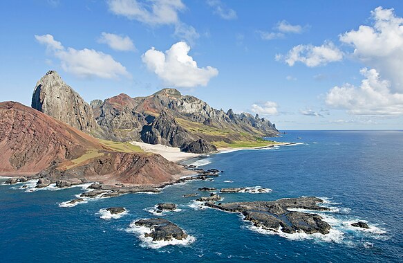
- Info Edited version of the photo, by Laitche. @Webysther, Daniel Case, Code, and Tremonist: Now? 😄 ArionEstar 😜 (talk) 20:53, 28 April 2015 (UTC)
- Support --Laitche (talk) 23:11, 28 April 2015 (UTC)
 Abstain as editor. --Laitche (talk) 19:41, 1 May 2015 (UTC)
- Support Much better. Thank you, Laitche. --Code (talk) 05:31, 29 April 2015 (UTC)
- Support 😄 ArionEstar 😜 (talk) 08:53, 29 April 2015 (UTC)
- Support Looks much nicer now, thanks a lot. --Tremonist (talk) 12:22, 29 April 2015 (UTC)
- Support Superb. -- Pofka (talk) 13:53, 29 April 2015 (UTC)
- Support --Lewis Hulbert (talk) 15:14, 29 April 2015 (UTC)
- Support Jacopo Werther iγ∂ψ=mψ 15:15, 29 April 2015 (UTC)
- Weak support Just enough to make it featurable but it still seems slightly overexposed. Daniel Case (talk) 16:14, 29 April 2015 (UTC)
- Oppose Much better than the version above, but still a lot of information lost in blown highlights. There is also a significant amount of CA on the left side. — Julian H.✈ 16:43, 29 April 2015 (UTC)
- and due to NR, Already the source image has CAs, Yes it's not the best edit and don't have the RAW. Seems it doesn't reach your FP bar, it's OK. + If you want to make an other edit, I don't mind. Thanks Julian. --Laitche (talk) 17:05, 29 April 2015 (UTC)
- Comment New version uploaded, a bit remove CAs, -EV a little. --Laitche (talk) 18:11, 29 April 2015 (UTC)
- Oppose Sorry, this is not a FPC, look the top of the mountains guys, looks like vanished. I like the composition, but the colours, and the amount of details is not enough. -- RTA 19:09, 29 April 2015 (UTC)
- @RTA Simply, you mean it's a bad editing, right? --Laitche (talk) 19:58, 29 April 2015 (UTC)
- Laitche, sort of, the shoot was taken in not good camera setup, 1/800 sec, creating a too dark image, and some other small issues, but she could reverted a great part of that in the raw file, this image that you created, with all of the best intentions, is not a FP. Sorry. -- RTA 20:35, 29 April 2015 (UTC)
- @RTA Simply, you mean it's a bad editing, right? --Laitche (talk) 19:58, 29 April 2015 (UTC)
- Info The new version is uploaded. --Laitche (talk) 14:19, 1 May 2015 (UTC)
- Comment @ArionEstar: The colors of this version are not natural and just a little bit oversaturated that's why I uploaded that version. But if you like this one, I don't mind. --Laitche (talk) 15:41, 1 May 2015 (UTC)
- @Laitche: In the other version, the cloud at the center of the sky is green. 😄 ArionEstar 😜 (talk) 16:06, 1 May 2015 (UTC)
- @ArionEstar: Those are CAs, still a lot CAs in this image, but that's impossible to remove all CAs, imo. And that is one of the reason I need the RAW file. --Laitche (talk) 16:21, 1 May 2015 (UTC)
- @Laitche: In the other version, the cloud at the center of the sky is green. 😄 ArionEstar 😜 (talk) 16:06, 1 May 2015 (UTC)
- Support --Σπάρτακος (talk) 18:43, 2 May 2015 (UTC)
- Support --LuisArmandoRasteletti (talk) 23:10, 3 May 2015 (UTC)
File:Comma butterfly (Polygonia c-album) close up.JPG, not featured[edit]
Voting period is over. Please don't add any new votes.Voting period ends on 7 May 2015 at 11:59:45 (UTC)
Visit the nomination page to add or modify image notes.
_close_up.JPG/450px-Comma_butterfly_(Polygonia_c-album)_close_up.jpg)
- Category: Commons:Featured pictures/Animals/Arthropods
- Info All by Charlesjsharp
- Support -- Charles (talk) 11:59, 28 April 2015 (UTC)
- Support --Tremonist (talk) 16:30, 28 April 2015 (UTC)
- Oppose Subject our of focus. Alvesgaspar (talk) 08:22, 29 April 2015 (UTC)
- Support -- Pofka (talk) 13:50, 29 April 2015 (UTC)
- Support --LuisArmandoRasteletti (talk) 23:08, 3 May 2015 (UTC)
- weak oppose: I like the framing and lighting, but it seems slightly back-focused (eye is unsharp, while antenna behind is sharp) --El Grafo (talk) 13:08, 4 May 2015 (UTC)
- Oppose Per Alvesgaspar + bad crop, D kuba (talk) 13:10, 4 May 2015 (UTC)
- Oppose Crop is fine and makes a change, but quite a lot out of focus makes it hard to view comfortably. Not sure of the solution as DoF isn't easy to solve. -- Colin (talk) 07:48, 7 May 2015 (UTC)
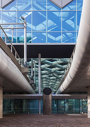
File:Den Haag Centraal-1589.jpg, featured[edit]
Voting period is over. Please don't add any new votes.Voting period ends on 7 May 2015 at 09:28:08 (UTC)
Visit the nomination page to add or modify image notes.
- Category: Commons:Featured pictures/Places/Architecture
- Info all by Hubertl -- Hubertl (talk) 09:28, 28 April 2015 (UTC)
- Info Tram-viaduct construction, entering the partly open tram station at the Central station of The Hague, Netherland.
- Support -- Hubertl (talk) 09:28, 28 April 2015 (UTC)
- Support Good composition,interesting place --LivioAndronico talk 12:49, 28 April 2015 (UTC)
- Support Artistic composition. Like a painting "blue in green". -- Johann Jaritz (talk) 15:39, 28 April 2015 (UTC)
- Support --Tremonist (talk) 16:29, 28 April 2015 (UTC)
- Support --Famberhorst (talk) 17:34, 28 April 2015 (UTC)
- Support -- Pofka (talk) 13:51, 29 April 2015 (UTC)
- Oppose It's a confusing. What is a featuring subject? composition?, lighting?, objects? I think this is similar case of this nomination. Sorry for opposing your nom again. --Laitche (talk) 14:12, 29 April 2015 (UTC)
- Oppose Per Laitche. QI probably but not an FP. Daniel Case (talk) 18:28, 29 April 2015 (UTC)
- Neutral For me this kind of unusual compositions make excellent FP. However the lack of symmetry caused by the structure at right is too imposing. Alvesgaspar (talk) 09:38, 1 May 2015 (UTC)
- Support Unusual but good. --Code (talk) 15:17, 1 May 2015 (UTC)
- Support Beautiful,good and especially original --Σπάρτακος (talk) 18:44, 2 May 2015 (UTC)
- Support --LuisArmandoRasteletti (talk) 23:08, 3 May 2015 (UTC)
- Neutral per Laitche. -- Colin (talk) 07:45, 7 May 2015 (UTC)
File:Kesari bhath.jpg, not featured[edit]
Voting period is over. Please don't add any new votes.Voting period ends on 7 May 2015 at 05:27:37 (UTC)
Visit the nomination page to add or modify image notes.
- Category: Commons:Featured pictures/Food and drink
- Info All by AntanO
- Support -- AntanO 05:27, 28 April 2015 (UTC)
- Support -- depth field fail, but don't loss relevant detail. Good sharp, try using self shoot 10 secs or focus remote after 5 secs. :) Webysther (talk) 06:41, 28 April 2015 (UTC)
- Oppose The subject is unattractively cropped at right and depth of field is too shallow. --Cayambe (talk) 09:33, 28 April 2015 (UTC)
- Oppose Bad crop. Yann (talk) 12:29, 28 April 2015 (UTC)
- Oppose Dito. --Tremonist (talk) 16:28, 28 April 2015 (UTC)
- Oppose As per others. With better crop it could have been FP. -- Pofka (talk)
- Comment If needs of better crop including whole dish, I can re-upload. But, I am not sure the reason for opposition. Crop or DoF?--AntanO 15:14, 29 April 2015 (UTC)
- Comment I would prefer the whole bowl into right. It's content is interesting and colorful and I see no reason cropping a part of it. Though, I'm not sure about the bottom part since it seems this bowl is just some basic white bowl without any interesting decorations we use in microwaves to heat food. If that is true, I would personally prefer bottom-cropped version, but with the full right part. Furthermore, there probably is too much black all around the bowl and I think it should be slightly reduced as well. -- Pofka (talk) 15:13, 30 April 2015 (UTC)
- weak support I actually like the fact that it's not a boring centered composition with the whole bowl being visible. Crop could mabe even be a bit tighter for my taste. A shallow DOF makes sense for this kind of shot as well, we really don't need to have the rim of the bowl in focus. But having a little bit more of the front nut in focus would have been nice. And while I like the lighting in general, having a shadow right on the front edge of the front nut is a bit unfortunate, imho. --El Grafo (talk) 12:08, 30 April 2015 (UTC)
- Support I also like the off-centered composition, although I personally would have gone even further with the cropping on the right hand side. The cropping is something that you can see a lot in food photography these days. In general, I'd like to see more food photos here on Commons. --Frank Schulenburg (talk) 03:08, 2 May 2015 (UTC)
- Support --LuisArmandoRasteletti (talk) 23:09, 3 May 2015 (UTC)
- Support I think the crop is more artistic than objectively bad. I can also live with the shallow DOF in an "artsy" photo like this. --King of ♥ ♦ ♣ ♠ 01:15, 5 May 2015 (UTC)
File:Myioborus torquatus Santa Elena.JPG, featured[edit]
Voting period is over. Please don't add any new votes.Voting period ends on 11 May 2015 at 00:22:17 (UTC)
Visit the nomination page to add or modify image notes.
- Category: Commons:Featured pictures/Animals/Birds
- Info created by Cephas - uploaded by Cephas - nominated by Cephas -- Cephas (talk) 00:22, 2 May 2015 (UTC)
- Support -- Cephas (talk) 00:22, 2 May 2015 (UTC)
- Support 😄 ArionEstar 😜 (talk) 00:26, 2 May 2015 (UTC)
- Support --Bojars (talk) 05:32, 2 May 2015 (UTC)
- Support Poco2 08:38, 2 May 2015 (UTC)
- Support --Cayambe (talk) 10:41, 2 May 2015 (UTC)
- Support --Martin Falbisoner (talk) 11:14, 2 May 2015 (UTC)
- Neutral Nice but noise. --Laitche (talk) 13:08, 2 May 2015 (UTC)
- Support --Mile (talk) 14:21, 2 May 2015 (UTC)
- Support --Kikos (talk) 21:24, 2 May 2015 (UTC)
- Support --Kadellar (talk) 01:32, 3 May 2015 (UTC)
- Support --Charles (talk) 07:36, 3 May 2015 (UTC)
- Support -- Pofka (talk) 08:49, 3 May 2015 (UTC)
- Support Too cute to resist, but I'd be !voting this way anyway because it's technically well-done. Daniel Case (talk) 17:26, 3 May 2015 (UTC)
- Support --LuisArmandoRasteletti (talk) 22:52, 3 May 2015 (UTC)
- Support --Hubertl (talk) 01:07, 4 May 2015 (UTC)
- Support -- Wolf im Wald 09:05, 4 May 2015 (UTC)
- Support D kuba (talk) 12:39, 4 May 2015 (UTC)
- Support --Jacek Halicki (talk) 13:10, 4 May 2015 (UTC)
- Support absolutely --Abd (talk) 01:05, 5 May 2015 (UTC)
- Support --Pugilist (talk) 05:17, 5 May 2015 (UTC)
- Support --Tremonist (talk) 13:19, 5 May 2015 (UTC)
- Support --King of ♥ ♦ ♣ ♠ 23:49, 5 May 2015 (UTC)
File:Great Egret during mating season at Smith Oaks Sanctuary, High Island.jpg, featured[edit]
Voting period is over. Please don't add any new votes.Voting period ends on 10 May 2015 at 09:11:42 (UTC)
Visit the nomination page to add or modify image notes.
- Category: Commons:Featured pictures/Animals/Birds
- Info created & uploaded by Frank Schulenburg - nominated by Tomer T -- Tomer T (talk) 09:11, 1 May 2015 (UTC)
- Support -- Tomer T (talk) 09:11, 1 May 2015 (UTC)
- Support --Hubertl (talk) 18:20, 1 May 2015 (UTC)
- Support -- Gzzz (talk) 20:42, 1 May 2015 (UTC)
- Support 😄 ArionEstar 😜 (talk) 00:57, 2 May 2015 (UTC)
- Support Great shot in the wild Poco2 08:31, 2 May 2015 (UTC)
- Support -- Pofka (talk) 08:56, 3 May 2015 (UTC)
- Support --LuisArmandoRasteletti (talk) 22:58, 3 May 2015 (UTC)
- Support -- Wolf im Wald 09:06, 4 May 2015 (UTC)
- Support D kuba (talk) 13:04, 4 May 2015 (UTC)
- Support --Jacek Halicki (talk) 13:34, 4 May 2015 (UTC)
- Support fascinating --Abd (talk) 02:11, 5 May 2015 (UTC)
- Support --Tremonist (talk) 13:02, 5 May 2015 (UTC)
- Weak Support a bit noisy but acceptable. --Laitche (talk) 01:11, 7 May 2015 (UTC)
- Support Daniel Case (talk) 03:05, 7 May 2015 (UTC)
File:Iceberg in North Star Bay, Greenland.jpg, featured[edit]
Voting period is over. Please don't add any new votes.Voting period ends on 7 May 2015 at 17:45:43 (UTC)
Visit the nomination page to add or modify image notes.
- Category: Commons:Featured pictures/Natural phenomena
- Info created by NASA - uploaded & nominated by Originalwana (talk) 17:45, 28 April 2015 (UTC)
- Support As nominator Originalwana (talk) 17:45, 28 April 2015 (UTC)
- Neutral Good, but lacks resolution a bit. --Tremonist (talk) 12:23, 29 April 2015 (UTC)
- Support Colors and especially sky are appealing. I don't think more detail is really required when the picture is captured in a such poor lighting. When you zoom-in you can see everything perfectly. The only thing which disturbs me in it is the orange illuminants on ice near the iceberg. I would prefer them being only in the far distance because now it ruins everything a bit, especially when looking into a low resolution picture. -- Pofka (talk) 13:45, 29 April 2015 (UTC)
- Support Resolution is good. Nice sky! 😄 ArionEstar 😜 (talk) 22:30, 29 April 2015 (UTC)
- Weak Support. A bit unsharp/noisy but within the range of acceptability. --King of ♥ ♦ ♣ ♠ 01:13, 1 May 2015 (UTC)
- Support - Cool picture. Very detailled despite the circumstances. --Pugilist (talk) 12:14, 1 May 2015 (UTC)
- Weak Support. Per King of Hearts. Excellent composition and beautyfull view, but in full size image is unsharp/noisy. D kuba (talk) 19:34, 1 May 2015 (UTC)
- Support -- Lauro Sirgadocontribs 22:12, 2 May 2015 (UTC)
- Support --LuisArmandoRasteletti (talk) 23:07, 3 May 2015 (UTC)
- Support -- Wolf im Wald 09:12, 4 May 2015 (UTC)
- Oppose No colourspace metadata (EXIF) or profile. This is required per image guidelines at FP. This image's colours are therefore arbitrary and likely to be different from one display to another. -- Colin (talk) 07:52, 7 May 2015 (UTC)
- Oppose Nice colors, but quite noisy. Yann (talk) 16:17, 7 May 2015 (UTC)
- Oppose per others. --Laitche (talk) 17:07, 7 May 2015 (UTC)
File:Torre Pelli abril 2015.jpg, not featured[edit]
Voting period is over. Please don't add any new votes.Voting period ends on 7 May 2015 at 19:58:23 (UTC)
Visit the nomination page to add or modify image notes.
- Category: Commons:Featured pictures/Places/Architecture
- Info created, uploaded and nominated by Gzzz
- Neutral as creator-- Gzzz (talk) 19:58, 28 April 2015 (UTC)
- Comment no judgement for the time beeing, its tilted clockwise.. --Hubertl (talk) 21:29, 28 April 2015 (UTC)
- Comment Leans a little to the right? --Tremonist (talk) 12:26, 29 April 2015 (UTC)
- Info It's a side view of the tower. As you can see it better on this picture, taken from the same side, the back is more vertical than the front. On my picture, if you look at the middle column of windows, it's (in my opinion) not tilted at all : I checked it with Photoshop and Lightroom... Gzzz (talk) 19:32, 29 April 2015 (UTC)
- Support Nice light and colours. --Code (talk) 19:46, 29 April 2015 (UTC)
- Support as File:Parque Avenida Building in Paulista Avenue.jpg. What a building! 😄 ArionEstar 😜 (talk) 22:28, 29 April 2015 (UTC)
- Neutral yellow van disturb, D kuba (talk) 07:02, 30 April 2015 (UTC)
- Support --King of ♥ ♦ ♣ ♠ 01:13, 1 May 2015 (UTC)
- Support Poco2 15:46, 2 May 2015 (UTC)
- Info That can be seen on the Google Maps from nearby this camera location. --Laitche (talk) 09:55, 3 May 2015 (UTC)
- Oppose This is a good qi, but the distractions and obstructions on the ground together with the simple composition keep this below FP level in my opinion. — Julian H.✈ 11:10, 3 May 2015 (UTC)
- Comment I think the perspective correcting of this nomination is not enough, it looks similar this angle. When compared with this one, please see lampposts, trees and buildings of both images, that's the reason I think it's not enough. --Laitche (talk) 16:25, 3 May 2015 (UTC)
- Support --LuisArmandoRasteletti (talk) 23:06, 3 May 2015 (UTC)
- Oppose per Julian. --El Grafo (talk) 13:11, 4 May 2015 (UTC)
- Oppose per Julian. -- Colin (talk) 11:33, 7 May 2015 (UTC)
Alternative[edit]
- Comment Perspective correcting, Composition adjustment, Rotated counterclockwise 0.3 degrees. @Gzzz: If you mind, I will withdraw the alternative. --Laitche (talk) 20:12, 4 May 2015 (UTC)
- Abstain as editor. --Laitche (talk) 20:12, 4 May 2015 (UTC)
- Support No problem for me ! I like it ! -- Gzzz (talk) 20:56, 4 May 2015 (UTC)
- Support per Gzzz. 😄 ArionEstar 😜 (talk) 23:36, 4 May 2015 (UTC)
- Support --King of ♥ ♦ ♣ ♠ 01:14, 5 May 2015 (UTC)
- Oppose per Julian. -- Colin (talk) 11:33, 7 May 2015 (UTC)
Image:Escudo de Osorno.svg, not featured[edit]
Voting period is over. Please don't add any new votes.Voting period ends on 7 May 2015 at 18:28:41 (UTC)
Visit the nomination page to add or modify image notes.

- Category: Commons:Featured pictures/Non-photographic media/Computer-generated
- Info created by Carlos yo - uploaded by Carlos yo - nominated by Carlos yo -- Carlos yo (Discusión) 18:28, 28 April 2015 (UTC)
- Support -- Carlos yo (Discusión) 18:28, 28 April 2015 (UTC)
- Question Is there any source that can be used to judge how well it matches the original? — Julian H.✈ 20:46, 28 April 2015 (UTC)
- Support It's very detailed, good work. --Tremonist (talk) 12:25, 29 April 2015 (UTC)
- Support --LuisArmandoRasteletti (talk) 23:07, 3 May 2015 (UTC)
File:Bluebonnet-8100.jpg, featured[edit]
Voting period is over. Please don't add any new votes.Voting period ends on 7 May 2015 at 21:21:53 (UTC)
Visit the nomination page to add or modify image notes.
- Category: Commons:Featured pictures/Plants#Family : Fabaceae
- Info created by Loadmaster - uploaded by Loadmaster - nominated by Pine -- Pine✉ 21:21, 28 April 2015 (UTC)
- Support -- Pine✉ 21:21, 28 April 2015 (UTC)
- Support 😄 ArionEstar 😜 (talk) 23:02, 28 April 2015 (UTC)
- Support --Code (talk) 05:33, 29 April 2015 (UTC)
- Support --LivioAndronico talk 11:56, 29 April 2015 (UTC)
- Support --Tremonist (talk) 12:26, 29 April 2015 (UTC)
- Support -- Pofka (talk) 13:42, 29 April 2015 (UTC)
- Support Daniel Case (talk) 04:14, 30 April 2015 (UTC)
- Support Poco2 13:09, 2 May 2015 (UTC)
- Comment Cropping out the brown stalk at the right side would be much better. --Laitche (talk) 13:25, 2 May 2015 (UTC)
- Support --LuisArmandoRasteletti (talk) 23:05, 3 May 2015 (UTC)
File:Kings Cross Railway Station Platforms 5 to 8, London, UK - Diliff.jpg, featured[edit]
Voting period is over. Please don't add any new votes.Voting period ends on 11 May 2015 at 23:25:09 (UTC)
Visit the nomination page to add or modify image notes.
- Category: Commons:Featured pictures/Places/Interiors
- Info created by Diliff - uploaded by Diliff - nominated by Diliff. I took this architectural image of the interior of London Kings Cross railway station in London recently after a Wiki meet up. You may notice that the viewpoint isn't perfectly aligned with the centre of the ceiling. This was because the central platform itself is not aligned with the ceiling, so I was forced to choose one or the other, and I felt that the platform was more important to keep centred. The building itself dates from 1851 to 1852 and is comprised of two arched sheds. This photo shows the western side of the two sheds, but the eastern shed is visible through the arch on the right side of the frame. Diliff (talk) 23:25, 2 May 2015 (UTC)
- Support -- Diliff (talk) 23:25, 2 May 2015 (UTC)
- Support 😄 ArionEstar 😜 (talk) 23:37, 2 May 2015 (UTC)
- Support However I would have cut the empty bottom. -- Christian Ferrer 15:51, 3 May 2015 (UTC)
- Support --LuisArmandoRasteletti (talk) 22:49, 3 May 2015 (UTC)
- Support Wow. Love that infinite DoF. Looks like the sort of place that really could be a gateway to another world. Really great to see you giving the same treatment to a train station that you have brought to so many churches. Daniel Case (talk) 03:13, 4 May 2015 (UTC)
- Support --Code (talk) 05:26, 4 May 2015 (UTC)
- Support --Martin Falbisoner (talk) 06:12, 4 May 2015 (UTC)
- Support -- Pofka (talk) 08:55, 4 May 2015 (UTC)
- Support -- Wolf im Wald 09:00, 4 May 2015 (UTC)
- Support --Jacek Halicki (talk) 13:07, 4 May 2015 (UTC)
- Support --Cayambe (talk) 17:31, 4 May 2015 (UTC)
- Support remember my times there --LivioAndronico talk 19:08, 4 May 2015 (UTC)
- Support makes me want to visit --Abd (talk) 00:46, 5 May 2015 (UTC)
- Support Yann (talk) 06:56, 5 May 2015 (UTC)
- Support --Tremonist (talk) 13:23, 5 May 2015 (UTC)
- Support Good and useful photo, I wished that the viewpoint was higher up.--ArildV (talk) 08:29, 6 May 2015 (UTC)
- Support Now, this is a church interior :) --· Favalli ⟡ 01:06, 7 May 2015 (UTC)
- Support — Crisco 1492 (talk) 07:10, 7 May 2015 (UTC)
File:Notre-Dame Basilica Interior, Montreal, Canada - Diliff.jpg, featured[edit]
Voting period is over. Please don't add any new votes.Voting period ends on 11 May 2015 at 23:14:47 (UTC)
Visit the nomination page to add or modify image notes.
- Category: Commons:Featured pictures/Places/Interiors
- Info created by Diliff - uploaded by Diliff - nominated by Diliff. This image was probably my first church interior and actually dates way back to 2006. It's not technically as good as my modern stitched interiors but for a 9 year old image, I think it still compares well. The dark ambiance is deliberate. It's quite a dark interior and to preserve the highlight details, I've chosen not to bump the shadows too much. As is often the case, the full size image doesn't look as dark as it does in the thumbnail so please view at 100%. Diliff (talk) 23:14, 2 May 2015 (UTC)
- Support -- Diliff (talk) 23:14, 2 May 2015 (UTC)
- Support More churches! 😄 ArionEstar 😜 (talk) 23:38, 2 May 2015 (UTC)
- Support That ceiling looks simply magnificent. -- Pofka (talk) 08:44, 3 May 2015 (UTC)
- Support --Cayambe (talk) 11:20, 3 May 2015 (UTC)
- Support Good image in 2006 and also good repairing technique. --Laitche (talk) 18:26, 3 May 2015 (UTC)
- Support --LuisArmandoRasteletti (talk) 22:50, 3 May 2015 (UTC)
- Support Fascinating. Have you considered doing some of your modern church interiors deliberately darker like this? It would be interesting. Daniel Case (talk) 03:01, 4 May 2015 (UTC)
- Well, I suppose I could but not many are as well-lit as this church. I did give one church a similar treatment as it was also similarly dark, lit only with stained glass. But most churches are not naturally dark. I do try to maintain the original ambience of the interior, except with better clarity of shadow and highlight detail. :-) Diliff (talk) 10:21, 4 May 2015 (UTC)
- Support --Code (talk) 05:26, 4 May 2015 (UTC)
- Support --Martin Falbisoner (talk) 06:11, 4 May 2015 (UTC)
- Support -- Wolf im Wald 09:05, 4 May 2015 (UTC)
- Support --Jacek Halicki (talk) 13:08, 4 May 2015 (UTC)
- Support gorgeous, luscious --Abd (talk) 00:50, 5 May 2015 (UTC)
- Support Yann (talk) 06:58, 5 May 2015 (UTC)
- Support --Tremonist (talk) 13:22, 5 May 2015 (UTC)
- Support - Ooh! — Crisco 1492 (talk) 07:10, 7 May 2015 (UTC)
- Support -- Colin (talk) 19:44, 7 May 2015 (UTC)
File:Dome of Bernini's Parish Church in Castel Gandolfo.jpg, featured[edit]
Voting period is over. Please don't add any new votes.Voting period ends on 12 May 2015 at 09:11:18 (UTC)
Visit the nomination page to add or modify image notes.
- Category: Commons:Featured pictures/Places/Interiors
- Info All by -- LivioAndronico talk 09:11, 3 May 2015 (UTC)
- Support -- LivioAndronico talk 09:11, 3 May 2015 (UTC)
- Support 😄 ArionEstar 😜 (talk) 12:43, 3 May 2015 (UTC)
- This user was blocked by Yann see here , and I'm sorry but I do not consider the vote valid, it has been placed at random.--LivioAndronico talk 12:06, 4 May 2015 (UTC)
- Support Daniel Case (talk) 03:18, 4 May 2015 (UTC)
- Support -- Pofka (talk) 08:55, 4 May 2015 (UTC)
- Support -- Christian Ferrer 16:39, 4 May 2015 (UTC)
- Support --Cayambe (talk) 17:15, 4 May 2015 (UTC)
- Support nice--Wolfgang Moroder (talk) 18:23, 4 May 2015 (UTC)
- Support spectacular --Abd (talk) 00:42, 5 May 2015 (UTC)
- Support --Hubertl (talk) 07:56, 5 May 2015 (UTC)
- Support --Tremonist (talk) 13:24, 5 May 2015 (UTC)
- Support --Famberhorst (talk) 16:01, 6 May 2015 (UTC)
- Support Yes ! (do you see the difference ?)--Jebulon (talk) 15:28, 7 May 2015 (UTC)
- between what? --LivioAndronico talk 15:39, 7 May 2015 (UTC)
File:Gliwice (Gleiwitz) - water tower 03.JPG, not featured[edit]
Voting period is over. Please don't add any new votes.Voting period ends on 8 May 2015 at 12:44:16 (UTC)
Visit the nomination page to add or modify image notes.
_-_water_tower_03.JPG/486px-Gliwice_(Gleiwitz)_-_water_tower_03.jpg)
- Category: Commons:Featured pictures/Places/Architecture
- Info all by Pudelek -- Pudelek (talk) 12:44, 29 April 2015 (UTC)
- Support -- Pudelek (talk) 12:44, 29 April 2015 (UTC)
 Strong oppose For me the composition is very poor: the water tower is standing somewhere near a ugly dump field, there are dozens of ugly ruins everywhere as well. I'm sorry but the picture is absolutely not interesting and is nowhere near the FP standards. I tried finding something positive in it, but failed. Maybe only the lighting is fine in it. Though, it probably would suit for QP if that water tower is notable somehow. -- Pofka (talk) 13:35, 29 April 2015 (UTC)
- Oppose Strange composition. --Tremonist (talk) 13:06, 30 April 2015 (UTC)
- Neutral I find the composition good. It is the subject and colors which are a bit dull. Alvesgaspar (talk) 09:28, 1 May 2015 (UTC)
- Support The composition is interesting. It is a lonely and somehow ugly place and this is what the picture shows. The dull colours underline the repellent nature of the setting. The little child and his mum (?) are contrasting very well and can only be seen by those who look very carefully. The image quality is good, the tower is very sharp and I can't see any other shortcomings. All in all, for me this is certainly one of the finest pictures on Commons. --Code (talk) 17:49, 1 May 2015 (UTC)
- Neutral Per Alvesgaspar Poco2 08:54, 2 May 2015 (UTC)
- Support --LuisArmandoRasteletti (talk) 23:04, 3 May 2015 (UTC)
- Support per Code. --El Grafo (talk) 13:19, 4 May 2015 (UTC)
- Oppose I can see what Code means but the subject is saying nothing to me. --Laitche (talk) 17:58, 4 May 2015 (UTC)
- Weak Support I like the composition,not the mum but the tower in the nothing --LivioAndronico talk 19:13, 4 May 2015 (UTC)
- Oppose as others. Yann (talk) 13:56, 5 May 2015 (UTC)
- Neutral Good light and composition, but the subject is just a bit plain. --King of ♥ ♦ ♣ ♠ 23:44, 5 May 2015 (UTC)
- Oppose Not doing anything for me. -- Colin (talk) 11:38, 7 May 2015 (UTC)
File:Vista de Sagunto, España, 2015-01-03, DD 23-31 HDR PAN.JPG, featured[edit]
Voting period is over. Please don't add any new votes.Voting period ends on 12 May 2015 at 12:40:41 (UTC)
Visit the nomination page to add or modify image notes.
- Category: Commons:Featured pictures/Places/Panoramas
- Info View of the former roman city of Sagunto after sunset at the moon light. The picture was taken from the hill where the castle is located. This picture is the result of 9 frames (3 different frames with 3 differnt exposures). Poco2 12:40, 3 May 2015 (UTC)
- Support -- Poco2 12:40, 3 May 2015 (UTC)
- Support 😄 ArionEstar 😜 (talk) 12:42, 3 May 2015 (UTC)
- Support Kruusamägi (talk) 16:04, 3 May 2015 (UTC)
- Support Great. --Code (talk) 17:01, 3 May 2015 (UTC)
- Support --Kadellar (talk) 17:34, 3 May 2015 (UTC)
- Question Is that the moon? Can you add the camera location? --Laitche (talk) 17:57, 3 May 2015 (UTC)
 Strong support Wow. -- Pofka (talk) 19:51, 3 May 2015 (UTC)
- Support Dorieo (talk) 22:18, 3 May 2015 (UTC)
- Support --LuisArmandoRasteletti (talk) 22:48, 3 May 2015 (UTC)
- Support The moon is too bright but nice photo. --Laitche (talk) 23:20, 3 May 2015 (UTC)
- Support --Hubertl (talk) 01:04, 4 May 2015 (UTC)
- Support Fantástico --· Favalli ⟡ 02:22, 4 May 2015 (UTC)
- Support Daniel Case (talk) 04:03, 4 May 2015 (UTC)
- Support beautiful --Martin Falbisoner (talk) 06:10, 4 May 2015 (UTC)
- Support -- Colin (talk) 10:12, 4 May 2015 (UTC)
- Support Great colors. D kuba (talk) 12:28, 4 May 2015 (UTC)
- Support--ArildV (talk) 12:19, 4 May 2015 (UTC)
- Support Yann (talk) 12:23, 4 May 2015 (UTC)
- Support --Jacek Halicki (talk) 13:06, 4 May 2015 (UTC)
- Support -- Christian Ferrer 19:01, 4 May 2015 (UTC)
- Support beautiful --Abd (talk) 00:35, 5 May 2015 (UTC)
- Support The moon adds a nice touch. --King of ♥ ♦ ♣ ♠ 01:11, 5 May 2015 (UTC)
- Support --Tremonist (talk) 13:26, 5 May 2015 (UTC)
- Support --Böhringer (talk) 10:27, 6 May 2015 (UTC)
- Support --Famberhorst (talk) 16:00, 6 May 2015 (UTC)
- Support Excellent --The Photographer (talk) 13:31, 7 May 2015 (UTC)
- Support wow! Felt obligated to support it :) Tomer T (talk) 20:42, 7 May 2015 (UTC)
File:Basilica of San Vitale - triumphal arch mosaics.jpg, featured[edit]
Voting period is over. Please don't add any new votes.Voting period ends on 9 May 2015 at 10:46:32 (UTC)
Visit the nomination page to add or modify image notes.
- Category: Commons:Featured pictures/Places/Interiors
- Info UNESCO World heritage site Basilica of San Vitale - triumphal arch mosaics. All by --Mile (talk) 10:46, 30 April 2015 (UTC)
- Support -- Mile (talk) 10:46, 30 April 2015 (UTC)
- Support I will not stop me for technical quality analysis because the first thing I thought when I opened the page, it's wow. And I will stay on that. -- Christian Ferrer 11:39, 30 April 2015 (UTC)
- Support Very good! --Tremonist (talk) 13:16, 30 April 2015 (UTC)
- Weak Support It definitely gave "WOW" when opening the page, but I think that dark right corner is quite problematic as you can barely see anything in that part of the picture. -- Pofka (talk) 14:59, 30 April 2015 (UTC)
- Support 😄 ArionEstar 😜 (talk) 16:51, 30 April 2015 (UTC)
- Weak Support as Pofka --Hubertl (talk) 18:52, 30 April 2015 (UTC)
WeakThe subject has wow to me and the quality is good, but the composition is a bit awkward, it would have probably worked out if there had been a symmetry on both sides but it isn't. The top right area is also too dark Poco2 08:21, 2 May 2015 (UTC) Oppose- Support --Soundwaweserb (talk) 13:33, 2 May 2015 (UTC)
Weak--Laitche (talk) 17:16, 7 May 2015 (UTC) Oppose The shadow area at the upper right ruins the composition. --Laitche (talk) 16:54, 2 May 2015 (UTC)- Support --LuisArmandoRasteletti (talk) 23:02, 3 May 2015 (UTC)
- Support Could you check with Photoshop that there is no (or no problematic) out-of-gamut issues with saving this as sRGB instead. If you can, that would help make this image display with the correct colours for most users with desktop and mobile browsers. -- Colin (talk) 11:49, 7 May 2015 (UTC)
- Weak Support Nice pic. I guess a bit overprocessing and CAs on the windows at the bottom left but acceptable to me. --Laitche (talk) 15:52, 8 May 2015 (UTC)
File:Mosaic of the vault of the chapel of San Zeno (IX century).jpg, featured[edit]
Voting period is over. Please don't add any new votes.Voting period ends on 8 May 2015 at 20:04:39 (UTC)
Visit the nomination page to add or modify image notes.
.jpg/314px-Mosaic_of_the_vault_of_the_chapel_of_San_Zeno_(IX_century).jpg)
- Category: Commons:Featured pictures/Places/Interiors
- Info All by -- LivioAndronico talk 20:04, 29 April 2015 (UTC)
- Support -- LivioAndronico talk 20:04, 29 April 2015 (UTC)
- Support --XRay talk 03:53, 30 April 2015 (UTC)
- Support --Famberhorst (talk) 04:59, 30 April 2015 (UTC)
- Support A bit soft, but clearly a FP for me. --Uoaei1 (talk) 09:09, 30 April 2015 (UTC)
- Support --Tremonist (talk) 13:07, 30 April 2015 (UTC)
- Support -- Pofka (talk) 15:00, 30 April 2015 (UTC)
- Support 😄 ArionEstar 😜 (talk) 16:54, 30 April 2015 (UTC)
- Support --Jacek Halicki (talk) 18:28, 30 April 2015 (UTC)
- Support --Hubertl (talk) 18:52, 30 April 2015 (UTC)
- Support --Llez (talk) 20:06, 30 April 2015 (UTC)
- Support Albertus teolog (talk) 23:56, 1 May 2015 (UTC)
- Support There is some lack of symmetry in the corners, but still FP to me Poco2 08:15, 2 May 2015 (UTC)
- Oppose Because of the lack of symmetry, a mandatory for me in this kind of subjects and composition, sorry.--Jebulon (talk) 21:54, 2 May 2015 (UTC)
- Oppose per Jebulon. --Kadellar (talk) 01:38, 3 May 2015 (UTC)
- Don't lack of symmetry is simpled not regular,anyway I preferred show all the window for not cut it,thanks--LivioAndronico talk 09:18, 3 May 2015 (UTC)
- This user was blocked by Yann see here , and I'm sorry but I do not consider the vote valid, it has been placed at random.--LivioAndronico talk 12:07, 4 May 2015 (UTC)
- IMO you cannot do that. Even if there is a link between the vote and the block, the block came after the vote. The vote is valid. Nullum crimen, nulla poena sine lege.--Jebulon (talk) 15:22, 7 May 2015 (UTC)
- Jebulon, It's LivioAndronico's nomination so if anyone can remove support votes then he certainly can, and if you are upset with the final result you can re-nominate. LuisArmandoRasteletti's support of 90 candidates in a row is no more a valid vote than if I put an X next to all the candidates in my UK election today. He was just playing games and got blocked for it. No, we don't need rules for everything, a wiki is not a court of law. -- Colin (talk) 19:24, 7 May 2015 (UTC)
- He had been warned several times Errare humanum est, perseverare autem diabolicum
 --LivioAndronico talk 15:41, 7 May 2015 (UTC)
File:RIMPAC 2010 DVIDS299372.jpg, not featured[edit]
Voting period is over. Please don't add any new votes.Voting period ends on 12 May 2015 at 20:29:23 (UTC)
Visit the nomination page to add or modify image notes.
- Category: Commons:Featured pictures/People
- Info created by Cohen Young - uploaded by Fæ -- Fæ (talk) 20:29, 3 May 2015 (UTC)
- Support -- Fæ (talk) 20:29, 3 May 2015 (UTC)
- Oppose Crop is too tight. --Laitche (talk) 16:22, 4 May 2015 (UTC)
- Oppose. A very confusing and awkward photo. Nicely timed but that's about the only thing it has going for it IMO. Diliff (talk) 00:32, 5 May 2015 (UTC)
- Oppose Per others. --Tremonist (talk) 13:28, 5 May 2015 (UTC)
- Oppose "Confusing" can be a good thing, but in this case it isn't imo. It's also pretty dark and sharpness isn't great either. --El Grafo (talk) 11:51, 8 May 2015 (UTC)
File:Cologne Main Station May 2015.JPG, featured[edit]
Voting period is over. Please don't add any new votes.Voting period ends on 13 May 2015 at 15:33:45 (UTC)
Visit the nomination page to add or modify image notes.
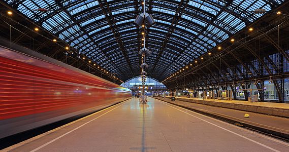
- Category: Commons:Featured pictures/Places/Architecture
- Info Cologne Hauptbahnhof as seen from the central platform of the main hall during blue hour. Please note that platform and roof (including its electric lighting) are not absolutely perfectly aligned. All by myself --Martin Falbisoner (talk) 15:33, 4 May 2015 (UTC)
- Support -- Martin Falbisoner (talk) 15:33, 4 May 2015 (UTC)
- Support Impressive.--ArildV (talk) 15:41, 4 May 2015 (UTC)
- Support Impressive.--Laitche (talk) 16:20, 4 May 2015 (UTC)
- Support --Code (talk) 16:28, 4 May 2015 (UTC)
- Support Impressive. 😄 ArionEstar 😜 (talk) 16:36, 4 May 2015 (UTC)
- Support
 Awesome! --LivioAndronico talk 16:56, 4 May 2015 (UTC)
 - Support --Cayambe (talk) 17:08, 4 May 2015 (UTC)
- Support --Jacek Halicki (talk) 19:22, 4 May 2015 (UTC)
- Comment I think if you had taken a photo without the train it would have been just as good by focusing the eye more upon the beauty and symmetry of the station.--Fotoriety (talk) 00:34, 5 May 2015 (UTC)
- Comment The hall without a moving train as a main component is less interesting than I'd expected myself. The main problem is that the hall is never really "empty", i.e. there's always some train or another standing or moving somewhere, destroying the symmetry. Another annoying factor: A couple of ugly trash cans on the platform to the left, here perfectly covered by the incoming train. Besides: I'd really miss the dynamic element we have in this picture... ---Martin Falbisoner (talk) 09:04, 5 May 2015 (UTC)
- Support --King of ♥ ♦ ♣ ♠ 01:09, 5 May 2015 (UTC)
- Support As I zoomed in I caught myself moving my head to try and see the full advertisement on the rear window. Once that happens, there is no need to add any further technical explanation. Daniel Case (talk) 03:28, 5 May 2015 (UTC)
- Support --Hubertl (talk) 07:53, 5 May 2015 (UTC)
- Support --Tremonist (talk) 13:30, 5 May 2015 (UTC)
- Support -- Christian Ferrer 18:18, 5 May 2015 (UTC)
- Support --Famberhorst (talk) 15:58, 6 May 2015 (UTC)
- Support Per Daniel Case --· Favalli ⟡ 01:31, 7 May 2015 (UTC)
- Support We've seen several similar shots in the past, but it's still impressing for me. --El Grafo (talk) 08:17, 8 May 2015 (UTC)
- Support --Ralf Roleček 19:38, 8 May 2015 (UTC)
- Support Poco2 09:53, 9 May 2015 (UTC)
File:The Shard from the Sky Garden 2015.jpg, featured[edit]
Voting period is over. Please don't add any new votes.Voting period ends on 13 May 2015 at 22:55:07 (UTC)
Visit the nomination page to add or modify image notes.
- Category: Commons:Featured pictures/Places/Architecture/Towers
- Info At 306m, The Shard is the tallest skyscraper in the European Union, and over twice the height of Guy's Hospital hiding behind it (the tallest hospital in the world). The people walking at the bottom of this tower are approximately 170 × smaller than the building. This photo was taken from the balcony of the "Sky Garden" at the top of the "Walkie-Talkie". That viewpoint is approximately half as high as the Shard is tall, and 750m distant. Created, uploaded and nominated by Colin.
- Support The photo wasn't easy to take as the "Sky Garden" balcony is surrounded by glass that a detrimental effect on quality, and tripods are not allowed. What elevates this photo above QI are:
- The image is a sharp 60MP resolution, which is about 2.8m tall on a standard 100dpi monitor screen.
- The viewpoint, at mid height and approximately twice as distant as the building is tall, is ideal for photographing skyscrapers since it does not suffer from vertical perspective distortions -- the proportions are true.
- All 306m of the tower are visible from base to top, which is very unusual in London unless one is standing at the base.
- A window is open to allow a window-cleaning crane to protrude. Or perhaps to fly a Millennium Falcon inside. -- Colin (talk) 22:55, 4 May 2015 (UTC)
- Support convinced ;-) --Martin Falbisoner (talk) 23:38, 4 May 2015 (UTC)
- Support 😄 ArionEstar 😜 (talk) 23:58, 4 May 2015 (UTC)
- Support, although the time of day doesn't seem ideal for photographing the Shard from this angle. This is almost certainly the best publicly accessible vantage point for photographing the Shard. (I know because I had considered it prior to the opening of the Sky Garden!) Diliff (talk) 00:30, 5 May 2015 (UTC)
- Thanks Diliff. I would like to go back during the blue-hour when it is lit up, and try to get permission to take a tripod. It wouldn't be possible during normal open-hours as a tripod would obstruct people in the relatively narrow and busy balcony. And I'd need them to turn the lights off, or use some black sheeting/box to avoid reflections. Or buy a really really tall tripod that gets above the glass barrier. Or get a trip in one of those window-cleaning cranes... -- Colin (talk) 08:45, 5 May 2015 (UTC)
- Support though lighting could be a bit better. --King of ♥ ♦ ♣ ♠ 01:07, 5 May 2015 (UTC)
- Support amazing work, Colin. --Abd (talk) 01:15, 5 May 2015 (UTC)
- Support Thank you for explaining the issues involved in creating this image in such detail. That level of detail, nonetheless, is dwarfed by what's in that image. In that portal open to tractor-beam in the Millenium Falcon, for instance, we can not only see a sort of wavy-line design (the Imperial logo? Stormtroopers waiting at attention? ), we can see that the light is on. Daniel Case (talk) 03:25, 5 May 2015 (UTC)
- Support Thanks for the thorough explanation of the circumstances of the shot. And an amazing picture. --Pugilist (talk) 05:10, 5 May 2015 (UTC)
- Support Yann (talk) 06:54, 5 May 2015 (UTC)
- Support -- Pofka (talk) 07:34, 5 May 2015 (UTC)
- Support good city view but perhaps you can clone out the disturbing skyscraper in the foreground?--ArildV (talk) 08:05, 5 May 2015 (UTC)
- :-) I'm no fan of it. It looks like someone took the set squares out of their childhood stationary set and spent a few minutes drawing something tall and pointy. Unlike the towers Britain used to build, which reward close examination, when you zoom in to this one you just see flat glass and steel. And compared to other modern skyscrapers even the glass is boring. -- Colin (talk) 08:45, 5 May 2015 (UTC)
- Support --Code (talk) 08:40, 5 May 2015 (UTC)
- Support Good job. -- -donald- (talk) 10:05, 5 May 2015 (UTC)
- Support --Tremonist (talk) 13:43, 5 May 2015 (UTC)
- Support amazing photographic skill, that red cranes are for a building's construction? if so it's a pity this superb view will not be seen in the future. --Laitche (talk) 18:19, 5 May 2015 (UTC)
- Support -- Christian Ferrer 18:24, 5 May 2015 (UTC)
- Support The only thing that could improve this would be better lighting, imho. The chosen vantage point seems indeed ideal. Congratulations! --El Grafo (talk) 10:10, 6 May 2015 (UTC)
- Thanks. I agree the about the lighting. I should admit that the vantage point is probably best for obtaining the full view of the building from top-to-bottom, but does make it harder to see that the Shard isn't a simple pyramid. If you look at File:Tower Bridge view at dawn crop.jpg, you can see that the side of the building that faces the Walkie-Talkie has a triangular wedge that sticks out. That is less obvious in this photo. However, as Laitche notes, it is possible that someone is building something to obscure the base from this direction too. One can't get all aspects perhaps, unless WMF want to charter a helicopter to take aerial pictures. -- Colin (talk) 10:56, 6 May 2015 (UTC)
- Support You couldn't have taken the picture when the Greenpeace protesters were climbing the building? ;-) -- KTC (talk) 12:31, 6 May 2015 (UTC)
- Support Good work --· Favalli ⟡ 01:24, 7 May 2015 (UTC)
- Support --Ralf Roleček 19:38, 8 May 2015 (UTC)
- Support Colors are too grey/monochrome and lighting is not bad but it is not adding interest to the picture, probably at dust or dawn the result would have been better (looking at the opening hours it looks like dawn isn't possible, but dusk). Still, outstanding quality of a very significant subject in London for which we don't have a HQ picture like this. Poco2 09:52, 9 May 2015 (UTC)
File:Arian Baptistry ceiling mosaic - Ravenna.jpg, featured[edit]
Voting period is over. Please don't add any new votes.Voting period ends on 10 May 2015 at 09:46:56 (UTC)
Visit the nomination page to add or modify image notes.
- Category: Commons:Featured pictures/Places/Interiors/Religious buildings
- Info Baptism of Jesus by Saint John the Baptist with procession of the Apostles around. Arian Baptistry ceiling mosaic in Ravenna, Italy. Built 5-6 century A.D. UNESCO World heritage site. All by --Mile (talk) 09:46, 1 May 2015 (UTC)
- Support -- Mile (talk) 09:46, 1 May 2015 (UTC)
- Support At first I thought that these corners are too dark. But when I zoomed-in that, it became clear for me that if it would be lighter, it would probably look much worse because these walls seems solidly damaged by time and requires at least minor restoration (especially windows surroundings). Illumination selection is excellent. By the way, love these blue windows. They simply look great with that gold center. -- Pofka (talk) 10:00, 1 May 2015 (UTC)
- Comment Pofka True you are. Those walls are not helping viewer to concentrate on mosaic (check here), but i did not want to go into sqaure crop to avoid them, because windows breathe some ligth-life into composition. So i used lower ligth gradience. --Mile (talk) 10:16, 1 May 2015 (UTC)
- Support --Hubertl (talk) 18:18, 1 May 2015 (UTC)
- Comment Wouldn't it deserve a slight tilt clockwise ? Gzzz (talk) 20:41, 1 May 2015 (UTC)
- Support Albertus teolog (talk) 23:55, 1 May 2015 (UTC)
- Oppose It needs a tilt in cw direction. Furthermore the overexposed (and with CA) windows spoil the picture. IMHO there is one way, though, to get a FP out of it, look at this. If you make an alternative like that I'd support. Poco2 08:34, 2 May 2015 (UTC)
- Support --Soundwaweserb (talk) 13:34, 2 May 2015 (UTC)
- Oppose Tilted. --Kadellar (talk) 01:35, 3 May 2015 (UTC)
- Info New version, since some dont like previous. Lets try sqaure crop. Check now...Kadellar, Poc. --Mile (talk) 08:04, 3 May 2015 (UTC)
- I am not convinced either, those overexposed and now cropped windows are expoiling it. You should have taken several pictures to increase the dynamic range or opt for something like this: Arian
 , that I just uploaded, you can use as alternative if you like it Poco2 09:19, 3 May 2015 (UTC)
- I am not convinced either, those overexposed and now cropped windows are expoiling it. You should have taken several pictures to increase the dynamic range or opt for something like this: Arian
- Support --LuisArmandoRasteletti (talk) 22:57, 3 May 2015 (UTC)
- Support --Jacek Halicki (talk) 13:32, 4 May 2015 (UTC)
- Support --Tremonist (talk) 13:16, 5 May 2015 (UTC)
- Support Much better now ! --Gzzz (talk) 19:35, 6 May 2015 (UTC)
- Support Good quality mosaic. -- Colin (talk) 19:18, 7 May 2015 (UTC)
File:The windmills of Kinderdijk.JPG, not featured[edit]
Voting period is over. Please don't add any new votes.Voting period ends on 10 May 2015 at 09:05:44 (UTC)
Visit the nomination page to add or modify image notes.
- Category: Commons:Featured pictures/Places/Architecture
- Info created & uploaded by Tarod - nominated by Tomer T -- Tomer T (talk) 09:05, 1 May 2015 (UTC)
- Oppose Excellent composition and nice lighting but the details are lost by processing(sharp, denoise, etc) in my opinion, sorry. --Laitche (talk) 16:33, 1 May 2015 (UTC)
- Weak Support. Agree with Laitche that this is not the sharpest. But there is so much "wow" in this image that I'm comfortable asking myself, does this look perfectly sharp at 2000 px? Yes it does. --King of ♥ ♦ ♣ ♠ 02:00, 2 May 2015 (UTC)
- Weak Support Per KoH, the cropped Windmill sail at the bottom is also a pity Poco2 09:03, 2 May 2015 (UTC)
- Comment The King's comment means this one, but I don't think that one is perfectly sharp(details) and still there are a bit noises on the grasses at the right side + downscaling is a minus factor + this is already downscaled(3901 / 4608 x 3072 = 2601). --Laitche (talk) 09:24, 2 May 2015 (UTC) --Laitche (talk) 18:41, 5 May 2015 (UTC)
- Support --Soundwaweserb (talk) 13:41, 2 May 2015 (UTC)
- Support 😄 ArionEstar 😜 (talk) 16:15, 2 May 2015 (UTC)
- Oppose Disturbing tight crop at top and cut reflection at the bottom. -- Christian Ferrer 16:19, 3 May 2015 (UTC)
- Support --LuisArmandoRasteletti (talk) 22:58, 3 May 2015 (UTC)
- Neutral I like the composition but for my taste it's unfortunately not sharp enough to give a support. --Code (talk) 05:32, 4 May 2015 (UTC)
- Support --Tremonist (talk) 13:02, 5 May 2015 (UTC)
- Neutral I like the lighting and the composition is excellent, imho (don't really mind the cut wing). Sharpness is not bad for a kit lens, but a decent prime would probably have yielded a much better result. Sorry, I really can't decide. --El Grafo (talk) 09:55, 6 May 2015 (UTC)
- Oppose Quality not high enough for FP landscape. Disagree with KoH that we should be happy with a 2MP sharp for landscape -- plenty 36MP FPC failures would pass at that standard. -- Colin (talk) 12:30, 7 May 2015 (UTC)
File:Tjörnbron September 2014 02.jpg, featured[edit]
Voting period is over. Please don't add any new votes.Voting period ends on 10 May 2015 at 07:26:18 (UTC)
Visit the nomination page to add or modify image notes.
- Category: Commons:Featured_pictures/Places/Architecture/Bridges
- Info Tjörnbron (the Tjörn bridge). Tjörnbron is one of three bridges along Tjörnbroleden that connects the islands of Tjörn and Orust to the mainland. Inaugurated in 1981, the bridge was built in record time after its predecessor, the Almö Bridge, which was inaugurated in June 1960, collapsed after the bulk carrier MS Star Clipper collided with its span on 18 January 1980. Created, uploaded and nominated by -- ArildV (talk) 07:26, 1 May 2015 (UTC)
- Support -- ArildV (talk) 07:26, 1 May 2015 (UTC)
- Comment Nice image. IMO white is missing, it's a bit soft. And there are halos (from sharpening). IMO it's fixable.--XRay talk 08:14, 1 May 2015 (UTC)
- Info Thank you for your careful review. New version uploaded based on your proposal. I also did did some local adjustment of sharpness and contrast (photo taken at the sea, and there may be water in the air and therefore a softer images .but also a very beutiful sunny autumn afternoon), and additional cleaning. I appreciate all suggestions for improvement, but please (when reviewing) also remember that it is a uncompressed wide angle image of a very large object. The images is taken with a very sharp prime lens to get the best possible result. Regards--ArildV (talk) 09:52, 1 May 2015 (UTC)
- Comment Very good, but there's a big dust spot in the sky. --Code (talk) 11:52, 1 May 2015 (UTC)
- Comment A bit too dark perhaps? --King of ♥ ♦ ♣ ♠ 02:05, 2 May 2015 (UTC)
- Weak Oppose The subject has wow potential but the result is not at FP level to me. The left crop is not convincing and the top crop too tight. Furthermore this kind of pictures demand IMO perspective feeling and the square-like format is not helping for this purpose. Looking into a map it looks like it is possible to get a bit further and capture more on the left, or even create a pano out of several frames Poco2 08:30, 2 May 2015 (UTC)
- Comment It was not possible to get a bit further back, it is cliffs and if you go further back you start to climb down. If you go to the left, you will get a very boring car park instead of the sea and get a very boring images. The composition is carefully choiced in order to get the best composition with both the bridge and the sea below. Its not a square-like format, its standard 6x4.--ArildV (talk) 08:49, 2 May 2015 (UTC)
- Oppose The brightened version is far much better, however the square-like format and the cut part at left don't help. -- Christian Ferrer 16:22, 3 May 2015 (UTC)
- Support -- Wolf im Wald 09:08, 4 May 2015 (UTC)
- Neutral Good quality and nice lighting but need more air on the top and the left, I can't breathe... --Laitche (talk) 17:10, 4 May 2015 (UTC)
- Support --Tremonist (talk) 13:01, 5 May 2015 (UTC)
- Support It is a bit soft. Don't mind the left crop as it is very hard to get all of a bridge in the frame. Nice light. -- Colin (talk) 12:21, 7 May 2015 (UTC)
- Weak Support The space at top is a bit short. If it could be cloned, then great. Yann (talk) 23:01, 9 May 2015 (UTC)
File:Golconda Fort 002 - Baradari.jpg, not featured[edit]
Voting period is over. Please don't add any new votes.Voting period ends on 10 May 2015 at 15:59:40 (UTC)
Visit the nomination page to add or modify image notes.
- Category: Commons:Featured pictures/Places/Architecture/Castles and fortifications
- Info created by Bgag - uploaded by Bgag - nominated by Christian Ferrer -- Christian Ferrer 15:59, 1 May 2015 (UTC)
- Support -- Christian Ferrer 15:59, 1 May 2015 (UTC)
- Support good work. In general, I like Bgags work. Thanks for nominating! --Hubertl (talk) 18:16, 1 May 2015 (UTC)
Weak Oppose a bit oversharpened. --Laitche (talk) 21:32, 1 May 2015 (UTC)- Comment Agree with Laitche but would support if the problem is fixed. Poco2 09:04, 2 May 2015 (UTC)
- I asked him on his talk page. -- Christian Ferrer 14:19, 2 May 2015 (UTC)
- Support --LuisArmandoRasteletti (talk) 22:53, 3 May 2015 (UTC)
- Comment I have imported a new version. Thanks to Poco a poco. --Bgag (talk) 23:08, 4 May 2015 (UTC)
- Support --Tremonist (talk) 13:17, 5 May 2015 (UTC)
- weak oppose Oversharpening issue mentioned above seems to be resolved now, but the centered composition and low angle don't really wow me. --El Grafo (talk) 09:28, 6 May 2015 (UTC)
- Support Poco2 18:35, 6 May 2015 (UTC)
- Oppose Softer but loss details? surfaces of rocks look too smooth + per El Grafo. --Laitche (talk) 01:01, 7 May 2015 (UTC)
- Oppose Per Laitche, looks like a cameraphone it is so smudgy and the subject/composition/angle is far from FP. -- Colin (talk) 19:29, 7 May 2015 (UTC)
File:Mary Garrity - Ida B. Wells-Barnett - Google Art Project - restoration crop.jpg, featured[edit]
Voting period is over. Please don't add any new votes.Voting period ends on 14 May 2015 at 14:06:01 (UTC)
Visit the nomination page to add or modify image notes.
- Category: Commons:Featured pictures/Historical
- Info created by Mary Garrity, restored and uploaded by Adam Cuerden, nominated by -- Yann (talk) 14:06, 5 May 2015 (UTC)
- Info African-American journalist, newspaper editor, suffragist, sociologist, and an early leader in the civil rights movement.
- Support -- Yann (talk) 14:06, 5 May 2015 (UTC)
- Weak Support. Nice portrait. Her clothes are blurred, but her face is sharp and I'm fine with the quality given the era. --King of ♥ ♦ ♣ ♠ 23:48, 5 May 2015 (UTC)
- Comment I agree with King but I have no idea even an old picture, this kind of image editing like 500px.com (I don’t hate that site.) is
suitableacceptable for FP or not. (For modern photos of course not, imo, but this one is an old one...)--Laitche (talk) 01:54, 6 May 2015 (UTC)- There is no special effect here, at least nothing done recently. And she is a famous person. Regards, Yann (talk) 07:37, 6 May 2015 (UTC)
- No, I don't mean digital effect. In this case, have a look at the lower part carefully, in my opinion, the lower part is so blurry(maybe motion blur or out of focus like the top of her hair) and I guess that was one of the reasons they had to apply this effect so I'm Neutral (If Wikipedia FP, I'll definitely support this one). --Laitche (talk) 11:55, 6 May 2015 (UTC)
- No, I don't mean digital effect. In this case, have a look at the lower part carefully, in my opinion, the lower part is so blurry(maybe motion blur or out of focus like the top of her hair) and I guess that was one of the reasons they had to apply this effect so I'm
- There is no special effect here, at least nothing done recently. And she is a famous person. Regards, Yann (talk) 07:37, 6 May 2015 (UTC)
- Support There seems to be a tiny little bit of motion blur on her clothing, but unlike the other case I think that's acceptable here. --El Grafo (talk) 09:14, 6 May 2015 (UTC)
- Weak Support in spite of some blurred areas. It's probably impossible to restore it any better. --Tremonist (talk) 12:21, 6 May 2015 (UTC)
- Weak Support per King of Hearts and Tremonist. 😄 ArionEstar 😜 (talk) 20:20, 6 May 2015 (UTC)
- Support Very high value, nicely restored.--Jebulon (talk) 15:00, 7 May 2015 (UTC)
- Support For a historical picture is accettable... --LivioAndronico talk 15:44, 7 May 2015 (UTC)
- Support --Martin Falbisoner (talk) 17:10, 7 May 2015 (UTC)
- Support Fine restoration of historical picture. --Pugilist (talk) 19:22, 8 May 2015 (UTC)
- Support --Ralf Roleček 19:38, 8 May 2015 (UTC)
- Support -- Pofka (talk) 21:32, 8 May 2015 (UTC)
- Support --Schnobby (talk) 17:07, 9 May 2015 (UTC)
- Support --Σπάρτακος (talk) 12:25, 10 May 2015 (UTC)
File:Vervain hummingbird (Mellisuga minima).jpg, featured[edit]
Voting period is over. Please don't add any new votes.Voting period ends on 10 May 2015 at 18:37:51 (UTC)
Visit the nomination page to add or modify image notes.
.jpg/450px-Vervain_hummingbird_(Mellisuga_minima).jpg)
- Category: Commons:Featured pictures/Animals/Birds
- Info all by Charlesjsharp -- Charles (talk) 18:37, 1 May 2015 (UTC)
- Support -- Charles (talk) 18:37, 1 May 2015 (UTC)
- Support --LivioAndronico talk 18:42, 1 May 2015 (UTC)
- Support --Bojars (talk) 19:03, 1 May 2015 (UTC)
- Support -- Gzzz (talk) 20:34, 1 May 2015 (UTC)
- Support 😄 ArionEstar 😜 (talk) 00:14, 2 May 2015 (UTC)
- Support --Hubertl (talk) 00:27, 2 May 2015 (UTC)
- Support Outstanding. --Frank Schulenburg (talk) 03:03, 2 May 2015 (UTC)
- Support Poco2 08:35, 2 May 2015 (UTC)
- Neutral Very nice composition although the quality(details, sharpness, noise) is not reaching current FP bar
distinctly interior to other trochilidae(hummingbird) FPs, in this case posterization on yellow part and probably downsampling(5472px -> 3683px) are acceptable to me. --Laitche (talk) 08:43, 2 May 2015 (UTC) - Support --Martin Falbisoner (talk) 11:14, 2 May 2015 (UTC)
- Support --Code (talk) 12:02, 2 May 2015 (UTC)
- Support.--Famberhorst (talk) 16:26, 2 May 2015 (UTC)
- Oppose I'm sorry but I don't think it's really sharp. --Kadellar (talk) 01:34, 3 May 2015 (UTC)
- Support -- Pofka (talk) 08:54, 3 May 2015 (UTC)
- Support --LuisArmandoRasteletti (talk) 22:53, 3 May 2015 (UTC)
- Support --Cayambe (talk) 07:35, 4 May 2015 (UTC)
- Support -- Wolf im Wald 09:05, 4 May 2015 (UTC)
- Support D kuba (talk) 12:56, 4 May 2015 (UTC)
- Support --Jacek Halicki (talk) 13:11, 4 May 2015 (UTC)
- Support --Tremonist (talk) 13:17, 5 May 2015 (UTC)
- Support --King of ♥ ♦ ♣ ♠ 23:50, 5 May 2015 (UTC)
- Jump-on-the-bandwagon support Daniel Case (talk) 03:04, 7 May 2015 (UTC)
- Support -- Colin (talk) 19:31, 7 May 2015 (UTC)
File:M101 hires STScI-PRC2006-10a.jpg, not featured[edit]
Voting period is over. Please don't add any new votes.Voting period ends on 11 May 2015 at 04:28:59 (UTC)
Visit the nomination page to add or modify image notes.
- Category: Commons:Featured pictures/Space exploration
- Info created by European Space Agency & NASA - uploaded by Tryphon - nominated by Pine -- Pine✉ 04:28, 2 May 2015 (UTC)
- Support -- Pine✉ 04:28, 2 May 2015 (UTC)
- Support 😄 ArionEstar 😜 (talk) 10:48, 2 May 2015 (UTC)
- Support -- Pofka (talk) 08:48, 3 May 2015 (UTC)
- Support --LuisArmandoRasteletti (talk) 22:51, 3 May 2015 (UTC)
- Support yes, spectacular space image, the universe is an amazing place, compared to the alternative. --Abd (talk) 01:04, 5 May 2015 (UTC)
- Support --Tremonist (talk) 13:21, 5 May 2015 (UTC)
- Oppose some parts are blurry(strange) at full resolution especially upper left, lower left, lower right. --Laitche (talk) 21:41, 5 May 2015 (UTC)
- strong oppose There are a number of thick lines of blur through the picture. I guess they are seams from a stitching process but they mean the image is really a long way from FP class space photo. -- Colin (talk) 19:36, 7 May 2015 (UTC)
- Comment This is not "a photo," it is a composite of at least 51. Those images were of differing resolutions. A lower-resolution area of the image (such can be seen near the edges), will appear blurry, viewed at high resolution. However, to eliminate that variation, it would be necessary to reduce the resolution of the stunningly high-resolution regions, which are much of the appeal of the full image, which was a "Hubble Heritage Release."[1]. Some level of "blurring" might also be natural nebulosity in some places. However, I looked carefully and could not see "lines of blur."
- This image is spectacular because M101 is spectacular, and it required years of work to create this, the best of M101 extant, by far. I doubt it could be improved without a new space telescope. Single images from the Hubble won't have the "defects" pointed to here, but won't show what this composite shows. I searched through Category:Pinwheel Galaxy and Category:Hubble images of spiral galaxies and found nothing comparable to this image in overall appeal and beauty. --Abd (talk) 23:58, 7 May 2015 (UTC)
- Abd I don't think you've looked hard enough if you can't see the "lines of blur". They are about 10px thick and quite obvious. Use the non-flash zoom browser to look around. We have plenty NASA/Hubble photos, most of which are composites, that are perfect, so a long way from "finest". -- Colin (talk) 01:06, 8 May 2015 (UTC)
File:Angla Viite talu pukktuulik Saaremaal, suvi 2014.jpg, not featured[edit]
Voting period is over. Please don't add any new votes.Voting period ends on 11 May 2015 at 14:04:36 (UTC)
Visit the nomination page to add or modify image notes.
- Category: Commons:Featured pictures/Places/Architecture
- Info created and uploaded by MinuHiiumaa - nominated by Kruusamägi (talk) 14:04, 2 May 2015 (UTC)
- Support Kruusamägi (talk) 14:04, 2 May 2015 (UTC)
- Support Could be biger resolustion. Its nice. --Mile (talk) 14:20, 2 May 2015 (UTC)
- Support Ohh Estonia... 😄 ArionEstar 😜 (talk) 14:27, 2 May 2015 (UTC)
- Support as Mile --LivioAndronico talk 20:45, 2 May 2015 (UTC)
- Oppose Not bad, but only a very good QI. I don't find anything extraordinary here. I miss something special. Matter of taste ? Sorry.--Jebulon (talk) 22:00, 2 May 2015 (UTC)
- Oppose Too much space at the left side and I'm guessing it's over-downscaling but there's no metadata and camera info... --Laitche (talk) 23:50, 2 May 2015 (UTC)
- Support Excellent lighting and clouds. --King of ♥ ♦ ♣ ♠ 04:04, 3 May 2015 (UTC)
- Oppose the composition does not works for me: too much space on left. --Alchemist-hp (talk) 07:47, 3 May 2015 (UTC)
- Neutral Very good picture but too small for my taste. --Code (talk) 17:03, 3 May 2015 (UTC)
- Support --LuisArmandoRasteletti (talk) 22:50, 3 May 2015 (UTC)
- Oppose not bad but not enough outstandind -- Christian Ferrer 19:11, 4 May 2015 (UTC)
- Support Yes, about a fourth off of the left, but the right-hand 3/4 is great and cropping it simple. --Abd (talk) 00:57, 5 May 2015 (UTC)
- Support --Tremonist (talk) 13:22, 5 May 2015 (UTC)
- Oppose per others. -- Colin (talk) 19:39, 7 May 2015 (UTC)
File:Crataegus junges Blatt.JPG, not featured[edit]
Voting period is over. Please don't add any new votes.Voting period ends on 15 May 2015 at 18:09:41 (UTC)
Visit the nomination page to add or modify image notes.
- Category: Commons:Featured pictures/Plants
- Info Young leaf of hawthorn (Crateagus). All by -- Uoaei1 (talk) 18:09, 6 May 2015 (UTC)
- Support -- Uoaei1 (talk) 18:09, 6 May 2015 (UTC)
- Oppose Too many blurred parts, and the shadow on the right part of the leaves is disturbing -- Gzzz (talk) 19:15, 6 May 2015 (UTC)
- Oppose Some nice parts, but per Gzzz otherwise. --Tremonist (talk) 12:25, 7 May 2015 (UTC)
- Oppose Definitely for the shadow in the right. -- Pofka (talk) 21:31, 8 May 2015 (UTC)
File:Kaubalaeva "E. Russ" vrakk.jpg, featured[edit]
Voting period is over. Please don't add any new votes.Voting period ends on 11 May 2015 at 18:49:33 (UTC)
Visit the nomination page to add or modify image notes.
- Category: Commons:Featured pictures/Places
- Info created by Juha Flinkman / National Heritage Board - uploaded and nominated by Kruusamägi (talk) 18:49, 2 May 2015 (UTC)
- Support -- Kruusamägi (talk) 18:49, 2 May 2015 (UTC)
- Oppose Nice but too much small for me,sorry --LivioAndronico talk 20:44, 2 May 2015 (UTC)
- Support interesting. Minimum size of 2MP is available. --Alchemist-hp (talk) 23:27, 2 May 2015 (UTC)
- I don't say that isn't available,I said "too much small for me" in my opinion --LivioAndronico talk 09:13, 3 May 2015 (UTC)
- I don't say that isn't available,I said "too much small for me" in my opinion
- Support --Bojars (talk) 05:43, 3 May 2015 (UTC)
- Comment English description, please. --Laitche (talk) 11:19, 3 May 2015 (UTC)
- Done Kruusamägi (talk) 14:16, 3 May 2015 (UTC)
- Done Kruusamägi (talk) 19:47, 3 May 2015 (UTC)
- Support Unusual photo/ Size is good, of course, D kuba (talk) 19:17, 3 May 2015 (UTC)
- Support --LuisArmandoRasteletti (talk) 22:50, 3 May 2015 (UTC)
- Support --Laitche (talk) 00:38, 4 May 2015 (UTC)
- Support --Hubertl (talk) 01:06, 4 May 2015 (UTC)
- Support --Famberhorst (talk) 05:03, 4 May 2015 (UTC)
- Support -- Pofka (talk) 08:55, 4 May 2015 (UTC)
- Support --Pugilist (talk) 10:28, 4 May 2015 (UTC) Small size, but given the circumstances I still support. --Pugilist (talk) 10:28, 4 May 2015 (UTC)
- Oppose Competently done underwater image, QI perhaps, but no wow. Daniel Case (talk) 20:27, 4 May 2015 (UTC)
- Support Well, wow for me! Maybe I'm a softie and just love life, but ... wow! --Abd (talk) 00:54, 5 May 2015 (UTC)
- Support --Tremonist (talk) 13:22, 5 May 2015 (UTC)
- Support A bit small, but interesting subject, nicely framed and well-lit. --El Grafo (talk) 09:23, 6 May 2015 (UTC)
- Oppose Underwater may be uncommon but I don't see any other reason to justify the TV-screen resolution. Other than the ship's wheel someone propped up, there's nothing much going for the composition or technical aspects above QI. -- Colin (talk) 19:42, 7 May 2015 (UTC)
- Oppose I would support this if it were in higher resolution, but here the "wow" is not at such a high level that I can overlook the low resolution. --King of ♥ ♦ ♣ ♠ 01:13, 9 May 2015 (UTC)
- Oppose For others --Σπάρτακος (talk) 12:27, 10 May 2015 (UTC)
File:Markovi Kuli, hill in Macedonia.JPG, not featured[edit]
Voting period is over. Please don't add any new votes.Voting period ends on 16 May 2015 at 11:25:18 (UTC)
Visit the nomination page to add or modify image notes.
- Category: Commons:Featured pictures/Places/Natural
- Info created by Lenivongeleva - uploaded by Lenivongeleva - nominated by Kiril Simeonovski -- Kiril Simeonovski (talk) 11:25, 7 May 2015 (UTC)
- Support -- Kiril Simeonovski (talk) 11:25, 7 May 2015 (UTC)
- Neutral I really like natural colors here, but in the full resolution, image is very unsharp/blurry. D kuba (talk) 12:20, 7 May 2015 (UTC)
- Neutral A little too dark. --Tremonist (talk) 12:26, 7 May 2015 (UTC)
- Oppose I share D kubas's opinion. Far from FP standards.--Jebulon (talk) 14:54, 7 May 2015 (UTC)
- Oppose Unsharp due to inappropriate choice of aperture (f/2.8). --King of ♥ ♦ ♣ ♠ 02:07, 8 May 2015 (UTC)
- Oppose per King. Aperture and exposure time don't make sense here --Martin Falbisoner (talk) 06:14, 8 May 2015 (UTC)
- Oppose Per others. -- Pofka (talk) 21:12, 8 May 2015 (UTC)
- Aperture/exposure doesn't make sense? Inappropriate choice on aperture? Could you please explain it to my why is it inappropriate and doesn't make sense.--Donninigeorgia (talk) 21:21, 8 May 2015 (UTC)
- A relatively large aperture (f/2.8) was used. In general, for landscapes a smaller aperture of f/8 or so are preferred (note that larger number = smaller aperture). The smaller the aperture, the more that's in focus. --King of ♥ ♦ ♣ ♠ 01:10, 9 May 2015 (UTC)
- With f2.8 and 50mm the distance to infinite focus (hyper focal distance) is about 30 meters. The object in this picture is further than 30 meters, I think. So your argument is not valid, in my opinion. --Donninigeorgia (talk) 09:36, 9 May 2015 (UTC)
- Comment We don't know what exactly the photographer focused on. Besides: Large apertures tend to provide only limited sharpness in general. --Martin Falbisoner (talk) 13:32, 9 May 2015 (UTC)
- From personal experience, anything at the hyperfocal distance (whatever that might be for a particular photo) is going to too unsharp for FPC. And besides, lenses have generally poor corner performance at large apertures regardless of focus. --King of ♥ ♦ ♣ ♠ 20:48, 9 May 2015 (UTC)
- With f2.8 and 50mm the distance to infinite focus (hyper focal distance) is about 30 meters. The object in this picture is further than 30 meters, I think. So your argument is not valid, in my opinion. --Donninigeorgia (talk) 09:36, 9 May 2015 (UTC)
- A relatively large aperture (f/2.8) was used. In general, for landscapes a smaller aperture of f/8 or so are preferred (note that larger number = smaller aperture). The smaller the aperture, the more that's in focus. --King of ♥ ♦ ♣ ♠ 01:10, 9 May 2015 (UTC)
- Info EOS Kiss X4(550D) with f/2.8 and 50mm, Hyperfocal distance = 46.6 meters. I think they can know that in this site. This info can help you? --Laitche (talk) 13:58, 9 May 2015 (UTC)
- Info I believe you all already know that but I've tried to get the subject distance to this hill from Google Maps and Satellite with this photo(this subject is the lower part, the left side) + altitude(they can get the sea level from the Google Maps) then the subject distance is about 35m - 45m, What if the subject distance = 40 meters, the near limit of DOF = 21.5 meters. And the bottom part of this photo is about 5m - 8m (presumption) so lower area of this photo is out of focus. But of course it's not 100% sure because I can't get the camera location and the angle exactly. --Laitche (talk) 12:36, 11 May 2015 (UTC)
See how ridiculous that is. The photograph is unsharp from top to bottom. If you find the picture not sharp then just say it's not sharp and don't talk about things you don't know. Maybe the dof is too shallow, maybe the lens is not sharp at 2.8. You can take landscapes with large aperture and even with shallow dof. Sometimes the shallow dof is like the dot over the i in landscape photograph, the completion of composition. Sometimes the dof is infinite at 2.8. And sometimes the lens is really sharp at 2.8!! Let go the rules of thumb, these rules kill the creativity. And don't look at the data when judging the picture. Look at he picture! My suggestion to you all. --Donninigeorgia (talk) 18:51, 11 May 2015 (UTC)
- Yes, I agree with you. --Laitche (talk) 23:27, 11 May 2015 (UTC)
- Sometimes I see the similar things in a museum of art, in my country there are very detail descriptions by each painting in a museum, they are reading the descriptions takes 2 or 3 minutes after that they look at the painting but only 5 seconds... and go to the next painting, so I think What! why they don't look at the paintings, it's a museum not a library... --Laitche (talk) 10:21, 12 May 2015 (UTC)
- Comment The JPG is unsharp at 100%, but it is 18MP so that can be downsized. At 10MP it looks sharp enough. Are we encouraging folk to upload downsized images just to pass the pixel peepers? I agree that f/2.8 seems an odd choice for a landscape like this where one typically wants front-to-back sharpness and there is plenty light. The lens is a Canon EF 50mm f/1.8 II so it is slightly stopped down and the reviews claim peak sharpness is around f/5.6. Unfortunately, the EXIF data has failed to capture the focus distance, though the EXIFTOOL helpfully confirms the hyperfocal distance is 46.74 m. But the whole DoF judgement makes assumptions about viewing distance and print size. This could still be printed fairly large and look sharp. While I agree one mustn't review the EXIF rather than the picture, one mustn't also just review the pixels rather than the picture. A discussion of what mistakes may have been made isn't unhealthy in itself. It's a perfectly decent "moutaintop on a sunny day" photo, but I'm not really feeling wowed by it. -- Colin (talk) 19:10, 12 May 2015 (UTC)
File:La Joven Madre 1889 by Arturo Michelena.jpg, featured[edit]
Voting period is over. Please don't add any new votes.Voting period ends on 16 May 2015 at 23:25:59 (UTC)
Visit the nomination page to add or modify image notes.
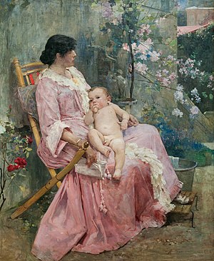
- Category: Commons:Featured pictures/Non-photographic media
- Info Young mother (La joven madre), by Arturo Michelena. Photopraphed and uploaded by The Photographer - nominated by ArionEstar -- 😄 ArionEstar 😜 (talk) 23:25, 7 May 2015 (UTC)
- Support -- 😄 ArionEstar 😜 (talk) 23:25, 7 May 2015 (UTC)
- Support Thanks for this nomination --The Photographer (talk) 00:28, 8 May 2015 (UTC)
- Support --Tremonist (talk) 12:29, 8 May 2015 (UTC)
- Support --Villy Fink Isaksen (talk) 16:32, 8 May 2015 (UTC)
- Support --Mile (talk) 19:24, 8 May 2015 (UTC)
- Support but category is right? mmmm....--LivioAndronico talk 19:43, 8 May 2015 (UTC)
- Yes Sir --The Photographer (talk) 17:34, 11 May 2015 (UTC)
- Support --Rjcastillo (talk) 20:22, 8 May 2015 (UTC)
- Support -- Pofka (talk) 21:10, 8 May 2015 (UTC)
- Support --Cayambe (talk) 09:03, 9 May 2015 (UTC)
- Support --Schnobby (talk) 17:05, 9 May 2015 (UTC)
- Support --Σπάρτακος (talk) 12:23, 10 May 2015 (UTC)
File:Mont Fort panoramic view01 360 degrees 2015-04-26.jpg, featured[edit]
Voting period is over. Please don't add any new votes.Voting period ends on 16 May 2015 at 14:47:16 (UTC)
Visit the nomination page to add or modify image notes.
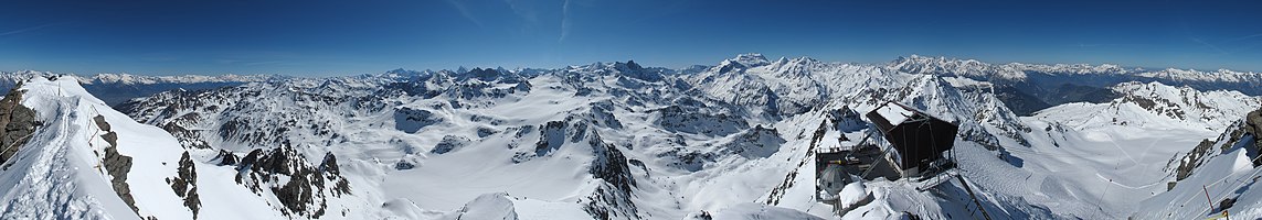
- Category: Commons:Featured pictures/Places/Panoramas
- Info created, uploaded and nominated by KlausFoehl -- KlausFoehl (talk) 14:47, 7 May 2015 (UTC)
- Support -- KlausFoehl (talk) 14:47, 7 May 2015 (UTC)
- Support Good panorama. --Tremonist (talk) 16:44, 7 May 2015 (UTC)
{{s}}--Hubertl (talk) 18:49, 7 May 2015 (UTC)Sorry, I have to give a strategic--Hubertl (talk) 09:06, 8 May 2015 (UTC){{o}}until the stitching error will be fixed. This picture is so fantastic, that it´s worth to make it really perfect! See notes! I´m glad, that I´m not the only one which has overseen it.- Eh? that can be overlooked for me and if stitching errors are fixed, it's not perfect cause there's considerable amount of CA in this panorama. --Laitche (talk) 10:28, 8 May 2015 (UTC)
- You´ve read what I wrote? Why then the eh??, Laitche? What is misunderstanding with the word stategic followed up by what I wrote in the next sentence? --Hubertl (talk) 15:34, 8 May 2015 (UTC)
- Eh? that can be overlooked for me and if stitching errors are fixed, it's not perfect cause there's considerable amount of CA in this panorama. --Laitche (talk) 10:28, 8 May 2015 (UTC)
- Support 😄 ArionEstar 😜 (talk) 19:41, 7 May 2015 (UTC)
- Support. Excellent panorama, good sharpness, resolution and location. Diliff (talk) 19:48, 7 May 2015 (UTC)
- Support Some posterization in the sky in edges but still remarkable panorama. --Mile (talk) 20:15, 7 May 2015 (UTC)
- Support
I added the image note of a stitching error.--Laitche (talk) 20:27, 7 May 2015 (UTC) stitching error is fixed. --Laitche (talk) 17:46, 8 May 2015 (UTC) - Support I'm more than sufficiently wowed --Martin Falbisoner (talk) 06:12, 8 May 2015 (UTC)
- Info
 Fixed New version stitched and uploaded removing the errors mentioned above. -- KlausFoehl (talk) 13:11, 8 May 2015 (UTC)
 - Support almost perfect now! --Hubertl (talk) 15:34, 8 May 2015 (UTC)
- Support Great! Yann (talk) 15:52, 8 May 2015 (UTC)
- Support --Tomascastelazo (talk) 17:34, 8 May 2015 (UTC)
- Support After removal of errors I support. An amazing panaroma. --Pugilist (talk) 19:18, 8 May 2015 (UTC)
- Support --Ralf Roleček 19:37, 8 May 2015 (UTC)
- Support --LivioAndronico talk 19:49, 8 May 2015 (UTC)
- Support -- Pofka (talk) 21:11, 8 May 2015 (UTC)
- Support good quality, good lighting, good composition, nice place... 09:36, 9 May 2015 (UTC)— Preceding unsigned comment added by Poco a poco (talk • contribs) --LivioAndronico talk 13:33, 12 May 2015 (UTC)
- Support -- Colin (talk) 19:14, 12 May 2015 (UTC)
File:Sildpollnes Church and Higravstindan in morning, Austvågøya, Lofoten, Norway, 2015 April.jpg, featured[edit]
Voting period is over. Please don't add any new votes.Voting period ends on 17 May 2015 at 09:05:06 (UTC)
Visit the nomination page to add or modify image notes.
- Category: Commons:Featured pictures/Places/Architecture/Religious buildings
- Info created & uploaded by Ximonic - nominated by Tomer T -- Tomer T (talk) 09:05, 8 May 2015 (UTC)
- Support -- Tomer T (talk) 09:05, 8 May 2015 (UTC)
- Support 😄 ArionEstar 😜 (talk) 10:54, 8 May 2015 (UTC)
- Neutral Nice, but sky and mountain appear a little dark. --Tremonist (talk) 12:28, 8 May 2015 (UTC)
- Comment Picture have perspective problems. --Jacek Halicki (talk) 13:31, 8 May 2015 (UTC)
- Support --Ralf Roleček 19:35, 8 May 2015 (UTC)
- Support -- Pofka (talk) 21:10, 8 May 2015 (UTC)
- Support --Hubertl (talk) 23:45, 8 May 2015 (UTC)
- Support --King of ♥ ♦ ♣ ♠ 01:08, 9 May 2015 (UTC)
- Support -- Wolf im Wald 09:07, 9 May 2015 (UTC)
- Weak Support because of the lighting causing that the front of the church is in shadow, otherwise very nice composition and subject Poco2 09:35, 9 May 2015 (UTC)
- Support --PIERRE ANDRE LECLERCQ (talk) 10:44, 9 May 2015 (UTC)
- Comment I really like this photo, its a very nice composition and the white timber church and the mountains is very Norwegian. But I have to agree with Tremonist, it is a little dark.--ArildV (talk) 19:57, 10 May 2015 (UTC)
- Strong support Per Tremonist and because, frankly, this is one of the best images we've had here in a while. Daniel Case (talk) 22:24, 11 May 2015 (UTC)
- Thank you again, Tomer T, for this nice nomination! And thanks for the feedback. I've done some minor adjustments because of the issues mentioned above. --Ximonic (talk) 02:01, 12 May 2015 (UTC)
- Weak Support Very nice composition and good mood, the front face of the church is in shadow but I don't think bad lighting. --Laitche (talk) 12:51, 12 May 2015 (UTC) due to processing of the sky(clouds) is a bit carelessly. --Laitche (talk) 14:08, 12 May 2015 (UTC)
- Comment Nice but 63% downsized. Don't let the pixel peepers put you off uploading full-size. You have perfectly good kit and ideal conditions. -- Colin (talk) 19:27, 12 May 2015 (UTC)
File:15-05-05-Schloß-Schwerin-RalfR-DSCF5191-2.jpg, featured[edit]
Voting period is over. Please don't add any new votes.Voting period ends on 17 May 2015 at 19:26:11 (UTC)
Visit the nomination page to add or modify image notes.
- Category: Commons:Featured pictures/Places
- Info Schwerin Castle shortly after a storm in the evening sun - created by Ralf Roletschek - uploaded by Ralf Roletschek - nominated by User:Ralf Roletschek
- Support -- Ralf Roleček 19:26, 8 May 2015 (UTC)
- Support
You have some smudges to clean (see note).Well done. Super. --Mile (talk) 19:30, 8 May 2015 (UTC)
- Done --Ralf Roleček 19:32, 8 May 2015 (UTC)
- Support Very good --LivioAndronico talk 19:37, 8 May 2015 (UTC)
- Support --Rjcastillo (talk) 20:17, 8 May 2015 (UTC)
- Support Very nice night shot. 😄 ArionEstar 😜 (talk) 20:32, 8 May 2015 (UTC)
- Support Perfect example when dark actually improves everything. -- Pofka (talk) 21:08, 8 May 2015 (UTC)
- Support Somewhat noisy and the sharpness could be better but the composition makes it. Very nice. --Code (talk) 22:07, 8 May 2015 (UTC)
- Support --Hubertl (talk) 23:39, 8 May 2015 (UTC)
- Weak Support. Great lighting. The overblown reflection in the water is a pity, though. --King of ♥ ♦ ♣ ♠ 01:06, 9 May 2015 (UTC)
- Support Very nice for me.--Famberhorst (talk) 05:16, 9 May 2015 (UTC)
- Support fairy-tale landscape. --Laitche (talk) 08:55, 9 May 2015 (UTC)
- Support I would probably go for a tighter crop on left and top but anyhow nice shot Poco2 09:18, 9 May 2015 (UTC)
- Support --Martin Falbisoner (talk) 13:38, 9 May 2015 (UTC)
- Neutral I do not really know. It is very beautiful, but I agree with Diego about the crop and the water is to dark imo.--ArildV (talk) 18:13, 9 May 2015 (UTC)
- I think also its better with crop. But i dont want change this during voting. --Ralf Roleček 18:36, 9 May 2015 (UTC)
- Support --Σπάρτακος (talk) 12:17, 10 May 2015 (UTC)
- Support Well, that's what I'd call "Wow-effect", congratulations! --El Grafo (talk) 12:28, 10 May 2015 (UTC)
- Support --Tremonist (talk) 12:53, 12 May 2015 (UTC)
- Support IMO, Ralf, you did it ! Well done ! --Jebulon (talk) 21:21, 12 May 2015 (UTC)
File:2015 Kwiatostan gruszy pospolitej.jpg, featured[edit]
Voting period is over. Please don't add any new votes.Voting period ends on 17 May 2015 at 13:28:20 (UTC)
Visit the nomination page to add or modify image notes.
- Category: Commons:Featured pictures/Plants
- Info All by me -- Jacek Halicki (talk) 13:28, 8 May 2015 (UTC)
- Support -- Jacek Halicki (talk) 13:28, 8 May 2015 (UTC)
- Support 😄 ArionEstar 😜 (talk) 13:34, 8 May 2015 (UTC)
- Support --LivioAndronico talk 19:09, 8 May 2015 (UTC)
- Support --Ralf Roleček 19:35, 8 May 2015 (UTC)
- Support --Hubertl (talk) 23:43, 8 May 2015 (UTC)
- Support Nice sigth. --Mile (talk) 11:35, 9 May 2015 (UTC)
- Support --Martin Falbisoner (talk) 13:36, 9 May 2015 (UTC)
- Support --Σπάρτακος (talk) 12:19, 10 May 2015 (UTC)
- Support — Crisco 1492 (talk) 02:20, 11 May 2015 (UTC)
- Support D kuba (talk) 09:44, 11 May 2015 (UTC)
- Support Daniel Case (talk) 22:19, 11 May 2015 (UTC)
- Support --Tremonist (talk) 12:20, 12 May 2015 (UTC)
File:Spiraea japonica 'Goldflame' 07.jpg, featured[edit]
Voting period is over. Please don't add any new votes.Voting period ends on 15 May 2015 at 04:59:16 (UTC)
Visit the nomination page to add or modify image notes.
- Category: Commons:Featured pictures/Plants#Family: Rosaceae
- Info Spiraea japonica 'Gold Flame'. Wonderful anticipation marbled leaves. created by Famberhorst - uploaded by Famberhorst - nominated by Famberhorst -- Famberhorst (talk) 04:59, 6 May 2015 (UTC)
- Support -- Famberhorst (talk) 04:59, 6 May 2015 (UTC)
- Support --Tremonist (talk) 12:47, 6 May 2015 (UTC)
- Support --LivioAndronico talk 18:56, 6 May 2015 (UTC)
- Oppose simple and nice composition but overprocessing (imo, oversharpened, oversaturated, NR to much, using blur filter on background, posterization at the upper right, etc). --Laitche (talk) 20:00, 6 May 2015 (UTC) --Laitche (talk) 22:54, 6 May 2015 (UTC)
- Support Per Laitche except I think the overprocessing isn't enough to ruin this. Daniel Case (talk) 20:44, 6 May 2015 (UTC)
- Support The simplicity makes it wow for me. --Hubertl (talk) 23:54, 6 May 2015 (UTC)
- Support per Hubertl --Martin Falbisoner (talk) 17:11, 7 May 2015 (UTC)
- Oppose that juicy green of the background looks nice, but it completely dominates the image and distracts from the much paler subject. --El Grafo (talk) 08:12, 8 May 2015 (UTC)
- Support -- Pofka (talk) 21:32, 8 May 2015 (UTC)
- Support - I like the contrast between yellow and green. It works well. — Crisco 1492 (talk) 00:40, 9 May 2015 (UTC)
- Support Quality is good, not expceptional, but it is IMHO compensated with a nice bokeh and a convincing combination of colors. Poco2 09:42, 9 May 2015 (UTC)
File:Ljungdalen April 2015 12.jpg, featured[edit]
Voting period is over. Please don't add any new votes.Voting period ends on 19 May 2015 at 08:41:20 (UTC)
Visit the nomination page to add or modify image notes.
- Category: Commons:Featured pictures/Places/Architecture
- Info Abandoned barn in Ljungdalen, a small villages in Berg Municipality, Jämtland County (Sweden). Created, uploaded and nominated by -- Arild Vågen (talk) 08:41, 10 May 2015 (UTC)
- Support -- ArildV (talk) 08:41, 10 May 2015 (UTC)
- Support Very nice, the crop overall is maybe a bit tight but the composition works for me, the subject is interesting and the colors are rounding it, good job. Poco2 08:52, 10 May 2015 (UTC)
- Support something different --Villy Fink Isaksen (talk) 09:19, 10 May 2015 (UTC)
- Support --LivioAndronico talk 10:27, 10 May 2015 (UTC)
- Support --Code (talk) 10:28, 10 May 2015 (UTC)
- Support per above --Martin Falbisoner (talk) 11:21, 10 May 2015 (UTC)
- Support --Σπάρτακος (talk) 12:00, 10 May 2015 (UTC)
- Support Nice... Snow is hard to photograh and you did a nice job. --Tomascastelazo (talk) 15:35, 10 May 2015 (UTC)
- Weak Support That blue-roofed house is a bit pity but I like this atmosphere and agree with Tomascastelazo. --Laitche (talk) 16:39, 10 May 2015 (UTC) due to a little bit purplish clouds. --Laitche (talk) 20:15, 10 May 2015 (UTC)
- Support Just another example when ugly object looks great in right composition. -- Pofka (talk) 18:01, 10 May 2015 (UTC)
- Support --Pugilist (talk) 18:48, 10 May 2015 (UTC)
- Support --King of ♥ ♦ ♣ ♠ 19:54, 10 May 2015 (UTC)
- Support --Ralf Roleček 20:15, 10 May 2015 (UTC)
- Support Jacopo Werther iγ∂ψ=mψ 21:59, 10 May 2015 (UTC)
- Support --Famberhorst (talk) 05:03, 11 May 2015 (UTC)
- Support Per Pofka. Beautifully forlorn. I'd complain about the ridgeline being unsharp, but that would be too much. What's that thing with the cross on it the person there is standing next to? Daniel Case (talk) 05:21, 11 May 2015 (UTC)
- Info Thank you all for review and support. It is a trail cross, winter trails are marked with poles with a red cross in the Swedish mountains. Its is a snowmobile trail in the background.--ArildV (talk) 05:41, 11 May 2015 (UTC)
- I figured it was something like that. Thanks. Daniel Case (talk) 22:16, 11 May 2015 (UTC)
- Support Per Pofka. Yann (talk) 09:28, 11 May 2015 (UTC)
- Support --Tremonist (talk) 13:42, 12 May 2015 (UTC)
- Support Albertus teolog (talk) 12:12, 15 May 2015 (UTC)
File:Ribnica 01.jpg, not featured[edit]
Voting period is over. Please don't add any new votes.Voting period ends on 15 May 2015 at 09:24:29 (UTC)
Visit the nomination page to add or modify image notes.
- Category: Commons:Featured pictures/Places/Architecture/Bridges
- Info French bridge over river Bistrica in Ribnica, Slovenia - created by Mihael Grmek - uploaded by Mihael Grmek - nominated by Meho29 -- Mihael Grmek (talk) 09:24, 6 May 2015 (UTC)
- Weak Support, nice scenery, but consider crop in the lower part. --Tremonist (talk) 12:50, 6 May 2015 (UTC)
- Support 😄 ArionEstar 😜 (talk) 21:22, 6 May 2015 (UTC)
- Oppose indistinct subject, busy composition. --Laitche (talk) 22:17, 6 May 2015 (UTC)
- Oppose Beautiful colors but the lighting is not quite right, as the bridge is in shadow and the midday sun makes everything look flat. --King of ♥ ♦ ♣ ♠ 04:53, 7 May 2015 (UTC)
- Support, although crop at the bottom would certainly improve the composition. — Yerpo Eh? 06:31, 8 May 2015 (UTC)
- Support I like the way you captured the reflection and how you handled the colors of the image. I would have reduced the HDR-effect a bit. Overall, I support this nomination, though. --Frank Schulenburg (talk) 03:58, 10 May 2015 (UTC)
- Support The bridge is enhanced precisely because it is fully in the shade, the shadow is not an evil in this image. -- Christian Ferrer 05:35, 10 May 2015 (UTC)
- Support -- Colin (talk) 17:17, 12 May 2015 (UTC)
- Comment Why bridge and river bank are cut from left side?, D kuba (talk) 09:45, 13 May 2015 (UTC)
File:Webysther 20150501201754 - Interior Sala São Paulo.jpg, not featured[edit]
Voting period is over. Please don't add any new votes.Voting period ends on 19 May 2015 at 13:22:32 (UTC)
Visit the nomination page to add or modify image notes.
- Category: Commons:Featured_pictures/Places/Interiors
- Info created by Webysther - uploaded by Webysther - nominated by Webysther -- Webysther (talk) 13:22, 10 May 2015 (UTC)
- Support -- Webysther (talk) 13:22, 10 May 2015 (UTC)
- Oppose --Too many stitching errors: the focus changed from one shot to the other. Sting (talk) 15:30, 10 May 2015 (UTC)
- Oppose per Sting. --Laitche (talk) 16:02, 10 May 2015 (UTC)
- Oppose A real pity sorry but real a bad work.....--LivioAndronico talk 17:45, 10 May 2015 (UTC)
- Neutral Well, it has wow surely. It's nice and don't deserve my oppose, but I will not support while stitching errors exist. 😄 ArionEstar 😜 (talk) 19:15, 10 May 2015 (UTC)
- Oppose. Yes, the only problem with it is the focus change between frames. It would absolutely be a support from me if that had not happened. I guess you left autofocus on, which is a big problem for panoramas. Even a slight difference in focus makes the stitching very obvious. Diliff (talk) 02:45, 11 May 2015 (UTC)
- Off topic: @Diliff: This is interesting. I am planning to try to take some panoramas in the next weeks, so I am curious: Should I focus manually and then not touch the focus any more or should I change the focus for each frame so that always the same layer (I don't know if this is the right word) is in focus? Can you give me a hint? I hope you understand what I mean - I don't know how to express this question better in English. --Code (talk) 09:57, 11 May 2015 (UTC)
- You can use autofocus for the initial focusing if you want (but in an interior, it's usually better to use the hyperfocal distance to get maximum depth of field - the article is quite confusing but it is worth reading about - try this article) before you start taking the photos, but you should never focus differently for each frame. You will most likely have the problems with focus change like in this image if you leave autofocus on for the panorama. Diliff (talk) 10:10, 11 May 2015 (UTC)
- Focus, exposure and white balance must be the same for each frame. It is convenient to leave the camera set to AWB, which is fine if you shoot raw. Just make sure when you import to Lightroom/whatever that you synchronise them to all have the same values (temperature/tint). Also apply any lens profiles + remove CA before generating any TIFF to send to an external panorama tool. However, if you use the Lightroom 6 panorama tool, and are importing from raw, then the tool will automatically ensure each frame has consistent white balance and will also apply the relevant lens profile. -- Colin (talk) 12:49, 11 May 2015 (UTC)
- @Diliff: @Colin: Thank you very much. Indeed I am using Lightroom 6 which seems to work very well concerning both HDRs and panoramas. But what I really need is a new tripod and a panorama head. I guess without a panorama head it will be nearly impossible to take a panorama e.g. of this or this building. Do you have a recommendation which equipment I should buy? --Code (talk) 05:53, 12 May 2015 (UTC)
- It will certainly help (though there are places where a tripod is not allowed or would cause obstruction). I've managed hand-held such as
- The first three, I rested my arms/elbows on a wall/rail and tried to rotate the camera round its "exist pupil" (usually somewhere in the middle of the lens). The latter two were just hand held. When doing it hand-held, I recommend taking two shots for each frame since there is a danger you get a blurred shot (remember you are taking lots of shots, and if one of them is blurred, you can't make the panorama). Even at shutter speeds above the recommended lower-limit, and with stabilisation, you can still get the odd blurred short -- especially when tilting the camera at an unnatural angle to take the top row. However, doing it hand-held increases the risk of small alignment/stitching/parallax issues. I don't know if Lightroom's new feature is capable of taking feature-quality shots in difficult cases (my experience is with Hugin + Smartblend) but I know that when I do it by hand, I often have to export the warped stitching frames out of Hugin and into Photoshop in order to fix up parallax issues (or where people wander about between frames). Some issues can be fixed by choosing to blend different parts of frames, but some require cloning or moving. For the images you linked, the building should be no problem. Where you might notice an issue is the lines on the pavement towards your feet. Another trouble-maker for parallax is lampposts midway between you and the subject - they may span two frames and it is very hard to avoid any parallax. With a pano head + tripod, then many problems disappear and you should get a better success rate. There's still the risk of getting twins (same person, multiple shots) or bits of people. Oh, this is getting a bit off topic. Perhaps we should discuss kit on your talk page. Your budget is a factor! But anyway, it is possible to take such images hand-held but can involve a fair bit of fixing work and the risk of disappointment. -- Colin (talk) 07:27, 12 May 2015 (UTC)
File:Louis Armstrong restored.jpg, featured[edit]
Voting period is over. Please don't add any new votes.Voting period ends on 19 May 2015 at 21:35:08 (UTC)
Visit the nomination page to add or modify image notes.
- Category: Commons:Featured pictures/People
- Info created by World-Telegram staff photographer, uploaded by Calliopejen1, nominated by Yann (talk) 21:35, 10 May 2015 (UTC)
- Support -- Yann (talk) 21:35, 10 May 2015 (UTC)
- Support Oh, I think this is good, very good capture the moment, And so sorry Yann but in this case Category:People would be better, just my opinion. --Laitche (talk) 22:09, 10 May 2015 (UTC)
- Support iconic! --Martin Falbisoner (talk) 06:36, 11 May 2015 (UTC)
- Support - Excellent. — Crisco 1492 (talk) 06:53, 11 May 2015 (UTC)
- Support Oui sure People --LivioAndronico talk 16:52, 11 May 2015 (UTC)
- Support Very nice classic picture --Davefoc (talk) 22:03, 11 May 2015 (UTC)
- Support Very picturesque image. 😄 ArionEstar 😜 (talk) 22:26, 11 May 2015 (UTC)
- Support --Tremonist (talk) 13:45, 12 May 2015 (UTC)
- Support "the" portrait of Satchmo.--Jebulon (talk) 21:16, 12 May 2015 (UTC)
- Support --El Grafo (talk) 10:11, 13 May 2015 (UTC)
- Support --Ralf Roleček 22:18, 13 May 2015 (UTC)
- Support --Schnobby (talk) 12:36, 14 May 2015 (UTC)
File:Pht-Vugar Ibadov eurovision (8).jpg, not featured[edit]
Voting period is over. Please don't add any new votes.Voting period ends on 15 May 2015 at 14:52:06 (UTC)
Visit the nomination page to add or modify image notes.
.jpg/451px-Pht-Vugar_Ibadov_eurovision_(8).jpg)
- Category: Commons:Featured pictures/People
- Info created by Vugarİbadov - uploaded by Vugarİbadov - nominated by Interfase -- Interfase (talk) 14:52, 6 May 2015 (UTC)
- Support -- Interfase (talk) 14:52, 6 May 2015 (UTC)
- Oppose Noisy, excessive shadow/highlight control, and probably oversharpening. Moreover, the dancers on the left are not sharp. --Gzzz (talk) 19:30, 6 May 2015 (UTC)
- Oppose A little too noisy, that's right. Sorry. --Tremonist (talk) 12:22, 7 May 2015 (UTC)
- Support --Tomascastelazo (talk) 17:37, 8 May 2015 (UTC)
- I like this picture because it is a human interest picture, rare around here. The technical quality is pretty decent taking into account that it is a stage shot, apparently during a live event. There are three main characters in different poses, one in its corresponding one third space, with facial expressions showing and important parts inside the frame. It is a culturally informative photograph. --Tomascastelazo (talk) 23:29, 8 May 2015 (UTC)
- Oppose The shadow on the two right-hand performers is unfortunate, as is cropping her dress. I would support for QI, as for many other of the photographs uploaded at this event. Technically it is a good as one could expect in the circumstances, and the complaints about noise seem unfair. What do you expect? ISO 100? -- Colin (talk) 17:27, 12 May 2015 (UTC)
File:La Belle Otero, par Jean Reutlinger, sepia.jpg, featured[edit]
Voting period is over. Please don't add any new votes.Voting period ends on 16 May 2015 at 16:19:40 (UTC)
Visit the nomination page to add or modify image notes.
- Category: Commons:Featured pictures/Historical
- Info created by Jean Reutlinger, restored, uploaded, and nominated by -- Yann (talk) 16:19, 7 May 2015 (UTC)
- Info Spanish-born dancer, actress and courtesan. La Belle Otero was quite a personality. "The most sought after woman in all of Europe", according to WP. Nothing less... Yann (talk) 21:36, 7 May 2015 (UTC)
- Support -- Yann (talk) 16:19, 7 May 2015 (UTC)
- Support in spite of the blurred curls. --Tremonist (talk) 16:44, 7 May 2015 (UTC)
- Support --Ralf Roleček 19:36, 8 May 2015 (UTC)
- Support --LivioAndronico talk 19:49, 8 May 2015 (UTC)
- Support — Crisco 1492 (talk) 00:38, 9 May 2015 (UTC)
- Support --Jebulon (talk) 20:45, 11 May 2015 (UTC)
- Support FP now! 😄 ArionEstar 😜 (talk) 10:13, 16 May 2015 (UTC)
File:Mars 23 aug 2003 hubble.jpg, not featured[edit]
Voting period is over. Please don't add any new votes.Voting period ends on 20 May 2015 at 07:50:45 (UTC)
Visit the nomination page to add or modify image notes.
- Category: Commons:Featured pictures/Astronomy
- Info created by NASA, ESA, and The Hubble Heritage Team (STScI/AURA) - uploaded by Huntster - nominated by Jcpag2012 -- Jcpag2012 (a.k.a. John Carlo) from Wikimedia Commons 07:50, 11 May 2015 (UTC)
- Support -- Jcpag2012 (a.k.a. John Carlo) from Wikimedia Commons 07:50, 11 May 2015 (UTC)
- Neutral Change from support. I defer to people that sound better informed than me on this. --Davefoc (talk) 03:00, 13 May 2015 (UTC)
- Oppose I'm afraid that's simply not a great image of Mars (relatively) for me, either in terms of resolving the details of the surface, or transition between the planet edge and the black background. The other images discussed at en:Talk:Mars#Lead image are much better for me. -- KTC (talk) 11:02, 12 May 2015 (UTC)
- Oppose Far better images exist. Ask NASA. --Tremonist (talk) 13:51, 12 May 2015 (UTC)
- Oppose Fuzzy, D kuba (talk) 09:19, 13 May 2015 (UTC)
File:Station Äußere Kanalstraße.JPG, featured[edit]
Voting period is over. Please don't add any new votes.Voting period ends on 20 May 2015 at 06:55:25 (UTC)
Visit the nomination page to add or modify image notes.
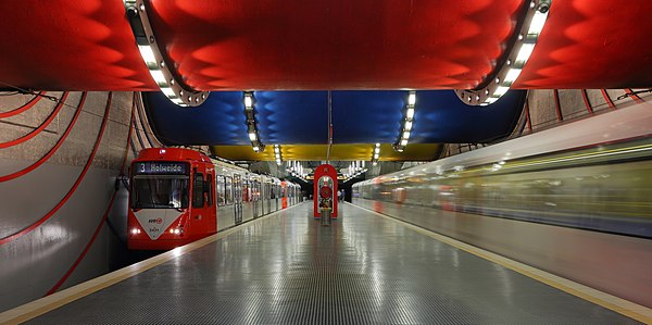
- Category: Commons:Featured pictures/Places/Architecture
- Info Station Äußere Kanalstraße of the Cologne Stadtbahn, all by myself, --Martin Falbisoner (talk) 06:55, 11 May 2015 (UTC). There aren't that many architecturally interesting underground stations in Cologne - Äußere Kanalstraße certainly belongs to the finest. Taking this picture was quite challenging, as Cologne's trains are rather short and tend to arrive at a comparatively low speed, making it difficult to achieve an attractive motion blur effect. Moreover, having trains on both sides of the platform was mere coincidence - and that there aren't too many ghost-like passengers walking around was imo sheer luck. It took me quite a while to get my shot. Btw, the giant pipes aren't totally even.
- Support -- Martin Falbisoner (talk) 06:55, 11 May 2015 (UTC)
- Support Interesting composition, that red pipe at the top and the repetition of the red color in other parts of the image give it a special touch. --El Grafo (talk) 07:46, 11 May 2015 (UTC)
- Support The quality is perfect and the composition is very nice. --Code (talk) 09:09, 11 May 2015 (UTC)
- Support Yann (talk) 09:23, 11 May 2015 (UTC)
- Support Please fix the tilt to left --The Photographer (talk) 11:29, 11 May 2015 (UTC)
- Comment Thanks! I know it does appear as if there was a tilt to the left. But please have a look at the trash can or the "help booth" in the middle: The verticals are absolutely straight. Even when taking the picture I was already under the impression that the upper pipes were slightly slanting. Note that they don't serve mere decorative purposes - the pipes are in fact still functional drainpipes. --Martin Falbisoner (talk) 12:02, 11 May 2015 (UTC)
- I had some doubts, however, the inclination seems to be part of the functionality. Furthermore, verifies the difference in the lower cut --The Photographer (talk) 16:02, 11 May 2015 (UTC)
- Support This image is strange and I love it --LivioAndronico talk 16:41, 11 May 2015 (UTC)
I've known the creator's intentions so I have to change the reason to oppose, there are two main subjects (the trains and the giant pipes) and both of two are foreground here. This trial doesn't work for me in this case, for now :) --Laitche (talk) 20:26, 12 May 2015 (UTC)- Every image is "ordinary" for someone :) --The Photographer (talk) 00:33, 12 May 2015 (UTC)
- Yes, that's right but I think it needs a capture something wow for the FP :) --Laitche (talk) 00:53, 12 May 2015 (UTC)
- I've only been once to Japan, yet - unfortunately, but I honestly do understand that the scene may seem rather ordinary to you (though it's not that easy at all to deal with photographically). Here, in any case, it isn't. Unfortunately. ;-) --Martin Falbisoner (talk) 04:07, 12 May 2015 (UTC)
- I think every work in the FPC is not easy shot so when I look at the works, always very carefully. Yup, most of Japanese urban scenes are ordinary because they have no originality it's kinda copy of yours (means western culture) but still lots of nice places there if you can find a good tour guide and I'm the most unsuitable person for that... By the way, your former nomination is very impressive and I feel wow so I think wows are many places just we couldn't find that, in my opinion. --Laitche (talk) 11:39, 12 May 2015 (UTC)
- I've only been once to Japan, yet - unfortunately, but I honestly do understand that the scene may seem rather ordinary to you (though it's not that easy at all to deal with photographically). Here, in any case, it isn't. Unfortunately. ;-) --Martin Falbisoner (talk) 04:07, 12 May 2015 (UTC)
- Yes, that's right but I think it needs a capture something wow for the FP :) --Laitche (talk) 00:53, 12 May 2015 (UTC)
- Support Per others. --Tremonist (talk) 13:50, 12 May 2015 (UTC)
- Comment I'm not sure but it has been taken at eye level, right? if it taken at like big dog's eye level, it could be get the wow. I mean that way might makes the extraordinary effect. --Laitche (talk) 15:28, 12 May 2015 (UTC)
- Comment sometimes a "big dog's eye level perspective" works, sometimes it doesn't, depending on the respective station's design. It would have been worth a try here, but circumstances were a bit tricky... --Martin Falbisoner (talk) 17:18, 12 May 2015 (UTC)
- Support - There's enough wow for me here. Those pipes aren't horizontal, right? One's angled in one direction, while the other goes the other way. — Crisco 1492 (talk) 15:35, 12 May 2015 (UTC)
- Comment exactly! --Martin Falbisoner (talk) 17:18, 12 May 2015 (UTC)
- Comment It's totally different thinking from the above comment. This category is architecture so I think main subject is the giant pipes(red, blue, yellow) but it seems main subject is the trains in this photo and as far as reading your info, that info is saying the trains are also main subject, maybe that's the reason I don't feel this outstanding, just an additional comment. --Laitche (talk) 16:23, 12 May 2015 (UTC)
- Comment Thanks for sharing your thoughts, Laitche, I really appreciate it! As for your question, well, I hoped to depict the station's general design and architecture in action, conveying the atmosphere it creates in a functional way. So trains are in fact an important element to me. --Martin Falbisoner (talk) 17:18, 12 May 2015 (UTC)
I know what you mean but I think that's so difficult, you mean that two main subject with combination to make a work + depict the action and an atmosphere within a work. If so I think this photo is not reaching your ideal. But I hope you to take that ideal shot someday :) --Laitche (talk) 17:47, 12 May 2015 (UTC)
- Support Good all around. Daniel Case (talk) 19:03, 12 May 2015 (UTC)
- Question Maybe I'm missing the point, are you trying to combine the five elements for making this work? I mean both trains and pipes and floor(ground) plus help booth to depict this depth and perspective. --Laitche (talk) 21:19, 12 May 2015 (UTC)
- Support Not simple but nice perspective and nice colors. --Laitche (talk) 22:13, 12 May 2015 (UTC)
- Support --Hubertl (talk) 05:56, 13 May 2015 (UTC)
- Support. I find the red ceiling the foreground a bit distracting and cramping the composition a bit, but it's a creative composition and the quality is good. I would have liked to have seen the view from slightly further forward with just the tips of the lights on the ceiling curving around, or perhaps further forward again, so that the blue curve was the predominant area of the ceiling. I'm not sure how interesting the ceiling is between the red and blue areas though so perhaps this wouldn't have worked. Diliff (talk) 12:12, 13 May 2015 (UTC)
- Comment The actual ceiling between the pipes is rather dull. As for moving further forward: Yes, a predominantly blue foreground would have been very appealing, creating an interesting contrast to the red color that is dominating the rest of the station. But I'm afraid the "emergency booth" would have become quite massive then... --Martin Falbisoner (talk) 13:30, 13 May 2015 (UTC)
- Support --Ralf Roleček 22:17, 13 May 2015 (UTC)
- Support --Famberhorst (talk) 15:56, 14 May 2015 (UTC)
- Support Albertus teolog (talk) 12:08, 15 May 2015 (UTC)
- Support Solid composition and great quality Poco2 18:56, 15 May 2015 (UTC)
File:NYC Public Library Research Room Jan 2006-1- 3.jpg (delist)[edit]
Voting period is over. Please don't add any new votes.Voting period ends on 6 May 2015 at 14:37:33
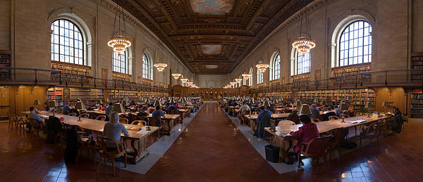
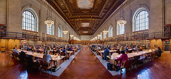
- Info Two is too much (Original nomination)
- Info Delisting nominated by Claus. --Laitche (talk) 19:45, 27 April 2015 (UTC)
File:NYC Public Library Research Room Jan 2006-1- 3.jpg, Left[edit]
 Keep -- Claus 14:37, 27 April 2015 (UTC)
- Comment @Claus Obana and Diliff: I made the sections and moved your vote. If my decision is wrong, please move your vote or all revert what I did. --Laitche (talk) 16:46, 27 April 2015 (UTC)
- Huh? But instead of just delisting, it could be fixed, either by myself or someone else... No need to delist an image over a very minor stitching issue. Diliff (talk) 17:27, 28 April 2015 (UTC)
- Also, could you point out what exactly you mean? The left wall/column looks pretty clean IMO. I don't think even a pixel-peeper would notice any problems with the column unless directly comparing to the version with the stitching problem. Is that really how we should be judging images? Diliff (talk) 17:30, 28 April 2015 (UTC)
- It's not a case of minor mis-alignment. There is that, but more importantly, the sharpness is completely different as if the patch was blurred before being applied. I will of course withdraw my vote if that was fixed. (I have added an image note to the iamge) -- KTC (talk) 20:03, 28 April 2015 (UTC)
- I know what you mean but sorry, I think you may be too picky to delist :) --Laitche (talk) 21:20, 28 April 2015 (UTC)
- I agree with Laitche, I think you were being a bit picky, but I've uploaded a new version which I think is an improvement. I don't have the original files to re-stitch anymore, so I had to use the clone tool as best I could. It's up in the top corner, not many people would notice it unless they were really looking for faults. Diliff (talk) 22:16, 28 April 2015 (UTC)
- I accept that may well be the case, but since I did notice it, I couldn't ignore it. Either way, thanks, and I've struck my delist vote. -- KTC (talk) 12:05, 29 April 2015 (UTC)
- I think we all notice minor faults or things that could have been done better but they don't all result in opposes or delist votes. ;-) Also, we don't usually delist an existing historic FP unless there's a really good reason (like a duplicate, or a serious fault that was missed at the time it became a FP). But anyway, thanks for striking it. Diliff (talk) 12:58, 29 April 2015 (UTC)
- I accept that may well be the case, but since I did notice it, I couldn't ignore it. Either way, thanks, and I've struck my delist vote. -- KTC (talk) 12:05, 29 April 2015 (UTC)
- It's not a case of minor mis-alignment. There is that, but more importantly, the sharpness is completely different as if the patch was blurred before being applied. I will of course withdraw my vote if that was fixed. (I have added an image note to the iamge) -- KTC (talk) 20:03, 28 April 2015 (UTC)
- Also, could you point out what exactly you mean? The left wall/column looks pretty clean IMO. I don't think even a pixel-peeper would notice any problems with the column unless directly comparing to the version with the stitching problem. Is that really how we should be judging images? Diliff (talk) 17:30, 28 April 2015 (UTC)
- Huh? But instead of just delisting, it could be fixed, either by myself or someone else... No need to delist an image over a very minor stitching issue. Diliff (talk) 17:27, 28 April 2015 (UTC)
- Keep. — Julian H.✈ 20:38, 28 April 2015 (UTC)
- Keep. --Laitche (talk) 21:20, 28 April 2015 (UTC)
- Keep. Diliff (talk) 22:16, 28 April 2015 (UTC)
File:NYC Public Library Research Room Jan 2006.jpg, Right[edit]
- Delist . Agree with you, I saw that there were two version recently and I wanted to do something about it but didn't get a chance. I support delisting of File:NYC Public Library Research Room Jan 2006.jpg as it is a version with a slight stitching problem. File:NYC Public Library Research Room Jan 2006-1- 3.jpg is the version which should be kept. Diliff (talk) 15:20, 27 April 2015 (UTC)
- Delist --Laitche (talk) 16:43, 27 April 2015 (UTC)
- Comment I added the image notes of stitching errors. --Laitche (talk) 16:58, 27 April 2015 (UTC)
- Delist — Julian H.✈ 18:06, 27 April 2015 (UTC)
- Delist -- KTC (talk) 23:23, 27 April 2015 (UTC)
- Delist --Cayambe (talk) 06:45, 28 April 2015 (UTC)
- Delist --Tremonist (talk) 16:15, 28 April 2015 (UTC)
- Delist --Claus 03:56, 29 April 2015 (UTC)
Result: 7 delist, 0 keep, 0 neutral => delisted. Delisted alternative is File:NYC Public Library Research Room Jan 2006.jpg --Laitche (talk) 16:57, 16 May 2015 (UTC)
File:Bessen van Aucuba japonica. Locatie, Tuinreservaat Jonker vallei 03.jpg, featured[edit]
Voting period is over. Please don't add any new votes.Voting period ends on 16 May 2015 at 23:21:11 (UTC)
Visit the nomination page to add or modify image notes.
- Category: Commons:Featured pictures/Plants#Family: Garryaceae
- Info berries van Aucuba japonica. Location. Garden sanctuary JonkerValley. Created and uploaded by Dominicus Johannes Bergsma - nominated by Arion -- 😄 ArionEstar 😜 (talk) 23:21, 7 May 2015 (UTC)
- Support -- 😄 ArionEstar 😜 (talk) 23:21, 7 May 2015 (UTC)
- Support Nice color. Daniel Case (talk) 03:41, 8 May 2015 (UTC)
- Support Thank ArionEstar for the nomination for the nomination.--Famberhorst (talk) 05:03, 8 May 2015 (UTC)
- Support fine example of red-green contrast --Martin Falbisoner (talk) 06:10, 8 May 2015 (UTC)
- Oppose Sharpness is good on the subject, but the background bokeh is much too busy imho. --El Grafo (talk) 08:06, 8 May 2015 (UTC)
- Support --Tremonist (talk) 12:29, 8 May 2015 (UTC)
- Support --Ralf Roleček 19:36, 8 May 2015 (UTC)
- Support --LivioAndronico talk 19:45, 8 May 2015 (UTC)
- Support --Rjcastillo (talk) 20:22, 8 May 2015 (UTC)
- Support -- Pofka (talk) 21:10, 8 May 2015 (UTC)
- Support --Hubertl (talk) 23:46, 8 May 2015 (UTC)
- Support Good job Poco2 09:35, 9 May 2015 (UTC)
File:Reims Cathedral Organ, France - Diliff.jpg, featured[edit]
Voting period is over. Please don't add any new votes.Voting period ends on 17 May 2015 at 11:40:31 (UTC)
Visit the nomination page to add or modify image notes.
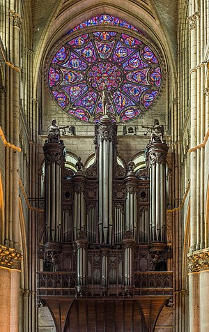
- Category: Commons:Featured pictures/Objects#Musical instruments
- Info created by Diliff - uploaded by Diliff - nominated by Diliff -- Diliff (talk) 11:40, 8 May 2015 (UTC)
- Support -- Diliff (talk) 11:40, 8 May 2015 (UTC)
- Support Is the main subject is the organ, should the category be changed accordingly? Regards, Yann (talk) 11:54, 8 May 2015 (UTC)
- Is there a category for organs? :-) Yes, I would say the main subject is the organ (and the rose window above it). Diliff (talk) 12:03, 8 May 2015 (UTC)
- Commons:Featured pictures/Objects#Musical instruments seems the best fit then. Regards, Yann (talk) 15:42, 8 May 2015 (UTC)
- Is there a category for organs? :-) Yes, I would say the main subject is the organ (and the rose window above it). Diliff (talk) 12:03, 8 May 2015 (UTC)
- Support 😄 ArionEstar 😜 (talk) 12:00, 8 May 2015 (UTC)
- Support --Tremonist (talk) 12:19, 8 May 2015 (UTC)
- Support but the crop on the bottom is too tight - I would like to see also the 2nd stained glass window. Nevertheless excellent. --Uoaei1 (talk) 13:35, 8 May 2015 (UTC)
- I didn't think the details below the organ were so interesting (below is the arch of the doorway, and then you might complain that the view is incomplete!) and I also didn't want the aspect ratio to be too high - already it is quite a tall image. What second stained glass window? The one behind the organ? It's not really visible from any angle, I guess it was designed before the organ was installed. I took this with my 70-300mm lens from the other end of the cathedral so getting further back to see behind the organ is not really an option. Diliff (talk) 14:09, 8 May 2015 (UTC)
- Question The west façade of Reims cathedral has two stained glass windows - the rose, and the one in the tympanon of the main door. I have looked for other images of reims cathedral, and this is not the west façade, maybe it is north or south? --Uoaei1 (talk) 18:22, 9 May 2015 (UTC)
- Oppose I dont like composition, at least could be croped to first horizontal line at bottom. --Mile (talk) 19:15, 8 May 2015 (UTC)
- Support --Ralf Roleček 19:35, 8 May 2015 (UTC)
- Support This is spectacular in my opinion --LivioAndronico talk 19:41, 8 May 2015 (UTC)
- Support -- Pofka (talk) 21:09, 8 May 2015 (UTC)
- Support Very attentive work :) --Laitche (talk) 22:56, 8 May 2015 (UTC)
- Support - He's in your country, taking your cathedrals... hope to see some more French churches at FPC both here and on Wikipedia. — Crisco 1492 (talk) 00:39, 9 May 2015 (UTC)
- I've been busy. :-) Diliff (talk) 01:07, 9 May 2015 (UTC)
- Comment Nice shot, is there a way to lighten up the bottom part? Poco2 09:21, 9 May 2015 (UTC)
- I brightened the area of the organ case around the bottom of the pipes and below, I assume this is what you meant. It was a slight change but hopefully what you were thinking of? Diliff (talk) 15:16, 9 May 2015 (UTC)
- Support --Martin Falbisoner (talk) 13:36, 9 May 2015 (UTC)
- Support Thanks for another great shoot and masterpiece for the David church book wow --The Photographer (talk) 23:22, 9 May 2015 (UTC)
- Support --Σπάρτακος (talk) 12:20, 10 May 2015 (UTC)
- Oppose As they say around here, no wow for me. --Tomascastelazo (talk) 16:35, 10 May 2015 (UTC)
- Tomas, what do you think about this image ?, wow for you? or maybe the size is not big --The Photographer (talk) 17:34, 10 May 2015 (UTC)
- Wow The Photographer (which should be The Beggar) you sure have outdone everyone with your class. Diliff, is this guy from your crowd? --Tomascastelazo (talk) 18:10, 10 May 2015 (UTC)
- Tomas, what do you think about this image ?, wow for you? or maybe the size is not big --The Photographer (talk) 17:34, 10 May 2015 (UTC)
- Please don't vote on my nominations in future. I feel our recent discussions have clouded your emotions and I have no faith whatsoever that you are able to judge an image of mine impartially. Diliff (talk) 17:01, 10 May 2015 (UTC)
- You most surely are joking! Lol! You told me in another thread that I do not know what you think, yet here you are doing the opposite with me!!! I vote my conscience, and while this picture is "technically" perfect, just like a life-like plastic flower, it has no aroma (wow in your lexicon). I see too many pictures of european or western culture themes, catering for western likes, perceptions and prejudices, like this one. The world is much larger than that and I think we should see more of it. --Tomascastelazo (talk) 17:33, 10 May 2015 (UTC)
- Once again you are mistaking 'knowing' with 'believing'. I don't know, I simply believe you are not able to judge my images impartially. I'm not interested in discussing your ideas any further. Please just respect my wishes and we'll both enjoy our time here a lot more. Diliff (talk) 17:51, 10 May 2015 (UTC)
- I vote when I wish, how I wish, where I wish. Believe all you want, just like I do. I believe that we must realize that this forum is much like Hans Christian Andersen´s tale, where everybody pays lip service, but in the end, the emperor has no clothes. We should get there in order to move forward. --Tomascastelazo (talk) 17:59, 10 May 2015 (UTC)
- Yes, I get it, you do whatever the hell you want and nobody can stop you. Great, you're a megalomaniac. I'm asking you to stop voting on my nominations as a courtesy and to maintain a polite and positive environment for all. If you point blank refuse because you can do whatever the fuck you want, it is bordering on harassment and you are below contempt as far as I'm concerned. Diliff (talk) 18:52, 10 May 2015 (UTC)
- Ask til the end of times if you want, but I cannot give into relinquishing a right, a privilege or whatever voting is called around here, according to the rules of the process, and I certainly will not give up my right to self expression in a subject that has been an important part of my life, photography, and I will call the shots from that platform as I please. If my vote throws you into a tantrum #REDIRECT[[2]], that is really your problem. I don´t have to like your photography, which is pretty good, but I have some reservations and opinions about it. Or what, do you just want people to vote support in your work? --Tomascastelazo (talk) 21:21, 10 May 2015 (UTC)
- Tomascastelazo, I think in this oppose you are being churlish and have stepped into judging David rather than judging the image we have here. Have you actually opened it full-size and explored it? I agree that David's photographs are technical, clinical perhaps, but this is an approach to photography that is perfectly valid, and has its place (particularly on Commons). You and others may wish to imprint their own "aroma" on the captured/rendered image and that's another valid approach and one to celebrate. If David were photographing the mundane then one might find little wow. But goodness me, this organ! That window! You are, in my opinion, concentrating on the person behind the camera rather than the subject in front of it. While I agree that David cannot ask you to stop voting on his nominations (wouldn't we all like to get rid of awkward reviewers), you two have reached a point where there is too much red mist in front of your eyes. It is a good idea to take a wee break from judging the images of someone you are annoyed with. David, I could argue and shout for Scotland in the Olympics, and feel your pain, but this response isn't acceptable. Just both of you give it a rest, please. I've been there; it doesn't work. -- Colin (talk) 20:12, 12 May 2015 (UTC)
- @Colin: You seem to overlook the fact that Diliff was the one who lowered the general discussion to this low by name calling and inuendos, attacking my person instead of focusing on the issues, he is getting the professional courtesy that he afford me. As far as his photograhy, I´ve never said that it is bad, it is pretty good, technically, but that does not make it a masterpiece every picture that he makes. Being a top photographer does not come cheap, either in the praise or the critique. Yes, I may be harsh in my critique, but he deserves nothing less, lest he get too comfortable in his ways and stops the quality of his contributions once he has attained a comfortable reputation and becomes the king that has no clothes on. His quality now is normal for him, and normal doesn´t cut it. There are many great still shots of many buildings and much offer of them, good is not good enough anymore. On the other hand, my personal preference in photography deals with more dynamic photography, almost on a phenomenological level, on the here and now, on the happening event, be it a human or a natural event. Classic european art or architecture is a thing of the past, the time of the great cathedrals is over. How many pictures of the great pyramids do we need, unless they afford a new and fesh view? Same with old churches or old paintings, mostly european or western civilization. That is not to say that we need nor record them, yes, we do, but they are past the threshold of originality. Too many good pictures everywhere of them, and one more is just one more... Now, in the past I argued so much about giving informed, objective evaluations, based on universal photography evaluation criteria and pointed out what I still consider an amateur way of support/oppose system and was chastized as a jerk and know-it-all, but the case is still the same, or worse, because we are in the same state of incompetence in general, where the wow factor became accepted reason to support or oppose. So, like the old saying goes, if you can´t beat them, join them... It is easier to hide the ignorance or lack of objectivity behind that way of voting than to give an honest opinion and be questioned and attacked. So, I think Diliff is a great crasftman, but I think that his arrogance gets the better of him sometimes. Count on me to express my opinions and yes, the wow factor for him, in my world, is much higher than for many more, but again, he deserves nothing less, a good photographer deserves harsh critique. --Tomascastelazo (talk) 00:09, 13 May 2015 (UTC)
- Tomascastelazo, I think in this oppose you are being churlish and have stepped into judging David rather than judging the image we have here. Have you actually opened it full-size and explored it? I agree that David's photographs are technical, clinical perhaps, but this is an approach to photography that is perfectly valid, and has its place (particularly on Commons). You and others may wish to imprint their own "aroma" on the captured/rendered image and that's another valid approach and one to celebrate. If David were photographing the mundane then one might find little wow. But goodness me, this organ! That window! You are, in my opinion, concentrating on the person behind the camera rather than the subject in front of it. While I agree that David cannot ask you to stop voting on his nominations (wouldn't we all like to get rid of awkward reviewers), you two have reached a point where there is too much red mist in front of your eyes. It is a good idea to take a wee break from judging the images of someone you are annoyed with. David, I could argue and shout for Scotland in the Olympics, and feel your pain, but this response isn't acceptable. Just both of you give it a rest, please. I've been there; it doesn't work. -- Colin (talk) 20:12, 12 May 2015 (UTC)
- Ask til the end of times if you want, but I cannot give into relinquishing a right, a privilege or whatever voting is called around here, according to the rules of the process, and I certainly will not give up my right to self expression in a subject that has been an important part of my life, photography, and I will call the shots from that platform as I please. If my vote throws you into a tantrum #REDIRECT[[2]], that is really your problem. I don´t have to like your photography, which is pretty good, but I have some reservations and opinions about it. Or what, do you just want people to vote support in your work? --Tomascastelazo (talk) 21:21, 10 May 2015 (UTC)
- Yes, I get it, you do whatever the hell you want and nobody can stop you. Great, you're a megalomaniac. I'm asking you to stop voting on my nominations as a courtesy and to maintain a polite and positive environment for all. If you point blank refuse because you can do whatever the fuck you want, it is bordering on harassment and you are below contempt as far as I'm concerned. Diliff (talk) 18:52, 10 May 2015 (UTC)
- I vote when I wish, how I wish, where I wish. Believe all you want, just like I do. I believe that we must realize that this forum is much like Hans Christian Andersen´s tale, where everybody pays lip service, but in the end, the emperor has no clothes. We should get there in order to move forward. --Tomascastelazo (talk) 17:59, 10 May 2015 (UTC)
- Once again you are mistaking 'knowing' with 'believing'. I don't know, I simply believe you are not able to judge my images impartially. I'm not interested in discussing your ideas any further. Please just respect my wishes and we'll both enjoy our time here a lot more. Diliff (talk) 17:51, 10 May 2015 (UTC)
- You most surely are joking! Lol! You told me in another thread that I do not know what you think, yet here you are doing the opposite with me!!! I vote my conscience, and while this picture is "technically" perfect, just like a life-like plastic flower, it has no aroma (wow in your lexicon). I see too many pictures of european or western culture themes, catering for western likes, perceptions and prejudices, like this one. The world is much larger than that and I think we should see more of it. --Tomascastelazo (talk) 17:33, 10 May 2015 (UTC)
- Tomascastelazo I think you are old enough not to begin your argument with "He started it!" :-) Moving on from the personal animosity on show, you raise some interesting points about how we should review. Are we reviewing here the image on Commons or reviewing Diliff's nomination like one would a pupil? If the latter, your approach of ratcheting up the standard you hold him to is perfectly reasonable, and giving gushing praise to the weak efforts of beginners might also be reasonable. I take the approach that here we are reviewing a image on Commons. I believe if you want Diliff to stretch into new photographic styles, to put some soul in his photos, have suggestions for improvement, or criticisms of his personal portfolio, then that's probably better done on his talk page.
- I agree that review at FP is largely down to (a) does it have any technical flaws [ranging from the reasonable to the ridiculous pixel peeping and unreasonable demands] and (b) does it have any wow [artistically, technically, or in the subject]. We very much lack the education on and language for photographic or artistic criticism, and many reviewers simply don't oppose because they are unable to express their feelings or don't wish to argue about them. I don't see any easy solution to that since we have the community we have, which is composed of amateur photographers rather than art students.
- Should FP stop featuring new images of subjects where we have plenty already (or raising the bar very high for), as you seem to suggest? I don't think that's a helpful approach. Yes Commons's featured images are heavily biased to the sort of photographs an amateur photographer might enjoy taking: buildings, landscapes, birds, plants, insects, cities. You aren't, by opposing images of cathedrals say, going to start making people take photographs of people or photographs in other parts of the world.
- There's an argument that photographing a work-of-art like this organ/window, should be done like photographing a painting -- there should be no evidence of the photographer and instead the effort should be to present the wonder of subject with accuracy. This photograph does that, and to a quality level that would be more than acceptable for professional use. The world does not, in fact, have a surfeit of photographs of cathedral interiors at the standard we see here, never mind also freely available for anyone to use for any purpose. Such works may not fill you with inspiration, but they are a part of our cultural heritage and recording them here, freely, is very much what I believe Commons should encourage and reward. It only takes an event like this to realise how much can be lost in a few hours, and we are left with only photographs, most of which are poor quality and copyright restricted. -- Colin (talk) 08:26, 13 May 2015 (UTC)
- @Tomascastelazo: I think you should closely look at the picture and try to find an error, thus improving everyone. The wow factor is subjective and maybe you're making a sincere vote, however, I believe that due to recent events, no one will believe that. Try to make as some malicious users do seek subjective technical errors that are more difficult to combat, such as "the lighting is not adequate," "color space is not correct", "the image is overexposed to right "," Why ISO 400 "," F 7.1 is too "," Contact information in the metadata is poorly formatted, "" the latest version has less detail than the first, "any of the above would have been a little questionable reason however, envy is not. PD. "The Beggar"? That was mean :( --The Photographer (talk) 20:45, 12 May 2015 (UTC)
- @ The Photographer I quote you: "Tomas, what do you think about this image ?, wow for you? or maybe the size is not big --The Photographer (talk) 17:34, 10 May 2015 (UTC)" So I took the time to see who throws this type of poop at me and I find out that it is from someone who asks for money so he can "contribute" to write this kind of crap in Wikipedia, hence The Beggar... I really do not know if it is worthh my effort to have any type of xchange with you... --Tomascastelazo (talk) 00:09, 13 May 2015 (UTC)
- I'm not going to get myself involved in a detailed discussion with you again Tomas, because I can see now that it's completely pointless and we'll get nowhere. But what I just want to say is that it seems your unwillingness to engage with anyone in a proper discussion is the problem here. Certainly it's the problem I have with you, but I'm guessing that others feel similarly frustrated. When someone asks you a question or otherwise prompts you for a response, you seem to either ignore it or you answer a different question to the one that was asked, and you frequently turn it around on them and make personal. Regardless of The Photographer's character, background, history etc, he asked a valid question. You might not agree with the question, its validity, or the way he asked it, but to dismiss it with an attack on his character that has absolutely nothing to do with this discussion is petty and unhelpful and more likely than not to inflame the situation. I certainly feel that's how things progressed in other discussions I've had with you. Anyway, just my two cents. Take it or leave it. Either way, I'm not going to respond to insinuations that I'm throwing a tantrum or the petty insults you throw at me, etc so please spare everyone the trouble. Diliff (talk) 12:28, 13 May 2015 (UTC)
- After the first two sentences, Photographer was simply trolling and accusing Tomas of envy. So he got a verbal punch in the face, which is understandable. -- Colin (talk) 13:10, 13 May 2015 (UTC)
- If punches in the face were acceptable responses to trolling, verbal or otherwise, Tomas would have got a lot more from me than he did. I'm not sure that bringing up something irrelevant to the situation by way of investigating his character is 'understandable' though, really. The picture of a penis that he linked to was obviously not relevant or understandable either, and he has apologised for that. I'm not holding my breath for an similar apology from Tomas though. Diliff (talk) 15:07, 13 May 2015 (UTC)
- I think everyone here have fallen into the trap of being drawn into the emotions. I made a disrespectful comment, I apologize for that, I just felt very upset by the behavior of Tomas, however, that is no excuse for making a rude comment. Not everyone can be as methodical, calculating as Colin, or hypocritical as other users. Tomas, I apologize with regard to my comment with a picture of a penis, I think I got carried away by the great need to defend David, who I consider me a true fan (I just like his images of churches ). This issue has entered a field that seems a fight of children driven by the inner feeling of envy. Here some are determined to be envied quality images and others, however, while the quality of envy Tomas David, David envy the quality of Alves and Alves but Colin's Colin Thomas. So this is a chain of mutual envy, we fail to recognize that each of us is unique with unparalleled quality better than anyone. And beyond that envy that deep is love. If together we understood this, and if we were smarter emotionally, we could do something good together, sending the WMF the devil. However, anyone is interested in this circus, Mexican novels keep happening, they suck our energy and our work. --The Photographer (talk) 14:49, 13 May 2015 (UTC)
- Support Fabulous detail of the organ and stained glass above. The lighting is perfect. I wouldn't be surprised if there was no better photograph of this outstanding subject. -- Colin (talk) 20:12, 12 May 2015 (UTC)
File:Still Pond, Isabella Plantation, Richmond Park, London, UK - Diliff.jpg, not featured[edit]
Voting period is over. Please don't add any new votes.Voting period ends on 17 May 2015 at 11:43:52 (UTC)
Visit the nomination page to add or modify image notes.
- Category: Commons:Featured_pictures/Places/Natural
- Info created by Diliff - uploaded by Diliff - nominated by Diliff. Something a bit different from me. Well spring is here in England and just around the corner from where I live is Richmond Park, and within it, a little known but quite amazing garden called Isabella Plantation, which blooms with Azaleas and Rhododendrons in May. (Other photos taken on the same visit) -- Diliff (talk) 11:43, 8 May 2015 (UTC)
- Support -- Diliff (talk) 11:43, 8 May 2015 (UTC)
- Support Amazing colours. Yann (talk) 11:55, 8 May 2015 (UTC)
- Support I know these plants actually do have such colours while blooming. :) --Tremonist (talk) 12:27, 8 May 2015 (UTC)
- Comment Diliff, I think that you should crop as the note, nothing interesting at the bottom and it let to a weaker photo. If you crop, this could give the sensation of a bigger slop... -- RTA 16:49, 8 May 2015 (UTC)
- Oppose Without a doubt Diliff creates very good quality images, however, a good photograph is more than just a pretty picture. In this case, the execution is flawless, but I fail to see the relevenace of this image for FP. --Tomascastelazo (talk) 17:30, 8 May 2015 (UTC)
- What? No relevance? I don't understand how you could reach that conclusion. How is this image different to any other landscape image? It illustrates the location. Look images in the category and tell me what is so different about this image. Diliff (talk) 17:59, 8 May 2015 (UTC)
- Other than being a nice picture of a pond, what is there to merit encyclopedic value? Are the flowers in danger of extinction? The trees? Is it hard to get to? Are the flowers one-of-a-kind? What does it illustrate? What does it teach? There must be a zillion look alike ponds in the world. --Tomascastelazo (talk) 23:16, 8 May 2015 (UTC)
- Since you seem to love rules, could you point to a rule that says it has to be rare or difficult to reach in order to be a FP? Regardless of whether there are a zillion look-alike ponds in the world or not (I doubt it anyway, and how many of them do we have FP-quality images for?), rarity has never been a requirement. Have a look at the other images in the Places/Natural category and tell me if all the others are rare and unique. Most are simply 'nice'. Diliff (talk) 23:30, 8 May 2015 (UTC)
- There are universal guideliness for photographic evaluations, and specific guidelines according to the applications of the photograph. This photograph would not do well in a children photography contest, for example, since it would be outside the contest context. Commons basically is a repository for encyclopedic images, if we were to follow the logic of Wikipedia, which promotes itself as a free enciclopedia. So I assume that the criteria then would be for Commons to host largely images of encyclopedic value, and that in itself focuses the context of the images. So, I would assume that the images, since they are in here to support encyclopedic articles, should have what I would call, encyclopedic visual value, that is, that they support or illustrate topics of encyclopedic interest. Those interest can be of many realms, the arts, biology, physics, history, architecture, etc. So if I were to look at the field of application of this image, which by the way you categorize as "natural," I would categorize it more in architecture, for it is really an artificial environment, a simple pond in a simple garden. As such, as a photograph of an artificial pond I find nothing extraordinary in this photograph, even the composition is lacking in my opinion. Pretty colors and good exposure, other than that, I find nothing else of interest. --Tomascastelazo (talk) 00:01, 9 May 2015 (UTC)
- Fine, you find nothing of interest, that's more of a reflection of your interests than of the encyclopaedic value though, in my opinion. Regardless of how accurate the selected category is, for encyclopaedically illustrating Isabella Plantation itself, the arrangement of azaleas around a pond, or any number of potential uses, I think this image would do the job nicely. We'll just have to agree to disagree. Diliff (talk) 00:46, 9 May 2015 (UTC)
- The issue boils down to that of uniqueness, illustration capacity. You say it is azaleas, well, have a look... #REDIRECT[[3]] ;) --Tomascastelazo (talk) 01:08, 9 May 2015 (UTC)
- A google image search has absolutely nothing to do with what we have available as freely licensed images on Commons. I could do a Google image search on any of the subjects of our featured pictures and find numerous similar images out there on the web, but what does that prove? Nothing. Diliff (talk) 01:19, 9 May 2015 (UTC)
- I simply opposed this picture because I do not find it special in any way, photographically or encyclopaedically. You are the one that extended the argument, I was just replying to your comments. This is a "but the emperor has no clothes at all" moment. --Tomascastelazo (talk) 01:34, 9 May 2015 (UTC)
- I extended it because I felt your reasoning was flawed and wanted to point that out but ultimately it comes down to opinion and I can see your mind will not be changed. Diliff (talk) 01:50, 9 May 2015 (UTC)
- Of course you felt my reasoning was flawed, anything not in alignment with your opinion is flawed. But as I quoted, the emperor has no clothes. ;) --Tomascastelazo (talk) 02:48, 9 May 2015 (UTC)
- This is Commons FP, not Wikipedia FP. There is absolutely no requirement at Commons FP for "encyclopedic value". Commons is a repository of "educational" media, and the difference is important. This image has educational value. The degree of educational value is an attribute that can be judged and weighed against the other attributes in an image to justify "featured" status. But an image on Commons can't have zero educational value -- as then it would be deleted. This pond/garden, particularly at this time of year, appears to be a popular subject for photographers and painters. Even if it was just a pond in David's garden, it would have educational value merely as a garden pond. So I think the phrase "relevance for FP" and talk of "encyclopedic value" was unfortunate and a distraction. Instead, the comment "I find nothing extraordinary in this photograph" which essentially means "no wow" is a valid criticism to make at FPC, and fair reason to oppose, though of course one may disagree with it. -- Colin (talk) 14:14, 9 May 2015 (UTC)
- Ok, if you say so, and I suppose David too. Still, an ordinary photograph. The emperor has no clothes. --Tomascastelazo (talk) 05:34, 10 May 2015 (UTC)
- This is Commons FP, not Wikipedia FP. There is absolutely no requirement at Commons FP for "encyclopedic value". Commons is a repository of "educational" media, and the difference is important. This image has educational value. The degree of educational value is an attribute that can be judged and weighed against the other attributes in an image to justify "featured" status. But an image on Commons can't have zero educational value -- as then it would be deleted. This pond/garden, particularly at this time of year, appears to be a popular subject for photographers and painters. Even if it was just a pond in David's garden, it would have educational value merely as a garden pond. So I think the phrase "relevance for FP" and talk of "encyclopedic value" was unfortunate and a distraction. Instead, the comment "I find nothing extraordinary in this photograph" which essentially means "no wow" is a valid criticism to make at FPC, and fair reason to oppose, though of course one may disagree with it. -- Colin (talk) 14:14, 9 May 2015 (UTC)
- Of course you felt my reasoning was flawed, anything not in alignment with your opinion is flawed. But as I quoted, the emperor has no clothes. ;) --Tomascastelazo (talk) 02:48, 9 May 2015 (UTC)
- I extended it because I felt your reasoning was flawed and wanted to point that out but ultimately it comes down to opinion and I can see your mind will not be changed. Diliff (talk) 01:50, 9 May 2015 (UTC)
- I simply opposed this picture because I do not find it special in any way, photographically or encyclopaedically. You are the one that extended the argument, I was just replying to your comments. This is a "but the emperor has no clothes at all" moment. --Tomascastelazo (talk) 01:34, 9 May 2015 (UTC)
- A google image search has absolutely nothing to do with what we have available as freely licensed images on Commons. I could do a Google image search on any of the subjects of our featured pictures and find numerous similar images out there on the web, but what does that prove? Nothing. Diliff (talk) 01:19, 9 May 2015 (UTC)
- The issue boils down to that of uniqueness, illustration capacity. You say it is azaleas, well, have a look... #REDIRECT[[3]] ;) --Tomascastelazo (talk) 01:08, 9 May 2015 (UTC)
- Fine, you find nothing of interest, that's more of a reflection of your interests than of the encyclopaedic value though, in my opinion. Regardless of how accurate the selected category is, for encyclopaedically illustrating Isabella Plantation itself, the arrangement of azaleas around a pond, or any number of potential uses, I think this image would do the job nicely. We'll just have to agree to disagree. Diliff (talk) 00:46, 9 May 2015 (UTC)
- There are universal guideliness for photographic evaluations, and specific guidelines according to the applications of the photograph. This photograph would not do well in a children photography contest, for example, since it would be outside the contest context. Commons basically is a repository for encyclopedic images, if we were to follow the logic of Wikipedia, which promotes itself as a free enciclopedia. So I assume that the criteria then would be for Commons to host largely images of encyclopedic value, and that in itself focuses the context of the images. So, I would assume that the images, since they are in here to support encyclopedic articles, should have what I would call, encyclopedic visual value, that is, that they support or illustrate topics of encyclopedic interest. Those interest can be of many realms, the arts, biology, physics, history, architecture, etc. So if I were to look at the field of application of this image, which by the way you categorize as "natural," I would categorize it more in architecture, for it is really an artificial environment, a simple pond in a simple garden. As such, as a photograph of an artificial pond I find nothing extraordinary in this photograph, even the composition is lacking in my opinion. Pretty colors and good exposure, other than that, I find nothing else of interest. --Tomascastelazo (talk) 00:01, 9 May 2015 (UTC)
- Since you seem to love rules, could you point to a rule that says it has to be rare or difficult to reach in order to be a FP? Regardless of whether there are a zillion look-alike ponds in the world or not (I doubt it anyway, and how many of them do we have FP-quality images for?), rarity has never been a requirement. Have a look at the other images in the Places/Natural category and tell me if all the others are rare and unique. Most are simply 'nice'. Diliff (talk) 23:30, 8 May 2015 (UTC)
- Other than being a nice picture of a pond, what is there to merit encyclopedic value? Are the flowers in danger of extinction? The trees? Is it hard to get to? Are the flowers one-of-a-kind? What does it illustrate? What does it teach? There must be a zillion look alike ponds in the world. --Tomascastelazo (talk) 23:16, 8 May 2015 (UTC)
- What? No relevance? I don't understand how you could reach that conclusion. How is this image different to any other landscape image? It illustrates the location. Look images in the category and tell me what is so different about this image. Diliff (talk) 17:59, 8 May 2015 (UTC)
- Support --Ralf Roleček 19:35, 8 May 2015 (UTC)
- Support -- Pofka (talk) 21:09, 8 May 2015 (UTC)
- Support --Hubertl (talk) 23:44, 8 May 2015 (UTC)
- Support - Very well managed. — Crisco 1492 (talk) 00:37, 9 May 2015 (UTC)
- Neutral Seems to me about how sharp and unnatural colors.--Famberhorst (talk) 05:12, 9 May 2015 (UTC)
- Oppose Pretty, but not outstanding for FP. The left side is leaning out and it just looks wrong since you would expect that the water flows to the left, the sky is overexposed, the right crop looks too tight and not balanced in comparison to the left one, the top crop seems to be in the middle of the way (I would have choosen a different composition including the whole of the trees or less of them) one and the reflexion in the water -that could have been the highlight- is not really working out for me (maybe too dark). Sorry David, this one is not a FP to me. Poco2 09:28, 9 May 2015 (UTC)
- No problem, but the left is not leaning, it just looks that way because of the shape of the pond. Yes, the sky is blown out but honestly, it's not possible to photograph this kind of forest scene properly and still retain the sky through the trees, even with HDR. I've tried many times and it doesn't work (because of the extreme contrast but also because the trees move in the breeze, making it impossible to blend without ghosting). Also, the sky was overcast so you would only have a dull grey sky anyway. I visited the garden twice just to get this kind of lighting because it works better for the pond and the flowers. With patchy sunlight through the trees, it doesn't look good, with blown highlights in the flowers and a muddy, light brown water. The reason for the composition here is that I especially wanted to take a panorama for the May photo contest. It's a photo taken specifically with panorama proportions in mind. I tried a panorama with just the flowers and the reflections of them in the water but I found the composition was pretty boring actually. I could upload it but I don't think it worked either. Diliff (talk) 10:00, 9 May 2015 (UTC)
- Oppose Sorry but I don't find this composition compelling. It's rather static, central, eye-level view, like someone just snapped a picture of the pond as they walked along the path. I know you're no snapshooter! I think the compositions, colours, reflections in this, this, this (ignoring the fisheye), and this to be superior. (Though those images have technical flaws too, which yours has not). The better ones seem to have the viewer right in among the flowers, rather than a distant spectator. In this, the flowers seem rather far away and the foreground unattractive. The reflection is much better in most of the others -- being actually "still" like the pond's name, which is I think a fairly important characteristic for the subject. -- Colin (talk) 14:33, 9 May 2015 (UTC)
- Consider a 3:1 panorama of the bushes, with the arc of the base of the flowers going from bottom left to bottom right. Very approximately, at 2107,695 and 5543x1849 in size) -- Colin (talk) 14:37, 9 May 2015 (UTC)
- No, it might seem like a casual snapshot but it's anything but. I tried multiple angles and, as I said, visited twice before settling on this composition. It's not for want of trying something different. Let me start with a summary of known limitations.
- It's not possible to shoot this in HDR because even a light breeze causes movement in the trees and the blown sky issue would still not be resolved.
- Without HDR, it must be overcast because the dappled sunlight on the flowers easily blows out the red channel and looks very ugly (I tried already on a sunny day). With dappled sunlight on the scene, it's not really possible to expose for the highlights on the flowers to avoid them blowing the red channel because this results in too much shadow noise even at ISO 100.
- If it's overcast, the composition needs to minimise the amount of sky visible in the scene, and even the reflections in the pond easily blow out.
- The problem is that some of images you've linked to compositionally rely foreground interest on the near side of the pond. There is nice vegetation growing on the banks in photos from previous years. Not so this year. Going for a side view rather than frontal would have worked in previous years but it is visually sparse this year. they must have ripped it all out and replanted only a few seedlings.
- I was really trying to get a panoramic aspect ratio. Perhaps it isn't the right ratio for a scene like this, but that was my aim.
- With this in mind, let me go through the photos you linked to. The first image is nice, but the aspect ratio and the reliance on foreground to frame it makes it not possible this year. The second image looks much more like a snapshot to me than my image. The third image could work (minus the fisheye projection) but what makes that any less snapshotty? It's still just a centred view, except taken from the edge instead of further back. And it too would suffer with a panoramic aspect ratio. The last image's composition is nice, but wouldn't work as a panorama and I suspect it's pretty difficult to get that view, you'd probably have to stomp all over the azalea bush and/or hold the camera over your head and hope you got the composition as you wanted it. The only other composition I found that I was remotely happy with was this. It's certainly less 'boring and centred', but I'm not convinced the big white patch of sky really works. I could crop the right side considerably but before long, all the cropping makes the composition feel cramped and you wish you could see what lies beyond the framing. And then you see it and wish you didn't. See the conundrum? :-) Anyway, I suppose there's a week or two before the azaleas fade, so if I feel inspired I might give it one more attempt. I appreciate the opposes for compositional reasons. Diliff (talk) 15:14, 9 May 2015 (UTC)
- I appreciate that a change to the planting might have deteriorated the subject. Each of the images have good/bad points - i'm not suggesting any of those are FP level. The second has nice reflections that are clear, still, and blue sky. With the fisheye, the lime-green tree leaves and blue sky was really nice, adding to the pink bushes for a very colourful picture -- I agree the photographer-position is similar to yours but there's more tree/sky which works well in that one (though the fisheye distortions aren't helpful). That photo really makes me want to visit on a sunny day, but yours is a bit like your average UK overcast day, which doesn't give the same happy feelings (I appreciate your argument about blown colours). Your dropbox photo doesn't do much for me either. Perhaps panorama is the wrong shape for this (though see my suggested crop that is still a panorama). I think if you could make a picture that is as happy-sunny-colourful as the fisheye one (ignoring the fisheye aspect, which isn't good) then I'd overlook any blown red channels. After all, they are probably blowing the red cones in my eye too. So I think a lovely sky is possible (or at least, possible in the reflection) even if that is at the expense of over-saturating the bushes. A still reflection of a blue sky would be appropriate for the "still pond", don't you think? -- Colin (talk) 16:12, 9 May 2015 (UTC)
- No, it might seem like a casual snapshot but it's anything but. I tried multiple angles and, as I said, visited twice before settling on this composition. It's not for want of trying something different. Let me start with a summary of known limitations.
- Consider a 3:1 panorama of the bushes, with the arc of the base of the flowers going from bottom left to bottom right. Very approximately, at 2107,695 and 5543x1849 in size) -- Colin (talk) 14:37, 9 May 2015 (UTC)
- Oppose Sorry, but the sky is overexposed and the composition doesn't really convince me. The latter may be a matter of taste. --Code (talk) 15:43, 9 May 2015 (UTC)
- OK, but the sky is not really important to the scene (it's only visible in patches through the trees) and it is impossible to expose for both the shaded foreground and an bright or overcast sky (See other FP examples. I already explained why HDR is not a good solution for a scene like this). If it was a simple technical mistake that could and should be corrected, fine, but it's not, it's a technical limitation. It's like saying a macro should have unlimited depth of field. Yeah, that would be great, but it's not possible. However, yes the composition is a matter of taste. :-) Diliff (talk) 15:54, 9 May 2015 (UTC)
- Support Iconic woodland picture, in the very best English landscaping tradition. --Hafspajen 11:50, 11 May 2015 (UTC)
- Oppose agree with Tomascastelazo.--Davefoc (talk) 22:18, 11 May 2015 (UTC)
- Tomas' reasoning: "the execution is flawless, but I fail to see the relevenace of this image for FP". Really? Here we go again... Diliff (talk) 09:54, 12 May 2015 (UTC)
- Dou you have to throw a tantrum #REDIRECT[[4]] every time someone opposes one of yoouur pictures? Why not just respect people´s opinions? --Tomascastelazo (talk) 19:13, 12 May 2015 (UTC)
- Tomas' reasoning: "the execution is flawless, but I fail to see the relevenace of this image for FP". Really? Here we go again... Diliff (talk) 09:54, 12 May 2015 (UTC)
- Comment IQ is good, but crop/composition i dont like. Luckily you have much size in resreve, so how about crop i put in note ? --Mile (talk) 11:04, 12 May 2015 (UTC) P.S. There is also one more suggestion by someone, also good, just lower rectangle a bit.
- OpposeI don't necessarily agree with other opposes, but it lacks wow in my opinion. I think it's above many other candidates on that page (and many FP) but "unfortunately" I voice my opinion here (if I would for your organ above, would be an oppose as well). And it's probably possible to shoot HDR even if the leaves move. In such case, I do additional work like manually underexposing and overexposing the normally exposed shot where necessary, and if possible, so everything overlap nicely. Easier to say but I'm pretty sure this is what advanced HDR soft do anyways. Or you get anything but a Canon sensor and don't need HDR ;-) - Benh (talk) 11:01, 16 May 2015 (UTC)
- If you want to vote on the Organ image, please do even if it's oppose. I'd be interested to hear your thoughts (but it shouldn't affect the result anyway I think). It is possible to shoot HDR, but there are consequences for the details when you do that. If the leaves move (and they will for sure), you have the problem where the leaves are in one position in the bright exposure, and the sky is in another position in the dark exposure. There is overlap. This would be fine if it was a simple scene with just a few leaves - you could manually clone out the problems. But when there are thousands of individual branches and leaves, it becomes far too difficult to do well. Even advanced HDR software does a bad job at managing ghosts. I know, because I've used many. In fact Lightroom CC is actually terrible at removing ghosts, and HDR merging was supposed to be its main new feature. I've been experimenting with it recently and the results are very poor indeed. Even a Nikon/Sony sensor would struggle with a scene of such high dynamic range. They have an extra 2 stops of dynamic range compared to Canon sensors, but I think you'd need more than that. Anyway, I think it's time to withdraw this nomination. It has no chance of succeeding and I accept the oppose reasoning (some of it anyway ;-) ). I've actually visited the gardens again on a sunny day and I think I have a few images that could be candidates. With direct sunlight, this scene is extremely challenging from a technical POV, retaining details (particularly on the flowers, but also in the sky) and avoiding ghosting and blending artefacts. Diliff (talk) 11:33, 16 May 2015 (UTC)
- I don't take the time to vote on all FPC, but based on the thumbnails alone, I would oppose a lot. I came to that one because the subject caught my eyes, and it's a fine example of "sharp and big is not all" that I wanted to point out. Yes LR's HDR sucks a lot. It's good when everything is still, but not so at removing ghosts (it seems to naively use the lowest exposure alone). LR sucks at many other things... like interpolation Fuji X-trans RAW. Even a free soft like dcraw does a much better job... Wish there's a plugin. Your other candidates are better IMO. The shadows patterns are interesting. Not sure I would support because the compositions look awkward (it feels you weren't sure of how to frame it), but it's only me. One suggestion (it's free !) because it's still, maybe getting closer to the water will give a nice symmetric reflection. - Benh (talk) 16:11, 16 May 2015 (UTC)
- I wouldn't say that I wasn't sure how to frame it, each image was a deliberate choice of composition. I tried different compositions to concentrate on different aspects of the scene so each image has a different 'purpose', but I think the problem is that none stand out as obviously 'the perfect' composition. Each has its own compromises and problems (reflections, sky, asymmetry of the shape of the flower bushes, etc). And yes LR's HDR is okay when everything is still, but so is all the other HDR merging software. I was expecting a lot more from Adobe as they usually improve on the competition. I've been discussing it with Colin privately. I was comparing the HDR output (not the tone mapping, but just the HDR merging) of PTGui vs Lightroom. PTGui is so much better. I still do the tone mapping in Lightroom afterwards regardless of which HDR merge process is used, but the files created by LR HDR merge are so much worse. See here: PTGui HDR 32 bit TIFF vs LR HDR merge 32bit DNG. It's difficult to compare them directly because the adjustments for tone mapping needed by each file are different because the files don't seem to have the same data. Also, in the LR file, the stream has been 'ghost corrected' and as you say, it's taken the darkest exposure which was a stupid idea, it was too dark and the result is awful. But look at the texture and tonality of the ferns and grass. The LR HDR file has lost all detail in the grass and is extremely flat and there seems to only be two shades of green - dark and light. PTGui's version is much much better with a lot more texture and range of luminosity. So I'm very disappointed with LR to be honest. Oh, and LR took an extremely long time to process the HDR file. About 10 times slower than PTGui (which stitched AND HDR merged a 115 image panorama in the time it took LR to only HDR merge the downsampled image at about 11000 x 9000 resolution). Diliff (talk) 16:57, 16 May 2015 (UTC)
- I don't take the time to vote on all FPC, but based on the thumbnails alone, I would oppose a lot. I came to that one because the subject caught my eyes, and it's a fine example of "sharp and big is not all" that I wanted to point out. Yes LR's HDR sucks a lot. It's good when everything is still, but not so at removing ghosts (it seems to naively use the lowest exposure alone). LR sucks at many other things... like interpolation Fuji X-trans RAW. Even a free soft like dcraw does a much better job... Wish there's a plugin. Your other candidates are better IMO. The shadows patterns are interesting. Not sure I would support because the compositions look awkward (it feels you weren't sure of how to frame it), but it's only me. One suggestion (it's free !) because it's still, maybe getting closer to the water will give a nice symmetric reflection. - Benh (talk) 16:11, 16 May 2015 (UTC)
- If you want to vote on the Organ image, please do even if it's oppose. I'd be interested to hear your thoughts (but it shouldn't affect the result anyway I think). It is possible to shoot HDR, but there are consequences for the details when you do that. If the leaves move (and they will for sure), you have the problem where the leaves are in one position in the bright exposure, and the sky is in another position in the dark exposure. There is overlap. This would be fine if it was a simple scene with just a few leaves - you could manually clone out the problems. But when there are thousands of individual branches and leaves, it becomes far too difficult to do well. Even advanced HDR software does a bad job at managing ghosts. I know, because I've used many. In fact Lightroom CC is actually terrible at removing ghosts, and HDR merging was supposed to be its main new feature. I've been experimenting with it recently and the results are very poor indeed. Even a Nikon/Sony sensor would struggle with a scene of such high dynamic range. They have an extra 2 stops of dynamic range compared to Canon sensors, but I think you'd need more than that. Anyway, I think it's time to withdraw this nomination. It has no chance of succeeding and I accept the oppose reasoning (some of it anyway ;-) ). I've actually visited the gardens again on a sunny day and I think I have a few images that could be candidates. With direct sunlight, this scene is extremely challenging from a technical POV, retaining details (particularly on the flowers, but also in the sky) and avoiding ghosting and blending artefacts. Diliff (talk) 11:33, 16 May 2015 (UTC)
File:Alto Horno, Puerto de Sagunto, España, 2015-01-04, DD 91.JPG, featured[edit]
Voting period is over. Please don't add any new votes.Voting period ends on 17 May 2015 at 17:11:29 (UTC)
Visit the nomination page to add or modify image notes.
- Category: Commons:Featured pictures/Places/Architecture/Industry
- Info Former blast furnace #2 belonging the disappeared Altos Hornos del Mediterráneo S.A. (Mediterranean Blast Furnaces), located in Port of Sagunto, Valencian Community, Spain. The company Altos Hornos del Mediterráneo S.A (AHM), based on the Altos Hornos de Vizcaya S.A., was created in 1971 to serve the ferrous metallurgy in Sagunto. This blast furnace, the only one remaining of the 3 that were operating, is 64 m high and was first built in 1922 and remodelated in the 70's. It operated only 13 years long and after its restoration, today is open to public visits. Poco2 17:11, 8 May 2015 (UTC)
- Support -- Poco2 17:11, 8 May 2015 (UTC)
- Support --Tomascastelazo (talk) 17:32, 8 May 2015 (UTC)
- Support --Ralf Roleček 19:35, 8 May 2015 (UTC)
- Support --Rjcastillo (talk) 20:20, 8 May 2015 (UTC)
- Support -- Pofka (talk) 21:08, 8 May 2015 (UTC)
- Support --Hubertl (talk) 23:42, 8 May 2015 (UTC)
- Support — Crisco 1492 (talk) 00:35, 9 May 2015 (UTC)
- Support --King of ♥ ♦ ♣ ♠ 01:07, 9 May 2015 (UTC)
- Support Nice light --· Favalli ⟡ 02:19, 9 May 2015 (UTC)
- Support --Martin Falbisoner (talk) 13:37, 9 May 2015 (UTC)
- Support --Jacek Halicki (talk) 17:05, 9 May 2015 (UTC)
- Support Jacopo Werther iγ∂ψ=mψ 20:09, 9 May 2015 (UTC)
- Comment This architecture is too difficult to judge for me... --Laitche (talk) 21:49, 9 May 2015 (UTC)
- Laitche: I am not 100% about your comment, but let me give you some background information about the subject. There are only 2 preserved blast furnaces in Spain like this (one in the Basque Country and this one in Sagunto). These facilities are preserved because they are considered like a symbol of ferrous metallurgy in Spain some decades ago. Poco2 07:56, 10 May 2015 (UTC)
- No, that's not what I meant, I mean the structure of this blast furnace is so complicated. Consequently, evaluation of technical elements of the photograph is very difficult, especially distortions. I think for this one, maybe I can judge but this nomination, the angle is also difficult I guess it's leaning to the right 0.5 degrees but a reference point is only the lampposts so I’m not sure hence I abstained :) --Laitche (talk) 10:49, 10 May 2015 (UTC)
- No, that's not what I meant, I mean the structure of this blast furnace is so complicated. Consequently, evaluation of technical elements of the photograph is very difficult, especially distortions. I think for this one, maybe I can judge but this nomination, the angle is also difficult I guess it's leaning to the right 0.5 degrees but a reference point is only the lampposts so I’m not sure hence I
- Laitche: I am not 100% about your comment, but let me give you some background information about the subject. There are only 2 preserved blast furnaces in Spain like this (one in the Basque Country and this one in Sagunto). These facilities are preserved because they are considered like a symbol of ferrous metallurgy in Spain some decades ago. Poco2 07:56, 10 May 2015 (UTC)
- Support --Σπάρτακος (talk) 12:18, 10 May 2015 (UTC)
- Oppose Sharpness issues (see note) and denoise hallos. Maybe lens should be refurbished since you have same problem with sharpness on all photos. --Mile (talk) 14:16, 10 May 2015 (UTC)
- Thanks for your revenge vote Mile, once more. Some people have been critizing me because I didn't participate in FPC in the last months reviewing as I did nominating, and it is obvious why. I am happy to improve my skills thank to sincere feedback, and I expect the same from others. This kind of votes are just sad. Now to your comment Mile. It is the first time in my life that I hear the term "denoising halos". Can you explain that? With regards to the lens, I borrowed it from WMAT for 2 weeks during Christmas (my whole gear was stolen), so it is difficult to believe that all my picures have the same issue, but I don't see the issues you mention and in your note I cannot perceive any halos. Therefore I don't think that our WMAT collegues should be worried. Btw, Uoaei1, don't bother in figuring out what means splashed colors, you just suffered from the same reaction as I did. Poco2 16:04, 10 May 2015 (UTC)
- Poc You set the standards, i follow them. --Mile (talk) 19:58, 10 May 2015 (UTC)
- Support --Tremonist (talk) 12:21, 12 May 2015 (UTC)
- Support Albertus teolog (talk) 12:16, 15 May 2015 (UTC)
- Support interesting subject and nice lighting. But you should fix the leaning the right... I saw it even on the thumbnail. - Benh (talk) 11:15, 16 May 2015 (UTC)
- Benh: do you mean that the right side is leaning in? what have you taken as a reference? the building (that would be misleading, look at the other elements)? Poco2 15:30, 16 May 2015 (UTC)
- Comment would better add the camera location if you can. --Laitche (talk) 14:01, 17 May 2015 (UTC)

.jpg,_featured)
_close_up.JPG,_not_featured)
_-_water_tower_03.JPG,_not_featured)
.jpg,_featured)
.jpg,_featured)
.jpg,_not_featured)
_1803.jpg,_featured)
,_Upper_Silesia.jpg,_not_featured)
_02.JPG,_featured)
_by_night.JPG,_featured)
.jpg,_not_featured)
.jpg,_not_featured)
.jpg,_featured)
.jpg&action=edit§ion=T-1)
_close_up.JPG&action=edit§ion=T-1)
_-_water_tower_03.JPG&action=edit§ion=T-1)
.jpg&action=edit§ion=T-1)
.jpg&action=edit§ion=T-1)
.jpg&action=edit§ion=T-1)
File:Ascension of Jesus among the apostles and the Virgin.jpg, featured[edit]
Voting period is over. Please don't add any new votes.Voting period ends on 17 May 2015 at 19:28:07 (UTC)
Visit the nomination page to add or modify image notes.
- Category: Commons:Featured pictures/Non-photographic media#Religion
- Info All by -- LivioAndronico talk 19:28, 8 May 2015 (UTC)
- Support -- LivioAndronico talk 19:28, 8 May 2015 (UTC)
- Support --Ralf Roleček 19:33, 8 May 2015 (UTC)
- Support 😄 ArionEstar 😜 (talk) 19:37, 8 May 2015 (UTC)
- Support --Rjcastillo (talk) 20:17, 8 May 2015 (UTC)
- Support — Crisco 1492 (talk) 00:33, 9 May 2015 (UTC)
- Support Poco2 09:22, 9 May 2015 (UTC)
- Support --PIERRE ANDRE LECLERCQ (talk) 10:42, 9 May 2015 (UTC)
- Support -- Pofka (talk) 11:19, 9 May 2015 (UTC)
- Support --Martin Falbisoner (talk) 13:39, 9 May 2015 (UTC)
- Support --Jacek Halicki (talk) 16:56, 9 May 2015 (UTC)
- Oppose Sorry but I think the dark corners is disturbing.--ArildV (talk) 18:11, 9 May 2015 (UTC)
- Unfortunately I have not painted it and little we can do with the colors and even more unfortunately the author(Giuseppe Cesari) died 375 years ago
 --LivioAndronico talk 20:11, 9 May 2015 (UTC)
- No tripod, camera resting on the ground and pray that no one see it --LivioAndronico talk 20:36, 9 May 2015 (UTC)
- Ok, I understand that but even with a single raw file from D3200 I think you can do more.--ArildV (talk) 20:40, 9 May 2015 (UTC)
- I hope my friend --LivioAndronico talk 20:47, 9 May 2015 (UTC)
- Ok, I understand that but even with a single raw file from D3200 I think you can do more.--ArildV (talk) 20:40, 9 May 2015 (UTC)
- Unfortunately I have not painted it and little we can do with the colors and even more unfortunately the author(Giuseppe Cesari) died 375 years ago
- Support --Famberhorst (talk) 05:04, 10 May 2015 (UTC)
- Support --Σπάρτακος (talk) 12:15, 10 May 2015 (UTC)
- Support --Tremonist (talk) 12:54, 12 May 2015 (UTC)
- Support Santa Prassede - another favourite Roman church of mine. The quality is good and the lines are interesting. The dark corners look like vignetting which leads the view to the center. --Code (talk) 16:34, 13 May 2015 (UTC)
- Support Albertus teolog (talk) 12:13, 15 May 2015 (UTC)
- Info Demoted/Delisted to not featured per this consensus. --Cart (talk) 13:33, 18 October 2018 (UTC)
File:Campos de Cariñena, España, 2015-01-08, DD 32.JPG, featured[edit]
Voting period is over. Please don't add any new votes.Voting period ends on 17 May 2015 at 17:38:29 (UTC)
Visit the nomination page to add or modify image notes.
- Category: Commons:Featured pictures/Places/Natural
- Info Vineyard fields in winter in Cariñena, Zaragoza, Spain. Cariñena, a popular wine region in Spain, that was constituted in 1933, was one of the first regions that became Denominación de Origen (Designation of Origin) in Spain. The most popular wine grape variety is grenache and the production of the area in 2013 was of 57 mill litres, 75% of them were exported. Poco2 17:38, 8 May 2015 (UTC)
- Support -- Poco2 17:38, 8 May 2015 (UTC)
- Oppose Too brigth, where is focus ? --Mile (talk) 19:21, 8 May 2015 (UTC)
- Support --Hubertl (talk) 23:41, 8 May 2015 (UTC) What is the plural of focus?
- Comment I agree with Mile that the brightness should be reduced. --King of ♥ ♦ ♣ ♠ 01:07, 9 May 2015 (UTC)
- Question Did you use a tripod fitted with level? --Laitche (talk) 09:59, 9 May 2015 (UTC)
- Support I've been looking at this picture for a while, and I really like it. I have photographed mexican vineyards for a while and one always looks for the different take, and this is it. Great shot. --Tomascastelazo (talk) 11:56, 9 May 2015 (UTC)
- I love how the photograph is arranged into thirds, each giving a different look. --Tomascastelazo (talk) 17:39, 9 May 2015 (UTC)
- Support the last version is better IMO. -- Christian Ferrer 15:11, 9 May 2015 (UTC)
- Support --Kadellar (talk) 15:41, 9 May 2015 (UTC)
- Support I like the composition and the colours. This colours remind me Gogh's works like this.--Laitche (talk) 17:26, 9 May 2015 (UTC)
- Support I was going to oppose but after re-watch the images two or three times I changed my opinion. I think there is something here. It is actually a great composition, and it works.--ArildV (talk) 18:26, 9 May 2015 (UTC)
- Support Yann (talk) 07:29, 10 May 2015 (UTC)
- Support --Tremonist (talk) 12:21, 12 May 2015 (UTC)
- Support Albertus teolog (talk) 12:14, 15 May 2015 (UTC)
File:Sheikh Chilli Tomb, Kurukshetra, Haryana, India.jpg, not featured[edit]
Voting period is over. Please don't add any new votes.Voting period ends on 21 May 2015 at 15:31:34 (UTC)
Visit the nomination page to add or modify image notes.
- Category: Commons:Featured pictures/Places/Architecture/Religious buildings
- Info created by Manoj Khurana - uploaded by Manoj Khurana - nominated by Manojkhurana -- Manoj Khurana (talk) 15:31, 12 May 2015 (UTC)
- Hi. It seems I've entered incorrect category, as it's appearing red. This is my first nomination & I'll appreciate if someone can help me out.--Manoj Khurana (talk) 15:40, 12 May 2015 (UTC)
- Support -- Manoj Khurana (talk) 15:31, 12 May 2015 (UTC)
- Comment This is unlikely to succeed. You should submit first your images to Quality Images. You need to correct perspective distortion, but the image quality is much below FP standard. Sorry. Regards, Yann (talk) 15:41, 12 May 2015 (UTC)
- Oppose See above --LivioAndronico talk 19:48, 12 May 2015 (UTC)
- Oppose per Yann. Could you see the complete guidelines please. --Laitche (talk) 10:06, 13 May 2015 (UTC)
- Oppose per Yann. --Tremonist (talk) 14:38, 13 May 2015 (UTC)
File:Viacrucis in Santa Ana.jpg, not featured[edit]
Voting period is over. Please don't add any new votes.Voting period ends on 17 May 2015 at 17:59:45 (UTC)
Visit the nomination page to add or modify image notes.
- Category: Commons:Featured pictures/People
- All by -- Tomascastelazo (talk) 17:59, 8 May 2015 (UTC)
- Support -- Tomascastelazo (talk) 17:59, 8 May 2015 (UTC)
 Request Please add a category above. Thanks, Yann (talk) 18:22, 8 May 2015 (UTC)
- Support After a little hesitation. I like the composition, high educational value and it is decent quality. I like that you are close to the object, but at the same time get a decent composition.--ArildV (talk) 18:18, 9 May 2015 (UTC)
- Support agree with ArildV, picture composition less than great but subject matter seems important and other aspects of picture seem good to me (support added by Davefoc (talk | contribs))
- Support --Tremonist (talk) 12:52, 12 May 2015 (UTC)
- Oppose after the third time of contemplation. --Hubertl (talk) 06:06, 13 May 2015 (UTC)
- Oppose Interesting subject, but not good enough: overexposed sky, bad crop at left and right. Sorry. Yann (talk) 08:30, 13 May 2015 (UTC)
- Comment I am ok with a No Wow oppose, or a plain don´t like it, or it doesn´t tickle me, for there is no arguing against that. An oppose on technical issues or realities, however, does merit a response, for it leads to better understanding of the medium.
- One has to “read” the photograph in order to determine many things. So let me start with the “sky is over exposed.” Well, it is not over exposed. It is hazy. That in itself will give the appearance of overexposure when in fact it is not.
- How do I know? Well I was there, but even if I had not been there, I could still tell it was a hazy day. How? By looking at evidence in the rest of the photograph. This is a sun lit scene, outdoors, and I can see the type of shadows cast (look at the arm of the front person) I can see the sun lit skin and the skin in the shadow, side by side. With strong sunlight, the differential would be 4 stops exposure, rendering the shadow areas much darker.
- So, with an overcast day, the dynamic range in the scene is reduced, meaning, that there is less contrast, and the light differential is reduced, making it better overall to this particular scene.
- In addition to dynamic range, which is the capacity of film or sensor to register the luminosity of a scene, from light to dark, in the manner of tonal differences (see Zone System photography) there is also what is called “texture range” which is when one can distinguish the texture of the surfaces, and this range is shorter than the dynamic range.
- This is important in determining the quality of the exposure. A good exposure ideally would encompass detail (texture), if present, in high key areas (highlights, but not specular reflexions, and dark areas, toward the low luminosity of the scale). In here, we have a great texture range, from texture detail in low value areas, like the dark burlap of the people, to the detail in the white clothes of the roman guard. This speaks of very good exposure indeed, for a sunlight scene that can capture the texture range from light value sunlit items to dark areas in the shadows. A double whammy.
- So, I buy, or accept a “no wow” oppose because taste is subjective and culturally influenced, but I do refute a bad exposure oppose because in this particular case is just not the case.
- As far as the crop, no arguing against taste or preferences, but II will explain my crop. I cropped it this way to concentrate on the elements at hand, the men in burlap clothes and the people and statues on the platform, leaving out distracting elements, but retaining the essential elements. Again, this is a judgement call. This crop left out unwanted or distracting element, such as the crowd with zillion different clothes that clash with the simple costumes, umbrellas, hats, etc. I object much more to other details, like the watches, but things are the way they are…
- On the subjective side of the image, the cultural elements, the knowledge of the context s what can make this picture interesting. But if someone cannot distinguish the cultural variables, I can see that that this image is not something that I would hang on my wall, heck, I won´t hang it on my wall. The intention of this photograph is to register a cultural event or manifestation of a cultural element. This is, after all, an encyclopedic endeavor.
--Tomascastelazo (talk) 17:16, 13 May 2015 (UTC)
File:17 Years of Sekar Jepun 2014-11-01 05.jpg, featured[edit]
Voting period is over. Please don't add any new votes.Voting period ends on 18 May 2015 at 00:30:19 (UTC)
Visit the nomination page to add or modify image notes.
- Category: Commons:Featured pictures/People
- Info Two dancers from Sanata Dharma University's Sekar Jepun troupe perform the cendrawasih dance. In this movement, the two women (depicting a male and female bird of paradise) rotate around each other, in flirting movements meant to imitate the birds' mating ritual. created by Crisco 1492 - uploaded by Crisco 1492 - nominated by Crisco 1492 -- — Crisco 1492 (talk) 00:30, 9 May 2015 (UTC)
- Support -- — Crisco 1492 (talk) 00:30, 9 May 2015 (UTC)
- Support Beutiful and good quality and composition.--ArildV (talk) 18:07, 9 May 2015 (UTC)
- Weak Support A bit noisy, but great colors and composition. Yann (talk) 22:47, 9 May 2015 (UTC)
- Yeah, the 60D doesn't handle noise all that well. I didn't have much of a choice though; this movement can get pretty fast (see 4:50 or 5:35), and stage lighting only gave me so much wiggle room. — Crisco 1492 (talk) 01:55, 10 May 2015 (UTC)
- Support --Famberhorst (talk) 05:06, 10 May 2015 (UTC)
- Weak Support Per Yann --LivioAndronico talk 09:15, 10 May 2015 (UTC)
- Weak Oppose Beautiful colors but both of ladies are facing backward and a little noisy and crop is too tight and distracting background at the left side. --Laitche (talk) 12:33, 10 May 2015 (UTC)
- One's facing sideways, one's got her back to the camera. Since they're rotating around each other, when one was facing the camera, the other was blocking her from view. — Crisco 1492 (talk) 15:36, 10 May 2015 (UTC)
- Support --Hafspajen 11:46, 11 May 2015 (UTC)
- Support --Tremonist (talk) 12:54, 12 May 2015 (UTC)
- Support --Ralf Roleček 22:20, 13 May 2015 (UTC)
- Support --XRay talk 09:20, 16 May 2015 (UTC)
File:Abbey of St. Jean des Vignes, Soissons, Picardy, France - Diliff.jpg, not featured[edit]
Voting period is over. Please don't add any new votes.Voting period ends on 18 May 2015 at 15:48:17 (UTC)
Visit the nomination page to add or modify image notes.
- Category: Commons:Featured pictures/Places/Architecture/Religious buildings
- Info created by Diliff - uploaded by Diliff - nominated by Paris 16 -- Paris 16 (talk) 15:48, 9 May 2015 (UTC)
- Support -- Paris 16 (talk) 15:48, 9 May 2015 (UTC)
- Support. Thanks for the nomination. Diliff (talk) 15:56, 9 May 2015 (UTC)
- Oppose Sorry, although decent quality I dont really like the composition or crop. For me, it is a poor compromise between focusing on the tower or on the whole Church. The typical spring green color of the trees is pleasant, but at the same time distracting (the tree is too prominent imo). It is obviously no problem to photograph the church without shadows and trees. I do not think the light and color either produce any WOW imo.--ArildV (talk) 17:43, 9 May 2015 (UTC)
- Oppose I start off saying that the photograph is almost flawless. Great dof, great detail throughout and great exposure and dynamic range. What bother me is the perspective correction. I consider perspective correction an abused tool, giving at first a "little something" but in the end the images look unnatural. Perspective correction is no substitute for rise/fall in the view camera which gives a more "correct" perspective. I think that software perspective really gives an unnatural look, for it tends to put the subject, as in this case, on a single parallel plane to the viewer, when in reality the subject is in a relatively inclined plane. That is the difference between view cameras and digital perspective control. It actually deforms the subject while keeping verticals perpendicular to the ground, not allowing for the natural fall off of the distance between the viewer and different areas that are not equidistant from the point of view. --Tomascastelazo (talk) 18:10, 9 May 2015 (UTC)
| Discussion about the digital vs optical perspective correction |
|---|
|
- Support --Code (talk) 19:47, 9 May 2015 (UTC)
- Oppose Sorry, but the lighting doesn't work for me; too much is in shadow. --King of ♥ ♦ ♣ ♠ 20:45, 9 May 2015 (UTC)
- Comment This kind of photo is hard. First, its tall, doing PD correction it get unrealistic size (shortened), except doing big matrix so can be rescaled. What i dont like it extracting shadows to such extent it get noise - texture there is weird. I suppose you did best from what you can get to represent object is some "normal" way, but still lacks something more for FP. --Mile (talk) 21:26, 9 May 2015 (UTC)
- There seems to be the misapprehension that the angle of view is very large. It's really not that large. Ignore the focal length in the EXIF data, it's not reliable. My estimate is that it's the rough equivalent of 24mm on a full frame camera, there are many buildings with a much wider focal length than this that have been perspective corrected. And also, the texture in the shadows is the way the building actually looks. The shadows have not really been boosted, this is a HDR image taken at ISO 100, and the bracketed image which has not had any shadow lifting looking exactly the same in the dark areas. The texture of the dark areas of the tower indeed just looks that way and it has nothing to do with processing. Diliff (talk) 22:47, 9 May 2015 (UTC)
- Oppose I am not convinced by the right crop (maybe better no tree than half of it) but the fact that the subject is in shadow definitely spoils it to me. I can imagine that your time there was limited and that was the best you could make out of it, but the timing was just not convenient. Furthermore I also agree with Mile's comment that the texture of the facade doesn't look realistic to me, sorry. Poco2 08:15, 10 May 2015 (UTC)
- I don't mind criticism of the composition but I already explained to Mile that the facade actually looks like that. I took the photo at ISO 100 so it is not noise. The image is HDR but I can confirm that the bracketed image that is correctly exposed for the facade has the same speckled texture. It's not noise, it's not a HDR artefact, it's just (I think) lichen growing on the stone. If reality doesn't look realistic, what can I do? :-) Diliff (talk) 10:35, 10 May 2015 (UTC)
- See screenshot from Lightroom here. All values are set at zero, this is the 'neutral' processing settings of the dark bracket image. The texture of the dark areas are exactly the same, only slightly darker. Diliff (talk) 11:39, 10 May 2015 (UTC)
- David, I believe you, you don't to show any LR screenshots, but the result is still strange. I just looked into some detail pictures (e.g. this one or this one) and the texture looks fine. By the way, looking at your picture (I didn't know the place) I wasn't aware that I was missing the probably most interesting of this Abbey: the openings. Having that lighting, why didn't you try it like this from the other side showing also those nice openings in the facade?. Btw, I took a note about the place when I travel in France :) Poco2 16:24, 10 May 2015 (UTC)
- Well the thing is, you originally said it looks unrealistic, not strange, so I wanted to point out that it isn't unrealistic, it's as real as the camera can output and isn't the result of manipulation in post. I think you can see the same texture in the second image you referenced, although because it is in sunlight, it and doesn't accentuate the texture as much. I did actually take a photo from the side in your third link, but I wasn't as impressed. I thought this view was the best, personally, but I guess everyone has their own opinion. I'll upload my image from that angle though, it's probably still the best image we have from there. Diliff (talk) 16:54, 10 May 2015 (UTC)
- In case you're interested, here's my image from the view you suggested. I'm still not convinced that it's a particularly aesthetic view though, but I suppose you can see the tower a bit better. It looks rather unbalanced from an (almost) straight on angle. I think asymmetry of the tower makes it better to photograph from the side. Diliff (talk) 02:30, 11 May 2015 (UTC)
- Well the thing is, you originally said it looks unrealistic, not strange, so I wanted to point out that it isn't unrealistic, it's as real as the camera can output and isn't the result of manipulation in post. I think you can see the same texture in the second image you referenced, although because it is in sunlight, it and doesn't accentuate the texture as much. I did actually take a photo from the side in your third link, but I wasn't as impressed. I thought this view was the best, personally, but I guess everyone has their own opinion. I'll upload my image from that angle though, it's probably still the best image we have from there. Diliff (talk) 16:54, 10 May 2015 (UTC)
- David, I believe you, you don't to show any LR screenshots, but the result is still strange. I just looked into some detail pictures (e.g. this one or this one) and the texture looks fine. By the way, looking at your picture (I didn't know the place) I wasn't aware that I was missing the probably most interesting of this Abbey: the openings. Having that lighting, why didn't you try it like this from the other side showing also those nice openings in the facade?. Btw, I took a note about the place when I travel in France :) Poco2 16:24, 10 May 2015 (UTC)
- See screenshot from Lightroom here. All values are set at zero, this is the 'neutral' processing settings of the dark bracket image. The texture of the dark areas are exactly the same, only slightly darker. Diliff (talk) 11:39, 10 May 2015 (UTC)
- I don't mind criticism of the composition but I already explained to Mile that the facade actually looks like that. I took the photo at ISO 100 so it is not noise. The image is HDR but I can confirm that the bracketed image that is correctly exposed for the facade has the same speckled texture. It's not noise, it's not a HDR artefact, it's just (I think) lichen growing on the stone. If reality doesn't look realistic, what can I do? :-) Diliff (talk) 10:35, 10 May 2015 (UTC)
- Weak Oppose for others --Σπάρτακος (talk) 12:11, 10 May 2015 (UTC)
- Oppose Per others. -- Pofka (talk) 18:05, 10 May 2015 (UTC)
- Neutral Has composition problems. --Tremonist (talk) 12:56, 12 May 2015 (UTC)
File:Ardea alba in mangrove.jpg, featured[edit]
Voting period is over. Please don't add any new votes.Voting period ends on 18 May 2015 at 16:33:06 (UTC)
Visit the nomination page to add or modify image notes.
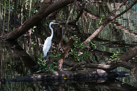
- Category: Commons:Featured pictures/Animals/Birds
- Info All by -- Tomascastelazo (talk) 16:33, 9 May 2015 (UTC)
- Support -- Tomascastelazo (talk) 16:33, 9 May 2015 (UTC)
- Oppose The subject is too small, and overall the image is too noisy. --Uoaei1 (talk) 20:00, 9 May 2015 (UTC)
- Comment Ok, got it... but look at the whole picture, it is not a picture of a bird, it is a picture of a setting, a mangrove and a bird. Mangroves are interesting places to visit due to the biodiversity, and there are not many pictures of mangroves taken from the inside, generally they are photographed from the outside, as a buch of plants. Light conditions vary greatly, so dynamic range is sometimes a problem. --Tomascastelazo (talk) 20:25, 9 May 2015 (UTC)
- Support a nice view of the ardea alba bird in his habitat. --Alchemist-hp (talk) 10:02, 10 May 2015 (UTC)
- Weak Support --Σπάρτακος (talk) 12:10, 10 May 2015 (UTC)
- Weak Support Some parts probably are too dark and too poorly visible, though it has some really outstanding parts. Minimum fulfilled for me. -- Pofka (talk) 18:06, 10 May 2015 (UTC)
- Pofka, the dynamic range in very large in this picture but the dark areas are not blocked, nor the highlights. Look at it in Lightroom or photoshop, in the histogram and you will see that. The inside of mangroves have varied qualities of light and the challenge is to get everything, or as much as possible, inside that range. --Tomascastelazo (talk) 18:24, 10 May 2015 (UTC)
- Oppose Sorry, but for me it's just too dark. --King of ♥ ♦ ♣ ♠ 19:53, 10 May 2015 (UTC)
- Neutral I like the photo, but it is too dark and blurred in parts. --Tremonist (talk) 12:58, 12 May 2015 (UTC)
- Tremonist maybe you soud check your monitor. --Tomascastelazo (talk) 05:22, 13 May 2015 (UTC)
- @Tremonist yes, the reflections on the water surface are very blurred ;-) --Alchemist-hp (talk) 07:01, 13 May 2015 (UTC)
- Tremonist maybe you soud check your monitor. --Tomascastelazo (talk) 05:22, 13 May 2015 (UTC)
- strong support White bird very well contrasts to the background. Darkness captures unique beauty of mangrove forest, D kuba (talk) 09:24, 13 May 2015 (UTC)
- Support interesting, nice, unusual place with hard light condition, even more hard with an animal for subject -- Christian Ferrer 11:43, 14 May 2015 (UTC)
- Support as per Christian above. Yann (talk) 13:03, 16 May 2015 (UTC)
File:Cedid Atlas (Middle East) 1803.jpg, featured[edit]
_1803.jpg&action=edit§ion=T-1)
Voting period is over. Please don't add any new votes.Voting period ends on 18 May 2015 at 19:52:20 (UTC)
Visit the nomination page to add or modify image notes.
_1803.jpg/397px-Cedid_Atlas_(Middle_East)_1803.jpg)
- Category: Commons:Featured pictures/Non-photographic media/Maps
- Info created by Oncenawhile - uploaded by Oncenawhile - nominated by Oncenawhile -- Oncenawhile (talk) 19:52, 9 May 2015 (UTC)
- Support -- Oncenawhile (talk) 19:52, 9 May 2015 (UTC)
- Support high resolution and high value but is not Commons:Featured pictures/Non-photographic media/Maps a better choice as there is other historical maps in this gallery? -- Christian Ferrer 05:40, 10 May 2015 (UTC)
- Thanks and agreed - have amended. Oncenawhile (talk) 06:32, 10 May 2015 (UTC)
- Support --Yann (talk) 07:24, 10 May 2015 (UTC)
- Support --Σπάρτακος (talk) 12:07, 10 May 2015 (UTC)
- Support -- Pofka (talk) 18:08, 10 May 2015 (UTC)
- Support Everything's readable, that's what counts. --Tremonist (talk) 12:59, 12 May 2015 (UTC)
- Support D kuba (talk) 09:33, 13 May 2015 (UTC)
File:Richèl Hogenkamp - Masters de Madrid 2015 - 11.jpg, featured[edit]
Voting period is over. Please don't add any new votes.Voting period ends on 18 May 2015 at 15:40:01 (UTC)
Visit the nomination page to add or modify image notes.
- Category: Commons:Featured pictures/Sports
- Info Richèl Hogenkamp at the Madrid Open 2015, Madrid, Spain. Created, uploaded and nominated by -- Kadellar (talk) 15:40, 9 May 2015 (UTC)
- Support -- Kadellar (talk) 15:40, 9 May 2015 (UTC)
- weak Support my only objection is the angle, it is taken from above. But it is also a great sport photo.--ArildV (talk) 17:58, 9 May 2015 (UTC)
- Thank you for your review. It is quite usual for tennis to have a high point of view, so you only see the colour of the court, no ads, no public, no line referees. --Kadellar (talk) 19:07, 9 May 2015 (UTC)
- I wouldn't say it's usual for professional sports photography, maybe amateur photography... Most professional tennis photography is taken at the level of players and use a shallow DoF to minimise those distracting elements. Diliff (talk) 15:19, 10 May 2015 (UTC)
- From yesterday's final: [7], [8], [9] --Kadellar (talk) 10:06, 11 May 2015 (UTC)
- And this one from 2013 is absolutely epic: [10] Photographers use to stand up with their 300mm or 400mm 2.8 and monopods apart from low point of view pictures, they do both. I've got no 2.8, but I've got good 400mm. --Kadellar (talk) 10:12, 11 May 2015 (UTC)
- I know the angle is often used and it can work well, I was just saying that it's not the most common angle for professional tennis photography. This google image search on the words "professional tennis photography" suggests that perhaps 5-10% of it is taken from significantly above court level. Not a scientific survey, I know, but a rough indication. :-) Diliff (talk) 10:23, 11 May 2015 (UTC)
![[10]](../../../../c.smimg.net/13/37/rafael-nadal-us-open.jpg)
- Support -- Pofka (talk) 18:04, 10 May 2015 (UTC)
- Support Good action scene. --Tremonist (talk) 12:55, 12 May 2015 (UTC)
- Support D kuba (talk) 09:30, 13 May 2015 (UTC)
- Support. After thinking about it for a while, I think it's good enough. I'm not such a fan of these angles but I agree that they are a valid way of minimising distracting background elements. This one has great simplicity. Diliff (talk) 12:03, 13 May 2015 (UTC)
- Weak Support The shadows in upper right corner are a bit pity but nice action shot. If this photo is downsized image, high resolution would better, imo. --Laitche (talk) 15:36, 13 May 2015 (UTC)
- Support --Ralf Roleček 22:20, 13 May 2015 (UTC)
- Comment Thank you all for your support and comments. --Kadellar (talk) 14:00, 18 May 2015 (UTC)
File:Santa Maria in Trastevere - Chapel ceiling.jpg, featured[edit]
Voting period is over. Please don't add any new votes.Voting period ends on 18 May 2015 at 20:15:21 (UTC)
Visit the nomination page to add or modify image notes.
- Category: Commons:Featured pictures/Non-photographic media#Religion
- Info All by -- LivioAndronico talk 20:15, 9 May 2015 (UTC)
- Support -- LivioAndronico talk 20:15, 9 May 2015 (UTC)
- Support Couldnt you wait a bit, we are doomed now. People will get sick of it. Hence my little contribution. But this one IS more sharper than previous. --Mile (talk) 20:35, 9 May 2015 (UTC)
- unfortunately I live in Rome and are .... full of domes--LivioAndronico talk 21:27, 9 May 2015 (UTC)
- Support --Jacek Halicki (talk) 20:36, 9 May 2015 (UTC)
- Support More war of domes! 😄 ArionEstar 😜 (talk) 00:43, 10 May 2015 (UTC)
- Support Santa Maria in Trastevere è definitivamente la mia chiesa preferita a Roma. Sarebbe grande se Diliff e la sua fotocamera potrebbero andarci una volta. --Code (talk) 07:25, 10 May 2015 (UTC)
- Ehm...grazie Code --LivioAndronico talk 08:57, 10 May 2015 (UTC)
- Weak Oppose I think that it is nice and, apart from the fact that it is a bit dark, the quality is good but not outstanding and I don't find the subject either original nor eye-catching. I guess that only in Italy there are thousand domes like this one. The dome below in Mile's nomination is surely more interesting from the composition point of view but with lower quality. I supported e.g. your dome with rectangular form because I found it different, but cannot affirm the same in this case, sorry. Poco2 08:03, 10 May 2015 (UTC)
- Don't worry Diego....anyway sure that the dome of Mile is better and more interesting --LivioAndronico talk 08:56, 10 May 2015 (UTC)
- Oppose For featured images of art, I expect outstanding artistic quality, what I miss here. --Uoaei1 (talk) 09:17, 10 May 2015 (UTC)
- Support --Σπάρτακος (talk) 12:01, 10 May 2015 (UTC)
- Support -- Pofka (talk) 18:12, 10 May 2015 (UTC)
- Oppose We have several FD's of this kind. This one does not stand out. The light in uneven with the dark part on the right and the colours are grey-ish. Strong light at buttom edge and right edge doesn't help either. --Pugilist (talk) 22:54, 10 May 2015 (UTC)
- Support --Tremonist (talk) 13:38, 12 May 2015 (UTC)
- Info Demoted/Delisted to not featured per this consensus. --Cart (talk) 13:34, 18 October 2018 (UTC)
File:2015-04 - Puits de la Houillère - 10.JPG, not featured[edit]
Voting period is over. Please don't add any new votes.Voting period ends on 18 May 2015 at 21:13:46 (UTC)
Visit the nomination page to add or modify image notes.
- Category: Commons:Featured pictures/Places/Architecture/Industry
- Info created, uploaded and nominated by A.BourgeoisP
- Support -- A.BourgeoisP (talk) 21:13, 9 May 2015 (UTC)
- Support Nice. --Tomascastelazo (talk) 21:31, 9 May 2015 (UTC)
- What is there to merit encyclopedic value? Are the trees in danger of extinction? Is it hard to get to? What does it illustrate? What does it teach? There must be a zillion look alike mounds in the world. The same questions you used to justify your oppose of this nomination could legitimately be asked of this image too... I ask these questions not because I dislike this image, but because I find it rather hypocritical that you can support it when there is nothing notable about this fairly anonymous looking scene, according to your own criteria. Diliff (talk) 23:16, 9 May 2015 (UTC)
- This image is a perfect example of reclaiming the nature of an old forgotten mine site. Its graphic aspect makes it interesting. A.BourgeoisP (talk) 23:22, 9 May 2015 (UTC)
- Comment ah, Diliff, starting with the zen of the photograph, it conveys ease, peace, letting be... It has aroma, visual aroma, it has wabi sabi... perfectly imperfect, but perfect in its imperfection. No way to measure aroma... On the compositional side, nice rule of thirds, nice color, nice texture, nice escense of the place, unpretentious... One needs not to intellectualice the scene, one is placed there. --Tomascastelazo (talk) 05:09, 10 May 2015 (UTC)
- And on an afterthought, Diliff, what has this image to do with yours? Absolutely nothing, so keep the conversations is their rightful place. No need to contamite the environment of this fine photogrpah. --Tomascastelazo (talk) 05:24, 10 May 2015 (UTC)
- My question is perfectly valid. I'm asking, using the framing of your own description of what a FP should be, how this image meets your expectations. You responded with mumbo-jumbo about what it makes you feel, rather than how it is encyclopaedic by your own definition. That was not even remotely close to answering the questions I asked. Diliff (talk) 10:55, 10 May 2015 (UTC)
- I don't really think you are looking for an answer and probably you couln't understand it beyond your narrow mindset, which is evident. I think that you moving a discussion from another candidate here is simply a very uncouth act and this candidatet's space has been poisoned, all because little David is throwing a tantrum because someone opposed one of his nominations. You are no more than someone who snaps pictures and loves pixel counting, but you miss the higher level of doing and understanding photography. It is like describing vanilla flavor to someone who has never tasted vanilla or like someone who doesn't know mechanics who when opening the hood only sees a confusion of things and wires, as opposed to a mechanic who sees injectors, alternators, belts, hydraulic pumps, etc. It is called "distinction," or the ability to distinguish. You know how to drive the car, but that doesn't make you neither a racer or a mechanic. Maybe a taxi driver. Same with photography. So if you really want to understand my answer, learn first something about the art. --Tomascastelazo (talk) 15:16, 10 May 2015 (UTC)
- Listen, you don't know what I think, so please don't guess or put words in my mouth. And please stop using airy fairy metaphors, they make no sense at all and only serve to distract from the discussion. Also, I'm not throwing a tantrum, I'm asking you a question about your voting patterns and your definition of a FP and you won't answer it except with a vague "je ne sais quoi!". I'm not upset because you opposed my nomination, I'm upset because the reasons you used to justify it were both unreasonable and inconsistent (and given our recent disagreement on FPC talk page, possibly a retaliatory vote) as demonstrated here in this nomination and your inability to explain your vote beyond silly meanderings about flavours, aromas, wabi sabi etc. I'm not trying to change your vote, I'm only pointing out how inconsistent, unreasonable and unable to properly answer a direct question you are. Diliff (talk) 16:01, 10 May 2015 (UTC)
- Lol @ Diliff... I quote myself on why I supported this image, which you obviously, in your ofuscated state, missed, or did not understand: "On the compositional side, nice rule of thirds, nice color, nice texture, nice escense of the place..." If you look at the picture from these parameters, you may appreciate its aesthetics. And me guessing what you think? Ah, that prerrogative is only reserved to you! You are free to dish out BS and judge people opinions but no one can speculate, the way you do about others, about you. Go for a ride taxi driver... --Tomascastelazo (talk) 16:12, 10 May 2015 (UTC)for a ride, taxi driver. --Tomascastelazo (talk) 16:12, 10 May 2015 (UTC)
- You say I don't understand your answer. That's not the problem here, the problem is you didn't answer my question, you ignored my question and answered your own rhetorical question that related to feelings and emotions and 'why you like the photo'. I didn't ask about that and you know damn well I didn't. As I said earlier, you answer questions like a slimy politician. By avoiding them and answering the question you wish was asked in the first place. I'll repeat the questions and perhaps you can point out where or how your answer relates to them. "What is there to merit encyclopedic value? Are the trees in danger of extinction? Is it hard to get to? What does it illustrate? What does it teach? There must be a zillion look alike mounds in the world.". Diliff (talk) 16:16, 10 May 2015 (UTC)
- “Never argue with stupid people, they will drag you down to their level and then beat you with experience.” Mark Twain... Should have listened to good old Samuel Clemens... ;) --Tomascastelazo (talk) 16:30, 10 May 2015 (UTC)
- Are you incapable of discussing anything without using quotes, rhetorical questions, anecdotes, parables and metaphors to make your points for you? We're done here yet again, because you won't stick to the subject. Pathetic... Diliff (talk) 16:48, 10 May 2015 (UTC)
- God almighty, grant me patience. Listen taxi driver, in popular language around here, this picture has Wow factor for me, that is why I voted for it, and no, I am not going to compare my rationale for voting in this picture vs yours, which incidentally, to me has no wow. go count some pixels... --Tomascastelazo (talk) 17:07, 10 May 2015 (UTC)
- Are you incapable of discussing anything without using quotes, rhetorical questions, anecdotes, parables and metaphors to make your points for you? We're done here yet again, because you won't stick to the subject. Pathetic... Diliff (talk) 16:48, 10 May 2015 (UTC)
- “Never argue with stupid people, they will drag you down to their level and then beat you with experience.” Mark Twain... Should have listened to good old Samuel Clemens... ;) --Tomascastelazo (talk) 16:30, 10 May 2015 (UTC)
- You say I don't understand your answer. That's not the problem here, the problem is you didn't answer my question, you ignored my question and answered your own rhetorical question that related to feelings and emotions and 'why you like the photo'. I didn't ask about that and you know damn well I didn't. As I said earlier, you answer questions like a slimy politician. By avoiding them and answering the question you wish was asked in the first place. I'll repeat the questions and perhaps you can point out where or how your answer relates to them. "What is there to merit encyclopedic value? Are the trees in danger of extinction? Is it hard to get to? What does it illustrate? What does it teach? There must be a zillion look alike mounds in the world.". Diliff (talk) 16:16, 10 May 2015 (UTC)
- Lol @ Diliff... I quote myself on why I supported this image, which you obviously, in your ofuscated state, missed, or did not understand: "On the compositional side, nice rule of thirds, nice color, nice texture, nice escense of the place..." If you look at the picture from these parameters, you may appreciate its aesthetics. And me guessing what you think? Ah, that prerrogative is only reserved to you! You are free to dish out BS and judge people opinions but no one can speculate, the way you do about others, about you. Go for a ride taxi driver... --Tomascastelazo (talk) 16:12, 10 May 2015 (UTC)for a ride, taxi driver. --Tomascastelazo (talk) 16:12, 10 May 2015 (UTC)
- Listen, you don't know what I think, so please don't guess or put words in my mouth. And please stop using airy fairy metaphors, they make no sense at all and only serve to distract from the discussion. Also, I'm not throwing a tantrum, I'm asking you a question about your voting patterns and your definition of a FP and you won't answer it except with a vague "je ne sais quoi!". I'm not upset because you opposed my nomination, I'm upset because the reasons you used to justify it were both unreasonable and inconsistent (and given our recent disagreement on FPC talk page, possibly a retaliatory vote) as demonstrated here in this nomination and your inability to explain your vote beyond silly meanderings about flavours, aromas, wabi sabi etc. I'm not trying to change your vote, I'm only pointing out how inconsistent, unreasonable and unable to properly answer a direct question you are. Diliff (talk) 16:01, 10 May 2015 (UTC)
- I don't really think you are looking for an answer and probably you couln't understand it beyond your narrow mindset, which is evident. I think that you moving a discussion from another candidate here is simply a very uncouth act and this candidatet's space has been poisoned, all because little David is throwing a tantrum because someone opposed one of his nominations. You are no more than someone who snaps pictures and loves pixel counting, but you miss the higher level of doing and understanding photography. It is like describing vanilla flavor to someone who has never tasted vanilla or like someone who doesn't know mechanics who when opening the hood only sees a confusion of things and wires, as opposed to a mechanic who sees injectors, alternators, belts, hydraulic pumps, etc. It is called "distinction," or the ability to distinguish. You know how to drive the car, but that doesn't make you neither a racer or a mechanic. Maybe a taxi driver. Same with photography. So if you really want to understand my answer, learn first something about the art. --Tomascastelazo (talk) 15:16, 10 May 2015 (UTC)
- My question is perfectly valid. I'm asking, using the framing of your own description of what a FP should be, how this image meets your expectations. You responded with mumbo-jumbo about what it makes you feel, rather than how it is encyclopaedic by your own definition. That was not even remotely close to answering the questions I asked. Diliff (talk) 10:55, 10 May 2015 (UTC)
- And on an afterthought, Diliff, what has this image to do with yours? Absolutely nothing, so keep the conversations is their rightful place. No need to contamite the environment of this fine photogrpah. --Tomascastelazo (talk) 05:24, 10 May 2015 (UTC)
- Weak Support. Very interesting composition. Weak for the unsharpness in the upper right. --King of ♥ ♦ ♣ ♠ 21:39, 9 May 2015 (UTC)
- Oppose I don't understand what is the subject here. Yann (talk) 22:40, 9 May 2015 (UTC)
- @Yann: the vegetation that proliferates on the old spoil tip. The composition is intended as attractive with the old tree trunk + the contrast between green young leaf on the top and brown-grey dead leaf on the ground. A.BourgeoisP (talk) 23:06, 9 May 2015 (UTC)
- Oppose No wow. -- Fotoriety (talk) 00:43, 10 May 2015 (UTC)
- @Fotoriety: Sorry but for the subject, this image emerges something wow... A.BourgeoisP (talk) 09:06, 10 May 2015 (UTC)
- Oppose no wow, a typical and trivial forest view. --Alchemist-hp (talk) 10:00, 10 May 2015 (UTC)
- And yet, the whole point of the image is that it isn't a actually 'typical and trivial forest', it's a forest that has recently emerged from the spoils of a mine. Diliff (talk) 10:57, 10 May 2015 (UTC)
- OK, I know the German Harz. This forest have a lot similar places too. Perhaps therefore is "typical" for me ... --Alchemist-hp (talk) 11:18, 10 May 2015 (UTC)
- And yet, the whole point of the image is that it isn't a actually 'typical and trivial forest', it's a forest that has recently emerged from the spoils of a mine. Diliff (talk) 10:57, 10 May 2015 (UTC)
- Oppose I don't know it's typical or remarkable but in which case it looks no wow plus quality issue, a bit overexposed overall and that motion blur on the leaves can not be overlooked to me. --Laitche (talk) 11:28, 10 May 2015 (UTC)
- Oppose For others --Σπάρτακος (talk) 12:01, 10 May 2015 (UTC)
- Oppose As others. -- Pofka (talk) 18:13, 10 May 2015 (UTC)
- Strong oppose Competently done image of coarse woody debris without any wow. Daniel Case (talk) 02:08, 11 May 2015 (UTC)
- The contempt of the full frame DSLR's possessors. Nether respect for the beauty and simplicity captured by an APS-C mirrorless... A.BourgeoisP (talk) 05:03, 11 May 2015 (UTC)
- Oppose Unremarkable. (APS-C shooter) -- 11:42, 12 May 2015 (UTC) — Preceding unsigned comment added by Colin (talk • contribs) --LivioAndronico talk 13:35, 12 May 2015 (UTC)
- Oppose Per others. --Tremonist (talk) 13:39, 12 May 2015 (UTC)
- Oppose I gave this picture a weak pro at QI. Not more. I don´t see this one as a FP at all.--Hubertl (talk) 06:02, 13 May 2015 (UTC)
File:Brooklyn Botanic Garden New York May 2015 003.jpg, featured[edit]
Voting period is over. Please don't add any new votes.Voting period ends on 23 May 2015 at 01:31:15 (UTC)
Visit the nomination page to add or modify image notes.
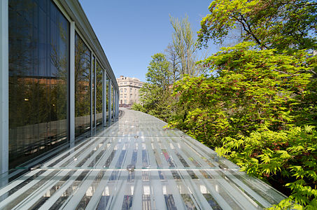
- Category: Commons:Featured pictures/Places/Architecture
- Info created by King of Hearts - uploaded by King of Hearts - nominated by King of Hearts -- King of ♥ ♦ ♣ ♠ 01:31, 14 May 2015 (UTC)
- Support -- King of ♥ ♦ ♣ ♠ 01:31, 14 May 2015 (UTC)
- Support Nice colors, nice lighting, creative composition. --Laitche (talk) 01:39, 14 May 2015 (UTC)
- Support Per Laitche. --Code (talk) 06:06, 14 May 2015 (UTC)
- Support Per Laitche. 😄 ArionEstar 😜 (talk) 07:12, 14 May 2015 (UTC)
- Support Per Laitche. -- Christian Ferrer 11:34, 14 May 2015 (UTC)
- Support Per Laitche. Daniel Case (talk) 02:16, 15 May 2015 (UTC)
- Support Albertus teolog (talk) 12:01, 15 May 2015 (UTC)
- Support --Tremonist (talk) 12:05, 15 May 2015 (UTC)
- Support --Ralf Roleček 19:07, 15 May 2015 (UTC)
- Support Very nice perspective with that path hiding away, quality is also good, FP to me. Poco2 19:19, 15 May 2015 (UTC)
- Support --XRay talk 09:16, 16 May 2015 (UTC)
- Support --Halavar (talk) 10:38, 16 May 2015 (UTC)
- Support --Jacek Halicki (talk) 12:06, 17 May 2015 (UTC)
- Support --Alex Florstein (talk) 14:12, 17 May 2015 (UTC)
File:Tectarius coronatus 01.JPG, featured[edit]
Voting period is over. Please don't add any new votes.Voting period ends on 22 May 2015 at 20:42:39 (UTC)
Visit the nomination page to add or modify image notes.
- Category: Commons:Featured pictures/Animals/Bones, shells and fossils
- Info created by Llez - uploaded by Llez - nominated by Llez -- Llez (talk) 20:42, 13 May 2015 (UTC)
- Support -- Llez (talk) 20:42, 13 May 2015 (UTC)
- Support 😄 ArionEstar 😜 (talk) 20:54, 13 May 2015 (UTC)
- Support --LivioAndronico talk 21:07, 13 May 2015 (UTC)
- Support --Code (talk) 21:18, 13 May 2015 (UTC)
- Support --Ralf Roleček 22:15, 13 May 2015 (UTC)
- Support -- George Chernilevsky talk 05:04, 14 May 2015 (UTC)
- Support --Cayambe (talk) 07:51, 14 May 2015 (UTC)
- Support --Mile (talk) 11:30, 14 May 2015 (UTC)
- Support --Schnobby (talk) 12:33, 14 May 2015 (UTC)
- Support Daniel Case (talk) 04:22, 15 May 2015 (UTC)
- Support --Martin Falbisoner (talk) 06:05, 15 May 2015 (UTC)
- Support --Jacek Halicki (talk) 08:20, 15 May 2015 (UTC)
- Support --Tremonist (talk) 12:02, 15 May 2015 (UTC)
- Support Another masterpiece. We have two genius Llez (for shells) and Diliff (for churchs interiors). I know the Llez tecnique and its natural lighted. Excellent work --The Photographer (talk) 15:58, 15 May 2015 (UTC)
- Support Indeed Poco2 19:15, 15 May 2015 (UTC)
- Support --Halavar (talk) 10:40, 16 May 2015 (UTC)
- Support Jacopo Werther iγ∂ψ=mψ 17:35, 16 May 2015 (UTC)
File:Walking through a lot of rainstorms.svg, not featured[edit]
Voting period is over. Please don't add any new votes.Voting period ends on 19 May 2015 at 02:22:39 (UTC)
Visit the nomination page to add or modify image notes.
- Category: Commons:Featured pictures/Non-photographic_media/Computer-generated
- Info A bit different from what I usually nominate but I think it’s a nice example of an SVG vector painting. All by Kelvinsong—♥ Kelvinsong talk 02:22, 10 May 2015 (UTC)
- Support—♥ Kelvinsong talk 02:22, 10 May 2015 (UTC)
- Comment Nice drawing, I like this colors and composition but bezier curve is a bit carelessly especially arms and shoulders plus insufficient wow for me. --Laitche (talk) 07:40, 10 May 2015 (UTC)
- Idk it’s kinda the style of the image—♥ Kelvinsong talk 13:25, 10 May 2015 (UTC)
- Info When I try opening the file in Firefox (35.0.1 on Linux Mint), I only get a parsing error (unclosed token) in line 3990, column 5. --El Grafo (talk) 12:17, 10 May 2015 (UTC)
- I could open it(svg) in Firefox (37.0.2) but Windows not Linux. I saw the bezier curve in Adobe Illustrator CC. --Laitche (talk) 12:51, 10 May 2015 (UTC)
- Works for me in Firefox on Ubuntu 15.04—♥ Kelvinsong talk 13:25, 10 May 2015 (UTC)
- Support --Martin Falbisoner (talk) 06:38, 11 May 2015 (UTC)
- Neutral beautiful, however, background and foreground could have more contrast --The Photographer (talk) 11:20, 12 May 2015 (UTC)
- Neutral Per others. --Tremonist (talk) 13:41, 12 May 2015 (UTC)
- weak support I'm already having problems judging digital reproductions of "real" paintings, and this being original artwork doesn't make it easier at all. It's easier with your biological drawings, as one can try to judge them by their accuracy etc., but here I'm lacking criteria besides renders well/has no syntax errors and do I like it?. Well' the error(s) don't seem to be severe and I do like it, so … --El Grafo (talk) 11:14, 13 May 2015 (UTC)
File:Neptune Full.jpg, featured[edit]
Voting period is over. Please don't add any new votes.Voting period ends on 19 May 2015 at 08:39:32 (UTC)
Visit the nomination page to add or modify image notes.
- Category: Commons:Featured pictures/Astronomy
- Info created by NASA - uploaded by Orange-kun - nominated by Jcpag2012 -- Jcpag2012 (a.k.a. John Carlo) from Wikimedia Commons 08:39, 10 May 2015 (UTC)
- Support -- Jcpag2012 (a.k.a. John Carlo) from Wikimedia Commons 08:39, 10 May 2015 (UTC)
- Support Simply can't say no to this mysterious and beautiful planet. -- Pofka (talk) 18:02, 10 May 2015 (UTC)
- Support --Tremonist (talk) 13:41, 12 May 2015 (UTC)
- Support large sapphire -- Lauro Sirgadocontribs 18:57, 13 May 2015 (UTC)
- Support D kuba (talk) 07:21, 14 May 2015 (UTC)
- Support Jacopo Werther iγ∂ψ=mψ 17:37, 16 May 2015 (UTC)
- Support Being a picture from space in 1989, it's good for FP. 😄 ArionEstar 😜 (talk) 20:02, 17 May 2015 (UTC)
File:Stift Melk Kolomanisaal Deckenfresko 02.JPG, not featured[edit]
Voting period is over. Please don't add any new votes.Voting period ends on 19 May 2015 at 09:29:04 (UTC)
Visit the nomination page to add or modify image notes.
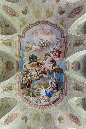
- Category: Commons:Featured pictures/Places/Interiors/Religious buildings
- Info Fresco in St. Koloman's Hall, Melk Abbey. Painted 1745 by Paul Troger, all the rest by me --Uoaei1 (talk) 09:29, 10 May 2015 (UTC)
- Support -- Uoaei1 (talk) 09:29, 10 May 2015 (UTC)
- Comment And this is outstanding for you? ...and need category--LivioAndronico talk 09:34, 10 May 2015 (UTC)
- @Livioandronico2013: Thank you for your reminder to add the category! --Uoaei1 (talk) 10:21, 10 May 2015 (UTC)
- Support I don't beleive that is outstanding,but is good and nice --LivioAndronico talk 10:26, 10 May 2015 (UTC)
- Oppose I miss some contrast, colors are splashed. Shoting with fisheye give you pretty strecthed lines in wider end and unrealistic shapes. Not so good idea for rectangle crop. --Mile (talk) 11:04, 10 May 2015 (UTC)
*
![]() Support --Σπάρτακος (talk) 11:59, 10 May 2015 (UTC)
Support --Σπάρτακος (talk) 11:59, 10 May 2015 (UTC)
- Support I see no issue with the colors here. The composition is really nice with those arches converging to the center of the picture, well done. Poco2 15:55, 10 May 2015 (UTC)
- Support --Tremonist (talk) 13:42, 12 May 2015 (UTC)
- Support Not all featured pictures of churchs interior have symmetry (most yes). In this case, the lack of symmetry doesn't bother me. 😄 ArionEstar 😜 (talk) 19:59, 17 May 2015 (UTC)
- Info Demoted to 'not featured' due to sock double vote. 4 October 2018. --Cart (talk) 20:47, 4 October 2018 (UTC)
File:Vieussan, Hérault 12.jpg, featured[edit]
Voting period is over. Please don't add any new votes.Voting period ends on 19 May 2015 at 17:22:30 (UTC)
Visit the nomination page to add or modify image notes.
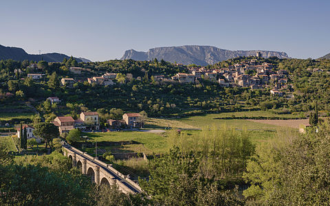
- Category: Commons:Featured pictures/Places
- Info created by Christian Ferrer - uploaded by Christian Ferrer - nominated by Christian Ferrer -- Christian Ferrer 17:22, 10 May 2015 (UTC)
- Support -- Christian Ferrer 17:22, 10 May 2015 (UTC)
- Support Lovely image --LivioAndronico talk 17:41, 10 May 2015 (UTC)
- Support Bottom left corner seemed a bit to dark, but since there is a illuminated bridge near it - it is fine. Other parts are simply beautiful. -- Pofka (talk) 17:58, 10 May 2015 (UTC)
- Comment Lovely but I think you could bump a contrast a bit. The shadows should be darker. --King of ♥ ♦ ♣ ♠ 19:57, 10 May 2015 (UTC)
- Support Very good, but I found a dust spot in the sky. I added a note. --Code (talk) 20:36, 10 May 2015 (UTC)
- Comment I haven't decided my vote yet but the front face of the buildings in shadow is a minus factor... --Laitche (talk) 21:51, 10 May 2015 (UTC)
- Oppose I don't like the vegetation dominating the bottom right corner; but i especially find the lighting unappealing. -- Fotoriety (talk) 00:43, 11 May 2015 (UTC)
- Oppose Bad lights. --Kikos (talk) 04:29, 11 May 2015 (UTC)
- Comment Honestly I do not see any problem there, eyes are guided by light. Eyes follow the bridge and a first set of home, then the second line of houses to the main village, and the mountain in the background to finish. The image would have been flat, with a light face, shadows and lighting give volume and enhance the two centers of interest are the village and the bridge. But the principles are the principles...then treat yourself, there are plenty of shade here than reason to oppose. -- Christian Ferrer 05:19, 11 May 2015 (UTC)
- Comment I know this composition is totally different from that nomination but the direction of light is almost same, And we opposed that nomination caused by shadow so I thought it's a bit unfair that's why I've just commented above but I think the light(shadow) is not so big problem here. --Laitche (talk) 09:32, 11 May 2015 (UTC)
- Hi Laitche, I see a big difference between the both image. On your exemple the first thing we see it's the shadows on the buildings. On my image sorry but it's not the first thing you see, it's the bridge and the village and after that, I agree, the big shadow on the hill. The big shadow on the hill is a shadow from a mountain, on my image shadows on the buildings are much much less harsh, and at full resolution on the village sorry but the little shadowed areas are not so disturbing and even are nice. So sorry but in all disturbing things on this image, if disturbing things there is, shadows on the buildings are the less disturbing. But I can understand the shadow on the hill is disturbing and without this big shadow this image would have 10 support. The light is very good and beautifull for my taste but I do not doubt that this will certainly not have to convince you or anyone looking for a reason to oppose. "unfair"? the both image are for me very different and if you oppose all shadowed images just because you did it once and now you do not want to seem unfair by support other images it's you who is unfair (I know, Laitche, you did not oppose at this time and this sentence is not only for you). -- Christian Ferrer 11:59, 11 May 2015 (UTC)
- I'm sure that you are misunderstanding my comment, that unfair means only why I wrote the first comment, not for this nomination and I don't think the light is a big problem here as I wrote above (but a bit minus factor, I think) and I have not decided my vote yet, at all :) --Laitche (talk) 12:54, 11 May 2015 (UTC)
- After my first comment I saw the two oppose votes and then I thought, maybe my first comment is misleading the others that's why I added the second comment. Because the first comment is a little different from my intention so I needed an explanation. --Laitche (talk) 00:30, 12 May 2015 (UTC)
- Hi Laitche, I see a big difference between the both image. On your exemple the first thing we see it's the shadows on the buildings. On my image sorry but it's not the first thing you see, it's the bridge and the village and after that, I agree, the big shadow on the hill. The big shadow on the hill is a shadow from a mountain, on my image shadows on the buildings are much much less harsh, and at full resolution on the village sorry but the little shadowed areas are not so disturbing and even are nice. So sorry but in all disturbing things on this image, if disturbing things there is, shadows on the buildings are the less disturbing. But I can understand the shadow on the hill is disturbing and without this big shadow this image would have 10 support. The light is very good and beautifull for my taste but I do not doubt that this will certainly not have to convince you or anyone looking for a reason to oppose. "unfair"? the both image are for me very different and if you oppose all shadowed images just because you did it once and now you do not want to seem unfair by support other images it's you who is unfair (I know, Laitche, you did not oppose at this time and this sentence is not only for you). -- Christian Ferrer 11:59, 11 May 2015 (UTC)
- Support Has interesting shadows. --Tremonist (talk) 13:44, 12 May 2015 (UTC)
- Support -- George Chernilevsky talk 19:46, 12 May 2015 (UTC)
- Weak Support Good quality, close-range view is a bit distracting but distant view is attractive. --Laitche (talk) 00:06, 14 May 2015 (UTC)
- Neutral I like the scene. If possible I'd have tried to shot it further from the left so that the bridge builds a more predominating diagonal and so, at the same time, get rid of the part of the vacuum in the half right below the houses. The main problem here though IMHO is the lighting. I would enjoy to see this landscape with a morning light. Poco2 18:52, 15 May 2015 (UTC)
- Support --Alex Florstein (talk) 14:15, 17 May 2015 (UTC)
- Comment Agree with Poco. The balance of bridge and village is good, but the bottom right is dead space, and it lack magical light. -- Colin (talk) 21:20, 17 May 2015 (UTC)
- Unfortunately I could not move, it was the only point of view (trees at right and left of me) so close of the village. There is a lot of other possibility File:Vieussan, Hérault 14.jpg from surrounding hills but not so close or need the telephoto lens. And to answer to Poc, at the morning the bridge is shadowed from this point of view. -- Christian Ferrer 05:24, 18 May 2015 (UTC)
File:Richmond Federal Appeals Court and skyline VA1.jpg, not featured[edit]
Voting period is over. Please don't add any new votes.Voting period ends on 20 May 2015 at 01:16:04 (UTC)
Visit the nomination page to add or modify image notes.
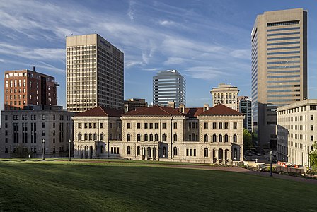
- Category: Commons:Featured pictures/Places
- Info created by Acroterion - uploaded by Acroterion - nominated by Acroterion -- Acroterion (talk) 01:16, 11 May 2015 (UTC)
- Support -- Acroterion (talk) 01:16, 11 May 2015 (UTC)
- Weak Oppose. Excellent lighting (very dramatic!), but I have some reservations: 1) the grass in the foreground is in shadow (could be made less prominent by cropping some of it); 2) sharpness is not great, with a feeling that the image has been oversharpened to compensate for a lack of initial sharpness; 3) the crop on the top is too tight. --King of ♥ ♦ ♣ ♠ 01:26, 11 May 2015 (UTC)
- I expect that opinions will vary about the grass and the crop: I like the texture of the grass in the shadow as opposed to more sky, which captures the sense of place better than a sky-heavy crop, but I understand the objection. A tripod would have been nice, but the light (a bit dim at that early hour) was too good to pass up. Acroterion (talk) 01:40, 11 May 2015 (UTC)
- Support as an urban shot... --Tomascastelazo (talk) 19:21, 11 May 2015 (UTC)
- Comment The lawn is almost fully in shadow. --Tremonist (talk) 13:46, 12 May 2015 (UTC)
- Support --Hubertl (talk) 05:59, 13 May 2015 (UTC)
- Oppose It looks over-enhancement for me. --Laitche (talk) 17:42, 13 May 2015 (UTC)
- Support Albertus teolog (talk) 12:11, 15 May 2015 (UTC)
- Weak Oppose Mostly per KoH. The composition is nice but the elements in it are not spectacular and the quality (see e.g. the skyscraper on the right) is not exceptional. I would have probably cropped the left part also, since the building at the bottom is in shadow and covers the, maybe more interesting, red one. The shadow at the bottom is to predominating and there is no eye-catching element here. Probably I'd try it again at a different time and looking for a different composition. Looking around I liked this one (frontal view showing the nice square in front of it). Sorry, but this version is IMHO not one of our finest Poco2 18:48, 15 May 2015 (UTC)
- As I noted to KoH, the composition is a deliberate choice to emphasize the sense of place and time of day: a building that faces northeast (and therefore is only directly illuminated by early morning light) at the bottom of a steep grassy hill about 30m below and about 100m to the south of the Virginia Capitol. The alternate image suggested by Poco shows the modern plaza directly in front of the Capitol: it has nothing to do with the courthouse. This alternate image was shot slightly later with the same light, from the bottom of the hill;. At the time the image was shot I was struck by the contrast between the brightly but obliquely illuminated courthouse and the shadowed but textured grass. That choice may not appeal to all, as I understand, and as the comments reflect: the picture is somewhat different from what is usually seen and promoted here. The image was edited to bring up the shadows a little bit and contrast reduced, sharpened (perhaps overly, as KoH suggests) and enhanced a little, principally for the sky. The actual grass is a vivid green, as befits a lawn in front of Jefferson's Capitol. Acroterion (talk) 14:51, 16 May 2015 (UTC)
- 1.1px is what I usually use. Acroterion (talk) 00:42, 20 May 2015 (UTC)
- Oppose Per others. Looks over-processed. Too much NR? There's no colourspace tag or profile either. -- Colin (talk) 21:23, 17 May 2015 (UTC)
- No noise processing was applied beyond the preset in PS RAW files (not needed with a 6D at ISO 100), and enhancement was minimal - a little vibrance and midtone contrast, the grass in the shadow brought up so the texture was visible): the colors and contrast at that sun angle were sufficient. I generally remove EXIF data because I dislike having equipment serials published, though I may give up on that as pointless: it's a Canon 6d, ISO 100, f10, 1/200 at 28mm. Acroterion (talk) 00:42, 20 May 2015 (UTC)
- Acroterion Removing too much EXIF data makes it an invalid JPG. A colourspace tag, and much preferably also a color profile, is required by our image guidelines for FP. Without it, the browser or image viewer then has to make guesses and browsers are really dumb: they assume the colour RGB values in the JPG are the same as the RGB values for your monitor. Many LCD monitors differ considerably from sRGB (most consumer monitors, especially on laptops, display only a meager portion of this colorspace) and high-quality professional monitors tend to be much wider-gamut than sRGB. If you use Lightroom, then look at Jeffrey’s "Metadata Wrangler" Lightroom Plugin] to control what gets published when you export. -- Colin (talk) 07:56, 20 May 2015 (UTC)
- Oppose Shadows. Ordinary shot. I see nothing interesting in it. Sorry. -- Pofka (talk) 18:59, 19 May 2015 (UTC)
File:San Francisco from Twin Peaks September 2013 panorama 5.jpg, featured[edit]
Voting period is over. Please don't add any new votes.Voting period ends on 20 May 2015 at 04:36:51 (UTC)
Visit the nomination page to add or modify image notes.
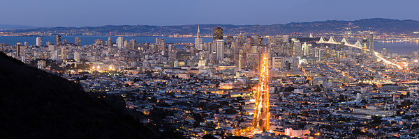
- Category: Commons:Featured pictures/Places/Panoramas
- Info created by King of Hearts - uploaded by King of Hearts - nominated by King of Hearts -- King of ♥ ♦ ♣ ♠ 04:36, 11 May 2015 (UTC)
- Support -- King of ♥ ♦ ♣ ♠ 04:36, 11 May 2015 (UTC)
- Support some (minor) noise and sharpness issues - more than mitigated by wow factor --Martin Falbisoner (talk) 06:35, 11 May 2015 (UTC)
- Oppose Fuzzi --Tomascastelazo (talk) 19:18, 11 May 2015 (UTC)
- Oppose A bit hazy. And noisy only on the left, I added the notes of the borders between the left and the right. If you can't see the borders, I guess something wrong with your monitor... --Laitche (talk) 23:51, 11 May 2015 (UTC)
- Oppose Sorry, but the bottom left corner is sooo black. --Tremonist (talk) 13:48, 12 May 2015 (UTC)
Alt[edit]
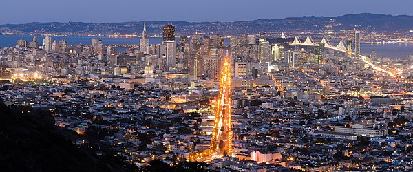
- Info I just took another look and realized that for some stupid reason, I accidentally shot the left frame at ISO 400, hence the unsharpness/noise. I've made a new version using only the right two frames, which I still feel is a compelling composition. King of ♥ ♦ ♣ ♠ 00:50, 12 May 2015 (UTC)
- Support --King of ♥ ♦ ♣ ♠ 00:52, 12 May 2015 (UTC)
- Support Great panorama. --Tremonist (talk) 13:47, 12 May 2015 (UTC)
- Support --Martin Falbisoner (talk) 20:52, 12 May 2015 (UTC)
- Neutral Nice panorama but a bit hazy. --Laitche (talk) 22:59, 12 May 2015 (UTC)
- Comment It is slightly tilted, it becomes very obvious in the bottom right. I think that I miss here some more panorama feeling. The decision not to cut the Market St was right, but I'd liked to see more on the left (maybe from a different location in Twin Peaks) and specially to the right, something in this direction (where by the way I like the Market St as a diagonal). Poco2 18:38, 15 May 2015 (UTC)
- Support Perhaps not perfect and indeed a bit tilted, but imo quite visually pleasing and a good mood for a pano. --DXR (talk) 11:02, 17 May 2015 (UTC)
- Support -- Christian Ferrer 19:43, 17 May 2015 (UTC)
- Support -- Pofka (talk) 18:58, 19 May 2015 (UTC)
- Support --Kadellar (talk) 19:27, 19 May 2015 (UTC)
File:Пзм-интерьер-11-собор-внутри-1420.jpg, not featured[edit]
Voting period is over. Please don't add any new votes.Voting period ends on 23 May 2015 at 22:39:05 (UTC)
Visit the nomination page to add or modify image notes.
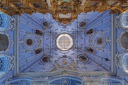
- Category: Commons:Featured pictures/Places
- Info created by PereslavlFoto - uploaded by PereslavlFoto - nominated by PereslavlFoto -- PereslavlFoto (talk) 22:39, 14 May 2015 (UTC)
- Support -- PereslavlFoto (talk) 22:39, 14 May 2015 (UTC)
- Comment Very nice, but I think it's tilted left (look at the bottom line). --King of ♥ ♦ ♣ ♠ 23:34, 14 May 2015 (UTC)
- Comment This is a XVIII century building, there is nothing extra-straight in it. --PereslavlFoto (talk) 00:11, 15 May 2015 (UTC)
- Oppose, very interesting composition, however the lack of focus on non central areas, and the dark areas needing to be more bright; makes this not a FP. And for me this photo is upside down (:D). -- RTA 01:08, 15 May 2015 (UTC)
- Neutral It has the "wow" to me, but especially central area lacks sharpness. --Tremonist (talk) 12:09, 15 May 2015 (UTC)
- Neutral Per Tremonist Poco2 19:57, 15 May 2015 (UTC)
File:150502 Strelitzer Straße bei Nacht.jpg, featured[edit]
Voting period is over. Please don't add any new votes.Voting period ends on 20 May 2015 at 05:22:59 (UTC)
Visit the nomination page to add or modify image notes.
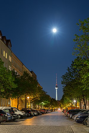
- Category: Commons:Featured pictures/Places/Architecture/Cityscapes
- Info Night view of Berlin Strelitzer Straße towards the TV Tower which is pointing to the moon. All by me. -- Code (talk) 05:22, 11 May 2015 (UTC)
- Support -- Code (talk) 05:22, 11 May 2015 (UTC)
- Support well done! --Martin Falbisoner (talk) 06:34, 11 May 2015 (UTC)
- Support --LivioAndronico talk 16:51, 11 May 2015 (UTC)
- Support --Tremonist (talk) 13:49, 12 May 2015 (UTC)
- Support — Crisco 1492 (talk) 15:38, 12 May 2015 (UTC)
- Support --Abiii132 17:25, 12 May 2015 (UTC)
- Oppose Good and nice, but the subject is not FP worthy for my taste. A street by night, even with the moon and the tower is not enough for me. The empty foreground is a bit too prominent, the cropped car is a bit disturbing. I'm sorry.--Jebulon (talk) 21:12, 12 May 2015 (UTC)
- Comment probably posterization see notes. --Laitche (talk) 22:40, 12 May 2015 (UTC)
- Hm. Thank you for your comment but sorry, even after having more than one look at your notes I couldn't see anything that looked like posterization to me. I didn't much postprocessing (only adjusting the white balance, reducing lights and adding some sharpness) so I don't know how it should come to posterization here. --Code (talk) 21:32, 13 May 2015 (UTC)
- Support --Ralf Roleček 22:18, 13 May 2015 (UTC)
- Support Albertus teolog (talk) 12:10, 15 May 2015 (UTC)
- Weak Oppose There is a (double) lens flare below the moon (slightly to the left), can you please fix that?. Quality is overall good but I am a bit disappointed that the moon is not aligned with the tower, that would have been a special touch in the composition Poco2 18:55, 15 May 2015 (UTC)
- @Poco a poco: Thanks for the review. I'm not sure whether the lens flares are a bug or a feature. However - unfortunately I don't know how to remove them. I tried some cloning in Photoshop but the result was bad. Decreasing the green saturation in this area didn't work either. Do you have an idea how to get rid of them? And: Would it change your mind? --Code (talk) 15:57, 17 May 2015 (UTC)
- Support Lovely illuminations everywhere and that moon simply is the top on the cake. -- Pofka (talk) 18:57, 19 May 2015 (UTC)
File:Cieszyn Studnia Trzech Braci 2.JPG, not featured[edit]
Voting period is over. Please don't add any new votes.Voting period ends on 24 May 2015 at 11:59:57 (UTC)
Visit the nomination page to add or modify image notes.
- Category: Commons:Featured pictures/Places/Architecture
- Info created, uploaded and nominated by Albertus teolog -- Albertus teolog (talk) 11:59, 15 May 2015 (UTC)
- Support -- Albertus teolog (talk) 11:59, 15 May 2015 (UTC)
- Neutral I like it, but if it were a little sharper and the writing on the walls inside were actually readable, I would support it. --Tremonist (talk) 12:12, 15 May 2015 (UTC)
- Oppose No wow for me. --King of ♥ ♦ ♣ ♠ 06:29, 16 May 2015 (UTC)
- Oppose Overlapping shadow, disturbing background, etc. Yann (talk) 16:40, 17 May 2015 (UTC)
- Oppose There's some potential there, with the road and the cat. But the cat's in the shade. As noted, the writing isn't clear and the background is disturbing. -- Colin (talk) 17:20, 19 May 2015 (UTC)
- Oppose Per others. Ordinary picture. -- Pofka (talk) 18:45, 19 May 2015 (UTC)
File:Dante Gabriel Rossetti - The Day Dream - Google Art Project.jpg, featured[edit]
Voting period is over. Please don't add any new votes.Voting period ends on 20 May 2015 at 20:17:17 (UTC)
Visit the nomination page to add or modify image notes.
- Category: Commons:Featured pictures/Non-photographic media
- Info created by Dante Gabriel Rossetti - uploaded by DcoetzeeBot - nominated by kasir -- Kasir (talk) 20:17, 11 May 2015 (UTC)
- Support -- Kasir (talk) 20:17, 11 May 2015 (UTC)
- Support Good resolution. --Tremonist (talk) 13:52, 12 May 2015 (UTC)
- Support -- George Chernilevsky talk 19:45, 12 May 2015 (UTC)
- Support — Crisco 1492 (talk) 06:32, 13 May 2015 (UTC)
- Support --LivioAndronico talk 11:54, 13 May 2015 (UTC)
- Support 😄 ArionEstar 😜 (talk) 17:15, 13 May 2015 (UTC)
- Support And seven :D --The Photographer (talk) 19:16, 15 May 2015 (UTC)
- Support – Sagaciousphil (talk) 08:59, 18 May 2015 (UTC)
- Support -- Pofka (talk) 18:55, 19 May 2015 (UTC)
File:LibellulaCroceipennis 6561PMax.jpg, featured[edit]
Voting period is over. Please don't add any new votes.Voting period ends on 20 May 2015 at 18:36:01 (UTC)
Visit the nomination page to add or modify image notes.
- Category: Commons:Featured pictures/Animals
- Info created by Davefoc - uploaded by Davefoc - nominated by Davefoc -- Davefoc (talk) 18:36, 11 May 2015 (UTC)
- Support -- Davefoc (talk) 18:36, 11 May 2015 (UTC)
- Support --Tomascastelazo (talk) 19:13, 11 May 2015 (UTC)
- Neutral It looks nice, but we had a much sharper insect portrait in the Picture of the Year contest. --Tremonist (talk) 12:18, 12 May 2015 (UTC)
- CommentThank you for the comment Tremonist. I have uploaded a new version of the file in an attempt to address the issues you mentioned. The main change to the new version is to increase the resolution a bit. I manually edited the output of the stacking program to improve the sharpness in a few areas, but mostly any non-sharpness was in the underlying images or the result of physics that cause some problems I didn't expect. A front part of the subject will be significantly out of focus when part of the subject towards the rear is in focus and the blur from the out of focus part can interfere with the in-focus part of the subject at the back. I could have used a smaller aperture which would have helped this problem (or just left the wings completely out of focus). There were a number of things going on when I took the picture (wind, clouds, the dragonfly was moving) and I opted for a little faster shutter speed to deal with them but of course the trade off was a little smaller depth of field on the individual images. Anyway, whether I've changed your mind or not with my edits, I enjoyed the opportunity to push the limits on how I could improve the image. Thank you.--Davefoc (talk) 02:18, 13 May 2015 (UTC)
- Support more than sufficient quality, very interesting composition, in short: wow --Martin Falbisoner (talk) 06:09, 13 May 2015 (UTC)
- Support Ocelli are clearly visible, i agree, D kuba (talk) 09:12, 13 May 2015 (UTC)
- Support Outstanding. I wish we had more of this kind on Commons. Thank you for this great image! --Frank Schulenburg (talk) 13:24, 13 May 2015 (UTC)
- Support Wow for me. Given sufficient “wow factor” and mitigating circumstances, a featured picture is permitted to fall short on technical quality. The quote is from the guidelines :) --Laitche (talk) 18:13, 17 May 2015 (UTC)
- Support Lots of wow for me as well. --El Grafo (talk) 21:45, 18 May 2015 (UTC)
- Support Definitely a lot of wow here. -- Pofka (talk) 18:56, 19 May 2015 (UTC)
File:Armes de Brunehilde portées par Lucienne Bréval.jpg, featured[edit]
Voting period is over. Please don't add any new votes.Voting period ends on 25 May 2015 at 12:53:33 (UTC)
Visit the nomination page to add or modify image notes.
- Category: Commons:Featured pictures/Objects
- Info created by National Library of France, uploaded and nominated by -- Yann (talk) 12:53, 16 May 2015 (UTC)
- Support Thanks to Zhuyifei1999 for helping getting this. -- Yann (talk) 12:53, 16 May 2015 (UTC)
- Support 😄 ArionEstar 😜 (talk) 14:48, 16 May 2015 (UTC)
- Support Good quality, nice use of low-key lighting. --King of ♥ ♦ ♣ ♠ 22:08, 16 May 2015 (UTC)
- Support Great image. — Crisco 1492 (talk) 08:01, 17 May 2015 (UTC)
- Support --LivioAndronico talk 09:41, 17 May 2015 (UTC)
- Support --Jacek Halicki (talk) 11:57, 17 May 2015 (UTC)
- Support Interesting subject, flawlessly photographed. --Davefoc (talk) 00:49, 18 May 2015 (UTC)
- Support --Llez (talk) 12:12, 19 May 2015 (UTC)
- Support --Tremonist (talk) 13:15, 19 May 2015 (UTC)
- Support --Halavar (talk) 15:14, 19 May 2015 (UTC)
- Support -- Pofka (talk) 18:40, 19 May 2015 (UTC)
- Support -- Colin (talk) 19:36, 19 May 2015 (UTC)
- Support D kuba (talk) 08:41, 20 May 2015 (UTC)
File:Standardgraph 2522 2.5 to 7mm lettering guides.jpg, featured[edit]
Voting period is over. Please don't add any new votes.Voting period ends on 25 May 2015 at 10:55:30 (UTC)
Visit the nomination page to add or modify image notes.
- Category: Commons:Featured pictures/Objects
- Info created by Lucasbosch - uploaded by Lucasbosch - nominated by -- Lucasbosch (talk) 10:55, 16 May 2015 (UTC)
- Support -- Lucasbosch (talk) 10:55, 16 May 2015 (UTC)
- Support Unusual and good. Yann (talk) 12:58, 16 May 2015 (UTC)
- Support I was about to complain "Why is this not a PNG?" Then I realized it's a photo of actual objects as opposed to a computer-generated diagram. --King of ♥ ♦ ♣ ♠ 16:11, 16 May 2015 (UTC)
- @King of Hearts: I have to confess though that this involved some editing to get the same hues for each of the lettering guides. --Lucasbosch (talk) 18:36, 16 May 2015 (UTC)
- Support Another unexpected, and unsurpassed, image of a common object. Daniel Case (talk) 05:34, 17 May 2015 (UTC)
- Support - Very well done. — Crisco 1492 (talk) 08:08, 17 May 2015 (UTC)
- Support --Martin Falbisoner (talk) 09:17, 17 May 2015 (UTC)
- Support --Jacek Halicki (talk) 11:58, 17 May 2015 (UTC)
- Support For a common object, it's FP IMO. @Lucasbosch: Welcome to FPC. 😄 ArionEstar 😜 (talk) 12:14, 17 May 2015 (UTC)
- Support --Ralf Roleček 09:18, 18 May 2015 (UTC)
- Support D kuba (talk) 11:54, 19 May 2015 (UTC)
- Support --Llez (talk) 12:19, 19 May 2015 (UTC)
- Support --Tremonist (talk) 13:14, 19 May 2015 (UTC)
- Support -- Pofka (talk) 18:40, 19 May 2015 (UTC)
- Support -- Colin (talk) 19:35, 19 May 2015 (UTC)
File:Unfinished railway bridge near Pyskowice (Peiskretscham), Upper Silesia.jpg, not featured[edit]
,_Upper_Silesia.jpg&action=edit§ion=T-1)
Voting period is over. Please don't add any new votes.Voting period ends on 24 May 2015 at 14:56:06 (UTC)
Visit the nomination page to add or modify image notes.
%2c_Upper_Silesia.jpg/438px-Unfinished_railway_bridge_near_Pyskowice_(Peiskretscham)%2c_Upper_Silesia.jpg)
- Category: Commons:Featured pictures/Places/Architecture/Bridges
- Info all by Pudelek -- Pudelek (talk) 14:56, 15 May 2015 (UTC)
- Support -- Pudelek (talk) 14:56, 15 May 2015 (UTC)
- Oppose, bad crop. Daniel Case (talk) 15:19, 15 May 2015 (UTC)
- Oppose, yes a bad crop --Villy Fink Isaksen (talk) 15:31, 15 May 2015 (UTC)
- Oppose Bad crop at the bottom. Gras overexposed. Sorry.--XRay talk 09:16, 16 May 2015 (UTC)
- Oppose per others. I think this shot is difficult, means this scene has wideband dynamic range, rare chance for exquisite shot, a pity. --Laitche (talk) 10:59, 16 May 2015 (UTC)
- Oppose Way too much darkness around the central vista. --Tremonist (talk) 13:08, 19 May 2015 (UTC)
- Oppose If that tube would have better illuminating, it could look nice. It is already proven that some ugly structures looks great in right composition. -- Pofka (talk) 18:44, 19 May 2015 (UTC)
File:Syringa vulgaris 2015 G1.jpg, not featured[edit]
Voting period is over. Please don't add any new votes.Voting period ends on 21 May 2015 at 19:41:57 (UTC)
Visit the nomination page to add or modify image notes.
- Category: Commons:Featured pictures/Plants
- Info created, uploaded by George Chernilevsky - nominated by George Chernilevsky talk 19:41, 12 May 2015 (UTC)
- Support -- George Chernilevsky talk 19:41, 12 May 2015 (UTC)
- Support 😄 ArionEstar 😜 (talk) 19:55, 12 May 2015 (UTC)
- Support --Abiii132 21:01, 12 May 2015 (UTC)
- Neutral Nice, but has some blurred parts. --Tremonist (talk) 14:32, 13 May 2015 (UTC)
- Support --Ralf Roleček 22:16, 13 May 2015 (UTC)
- Neutral First: Maybe ok, but some parts of flowers and leafs are in the shadow. Second: To tight crop from both sides (small piece of leaf on the left is cut). Three: Not outstanding fhoto of flower, D kuba (talk) 07:35, 14 May 2015 (UTC)
- Oppose Sorry, no wow --Wolfgang Moroder (talk) 22:00, 14 May 2015 (UTC)
- Support -- -donald- (talk) 07:38, 15 May 2015 (UTC)
- Oppose per Wolfgang Moroder and the crop is too tight, cutting off the leaf at the left side. --Laitche (talk) 10:03, 15 May 2015 (UTC)
- Support Albertus teolog (talk) 12:05, 15 May 2015 (UTC)
- Weak Oppose Detail is nice, the subject is also interesting and I also agree that the crop is a bit tight. I like the blue green purple color combination. Still using the flash here makes it look a bit artificial to me. Having a nice light I would have tried to use it instead of using a flash and so having a mix of natural and unnatural lighting, sorry, it doesn't convince me. Poco2 19:13, 15 May 2015 (UTC)
- Ok I take a decision sorry but Oppose,don't convince me too.--LivioAndronico talk 21:22, 15 May 2015 (UTC)
- Oppose Deserves the QI badge but not special enough for FP --Kreuzschnabel 21:35, 15 May 2015 (UTC)
- Support --Alex Florstein (talk) 14:13, 17 May 2015 (UTC)
- Oppose per others --Uoaei1 (talk) 17:33, 19 May 2015 (UTC)
- Support -- Pofka (talk) 18:52, 19 May 2015 (UTC)
- Oppose per Poco a poco. --El Grafo (talk) 11:22, 21 May 2015 (UTC)
File:2013 Ahmanson Cup Regatta yacht Zapata II b photo D Ramey Logan.jpg, featured[edit]
Voting period is over. Please don't add any new votes.Voting period ends on 21 May 2015 at 17:42:51 (UTC)
Visit the nomination page to add or modify image notes.
- Category: Commons:Featured pictures/Sports
- Info created by WPPilot - uploaded by WPPilot - nominated by Ellin Beltz -- Ellin Beltz (talk) 17:42, 12 May 2015 (UTC)
- Support -- A large sharp image of a sailboat, beautifully lit and perfectly sharp. The image is in use on multiple articles. Ellin Beltz (talk) 17:42, 12 May 2015 (UTC)
- Comment Good quality and great composition, but unfortunately the picture is tilted cw (see horizon). --Code (talk) 17:53, 12 May 2015 (UTC)
- Info per Code, it's 1.5 degrees tilted clockwise and easy to fix it. --Laitche (talk) 18:17, 12 May 2015 (UTC)
- Comment I have uploaded an alt using the 1.5 factor for rotation. --WPPilot (talk) 18:58, 12 May 2015 (UTC)
- Info I made the alternative section. --Laitche (talk) 20:09, 12 May 2015 (UTC)
- Weak Support In this case, tilted horizontal line is acceptable for giving expression to the feeling of stir, IMHO. --Laitche (talk) 10:36, 13 May 2015 (UTC)
- Oppose Tilted. Yann (talk) 12:54, 13 May 2015 (UTC)
- Oppose Dito. --Tremonist (talk) 14:34, 13 May 2015 (UTC)
- Oppose Tilted. --LivioAndronico talk 16:18, 13 May 2015 (UTC)
Alternative 1[edit]
- Support -- A large sharp image of a sailboat, beautifully lit and perfectly sharp. The image is in use on multiple articles. Ellin Beltz (talk) 17:42, 12 May 2015 (UTC)
- I Support the alternative. 😄 ArionEstar 😜 (talk) 19:13, 12 May 2015 (UTC)
- Support Tight crop but nice photo. --Laitche (talk) 20:46, 12 May 2015 (UTC)
- Support --Code (talk) 21:08, 12 May 2015 (UTC)
- Oppose Nice but too tight crop. And what have of outstanding this? --LivioAndronico talk 21:55, 12 May 2015 (UTC)
- Oppose crop is so tight, I'd actually prefer the tilted horizon. --El Grafo (talk) 10:08, 13 May 2015 (UTC)
- Oppose Dito. --Tremonist (talk) 14:33, 13 May 2015 (UTC)
Alternative 2[edit]
- Info Rotated 1.5 degrees counterclockwise, Cloned the top. @WPPilot: , @Ellin Beltz: if you mind, I will withdraw alternative 2. --Laitche (talk) 13:29, 13 May 2015 (UTC)
- Comment I really like the cloned top and slight rotation; and I'm also learning a lot watching the process. Thank you! Ellin Beltz (talk) 22:51, 13 May 2015 (UTC)
- And I'm also learning lots of English here :) Are you not going to vote for alt2? --Laitche (talk) 00:26, 14 May 2015 (UTC)
- Support -- Yup! Ellin Beltz (talk) 17:43, 15 May 2015 (UTC)
- Abstain as editor. --Laitche (talk) 13:29, 13 May 2015 (UTC)
- Support Good work. --Tremonist (talk) 14:36, 13 May 2015 (UTC)
- @LivioAndronico:Specifically what do you mean self-denial? You mean I should nominate my own work? Or you mean if I make this one why I support alternative1? or vice versa if I support alt1 why I make alt2? --Laitche (talk) 17:32, 13 May 2015 (UTC)
- Wrong term Laitche --LivioAndronico talk 18:55, 13 May 2015 (UTC)
- @LivioAndronico:I'm not so good at English so I'm not sure but if you mean this cloning, that's typical way here(FPC), this one is
eightseven years ago. And retouch and effect are different. --Laitche (talk) 19:12, 13 May 2015 (UTC)
- @LivioAndronico:I'm not so good at English so I'm not sure but if you mean this cloning, that's typical way here(FPC), this one is
- Wrong term Laitche --LivioAndronico talk 18:55, 13 May 2015 (UTC)
- @LivioAndronico:Specifically what do you mean self-denial? You mean I should nominate my own work? Or you mean if I make this one why I support alternative1? or vice versa if I support alt1 why I make alt2? --Laitche (talk) 17:32, 13 May 2015 (UTC)
No Laitche....abnegation =renunciation of your own interests in favor of the interests of others. Never seen 2 alternatives for a picture does not own. --LivioAndronico talk 19:45, 13 May 2015 (UTC)
- Your English is a little confusing for me, but if you mean 2 alternatives, the alternative1 is not mine, my nomination is only alternative2. But if I'm missing his point, Could someone please explain what Livio is saying with simple English... --Laitche (talk) 20:36, 13 May 2015 (UTC)
- Delete,good in this way --LivioAndronico talk 20:52, 13 May 2015 (UTC)
- Maybe I got it, but I don't think this is an abnegation at all :) --Laitche (talk) 20:46, 13 May 2015 (UTC)
- Umm, I think it's a bit difficult to explain and I think you can't understand what I mean but I'm not interested in my own interests for now :) --Laitche (talk) 21:03, 13 May 2015 (UTC)
- And this is not renunciation for me, it's very difficult but this is kind of The reverse is also true. but even in Japanese I don't have confidence to explain the state of my mind. --Laitche (talk) 21:31, 13 May 2015 (UTC)
- Support Radical scene. 😄 ArionEstar 😜 (talk) 17:02, 13 May 2015 (UTC)
- Support --Code (talk) 17:45, 13 May 2015 (UTC)
- Support -- George Chernilevsky talk 17:47, 13 May 2015 (UTC)
- Oppose Nice but not outstanding,only a boat,beautiful but nothing more --LivioAndronico talk 20:52, 13 May 2015 (UTC)
- Support --Ralf Roleček 22:16, 13 May 2015 (UTC)
- Support -- I hope the picture does not start a riot! --WPPilot (talk) 22:56, 13 May 2015 (UTC)
- No problem here, don't worry :) --Laitche (talk) 14:57, 14 May 2015 (UTC)
- Hahaha, this boat, btw a "all-wooden Calkins 50" was "considered the Rolls-Royces of the Southern California sail boat racing scene in 1964 when it was built. The design was considered so advanced, it was banned from racing" that is from the page on the boat upon the En site. --WPPilot (talk) 19:56, 14 May 2015 (UTC)
- No problem here, don't worry :) --Laitche (talk) 14:57, 14 May 2015 (UTC)
- Weak Support Nice view, moment and composition but quality is not outstanding and still it is too tight to me Poco2 19:09, 15 May 2015 (UTC)
- Support -- Pofka (talk) 18:53, 19 May 2015 (UTC)
File:25 P 51XR Mustang N6WJ Precious Metal Reno Air Race 2014 photo D Ramey Logan.jpg, not featured[edit]
Voting period is over. Please don't add any new votes.Voting period ends on 21 May 2015 at 13:10:08 (UTC)
Visit the nomination page to add or modify image notes.
- Category: Commons:Featured pictures/Objects/Vehicles
- Info created by D Ramey Logan - uploaded by WPPilot - nominated by WPPilot -- WPPilot (talk) 13:10, 12 May 2015 (UTC)
- Support -- WPPilot (talk) 13:10, 12 May 2015 (UTC)
- Oppose Great view, but, sorry, also lacks sharpness. --Tremonist (talk) 13:57, 12 May 2015 (UTC)
- Comment This plane is traveling at about 500 mph.. --WPPilot (talk) 14:01, 12 May 2015 (UTC)
- 500mph? Maybe kph. You can assure sharpness by using higher ISO and shutter speed like 1/2500 or 1/4000. Anyway, for planes and helicopters with propellers, it's better to use slower shutter speeds, like 1/400, so that the movement of the blades is better shown, and therefore you have to use something more similar to a panning technique. I also Oppose because of oversaturation. The blue sky is nice, but it could be much better to have a couple of clouds for a FP. --Kadellar (talk) 16:41, 18 May 2015 (UTC)
- 500mph? Maybe kph. You can assure sharpness by using higher ISO and shutter speed like 1/2500 or 1/4000. Anyway, for planes and helicopters with propellers, it's better to use slower shutter speeds, like 1/400, so that the movement of the blades is better shown, and therefore you have to use something more similar to a panning technique. I also
- Support - excellent shot considering that the plane is at quite a distance and moving quickly; the colours look good, especially the resemblance to the Swedish flag (as apparently the pilot is a Swede); meets the other general requirements (license, 2+Mpx). Green Giant (talk) 15:49, 12 May 2015 (UTC)
- Oppose as oversaturated Daniel Case (talk) 17:18, 12 May 2015 (UTC)
- Oppose Daniel rule --LivioAndronico talk 19:49, 12 May 2015 (UTC)
- Oppose As others. With better sharpness it could have been something. Now I doubt it could be QP. -- Pofka (talk) 18:55, 19 May 2015 (UTC)
File:Fiat 500 in Emilia-Romagna.jpg, featured[edit]
Voting period is over. Please don't add any new votes.Voting period ends on 21 May 2015 at 15:35:02 (UTC)
Visit the nomination page to add or modify image notes.
- Category: Commons:Featured pictures/Objects/Vehicles
- Info FIAT 500. All by --Mile (talk) 15:35, 12 May 2015 (UTC)
- Support -- Mile (talk) 15:35, 12 May 2015 (UTC)
- Comment I suggest a crop,see note --LivioAndronico talk 19:46, 12 May 2015 (UTC)
- Comment Cropsuggestion as Livioandronico...--Hubertl (talk) 05:55, 13 May 2015 (UTC)
- Comment PetarM, I suggest the use of line on the floor to cut, you will see (and I remade the note). However, I fancy the original crop, what is bothering me is the brightness, the photo could be a little bit more bright on the dark areas of the car. -- RTA 06:32, 13 May 2015 (UTC)
- Done as suggested. @ LivioAndronico,Hubertl. Its 60th anniversary of this type of car. I know cars pass rarely on FP, but lets try. RTA i added some +EV. Maybe i could extract some more but its pure .jpeg shot. --Mile (talk) 11:08, 13 May 2015 (UTC)
- Support Very good --LivioAndronico talk 11:50, 13 May 2015 (UTC)
- Support --Tremonist (talk) 14:37, 13 May 2015 (UTC)
- Weak Support Good quality, but no much wow. 😄 ArionEstar 😜 (talk) 17:07, 13 May 2015 (UTC)
- Question taken from the Scope page: The aim of Wikimedia Commons is to provide a media file repository:
that makes available public domain and freely-licensed educational media content to all, and that acts as a common repository for the various projects of the Wikimedia Foundation. The expression "educational" is to be understood according to its broad meaning of "providing knowledge; instructional or informative". So, my question is how does this image fit into that aim? --Tomascastelazo (talk) 22:26, 13 May 2015 (UTC)
- It provides the knowledge of the car's appearance. Does that answer your question? Daniel Case (talk) 03:46, 14 May 2015 (UTC)
- Precisely. How else would you educate people about this model of car? 36.81.16.245 03:51, 14 May 2015 (UTC)
- It provides the knowledge of the car's appearance. Does that answer your question? Daniel Case (talk) 03:46, 14 May 2015 (UTC)
- CommentTomascastelazo,36.81.16.245 Its FIAT 500 60th anniversary. Cult car, a gem of Italian design which made masses of poeple in Italy, Yugoslavia, Poland,... mobile. Somekind of VW Bettle in America. This is photo of car in excellent shape with good contrast in good background. I dont educate them, I show them object in best possible manner. Since photo is worth a 1000 words, its start from here. --Mile (talk) 05:45, 14 May 2015 (UTC)
- I dare say the IP was supporting Daniel (and you). COM:SCOPE uses the term "educational", after all. — Crisco 1492 (talk) 09:41, 15 May 2015 (UTC)
- Support Background is a little unsharp at right but, given how tasty the Fiat is, I can't complain. Daniel Case (talk) 03:46, 14 May 2015 (UTC)
- Comment Oppose I think that's reflection of light but looks like near white paint, above the windows, below the windows to continuing the bonnet, between head-light and front tire and between tail-light and rear tire, especially the part blow the front-light looks like dripping with paint. --Laitche (talk) 19:56, 14 May 2015 (UTC) Sorry but I have to vote, That whitish reflection below the head-light which looks like dripping with paint is obviously flaw and that can not be overlooked for me. --Laitche (talk) 10:29, 15 May 2015 (UTC)
- Oppose background disturbing pretty much --Wolfgang Moroder (talk) 21:22, 14 May 2015 (UTC)
- to tell you the truth, that Antonio Dalla Valle intrigues me pretty much --Wolfgang Moroder (talk) 21:25, 14 May 2015 (UTC)
- Support - Good job. — Crisco 1492 (talk) 09:43, 15 May 2015 (UTC)
- Support Albertus teolog (talk) 12:06, 15 May 2015 (UTC)
- Oppose sorry, but I see nothing that makes this a FP. --Berthold Werner (talk) 14:20, 15 May 2015 (UTC)
- Weak Oppose I think that the idea is not bad: a typical shiny italian car in a nice old street with a nice combination of colours. The main problem I see here though is the crop, it is too tight everywhere specially on the left and top (the cropped window e.g. is a pity). If you can provide a different crop I may change my vote. Poco2 19:06, 15 May 2015 (UTC)
- Support --Hubertl (talk) 08:22, 18 May 2015 (UTC)
- Support --Kadellar (talk) 16:45, 18 May 2015 (UTC)
- Oppose No wow for me, tight crop --Uoaei1 (talk) 17:35, 19 May 2015 (UTC)
- Support -- Pofka (talk) 18:54, 19 May 2015 (UTC)
File:Korab vodopad.jpg, not featured[edit]
Voting period is over. Please don't add any new votes.Voting period ends on 25 May 2015 at 21:31:24 (UTC)
Visit the nomination page to add or modify image notes.
- Category: Commons:Featured pictures/Places/Natural
- Info created by Gadjowsky - uploaded by Gadjowsky - nominated by Kiril Simeonovski -- Kiril Simeonovski (talk) 21:31, 16 May 2015 (UTC)
- Support -- Kiril Simeonovski (talk) 21:31, 16 May 2015 (UTC)
- Oppose Too much CAs, sorry. --Laitche (talk) 22:44, 16 May 2015 (UTC)
- Oppose Per Laitche, CA all over the place. Also unsharp and, as always when there's this much illuminated cloud in an image, blown highlights. And frankly, if as the filename indicates the subject is the waterfall, why not just close in on it? We don't need the whole ridge (unless of course that was your subject and you misnamed the file). Daniel Case (talk) 05:23, 17 May 2015 (UTC)
- Daniel, it is perfectly reasonable to photograph the ridge to show "the waterfall in context". If "closed in" on the waterfall, it could be anywhere. -- Colin (talk) 19:42, 19 May 2015 (UTC)
- There is so much comtext I almost missed the waterfall. It could be anywhere. Daniel Case (talk) 21:33, 19 May 2015 (UTC)
- Oppose per others --LivioAndronico talk 09:38, 17 May 2015 (UTC)
- Oppose The clouds appear too dark. --Tremonist (talk) 13:17, 19 May 2015 (UTC)
- Oppose Ordinary tourist shot. -- Pofka (talk) 18:34, 19 May 2015 (UTC)
File:Liberty Island photo D Ramey Logan.jpg, not featured[edit]
Voting period is over. Please don't add any new votes.Voting period ends on 21 May 2015 at 13:21:31 (UTC)
Visit the nomination page to add or modify image notes.
- Category: Commons:Featured_pictures/Places
- Info created by D Ramey Logan - uploaded by WPPilot - nominated by WPPilot -- WPPilot (talk) 13:21, 12 May 2015 (UTC)
- Support -- WPPilot (talk) 13:21, 12 May 2015 (UTC)
- Oppose Sorry,bad quality,bad perspective,bad light.....and need category--LivioAndronico talk 13:43, 12 May 2015 (UTC)
- Oppose due to quality problems (sharpness &c.). --Tremonist (talk) 13:55, 12 May 2015 (UTC)
- Support - the main features (the island and the structure) are sharp enough, given the distance; it could follow the rule of thirds but in this instance I think the scale is fine; meets the other general requirements (license, 2+mpx etc); biggest plus point is that it is used on a number of articles. Green Giant (talk) 15:46, 12 May 2015 (UTC)
- Support - Size, sharpness and subject are fine, it's not an angle which can be gotten by any tourist or from the ferries or tourist boats. I don't see "rule of thirds" in the requirements for featured pictures. I totally fail to see "bad quality" or "bad perspective" or "bad light" here, I see an image which is in wide use across the project which fits the featured picture requirements. Ellin Beltz (talk) 17:28, 12 May 2015 (UTC)
- Support --Tomascastelazo (talk) 18:59, 12 May 2015 (UTC)
- Oppose No Wow, average-bad light conditions --Wolfgang Moroder (talk) 21:39, 12 May 2015 (UTC)
- Oppose Sorry but not FP imo. I dont think 1/320 sec was enough. The images is blurred, over sharpening can not repair it. I dont understand the choice of apperture, you dont need f/9 when you are using a very sharp prime lens (infinite focus here anyway). High educational value, but not one of our finest aerial images.--ArildV (talk) 21:54, 12 May 2015 (UTC)
- Info I took this from a helicopter. It was not gyro mounted and as a result of the shake of the rotors, I used f9 @ 1/320 in an attempt to reduce the vibration of the blades. You can see it first hand here --WPPilot (talk) 00:32, 13 May 2015 (UTC)
- Oppose I'm willing to relax the lighting conditions a bit due to the unique perspective (which alone counts for a good deal of "wow"). But it's just far too unsharp. --King of ♥ ♦ ♣ ♠ 00:58, 13 May 2015 (UTC)
- Oppose I disagree with Ellin Beltz: This is an angle which can be gotten by any tourist if they are willing to pay for the Chopper ride, as there are several companies offering helicopter tours around NYC. There are tons of images like this out there, and frankly I don't think this one is above average concerning wow-factor. That's not really the photographer's fault though, as quality is quite OK for a picture taken under those conditions. I'd mainly blame my oppose on the unattractive weather conditions, which don't really contribute to the image (to pick up the wording of COM:Image guidelines) and probably contributed to the observed unsharpness (lots of moisture in the air). However, after a very quick look at the category, it seems that this might be a good candidate for COM:VI because of the good perspective. --El Grafo (talk) 10:00, 13 May 2015 (UTC)
- Comment I'll check on some of my slides I made in 1981 on those chopper flights --Wolfgang Moroder (talk) 22:03, 14 May 2015 (UTC)
- Very strong oppose Besides the amply-documented technical issues, there's the composition—Liberty's head against the very cluttered background of Northeastern New Jersey does not make for anything in the way of wow. And then the timing ... I'm sorry, but having lived in or near that area for most of my life I would have waited till warmer weather, or at least a sunnier day. It would have to be beautiful and green for this image to even begin to have a chance ... at QI, that is. Daniel Case (talk) 05:19, 17 May 2015 (UTC)
- Oppose As others. -- Pofka (talk) 18:54, 19 May 2015 (UTC)
- Comment Thanks! Some replies: Not living in NYC, I think it's really cool to see how close Liberty is to New Jersey. Also I am a bit distressed that featured pictures are only ever bright blue skies, or glowing colored sunsets. That may be featured, but it's not very realistic and after a while begins to feel trite. Bright blue skies also produce shadows which compete with the subject of many architecturals and while they may make great WOWs, they obscure the information. I'm not arguing against anything ya'll said, I'm only putting a thought in your mind that this system is producing great photos for the lead pages yes, but also beginning to look very redundant in appearance. Too much color, too much contrast, too much sharpening and it all starts to look like CGI. On a prior nomination of an award-winning photograph of a redwood forest I was told "anyone could take this, but they should wait for a sunny day". The teller must not have ever been in the old growth redwoods because it WAS a sunny day, the trees produce mist and are very tall and no sunlight hits the ground. That - of course - is not applicable in this case, New York does get sun, but I personally found this image of great interest due to the colors not being green and blue with fluffy white clouds and noticing how close she was to New Jersey was a real mind blower. Those WOW shots you linked have deep shadows and make her look like she's 90 miles from shore. Is that WOW or education? Ellin Beltz (talk) 20:06, 19 May 2015 (UTC) PS before anyone gets mad at me, I'm only commenting - I'm not upset about any of these comments, but I am arguing for a bit more flexibility in the system.
- @Ellin Beltz: Believe it or not, it's actually possible to have a civil, respectful discussion at FPC, so no worries about that ;-) In fact, I actually agree with many of your points. I'm firmly convinced that a nice sunny day can not be a requirement for a FP and that such conditions alone are not enough to make a picture FP. Any kind of weather is fine in general, as long as it makes sense for the image. There are actually at least three factors that should be considered in this regard, imho.
- 1) is lighting conditions. The light we have here is very diffuse with hardly any shadows at all, which in this case makes the main subject look rather flat. On the other hand, you are of course right when you say that a bright sunny day usually has deep and sharp shadows, which may or may not be a bad thing, depending on the subject. But there are options between these two extremes. For example, when the sun stands lower, shadows become longer, but softer. Maybe shooting around the golden hour would've worked here …
- 2) is mood, which is a bit harder to grasp. Here, the bright sunny day usually is a safe bet, because that's what people tend to like. But it's not a requirement, as this current candidate proves, and even really bad weather can lead to very attractive images. My personal approach to photographing in "bad weather" conditions is: Try to make sure the image looks good because of the weather, not despite it (which is basically just a rephrasing of what is written in our image guidelines). In this case (imho), the weather is neither good nor bad, it's just boring. Even that is not a bad thing per se, but in this case it doesn't really work with this scene (again: imho).
- 3) is influence on image quality. A lot of moisture in the air can severely affect sharpness, but so can heat haze over a hot surface in summer. Whether that's a bad thing or not may depend on the image and should probably be weighed against 1) and 2).
- OK, I guess I'll better stop now. Cheers, --El Grafo (talk) 13:59, 20 May 2015 (UTC)
File:Verbier Skibrücke01 2015-04-21.jpg, not featured[edit]
Voting period is over. Please don't add any new votes.Voting period ends on 22 May 2015 at 12:47:30 (UTC)
Visit the nomination page to add or modify image notes.
- Category: Commons:Featured pictures/Places/Architecture/Bridges
- Info created, uploaded and nominated by KlausFoehl -- KlausFoehl (talk) 12:47, 13 May 2015 (UTC)
- Support as nominator -- KlausFoehl (talk) 12:47, 13 May 2015 (UTC)
- Support Interesting vista, so: why not? --Tremonist (talk) 14:39, 13 May 2015 (UTC)
- Comment I really like the subject and the composition but I'm not completely convinced of the technical quality. Your photographic skills definitely deserve a better equipment. For now I'm undecided. --Code (talk) 21:24, 13 May 2015 (UTC)
- Oppose (IMO) a shot to aim too oddly. --Laitche (talk) 15:36, 14 May 2015 (UTC)
- Oppose Pretty boring --Wolfgang Moroder (talk) 21:58, 14 May 2015 (UTC)
- Oppose Per others. No wow for me. --LB 06:44, 22 May 2015 (UTC)
File:Cemitério da Consolação, São Paulo city 04.jpg, featured[edit]
Voting period is over. Please don't add any new votes.Voting period ends on 22 May 2015 at 16:56:59 (UTC)
Visit the nomination page to add or modify image notes.
- Category: Commons:Featured pictures/Objects
- Info Funerary art in Cemitério da Consolação, São Paulo city. Created and uploaded by The Photographer - nominated by Arion -- 😄 ArionEstar 😜 (talk) 16:56, 13 May 2015 (UTC)
- Support -- 😄 ArionEstar 😜 (talk) 16:56, 13 May 2015 (UTC)
- Support --Ralf Roleček 22:15, 13 May 2015 (UTC)
- Oppose, something weird, or a lack of contrasts or sharpness, seems wash out... and we could have a copyright problem, as this is very likely to be tombstone, and the lack of description made this harder to achieve the educational propose. -- RTA 00:59, 15 May 2015 (UTC)
- I respect your opinion, but for me, sharpness level is acceptable. 😄 ArionEstar 😜 (talk) 19:49, 15 May 2015 (UTC)
- RTA comment was not about last version Arion --The Photographer (talk) 22:37, 15 May 2015 (UTC)
- Yeah, I know. Anyway, sharpness is good. 😄 ArionEstar 😜 (talk) 22:58, 15 May 2015 (UTC)
- RTA comment was not about last version Arion --The Photographer (talk) 22:37, 15 May 2015 (UTC)
- I respect your opinion, but for me, sharpness level is acceptable. 😄 ArionEstar 😜 (talk) 19:49, 15 May 2015 (UTC)
- weak Support Yes, something's strange about this, but that's why I like it. Copyright shouldn't be a issue, as Brazil has FOP. But yes, the description is not very specific. --El Grafo (talk) 07:49, 15 May 2015 (UTC)
- Weak Support. Sharpness could be improved a little bit. --Tremonist (talk) 12:02, 15 May 2015 (UTC)
- Done Sharpening, thanks --The Photographer (talk) 18:57, 15 May 2015 (UTC)
@The Photographer: No, it was not done. 😄 ArionEstar 😜 (talk) 20:03, 15 May 2015 (UTC)
- Done I forget upload the file :D --The Photographer (talk) 20:21, 15 May 2015 (UTC)
- Thanks now! 😄 ArionEstar 😜 (talk) 21:50, 15 May 2015 (UTC)
- Support --The Photographer (talk) 18:44, 15 May 2015 (UTC)
- Support --LivioAndronico talk 21:18, 15 May 2015 (UTC)
- Support Quite good. Yann (talk) 13:00, 16 May 2015 (UTC)
- Support -- Pofka (talk) 18:52, 19 May 2015 (UTC)
File:13-09-01-kochtreffen-wien-RalfR-09.jpg, not featured[edit]
Voting period is over. Please don't add any new votes.Voting period ends on 22 May 2015 at 22:13:22 (UTC)
Visit the nomination page to add or modify image notes.
- Category: Commons:Featured pictures/Objects
- Info Moulin Legumes No.2, all by Ralf Roletschek
- Support -- Ralf Roleček 22:13, 13 May 2015 (UTC)
- Support 😄 ArionEstar 😜 (talk) 22:37, 13 May 2015 (UTC)
- Support --Mile (talk) 11:29, 14 May 2015 (UTC)
- Support Different is always good if done well. A little bit oversharpened, maybe, but not enough to ruin it. Daniel Case (talk) 19:41, 14 May 2015 (UTC)
- Weak Oppose about sharpness per Daniel and a bit tight crop, sorry. --Laitche (talk) 20:41, 14 May 2015 (UTC)
- Oppose No wow for me, there's nothing special about both the subject itself and the way it was photographed. Quality isn't that great either, I had to zoom in to 100% to see that the white handle is actually thicker than 1mm at the side – that vertical rim is blending in with the background. --El Grafo (talk) 08:09, 15 May 2015 (UTC)
- Support Albertus teolog (talk) 12:03, 15 May 2015 (UTC)
- Support Interesting kitchen tool. --Tremonist (talk) 12:04, 15 May 2015 (UTC)
- Comment There is a dust spot (see note). Poco2 19:17, 15 May 2015 (UTC)
- Support --Code (talk) 06:16, 17 May 2015 (UTC)
- Support Ok now --LivioAndronico talk 09:41, 17 May 2015 (UTC)
- Oppose QI; not remarkable. Noisy and not sharp considering the lowish resolution. Background is uninspiring and limits usefulness (a kitchen setting would have been more appropriate). -- Colin (talk) 16:54, 19 May 2015 (UTC)
- Oppose per Colin --Uoaei1 (talk) 17:31, 19 May 2015 (UTC)
- Oppose Per Colin. By featuring this we would have to feature every random household item somebody captures with a good camera. Absolutely nothing extraordinary here. -- Pofka (talk) 18:49, 19 May 2015 (UTC)
- Oppose per Colin --LC-de (talk) 12:48, 22 May 2015 (UTC)
File:14-09-02-oslo-RalfR-393.jpg, not featured[edit]
Voting period is over. Please don't add any new votes.Voting period ends on 22 May 2015 at 22:06:38 (UTC)
Visit the nomination page to add or modify image notes.
- Category: Commons:Featured pictures/Places
- Info Oslo Harbour and City Hall, all by Ralf Roletschek
- Support -- Ralf Roleček 22:06, 13 May 2015 (UTC)
- Request @Ralf Roletschek: kannst Du bitte die Hälfte vom Wasser unten wegschneiden? Das zu Viel an Wasser stört den ansonsten schönen Gesamteindruck. Gruß, --Alchemist-hp (talk) 14:54, 14 May 2015 (UTC)
- Done beschnitten. --Ralf Roleček 08:43, 15 May 2015 (UTC)
- Comment IMHO the image actually needs the water, for balance, and to show (the certainly blurred) reflections on the water.
- Support -- KlausFoehl (talk) 15:05, 14 May 2015 (UTC) Oppose too bottom heavy after crop -- KlausFoehl (talk) 11:05, 18 May 2015 (UTC)
- Comment @KlausFoehl: thanks for your opinion, that's not mine. 50% from the water can be croped out without lost any information or balance, but it get more suspense and the foreground view don't drown ... --Alchemist-hp (talk) 15:52, 14 May 2015 (UTC)
- Support better now. --Alchemist-hp (talk) 10:46, 15 May 2015 (UTC)
- Support --Tremonist (talk) 12:03, 15 May 2015 (UTC)
- Support -- George Chernilevsky talk 16:11, 15 May 2015 (UTC)
- Support --LivioAndronico talk 21:18, 15 May 2015 (UTC)
- Support Nice mood. Maybe the WB could be a little more yellow. --King of ♥ ♦ ♣ ♠ 06:33, 16 May 2015 (UTC)
- Weak Support Some details could be sharper.--XRay talk 09:17, 16 May 2015 (UTC)
- Support --Halavar (talk) 10:40, 16 May 2015 (UTC)
- Support 😄 ArionEstar 😜 (talk) 11:32, 16 May 2015 (UTC)
- Oppose Just a QI; not remarkable. -- Colin (talk) 16:47, 19 May 2015 (UTC)
- Oppose I'm surprised that this one has so much supporters. I see it as a usual QP as well. -- Pofka (talk) 18:51, 19 May 2015 (UTC)
- Oppose per Colin and Pofka. --Laitche (talk) 19:40, 21 May 2015 (UTC)
- Request @Ralf Roletschek: the image is too sharp, you need to use the new artificial "blur technique" like this: File:Bluebells_ICM,_Ashridge_Estate,_2015.jpg for now. Perhaps Colin can help you!? --Alchemist-hp (talk) 21:54, 21 May 2015 (UTC)
- Comment @Alchemist-hp: Hahaha, very nice, you are kidding! --Laitche (talk) 23:19, 21 May 2015 (UTC)
- Comment no, I'm deadly serious. --Alchemist-hp (talk) 23:32, 21 May 2015 (UTC)
How is this blur technique. Far from Colin's image though. --Laitche (talk) 01:28, 22 May 2015 (UTC)I went too far, sorry. --Laitche (talk) 09:23, 22 May 2015 (UTC)- Hey, wow, much better then the "Colin" version :-) :-) :-) --Alchemist-hp (talk) 05:55, 22 May 2015 (UTC)
File:Ermita de la Virgen de la Peña, LIC Sierras de Santo Domingo y Caballera, Aniés, Huesca, España, 2015-01-06, DD 08-09 PAN.JPG, featured[edit]
Voting period is over. Please don't add any new votes.Voting period ends on 26 May 2015 at 17:47:31 (UTC)
Visit the nomination page to add or modify image notes.
- Category: Commons:Featured pictures/Places/Architecture/Religious buildings
- Info Sunset view of the Ermita de la Virgen de la Peña (Hermitage of the Virgen of the Rock) with the village of Aniés in the front, province of Huesca, Spain. The oldest parts of the sanctuary are romanic and date from the middle edge (13th century). The hermitage is only accesible on foot through a steep path in the forest or caved in the mountain. All by me, Poco2 17:47, 17 May 2015 (UTC)
- Support Poco2 17:47, 17 May 2015 (UTC)
- Support Exquisite moment and atmosphere. Given sufficient “wow factor”. --Laitche (talk) 19:10, 17 May 2015 (UTC)
- Support --Ralf Roleček 09:16, 18 May 2015 (UTC)
- Support --Kadellar (talk) 11:53, 18 May 2015 (UTC)
- Support. A great view, but shame about the horizon's overexposure though. This is a perfect candidate for HDR. Diliff (talk) 13:17, 18 May 2015 (UTC)
- Comment To my defense: taking this shot was tricky without getting in trouble. I was standing on a rock without any protection and shot a lot of times without looking through the viewfinder (no way to use a tripod and actually no fun to climb there with mine). I have uploaded actually a HDR version but to manage it I had to use a more conservative angle, with a portion of the building cropped. Anyhow, I am not convinced by the HDR result, either. Poco2 18:50, 18 May 2015 (UTC)
- Interesting to see the comparison though, but I agree, I'm not convinced by the HDR result or the conservative composition in that version. I know I keep saying it, but you would have more success if you changed your HDR processing. ;-) With Lightroom HDR, you have (almost) full control over it, so much more than Tufuse, which is mostly automatic. Diliff (talk) 23:25, 18 May 2015 (UTC)
- Support --Martin Falbisoner (talk) 14:35, 18 May 2015 (UTC)
- Support Amazing view, excellent quality --The Photographer (talk) 16:14, 18 May 2015 (UTC)
- Support Love the sunset, but this would be a stunning photo even without it. Daniel Case (talk) 00:37, 19 May 2015 (UTC)
- Support What a view! --King of ♥ ♦ ♣ ♠ 00:46, 19 May 2015 (UTC)
- Support --Tremonist (talk) 14:45, 19 May 2015 (UTC)
- Support --Halavar (talk) 15:12, 19 May 2015 (UTC)
- Weak support The top looks way too white. Though, overall it is great. -- Pofka (talk) 18:31, 19 May 2015 (UTC)
- Support --Famberhorst (talk) 15:51, 21 May 2015 (UTC)
- Support -- Norbert Nagel (talk) 17:21, 21 May 2015 (UTC)
File:Amiens Cathedral Transept Crossing, Picardy, France - Diliff.jpg, featured[edit]
Voting period is over. Please don't add any new votes.Voting period ends on 27 May 2015 at 08:17:30 (UTC)
Visit the nomination page to add or modify image notes.
- Category: Commons:Featured pictures/Places/Interiors/Religious buildings
- Info created by Diliff - uploaded by Diliff - nominated by Diliff. Something a bit different to my usual church and cathedral interiors (but only a bit!). Instead of being a view directly down the nave, this is a view across the transepts, although Amiens Cathedral is so large that you'd be forgiven for thinking it's a view down the nave! -- Diliff (talk) 08:17, 18 May 2015 (UTC)
- Support -- Diliff (talk) 08:17, 18 May 2015 (UTC)
- Support --Ralf Roleček 09:15, 18 May 2015 (UTC)
- Support — Crisco 1492 (talk) 09:53, 18 May 2015 (UTC)
- Support I like this solemn atmosphere. --Laitche (talk) 12:15, 18 May 2015 (UTC)
- Support @Diliff: Almost a painting! 😄 ArionEstar 😜 (talk) 13:32, 18 May 2015 (UTC)
- Haha, yes indeed. I should have tried to replicate the painting's view while I was there, just for fun. :-) It's the opposite direction of my image. But I can see that actually, not a lot has changed. The biggest changes I can see is the flooring has been updated and the iron gate to the choir wasn't there before. Diliff (talk) 14:36, 18 May 2015 (UTC)
- Support --Martin Falbisoner (talk) 14:36, 18 May 2015 (UTC)
- Support --Cayambe (talk) 15:37, 18 May 2015 (UTC)
- Support -- Christian Ferrer 05:19, 19 May 2015 (UTC)
- Support --Llez (talk) 12:10, 19 May 2015 (UTC)
- Support --Tremonist (talk) 14:46, 19 May 2015 (UTC)
- Support --Uoaei1 (talk) 17:09, 19 May 2015 (UTC)
- Support -- Pofka (talk) 18:30, 19 May 2015 (UTC)
- Support -- Colin (talk) 21:35, 19 May 2015 (UTC)
- Support --King of ♥ ♦ ♣ ♠ 01:09, 20 May 2015 (UTC)
- Support Outstanding as always. The colors of that transept rose, just wow. --DXR (talk) 13:11, 20 May 2015 (UTC)
- Support Poco2 20:07, 21 May 2015 (UTC)
File:Cherz y Pas Ciaulong.jpg, not featured[edit]
Voting period is over. Please don't add any new votes.Voting period ends on 23 May 2015 at 21:16:07 (UTC)
Visit the nomination page to add or modify image notes.
- Category: Commons:Featured pictures/Places
- Info All by Moroder -- Wolfgang Moroder (talk) 21:16, 14 May 2015 (UTC)
- Support -- Wolfgang Moroder (talk) 21:16, 14 May 2015 (UTC)
- Oppose The lighting just isn't doing wonders for me; a bit hazy. --King of ♥ ♦ ♣ ♠ 23:32, 14 May 2015 (UTC)
- Request Please add a category above. Yann (talk) 08:25, 15 May 2015 (UTC)
- Done tks --Wolfgang Moroder (talk) 08:54, 15 May 2015 (UTC)
- Support --Tremonist (talk) 12:07, 15 May 2015 (UTC)
- Support --Ralf Roleček 19:06, 15 May 2015 (UTC)
- Oppose Per KoH, sure a nice view but there is nothing eye-catching here to grant it a FP stamp, sorry. Poco2 19:57, 15 May 2015 (UTC)
- Support For me in FP isn't important the quality (like in QI) but the result and the effect and this effect is very good for me.--LivioAndronico talk 21:15, 15 May 2015 (UTC)
- Oppose The white is a bit grayish, I think the background is nice but the foreground ruins the whole composition. --Laitche (talk) 21:50, 15 May 2015 (UTC)
- Comment When the snow looks white on a picture it is mostly overexposed. Thanks for the review--Wolfgang Moroder (talk) 15:08, 16 May 2015 (UTC)
- By the way, I like your works very much. I think this composition is one of the finest in the FPs and this snow is very nice :) --Laitche (talk) 18:52, 16 May 2015 (UTC)
- Support Nice light and atmosphere, foreground could be sharper. --Code (talk) 04:32, 18 May 2015 (UTC)
File:Keble College Chapel Interior 2, Oxford, UK - Diliff.jpg, featured[edit]
Voting period is over. Please don't add any new votes.Voting period ends on 27 May 2015 at 13:47:07 (UTC)
Visit the nomination page to add or modify image notes.
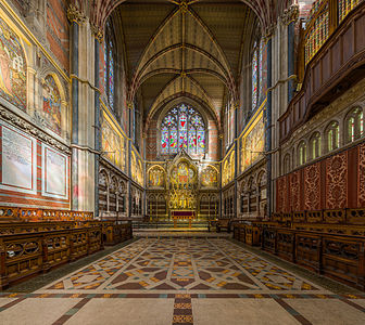
- Category: Commons:Featured pictures/Places/Interiors/Religious buildings
- Info created by Diliff - uploaded by Diliff - nominated by mirrys 13:47, 18 May 2015 (UTC)
- Support -- Mirrys (talk) 13:47, 18 May 2015 (UTC)
- Support 😄 ArionEstar 😜 (talk) 14:27, 18 May 2015 (UTC)
- Support --Martin Falbisoner (talk) 14:37, 18 May 2015 (UTC)
- Comment Just my opinion, this is an alternative of that nomination, or not? --Laitche (talk) 15:25, 18 May 2015 (UTC)
- I must admit, it is very similar but it's not of exactly the same thing. This is of the choir and sanctuary, the other one is of the nave which also shows the choir and sanctuary in the background. The focus is on different parts of the chapel but the views do overlap a bit. Diliff (talk) 17:47, 18 May 2015 (UTC)
- I tend to think the geometric distortions at the top of the pillars at the sides are simply too large to not distract the viewer. I do not find this nomination as good as the pther FP from the same college. Moreover, there is something which appear unbalanced to me in the foreground to the left, see annotation. It may be it is such in the college - often things are not quite symmetrical, it just distrcats my eye a bit. Otherwise very good. -- Slaunger (talk) 20:26, 18 May 2015 (UTC)
- My interior panoramas are quite methodical so I would be surprised if there was a major problem with the symmetry of the panorama, if it's something very asymmetrical in the scene, it's probably because the reality is like that. Yes, the horizontal line near the bottom does seem to tilt a little bit. It's usually the result of not quite centring the panorama perfectly. When the centre point is set slightly to the left or right of the centre (really just a couple of pixels off-centre), it has the effect of shifting the perspective slightly, and horizontal lines will lean a tiny bit. That's what's happened here I think. It wouldn't be so significant that it would completely upset the balance of the scene though and I don't think the slight lean of it is really noticeable unless you line it up against the bottom of the screen or something, but I'm happy to correct it as it's a fairly simple fix. Diliff (talk) 22:08, 18 May 2015 (UTC)
- Support what light! -- Christian Ferrer 12:03, 19 May 2015 (UTC)
- Support --Llez (talk) 12:05, 19 May 2015 (UTC)
- Support Same place and same composition as other nomination, but different point of view and main subject, so different picture. --Kadellar (talk) 12:24, 19 May 2015 (UTC)
- Comment If this nomination (as other nomination), both we can promoted? If so, it's OK for me. --Laitche (talk) 13:05, 19 May 2015 (UTC)
- Support --Tremonist (talk) 14:48, 19 May 2015 (UTC)
- Support --Uoaei1 (talk) 17:08, 19 May 2015 (UTC)
- Support -- Pofka (talk) 18:28, 19 May 2015 (UTC)
- Support Poco2 20:06, 21 May 2015 (UTC)
File:Møns Klint beech trees in gorge 2015-04-01-4864.jpg, featured[edit]
Voting period is over. Please don't add any new votes.Voting period ends on 27 May 2015 at 19:37:57 (UTC)
Visit the nomination page to add or modify image notes.
- Category: Commons:Featured pictures/Places/Natural
- Info If you think the 'sky' looks weird: It is not sky, see the file page :-) Created, uploaded and nominated by Slaunger -- Slaunger (talk) 19:37, 18 May 2015 (UTC)
- Support -- Slaunger (talk) 19:37, 18 May 2015 (UTC)
- Support WOHOW! 😄 ArionEstar 😜 (talk) 19:47, 18 May 2015 (UTC)
- Support --LivioAndronico talk 20:57, 18 May 2015 (UTC)
- Comment You better
fixremove the CAs (some are look like halos) around the trees if you can. --Laitche (talk) 21:19, 18 May 2015 (UTC) - Support The quality is not the best, however, I dont care, I want to see more! --The Photographer (talk) 22:14, 18 May 2015 (UTC)
- Support :) --Tomascastelazo (talk) 23:46, 18 May 2015 (UTC)
- Support Mysterious. --King of ♥ ♦ ♣ ♠ 04:09, 19 May 2015 (UTC)
- Support Creepy. A pity that the quality isn't better. --Code (talk) 05:13, 19 May 2015 (UTC)
- Support per above! --Martin Falbisoner (talk) 05:32, 19 May 2015 (UTC)
- Support — Julian H.✈ 05:58, 19 May 2015 (UTC)
- Support --Frank Schulenburg (talk) 06:10, 19 May 2015 (UTC)
- Support — as others. Yann (talk) 08:15, 19 May 2015 (UTC)
- Support --Kikos (talk) 08:42, 19 May 2015 (UTC)
- Neutral Yes, this color of the ocean is bewitching, enchanting, fascinating and if this color is only this moment like blue hour or dusk or something, it's amazing but seems always this color and if without the color, the composition is ordinary and the quality is not good as others say so I don't think this shot is outstanding. Or am I wrong? only this moment? --Laitche (talk) 10:52, 19 May 2015 (UTC)
- Support --Kadellar (talk) 12:19, 19 May 2015 (UTC)
- Support --Tremonist (talk) 14:52, 19 May 2015 (UTC)
- Support --Halavar (talk) 15:08, 19 May 2015 (UTC)
- Support That's some really horrific stuff. The picture definitely has emotion and perceives it perfectly. -- Pofka (talk) 18:23, 19 May 2015 (UTC)
- Support --El Grafo (talk) 19:36, 19 May 2015 (UTC)
- Laitche, The Photographer, Code and others. Thanks for your reviews! I agree with the comments that if you zoom in on the photo to inspect the pixel quality it is not something that blows your mind. There was a very big contrast in the scene, and to get a wide enough field of view I had to use my crappiest lens, which is the Canon EF-S 18-55 mm kit lens. Thanks to Lightroom it was possible for me to make it into something useful, the default jpg generated by the camera looked less than promising. I have corrected for CA already in LR, but I do agree with Laitche that there are some halos left. It is not something I have skill to further repair, I am afraid. Also, regarding the composition, which Laitche points out: I have several shots from the place and have experimented with many different crops. I have tried to find ones, where there are not so many trees at inclined angles intersecting the sides, but impossible due to the nature of the gorge and the half-tilted trees. The greatest asset is the mood and unusual backgroound light and the photo is best seen in its entirety I think, where I do think the composition is rather appealing. Laitche questions if the view is unusual. I would say it is not particularly unusual at this site, which is one of the most astonishing natural spots in my small home country. I think that at most times of the year it will be possible to find spots with an unusual atmosphere and light. Perhaps not exactly like this, but featurable in some sense if you have a little patience and seek it. This aerial photo of the area gives a good impression of how the milky sea water looks like on a sunny day. For these photos I was just lucky to pass by when the light was good over the sea with shade over the gorge and notice a possible good framing with a 'fake' magic sky by looking down steeply. -- Slaunger (talk) 20:37, 19 May 2015 (UTC)
- Support I wonder if a 2:1 crop (removing the bottom) would be stronger. -- Colin (talk) 22:17, 19 May 2015 (UTC)
- Support --Ralf Roleček 22:55, 19 May 2015 (UTC)
- Support Looks like a still from a Tim Burton movie :-) Impressive photo, high quality, lots of wow.
- Support --Hubertl (talk) 10:54, 20 May 2015 (UTC)
- Support -- Norbert Nagel (talk) 17:15, 21 May 2015 (UTC)
- Support --Famberhorst (talk) 17:17, 21 May 2015 (UTC)
- Support Top, that's a nice atmosphere captured here! Poco2 20:05, 21 May 2015 (UTC)
- Support -- H. Krisp (talk) 10:19, 22 May 2015 (UTC)
- Support --Schnobby (talk) 14:50, 22 May 2015 (UTC)
File:2014 Rohrbach 01.jpg, not featured[edit]
Voting period is over. Please don't add any new votes.Voting period ends on 28 May 2015 at 12:08:59 (UTC)
Visit the nomination page to add or modify image notes.
- Category: Commons:Featured pictures/Places
- Info Rohrbach, Ettenstatt, Ortsansicht,created by Derzno - uploaded by Derzno - nominated by Photomaster2015 -- Photomaster2015 (talk) 12:08, 19 May 2015 (UTC)
- Support -- Photomaster2015 (talk) 12:08, 19 May 2015 (UTC)
- Oppose Random crop. Yann (talk) 14:49, 19 May 2015 (UTC)
- Neutral Not special enough. --Tremonist (talk) 16:40, 19 May 2015 (UTC)
- Oppose Per others. The image absolutely is not extraordinary. Fields lacks the colors so much. Simple "passing through" shot. -- Pofka (talk) 18:06, 19 May 2015 (UTC)
- Oppose No wow. Daniel Case (talk) 02:54, 20 May 2015 (UTC)
- Oppose To tight, random crop, D kuba (talk) 08:34, 20 May 2015 (UTC)
- Oppose Not even a hint of wow. -- Norbert Nagel (talk) 17:18, 21 May 2015 (UTC)
File:MK33871 Limburger Dom.jpg, not featured[edit]
Voting period is over. Please don't add any new votes.Voting period ends on 28 May 2015 at 12:14:37 (UTC)
Visit the nomination page to add or modify image notes.
- Category: Commons:Featured pictures/Places
- Info Limburg Cathedral, created by Martin Kraft - uploaded by Martin Kraft - nominated by Photomaster2015 -- Photomaster2015 (talk) 12:14, 19 May 2015 (UTC)
- Support -- Photomaster2015 (talk) 12:14, 19 May 2015 (UTC)
- Oppose Obstruction by the foreground buildings. Yann (talk) 14:47, 19 May 2015 (UTC)
- Oppose Too cloudy. --Tremonist (talk) 16:43, 19 May 2015 (UTC)
- Oppose I agree to Yann, but disagree to Tremonist. --Uoaei1 (talk) 16:57, 19 May 2015 (UTC)
- Oppose Per Yann. Everything looks way too messy in this composition. Some of these buildings looks quite nice (especially the one at the left down corner) and could even improve the whole composition if captured somehow differently. Though, there also are not appealing spots: that damaged wall looks so poor, middle building covers the church way too much and the "dead" trees adds even more sadness to the already full of grey picture. Although, I actually like the sky as it looks quite dramatic. Pity, but the whole composition doesn't work for me. Sorry. -- Pofka (talk) 17:54, 19 May 2015 (UTC)
- Oppose Sorry. No good composition for me. -- Lothar Spurzem (talk) 22:31, 19 May 2015 (UTC)
- Oppose (formerly FPX) Image does not fall within the guidelines, of the problems noted above Daniel Case (talk) 02:51, 20 May 2015 (UTC) It does fall within the guidelines (Anyone can revert my edit.). --Laitche (talk) 11:34, 20 May 2015 (UTC)
- Comment I am repeating myself, but this image should not be FPXed. FPX is not meant to be the last nail in the coffin, but a simple process for images that have zero chance because of nonnegotiable flaws. A few people say that they don't think that the image is good enough (and that is absolutely fine), but that does not mean that the image is "not falling within the guidelines" (yes, you can construct the case that this is bad composition, but Limburg is a very tight-packed place and I myself failed to get any reasonable shot of the cathedral from this direction, so that image is pretty good given the circumstances and the photographer is not at fault). FPX is for bad images and while this perhaps is no FP, it is not a bad image. I think that I (and at least Poco and Colin in other cases) made myself clear that using FPX for such cases is rude to the photographer and nominator and beyond that serves nearly no use (an image without support has only five days anyway). --DXR (talk) 05:30, 20 May 2015 (UTC)
- Info Hi everybody. Thanks for commenting on this picture, I'ld never have nominated here myself. This photo was just a kind of test shot taken from the roof top of a parking garage why waiting for the next train in the train station near by. I wasn't realy satisfied with the perspectiv since there where some realy ugly buildungs framing this shot at the right and bottom, so there was not realy a chance to take a different crop. I uploaded this photos and some detail shoots (

 ) because I realy liked the lighting and the sky, but I am definitly not done with this cathedral ;)
@Pofka: These trees are not dead, they are just a bit late for early spring ;) // Martin K. (talk) 08:32, 21 May 2015 (UTC)
File:Tarassac hamlet, Hérault.jpg, featured[edit]
Voting period is over. Please don't add any new votes.Voting period ends on 24 May 2015 at 11:27:27 (UTC)
Visit the nomination page to add or modify image notes.
- Category: Commons:Featured pictures/Places/Natural
- Info created by Christian Ferrer - uploaded by Christian Ferrer - nominated by Christian Ferrer -- Christian Ferrer 11:27, 15 May 2015 (UTC)
- Support -- Christian Ferrer 11:27, 15 May 2015 (UTC)
- Support Nice mountain range with all shades of green and blue. --Tremonist (talk) 12:11, 15 May 2015 (UTC)
- Support. Nice -- George Chernilevsky talk 18:24, 15 May 2015 (UTC)
- Support Surely nice! 😄 ArionEstar 😜 (talk) 19:51, 15 May 2015 (UTC)
- Oppose Nice view, but neither the lighting nor the composition work for me. The river is there but doesn't stand out to help the composition. Furthermore the big trees in the foreground are too predominating, sorry, Poco2 20:00, 15 May 2015 (UTC)
- Oppose Sorry, the colors are a bit too muted for me. --King of ♥ ♦ ♣ ♠ 06:28, 16 May 2015 (UTC)
- Comment In my defense, it is the last hour of the sun and the colors of spring were as spectacular in reality. Vibrance aside, the file is edited very little and very close to the RAW file. The spectacular colors of the last sun hour in this beautifull valley are of course the main subject here, not at all any river. The particular light of that time in that location has made this a magical place during some moments. I am particularly happy and lucky to have seen this show, to have had the possibility to take the photo and to share it to you. This work a lot for me. -- Christian Ferrer 08:13, 16 May 2015 (UTC)
- Support For me is very beautiful,good light,composition isn't good like others but ever good. I love your panoramas --LivioAndronico talk 11:28, 16 May 2015 (UTC)
- Support --Code (talk) 06:12, 17 May 2015 (UTC)
- New version @King of Hearts: , @Poco a poco: , @Laitche: , thanks for your rewiews, the first time I decreased too much the luminosity, I have now uploaded a version with more light. -- Christian Ferrer 12:56, 17 May 2015 (UTC)
- I think my favorite is still the very first version uploaded. I actually like the hazy feeling, it's just that on the second version I feel saturation was turned down way too much. I think the contrast boost in the third and fourth versions was unnecessary. --King of ♥ ♦ ♣ ♠ 14:35, 17 May 2015 (UTC)
- The main topic I see here is the composition rather that then curves, and that wasn't addressed in the new version. Poco2 16:40, 17 May 2015 (UTC)
- Done @King of Hearts: I uploaded a version very close to the first version but just with a little more light. -- Christian Ferrer 15:44, 17 May 2015 (UTC)
- @Christian Ferrer: OK, I withdraw my vote. --Laitche (talk) 19:37, 19 May 2015 (UTC)
- Support --Alex Florstein (talk) 14:10, 17 May 2015 (UTC)
- Oppose Composition, content, lights/shadows. --Kikos (talk) 05:49, 18 May 2015 (UTC)
- Support Nice landscape --Uoaei1 (talk) 17:29, 19 May 2015 (UTC)
- Support -- Pofka (talk) 18:46, 19 May 2015 (UTC)
- Support --Famberhorst (talk) 15:58, 21 May 2015 (UTC)
- Support New version looks better:) --Halavar (talk) 13:25, 22 May 2015 (UTC)
Hasht Behesht, not featured[edit]
Voting period is over. Please don't add any new votes.Voting period ends on 28 May 2015 at 11:01:49 (UTC)
Visit the nomination page to add or modify image notes.
-
 2014 photo
 -
 1840 painting
- Category: Commons:Featured_pictures/Places/Interiors
- Info created by Pascal Coste, Monfie - uploaded by Monfie - nominated by Monfie -- Monfie (talk) 11:01, 19 May 2015 (UTC)
- Support -- Monfie (talk) 11:01, 19 May 2015 (UTC)
- Question What exactly are you nominating? The photo, the drawing or both? --Kadellar (talk) 12:13, 19 May 2015 (UTC)
- Neutral Left image: Ceiling too dark, upper part of the dome blurred. Right image: Painting seems ok too me. --Tremonist (talk) 12:09, 20 May 2015 (UTC)
- Comment @مانفی: I {{Support}} only the painting. 😄 ArionEstar 😜 (talk) 23:31, 22 May 2015 (UTC)
File:Caves cliff Matala Crete Greece.jpg[edit]
Voting period is over. Please don't add any new votes.Voting period ends on 2 Jun 2015 at 16:00:49 (UTC)
Visit the nomination page to add or modify image notes.
- Category: Commons:Featured pictures/Places
- Info all by me -- Jebulon (talk) 16:00, 24 May 2015 (UTC)
- Support View of the caves in the cliffs of Matala, Crete, Greece. They are artificial, and were dug at the neolithic period. Some of them where used as tombs. in the 60's, it was a famous rendez-vous place for the hippies (song "Carey", by Joni Mitchell, 1971). I don't think we have FP of this kind of areas, so the category "others", in "places" is the more relevant, if promoted.-- Jebulon (talk) 16:00, 24 May 2015 (UTC)
- Oppose Sorry,not outstanding for me. --LivioAndronico talk 16:47, 24 May 2015 (UTC)
- Oppose Certainly interesting but not among the very best images on Commons IMHO. Bright parts are overexposed, the composition lacks some interesting idea IMHO, and I miss some scale reference. No idea what size the holes are. --Kreuzschnabel 17:01, 24 May 2015 (UTC)
- No overexposition no where, sorry. No loss of detail, please see histogram.
 I withdraw my nomination--Jebulon (talk) 19:41, 24 May 2015 (UTC)
File:Lake Bondhus Norway 2862 plastic-foil-relief.jpg[edit]
Voting period is over. Please don't add any new votes.Voting period ends on 31 May 2015 at 08:52:56 (UTC)
Visit the nomination page to add or modify image notes.
- Category: Commons:Featured pictures/Places/Natural
- Info all by -- Alchemist-hp (talk) 08:52, 22 May 2015 (UTC)
- Support -- Alchemist-hp (talk) 08:52, 22 May 2015 (UTC)
- Oppose I don't see the point of this plastic-foil-relief. Yann (talk) 09:21, 22 May 2015 (UTC)
- Support wonderful artwork. --Pölkkyposkisolisti (talk) 10:06, 22 May 2015 (UTC)
- Oppose I don’t see any improvement compared to the original. And what’s the point of the central flashlight glare? --Kreuzschnabel 10:18, 22 May 2015 (UTC)
- Oppose Maybe great artwork, but central flashlight glare disqualifies photo as FP, D kuba (talk) 10:24, 22 May 2015 (UTC)
- Oppose Is this your reply to Colin's blurred bluebells image? ;-) Diliff (talk) 11:52, 22 May 2015 (UTC)
- Oppose It is a nice piece of art, but there are reflections visible. --Tremonist (talk) 12:44, 22 May 2015 (UTC)
- Err, it is not a painting, the 'reflections' are not real. It is a photograph which has been digitally altered to look like this. Diliff (talk) 13:21, 22 May 2015 (UTC)
- Oppose What is the merit of the "plastic foil relief effect" for FP? For me it looks rather strange. --Tuxyso (talk) 21:16, 22 May 2015 (UTC)
- Oppose I don't see the point of featuring two different edits of the same photo. --King of ♥ ♦ ♣ ♠ 21:19, 22 May 2015 (UTC)
- I withdraw my nomination. I recognize it, that's ridiculous. It is a "simple artwork" made by somy mouse clicks via photoshop. Such a thing can never be an FP-image for me. Thanks to Archaeodontosaurus for this comment too. --Alchemist-hp (talk) 07:21, 23 May 2015 (UTC)
- So, you've basically admitted to being a troll with this nomination then. Congratulations. Mission accomplished. Diliff (talk) 10:56, 23 May 2015 (UTC)
- Mah...--LivioAndronico talk 20:02, 23 May 2015 (UTC)
[[:]], featured[edit]
Voting period is over. Please don't add any new votes.Voting period ends on 9 May 2015 at 14:04:42 (UTC)
Visit the nomination page to add or modify image notes.
- Category: Static non-photographic media
- Info created by Candido Portinari - uploaded by Webysther - nominated by Webysther -- Webysther (talk) 14:04, 30 April 2015 (UTC)
- Support -- Webysther (talk) 14:04, 30 April 2015 (UTC)
- Support Very very very better,you have my sure support!--LivioAndronico talk 14:58, 30 April 2015 (UTC)
- Support 😄 ArionEstar 😜 (talk) 16:50, 30 April 2015 (UTC)
- Support -- Pofka (talk) 18:27, 30 April 2015 (UTC)
- weak I don´t know the original, therefore I don´t know the original colors and - above all - I have no idea about the contrasting. though pro, even weak.--Hubertl (talk) 18:50, 30 April 2015 (UTC)
- Truth! :D The contrast is weak in original, the paint use tint water based. More info (portuguese) -- Webysther (talk) 00:20, 1 May 2015 (UTC)
- I capture using proPhoto RGB color space, but to internet I convert to sRGB. The red change a bit, unfortunally this problem is about color space. Other colors in my monitor (calib.) is faithful to the original. -- Webysther (talk) 00:23, 1 May 2015 (UTC)
- Support Yann (talk) 20:12, 30 April 2015 (UTC)
- Comment IMO too soft. May be better with more contrast.--XRay talk 08:17, 1 May 2015 (UTC)
- @XRay: Done. 😄 ArionEstar 😜 (talk) 21:13, 5 May 2015 (UTC)
- @XRay:
- Comment Webysther I told about copyright violation, I did not get in to this, because I trusted in you to do the right thing, until 2032 this photos are not in public domain, they are not free. -- RTA 10:36, 2 May 2015 (UTC)
- Support --LuisArmandoRasteletti (talk) 23:00, 3 May 2015 (UTC)
- Support Nice, Well done --The Photographer (talk) 19:05, 4 May 2015 (UTC)
- Support --Tremonist (talk) 12:56, 5 May 2015 (UTC)
File:Misvormde nevelzwam (Clitocybe nebularis) 02.JPG, featured[edit]
_02.JPG&action=edit§ion=T-1)
Voting period is over. Please don't add any new votes.Voting period ends on 29 May 2015 at 04:58:45 (UTC)
Visit the nomination page to add or modify image notes.
_02.JPG/349px-Misvormde_nevelzwam_(Clitocybe_nebularis)_02.jpg)
- Category: *Category: Commons:Featured pictures/Fungi#Clitocybe nebularis
- Info Deformed clouded agaric (Clitocybe nebularis), a mushroom that grows on another mushroom. Rare malformation (Teratology).created by Famberhorst - uploaded by Famberhorst - nominated by Famberhorst -- Famberhorst (talk) 04:58, 20 May 2015 (UTC)
- Support -- Famberhorst (talk) 04:58, 20 May 2015 (UTC)
- Support -- H. Krisp (talk) 10:46, 20 May 2015 (UTC)
- Support Very detailed. --Tremonist (talk) 12:15, 20 May 2015 (UTC)
- Support --LivioAndronico talk 18:03, 20 May 2015 (UTC)
- Support --XRay talk 18:49, 21 May 2015 (UTC)
- Support Fungi jump! 😄 ArionEstar 😜 (talk) 21:36, 21 May 2015 (UTC)
- Support --LC-de (talk) 09:29, 22 May 2015 (UTC)
- Support --Halavar (talk) 13:21, 22 May 2015 (UTC)
- Support --Llez (talk) 06:19, 23 May 2015 (UTC)
- Support --Hubertl (talk) 10:19, 23 May 2015 (UTC)
- Support -- Pofka (talk) 15:37, 24 May 2015 (UTC)
File:Santa Maria in Trastevere - Cappella Altemps.jpg, featured[edit]
Voting period is over. Please don't add any new votes.Voting period ends on 27 May 2015 at 08:25:38 (UTC)
Visit the nomination page to add or modify image notes.
- Category: Commons:Featured pictures/Non-photographic_media#Religion
- Info All by -- LivioAndronico talk 08:25, 18 May 2015 (UTC)
- Support -- LivioAndronico talk 08:25, 18 May 2015 (UTC)
- Support Impressive ceiling. --Tremonist (talk) 14:53, 19 May 2015 (UTC)
- Support 😄 ArionEstar 😜 (talk) 16:38, 19 May 2015 (UTC)
- Support --Uoaei1 (talk) 17:00, 19 May 2015 (UTC)
- Support Wow. -- Pofka (talk) 18:21, 19 May 2015 (UTC)
- Support You are lucky with this ceiling, so nice, has issues so i would reshoot when that time come. It is wort of it. Then just put "replace". --Mile (talk) 19:03, 19 May 2015 (UTC)
- Comment Look at the left bottom corner Poco2 20:26, 19 May 2015 (UTC)
- see what? --LivioAndronico talk 20:33, 19 May 2015 (UTC)
-
- Ops
 Done --LivioAndronico talk 23:20, 19 May 2015 (UTC)
- Ops
- Support -- George Chernilevsky talk 05:21, 20 May 2015 (UTC)
- Support --Jacek Halicki (talk) 10:16, 20 May 2015 (UTC)
- Support --Hubertl (talk) 10:54, 20 May 2015 (UTC)
- Support --Famberhorst (talk) 18:07, 20 May 2015 (UTC)
- Support -- Christian Ferrer 04:41, 21 May 2015 (UTC)
- In my opinion: I think when the category is Non-photographic media, the creator is a painter in this case. If the category is interiors or something, the photographer is a creator. --Laitche (talk) 10:05, 22 May 2015 (UTC)
- Yes like these others....--LivioAndronico talk 11:03, 22 May 2015 (UTC)
File:Wrocław Główny (Breslau Hauptbahnhof) by night.JPG, featured[edit]
_by_night.JPG&action=edit§ion=T-1)
Voting period is over. Please don't add any new votes.Voting period ends on 24 May 2015 at 14:54:12 (UTC)
Visit the nomination page to add or modify image notes.
_by_night.JPG/472px-Wroc%c5%82aw_G%c5%82%c3%b3wny_(Breslau_Hauptbahnhof)_by_night.jpg)
- Category: Commons:Featured pictures/Places/Interiors
- Info all by Pudelek -- Pudelek (talk) 14:54, 15 May 2015 (UTC)
- Support -- Pudelek (talk) 14:54, 15 May 2015 (UTC)
- Support Fascinating angle on a lovely old train shed. A bit distorted and unsharp near the left edge, and the signals are a little posterized, but as I so often say I don't think that's enough to ruin this. Daniel Case (talk) 15:21, 15 May 2015 (UTC)
- Support --LivioAndronico talk 21:12, 15 May 2015 (UTC)
- Support Neutral Quality is OK for me and I like this empty and antique-looking mood. --Laitche (talk) 22:07, 15 May 2015 (UTC)
- Support - Ambiance overcomes technical shortcomings. — Crisco 1492 (talk) 01:24, 16 May 2015 (UTC)
- Support. Nice use of line and perspective. I think the composition would be even better if the point of convergence were a bit further to the right. --King of ♥ ♦ ♣ ♠ 06:30, 16 May 2015 (UTC)
- Support --Halavar (talk) 10:36, 16 May 2015 (UTC)
- Support --Martin Falbisoner (talk) 09:18, 17 May 2015 (UTC)
- Oppose Sorry, but imo the right side crop is not good. The building either needs some space or should be cut, but this creates an unbalanced composition for me. --DXR (talk) 10:53, 17 May 2015 (UTC)
- Support --Jacek Halicki (talk) 12:03, 17 May 2015 (UTC)
- Support --Code (talk) 15:37, 17 May 2015 (UTC)
- Support --Tremonist (talk) 13:07, 19 May 2015 (UTC)
- Support -- Pofka (talk) 18:45, 19 May 2015 (UTC)
- Oppose There are hundreds of train station photos on Commons. This one is a QI but not more. Why downsized 2/3? The right hand side isn't very interesting and no people to add interest to make up for this. -- Colin (talk) 19:13, 19 May 2015 (UTC)
- Oppose Per DXR. — Julian H.✈ 13:26, 20 May 2015 (UTC)
File:2014 Ostrawa, Kościół Niepokalanego Poczęcia NMP 02.jpg, featured[edit]
Voting period is over. Please don't add any new votes.Voting period ends on 25 May 2015 at 10:34:38 (UTC)
Visit the nomination page to add or modify image notes.
- Category: Commons:Featured pictures/Places/Architecture/Religious buildings
- Info all by Halavar - nominated by Halavar -- Halavar (talk) 10:34, 16 May 2015 (UTC)
- Support -- Halavar (talk) 10:34, 16 May 2015 (UTC)
- Support Nice church! 😄 ArionEstar 😜 (talk) 10:46, 16 May 2015 (UTC)
- Weak Support The quality isn't outstanding but the composition is very good --LivioAndronico talk 11:31, 16 May 2015 (UTC)
- Comment Looks a bit hazy. Raise the contrast maybe? --King of ♥ ♦ ♣ ♠ 16:10, 16 May 2015 (UTC)
- Support --Jacek Halicki (talk) 11:58, 17 May 2015 (UTC)
- Support D kuba (talk) 11:57, 19 May 2015 (UTC)
- Support --Llez (talk) 12:20, 19 May 2015 (UTC)
- Support --Tremonist (talk) 13:14, 19 May 2015 (UTC)
- Oppose Not eye-catching enough for me. --Uoaei1 (talk) 17:26, 19 May 2015 (UTC)
- Weak support One of these pictures when you doubt that it is FP, but in the same way you find it quite good. Probably minimum standards are passed. -- Pofka (talk) 18:43, 19 May 2015 (UTC)
- Oppose A good QI of this church. -- Colin (talk) 19:33, 19 May 2015 (UTC)
- Support Daniel Case (talk) 02:56, 20 May 2015 (UTC)
- Weak oppose Nice composition and good perspective control but the colours and the quality are not reaching the FP standards, imho. --Laitche (talk) 08:54, 22 May 2015 (UTC)
- Oppose. Yes, I think this is more of a QI than FP. There's nothing wrong with a simple composition like this but it needs something extra (nice light, lots of detail, etc) for it to reach FP for me. Diliff (talk) 12:00, 22 May 2015 (UTC)
- Oppose Per Diliff Poco2 19:15, 22 May 2015 (UTC)
- Support --Pudelek (talk) 08:41, 25 May 2015 (UTC)
File:2015 Góry Złote z Borówkowej.jpg, featured[edit]
Voting period is over. Please don't add any new votes.Voting period ends on 29 May 2015 at 10:10:08 (UTC)
Visit the nomination page to add or modify image notes.
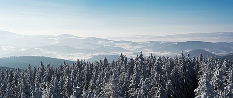
- Category: Commons:Featured pictures/Places/Natural
- Info All by me -- Jacek Halicki (talk) 10:10, 20 May 2015 (UTC)
- Support -- Jacek Halicki (talk) 10:10, 20 May 2015 (UTC)
- Support Beautiful shades of light blue. :) --Tremonist (talk) 12:15, 20 May 2015 (UTC)
- Support --LivioAndronico talk 18:03, 20 May 2015 (UTC)
- Support D kuba (talk) 20:38, 20 May 2015 (UTC)
- Support Pretty Poco2 18:54, 21 May 2015 (UTC)
- Support Light… 😄 ArionEstar 😜 (talk) 21:35, 21 May 2015 (UTC)
- Support --Halavar (talk) 13:21, 22 May 2015 (UTC)
- Support --Llez (talk) 06:20, 23 May 2015 (UTC)
- Support YES! Very nice fog. --Ralf Roleček 21:14, 23 May 2015 (UTC)
- Support Very good. If you would use slightly less noise reduction, I think you could eliminate the posterization in the sky. — Julian H.✈ 10:22, 24 May 2015 (UTC)
- Support -- Pofka (talk) 15:37, 24 May 2015 (UTC)
File:Fireworks over Houston, Texas (LOC).jpg, not featured[edit]
.jpg&action=edit§ion=T-1)
Voting period is over. Please don't add any new votes.Voting period ends on 25 May 2015 at 22:21:19 (UTC)
Visit the nomination page to add or modify image notes.
.jpg/384px-Fireworks_over_Houston%2c_Texas_(LOC).jpg)
- Category: Commons:Featured pictures/Places
- Info created by Carol M. Highsmith, uploaded and nominated by -- Yann (talk) 22:21, 16 May 2015 (UTC)
- Support There is some noise, but seeing the resolution, I hope you will accept it... -- Yann (talk) 22:21, 16 May 2015 (UTC)
- Weak Oppose. For a scan that's not sharp at full res, I accept that it was scanned perhaps too precisely and try to look at it at a reasonable size, 3000px in this case. It's pretty much sharp except for the building on the right. Nice fireworks but I can't have such an important element of the composition be visibly unsharp at 7 MP. --King of ♥ ♦ ♣ ♠ 23:08, 16 May 2015 (UTC)
- Support Photo from 1980. Its good to see some of it. --Mile (talk) 05:51, 17 May 2015 (UTC)
- Oppose This is bad also for 1980 --LivioAndronico talk 09:35, 17 May 2015 (UTC)
- Support Per Mile. 😄 ArionEstar 😜 (talk) 13:54, 17 May 2015 (UTC)
- Support --Ralf Roleček 09:17, 18 May 2015 (UTC)
- Support --Tremonist (talk) 14:29, 19 May 2015 (UTC)
- Support --Halavar (talk) 15:13, 19 May 2015 (UTC)
- Support Good scene, and acceptable sharpness if downsized. -- Colin (talk) 21:05, 19 May 2015 (UTC)
- Oppose The resolution (7475px) is not remarkable since this is an analog photography, Simply the quality is not good and spectators are a bit distracting, imho. --Laitche (talk) 08:23, 22 May 2015 (UTC)
- Oppose Per Laitche Poco2 19:17, 22 May 2015 (UTC)
- Support -- Christian Ferrer 21:01, 24 May 2015 (UTC)
* Striked --Cart (talk) 19:35, 4 October 2018 (UTC)
![]() Oppose For King --Σπάρτακος (talk) 10:54, 25 May 2015 (UTC)
Oppose For King --Σπάρτακος (talk) 10:54, 25 May 2015 (UTC)
- Info Eligible for re-nomination due to due to sock double vote. 4 October 2018 --Cart (talk) 19:11, 4 October 2018 (UTC)
File:Gombak Selangor Batu-Caves-01.jpg, featured[edit]
Voting period is over. Please don't add any new votes.Voting period ends on 29 May 2015 at 13:34:01 (UTC)
Visit the nomination page to add or modify image notes.
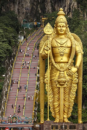
- Category: Commons:Featured pictures/Places
- Info The 'Lord Murugan Statue' in Batu Caves, Malaysia is the tallest statue of Hindu deity in Malaysia and second tallest statue of Hindu deity in the world.
All by -- CEphoto, Uwe Aranas (talk) 13:34, 20 May 2015 (UTC) - Support -- CEphoto, Uwe Aranas (talk) 13:34, 20 May 2015 (UTC)
- Support --Kikos (talk) 13:54, 20 May 2015 (UTC)
- Weak Support Great view of the statue! (What counts most.) But background blurred a little and readability of inscriptions below could be better. --Tremonist (talk) 13:55, 20 May 2015 (UTC)
- Support Great everything!!! --Tomascastelazo (talk) 15:49, 20 May 2015 (UTC)
- Support 😄 ArionEstar 😜 (talk) 16:44, 20 May 2015 (UTC)
- Support Now this is what we mean by "wow". Daniel Case (talk) 16:55, 20 May 2015 (UTC)
- Support --Yann (talk) 17:44, 20 May 2015 (UTC)
- Comment Great work and interesting. One perhaps improvable aspect: The cliffs in the background at the top have an almost plastic look. Maybe noise reduction should be applied less agressively there to better bring out the texture? -- Slaunger (talk) 20:22, 20 May 2015 (UTC)
- Support - I doubt the signs would be more legible unless Uwe did a panoramic stitch so that they weren't right at the edge of the frame. Wow overcomes minor technical issues for me. — Chris Woodrich (talk) 23:39, 20 May 2015 (UTC)
- Support Might be slightly oversharpened, but very good anyways. --King of ♥ ♦ ♣ ♠ 00:51, 21 May 2015 (UTC)
- Support --Famberhorst (talk) 04:56, 21 May 2015 (UTC)
- Support per above --Martin Falbisoner (talk) 06:33, 21 May 2015 (UTC)
- Support --DXR (talk) 07:44, 21 May 2015 (UTC)
- Support --Cayambe (talk) 13:50, 21 May 2015 (UTC)
- Weak Support Slightly over-sharpened at full size for my taste. On the other hand, that makes the statue really pop at smaller sizes (e.g. 682 × 1,024). --El Grafo (talk) 18:33, 21 May 2015 (UTC)
- Support The bottom crop is tricky and the left part doesn't look straight, but hell of a picture anyhow Poco2 18:59, 21 May 2015 (UTC)
- Support --· Favalli ⟡ 01:27, 22 May 2015 (UTC)
- Support --Halavar (talk) 13:20, 22 May 2015 (UTC)
- Support --LC-de (talk) 13:53, 22 May 2015 (UTC)
- weak support Too much contrast. Did you push on the Clarity knob too far? -- Colin (talk) 20:07, 22 May 2015 (UTC)
- Support --Llez (talk) 06:21, 23 May 2015 (UTC)
- Support --Hubertl (talk) 10:18, 23 May 2015 (UTC)
- Support --Jacek Halicki (talk) 15:23, 23 May 2015 (UTC)
- Support --Alchemist-hp (talk) 09:23, 24 May 2015 (UTC)
- Support --Tuxyso (talk) 09:33, 24 May 2015 (UTC)
- Support but oversharpened. — Julian H.✈ 10:31, 24 May 2015 (UTC)
- Support -- Pofka (talk) 15:35, 24 May 2015 (UTC)
File:Gorna Leshnica Shara.jpg, not featured[edit]
Voting period is over. Please don't add any new votes.Voting period ends on 25 May 2015 at 21:40:15 (UTC)
Visit the nomination page to add or modify image notes.
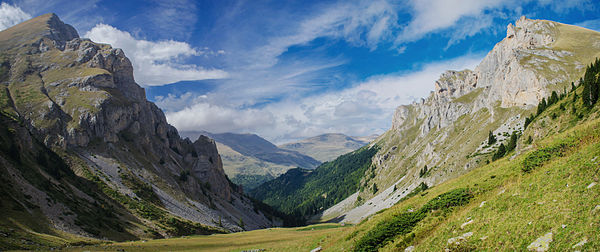
- Category: Commons:Featured pictures/Places/Natural
- Info created by Gadjowsky - uploaded by Gadjowsky - nominated by Kiril Simeonovski -- Kiril Simeonovski (talk) 21:40, 16 May 2015 (UTC)
- Support -- Kiril Simeonovski (talk) 21:40, 16 May 2015 (UTC)
- Weak Support. Excellent composition and colors. There is some minor posterization in the sky and chromatic aberration in the mountains. --King of ♥ ♦ ♣ ♠ 22:07, 16 May 2015 (UTC)
- Oppose Nice view and light but not so details (unsharp) and oversaturation plus CAs, sorry. --Laitche (talk) 22:49, 16 May 2015 (UTC)
- Heartwrenching oppose Such a great shot.. Such a great angle. Such great light. Such great colors ... until you see that patch of just not-quite-right blue in the sky on the right. And then all the unsharpness and CA, and you want to cry. "Where did it go wrong?" you find yourself asking. Well, shooting it at anything below f/11 was a start. And with ISO 200, to boot. Daniel Case (talk) 05:29, 17 May 2015 (UTC)
- Oppose per Daniel Case, I'm afraid. Though I'm not sure whether f/8 and ISO 200 are really to blame here. What a pity! --Martin Falbisoner (talk) 09:16, 17 May 2015 (UTC)
- Neutral Excellent composition and colors but not very good quality --LivioAndronico talk 09:36, 17 May 2015 (UTC)
- Info Gadjowsky, Kiril Simeonovski Something went wrong with equipement i suppose. This is second serie of great photos ruined by something. I see its made with D5100 series, nothing wrong with EXIF. D5100 has affected series with sensor position, find it on forum and check serial Number of camera. Some made it on their own, hex key solved it. I would try with some other lens first too see if it repeats and its not the lens. --Mile (talk) 12:30, 17 May 2015 (UTC)
- Some of the problem is processing, not just softness/CA. Were the frames taken at the same exposure or was too much post-processing applied? Polarising lens? -- Colin (talk) 15:46, 17 May 2015 (UTC)
File:Purekkari neeme rändrahn 2014.jpg, featured[edit]
Voting period is over. Please don't add any new votes.Voting period ends on 29 May 2015 at 13:03:37 (UTC)
Visit the nomination page to add or modify image notes.
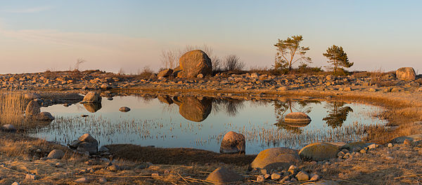
- Category: Commons:Featured pictures/Places/Natural
- Info created and uploaded by MinuHiiumaa - nominated by Kruusamägi (talk) 13:03, 20 May 2015 (UTC)
- Support -- Kruusamägi (talk) 13:03, 20 May 2015 (UTC)
- Neutral Nice lights, but a little too dark. --Tremonist (talk) 13:51, 20 May 2015 (UTC)
- Comment Nice colors and light but some frame's focus are changed. If that problem is fixed, I would support. --Laitche (talk) 18:40, 20 May 2015 (UTC)
- Support Excellent lighting. Quality is fine IMO. --King of ♥ ♦ ♣ ♠ 00:52, 21 May 2015 (UTC)
- Support Per King of Hearts. --Code (talk) 04:46, 21 May 2015 (UTC)
- Support -- Norbert Nagel (talk) 17:16, 21 May 2015 (UTC)
- Support --XRay talk 18:48, 21 May 2015 (UTC)
- Support Nice light, place and quality, FP to me Poco2 18:55, 21 May 2015 (UTC)
- Support beautiful --99of9 (talk) 05:19, 22 May 2015 (UTC)
- Support --Ivar (talk) 05:20, 22 May 2015 (UTC)
- Support -- Christian Ferrer 11:07, 22 May 2015 (UTC)
- Support --Halavar (talk) 13:20, 22 May 2015 (UTC)
- Support -- Colin (talk) 20:03, 22 May 2015 (UTC)
- Support --Llez (talk) 06:20, 23 May 2015 (UTC)
- Support --Alchemist-hp (talk) 09:23, 24 May 2015 (UTC)
- Support. It's realtively dark, but I understand that brightening it would weaken the colours, so that's ok. — Julian H.✈ 10:16, 24 May 2015 (UTC)
- Support -- Pofka (talk) 15:36, 24 May 2015 (UTC)
- Support Took a while for this image to grow on me, but it did. Suggests a Roger Dean Yes cover. Daniel Case (talk) 14:53, 25 May 2015 (UTC)
File:Still Pond 2, Isabella Plantation, Richmond Park, London, UK - Diliff.jpg, featured[edit]
Voting period is over. Please don't add any new votes.Voting period ends on 29 May 2015 at 17:24:39 (UTC)
Visit the nomination page to add or modify image notes.
- Category: Commons:Featured pictures/Places/Natural
- Info created by Diliff - uploaded by Diliff - nominated by Laitche -- Laitche (talk) 17:24, 20 May 2015 (UTC)
- Support Depicting the interplay of light and the shadow. Beautiful colors, nice composition and good quality. -- Laitche (talk) 17:24, 20 May 2015 (UTC)
- Comment Not bad, but the other one is better. Too dark for me. Yann (talk) 18:00, 20 May 2015 (UTC)
- Support. It's a bit dark yes but it's a shadowy scene, with only small patches of light reaching the pond. I think the brightness is suitable for the scene. And I think it's different enough to the other FPC that it can stand alone. The focus is mostly on the reflection of the pond, with the flowers and trees framing it. Diliff (talk) 19:36, 20 May 2015 (UTC)
- Support Wow, what colors, reflection and light. And nice with a digression from church interiors;) It is good to come out! -- Slaunger (talk) 20:18, 20 May 2015 (UTC)
- Now this one I can Support. Daniel Case (talk) 21:46, 20 May 2015 (UTC)
- Support - Very dreamy. — Chris Woodrich (talk) 23:33, 20 May 2015 (UTC)
- Support I like the diagonals formed by the light. --King of ♥ ♦ ♣ ♠ 00:51, 21 May 2015 (UTC)
- Support --Kikos (talk) 04:35, 21 May 2015 (UTC)
- Support --Code (talk) 04:43, 21 May 2015 (UTC)
- Support of course, no doubt, awesome --Martin Falbisoner (talk) 06:32, 21 May 2015 (UTC)
- Support --Tremonist (talk) 13:50, 21 May 2015 (UTC)
- Support This look like a paint --LivioAndronico talk 19:40, 21 May 2015 (UTC)
- Support -- H. Krisp (talk) 10:20, 22 May 2015 (UTC)
- Support --Llez (talk) 06:21, 23 May 2015 (UTC)
- Support --Jacek Halicki (talk) 15:15, 23 May 2015 (UTC)
- Support -- Pofka (talk) 15:35, 24 May 2015 (UTC)
File:Rainbow-spiral lollipop.JPG, not featured[edit]
Voting period is over. Please don't add any new votes.Voting period ends on 26 May 2015 at 10:48:42 (UTC)
Visit the nomination page to add or modify image notes.

- Category: Commons:Featured pictures/Food and drink
- Info All by AntanO
- Support -- AntanO 10:48, 17 May 2015 (UTC)
- Support Good lighting which supplements the object well. Could use a bit tighter cropping though. --LB 15:31, 17 May 2015 (UTC)
- Oppose Overprocessing, postarized. --Laitche (talk) 16:35, 17 May 2015 (UTC)
- Comment Could you specify? --AntanO 16:47, 17 May 2015 (UTC)
- OK, I'm not 100% sure but added a few notes. --Laitche (talk) 16:58, 17 May 2015 (UTC)
- It's not posterization, but "nature" of the candy. --AntanO 17:09, 17 May 2015 (UTC)
- If it's not, I don't mind to remove the notes at all :) --Laitche (talk) 17:31, 17 May 2015 (UTC)
- Actually I agree with you, it almost definitely is posterization, but it's not too significant. Diliff (talk) 13:19, 18 May 2015 (UTC)
- Yes, not too significant, IMO posterization mostly means overprocessing. --Laitche (talk) 15:16, 18 May 2015 (UTC)
- Sometimes it is an indication, but not always. I think we should judge the nomination by what we see though, not by the mistakes we think have been made. I'm not saying you can't have an opinion, but your opinion on what could or should be done differently should be independent of your opinion of the image itself. Just my thoughts on judging anyway. Diliff (talk) 15:50, 19 May 2015 (UTC)
- Yes, not too significant, IMO posterization mostly means overprocessing. --Laitche (talk) 15:16, 18 May 2015 (UTC)
- Actually I agree with you, it almost definitely is posterization, but it's not too significant. Diliff (talk) 13:19, 18 May 2015 (UTC)
- If it's not, I don't mind to remove the notes at all :) --Laitche (talk) 17:31, 17 May 2015 (UTC)
- It's not posterization, but "nature" of the candy. --AntanO 17:09, 17 May 2015 (UTC)
- OK, I'm not 100% sure but added a few notes. --Laitche (talk) 16:58, 17 May 2015 (UTC)
- Support Its not bad, i like the colors, but background not so much.
At least could be croped some (see note).Done. --Mile (talk) 12:03, 18 May 2015 (UTC) - Question Object isn't in the centre of image. So it was your target? D kuba (talk) 11:22, 19 May 2015 (UTC)
- Neutral Good colours. --Tremonist (talk) 14:43, 19 May 2015 (UTC)
- Support I know, isn't the best for quality but I love original images --LivioAndronico talk 18:11, 20 May 2015 (UTC)
- Support Per Livioandronico2013 Poco2 19:16, 22 May 2015 (UTC)
- Support --Σπάρτακος (talk) 10:55, 25 May 2015 (UTC)
File:14 05 2015 Gomphus pulchellus Keiljungfer 05.jpg, featured[edit]
Voting period is over. Please don't add any new votes.Voting period ends on 30 May 2015 at 17:04:01 (UTC)
Visit the nomination page to add or modify image notes.
- Category: Commons:Featured pictures/Animals/Arthropods/Odonata
- Info created, uploaded and nominated by -- Norbert Nagel (talk) 17:04, 21 May 2015 (UTC)
- Support -- Norbert Nagel (talk) 17:04, 21 May 2015 (UTC)
- Support --Martin Falbisoner (talk) 06:04, 22 May 2015 (UTC)
- Support I guess a bit overprocessing (and also maybe downsized too much but I'm not certain.) plus that brown lines(sprigs? stalks?) in background are a bit distracting, but in any case it's a nice photo. --Laitche (talk) 09:18, 22 May 2015 (UTC)
- Support -- H. Krisp (talk) 10:16, 22 May 2015 (UTC)
- Support --Tremonist (talk) 12:31, 22 May 2015 (UTC)
- Support --Halavar (talk) 13:19, 22 May 2015 (UTC)
- Support One second exposure? Jee 16:22, 22 May 2015 (UTC)
- Comment The dragonfly just molted from the nymph state and couldn't move much because the wings needed to dry. The perfect moment for a longer exposure with iso100. -- Norbert Nagel (talk) 09:41, 23 May 2015 (UTC)
- Support --Uoaei1 (talk) 18:51, 22 May 2015 (UTC)
- Support Poco2 19:14, 22 May 2015 (UTC)
- Support Bzzzzzz… 😄 ArionEstar 😜 (talk) 23:03, 22 May 2015 (UTC)
- Support --Llez (talk) 06:23, 23 May 2015 (UTC)
- Support - Brilliant. — Chris Woodrich (talk) 08:42, 23 May 2015 (UTC)
- Support -- Christian Ferrer 14:35, 23 May 2015 (UTC)
- Support --Jacek Halicki (talk) 15:14, 23 May 2015 (UTC)
- Support --Famberhorst (talk) 15:59, 23 May 2015 (UTC)
- Support --Cayambe (talk) 17:33, 23 May 2015 (UTC)
- Support Great work. — Julian H.✈ 10:33, 24 May 2015 (UTC)
- Support -- Pofka (talk) 15:33, 24 May 2015 (UTC)
- Support --Σπάρτακος (talk) 11:28, 25 May 2015 (UTC)
- Support D kuba (talk) 16:59, 25 May 2015 (UTC)
- Support Lovely shades of green and yellow; DoF just right. Daniel Case (talk) 15:30, 26 May 2015 (UTC)
File:Archbasilica of St. John Lateran HD.jpg, featured[edit]
Voting period is over. Please don't add any new votes.Voting period ends on 26 May 2015 at 13:35:59 (UTC)
Visit the nomination page to add or modify image notes.
- Category: Commons:Featured pictures/Places
- Info All by -- LivioAndronico talk 13:35, 17 May 2015 (UTC)
- Support -- LivioAndronico talk 13:35, 17 May 2015 (UTC)
- Support 😄 ArionEstar 😜 (talk) 19:48, 17 May 2015 (UTC)
- Question Why such a tight crop (top, both sides)? --Kreuzschnabel 20:57, 17 May 2015 (UTC)
- because on the right there was a great advertisement and on the left a stage ... is the union of 10 photos .... for the top honestly I have not noticed. Thank you.--LivioAndronico talk 21:17, 17 May 2015 (UTC)
- Weak Support. The image quality still has quite a lot of issues (look at the bottom of the image, the grass is hardly even recognisable as grass, it is soft and looks like a watercolour painting (too much noise reduction?). Thankfully, because it is high resolution and stitched, it can be downsampled to a reasonable resolution to look sharper and to minimise the image quality problems. As for the crop, I can understand why you needed to crop it so close on the sides, but it does make the composition feel a bit cramped. Diliff (talk) 08:38, 18 May 2015 (UTC)
- Support --Jacek Halicki (talk) 12:41, 18 May 2015 (UTC)
- Support --Martin Falbisoner (talk) 14:36, 18 May 2015 (UTC)
- Oppose, sorry, but it needs more space, too tight crop everywhere except at the bottom. --Kadellar (talk) 16:07, 18 May 2015 (UTC)
- Oppose Nice, but par Kadellar. Yann (talk) 20:13, 18 May 2015 (UTC)
- Support --Tremonist (talk) 14:46, 19 May 2015 (UTC)
- Support --Uoaei1 (talk) 17:14, 19 May 2015 (UTC)
- Support -- exactly the same comments as Diliff. Too much NR. The bottom part is just a mush with no details and unattractive light. I can at least downsize to get the sharpness. -- Colin (talk) 21:24, 19 May 2015 (UTC)
- Comment Stitching errors, added the notes. --Laitche (talk) 16:39, 20 May 2015 (UTC)
- Done Thanks --LivioAndronico talk 17:28, 20 May 2015 (UTC)
- A little bit carelessly but OK :) --Laitche (talk) 17:54, 20 May 2015 (UTC)
- I'm learning thanks --LivioAndronico talk 18:09, 20 May 2015 (UTC)
- Support I understand the reasons for the tight crop; honestly the picture is so well done that this is not a real problem. Daniel Case (talk) 01:30, 21 May 2015 (UTC)
- Support Majestic --Wolfgang Moroder (talk) 05:04, 21 May 2015 (UTC)
- Weak Support This picture is way too tight, Livio, this is an issue I see often in your pictures. Let your pictures breath! On the other side the quality is pretty good, probably the best one I have seen here among your works. I also agree with Diliff that that the bottom part (probably through brightening during processing) has little detail but it is IMO not so important for this composition Poco2 08:33, 24 May 2015 (UTC)
- Support -- Christian Ferrer 21:02, 24 May 2015 (UTC)
- Support --Σπάρτακος (talk) 10:56, 25 May 2015 (UTC)
- Info Demoted/Delisted to not featured per this consensus. --Cart (talk) 13:32, 18 October 2018 (UTC)
File:Mausoleum of Galla Placidia ceiling mosaics.jpg, featured[edit]
Voting period is over. Please don't add any new votes.Voting period ends on 30 May 2015 at 20:06:19 (UTC)
Visit the nomination page to add or modify image notes.
- Category: Commons:Featured pictures/Places/Interiors
- Info A mosiac from 5th century A.D called "Garden of Eden" in mausoleum of Galla Placidia. UNESCO World heritage site. Ravenna, Italy. You are looking at ceiling in shape of shell. All by --Mile (talk) 20:06, 21 May 2015 (UTC)
- Support -- Mile (talk) 20:06, 21 May 2015 (UTC)
- Support --Tremonist (talk) 12:50, 22 May 2015 (UTC)
- Support --Uoaei1 (talk) 18:52, 22 May 2015 (UTC)
- Support Poco2 19:05, 22 May 2015 (UTC)
- Support Unless this image's colours fall well outside sRGB, could you please save your RAW as sRGB for upload to the internet. Using AdobeRGB is highly likely to cause others to see the wrong colours and extremely likely to not notice any improvement anyway. -- Colin (talk) 20:18, 22 May 2015 (UTC)
- Support 😄 ArionEstar 😜 (talk) 23:03, 22 May 2015 (UTC)
- Support --Llez (talk) 06:25, 23 May 2015 (UTC)
- Support --LivioAndronico talk 20:27, 23 May 2015 (UTC)
- Support -- Pofka (talk) 15:33, 24 May 2015 (UTC)
- Support --Σπάρτακος (talk) 11:29, 25 May 2015 (UTC)
File:Going am Wilden Kaiser Panorama 2011-01-29.jpg, featured[edit]
Voting period is over. Please don't add any new votes.Voting period ends on 31 May 2015 at 09:26:38 (UTC)
Visit the nomination page to add or modify image notes.
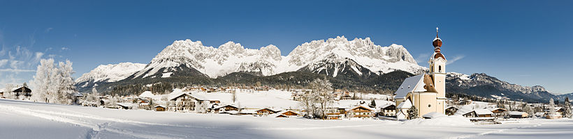
- Category: Commons:Featured pictures/Places/Panoramas
- Info created &- uploaded by Bernie Kohl - nominated by Tomer T -- Tomer T (talk) 09:26, 22 May 2015 (UTC)
- Support -- Tomer T (talk) 09:26, 22 May 2015 (UTC)
- Weak support A bit overexposed but simply nice. --Laitche (talk) 12:37, 22 May 2015 (UTC)
- Neutral Beautiful landscape, but especially the summits are blurred. --Tremonist (talk) 12:43, 22 May 2015 (UTC)
- Support Don't see any overexposure. Beautiful, clear, pro --LC-de (talk) 13:35, 22 May 2015 (UTC)
- Support although the mountains are a bit soft --Uoaei1 (talk) 18:47, 22 May 2015 (UTC)
- Support Poco2 19:02, 22 May 2015 (UTC)
- Support Wow. Perfect scene.--LB 19:08, 22 May 2015 (UTC)
- Support Very good picture and I love this place. --Code (talk) 21:41, 22 May 2015 (UTC)
- Support 😄 ArionEstar 😜 (talk) 23:01, 22 May 2015 (UTC)
- Weak Support. Lovely snow. I don't like the rounded horizon, but I accept it as a result of the wideness of the panorama. --King of ♥ ♦ ♣ ♠ 10:26, 23 May 2015 (UTC)
- Support --Kadellar (talk) 14:30, 23 May 2015 (UTC)
- Moderate support per Laitche. Daniel Case (talk) 20:34, 23 May 2015 (UTC)
- Support A very nice scenery, nonetheless slight overexposure / detail loss on the snowy areas and relatively soft. This pano in the high end quality as the winterscapes of Böhringer had been perfect. --Tuxyso (talk) 09:44, 24 May 2015 (UTC)
- Neutral Without a doubt very nice, but too bright in my opinion. — Julian H.✈ 10:38, 24 May 2015 (UTC)
- Support --Martin Falbisoner (talk) 11:43, 24 May 2015 (UTC)
- Support -- Pofka (talk) 15:29, 24 May 2015 (UTC)
- Support D kuba (talk) 16:54, 25 May 2015 (UTC)
- Support darken would be no problem - the photo is otherwise very good --Böhringer (talk) 06:04, 26 May 2015 (UTC)
File:Lion d'Afrique.jpg, featured[edit]
Voting period is over. Please don't add any new votes.Voting period ends on 31 May 2015 at 12:26:48 (UTC)
Visit the nomination page to add or modify image notes.
- Category: Commons:Featured pictures/Animals/Mammals
- Info created & uploaded by Clément Bardot - nominated by Tomer T -- Tomer T (talk) 12:26, 22 May 2015 (UTC)
- Support -- Tomer T (talk) 12:26, 22 May 2015 (UTC)
- Support Nice portrait! --Tremonist (talk) 12:34, 22 May 2015 (UTC)
- Support Agree, very nice! --Halavar (talk) 13:18, 22 May 2015 (UTC)
- Support --Kikos (talk) 17:29, 22 May 2015 (UTC)
- Question Clément Bardot: what kind of shot is it? zoo or wild animal? Poco2 19:00, 22 May 2015 (UTC)
- Why this question ?--Jebulon (talk) 21:05, 22 May 2015 (UTC)
- It is a nice portrait, quality is good and lighting is great. The crop is though pretty tight, that is why I was wondering whether it is a zoo shot where you have no problem to take 50 pictures (animals are used to people) and choose the best one or in a safari where it is sometimes tricky to get such a good picture? Poco2 12:08, 23 May 2015 (UTC)
- And this may have an influence on your vote ?--Jebulon (talk) 16:54, 23 May 2015 (UTC)
- Does only the result count? I provide as much information as possible of my pictures when I nominate here. I don't expect that from others but in cases like this I'd really appreciate to know whether this animal is captive and stands like this in front of the zoo visitors for hours or is a lucky strike in a safari. What is the problem with that?. Clément Bardot can you please, give a hint about this picture? thanks, Poco2 18:49, 23 May 2015 (UTC)
- No, dear Poco, there is no problem for me with that, and, yes, "don't hide behind your finger" as we say in french, only the result count (a pity, I agree). I try too to provide as much infos as possible when I upload - not only nominate in FPC - here in Commons.--Jebulon (talk) 09:05, 25 May 2015 (UTC)
- Why this question ?--Jebulon (talk) 21:05, 22 May 2015 (UTC)
- Support --Tomascastelazo (talk) 19:57, 22 May 2015 (UTC)
- Support --King of ♥ ♦ ♣ ♠ 21:18, 22 May 2015 (UTC)
- Support --Code (talk) 21:42, 22 May 2015 (UTC)
- Support Daniel Case (talk) 03:08, 23 May 2015 (UTC)
- Support But some information, where the photo was taken, would be useful --Llez (talk) 06:28, 23 May 2015 (UTC)
- Support --LivioAndronico talk 09:30, 23 May 2015 (UTC)
- Support -- Colin (talk) 10:38, 23 May 2015 (UTC)
- Support :—< 😄 ArionEstar 😜 (talk) 13:12, 23 May 2015 (UTC)
- Comment Better description and location are needed and useful. --Kadellar (talk) 14:31, 23 May 2015 (UTC)
- Support --Jacek Halicki (talk) 15:02, 23 May 2015 (UTC)
- Support Good light, nice expression of the lion. --Tuxyso (talk) 09:37, 24 May 2015 (UTC)
- Support --Martin Falbisoner (talk) 11:44, 24 May 2015 (UTC)
- Support Gorgeous. -- Pofka (talk) 15:28, 24 May 2015 (UTC)
- Support good --Qian.Nivan (talk) 09:19, 25 May 2015 (UTC)
- Support -- H. Krisp (talk) 11:52, 27 May 2015 (UTC)
File:Still Pond 3, Isabella Plantation, Richmond Park, London, UK - Diliff.jpg, featured[edit]
Voting period is over. Please don't add any new votes.Voting period ends on 27 May 2015 at 08:20:30 (UTC)
Visit the nomination page to add or modify image notes.
- Category: Commons:Featured_pictures/Places/Natural
- Info created by Diliff - uploaded by Diliff - nominated by Diliff. This is an attempt to correct the criticisms of my previous FPC of this scene, which seemed to be mainly regarding the composition, the flat light and the blown sky. This image improves on each of these faults IMO, although the bright dappled sunlight through the trees does bring its own problems, as the contrast is very extreme. -- Diliff (talk) 08:20, 18 May 2015 (UTC)
- Support -- Diliff (talk) 08:20, 18 May 2015 (UTC)
- Support Much better! --Code (talk) 08:49, 18 May 2015 (UTC)
- Support --Ralf Roleček 09:15, 18 May 2015 (UTC)
- Support — Crisco 1492 (talk) 09:53, 18 May 2015 (UTC)
- Support much better colors on sunny day. --Mile (talk) 11:35, 18 May 2015 (UTC)
- Comment Not a few overexposed parts on the leaves like this one. I added some notes. --Laitche (talk) 11:46, 18 May 2015 (UTC)
- What you're seeing in this image and the one you linked to is actually not overexposure, it's artefacts caused by the slight movement of the leaves blowing in the wind which cannot be merged together properly when the HDR image is processed (and as discussed at length in my previous nomination, it is not possible to capture a scene like this without HDR). I can try to remove the problems by cloning them out, but it's not really possible to avoid completely, and no HDR processing software that I am aware of can remove these ghosts completely and successfully. But I think our obsession with finding problems with small details does sometimes overshadow the bigger picture: does the image deliver the scene to the viewer in an aesthetic and accurate way? I would argue that small amounts of ghosted leaves in the trees doesn't diminish that. You only see it as an artefact when you pixel peep. I could probably hide them completely by downsampling the image. Consider that it's a sharp 50 megapixel image. I could reduce the image to the point where these little details in the problem could be obscured, but Commons would suffer from not having such a detailed image. Diliff (talk) 12:36, 18 May 2015 (UTC)
- I understood, it's unavoidable problem with HDR (Sorry, I haven't read the discussion of your previous nomination.) and I can not see them in [downsampled image] as you said. Maybe I was too picky, I deleted the notes. Thanks. --Laitche (talk) 13:11, 18 May 2015 (UTC)
- What you're seeing in this image and the one you linked to is actually not overexposure, it's artefacts caused by the slight movement of the leaves blowing in the wind which cannot be merged together properly when the HDR image is processed (and as discussed at length in my previous nomination, it is not possible to capture a scene like this without HDR). I can try to remove the problems by cloning them out, but it's not really possible to avoid completely, and no HDR processing software that I am aware of can remove these ghosts completely and successfully. But I think our obsession with finding problems with small details does sometimes overshadow the bigger picture: does the image deliver the scene to the viewer in an aesthetic and accurate way? I would argue that small amounts of ghosted leaves in the trees doesn't diminish that. You only see it as an artefact when you pixel peep. I could probably hide them completely by downsampling the image. Consider that it's a sharp 50 megapixel image. I could reduce the image to the point where these little details in the problem could be obscured, but Commons would suffer from not having such a detailed image. Diliff (talk) 12:36, 18 May 2015 (UTC)
- Support --Jacek Halicki (talk) 12:44, 18 May 2015 (UTC)
![]() Oppose hmm, way too saturated, imo.
Oppose hmm, way too saturated, imo.
- It's so difficult to please everyone. What specifically do you think is too saturated? In my previous nomination, people complained that the colours/lighting was too flat. I haven't increased the saturation of this image at all though. The flowers are actually very bright and saturated and I don't think they are misrepresented. The leaves in the tree are saturated because they are illuminated by the sunlight, not because the saturation has been enhanced digitally. Here's two screen captures from Lightroom of the original RAW files of the flowers and the leaves, showing no additional processing at all. Spring is just a very saturated time of year for colours. Diliff (talk) 15:21, 18 May 2015 (UTC)
- Actually the sky's the dealbreaker for me. Just doesn't look natural here. --Martin Falbisoner (talk) 18:54, 18 May 2015 (UTC)
- Fair enough. The saturation of the sky hasn't been altered either. Diliff (talk) 18:58, 18 May 2015 (UTC)
- I uploaded a few version with a lightened sky (which has the effect of making the sky look desaturated). Can you comment on that version? Diliff (talk) 20:07, 18 May 2015 (UTC)
- Much (!) better. Support now --Martin Falbisoner (talk) 20:26, 18 May 2015 (UTC)
- Much (!) better.
- I uploaded a few version with a lightened sky (which has the effect of making the sky look desaturated). Can you comment on that version? Diliff (talk) 20:07, 18 May 2015 (UTC)
- Fair enough. The saturation of the sky hasn't been altered either. Diliff (talk) 18:58, 18 May 2015 (UTC)
- Actually the sky's the dealbreaker for me. Just doesn't look natural here. --Martin Falbisoner (talk) 18:54, 18 May 2015 (UTC)
- Support --Yann (talk) 20:12, 18 May 2015 (UTC)
- Support --LivioAndronico talk 21:13, 18 May 2015 (UTC)
- Neutral I think (and I know) this reason is not so good for voting but "This cramped and busy composition (including the aspect ratio of the image) does not meet with my tastes..." Other elements are splendid. --Laitche (talk) 22:00, 18 May 2015 (UTC)
- I tried a less cramped and less busy composition last time, and it was opposed, so I followed the suggestions and ended with this image. You know what they say "you can't please everybody, all of the time". :-) Maybe you would prefer this composition. I didn't think it would be as successful as a FP though. Diliff (talk) 22:40, 18 May 2015 (UTC)
- That picture is simply wonderful (ok, maybe you should lighten the sky a tad... ;-))! What makes you believe it couldn't stand a chance as FPC? --Martin Falbisoner (talk) 05:25, 19 May 2015 (UTC)
- Oh, I didn't think it would stand no chance, I just thought it was a composition that was slightly more artistic (with the focus being on the reflection) which is often not rewarded on Commons. It's also not as high resolution. I considered both images for nomination but thought this one would have a better chance. Maybe I was wrong! Diliff (talk) 11:12, 19 May 2015 (UTC)
- Yes, commons (or commoners) could truly benefit from a somewhat bolder approach towards artistic compositions at times --Martin Falbisoner (talk) 16:28, 19 May 2015 (UTC)
- Oppose The HDR look is a bit too strong. It looks weird when the sky is such a dark shade of blue relative to the foreground which is in shade. In my opinion it should be a faint blue, just barely enough to not blow out. --King of ♥ ♦ ♣ ♠ 00:44, 19 May 2015 (UTC)
- Wrt sky colour, we are not seeing the sky close to the horizon (where it is light) but relatively high (where it is deeper). The deep blue of the sky varies with the weather and pollution. Today, on my journey to work, I saw solid blue sky through very light green leaves. But other areas of the sky were pale blue and others verging on turquoise. I don't think expecting the sky to be "faint blue, just barely enough to not blow out" is valid if the sky wasn't actually that light a shade of blue. The issues of the sky being very bright compared to a shady area aren't represented by making the sky go pale, which is an artificial result of a sensor blowing on all channels: if you turn up the brightness of a blue (or red, or green) bulb, it doesn't go white. It just goes a more intense and bright blue. -- Colin (talk) 09:49, 19 May 2015 (UTC)
- Yeah, in addition to what Colin said, I would just add that the point of HDR is to help replicate what the eye sees, not to replicate the limitations of digital camera sensors. I know that traditionally with photography, we would expect to see the sky being brighter than the shaded foliage but I can tell you that when I was there, I could clearly see deep blue sky through the trees. The sky was a paler blue closer to the horizon (and that is reflected in the image where it starts to verge on white) due to the effect of haze and clouds, but up high in the sky as Colin mentioned was a deep blue. I know nothing I can say will necessarily convince your eyes that it looks 'right' as that is subjective, but for me, it looks very close to what I saw when I photographed it. Sometimes HDR can 'overdo' the contrast of the scene but I usually try quite hard to replicate what was seen and not push the contrast and saturation just for dramatic effect. Diliff (talk) 11:05, 19 May 2015 (UTC)
- We are limited by the relatively low dynamic range of JPG and computer monitors. The next ultra high definition movie format is supposed to be higher DR and we are promised a higher DR in our TV and monitors to go with it. But even then, it won't match reality because then you'd have a TV that, if it showed a picture of the sun, could burn your retina and fade your furniture fabric :-). Just be grateful we're not pre-1900 where film wasn't even panchromatic and all blue skys were burnt out pure white. -- Colin (talk) 11:56, 19 May 2015 (UTC)
- We are limited by the LDR of computer monitors, but we can attempt to replicate the tones that the eye sees, even if we can't replicate the intensity of them. I don't think HDR TVs and monitors that replicate the real luminosity of a scene is really the answer anyway. Yes, we can increase the maximum luminosity but it still has to factor in comfortable ranges suitable to the room that you're watching in. If you're in a dark room watching a film, you don't want an intense beam of sunlight in your face, you want something merely bright relative to the dark room you're watching in to give the illusion of sunlight. In any case, you'd also need a TV screen that covered your entire field of view to replicate how the eye sees. Having highlights that are as bright as the sun but concentrated in a 60" box of pixels would be much harder on the eyes than reality ever could be, because in the real world we actually have to shade the sun away from our eyes if we want to have any hope of seeing something in the shadows, lest it be washed out by the effect of the sunlight reflecting around inside our eyeballs! It would be very difficult to do that with a narrow angle of view that we typically watch a TV with. Diliff (talk) 12:52, 19 May 2015 (UTC)
- We are limited by the relatively low dynamic range of JPG and computer monitors. The next ultra high definition movie format is supposed to be higher DR and we are promised a higher DR in our TV and monitors to go with it. But even then, it won't match reality because then you'd have a TV that, if it showed a picture of the sun, could burn your retina and fade your furniture fabric :-). Just be grateful we're not pre-1900 where film wasn't even panchromatic and all blue skys were burnt out pure white. -- Colin (talk) 11:56, 19 May 2015 (UTC)
- Yeah, in addition to what Colin said, I would just add that the point of HDR is to help replicate what the eye sees, not to replicate the limitations of digital camera sensors. I know that traditionally with photography, we would expect to see the sky being brighter than the shaded foliage but I can tell you that when I was there, I could clearly see deep blue sky through the trees. The sky was a paler blue closer to the horizon (and that is reflected in the image where it starts to verge on white) due to the effect of haze and clouds, but up high in the sky as Colin mentioned was a deep blue. I know nothing I can say will necessarily convince your eyes that it looks 'right' as that is subjective, but for me, it looks very close to what I saw when I photographed it. Sometimes HDR can 'overdo' the contrast of the scene but I usually try quite hard to replicate what was seen and not push the contrast and saturation just for dramatic effect. Diliff (talk) 11:05, 19 May 2015 (UTC)
- Wrt sky colour, we are not seeing the sky close to the horizon (where it is light) but relatively high (where it is deeper). The deep blue of the sky varies with the weather and pollution. Today, on my journey to work, I saw solid blue sky through very light green leaves. But other areas of the sky were pale blue and others verging on turquoise. I don't think expecting the sky to be "faint blue, just barely enough to not blow out" is valid if the sky wasn't actually that light a shade of blue. The issues of the sky being very bright compared to a shady area aren't represented by making the sky go pale, which is an artificial result of a sensor blowing on all channels: if you turn up the brightness of a blue (or red, or green) bulb, it doesn't go white. It just goes a more intense and bright blue. -- Colin (talk) 09:49, 19 May 2015 (UTC)
- Support --Tremonist (talk) 14:47, 19 May 2015 (UTC)
- Support -- Pofka (talk) 18:30, 19 May 2015 (UTC)
- Support -- Colin (talk) 21:46, 19 May 2015 (UTC)
- Oppose Agree with King of Hearts. --Halavar (talk) 13:24, 22 May 2015 (UTC)
- Support --Σπάρτακος (talk) 10:58, 25 May 2015 (UTC)
File:Aguarales de Valpalmas, Zaragoza, España, 2015-01-06, DD 26.JPG, featured[edit]
Voting period is over. Please don't add any new votes.Voting period ends on 27 May 2015 at 18:11:39 (UTC)
Visit the nomination page to add or modify image notes.
- Category: Commons:Featured pictures/Places/Natural
- Info Los Aguarales de Valpalmas, is a rare, fragile and dynamic geological phenomena located near Valpalmas, Zaragoza, Spain. The landscape is the result of water flows over fragile material in a process known as piping. All by me, Poco2 18:11, 18 May 2015 (UTC)
- Support -- Poco2 18:11, 18 May 2015 (UTC)
- Oppose It is for me a very interesting geological formation. I have never seen anything like it. It took me a long time to get any idea of scale until I noticed the twig and other plant debris there. On the one hand it makes you curious to try and figure what is going on (and I did read a machine-translated version of the article on Spanish Wikipedia, where the photo is used to better understand); on the other hand the lack of an evident sense of scale is also confusing for the observer. I have a problem with the chosen focal distance which is in the immediate foreground, leading to a large fraction of the image being out of focus. This can be a good effect if you want to highlight a special interesting part of the formation and attract the eye to it, but it does not work very convincing for me in this case. -- Slaunger (talk) 19:55, 18 May 2015 (UTC)
- To be honest, the picture looks pretty much the way I wanted it to look like, I could have tried a higher f number but then would have good sharpness issues overall and I couldn't get further to increase the focal length with a similar frame because the perspective would have been completely different (the angle of view would have had to be higher, different picture indeed). And yes, I deliberately introduced a factor of "confusion" due to a missing scale. Is it a high mountain range or small heaps? That actually makes the picture the more interesting to me. Poco2 20:22, 19 May 2015 (UTC)
- Support It is special. --Tremonist (talk) 14:52, 19 May 2015 (UTC)
- Support Interesting! --Uoaei1 (talk) 17:04, 19 May 2015 (UTC)
- Support --Ralf Roleček 22:55, 19 May 2015 (UTC)
- Support Reminds Lithuanian cake Šakotis. Simply cannot say no to something which looks like a sea of these delicious things. -- Pofka (talk) 12:58, 20 May 2015 (UTC)
- Oppose Nice idea and interesting photo but overall, it is lacking variation for me. I want some kind of tension or decoration which means something making the photo more attractive, like a golden hours light or fogs or condensation or like that. --Laitche (talk) 08:48, 21 May 2015 (UTC)
- Support Strange, very attractive, never seen for me. Many questions in this picture, nice sharpness, good light and shadows... Wonderful Nature ! --Jebulon (talk) 21:29, 22 May 2015 (UTC)
- Support --Hubertl (talk) 10:23, 23 May 2015 (UTC)
- Support --Σπάρτακος (talk) 11:01, 25 May 2015 (UTC)
File:Basilique Saint-Remi de Reims Exterior 1, Reims, France - Diliff.jpg, featured[edit]
Voting period is over. Please don't add any new votes.Voting period ends on 27 May 2015 at 15:54:48 (UTC)
Visit the nomination page to add or modify image notes.
- Category: Commons:Featured pictures/Places/Architecture/Religious buildings
- Info created by Diliff - uploaded by Diliff - nominated by Paris 16 -- Paris 16 (talk) 15:54, 18 May 2015 (UTC)
- Support -- Paris 16 (talk) 15:54, 18 May 2015 (UTC)
- Support --Kadellar (talk) 16:42, 18 May 2015 (UTC)
- Support. Diliff (talk) 17:45, 18 May 2015 (UTC)
- Comment Hmm. Of course there is Diliff-execution and therefore great quality, but honestly I am not a fan of the angle (I understand that you (Diliff) didn't nominate it). I stood there a year ago, and I felt that the straight-on angle works better. Of course your image is much better technically (and much colder, fwiw), but having just a bit of the right surface of the right tower looks a bit odd to me, especially given that we have much more of the left tower. It is good to see that your version included the transept, which is a major plus. I realize you also have a version that looks very similar to mine, but imo is improvable w.r.t. PC (e.g. the rose is clearly not a perfect circle). Imho that second version, better processed and perhaps with a less squary crop could be a good FP. --DXR (talk) 18:58, 18 May 2015 (UTC)
- From memory, I applied a small amount of vertical compression to it to avoid too much distortion in the towers (I could be wrong, but it would explain the slightly squashed rose). I think both views have different strengths and weaknesses but overall, showing the transept is useful for an understanding of the shape of it. I enjoy the symmetry of a straight on view, but you lose a sense of what the building really is. A full frontal view a church is often nothing more than a study of its face, so I try to get a diagonal view of the church when it is practical to do so (often there are too many obstructions for a good view). But yes, you're right. I didn't nominate it, so I suppose it's Paris16's choice. I could support either, and I'd be happy to restitch without vertical compression if you think it's necessary (I didn't notice the rose until you mentioned it - it's only very slightly squashed). Diliff (talk) 19:14, 18 May 2015 (UTC)
- I quite like your face analogy, and fair enough. Of course I don't intend to oppose or do anything like that and like with portraits, it might indeed just be personal preference. I personally find that tall towers make diagonals prone to strange effects, especially with full PC (and so I get your reasoning for slight squishing of the height). Perhaps I simply have a mind that works best in 45° increments ;-) --DXR (talk) 05:46, 20 May 2015 (UTC)
- From memory, I applied a small amount of vertical compression to it to avoid too much distortion in the towers (I could be wrong, but it would explain the slightly squashed rose). I think both views have different strengths and weaknesses but overall, showing the transept is useful for an understanding of the shape of it. I enjoy the symmetry of a straight on view, but you lose a sense of what the building really is. A full frontal view a church is often nothing more than a study of its face, so I try to get a diagonal view of the church when it is practical to do so (often there are too many obstructions for a good view). But yes, you're right. I didn't nominate it, so I suppose it's Paris16's choice. I could support either, and I'd be happy to restitch without vertical compression if you think it's necessary (I didn't notice the rose until you mentioned it - it's only very slightly squashed). Diliff (talk) 19:14, 18 May 2015 (UTC)
- Support --Tremonist (talk) 14:49, 19 May 2015 (UTC)
- Support --Halavar (talk) 15:10, 19 May 2015 (UTC)
- Support --Uoaei1 (talk) 17:06, 19 May 2015 (UTC)
- Support -- George Chernilevsky talk 05:22, 20 May 2015 (UTC)
- Comment It needs a vertical perspective correction IMO. The right side is leaning in. Otherwise great quality and composition is ok. Poco2 19:26, 21 May 2015 (UTC)
- Hmm, yes slightly.. It looks like Paris 16 has introduced that problem when he did some perspective correction on it. I compared it to the previous version and while mine wasn't perfect (seems to be leaning outwards on both sides a tiny bit), he seems to have made it worse. Oh well, I'll see if I can fix it. Diliff (talk) 19:51, 21 May 2015 (UTC)
File:Leo Tolstoy 1897, black and white, 37767u.jpg, featured[edit]
Voting period is over. Please don't add any new votes.Voting period ends on 31 May 2015 at 14:46:42 (UTC)
Visit the nomination page to add or modify image notes.
- Category: Commons:Featured pictures/Historical
- Info created by F. W. Taylor (?), restored, uploaded, and nominated by -- Yann (talk) 14:46, 22 May 2015 (UTC)
- Support The best picture we have of Leo Tolstoy, along with File:L.N.Tolstoy Prokudin-Gorsky.jpg, and probably one of the best which exists. -- Yann (talk) 14:46, 22 May 2015 (UTC)
- Comment Actually, I don't know who should be credited as Author. The LoC says that F. W. Taylor claimed a copyright, but I doubt he is the photographer of this picture. Yann (talk) 14:46, 22 May 2015 (UTC)
- Support --Archaeodontosaurus (talk) 16:05, 22 May 2015 (UTC)
- Support --Uoaei1 (talk) 18:48, 22 May 2015 (UTC)
- Support Historic and valued. --Mile (talk) 06:29, 23 May 2015 (UTC)
- Support I can't oppose him --LivioAndronico talk 09:28, 23 May 2015 (UTC)
- Support --Cayambe (talk) 17:16, 23 May 2015 (UTC)
- Support Good job, D kuba (talk) 19:19, 23 May 2015 (UTC)
- Support -- Pofka (talk) 15:27, 24 May 2015 (UTC)
- Support Quality is not the best, but acceptable. 😄 ArionEstar 😜 (talk) 23:06, 24 May 2015 (UTC)
- Support - Per my !vote on the English Wikipedia. — Chris Woodrich (talk) 06:44, 25 May 2015 (UTC)
- Support Jacopo Werther iγ∂ψ=mψ 18:10, 25 May 2015 (UTC)
- Support --Tremonist (talk) 12:47, 26 May 2015 (UTC)
- Support --Halavar (talk) 20:18, 26 May 2015 (UTC)
File:Mexican fast street food.jpg, not featured[edit]
Voting period is over. Please don't add any new votes.Voting period ends on 28 May 2015 at 04:22:22 (UTC)
Visit the nomination page to add or modify image notes.
- Category: Commons:Featured pictures/Food and drink
- Info All by -- Tomascastelazo (talk) 04:22, 19 May 2015 (UTC)
- Support -- Tomascastelazo (talk) 04:22, 19 May 2015 (UTC)
- Oppose Nice idea but poor quality, sorry, and the look on the background peoples’ faces ruins it. Strong CA, sides leaning, white objects blown, the reddish apron seems channel-blown too (blueish look on the bright parts). A tighter framing would have done better (just the one lady doing her work). --Kreuzschnabel 07:33, 19 May 2015 (UTC)
- @ Kreuzschnabel, thanks for the suggestion, but the idea of the image is everything, food, people, environment... I used a 10mm lens to get as much in as possible... --Tomascastelazo (talk) 15:56, 19 May 2015 (UTC)
- Comment If you eliminate CA, it's fine for me. Can you add coordinates, please? --Kadellar (talk) 12:15, 19 May 2015 (UTC)
- @ Kadellar, removed CA, added location in image description. --Tomascastelazo (talk) 15:53, 19 May 2015 (UTC)
- Neutral due to quality problems. --Tremonist (talk) 14:54, 19 May 2015 (UTC)
- Support Quality could be better but something different at least. --Mile (talk) 18:49, 19 May 2015 (UTC)
- Comment The women at the left look a bit distorted. -- Lothar Spurzem (talk) 22:34, 19 May 2015 (UTC)
- Support --Ralf Roleček 21:17, 23 May 2015 (UTC)
- Oppose really interesting but the 1/3 left is a bit disturbing (harsh light, a bit blurred and distorted) -- Christian Ferrer 21:09, 24 May 2015 (UTC)
- Oppose For Christian Ferrer --Σπάρτακος (talk) 11:04, 25 May 2015 (UTC)
File:Miners shower, Rammelsberg Mining Museum, Harz, Germany, 2015-05-18-.jpg, featured[edit]
Voting period is over. Please don't add any new votes.Voting period ends on 27 May 2015 at 20:42:14 (UTC)
Visit the nomination page to add or modify image notes.
- Category: Commons:Featured pictures/Places/Interiors
- Info The Rammelsberg mining museum in Lower Saxony, Germany is a UNESCO World Heritage Site. Here is shown the miners' shower room. Created, uploaded and nominated by Slaunger. -- Slaunger (talk) 20:42, 18 May 2015 (UTC)
- Support -- Slaunger (talk) 20:42, 18 May 2015 (UTC)
- Support As beautiful and well-done in its own way as David's churches. Daniel Case (talk) 00:41, 19 May 2015 (UTC)
- Support Ordinary can be beautiful. --King of ♥ ♦ ♣ ♠ 04:11, 19 May 2015 (UTC)
- Support --Code (talk) 05:07, 19 May 2015 (UTC)
- Support per King once again --Martin Falbisoner (talk) 05:33, 19 May 2015 (UTC)
- Support yet an other symmetrical image but with a different motive than the churches, the ceilings and the trainstations! --Villy Fink Isaksen (talk) 06:09, 19 May 2015 (UTC)
- Villy Fink Isaksen: I placed windows on one side and port openings on the other just to make you less symmetrically bored. -- Slaunger (talk) 20:50, 19 May 2015 (UTC)
- Villy Fink Isaksen: I placed windows on one side and port openings on the other just to make you less symmetrically bored.
- Question Well done but sides still leaning out IMHO, should be easily fixable --Kreuzschnabel 07:37, 19 May 2015 (UTC)
- @Kreuzschnabel: : Thanks for your observation. You are correct. I have now uploaded a corrected version. -- Slaunger (talk) 17:14, 19 May 2015 (UTC)
- Oppose Good quality, but no wow. Sorry. Yann (talk) 08:14, 19 May 2015 (UTC)
- Support I partly agree with Yann, it's not the most exciting interior, but the picture is as good as it gets. --Kadellar (talk) 12:20, 19 May 2015 (UTC)
- Support --Tremonist (talk) 14:52, 19 May 2015 (UTC)
- Oppose Per Yann --Uoaei1 (talk) 17:02, 19 May 2015 (UTC)
- Support Another example of "So ugly, but catches your view for some unknown reason". -- Pofka (talk) 18:22, 19 May 2015 (UTC)
- Support -- Lauro Sirgadocontribs 18:29, 19 May 2015 (UTC)
- Support Excellent. Professional-quality photography of an important aspect of history. -- Colin (talk) 22:21, 19 May 2015 (UTC)
- Support --Ralf Roleček 22:54, 19 May 2015 (UTC)
- Support - Excellent (and different). --Pugilist (talk) 22:55, 19 May 2015 (UTC)
- Support -- George Chernilevsky talk 05:22, 20 May 2015 (UTC)
- Support --Jacek Halicki (talk) 10:19, 20 May 2015 (UTC)
- Support -- Christian Ferrer 04:38, 21 May 2015 (UTC)
- Support Nice mood. I am not certain but that may be posterization. --Laitche (talk) 18:29, 21 May 2015 (UTC)
- Comment Thanks for your observation, Laitche. Again I am impressed by your careful review and scrutiny. I believe you are correct that there is a little posterization in that dark corner. The photo is an HDR tone-mapped photo from three exposures 2 EV apart. That corner was very dark and I guess that despite the HDR and due to the limited dynamic range of my sensor, the posterization there has appeared due to a quite dramatic lift of shadows in Lightroom. I have tried to spend 20 mins again now fiddling around with a radial filter over that patch in Lightroom to try and make it better. It has not been a success, so I am not uploading a new version. I am afraid there is just not much that I can do about it. If I do not lift the shadows as much I feel it compromises the overall impression of the photo too much. In my opinion this small area of sub-optimal quality has negligable impact on the image when seen in its entirety. It is a question of making a reasonable tradeoff. My camera only allows three bracketed exposures and they cannot be separated more than 2 EV apart. I guess that I could have been even more careful and taken two sets of bracketed exposures to get six exposures 2 EV apart and get a larger dynamic range (Diliff normally uses five exposures in his church interiors, which is natively supported with his camera). But even then, my longest exposure was 13 s here and my camera allows only up to 30 s, so there is not much more I could have done to get the light out of that corner unless I had opened the aperture up from f/11, but then I would have lost DOF. -- Slaunger (talk) 20:42, 21 May 2015 (UTC)
- Thanks for your comment again! It seems I have to be honest, I am guessing overall this HDR image is just a little bit poterized. Please look at the windows very carefully, just my opinion :) --Laitche (talk) 21:48, 21 May 2015 (UTC)
- If your longest exposure was 13 seconds then you could have easily doubled the luminosity of the shadows.... Or simply bumped up your ISO a bit. The thing that many people forget (or don't understand) is that you can actually use higher ISOs with HDR tone mapping, as long as your darkest exposures in the bracket are exposed properly for the shadows. ISO 500-800 on most cameras will actually look okay as long as there are no dark areas in the image (the detail in the brightest 1/3 of the histogram will have very little noise at all). So you could have easily gone to ISO 400 without too many problems with noise IMO. ISO 100 is great for single exposures but unnecessary for HDR work. Diliff (talk) 00:58, 22 May 2015 (UTC)
- Thanks, Laitche and Diliff for your further observations. You are correct, Diliff about the posterization on the red soap tray as well. You are also correct, that I could have done better and used the equipment at hand more optimally by taking a 30 s exposure as well to get as much as possible out of the shadows. My technique is still good, I think, but improvable. Regarding the ISO, I should try that, although I do not share you optimism about how high I can go. I may go to ISO 200, but I really think my sensor is so noisy that I should not go higher. Yesterday, I worked on this HDR panorama where the scenary has less dynamic range to capture than in this interior. Here, I did not have to boost the shadows and dampen the highligts nearly as much in Lightroom, but still, I had to yank up the luminosity NR quite a bit to avoid too much noise in the sky at ISO 100 even after masking out sharpening in the sky. Well, but I should test this systematically. -- Slaunger (talk) 16:10, 22 May 2015 (UTC)
- Test my theory out then. :-) Take a photo that is overexposed at ISO 640 or ISO 800. Expose it so that the deep shadows of the scene are very bright, too bright to appear 'normal' but not too bright that they are actually blown. Then look at how much noise there is there. Then adjust the exposure in Lightroom so that the shadows look like normal shadows again. That's how much noise you'll have when you combine it into an HDR tone mapped image. Then compare it to a 'normal' image at ISO 100 with pushed shadows. The overexposed high ISO image will probably 'win' the noise competition against ISO 100. Normally this wouldn't be a useful method because exposing 'to the right' (of the histogram) would normally result in far too many blown details elsewhere in the scene, but it doesn't happen in an HDR image because you have other bracketed images to rescue the highlights from instead. The ISO level is almost arbitrary. What matters more is that you've 'exposed to the right' so that the details you want to capture in each bracket (highlights, mid tones and shadows) are in the upper end of the histogram. Diliff (talk) 16:36, 22 May 2015 (UTC)
- Thanks, Laitche and Diliff for your further observations. You are correct, Diliff about the posterization on the red soap tray as well. You are also correct, that I could have done better and used the equipment at hand more optimally by taking a 30 s exposure as well to get as much as possible out of the shadows. My technique is still good, I think, but improvable. Regarding the ISO, I should try that, although I do not share you optimism about how high I can go. I may go to ISO 200, but I really think my sensor is so noisy that I should not go higher. Yesterday, I worked on this HDR panorama where the scenary has less dynamic range to capture than in this interior. Here, I did not have to boost the shadows and dampen the highligts nearly as much in Lightroom, but still, I had to yank up the luminosity NR quite a bit to avoid too much noise in the sky at ISO 100 even after masking out sharpening in the sky. Well, but I should test this systematically. -- Slaunger (talk) 16:10, 22 May 2015 (UTC)
- Weak Oppose Nice but not outstanding to me, the perspective is nice but I miss a special touch here Poco2 19:00, 21 May 2015 (UTC)
- Support --Σπάρτακος (talk) 11:02, 25 May 2015 (UTC)
File:Stirling railway station - 02.jpg, featured[edit]
Voting period is over. Please don't add any new votes.Voting period ends on 27 May 2015 at 16:13:06 (UTC)
Visit the nomination page to add or modify image notes.
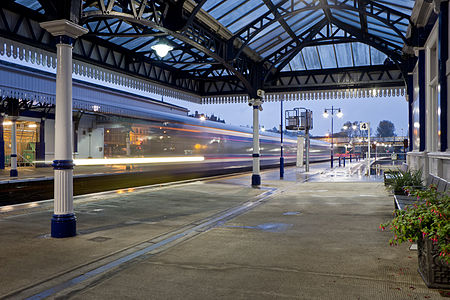
- Category: Commons:Featured pictures/Places/Architecture
- Info Stirling railway station. Created, uploaded and nominated by -- Kadellar (talk) 16:13, 18 May 2015 (UTC)
- Support -- Kadellar (talk) 16:13, 18 May 2015 (UTC)
- Neutral Small tilt and blue channel satured (WB) Support Well done, much better --The Photographer (talk) 16:32, 18 May 2015 (UTC)
- I largely agree with The Photographer, although I think the tilt is more a slight perspective issue in the left part of the image. WB too cold, I think (check WB on white paint on pillar). -- Slaunger (talk) 20:12, 18 May 2015 (UTC)
- The Photographer, Slaunger: I have uploaded a new version correcting the slight tilt and the WB (according to LR, 250 K warmer, which is not much). --Kadellar (talk) 11:59, 19 May 2015 (UTC)
- Support I find this a bit different (and refreshing) compared to the recent spurt of train station FPCs we've seen. --King of ♥ ♦ ♣ ♠ 00:38, 19 May 2015 (UTC)
- Support per King. Very nice! --Martin Falbisoner (talk) 05:30, 19 May 2015 (UTC)
- Support --Tremonist (talk) 14:50, 19 May 2015 (UTC)
- Support When blurred item actually improves image. -- Pofka (talk) 18:27, 19 May 2015 (UTC)
- Support --Ralf Roleček 22:55, 19 May 2015 (UTC)
- Support Love the perspective and ghostly train. Daniel Case (talk) 02:53, 20 May 2015 (UTC)
- Weak oppose It's not photographer's fault. The platform is curving to the right and the lampposts as well therefore I feel double vanishing point here and that is making an unbalanced composition, imho. --Laitche (talk) 10:41, 24 May 2015 (UTC)
- Weak oppose For Laitche--Σπάρτακος (talk) 11:00, 25 May 2015 (UTC)
File:Иультинский район.jpg, not featured[edit]
Voting period is over. Please don't add any new votes.Voting period ends on 27 May 2015 at 16:37:09 (UTC)
Visit the nomination page to add or modify image notes.
- Category: Commons:Featured pictures/Places
- Info Iultinsky area, created by Шабанов - uploaded by Шабанов - nominated by Bakuresearch -- Bakuresearch (talk) 16:37, 18 May 2015 (UTC)
- Support -- Bakuresearch (talk) 16:37, 18 May 2015 (UTC)
- Oppose (formerly FPX) Image does not fall within the guidelines,
border and signature must be removed.Jpeg compression a bit strong: loss of detail. --Kadellar (talk) 17:21, 18 May 2015 (UTC)
- Support This one is worth to save. So nice scenery from Russia. Border removed, watermark also, jpeg as before. Let give photo a try. --Mile (talk) 18:15, 18 May 2015 (UTC)
- Comment Maybe is tilted !? --Mile (talk) 18:17, 18 May 2015 (UTC)
- weak support I am probably neutral on the picture alone as it has a technical quality a bit below the high FP landscape bar. But for me, the location is a mitigating factor. I do not think we have much other pictures from this very remote and thinly populated area of Russia. So value put it just above the FP threshold for me. Maybe I am also touched on a soft spot; it reminds me of a small settlement in Northwest Greenland I once visited. -- Slaunger (talk) 20:07, 18 May 2015 (UTC)
- Oppose Sorry, but I don't find the composition very interesting; in particular, I think the lower crop cuts off the water in an awkward place. Perhaps a lower framing to include more foreground and less sky would be better. --King of ♥ ♦ ♣ ♠ 00:36, 19 May 2015 (UTC)
- Info Croped to rule of thirds.--Mile (talk) 06:11, 19 May 2015 (UTC)
- Neutral --Tremonist (talk) 14:51, 19 May 2015 (UTC)
- Oppose or at least an outstanding composition or at least an outstanding quality, here both are ok but not enough featured -- Christian Ferrer 21:06, 24 May 2015 (UTC)
File:15-05-23-Berlin-Sachsendamm-Tesla-RalfR-N3S 7354.jpg, featured[edit]
Voting period is over. Please don't add any new votes.Voting period ends on 1 Jun 2015 at 12:50:30 (UTC)
Visit the nomination page to add or modify image notes.
- Category: Commons:Featured pictures/Objects
- Info all by -- Ralf Roleček
- Support -- Ralf Roleček 12:50, 23 May 2015 (UTC)
- Support Nice impression. 😄 ArionEstar 😜 (talk) 13:11, 23 May 2015 (UTC)
- Request Please add an other license. Only the "GFDL 1.2 only" license isn't enough. New FPC rule. --Alchemist-hp (talk) 13:15, 23 May 2015 (UTC)
- Done --Ralf Roleček 13:30, 23 May 2015 (UTC)
- Danke. --Alchemist-hp (talk) 13:38, 23 May 2015 (UTC)
- Support Yes, a good idea and a good capture! --Alchemist-hp (talk) 13:38, 23 May 2015 (UTC)
- Support very nice. Ich frage mich, warum du dort mit dem Stativ warst haha. --Kadellar (talk) 14:36, 23 May 2015 (UTC)
- Ohne Stativ, Brückengeländer und 4 unscharfe Versuche --Ralf Roleček 14:51, 23 May 2015 (UTC)
- Support --Jacek Halicki (talk) 15:09, 23 May 2015 (UTC)
- Comment Interesting shot and composition but it looks a bit loss details, maybe with f/22? --Laitche (talk) 17:39, 23 May 2015 (UTC)
- Support --Hubertl (talk) 00:40, 24 May 2015 (UTC)
- Support Excellent. But I ask—what is the message being sent by this picture? That you shouldn't buy a Tesla because it will break down and you'll be stuck on the side of the road while traffic zooms by? Daniel Case (talk) 03:48, 24 May 2015 (UTC)
- Support Very intriguing shot. --King of ♥ ♦ ♣ ♠ 04:43, 24 May 2015 (UTC)
- Support — Chris Woodrich (talk) 08:12, 24 May 2015 (UTC)
- Comment I'm slightly concerned regarding the legal situation of this photo. Based on which interpretation do you regard this as being ok? — Julian H.✈ 10:50, 24 May 2015 (UTC)
- Was meinst du? Die Person ist Beiwerk, Nummernschilder brauchen nicht verpixelt werden. --Ralf Roleček 11:16, 24 May 2015 (UTC)
- Ich hätte hier stark bezweifelt, dass man sie als Beiwerk bezeichnen kann, aber ich bin natürlich diesbezüglich gar kein Experte. — Julian H.✈ 11:25, 24 May 2015 (UTC) Edit: siehe z.B. hier. — Julian H.✈ 11:29, 24 May 2015 (UTC)
- "..daß sie auch entfallen könnten, ohne daß Inhalt und Charakter des Bildes sich veränderten.." ist schon lange gelebter Konsens bei deutschen Gerichten. --Ralf Roleček 12:06, 24 May 2015 (UTC)
- @Ralf Roletschek: Hmmm. Ich würde meinen, dass sich der Inhalt und Charakter des Bildes sich ohne diese Person ganz erheblich verändern würde. Mit Person erzählt das Bild eine Geschichte: Sie ist offensichtlich liegengeblieben und ruft nun Hilfe. Das ist mMn genau das, was dieses Bild so gut macht, ohne die Person wäre die Aussage wesentlich schwächer. Ich persönlich hätte dieses Bild genau deswegen sicher nicht hochgeladen. Ist aber letztendlich Dein Risiko … --El Grafo (talk) 08:55, 27 May 2015 (UTC)
- "..daß sie auch entfallen könnten, ohne daß Inhalt und Charakter des Bildes sich veränderten.." ist schon lange gelebter Konsens bei deutschen Gerichten. --Ralf Roleček 12:06, 24 May 2015 (UTC)
- Ich hätte hier stark bezweifelt, dass man sie als Beiwerk bezeichnen kann, aber ich bin natürlich diesbezüglich gar kein Experte. — Julian H.✈ 11:25, 24 May 2015 (UTC) Edit: siehe z.B. hier. — Julian H.✈ 11:29, 24 May 2015 (UTC)
- Was meinst du? Die Person ist Beiwerk, Nummernschilder brauchen nicht verpixelt werden. --Ralf Roleček 11:16, 24 May 2015 (UTC)
- Support --LivioAndronico talk 11:05, 24 May 2015 (UTC)
- Support A photograph that leaves the viewer slightly puzzled. I am still annoyed that I find it difficult to see the idea behind the composition - but I prefer "annoying" photos that are able to attract my interest. --Pugilist (talk) 11:35, 24 May 2015 (UTC)
- Support per above --Martin Falbisoner (talk) 11:42, 24 May 2015 (UTC)
- Support --Laitche (talk) 11:53, 24 May 2015 (UTC) Neutral Nice idea and captured but sorry how many times I look at this, the details are lost I guess that with f/22 (this problem). --Laitche (talk) 21:37, 25 May 2015 (UTC)
- Support Great! --Code (talk) 12:14, 24 May 2015 (UTC)
- Support -- Pofka (talk) 15:25, 24 May 2015 (UTC)
- Support --Tomascastelazo (talk) 18:41, 24 May 2015 (UTC)
- Support Another very good idea, and achievement, for RR.--Jebulon (talk) 19:45, 24 May 2015 (UTC)
- Support Very good timing with the cars passing by and excellent idea. Eyecatching, and it can serve as an illustration for many kinds of subjects. The motion blur on the passing car naturally draws the attention to the red Tesla and the young lady. -- Slaunger (talk) 19:51, 24 May 2015 (UTC)
- Support Very good idea, nice capture. --Tuxyso (talk) 08:14, 25 May 2015 (UTC)
- Support good photo --Qian.Nivan (talk) 09:18, 25 May 2015 (UTC)
- Support For originality Poco2 13:21, 25 May 2015 (UTC)
- Support Per Poco a Poco. Jacopo Werther iγ∂ψ=mψ 18:40, 25 May 2015 (UTC)
- Support per Tuxyso.--ArildV (talk) 05:07, 26 May 2015 (UTC)
- Support --Tremonist (talk) 12:52, 26 May 2015 (UTC)
- Support -- Gildir (talk) 13:58, 26 May 2015 (UTC)
- Support -- Not a good promotion for Tesla, though. I like the repetition of the wheels in the blurred cars. --Jan Arkesteijn (talk) 09:02, 27 May 2015 (UTC)
File:Ana Ivanović - Masters de Madrid 2015 - 02.jpg, not featured[edit]
Voting period is over. Please don't add any new votes.Voting period ends on 28 May 2015 at 12:10:16 (UTC)
Visit the nomination page to add or modify image notes.
- Category: Commons:Featured pictures/Sports
- Info Ana Ivanović at the Madrid Open 2015, Madrid, Spain. The crop is not tighter to see the net and have better context and depth. Created, uploaded, nominated -- Kadellar (talk) 12:10, 19 May 2015 (UTC)
- Support -- Kadellar (talk) 12:10, 19 May 2015 (UTC)
- Support I think my primitive brain made me vote. --The Photographer (talk) 12:15, 19 May 2015 (UTC)
- Neutral due to quality problems. --Tremonist (talk) 16:41, 19 May 2015 (UTC)
-
- That grey thing was quite difficult to figure out what it is due to the poor quality of it. Tennis ball seems quite blurred as well. There also are a lot of visible pixels all over the player, especially seen on her face, arms and legs. This is the major issue. Oppose Pofka (talk) 18:01, 19 May 2015 (UTC)
- That grey thing was quite difficult to figure out what it is due to the poor quality of it. Tennis ball seems quite blurred as well. There also are a lot of visible pixels all over the player, especially seen on her face, arms and legs. This is the major issue.
- Support Its sport shot, Ana is well in focus, ball at some 100 km/h made some distance in that milisecond. Sun would solve it, but also spoil it since i like there is no clear shadow of player on clay which often disturbs so much. Maybe i would crop the net so you concentrate solely on Ana ;) (yes, we dont have female voters here). Gray thing Pofka mentioned is microphone, sure is out of focus - no relevance. At 263 mm this is very well executed.--Mile (talk) 18:36, 19 May 2015 (UTC)
- Support Great.--Soundwaweserb (talk) 19:03, 19 May 2015 (UTC)
- Oppose Sorry but not outstanding for me --LivioAndronico talk 23:16, 19 May 2015 (UTC)
- Oppose. Not quite FP for me either, the action you've captured is good (better if the ball is closer to her racquet though), but the composition not so good. I'd prefer to see her take up much more of the frame, but I don't think you have enough detail to crop it that much. Diliff (talk) 16:39, 21 May 2015 (UTC)
- Support Actually I prefer the angle and moment to the other one you nominated some days ago. I'd probably get rid of the net, though. Poco2 18:54, 21 May 2015 (UTC)
- Oppose I don't think the composition works well in a portrait orientation, with the action being horizontal and the upper background area having very strong contrast (and therefore drawing a lot of attention). — Julian H.✈ 10:19, 24 May 2015 (UTC)
- Oppose Ana is very attractive however I agree background (and bottom too) are disturbing. The cropped version is far much better from my point of view -- Christian Ferrer 21:16, 24 May 2015 (UTC)
- Oppose For Diliff --Σπάρτακος (talk) 11:05, 25 May 2015 (UTC)
File:Jatra Posters and a Tram.JPG , not featured[edit]
Voting period is over. Please don't add any new votes.Voting period ends on 28 May 2015 at 11:52:57 (UTC)
Visit the nomination page to add or modify image notes.
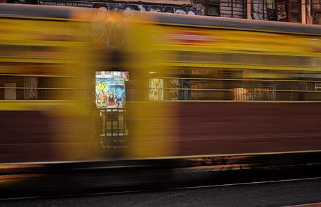
- Category: Commons:Featured_pictures/Objects/Vehicles
- Info Previously nominated image, no deletion requests from anyone due to alleged FOP issue, hence re-nomination. c/u/n by Dey.sandip -- Dey.sandip (talk) 11:52, 19 May 2015 (UTC)
- Support -- Dey.sandip (talk) 11:52, 19 May 2015 (UTC)
- Support as I just said --Martin Falbisoner (talk) 16:30, 19 May 2015 (UTC)
- Support --Tremonist (talk) 16:39, 19 May 2015 (UTC)
- Oppose I never understood such pictures, but previously some of them actually passed, so maybe that's just me? But for me it simply looks like: "The more you blur, the better it looks" ? By going this way soon we will nominate a few random color pixels for the Featured Pictures. It is barely possible to see anything in this picture, excluding that strange poster which is not extraordinary. I absolutely have no clue where it would be possible to use such image. It has no encyclopedia value. It even hurts my eyes by simply looking at it and I want to scroll down as soon as possible. This reminds me of some "randomly thrown tables and chairs" art. Never understood it and never will. Sorry. -- Pofka (talk) 18:15, 19 May 2015 (UTC)
- There's a whole range of potentially suitable articles for pictures like this one: 1, 2, 3... but besides: encyclopedic value in a narrow sense is (luckily!) no requirement for FP stars on Commons. You have - of course! - every right to dislike a picture though. Happens to all of us. --Martin Falbisoner (talk) 19:16, 19 May 2015 (UTC)
- A picture of Commons must not be useful for an encyclopedia and also needs no educational mission. Commons is a free pool of media and not the photo database of Wikipedia. And this picture can be used very good in Wikipedia. --Ralf Roleček 12:36, 20 May 2015 (UTC)
- There's a whole range of potentially suitable articles for pictures like this one: 1, 2, 3... but besides: encyclopedic value in a narrow sense is (luckily!) no requirement for FP stars on Commons. You have - of course! - every right to dislike a picture though. Happens to all of us. --Martin Falbisoner (talk) 19:16, 19 May 2015 (UTC)
- Support --Ralf Roleček 22:54, 19 May 2015 (UTC)
- Support --Hubertl (talk) 10:53, 20 May 2015 (UTC)
- Oppose Noise is a bit high, and I find it compositionally lacking compared to the other "blurred train" pictures we've seen here. --King of ♥ ♦ ♣ ♠ 00:56, 21 May 2015 (UTC)
- Oppose Composition. --Mile (talk) 20:24, 21 May 2015 (UTC)
- Support As before: Good capture: makes you want to investigate the image. -- Colin (talk) 19:25, 22 May 2015 (UTC)
- Oppose per King. — Julian H.✈ 10:15, 24 May 2015 (UTC)
- Oppose For King --Σπάρτακος (talk) 11:04, 25 May 2015 (UTC)
[edit]
.jpg&action=edit§ion=T-1)
Voting period is over. Please don't add any new votes.Voting period ends on 28 May 2015 at 13:40:20 (UTC)
Visit the nomination page to add or modify image notes.
.jpg)
- Category: Commons:Featured pictures/Objects/Vehicles
- Info created by UK Royal Navy - uploaded by Mindmatrix - nominated by Mindmatrix -- Mindmatrix 13:40, 19 May 2015 (UTC)
- Support -- Mindmatrix 13:40, 19 May 2015 (UTC)
- Support Sure. Yann (talk) 14:43, 19 May 2015 (UTC)
- Support --Tomascastelazo (talk) 16:03, 19 May 2015 (UTC)
- Support --Tremonist (talk) 16:44, 19 May 2015 (UTC)
- Regretful Oppose - Dramatic scene, but the quality (sharpness, chromatic noise) is not sufficient for me, and the crop on the left is too tight. --Uoaei1 (talk) 16:55, 19 May 2015 (UTC)
- Support The timing is simply excellent. -- Pofka (talk) 17:43, 19 May 2015 (UTC)
- Oppose Per Uoaei1. Chroma noise. --Mile (talk) 18:50, 19 May 2015 (UTC)
- Oppose per Uoaei1 and Mile, sorry. --Kadellar (talk) 19:10, 19 May 2015 (UTC)
- Support Very impressive -- Lothar Spurzem (talk) 22:29, 19 May 2015 (UTC)
- Support --Ralf Roleček 22:52, 19 May 2015 (UTC)
- Oppose Sorry,per others --LivioAndronico talk 23:13, 19 May 2015 (UTC)
- Oppose Poor photographic quality --CEphoto, Uwe Aranas (talk) 13:39, 20 May 2015 (UTC)
- @LivioAndronico Double vote! --Laitche (talk) 22:46, 21 May 2015 (UTC)
- ops....sorry --LivioAndronico talk 23:09, 21 May 2015 (UTC)
- @LivioAndronico Double vote! --Laitche (talk) 22:46, 21 May 2015 (UTC)
- Weak Support per Pofka and I can accept the quality in this conditions. --Laitche (talk) 19:02, 21 May 2015 (UTC)
- Support Just a comment about the suggested lack of quality: the scenery shows the irish sea during a storm in late winter not the calm sunlit mediterranian sea in the summer. --Dirtsc (talk) 15:22, 22 May 2015 (UTC)
- Support -- Gildir (talk) 15:42, 22 May 2015 (UTC)
- Oppose Bad quality. 1/200 f/13 ? --· Favalli ⟡ 00:38, 23 May 2015 (UTC)
- Oppose Great scene, very questionable aperature choice and lost potential in editing. As a result, the quality is not at a featured picture level, even for an action shot in bad weather. — Julian H.✈ 10:12, 24 May 2015 (UTC)
- Oppose Interesting scene but too poor quality (chroma noise everywhere) --Kreuzschnabel 17:24, 24 May 2015 (UTC)
File:Three women tiredly look at Antoin Sevruguin as he photographs them in the late 19th century..jpeg, not featured[edit]
Voting period is over. Please don't add any new votes.Voting period ends on 28 May 2015 at 12:22:48 (UTC)
Visit the nomination page to add or modify image notes.
- Category: Commons:Featured pictures/People
- Info Three women tiredly look at Antoin Sevruguin as he photographs them in the late 19th century, created by Antoin Sevruguin - uploaded by Alborzagros - nominated by Mirrys -- Mirrys (talk) 12:22, 19 May 2015 (UTC)
- Support -- Mirrys (talk) 12:22, 19 May 2015 (UTC)
- Support --High quality and as up-loader. Alborzagros (talk) 13:33, 19 May 2015 (UTC)
- Oppose Interesting, but quality is not there. Yann (talk) 14:46, 19 May 2015 (UTC)
- Info The original file at the source website doesn't show the pixelization observed here
→ could someone upload it (I'm in a bit of a rush atm).--El Grafo (talk) 15:21, 19 May 2015 (UTC)
- Oppose Per Yann. --Tremonist (talk) 16:43, 19 May 2015 (UTC)
- Strong oppose Per others. The quality probably nowhere is near the QP standards, not even talking about the FP. Check the middle woman nose. The quality is so poor that it is pixeled. -- Pofka (talk) 17:45, 19 May 2015 (UTC)
- Info It appears that this image was up-sampled, which introduced strong pixelization. I've uploaded what appears to be the original from the given source → @Yann, Tremonist, and Pofka: please have another look. --El Grafo (talk) 18:31, 19 May 2015 (UTC)
- Comment Quality is better, but still not good enough. There is quite a lot of noise, and it needs restoration anyway. Regards, Yann (talk) 19:02, 19 May 2015 (UTC)
- Comment per Pofka and Yann. --Tremonist (talk) 12:04, 20 May 2015 (UTC)
- Oppose per others. Btw, what’s the thing at the center of the bottom edge? Doesn’t look like part of the original photograph. --Kreuzschnabel 17:26, 24 May 2015 (UTC)
File:Cervo do Pantano Perfil.jpg, featured[edit]
Voting period is over. Please don't add any new votes.Voting period ends on 1 Jun 2015 at 14:42:34 (UTC)
Visit the nomination page to add or modify image notes.
- Category: Commons:Featured pictures/Animals/Mammals
- Info Close-up of a female marsh deer (Blastocerus dichotomus) in Itirapina, São Paulo state, Brazil.
- The marsh deer is the largest deer species from South America reaching a length of 2 m (6.6 ft) and a shoulder height of 1.2 m (3.9 ft). It is found in Argentina, Bolivia, Peru, Brazil, Uruguay and Paraguay. Formerly found in much of tropical and subtropical South America, it ranged east of the Andes, south from the Amazon rainforest, west of the Brazilian Atlantic rainforest and north of the Argentinian Pampa. Today it is largely reduced to isolated populations at marsh and lagoon zones in the Paraná, Paraguay, Araguaia and Guapore river basins. Created and uploaded by Jonathan Wilkins - nominated by Arion -- 😄 ArionEstar 😜 (talk) 14:42, 23 May 2015 (UTC)
- Support -- 😄 ArionEstar 😜 (talk) 14:42, 23 May 2015 (UTC)
- Question Is this deer Airport keeper ? Is it in nature ? --Mile (talk) 15:11, 23 May 2015 (UTC)
- @PetarM: At the Dr. José Augusto de Arruda Botelho Aerodrome. 😄 ArionEstar 😜 (talk) 15:27, 23 May 2015 (UTC)
- Support High-quality portrait, excellent. --King of ♥ ♦ ♣ ♠ 04:41, 24 May 2015 (UTC)
- Support --Mile (talk) 08:07, 24 May 2015 (UTC)
- Support --LivioAndronico talk 11:04, 24 May 2015 (UTC)
- Support Simple, but effective composition. Less is more. --Pugilist (talk),
- @Pugilist: "Menos é mais". 😄 ArionEstar 😜 (talk) 11:53, 24 May 2015 (UTC)
- Support -- Pofka (talk) 15:24, 24 May 2015 (UTC)
- Support The size is a little small but focus is just on the head and the way of using focal plane is very good. (a bit distracting background though.) --Laitche (talk) 16:51, 24 May 2015 (UTC)
- Support -- Slaunger (talk) 19:36, 24 May 2015 (UTC)
- Comment @ArionEstar: You better change the color space to sRGB otherwise you might be scolded by Colin... --Laitche (talk) 21:04, 24 May 2015 (UTC)
- @Laitche: Sorry, but what? 😄 ArionEstar 😜 (talk) 21:22, 24 May 2015 (UTC)
- I must get round to writing a guide for this. Unless Jonathan Wilkins can save as sRGB from raw, the benefits are reduced. -- Colin (talk) 21:44, 24 May 2015 (UTC)
- @Colin: OK, I almost understood, thanks and please signature above. @ArionEstar: I am not so good about color space but "Images for the web are most widely viewable when in the sRGB color space." as you can see on that page, and this image's ICC Profile is Adobe RGB (1998). --Laitche (talk) 22:02, 24 May 2015 (UTC)
- Never mind, I guess some FP's color space are uncalibrated, same as this :) --Laitche (talk) 23:06, 24 May 2015 (UTC)
- I must get round to writing a guide for this. Unless Jonathan Wilkins can save as sRGB from raw, the benefits are reduced. -- Colin (talk) 21:44, 24 May 2015 (UTC)
- @Laitche: Sorry, but what? 😄 ArionEstar 😜 (talk) 21:22, 24 May 2015 (UTC)
- Support --Cayambe (talk) 15:51, 25 May 2015 (UTC)
- Support --George Chernilevsky talk 17:33, 25 May 2015 (UTC)
- Support Lovely! Jacopo Werther iγ∂ψ=mψ 18:16, 25 May 2015 (UTC)
- Support --Yann (talk) 20:32, 25 May 2015 (UTC)
- Support -- Christian Ferrer 11:01, 26 May 2015 (UTC)
- Support --Tremonist (talk) 12:53, 26 May 2015 (UTC)
- Support Very nice portrait:) --Halavar (talk) 20:15, 26 May 2015 (UTC)
- Support -- H. Krisp (talk) 11:51, 27 May 2015 (UTC)
File:Paneles solares en Cariñena, España, 2015-01-08, DD 09-12 PAN.JPG, featured[edit]
Voting period is over. Please don't add any new votes.Voting period ends on 1 Jun 2015 at 14:16:04 (UTC)
Visit the nomination page to add or modify image notes.
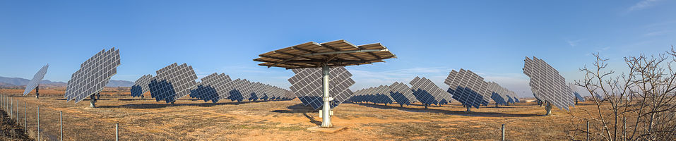
- Category: Commons:Featured pictures/Places/Architecture/Industry
- Info Panoramic view of the photovoltaic power station of Cariñena, Zaragoza, Spain. The panels are mounted on dual axis trackers in order to maximise the intensity of incoming direct radiation. This solution enables the arrays to track the sun in its daily orbit. Poco2 14:16, 23 May 2015 (UTC)
- Support -- Poco2 14:16, 23 May 2015 (UTC)
- Support nice composition. --Kadellar (talk) 14:37, 23 May 2015 (UTC)
- Support nice composition, nice light, nice sky
but bad news... stitching errors. --Laitche (talk) 14:56, 23 May 2015 (UTC) fixed. --Laitche (talk) 18:03, 23 May 2015 (UTC) - Support I suggest litle +contrast and move curve a bit down, its better. Now too brigth. This would be Sci-Fi photo without that tree. --Mile (talk) 15:09, 23 May 2015 (UTC)
- Support Very good and as already mentioned very futuristic - looks more like artwork than a photovoltaic power station. I found a another stitching error (see note) but I am sure Diego will fix it soon. --Tuxyso (talk) 15:34, 23 May 2015 (UTC)
- New version uploaded adressing all issues mentioned here (also yours Iifar) Poco2 17:32, 23 May 2015 (UTC)
- Support I Love this original things,good quality too --LivioAndronico talk 19:54, 23 May 2015 (UTC)
- Support Daniel Case (talk) 03:46, 24 May 2015 (UTC)
- Support though a bit hazier than I would have liked. --King of ♥ ♦ ♣ ♠ 04:42, 24 May 2015 (UTC)
- Support — Chris Woodrich (talk) 08:12, 24 May 2015 (UTC)
- Comment I'm not sure if there is a caching problem, but I see a very strong stitching problem with the fence post on the right side. — Julian H.✈ 10:55, 24 May 2015 (UTC)
- Support -- Pofka (talk) 15:24, 24 May 2015 (UTC)
- Support Great idea and composition, perfect lighting, reasonable quality. Pity for the CA on the fenceposts to the left. --Kreuzschnabel 17:09, 24 May 2015 (UTC)
- Comment The image has huge wow. There is a CA on the fence poles to the left, but it is acceptable for me given the large resolution. I am a little confused about the horizontal angle of view. Could you please indicate that on the file page. A geolocation would also be helpful for understanding better the layout of the solar power plant.-- Slaunger (talk) 19:44, 24 May 2015 (UTC)
- Slaunger: Done It looks like I uploaded the wrong version, the version uploaded now is free of CA. I also added the geodata Poco2 22:34, 24 May 2015 (UTC)
- Support Thanks, and I double-checked; it really is gone now. One thing that puzzles me is why the center panel is horizontally aligned? Is it malfunctioning or under service? Do you know? It gives a striking effect and adds a lot to the wow for me. -- Slaunger (talk) 19:24, 25 May 2015 (UTC)
- Sorry Slaunger, I forgot to answer your question (and realized as I asked you something else in your FPC). I cannot say it with certainty but after asking 3 guys who have some studies in this area, 2 of them agree that the panel in the front is malfunctioning and that position is the most stable against the wind. Poco2 18:27, 1 June 2015 (UTC)
- Slaunger:
- Support--Jebulon (talk) 20:22, 24 May 2015 (UTC)
- Support --Code (talk) 11:50, 25 May 2015 (UTC)
- Support Jacopo Werther iγ∂ψ=mψ 18:11, 25 May 2015 (UTC)
- Support --Yann (talk) 20:35, 25 May 2015 (UTC)
- Support --Böhringer (talk) 05:59, 26 May 2015 (UTC)
- Support --Martin Falbisoner (talk) 06:50, 26 May 2015 (UTC)
- Support --Tremonist (talk) 12:52, 26 May 2015 (UTC)
- Support --Halavar (talk) 20:15, 26 May 2015 (UTC)
File:Bluebells ICM, Ashridge Estate, 2015.jpg, not featured[edit]
Voting period is over. Please don't add any new votes.Voting period ends on 28 May 2015 at 22:40:46 (UTC)
Visit the nomination page to add or modify image notes.
- Category: Commons:Featured pictures/Places/Natural
- Info The bluebells with beech trees at Ashridge Estate. The image is the result of intentional camera movement (ICM), which creates an impressionistic effect. All by Colin.
- Support It's 16:9 so fill you screen. Or zoom to 100% to appreciate the slightly grainy streaks of colour. Educational imagery is more than sharp lenses and megapixel panoramas. Sometimes conveying the impression of a bluebell woodland is more important than a straight capture with all the distractions such a photograph may contain. -- Colin (talk) 22:40, 19 May 2015 (UTC)
- Support No explanation needed.--Tomascastelazo (talk) 22:50, 19 May 2015 (UTC)
- Oppose no FP, no wow to me. --Ralf Roleček 22:51, 19 May 2015 (UTC)
- Support Abstract, very nice. --King of ♥ ♦ ♣ ♠ 01:04, 20 May 2015 (UTC)
- Support simply great! --Martin Falbisoner (talk) 05:37, 20 May 2015 (UTC)
- Oppose nice fine art, but not FP for me. --Alchemist-hp (talk) 08:56, 20 May 2015 (UTC)
- Support Very good. Great colours. Has both artistic and educational value. --Code (talk) 09:28, 20 May 2015 (UTC)
- Support Nice demonstration of a classic photographic technique – and pleasing to the eye as well. --El Grafo (talk) 10:05, 20 May 2015 (UTC)
- Support Yes, I like it. In this case I don´t miss sharpness at all. ;-) --Hubertl (talk) 10:51, 20 May 2015 (UTC)
- Support Impressionism revisited. :) --Tremonist (talk) 12:13, 20 May 2015 (UTC)
- Oppose Nice and useful image and remarkable but not outstanding. I like this challenging shot. --Laitche (talk) 12:28, 20 May 2015 (UTC)
- Oppose I see no possible usage for such pictures. -- Pofka (talk) 12:38, 20 May 2015 (UTC)
- Support I supported this File:Allébron September 2014.jpg and will also support this. --Villy Fink Isaksen (talk) 13:04, 20 May 2015 (UTC)
- Comment I knew this image would be controversial. We are geared towards considering images on Commons as source material for the direct illustrations of a concrete article subject in Wikipedia. But only a fraction of our vocabulary concerns nouns, and only a fraction of educational material deals with such concrete subjects one can see or touch. Outside of such direct and obvious illustrations, Commons is a weak repository of images. How does one illustrate educational material on emotions such as "peace", "stress", "calm", "depression", "joy"? Or how about more abstract health issues such as "pain" or "migraine" or "cancer"? Or general topics like "nature" or "urban" where one wants a general impression of the subject without the distractions of specific examples. If you look on Wikipedia, if the articles are illustrated well at all, then it is with free historical work of art. Many of WP's articles are not illustrated, or illustrated with naive and crude image choices. But in a commercial world, were a picture editor can pay for or commission suitable material, then the choice is much wider.
- Pick up a New Scientist magazine and there's a good chance the front cover is (or some of the articles contain) an artistic illustration or a surreal photograph. For example, their article on migraine. You can't take a photograph of a migraine. An educational picture editor will choose an image that helps the reader engage with the material, process and store the information they are reading. Sometimes the image helps that process, rather than being the information itself.
- If you are British, then bluebell woodland represents Spring, the local natural environment, protected wildflowers, family walks, natures bold colours. And the above image can illustrate those without being an image of the specific beech woodland at Ashridge Estate in Hertfordshire, 10 May 2015. Without going too "contemporary art bollocks", what you get out of an image like this, is partly what you bring to it yourself. -- Colin (talk) 13:53, 20 May 2015 (UTC)
- +1 --Martin Falbisoner (talk) 06:37, 21 May 2015 (UTC)
- Support I wish this could go into category Physics. Since its about Optics. cat "Places" isnt so good chosen, you show us technique, place is of other importance. We have 3 "space" cats, and none of Physics. Well, till then... --Mile (talk) 15:21, 20 May 2015 (UTC)
- While I feel this is a good example of intentional camera movement (ICM) (and currently illustrates the Wikipedia article on the subject), I hope it can be appreciated more than just as an example of a photographic technique. If Commons is to embrace its mission of being a comprehensive repository of educational media, then it needs to contain more than just perfectly exposed, sharply rendered photographers of some object. There are so many missing "featured" categories, it is hard to know where to begin. Go to iStockPhoto and click on a category like Nature or Lifestyle. You won't find a picture of a specific woodland or a picture of a specific person. You find images (mainly of people) that deliver an emotion. And most of our featured images deliver very little in the way of emotion. Take the images young woman standing in a field or bike at the summer meadow. These aren't photographed to illustrate "lens flare", or to illustrate an article on young women or on bikes. But there's an educational use for them for sure. -- Colin (talk) 15:46, 20 May 2015 (UTC)
- Tomascastelazo's image File:Falling rain in mexico.jpg - is classified under "Natural phenomena", but is all you see just heavy rain? How does it make you feel? I want more of this on Commons. -- Colin (talk) 15:59, 20 May 2015 (UTC)
- Let´s look at this from several perspectives. We feature pictures of different types of architecture, and there is no one right way to architecture. We feature paintings from different schools, abstract, classical, impressionism, etc., and there is no one correct way to painting... The medium to represent those and many other themes is through the camera, through photography. But it turns out that photography, besides being a medium, is also a legitimate art form, just as painting, as music, as architecture. So why not feature photography not just as a representation medium of other art forms but for the art of photography itself? Photography has its own language, capable of not just registering "reality" but also capable of having its own discourse. My support of this image springs from there, from the recognition of the art of photography. If we deny the art of photography, we may as well deny all art. Not that everyone has to like it, just as not everyone appreciates architecture, or types of architecture, but we cannot ignore its place in the world of art. Like it or not, know it or not, should or should not, it has its little corner there. Have a look #REDIRECT[[11]] --Tomascastelazo (talk) 16:20, 20 May 2015 (UTC)
- Tomascastelazo's image File:Falling rain in mexico.jpg - is classified under "Natural phenomena", but is all you see just heavy rain? How does it make you feel? I want more of this on Commons. -- Colin (talk) 15:59, 20 May 2015 (UTC)
- Support This is right on the Monet . Daniel Case (talk) 16:56, 20 May 2015 (UTC)
- Comment Category Places is not useful. This doesn't show a place, but a technique. Regards, Yann (talk) 17:47, 20 May 2015 (UTC)
- It doesn't show a photographic technique any more than Diliff's cathedral photographs show an HDR stitched megapixel technique. It may be an example of a technique, but that's a very secondary aspect, and not why I took the picture. But worrying about what classification to put it in, is really tomorrows problem, and quite irrelevant to whether or not this is a fine image. -- Colin (talk) 18:31, 20 May 2015 (UTC)
- My HDR technique helps to see the cathedral more clearly and with more detail though, and is fairly invisible to the viewer. Your blur technique helps to show the scene less clearly and is fairly dominant in the photo... Your photo illustrates the location poorly, but the effect of the technique well. They're both 'techniques' but they have opposite effects on understanding the place you're viewing. Not saying that's a bad thing. I quite like the effect, and obviously you chose the 'place' to suit the effect but I think Yann is right that the image is more about the technique and the effect than about the place. It's just a category, but I think it has implications for how we view the image too. Out of interest, what are the orange streaks in the grass? Diliff (talk) 00:27, 21 May 2015 (UTC)
- It isn't "my blur technique" and isn't even an original subject for the technique. The straight photo is here, which explains the colours. Saying the "photo illustrates the location poorly" is missing the point. The purpose isn't to illustrate the specific beech woodland at Ashridge Estate in Hertfordshire on 10 May 2015. Nor, I believe, is its only education function to illustrate a photographic technique. That's like looking at The Scream and thinking only of a painting using oil, tempera, pastel and crayon on cardboard, or complaining it is a poor likeness of a person compared to a studio photograph taken with the latest Canon L portrait lens. There is far more to educational imagery than this conservative approach. -- Colin (talk)
- @Colin you have a nice fantasy :-) and sorry, but you are not Edvard Munch too ;-) --Alchemist-hp (talk) 07:53, 21 May 2015 (UTC)
- I wasn't saying 'your' technique in the sense that you invented it. It's simply yours because you're using it. Also, I agree with you that the purpose of the photo isn't to illustrate "specific beech woodland at Ashridge Estate etc", but we were discussing it in the context of what the suitable category is, and if it doesn't illustrate the place well, why is the category 'places'? That's the point I was making. Perhaps we need a new category: "artistic expression". I don't think it's a fair comparison though to think about it like The Scream. That is an established artistic work, and would be categorised as such. We don't need to break that work down to a technique in order to find an educational use for it because it is already notable and as such educational for that reason - it illustrates the work of a notable artist. I don't agree with Alchemist-HP's comments above at all though. I don't think it matters that you're not Edvard Munch. Anyone can create art, and your works don't become art only when others start respecting you as an 'artist'. But I'm not sure that Commons is intended to be a repository for non-notable art. It would have to serve an educational purpose beyond being merely art. I think this image does that though, by being a fairly clear example of the technique. Not all art could necessarily do that. Diliff (talk) 10:55, 21 May 2015 (UTC)
- I agree that media on Commons has to have some educational purpose, whether direct photography, artistic photography, drawing, painting, or video. We already have featured pictures that take a non-direct non-documentary approach to photography. For example:
- It isn't "my blur technique" and isn't even an original subject for the technique. The straight photo is here, which explains the colours. Saying the "photo illustrates the location poorly" is missing the point. The purpose isn't to illustrate the specific beech woodland at Ashridge Estate in Hertfordshire on 10 May 2015. Nor, I believe, is its only education function to illustrate a photographic technique. That's like looking at The Scream and thinking only of a painting using oil, tempera, pastel and crayon on cardboard, or complaining it is a poor likeness of a person compared to a studio photograph taken with the latest Canon L portrait lens. There is far more to educational imagery than this conservative approach. -- Colin (talk)
- My HDR technique helps to see the cathedral more clearly and with more detail though, and is fairly invisible to the viewer. Your blur technique helps to show the scene less clearly and is fairly dominant in the photo... Your photo illustrates the location poorly, but the effect of the technique well. They're both 'techniques' but they have opposite effects on understanding the place you're viewing. Not saying that's a bad thing. I quite like the effect, and obviously you chose the 'place' to suit the effect but I think Yann is right that the image is more about the technique and the effect than about the place. It's just a category, but I think it has implications for how we view the image too. Out of interest, what are the orange streaks in the grass? Diliff (talk) 00:27, 21 May 2015 (UTC)
- It doesn't show a photographic technique any more than Diliff's cathedral photographs show an HDR stitched megapixel technique. It may be an example of a technique, but that's a very secondary aspect, and not why I took the picture. But worrying about what classification to put it in, is really tomorrows problem, and quite irrelevant to whether or not this is a fine image. -- Colin (talk) 18:31, 20 May 2015 (UTC)
- File:Schwappender Wein.jpg
- File:Johnnie Walker Splash.JPG
- File:Refraction of Golden Gate Bridge in rain droplets 1.jpg
- File:Leaf trails.JPG
- File:Glühlampe explodiert.jpg and File:Glühwendel brennt durch.jpg (both POTY prize winners)
- File:Light Painting 1 - Booyeembara Park.jpg and File:Light painting screw.jpg
- File:Müga Wasserspiele sw 2013.jpg and File:The Photographer.jpg and File:Dallos-Nyers Boglárka 2013.jpg and File:Cycling Amsterdan 03.jpg and File:Falling rain in mexico.jpg
- File:12-03-17-aktstudien-nuernberg-by-RalfR-32.jpg and File:Nude recumbent woman by Jean-Christophe Destailleur.jpg (both NSFW)
- File:Refleksjoner.jpg and File:Epilobium hirsutum - Seed head - Triptych.jpg
- Now I don't want to compare directly with any specific examples above, but just talk generally. We have images where the subject is contrived or the lighting hides detail, where colours are removed or altered, where the subject is obscured through movement or rain. The effect is artistic at the expense of a straight documentary photograph of a regular unaltered subject. But something else is gained, we hope, and educational qualities are altered but not eliminated. Some of us like to (only) take straight photographs that maximize their encyclopaedic value in their opinion. That's fine but not the only way to create educational media. -- Colin (talk) 12:01, 21 May 2015 (UTC)
- Support you are really crazy --The Photographer (talk) 17:49, 20 May 2015 (UTC)
- Oppose Sorry per Laitche --LivioAndronico talk 18:05, 20 May 2015 (UTC)
- Oppose Per Pofka, D kuba (talk) 20:39, 20 May 2015 (UTC)
- Support --Kadellar (talk) 10:24, 21 May 2015 (UTC)
- Support. Diliff (talk) 10:55, 21 May 2015 (UTC)
- Neutral I also supported File:Allébron September 2014.jpg, but this one is just too much. On the other side the colors look fine and I cannot say how it would look if I had shot it, therefore my vote is neutral Poco2 18:52, 21 May 2015 (UTC)
- Oppose per other opposers. --Ivar (talk) 05:21, 22 May 2015 (UTC)
- Oppose per Alchemist --LC-de (talk) 09:31, 22 May 2015 (UTC)
- Support -- Gildir (talk) 15:40, 22 May 2015 (UTC)
- Oppose Encyclopedic interest, very limited. --Archaeodontosaurus (talk) 16:09, 22 May 2015 (UTC)
- Archaeodontosaurus, there's no requirement for any image on Commons, nor any featured image on Commons, to have "Encyclopedic interest". That's not the definition of "educational" that we use here. And it is wrong anyway, since the image is in use on Wikipedia, which is more than can be said for many Featured Pictures. To be "educational", the image doesn't have to be a source of information itself, but may help one think about a subject while reading about it. -- Colin (talk) 16:43, 22 May 2015 (UTC)
- Please note I did not say she was no sense in what I said was little. I warned the community about promoting this kind of image can be produced in two clicks. We could have quickly large amounts of image such that it will judge in various competitions. --Archaeodontosaurus (talk) 17:01, 22 May 2015 (UTC)
- I find your reply very difficult to understand, but I'd like to say that I don't think it matters whether it was difficult to produce or not. What matters is whether it's a useful or educational and of good technical quality. Some great FPs are trivially easy to photograph, some are extremely difficult technical accomplishments. Also, as Colin said, when it comes to usefulness, whether you think it's interesting isn't really the point. I think we (as reviewers) need to think beyond our personal interests and consider whether it could be useful or interesting to others too. Of course our personal interests will factor into how we judge images and it is impossible to completely separate that, but the more objective we can be, the better reviewers we will be. Diliff (talk) 17:14, 22 May 2015 (UTC)
- Archaeodontosaurus, we don't care if "no" or "little" "Encyclopaedic interest". It is irrelevant to the question of FP on Commons, and that's not just my opinion, it's our whole ethos at Commons FP which you should know. Encyclopaedic matters on Wikipedia FP only. Some people take "specimen" photos, as you do, and they are valuable and encyclopaedic, but many many other featured pictures on Commons are never destined to appear on Wikipedia nor any other encyclopaedia. Please do not confuse "Encyclopaedic" with "Educational", and for the latter, Commons has an extremely broad interpretation, which includes exploding light bulbs, hazy bridges obscured by rain drops, and lovers caught in a storm.
- I find your "two clicks" comment insulting and ignorant. This image was not the result of going out one morning and getting lucky when I dropped my camera; perhaps fortune smiles on you that way. This is the third Spring where I've experimented with ICM in bluebell woods, which are at their best for only about one or two weeks a year. It's a particularly low-success-rate endeavour, and one that requires tweaking the exposure, focal length and focus to get the best results, and trying a variety of locations, angles and lighting conditions. I've taken many dozens of photographs before reaching one I'm happy with. And I spent quality time post-processing this as I do for all my images on Commons. So on one measure, this photo has taken me three years, not "two clicks". Go ahead and mock that if you like; it seems others want to. -- Colin (talk) 19:13, 22 May 2015 (UTC)
- I am sad to be misspoke. I know your work I really admire. All what you told me, consernant your image, I believe without a doubt. My only message is to draw attention to the risk of seeing our contests invaded by images in two clicks. For cons, I continue to argue that we are primarily in the service of various encyclopedias --Archaeodontosaurus (talk) 07:55, 23 May 2015 (UTC)
- I find your reply very difficult to understand, but I'd like to say that I don't think it matters whether it was difficult to produce or not. What matters is whether it's a useful or educational and of good technical quality. Some great FPs are trivially easy to photograph, some are extremely difficult technical accomplishments. Also, as Colin said, when it comes to usefulness, whether you think it's interesting isn't really the point. I think we (as reviewers) need to think beyond our personal interests and consider whether it could be useful or interesting to others too. Of course our personal interests will factor into how we judge images and it is impossible to completely separate that, but the more objective we can be, the better reviewers we will be. Diliff (talk) 17:14, 22 May 2015 (UTC)
- Please note I did not say she was no sense in what I said was little. I warned the community about promoting this kind of image can be produced in two clicks. We could have quickly large amounts of image such that it will judge in various competitions. --Archaeodontosaurus (talk) 17:01, 22 May 2015 (UTC)
- Archaeodontosaurus, there's no requirement for any image on Commons, nor any featured image on Commons, to have "Encyclopedic interest". That's not the definition of "educational" that we use here. And it is wrong anyway, since the image is in use on Wikipedia, which is more than can be said for many Featured Pictures. To be "educational", the image doesn't have to be a source of information itself, but may help one think about a subject while reading about it. -- Colin (talk) 16:43, 22 May 2015 (UTC)
- I state that all my FP are used in various items of wikipedia and 90% my QI also. But I think your phrase was very unhappy. As said Oscar Wilde :"Better to remain silent and be thought a fool than to speak out and remove all doubt."--LivioAndronico talk 09:43, 23 May 2015 (UTC)
- Support I thought a long time, creative work is a multimedia as useful as an other, I'm very favorable to explore different techniques of photography or edition. I strongly agree with Archaeodontosaurus on the fact we are in the service of various encyclopedias, this is why I give my support here. Explorations of the technical and artistic possibilities of our cameras or hardwares have a big encyclopedic value from my point of view, as well as programing languages or as other knowledges. I support the pleasant image, the technique and the gait... -- Christian Ferrer 20:43, 24 May 2015 (UTC)
File:Crocodylus acutus camouflage.jpg, featured[edit]
Voting period is over. Please don't add any new votes.Voting period ends on 28 May 2015 at 21:06:29 (UTC)
Visit the nomination page to add or modify image notes.
- Category: Commons:Featured pictures/Animals/Reptiles
- Info All by -- Tomascastelazo (talk) 21:06, 19 May 2015 (UTC)
- Support -- Tomascastelazo (talk) 21:06, 19 May 2015 (UTC)
- Support --Ralf Roleček 22:52, 19 May 2015 (UTC)
- Support some quality issues but sufficient wow --Martin Falbisoner (talk) 05:36, 20 May 2015 (UTC)
- Support Great strange structures around the animal's head. :) --Tremonist (talk) 12:11, 20 May 2015 (UTC)
- Oppose The croco hides too well for me to Support this image. Lots of disturbing reflections and quite noisy. --Uoaei1 (talk) 14:50, 20 May 2015 (UTC)
- Question @ Uoaei1 isn't that the idea of camouflage? So the question is, does the picture tell the story it is trying to tell? --Tomascastelazo (talk) 18:31, 20 May 2015 (UTC)
- Support --Mile (talk) 10:57, 21 May 2015 (UTC)
- Weak Support A lot of reflections. Interesting. --XRay talk 18:52, 21 May 2015 (UTC)
- Support Inevitable reflections. 😄 ArionEstar 😜 (talk) 21:37, 21 May 2015 (UTC)
- Support It's not a typical image that makes you say "wow," with anything distinctive in it - but that's precisely how the camouflage manages to work so well. --King of ♥ ♦ ♣ ♠ 06:12, 22 May 2015 (UTC)
- Support -- H. Krisp (talk) 10:18, 22 May 2015 (UTC)
- Oppose Sorry but noise and I don't like the composition --LivioAndronico talk 11:01, 22 May 2015 (UTC)
- Oppose Of course it is a very tough task to depict an example of camouflage as you might want to show the subject and how it merges with the background - two contradictory requirements. But frankly, the picture here is not an example of a camouflaged animal. The reason why you don't see the croc clearly is just a combination of disturbing reflections with a somewhat unhappy composition. --LC-de (talk) 12:43, 22 May 2015 (UTC)
- Support I like the camouflaged reflections and the fact he is approaching the viewer. -- Colin (talk) 19:54, 22 May 2015 (UTC)
- Comment I generally try not to “explain” my photographs, but I think it is appropriate in this case. First of all, mangroves offer difficult light conditions. Most pictures of mangroves are taken from the outside looking in, but the view stops at the edge of the mangroves, and seldom ventures in. This is due to the thick foilage that makes it difficult to see far into it. Once inside the mangrove, depending on the day, light seeps in and gives a very spoty look inside, with patches of light next to patches of shadows with a great differential in exposure values, basically photographing small sunlit areas next to shadow areas, and thus making overal light conditions terrible. As just as light seeps in, the reflections of the canopy make a very confusing scene, visually speaking. Reflections everywhere, sunlight coming in small ray like patterns, etc. See here #REDIRECT[[12]] and here #REDIRECT[[13]] and here #REDIRECT[[14]]. When the water is still, it acts as a mirror to a very complex scene, and it is hard to distinguish the real thing from the reflection.
- Now to the crocs… When taken in lazy mode, that is, the crocs sunbathing, it is very easy to distinguish them in their environment, and this type of picture give una a good idea of the physiognomy, but not necesarily of their adaptive characteristics or their ability to blend into a scene. See here #REDIRECT[[15]] and here #REDIRECT[[16]].
- So, with all that, this picture is not a picture of a croc only, it is a picture of an environment that shows the blending in of a croc in that environment.
- --Tomascastelazo (talk) 20:58, 22 May 2015 (UTC)
- Oppose It is an interesting, and possibly a useful photo. The visual appeal is very limited though, and I would expect more of that for a featured picture. — Julian H.✈ 10:10, 24 May 2015 (UTC)
- Oppose per Julian, sorry. Interesting and useful but no wow for me. --Kreuzschnabel 17:21, 24 May 2015 (UTC)
* Striked --Cart (talk) 19:38, 4 October 2018 (UTC)
![]() Oppose For Julian --Σπάρτακος (talk) 11:07, 25 May 2015 (UTC)
Oppose For Julian --Σπάρτακος (talk) 11:07, 25 May 2015 (UTC)
- Info Post-promoted due to sock double vote. 12 October 2018 --Cart (talk) 18:21, 12 October 2018 (UTC)
File:Prospect Park New York May 2015 008.jpg, not featured[edit]
Voting period is over. Please don't add any new votes.Voting period ends on 30 May 2015 at 00:49:32 (UTC)
Visit the nomination page to add or modify image notes.
- Category: Commons:Featured pictures/Places/Natural
- Info created by King of Hearts - uploaded by King of Hearts - nominated by King of Hearts -- King of ♥ ♦ ♣ ♠ 00:49, 21 May 2015 (UTC)
- Support -- King of ♥ ♦ ♣ ♠ 00:49, 21 May 2015 (UTC)
- Support Beautiful composition -- Lothar Spurzem (talk) 08:46, 21 May 2015 (UTC)
- Support --Tremonist (talk) 13:50, 21 May 2015 (UTC)
- Comment Good composition. But please check for CAs at the branches top left. --XRay talk 18:43, 21 May 2015 (UTC)
- Support -- Christian Ferrer 11:08, 22 May 2015 (UTC)
- Support --Halavar (talk) 13:19, 22 May 2015 (UTC)
- Oppose Don't see anything remarkable about the composition. Urban pond/lake. The water and fallen branches aren't attractive. -- Colin (talk) 20:11, 22 May 2015 (UTC)
- Oppose Per Colin.--Jebulon (talk) 21:34, 22 May 2015 (UTC)
- Oppose Me as well. --LB 08:51, 23 May 2015 (UTC)
- Oppose No wow, per Colin. Daniel Case (talk) 03:50, 24 May 2015 (UTC)
- Support This immediately caught my eye. I really like the colors combination. -- Pofka (talk) 15:34, 24 May 2015 (UTC)
- Oppose For Colin --Σπάρτακος (talk) 11:12, 25 May 2015 (UTC)
File:Heldervue Somerset West.jpg, not featured[edit]
Voting period is over. Please don't add any new votes.Voting period ends on 3 Jun 2015 at 08:38:55 (UTC)
Visit the nomination page to add or modify image notes.
- Category: Commons:Featured pictures/Places/Architecture/Cityscapes
- Info created by SkyPixels - uploaded by SkyPixels - nominated by Discott -- Discott (talk) 08:38, 25 May 2015 (UTC)
- Support -- Discott (talk) 08:38, 25 May 2015 (UTC)
- Question Where is that phenomena? D kuba (talk) 10:55, 25 May 2015 (UTC)
- Comment Oversaturated. --Kadellar (talk) 12:17, 25 May 2015 (UTC)
- Oppose Nice view but oversaturated, overexposed or over-processing. Sorry. --Laitche (talk) 20:38, 25 May 2015 (UTC)
- Oppose übersättigt, zu stark bearbeitet. --Ralf Roleček 20:51, 25 May 2015 (UTC)
- @SkyPixels: Could you see if you can reprocess the file with less saturation, and add it as an alt below? --King of ♥ ♦ ♣ ♠ 21:11, 25 May 2015 (UTC)
- Oppose overprocessed --Martin Falbisoner (talk) 06:49, 26 May 2015 (UTC)
- Oppose per others, sorry. --Tremonist (talk) 12:57, 26 May 2015 (UTC)
- @ King of Hearts - I have added the original, before any post edit. is it better? — Preceding unsigned comment added by SkyPixels (talk • contribs) 08:03, 26 May 2015 (UTC)
- Oppose Striking composition, but overprocessing left blown highlights not only on clouds but houses below. Daniel Case (talk) 16:38, 26 May 2015 (UTC)
File:Strand Beach Road at Dusk.jpg, not featured[edit]
Voting period is over. Please don't add any new votes.Voting period ends on 3 Jun 2015 at 08:31:21 (UTC)
Visit the nomination page to add or modify image notes.
- Category: Commons:Featured pictures/Places/Architecture/Cityscapes
- Info created by SkyPixels - uploaded by SkyPixels - nominated by Discott -- Discott (talk) 08:31, 25 May 2015 (UTC)
- Support -- Discott (talk) 08:31, 25 May 2015 (UTC)
- Oppose I love the view in this one and actually was planning to support this nomination at first. Though, I doubt if the quality is high enough. Pixels are visible even on the closest buildings. Picture captured by Christian Ferrer (below this nomination) has MUCH better quality with similar cityscape. -- Pofka (talk) 17:20, 25 May 2015 (UTC)
- Neutral per Pofka. --Tremonist (talk) 12:56, 26 May 2015 (UTC)
File:Sète from Mount Saint-Clair by night 01.jpg, featured[edit]
Voting period is over. Please don't add any new votes.Voting period ends on 3 Jun 2015 at 06:17:43 (UTC)
Visit the nomination page to add or modify image notes.
- Category: Commons:Featured pictures/Places/Architecture/Cityscapes
- Info created by Christian Ferrer - uploaded by Christian Ferrer - nominated by Christian Ferrer -- Christian Ferrer 06:17, 25 May 2015 (UTC)
- Support -- Christian Ferrer 06:17, 25 May 2015 (UTC)
- Support Very nice. A pity that the sky wasn't better, it looks a little bit washed out. --Code (talk) 08:28, 25 May 2015 (UTC)
{{withdraw}} oups, sorry for having disturbed, I didn't check all the RAW file, maybe there is other better images-- Christian Ferrer 09:07, 25 May 2015 (UTC)- Info @Code: , new file uploaded -- Christian Ferrer 11:48, 25 May 2015 (UTC)
- Support --LivioAndronico talk 12:40, 25 May 2015 (UTC)
- Support -- Pofka (talk) 17:22, 25 May 2015 (UTC)
- Support --King of ♥ ♦ ♣ ♠ 17:25, 25 May 2015 (UTC)
- Support --George Chernilevsky talk 17:31, 25 May 2015 (UTC)
- Support Nice time! 😄 ArionEstar 😜 (talk) 18:02, 25 May 2015 (UTC)
- Support --Famberhorst (talk) 18:11, 25 May 2015 (UTC)
- Support Very detailed nice view. --Laitche (talk) 19:44, 25 May 2015 (UTC)
- Support --Yann (talk) 20:28, 25 May 2015 (UTC)
- Support --Ralf Roleček 20:52, 25 May 2015 (UTC)
- Support --Böhringer (talk) 05:58, 26 May 2015 (UTC)
- Support --Tremonist (talk) 12:55, 26 May 2015 (UTC)
- Support Scenery isn't that striking. But it was captured in fine detail from front to back with very minimal light posterization. Most of us know how difficult this can be with even larger, more photographically inviting night cityscapes. So the technical accomplishment more than makes up the difference. Daniel Case (talk) 15:37, 26 May 2015 (UTC)
- Support --Halavar (talk) 20:14, 26 May 2015 (UTC)
- Support A good tribute to this city.--Jebulon (talk) 20:37, 28 May 2015 (UTC)
File:Araucárias ao fundo Parque Nacional da Serra da Bocaina..jpg, featured[edit]
Voting period is over. Please don't add any new votes.Voting period ends on 3 Jun 2015 at 18:07:06 (UTC)
Visit the nomination page to add or modify image notes.
- Category: Commons:Featured pictures/Places/Natural
- Info created and uploaded by Heris Luiz Cordeiro Rocha - nominated by Arion -- 😄 ArionEstar 😜 (talk) 18:07, 25 May 2015 (UTC)
- Support -- 😄 ArionEstar 😜 (talk) 18:07, 25 May 2015 (UTC)
- Support--LivioAndronico talk 18:33, 25 May 2015 (UTC)
- Support
Ślimaczek (talk) 18:59, 25 May 2015 (UTC)
- Ślimaczek : Editors whose accounts have at least 10 days and 50 edits can vote.--LivioAndronico talk 19:11, 25 May 2015 (UTC)
- Support very good! --Ralf Roleček 20:48, 25 May 2015 (UTC)
- Neutral Amazing light! Excellent mood but too noisy, so pity! --Laitche (talk) 23:50, 25 May 2015 (UTC)
- @Laitche: Yes, but like here, I think the noise level is acceptable. 😄 ArionEstar 😜 (talk) 00:01, 26 May 2015 (UTC)
- ArionEstar: I am supporting that one before this, this photo's noise is too heavy... --Laitche (talk) 00:13, 26 May 2015 (UTC)
- Support --Martin Falbisoner (talk) 06:46, 26 May 2015 (UTC)
- Support -- Pofka (talk) 09:47, 26 May 2015 (UTC)
- Support Horses make it. --Mile (talk) 12:28, 26 May 2015 (UTC)
- Support --Tremonist (talk) 13:01, 26 May 2015 (UTC)
- Comment I am guessing when you removed vignetting worked with wrong color space since this image's color space is uncalibrated so I've changed the color space to sRGB with derivative work (alternative). --Laitche (talk) 14:21, 26 May 2015 (UTC)
- @Laitche: The vignetting effect is also in this photo, of the same photographer. 😄 ArionEstar 😜 (talk) 17:39, 27 May 2015 (UTC)
- @ArionEstar: I guess there are several causes that occurs as vignetting so I'm not sure. You maybe ask the photographer :) --Laitche (talk) 17:57, 27 May 2015 (UTC)
Alternative[edit]
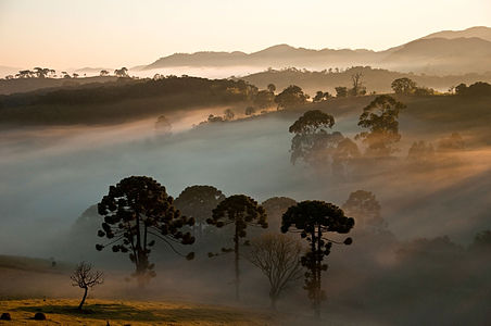
- Info Denoised, reverted decreased saturation, removed dust spots. Processed from the first version. --Laitche (talk) 13:06, 26 May 2015 (UTC)
- Abstain as editor. --Laitche (talk) 13:06, 26 May 2015 (UTC)
- Comment @Laitche: Yes, it's better, but vignette at the right and left uppers. It's necessary to zoom much for see it. 😄 ArionEstar 😜 (talk) 13:14, 26 May 2015 (UTC)
- Fixed --Laitche (talk) 13:36, 26 May 2015 (UTC)
- Thanks. I Support now. 😄 ArionEstar 😜 (talk) 13:57, 26 May 2015 (UTC)
- Thanks. I
- Support Great atmosphere. --LB 16:15, 26 May 2015 (UTC)
- Support --Kikos (talk) 19:01, 26 May 2015 (UTC)
- Support --Halavar (talk) 20:13, 26 May 2015 (UTC)
- Comment @Livioandronico2013, Ralf Roletschek, Martin Falbisoner, Pofka, PetarM, and Tremonist: @Tremonist: And this alternative? 😄 ArionEstar 😜 (talk) 21:58, 26 May 2015 (UTC)
- Support good also --Mile (talk) 05:58, 27 May 2015 (UTC)
- Support also fine with me --Martin Falbisoner (talk) 06:25, 27 May 2015 (UTC)
- Support Possibly even better. Love how these sun rays became more solid. -- Pofka (talk) 10:43, 27 May 2015 (UTC)
- Support -- H. Krisp (talk) 11:48, 27 May 2015 (UTC)
- Support Also good. --Tremonist (talk) 12:13, 27 May 2015 (UTC)
- Support Even thou I would have liked a slightly different composition more :P Kruusamägi (talk) 18:08, 27 May 2015 (UTC)
- Support --King of ♥ ♦ ♣ ♠ 01:31, 28 May 2015 (UTC)
- Support --Claus 09:57, 28 May 2015 (UTC)
- Support --Böhringer (talk) 15:07, 28 May 2015 (UTC)
- Support --Yann (talk) 07:26, 29 May 2015 (UTC)
File:Harbour snowy mountains Rethymno Crete Greece.jpg, not featured[edit]
Voting period is over. Please don't add any new votes.Voting period ends on 3 Jun 2015 at 16:54:29 (UTC)
Visit the nomination page to add or modify image notes.
- Category: Commons:Featured pictures/Places
- Info All by me -- Jebulon (talk) 16:54, 25 May 2015 (UTC)
- Support Sunny mediterranean harbour and snowy mountains in Rethymno, Crete, Greece.-- Jebulon (talk) 16:54, 25 May 2015 (UTC)
 Underexposed --The Photographer (talk) 17:06, 25 May 2015 (UTC)
- Oppose I'm not too impressed with the lighting, and in terms of composition, I think the pier on the right is awkwardly placed. --King of ♥ ♦ ♣ ♠ 17:53, 25 May 2015 (UTC)
- Neutral per King of Hearts. --Tremonist (talk) 12:59, 26 May 2015 (UTC)
- Oppose QI definitely, but no wow. Daniel Case (talk) 15:24, 26 May 2015 (UTC)
File:Neue Wache, Unter den Linden, Berlin-Mitte, Nacht (HDR).jpg, featured[edit]
.jpg&action=edit§ion=T-1)
Voting period is over. Please don't add any new votes.Voting period ends on 3 Jun 2015 at 13:15:16 (UTC)
Visit the nomination page to add or modify image notes.
.jpg/450px-Neue_Wache%2c_Unter_den_Linden%2c_Berlin-Mitte%2c_Nacht_(HDR).jpg)
- Category: Commons:Featured pictures/Places/Architecture
- Info Neue Wache (New Guardhouse) in Berlin-Mitte at night. It was built from 1816 and 1818 according to plans of Karl Friedrich Schinkel. It is one of the main works of German classicism. HDR made of three exposures (1s; 2s; 4s; 8s; 15s at f/7,1 and ISO 250). As some of you know I'm obsessed with this building. I made hundreds of photographs of it and uploaded some of them to Commons. Now I think this one could be FP. What do you think? All by -- Code (talk) 13:15, 25 May 2015 (UTC)
- Support -- Code (talk) 13:15, 25 May 2015 (UTC)
- Support --LivioAndronico talk 13:49, 25 May 2015 (UTC)
- Comment I think the WB might be a little too blue. --King of ♥ ♦ ♣ ♠ 17:23, 25 May 2015 (UTC)
- Support -- Pofka (talk) 17:26, 25 May 2015 (UTC)
- Support -- George Chernilevsky talk 17:30, 25 May 2015 (UTC)
- Comment A bit fuzzy all over the image and this is HDR so it's a strange comment but too high dynamic range then I get kind of artificial feeling. --Laitche (talk) 19:14, 25 May 2015 (UTC)
- @Laitche: Do you really think it looks artificial? I worked on this for hours to get a natural look, but maybe I looked at it for too long. You should come here and visit Berlin to see what it really looks like ;-) --Code (talk) 05:30, 26 May 2015 (UTC)
- @Code: Yeah, I have never been Berlin, it's a night view but when I see around the bikes on the right side and the benches on the left side, it's just like the daytime of a sunny day. They say "More than enough is too much." but I won't oppose this :) --Laitche (talk) 11:17, 26 May 2015 (UTC)
- @Laitche: It's not that I want to convince you but the brightness behind the building on the right side comes from some very bright street lamps and from the illumination of the other building on the right ("Zeughaus"). Thanks to HDR I could reduce the brightness there to an acceptable level, normally this part would have been completely blown. --Code (talk) 11:37, 26 May 2015 (UTC)
- I am understanding it's a normal because of HDR but I want (and I hope) HDR should be like a this kind of light :) --Laitche (talk) 17:58, 26 May 2015 (UTC)
- Support It's getting better and better. ;oD --Yann (talk) 20:26, 25 May 2015 (UTC)
- Support --Ralf Roleček 20:50, 25 May 2015 (UTC)
- Support FP imo --Martin Falbisoner (talk) 06:49, 26 May 2015 (UTC)
- Support -- Christian Ferrer 11:03, 26 May 2015 (UTC)
- Support --Tremonist (talk) 12:57, 26 May 2015 (UTC)
- Support A tasteful use of HDR. Daniel Case (talk) 16:35, 26 May 2015 (UTC)
- Support Kruusamägi (talk) 11:13, 28 May 2015 (UTC)
- Support just a second, there was something.. Oh, I forgot.. ;-)--Hubertl (talk) 18:48, 29 May 2015 (UTC)
File:Roosa hommikuudu Tolkuse rabas.jpg, featured[edit]
Voting period is over. Please don't add any new votes.Voting period ends on 3 Jun 2015 at 17:41:05 (UTC)
Visit the nomination page to add or modify image notes.
- Category: Commons:Featured pictures/Places/Natural
- Info created and uploaded by MKose - nominated by Kruusamägi (talk) 17:41, 25 May 2015 (UTC)
- Support -- Kruusamägi (talk) 17:41, 25 May 2015 (UTC)
- Support @Kruusamägi: Wow! Nice time! Almost like here. S2 😄 ArionEstar 😜 (talk) 17:47, 25 May 2015 (UTC)
- Support --King of ♥ ♦ ♣ ♠ 17:49, 25 May 2015 (UTC)
- Comment English description please. --Laitche (talk) 18:02, 25 May 2015 (UTC)
- Done Kruusamägi (talk) 22:17, 25 May 2015 (UTC)
- Question @Kruusamägi: Natural place or Natural phenomena? 😄 ArionEstar 😜 (talk) 18:11, 25 May 2015 (UTC)
- Comment It's a morning fog + sunrise and therefor it could just as well be classified as natural phenomena. I don't know what is more suitable category. Kruusamägi (talk) 22:17, 25 May 2015 (UTC)
- If you like crepuscular rays, I think natural phenomena is suitable. (but not sure) --Laitche (talk) 00:02, 26 May 2015 (UTC)
- If the subject of the photo is the bog, then it's better in Natural places, but if it's the sunrise, then it's better in Natural phenomena. As the subject of my photo above is the national park, it's better in Natural places. 😄 ArionEstar 😜 (talk) 00:50, 26 May 2015 (UTC)
- If you like crepuscular rays, I think natural phenomena is suitable. (but not sure) --Laitche (talk) 00:02, 26 May 2015 (UTC)
- Support--LivioAndronico talk 18:34, 25 May 2015 (UTC)
- Support
Ślimaczek (talk) 19:00, 25 May 2015 (UTC)
- Ślimaczek : Editors whose accounts have at least 10 days and 50 edits can vote.--LivioAndronico talk 19:10, 25 May 2015 (UTC)
- Support --Ralf Roleček 20:49, 25 May 2015 (UTC)
- Support Nice crepuscular rays, colours and reflections. noisy but acceptable for me. --Laitche (talk) 23:46, 25 May 2015 (UTC)
- Support Daniel Case (talk) 04:32, 26 May 2015 (UTC)
- Support --Böhringer (talk) 05:57, 26 May 2015 (UTC)
- Support per above --Martin Falbisoner (talk) 06:47, 26 May 2015 (UTC)
- Support Wow. -- Pofka (talk) 09:48, 26 May 2015 (UTC)
- Support --Mile (talk) 12:28, 26 May 2015 (UTC)
- Support --Tremonist (talk) 13:01, 26 May 2015 (UTC)
- Support -- H. Krisp (talk) 11:49, 27 May 2015 (UTC)
- Support --Ivar (talk) 14:54, 27 May 2015 (UTC)
- Support -- Christian Ferrer 11:19, 28 May 2015 (UTC)
- Support --Yann (talk) 07:26, 29 May 2015 (UTC)
File:Seal of Florida.svg, not featured[edit]
Voting period is over. Please don't add any new votes.Voting period ends on 3 Jun 2015 at 13:19:51 (UTC)
Visit the nomination page to add or modify image notes.

- Category: Commons:Featured pictures/Non-photographic media
- Info created by florida union - uploaded by User:BetacommandBot - nominated by Qian.neewan -- Qian.Nivan (talk) 13:19, 25 May 2015 (UTC)
- Support -- Qian.Nivan (talk) 13:19, 25 May 2015 (UTC)
- Comment It is good, but what makes it so special? --Tremonist (talk) 12:59, 26 May 2015 (UTC)
- Oppose It should be done manually rather than posterization --The Photographer (talk) 16:05, 26 May 2015 (UTC)
File:Karrenseilbahn Bergstation-Restaurant Dornbirn 1.JPG, featured[edit]
Voting period is over. Please don't add any new votes.Voting period ends on 4 Jun 2015 at 06:18:44 (UTC)
Visit the nomination page to add or modify image notes.
- Category: Commons:Featured pictures/Places/Architecture/Cityscapes
- Info Cable-car: Karrenseilbahn in Dornbirn, Austria. Restaurant in the mountain station. c/u/n by -- Böhringer (talk) 06:18, 26 May 2015 (UTC)
- Support -- Böhringer (talk) 06:18, 26 May 2015 (UTC)
- Neutral Nice blue hour lighting and very detailed. However, I find the composition a bit unsettling; the dining room is cropped at an awkward place at the top right, and as for the fence below, I feel like it should serve more of a compositional purpose or should be omitted altogether. --King of ♥ ♦ ♣ ♠ 06:33, 26 May 2015 (UTC)
- Support totally works for me --Martin Falbisoner (talk) 06:42, 26 May 2015 (UTC)
- Strong support Totally per Martin Falbisoner. 😄 ArionEstar 😜 (talk) 08:48, 26 May 2015 (UTC)
- Support --Yann (talk) 09:08, 26 May 2015 (UTC)
- Support Dark but pleasantly looking. -- Pofka (talk) 09:46, 26 May 2015 (UTC)
- Support My critical comment: the bottom of the restaurant is almost in line with the horizon. --Uoaei1 (talk) 10:35, 26 May 2015 (UTC)
{o} Sorry to disagree about the fence. I find it too disturbing, and not helping to the composition at all. A no go for me, I'm afraid--Jebulon (talk) 11:09, 26 May 2015 (UTC)- Support After thinking again, and re-review, I have to change my vote, my first review was not careful enough. I support now. "Il n'y a que les imbéciles qui ne changent pas d'avis".--Jebulon (talk) 11:24, 27 May 2015 (UTC)
- @Jebulon: You removed others votes... --Laitche (talk) 11:56, 27 May 2015 (UTC)
- Support Its something original, good IQ, but compo could be better, without the fence. --Mile (talk) 12:30, 26 May 2015 (UTC)
- Support --Tremonist (talk) 13:10, 26 May 2015 (UTC)
- Support I don't think the fence is disturbing the pictures composition at all. Also I can follow Böhringer's explanation regarding this topic above. --Plani (talk) 13:40, 26 May 2015 (UTC)
- Neutral Nice creative photo but agree with negative opinions of the fence, I am not happy with crop the bottom part but I want just without the fence composition... --Laitche (talk) 17:35, 26 May 2015 (UTC)
- Support. It's slightly off symmetrical which is the most significant compositional issue for me. I agree the fence isn't ideal, but I don't think cropping it is a better solution. Diliff (talk) 20:47, 26 May 2015 (UTC)
- Support --Ralf Roleček 21:17, 26 May 2015 (UTC)
- Comment These should be all the votes Jebulon removed. Laitche, would you please check? --Tremonist (talk) 12:24, 27 May 2015 (UTC)
- Support -- Christian Ferrer 11:31, 29 May 2015 (UTC)
- Support --Hubertl (talk) 18:39, 29 May 2015 (UTC)
- Support --Johann Jaritz (talk) Johann Jaritz 09:37, 31 May 2015 (UTC)
File:Krause Glucke Sparassis crispa.JPG, featured[edit]
Voting period is over. Please don't add any new votes.Voting period ends on 31 May 2015 at 10:55:29 (UTC)
Visit the nomination page to add or modify image notes.
- Category: Commons:Featured pictures/Fungi
- Info created, uploaded and nominated by -- H. Krisp (talk) 10:55, 22 May 2015 (UTC)
- Support -- H. Krisp (talk) 10:55, 22 May 2015 (UTC)
- Support Good structures. --Tremonist (talk) 12:36, 22 May 2015 (UTC)
- Support Poco2 19:02, 22 May 2015 (UTC)
- Support More Fungi! 😄 ArionEstar 😜 (talk) 23:24, 22 May 2015 (UTC)
- Support --Llez (talk) 06:27, 23 May 2015 (UTC)
- Support --Hubertl (talk) 10:11, 23 May 2015 (UTC)
- Oppose A good QI, but not really more in my opinion. — Julian H.✈ 10:36, 24 May 2015 (UTC)
- Support -- George Chernilevsky talk 14:17, 24 May 2015 (UTC)
- Support --Famberhorst (talk) 18:14, 25 May 2015 (UTC)
- Support --Ivar (talk) 14:56, 27 May 2015 (UTC)
File:Viborg_Katedralskole_Symmetrical.jpg, featured[edit]
Voting period is over. Please don't add any new votes.Voting period ends on 31 May 2015 at 06:43:09 (UTC)
Visit the nomination page to add or modify image notes.
- Category: Commons:Featured pictures/Places/Architecture
- Info created by Slaunger - uploaded by Slaunger - nominated by Tuxyso -- Tuxyso (talk) 06:43, 22 May 2015 (UTC)
- Support Excellent work, beautiful light. I like the silence of the photo - everything seems to be at the right place and rests in itself. -- Tuxyso (talk) 06:43, 22 May 2015 (UTC)
- Thanks for your review, Tremonist. The shadows in the front are from recently pruned trees in the low hanging morning sun, similar to what you see in the background at the sides. The school is surrounded with such trees. Personally, I think they help guide the eye towards the main subject, but that is of course a matter of taste. I do not quite understand your comment about the diffuse sky, I am afraid. I think it is rather visually attractive. -- Slaunger (talk) 15:50, 22 May 2015 (UTC)
- Support Thanks for this nomination, Tuxyso! -- Slaunger (talk) 15:50, 22 May 2015 (UTC)
- Support the goemetry does it -- KlausFoehl (talk) 18:37, 22 May 2015 (UTC)
- Comment Both sides are leaning in Poco2 19:04, 22 May 2015 (UTC)
- Poco a poco: Well spotted! I also noticed some dust spots, which are best removed from the source images in Lightroom prior to export to PTGui. I think I will rework the whole thing, and add some vertical control lines. Hold on, processing... -- Slaunger (talk) 19:27, 22 May 2015 (UTC)
- Support Splendid --LivioAndronico talk 09:34, 23 May 2015 (UTC)
- Support Very good. I spotted a little moire, that should be simple to remove with your brush. -- Colin (talk) 10:35, 23 May 2015 (UTC)
- Oppose These black lines on the grass are way too distracting. The quality and resolution is great. But not the timing of the shot. Sorry. -- Pofka (talk) 15:30, 24 May 2015 (UTC)
- Comment A little too dark for me. --King of ♥ ♦ ♣ ♠ 19:30, 25 May 2015 (UTC)
- Support -- George Chernilevsky talk 05:17, 27 May 2015 (UTC)
- Oppose as per Pofka. Could be improved with a crop. Yann (talk) 12:40, 28 May 2015 (UTC)
- @Yann: : I actually do not think this picture can be improved by a crop below; it will become unbalanced. It is very carefully and deliberately cropped exactly as shown here. The time-of-day could be chosen slightly better though such that the shadows of the pruned trees would not protrude as far into the frame while still having only minor parts of the visible building facades in shadow and not having too harsh light. I come by this place quite often and found that this particular morning the light was good. But of course one can always do better .-- Slaunger (talk) 20:54, 28 May 2015 (UTC)
- @Yann: : I actually do not think this picture can be improved by a crop below; it will become unbalanced. It is very carefully and deliberately cropped exactly as shown here. The time-of-day could be chosen slightly better though such that the shadows of the pruned trees would not protrude as far into the frame while still having only minor parts of the visible building facades in shadow and not having too harsh light. I come by this place quite often and found that this particular morning the light was good. But of course one can always do better
- Comment I am using dual monitor, when I look at this with DELL U2412M the colors are good, but when I look at this with DELL U2413 (which is available sRGB 100%) the colors are faded. --Laitche (talk) 13:25, 28 May 2015 (UTC)
- @Laitche: : Hmm, I think that is very strange. As far as I know those are quite good monitors. I have used an sRGB workflow in the entire process in camera, Lightroom and PTGui, and I also note that sRGB is indicated as color space in the EXIF. -- Slaunger (talk) 20:54, 28 May 2015 (UTC)
- @Slaunger: How is your monitor setting(mode)? I did wrong setting with U2413 two years ago. --Laitche (talk) 21:07, 28 May 2015 (UTC)
- Laitche My monitor is currently my weakest spot in my image process. It is not calibrated, it is resonably good though, and much better than the ones I have at my office. A Dell Ultrasharp is on my wishlist. -- Slaunger (talk) 21:12, 28 May 2015 (UTC)
- Slaunger Umm, Colin did not say anything about the colors above so maybe my over-thinking. --Laitche (talk) 21:22, 28 May 2015 (UTC)
- @Laitche: , The exif tool warns that although the file is tagged sRGB it lacks a colour profile. Slaugner, could you ensure Lightroom saves this profile data too. It usually does this just fine, and generally I only see out-of-camera JPGs lacking profiles (or if someone uses GIMP or Paint). Contact me if you like -- I recommend Jeffrey Friedl's Lightroom plugins such as the CC and MetadataWrangler to adjust what is saved. Without a profile, even though the image is correctly tagged, all browsers are pretty dumb about handling the mapping from image colour space to monitor colour space. But in a dual monitor setup, Laitche, if you have one monitor that is wide gamut and one that is standard sRGB gamut, then you are going to see colour saturation differences no matter what people do. The only software that I'm aware of that handles different monitor profiles is Lightroom/Photoshop. No browser handles it -- it just uses the profile for your primary monitor. I've got a calibrated wide-gamut monitor. The grass isn't very saturated, I must admit, but perhaps that's how it was, and the rest looks ok. Perhaps it does look nicer with a saturation boost? Contact me on my talk page to discuss your setup more if you like. -- Colin (talk) 21:39, 28 May 2015 (UTC)
- Slaunger Umm, Colin did not say anything about the colors above so maybe my over-thinking. --Laitche (talk) 21:22, 28 May 2015 (UTC)
- Laitche My monitor is currently my weakest spot in my image process. It is not calibrated, it is resonably good though, and much better than the ones I have at my office. A Dell Ultrasharp is on my wishlist. -- Slaunger (talk) 21:12, 28 May 2015 (UTC)
- @Slaunger: How is your monitor setting(mode)? I did wrong setting with U2413 two years ago. --Laitche (talk) 21:07, 28 May 2015 (UTC)
- @Laitche: : Hmm, I think that is very strange. As far as I know those are quite good monitors. I have used an sRGB workflow in the entire process in camera, Lightroom and PTGui, and I also note that sRGB is indicated as color space in the EXIF. -- Slaunger (talk) 20:54, 28 May 2015 (UTC)
- Neutral Disturbing shadows. 😄 ArionEstar 😜 (talk) 21:39, 30 May 2015 (UTC)